
 “Big brother is watching you.” – 1984
I decided to edit this composition from the previous one. During the email consultation, Shirley suggested the idea of having the triangle like a “play” button unless I had a reason for it being in a vertical position. I thought about the idea for a bit before deciding to rotate it, with the triangle as a representation of the idea of “big brother” playing with people’s minds, like a game. Apart from that, I also felt that the original composition lacked a background that could make the entire composition visually stronger. To add on to the idea of being watched, and the idea of “big brother” having a lot of power, I decided to use the pattern of an iris.
Principles of Design:
Emphasis – The details of the iris in the background appears to be emerging from the central subject, and brings focus to it. The triangle specifically draws ones’ attention to the camera eye, tying it back to the quote.
Contrast – The difference in the tone and clarity of the foreground and background adds on to the visual hierarchy.
Movement – The details of the iris attempt to show some form of surging energy that is emerging, indicating the movement of energy coming from the central subject.
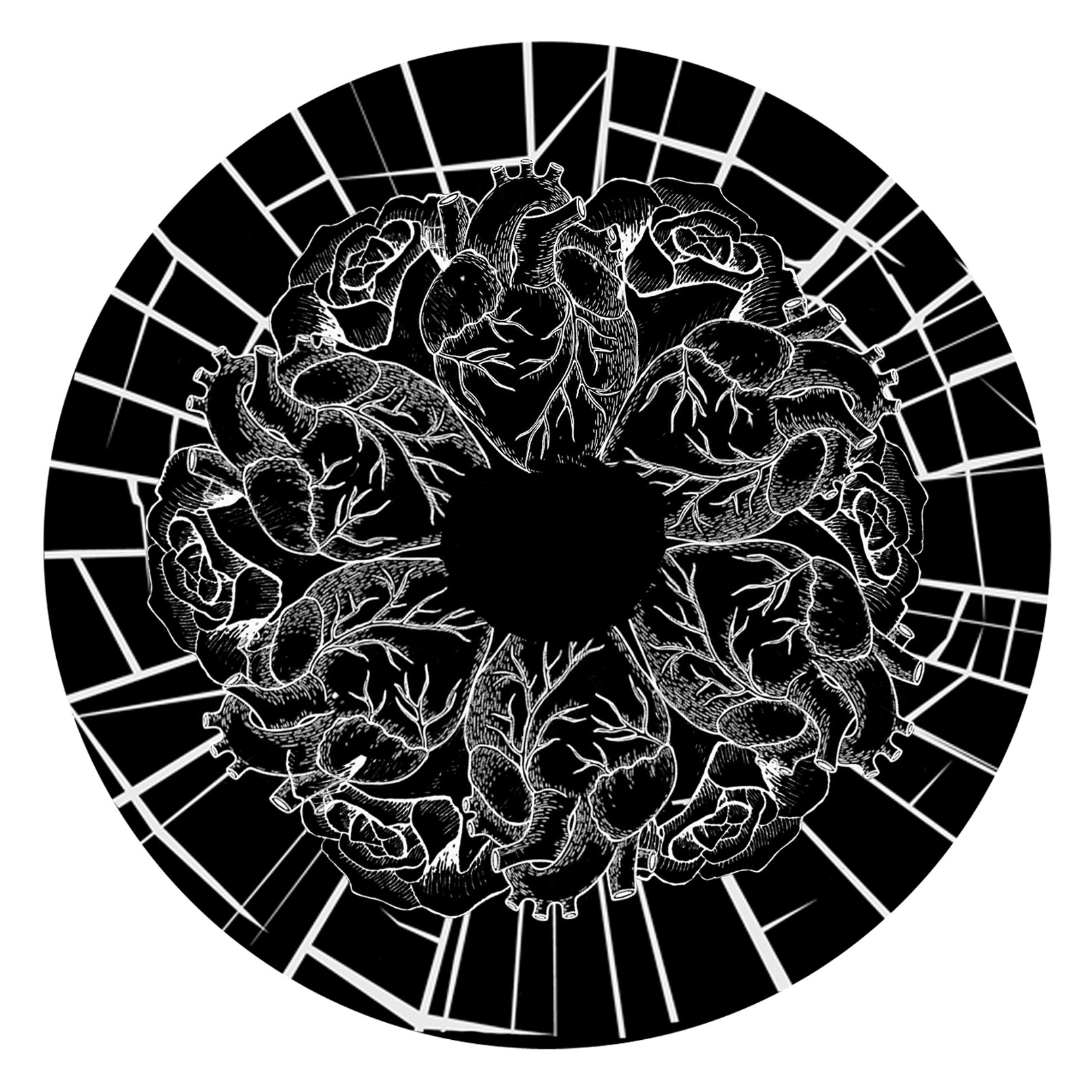 “Beauty is found within.” – Beauty and the Beast
I was inspired by how beauty should be seen from one’s interior character and not from one’s exterior appearance. My initial idea was to have the image look like a mandala, it is perfectly symmetrical and contained within a circle which is considered a perfect shape (and hence beautiful). Starting from the exterior of the image, the cracks represent a broken appearance that is not visually appealing (ugly), the roses signify beauty because flowers are considered beautiful objects and also because the rose is a main element in the actual movie. The heart is almost the same size as the rose to show that beauty blossoms from within. When one looks at the overall image, it also represents an eye, to express that beauty is in the eye of the beholder.
Principles of Design:
Balance – The entire composition is designed to be symmetrical because the inspiration stems from a mandala, which often exhibits radial balance. The cracks are the only elements in the composition that are not entirely symmetrical, but because they are evenly distributed across the outer circle, they still help to balance the composition.
Movement – The eye is led from the inner to the outer circles, due to the sudden empty space in the middle of a complex design.
Pattern – The repetition of the heart and rose forms the details of an iris and also shows harmony between the two as a representation of beauty.
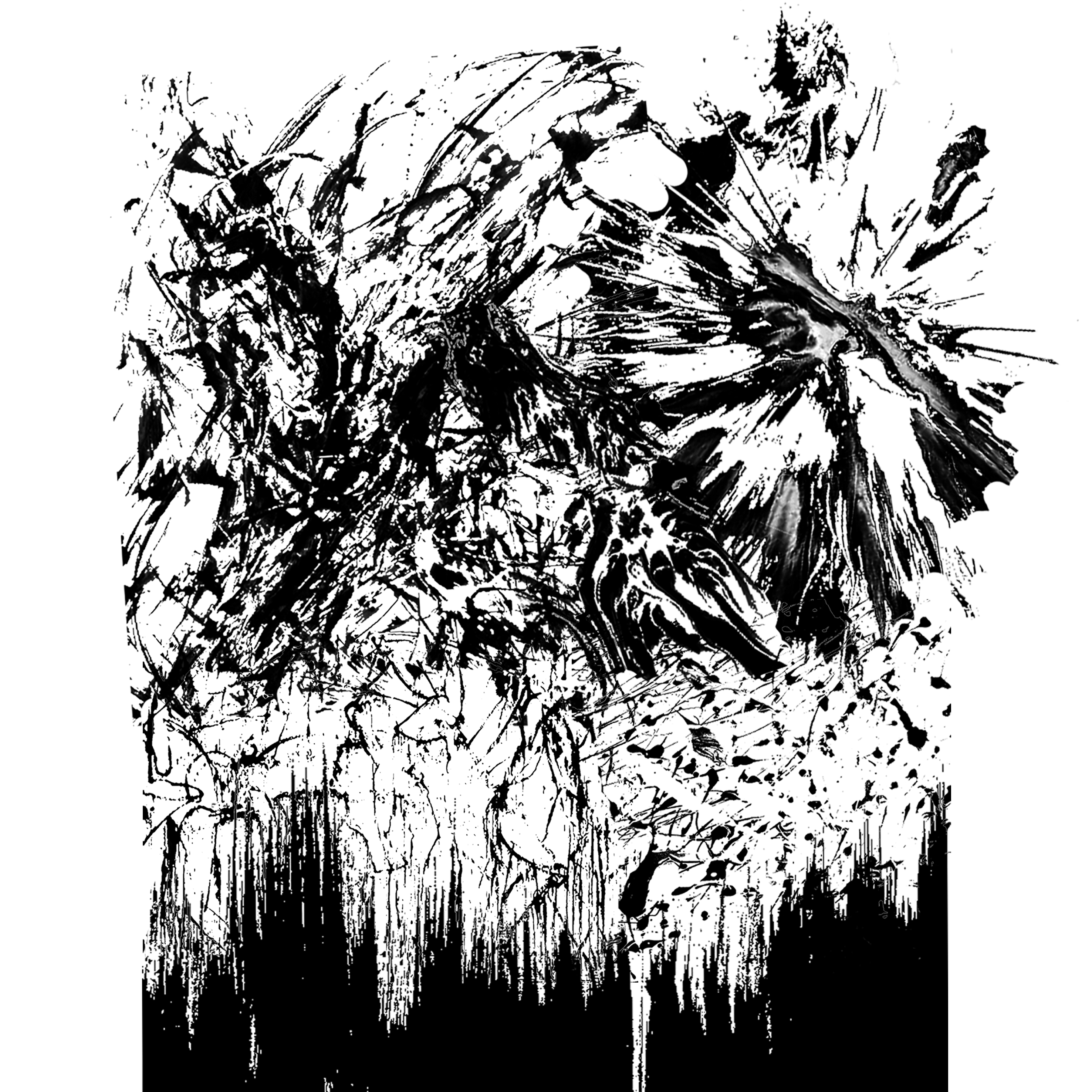
“I’m in a glass case of emotion.” – Anchorman
I decided to get my inspiration from project 1, where we used lines to express emotions. Using images that I previously researched on for project 1, I did a collage of various emotions. The lines progressively get more energetic, it starts from the bottom of what is seemingly a rectangular shape, before the emotions burst out at the top to express the fragility of the “glass case” to contain the emotions.
Principles of Design:
Movement – The visual hierarchy from the bottom to the top of the composition represents an increasing flow of emotion within the “glass case”. Closer to the top, the emotions start to flow outside of the case, indicating an emotional outburst due to the fragile containment.
Contrast – The energy of the lines show contrast in emotions, starting from the calm, to the violent (bottom to top). The emotions get more concentrated as it “rises” to the top and overflows out of the “glass case”.
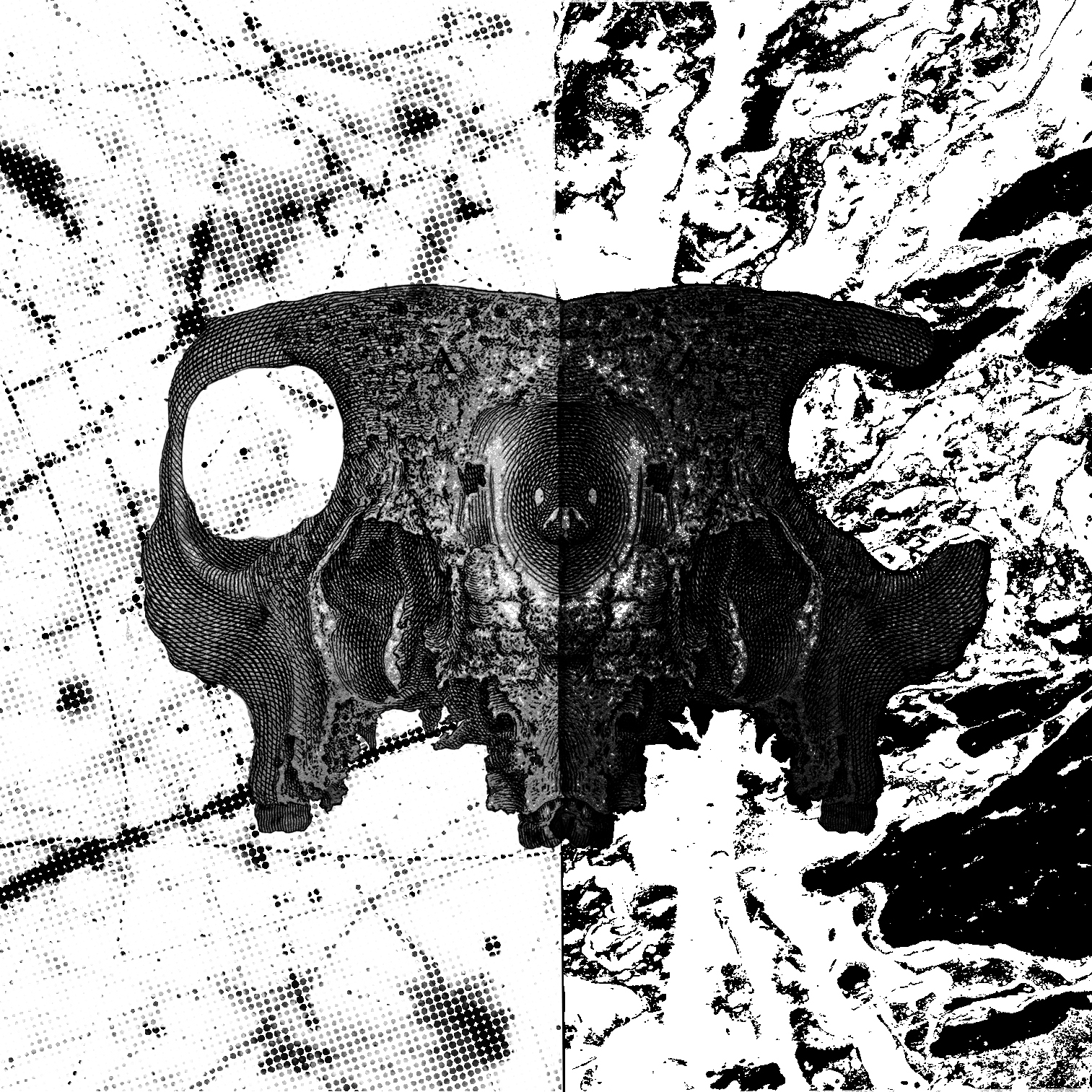
“We’ve all got light and dark inside us.” – Harry Potter and the Order of the Phoenix
The skulls are meant to represent two faces and hence two sides of a person. The lines in the background are meant to show the emotions/characteristics of the light and dark side of a person.
Principles of Design:
Balance – The entire composition is designed to be symmetrical, like a reflection of the other, since light and dark have directly opposite meanings.One skull is lighter than the other to represent the “light” and the “dark” side. There are similarities and differences in both sides, it is not entirely symmetrical but still looks visually balanced.
Contrast – The difference in the tone of the skulls show the “light” and “dark” side. There is also a contrast in the characteristics of the lines in the background of both halves. The lines on the left side are thin, light and random, representing the idea of positivity (excitement?) and freedom. The lines on the right side, however, are thicker, heavier and appear to be more energetic and controlled; it looks like an emotion that is bursting after being contained for too long. The dark background also adds on to the element of something “bad”.
Unity – The skulls are joined together in the centre to show the idea of it being from a “whole”, uniting both sides of the composition.