Mis Take 03

MIS TAKE
148mm x 210mm
Print on paper

Failure is unintentional. It conveys the idea of process and progress. The beauty of failure is often overlooked, and is considered worthless. There exists the perfect imperfection of the human condition, evident in failure. This idea is expressed through a series of mistakes and miss-takes that are subtly connected with one another, bringing attention to the unnoticed.


4d-proj-2_page_02


4d-proj-2_page_03


4d-proj-2_page_04


4d-proj-2_page_05


4d-proj-2_page_06


4d-proj-2_page_07


4d-proj-2_page_08


4d-proj-2_page_09


4d-proj-2_page_10


4d-proj-2_page_11

Mis Take 02

To start off my project, I needed as many found images of bad photos as I could get. Robert mentioned something very true, which was that everyone definitely had a collection of bad photos in their phone. True enough, after asking around for help, I curated and shortlisted some photos which I felt could help with my project. Though I will admit that almost half of the photos were found from my personal collection, having to dig through the Photos app on my macbook, I guess it’s still considered “found”? 🙂

screen-shot-2016-10-16-at-11-03-00-pmscreen-shot-2016-10-16-at-11-03-07-pm screen-shot-2016-10-16-at-11-03-11-pm

I realised that most of the photos had no specific subjects, and many of them consisted of a form of blur distortion, but in various forms. I also noticed that most of the photos had a certain distinct colour to them. With this observation, I looked at the collection as a whole and came to the conclusion that all the photos had some form of relationship among them, although they came from different people and different period of time.

screen-shot-2016-10-07-at-8-54-25-pm
I tried arranging them in a spectrum of colour but it was visually distracting, because one would tend to look at the image as a whole, instead of focusing on the photos. After consulting Robert, he agreed that it wasn’t working well and suggested that I focus on one subject/effect or a range of effects instead. -idea scrapped-

Mis Take 01

output_cdudn7

I came across this book at a Basheer book sale at North Spine, and the title just really spoke to me. (I have this weird connection with failure that’s hard to explain, my friends always associate me with it.) It’s a book that is “dedicated to the art of making mistakes” by Erik Kessels. (I have no idea who he was until Robert coincidentally spoke about him during class the very next day.) The book shows the works of various artists and photographers that revolves around the theme of failure.

The book served as an inspiration for my project, revolving around the idea of failed photography and the beauty behind them. Most people tend to overlook these photos as “bad images” and never look back at it again or may have even deleted them from their albums. I would like to bring attention to the unnoticed, and remind them to be more aware. I am determined to find the photos instead of taking them on my own, because I feel that such photos have to be very natural, and not done deliberately.

Some examples of failed photography that might be interesting to explore:

2Unintentional artistic bokeh effect

67c9d15e-c166-4999-84b7-27bd75b351ddOverexposure

68467cac-bf59-4c4f-81fd-0aa6675153e3Vertical linear motion

ba10f3d2-bc9a-42a7-91f8-defec1a3583eRotary motion

glitches-2Horizontal linear motion

lucia-marques-3Obscured by external sources

bad_photo_002
Obscured within photo (Classic finger blocking)

What I Remember 06

WHAT I REMEMBER
210mm x 297mm
Ink on transparency

Our childhood experiences play a formative role in creating who we are; it influences our decisions and can have a huge impact on the later part of our lives. It is the significant moment of being able to try everything for the first time, where there is room for trial, error and exploration.

In a spate of self-awareness, it dawned upon me that I was struggling with the recollection of my childhood memories. As a means of self-expression, I wanted to convey my thoughts and emotions of these significant milestones through the exploration of movements. Using transparency & light as my medium to play with the idea of “fading memories”, I intend to immerse viewers in the projection of my memories.


img_3858
I purposefully hung the transparencies lower than the comfortable height for viewers with the intention of making them lift up the work to take a closer look at it.

img_3873
img_3864

I was discussing my project with my classmate, Acid, at a half-lit ADM at 2am one day, when she showed me an effect against a dark corner of the wall. She shined a flashlight at the transparencies, making a projection on the wall. It was then that I realised that the effect was blurrier than what was seen on the translucency and could serve as a representation of “fading memories”. I also decided then that this was how I wanted to present my project. It is more interactive for viewers and hopefully will make them to think more about the deeper meaning behind the image.

What I Remember 05

I tried printing out the photos on different mediums for final submission. I felt like the paper base could make a huge difference in enhancing the experience of the photography project.

img_3819
Printed on paper with home inkjet printer, white space cut out to test the contrast of the paper against the wall as a background.

img_3821Printed on transparency with home inkjet printer to test out the effect.

img_3822
Printed on matte photo paper with home inkjet printer.

img_3825Printed on transparency and layered over a mix of coloured translucent paper to test effects of colour on the print.

After trying to print on the few mediums that I had at home, I decided to finalise with printing on transparency. I feel like the use of transparency could open the door for a wide range of effects because of the opacity of translucent printed on transparent. I also felt like the transparency could represent the act of “vulnerability” in showing my past to the world, in the sense of me being transparent about my life events.

What I Remember 04

I finally got down to trying out scanography with a home printer! It’s not exactly a very tedious process, but it’s very dependent on moving the photo at the right timing to get the effect at the right position. Here’s an example of how I did it:

The outcomes from experimenting with various movements to distort the photos were quite interesting, although it is difficult to replicate the exact effect again due to the nature of the process. Anyway, here are some of the methods I tried for each photo:


Basic CMYK


Basic CMYK


Currently it looks really really trippy and I quite like what has been produced so far. In my experimentations, I tried scanning extra elements in the hopes of enhancing the meaning of the photos. I’m not really sure if it works or how I can further improve this, will wait for the sharing session to hear what Robert & my classmates think about it so far. I thoroughly enjoyed the process of making, though I’m questioning if the photos look too complex and manipulated to make out what I’m trying to express.

What I Remember 03

Some examples of scanography found in zines:

tumblr_nia0eoqiel1svgodmo4_1280Using objects to create patterns

tumblr_nia1kbmdxt1svgodmo1_1280Using layers of paper

tumblr_nia36e0oot1svgodmo3_1280 tumblr_nia36e0oot1svgodmo4_1280Using motion & abstraction


I feel that motion & abstraction can be interesting as it does not distract the viewer from the subject matter (image), but brings more attention to certain areas of the photo that the creator might want to emphasise on. In the example shown above, it is also very emotive & expressive although there is a lack of colour. Hope all goes well!

What I Remember 02

I’ve been thinking a lot about how I could express my emotions through editing my photos with a particular medium. I remembered a process that I came across once, when I attended a Local People SG x M2 Academy market. A particular booth caught my eye – while everyone else was selling products, this booth was selling an experience – a hand at making zines, using scanography.

Scanography is the process of capturing digitized images of objects. It uses atypical objects, often three-dimensional, as well as from photography, due to the nature of the scanner’s operation.

The booth offered a wide range of items for us to play around with, from old textbooks & examination papers to a good morning towel. Using these items, as well as the movement of the creator while the scanner was in the process, created an effect that is impossible to replicate.

Examples of the pages in the zine from that flea market:

IMG_3698 (2)
IMG_3699
I love the distortion of the images and how the effect expresses the creator’s movements and probably their thoughts and emotions when creating the zine. I also like how it makes use of existing objects to make art, giving the old object a new lease of life. I would like to try using this method to manipulate my photos to express how I feel about my childhood photos and the stories behind them.

What I Remember 01

I’ve been having problems thinking of how to execute my existing topic regarding human behaviour/reaction and expressing that through photos. I think the idea of using a set-up experiment as a form of research is interesting, but the topic I’ve chosen is really really broad and I had a hard time finding a place to start. (#self-kill)

After contemplating about my topic for the past 2 weeks, I have decided to focus on something that is more personal and close to the heart. The title of my project will be “What I Remember”, and it the central theme will be about memories (or lack thereof). I’ve always had this situation whereby I have barely any recollection of my childhood. I thought of expressing what I actually remember about my past through existing images of my childhood, with the use of old photos and pops of colour, to express my thoughts and emotions about that particular photographed memory.

Before I started experimenting, I decided to do some research on the medium of using colours on photos to see if I could get any inspiration.

1._Flower_Power_(series),_2001,_acrylic_paint_on_photography,_130x200cm

I love how the bright red colour is in stark contrast to the black & white background, immediately bringing attention to their faces (or lack thereof). It also draws my attention to the action of the subjects and their dressing.

f31231e0019da5d299657611bf71a5af
I like how the tone of the blue matches that of the filter of the photo. Giving the photo a very “soft” feeling. I also like how the brush strokes provide some form of depth and direction of an imaginary face although there isn’t one in the photo.

tumblr_mixvagRpgo1qlaxyoo1_400

The textures of the paint caught my attention because it gave a very three dimensional effect to a 2D photo. The mix of blues and whites also divides itself from the mundane black and white of the rest of the photo. The sharp angles direct the eye, further emphasising and framing certain parts of the photo.

I will start trying out by adding colour onto the photos and see if I can achieve the desired effect to bring out the emotions I would want to express.

Image & Meaning

Initially, I briefly presented that I would like to explore the theme of Behaviour, which is defined as the way something behaves in response to a particular situation. I identified 3 sub-areas where behaviour can be observed – human, objects & nature, or mix of two. I have yet to decide on a specific direction, but it is likely to be focused on human behaviour as it is the most relatable to ourselves. The two kinds of human behaviour that immediately popped up in my mind are Thoughtless Acts & Reactions.


Thoughtless acts – subconscious actions that we perform without actually taking notice.
image and meaning-20
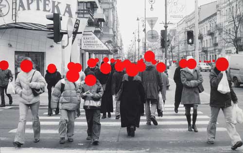
Sitting with a gap between one another, commonly seen on MRT trains & areas where communal sharing is necessary.
image and meaning-21Walking/balancing on a platform – for example on the curbs of pavements, long benches, etc.

image and meaning-22
Walking along tiles meant for leading the visually impaired.


Reactions – responses to a certain situation, a way of expressing emotions.
image and meaning-24
Emojis are expressions that people use to communicate emotions virtually, most often used in text messages as part of sentences.

Browsing usersub.

Gifs are a series of images combined to show a reaction, tell a short story, or a re-enactment of scenes in a humorous manner.
image and meaning-26Memes are usually images or screenshots from a video or movie of a person or situation with a fixed facial expression. It is often accompanied with text that adds a sense of humour to the overall composition. There are many versions of text that accompany a single image.
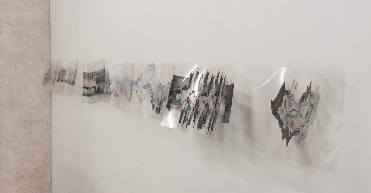
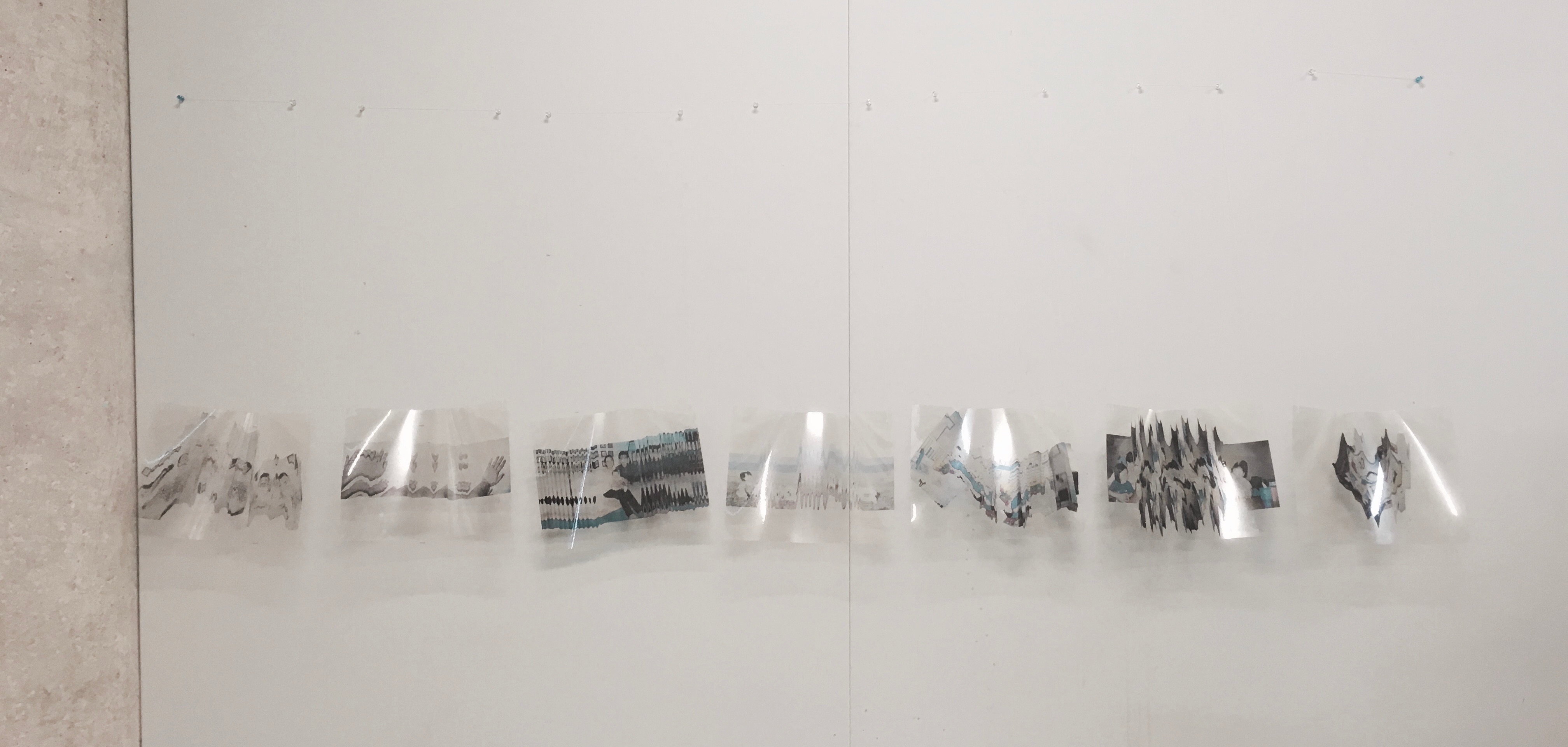

Ideation

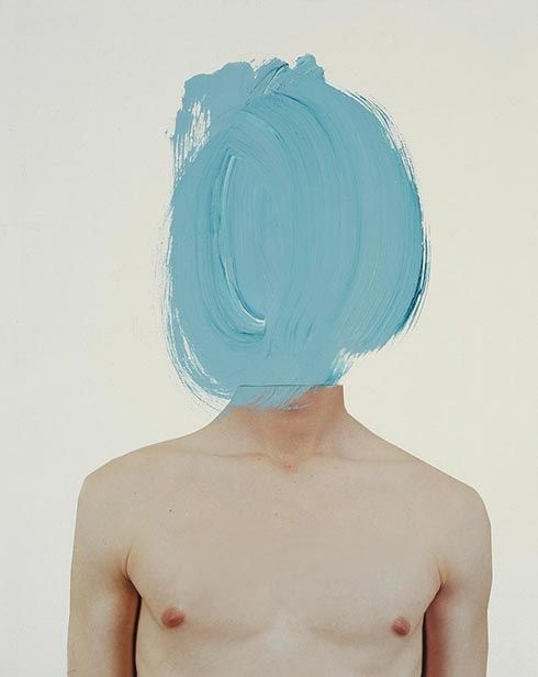
#1 – To do an experimental set-up that catches people in the action of performing a thoughtless act. I observed that people tend to look at themselves whenever there is a reflective surface, to ensure that they look as good as when they left the house. My initial idea was to have a reflective surface with a hidden camera to capture that behaviour.

#2 – To do a compilation of reactions in various forms (online media), to show how an image of a person with a fixed expression can be modified with various types of text and have multiple meanings.


I will try to think more about the theme and if it is what I really want to work on. At the moment it does not feel that right, and I think it is difficult to express something through photography if the creator does not feel for the project. Hoping the right inspiration will come soon!