After consultation, I went back to look more in-depth about the colours in my compositions. Here are the results.

Idea 1
(Colour Emotion)
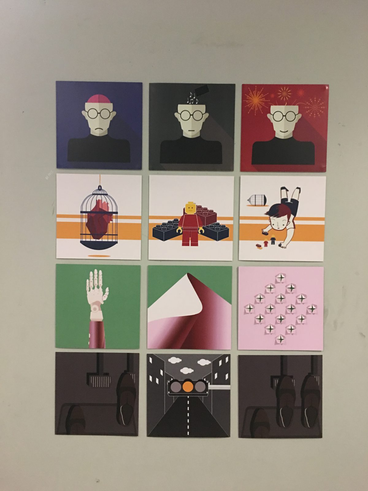
(My head): I’ve changed the background from red to blue to show the emotion as blue represent sadness. In addition, a sad mouth is added to enhance the emotion.
(Music): I’ve also changed the background for this composition. Grey is a neutral colour, it’s to represent no emotion. In addition, I make use of monochromatic for this composition, colours like black, white, grey and off white. I have also changed the “cup” to a “phone” as most of the time I use my phone to listen to music.
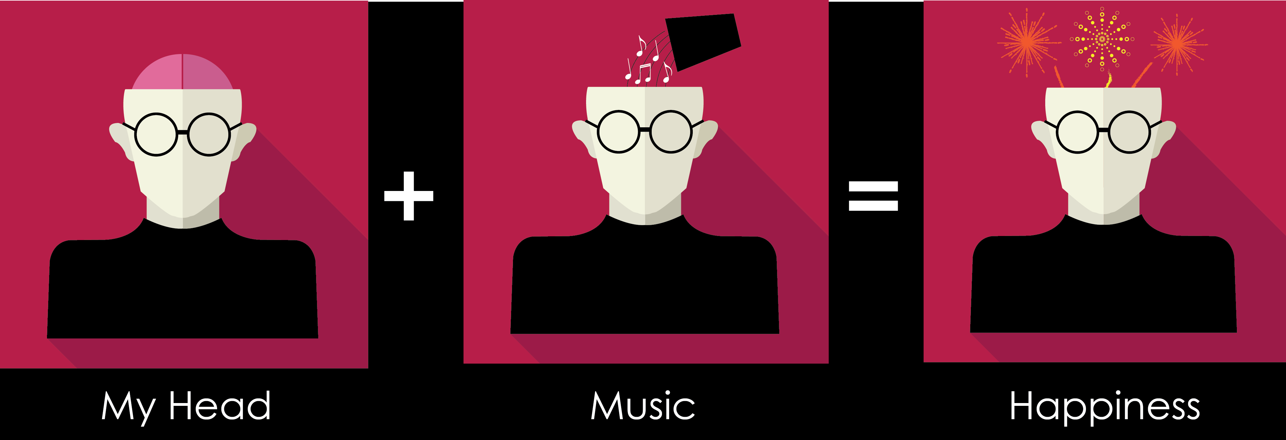
(Happiness): I’ve remained the colour red for the background as red represents happiness / love. I also added more fireworks. I have chosen to use analogous colours of red like orange and yellow. In addition, I added a smile to enhance the emotion.
Idea 2
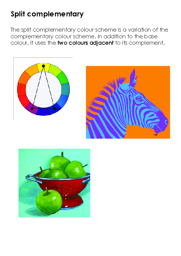
(Triadic Colours)
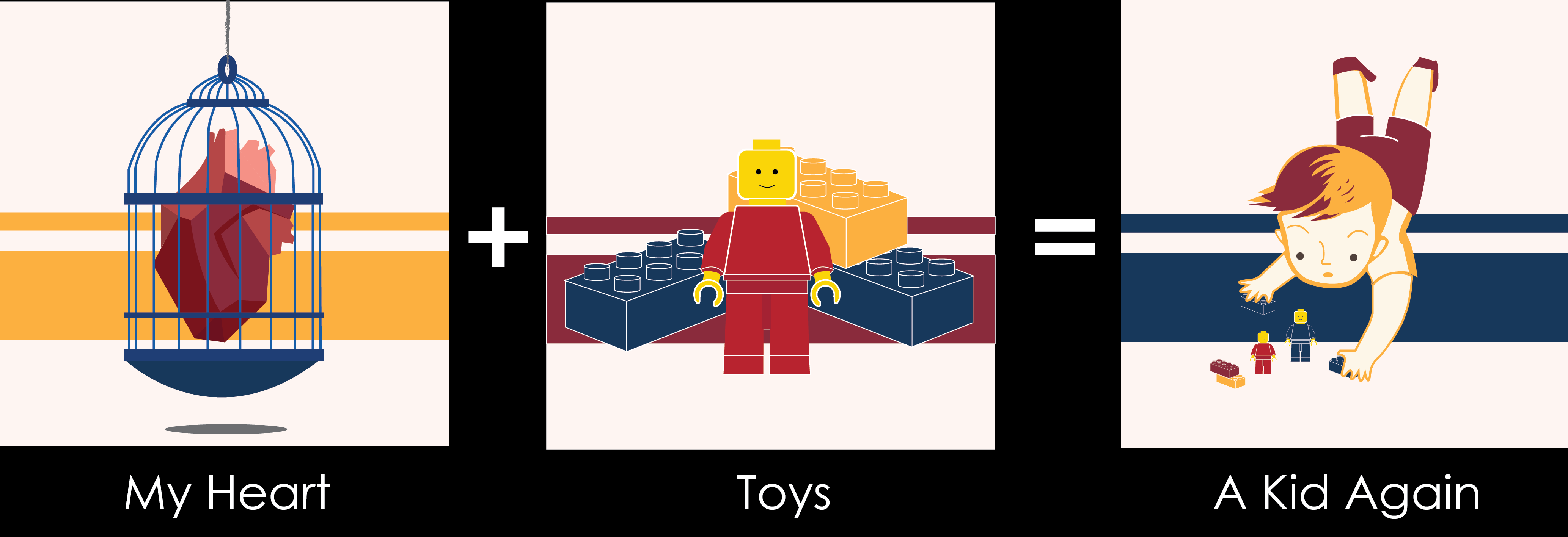
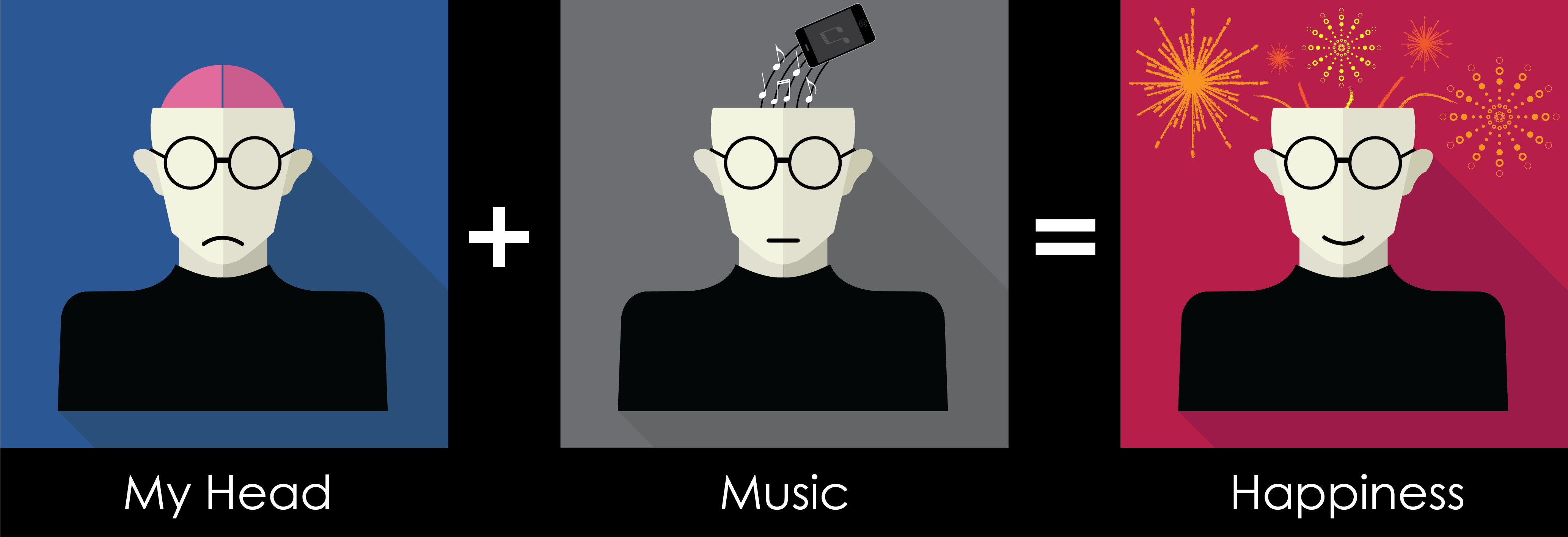
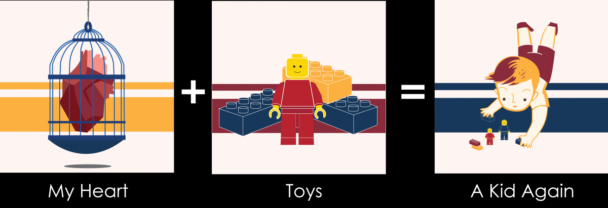
(My heart): My red heart is locked up in a blue bird cage. Meaning is that I always do things very logically, always follow what my brain tells me rather than my heart. Minimum changes on the colour.
(Toys): However, that is not the case when I see toys! Toys do not really have much used for an adult like me but I always buy them when I see them. In order for this composition to fit the (heart) composition, I change the background to yellow-orange which is the same as the first one.
(A kid Again): Same as before, I changed the background to yellow-orange. I also changed the boy’s colour to make the whole composition look more equal. The bird cage is added at the back to represent I broken out of my “logical” thinking.
Idea 3
(Complementary Colours)
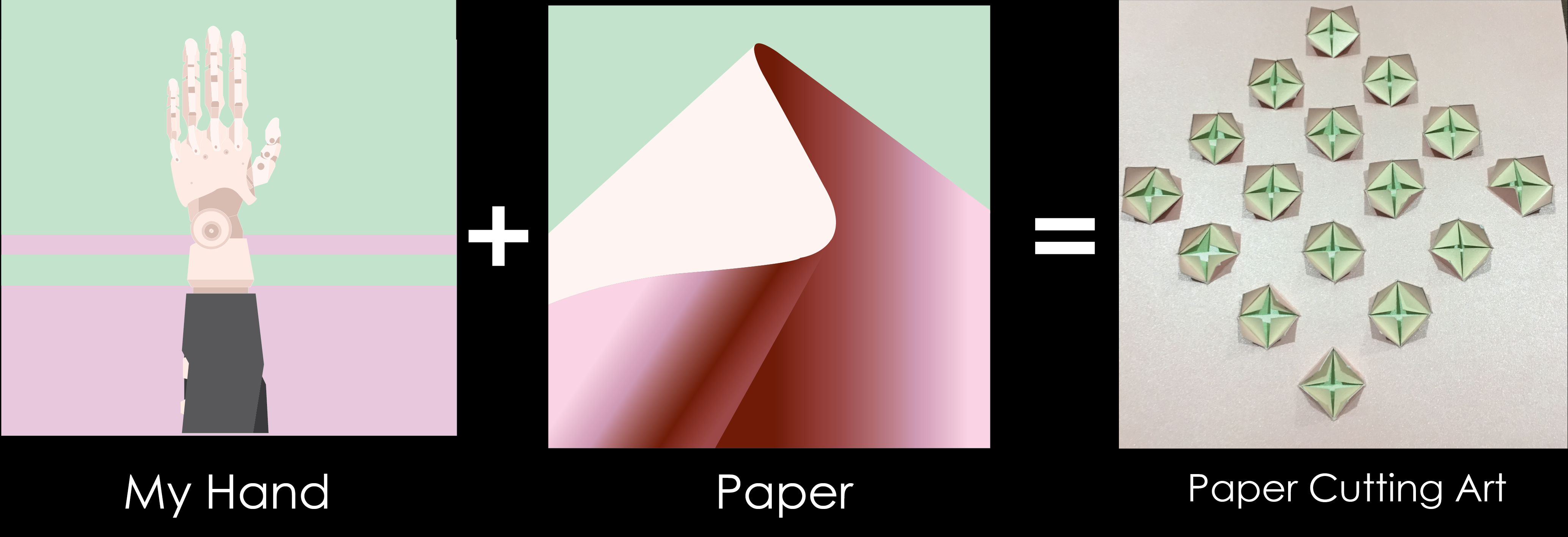
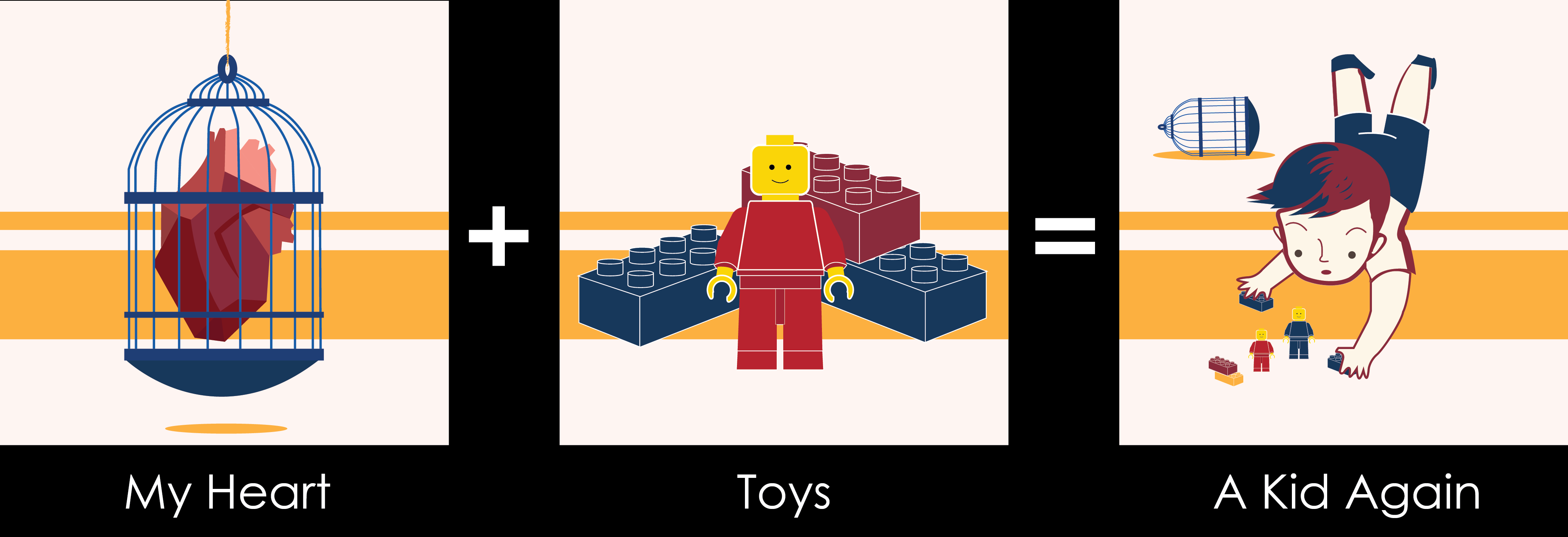
(My hand): Robot hands represents that I like hands on stuff and I’m good with using my hands, like making 3D models and paper cutting art. I removed the pattern at the back as it creates a distraction. I also chose a more saturated Green to make the hand stands out more.
(Paper): Making use of different Shades of pink to create an illusion that it has depth. (A 3D feel is created) In addition, I change the green to the same green as the (my hand) composition.
(Paper Cutting Art): I created a simple paper cut art, which able to show the 3 different colours.
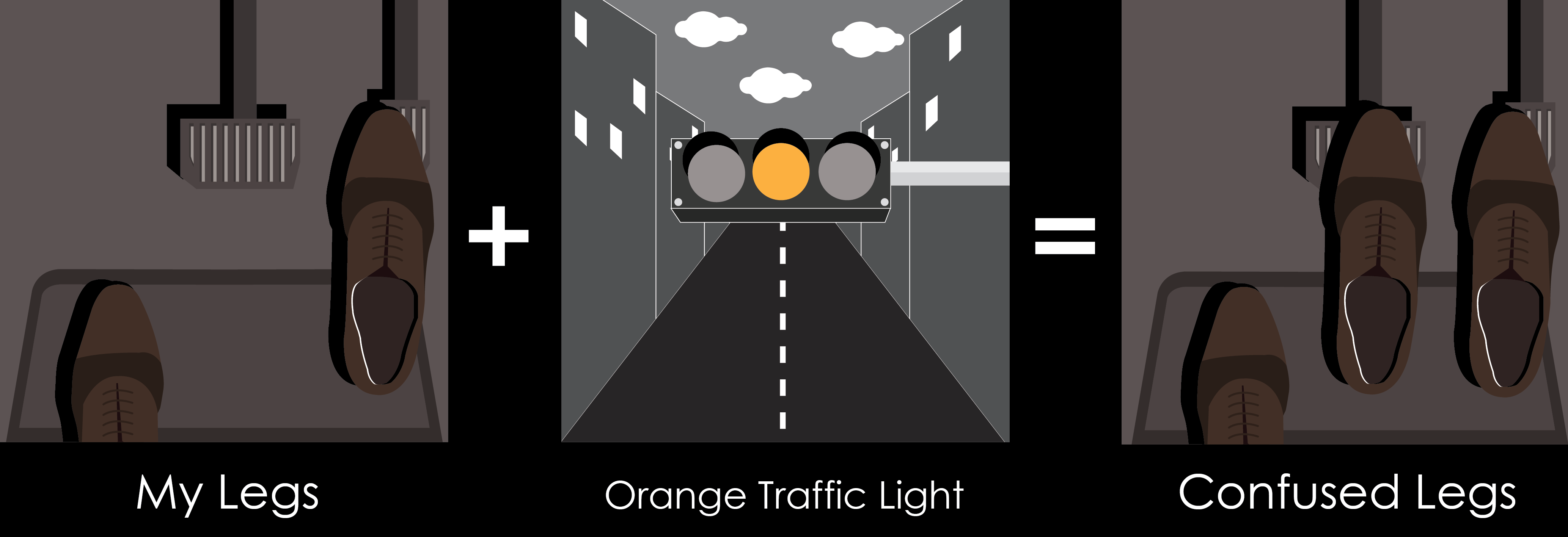
Idea 4
(Monochromatic)
(My legs): I make use of different shades of brown to create a scene I’m familiar with. In addition, I used black for the shoe shadow to create depth. I don’t really use my legs expect or walking and driving, Hence I drew my feet/shoes stepping on the car pedals.
(Orange Traffic Light): Using the different value of grey which includes black and white to create this composition. However, I place an orange colour traffic light in the centre to create attention. Moreover, with the perspective created by the road makes one attention to the traffic light once again.
(Confused legs): Same as the first composition, now I add an additional leg to show my confusion whether I should stop or go when an orange light showed up.
Reflection
I really love this project as I get to do the project using any medium with no restriction. Although there is a lot of work but I really enjoy this class! Thank you G09 for the positive feedback which makes me think that my efforts are worth it. :’) Lastly, Thank you, Joy, for the guidance these 14 weeks, I definitely learnt a lot from you. Thank you for the Pizza too! 😀
Bye Bye foundation 2D… I will see you next semester.


