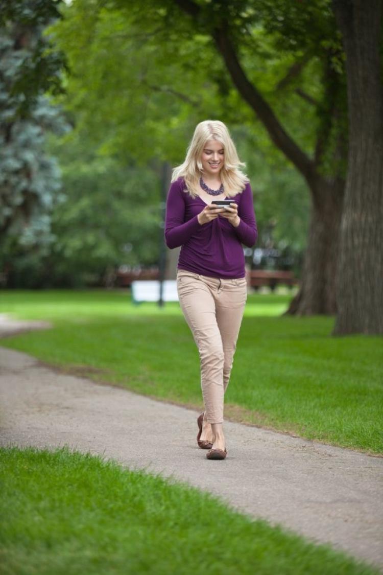
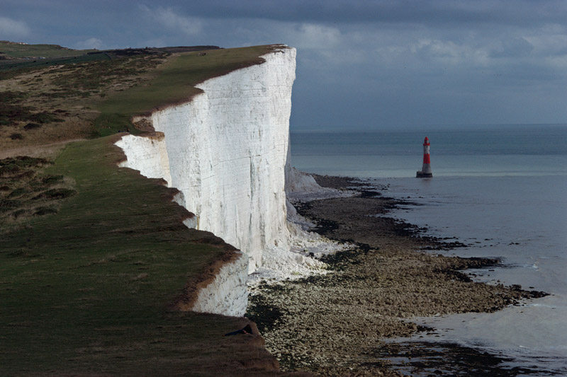
Idea 1 (Human vs Technology)
- People not caring about their surroundings and the dangerous situation they could be in while playing / using their phones.
- The efforts people put in for their addiction
Feedback after presentation
- One of my better compositions
- Some Photoshop issues on the girls legs and the human falling off the cliff.
Idea 2 (Human vs Human)

- Different sports to represent the different countries / beliefs/ stands that we have, which can be a reason for war.
- Bomb in replacement of ball
- Saw in replacement of a net.
Feedback after presentation
- Explosion looks like a plant. (should place more smaller explosions to look more real)
- Photoshop issue again, on the tennis player’s legs.
- Colour of the saw is too close to the globe.
Idea 3 (Human vs Animals)

- Rhinoceros being hunted for their horns.
- Rhinoceros’s lower part of the body is replaced by a dog’s and one of the dog’s leg is a fried chicken –> the cross between animals as pets and animals as food
- Panda is confused by the ‘Panda dog’.
- Gorilla as Harambe.
Feedback after presentation
- Panda and the panda dog is too far away.
- The entire composition feels separated
Idea 4 (Human vs Diseases)

- A kid is fighting against a mosquito (to represent the present situation of us fighting against Zika).
- Chicken to represent Bird Flu.
- Pig to represent H1N1
- Smaller mosquito to represent dengue fever.
- The 3 ‘animals’ are leaving the room as they have lost the fight against the boy (which represents us humans)
Feedback after presentation
- One of my better compositions.
- Can add animals in the TV.
Silk Screening
I went to buy myself a new silk screen as a backup and for efficiency sake too so I do not need to keep washing away the prints when it print don’t turn out nicely. However, things still didn’t turn out very well for me…

1st Screen – The cliff could not be seen clearly because it was too white, so I went to print another transparency after I darken the cliff.

2nd screen – The cliff can now be seen, but there is another problem. Due to the increased darkness of the cliff, the saw and Pikachu which was black could not be seen anymore. Perhaps it’s because I applied too much force when I silkscreen. Hence, I practised on paper the amount of strength I need to use.
After making sure I got the correct tone on the paper, I decided to give a go at printing on my bag. But because of the different material, I failed at the first try – the pikachu cannot be seen. So I repeated over and over again on paper. But no matter what it doesn’t work on the bag.
In the end I printed 10 times on 3-4 tote bags and picked the best one for submission. I believe my problem lies on the Photoshop stage. I should not bitmap the pictures one by one, I should have completed the entire composition then bitmap the whole thing altogether. My Photoshop skills can be much better too. Oh well, these are mistakes I need to learn from! I’m still glad I got to learn about silk screening as I have never done it before.

Now it is time for me to focus on my final project in order to make up for my mistakes made in project 2!