linko here
Month: February 2020
DR2014 Wearable Tech – Biomimicry
Biomimicry works in many ways and thus I decided to split into three sections, namely, Textiles, Function, and Design, though often than most they tend to overlap.
Textiles
1)

Inspired by the microscopic structure of the Morpho Butterfly’s wings, the textile appears a shimmery cobalt despite its lack of pigment. The dress’s iridescent hue is a trick of the light, and is manufactured by Teijin in Japan.
A native of the South America rainforest, the Morpho is one of the largest butterflies in the world, with wings that span five to eight inches. The vivid colour on the upper surface of their wings is the result of microscopic, overlapping scales that amplify certain wavelengths of light while cancelling out others.
Similarly, Morphotex relies on fibre structure and physical phenomena such as light reflection, interference, refraction, and scattering to produce its opalescence. The fabric comprises roughly 60 polyester and nylon fibers, arranged in alternating layers that can be varied in thickness to produce four basic colors: red, green, blue, and violet.
2)
A group of Pennsylvanians researchers from PennState implemented a new way to produce fabric in order for it to be self-healing and act as a barrier between the bearer and the outside world. By dipping the fabrics in several liquids, they create layers of material that then form a polyelectrolyte layer-by-layer coating.
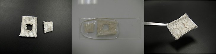
Similar to polymers present in Nature in the form of squid ring teeth proteins, positively and negatively charged polymers compose the polyelectrolyte coating. These quite amazing proteins already inspired the team to create a self-healing plastic last year.
Function
1)
“ … Fashion can be kinetic, dynamic and almost living expression of our unique experience with nature. I strongly believe that Fall can influence the fashion world to become more dynamic and to increase the way clothes can react to the world around them,” Özkan said. “I want clothing to have more responsiveness to the environment, so that instead of people always change their clothes, the clothes can sometimes change themselves.”
Birce Özkan began the garment design process by asking herself: “What if when the temperature got hot suddenly, our clothes would start to break apart in response? What if they had the skill to behave depending on the surrounding conditions? What if garments had the ability to sense the environment just like living organisms?”
Trees naturally shed leaves depending on the temperature and light. So, Özkan created an interactive garment that does the same. “In the fall, as the days shorten, and the temperature gets colder, the trees, without the light they need to sustain their chlorophyll, shed their leaves to keep their energy to survive for the winter ahead,” Özkan said. “This process was the inspiration for creating my garment’s mechanism. To prepare for the fall of leaves, trees activate “scissor cells” that split to create a bumping layer that forces the leaves out of place, destabilizing them so that they fall.”
Özkan used the same process for her garment that trees use. Light activates small motors in the garment. The motors speed up when there is less light and make the “leaves” fall from the garment. The motors are attached to steel wires, and the wires connect to holes where leaves are attached with wax. When there is less light, the motor pulls the wire which breaks the wax adhesion and makes the leaves fall down. Özkan said she believes the piece will help people have a greater appreciation for the earth.
2)
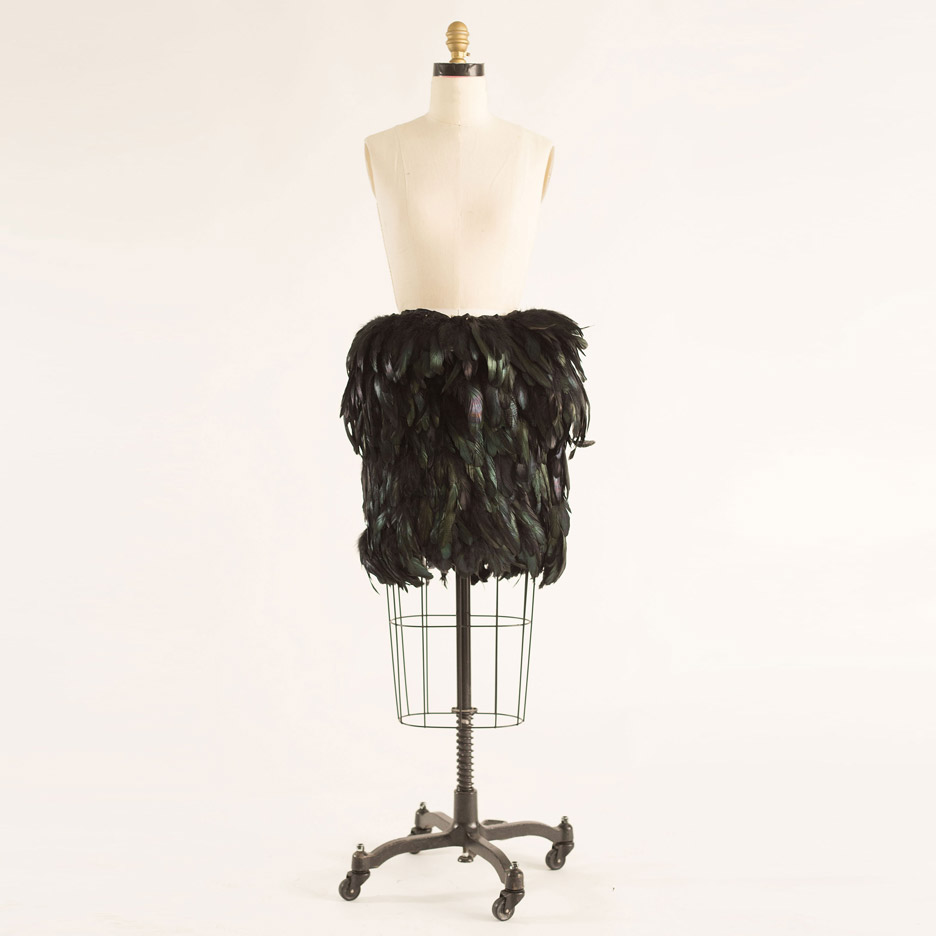
“Augmented Jacket” by Birce Ozkan
Birds have a biological compass that tells them what direction to fly during migration. Their compass is guided by the earth’s magnetic field.
“This gives them a freedom that humans lack. Instead, humans become more dependent on their mobile phones to find their bearings. This dependency limits the awareness of their surroundings and denies them of some experiences,” Özkan said.
So she created a jacket that imitates a birds’ internal compass. The jacket uses an electronic compass and embedded motors that make the feathers on the shoulders rise up when the wearer walks north.

Black cockerel feathers are attached around the collar of the jacket and fully cover the skirt. Both are made from a dark cotton-based material and feature an integrated electronic compass, which is connected to motors on the end of the feathers. When the compass detects that the wearer is facing north, the plumage is raised up by the motors to look like a bird flapping its wings.
“During my research, what I found out is that when humans lose their way, the easiest way to reorient themselves and find their way is to face north and visualise the map,” Ozkan told Dezeen.
“If the wearer loses their way, the skirt or jacket helps to find where is north and then when they face their body north, they visualise a map and can navigate based on memory.”
The next step for her Augmented Jacket and Skirt is to link up the clothes with Google Maps so the feathers respond to programmed routes.
The feathers on the left side would flap when the wearer needs to go in that direction, and the opposite side for turning right.
“You can write down the address and then the feathers will guide you if you need to turn right or left,” said Ozkan. “In that way, people don’t have to be dependent on their mobile phones and can be more aware of their surroundings and allow them some experiences.”
1)

Jean Louis Sabaji S/S 2013
2)
Comme des Garçons F/W 2013/14
Her collection came cut in classic menswear fabrics like houndstooth, pinstripe, and Prince of Wales but also in those reminiscent of “Beetlejuice stripes” or cartoon bright floral prints that could be found in a kindergarten.
From there Kawakubo played with volume and proportion to create another one of her customarily challenging collection.
So that a suit would show up with whorls of abstract fabric flowers swelling out of it, a jacket would feature odd shaped inflatable balloons in a matching fabric that would incased the sleeves or the shaggy layering of strips of fabric was another way the designer also bulked up a few of her ensembles. And the idea to flatted the pants between the legs (as if the models were using their thighs to keep them hanging straight) was so off the wall only Kawakubo could pull it off.
3)

Gucci F 2004
4) 
Yiqing Yin F/W 2012/13
Yiqing Yin’s new Autumn-Winter 2012-2013 collection re-imagines the female form in a world of purely mineral and vegetable composition.
The designer’s hand remains assuredly her own throughout excursions into bold and new galaxies of ever-shifting shades and shapes where tones blend and merge. Red remains pure while a slate grey betrays celestial glimmerings. Silver and blue fade into one.
Inviolably light cascades of satin and muslin offer oblique suggestions of chasteness through their mounting layers.
DR2014 Wearable Tech – Ideas & Moodboard


DM2007 Interactive II – Inspiring Art Work
While researching for inspiring interactive artworks, I chanced upon a plethora of different installations, and much to my amusement, realised the broadness of the term “Interactive Art”. Ranging from contemplative to experiential, these works could take different forms – music, dance, digital. To choose simply one work from this range was difficult, and thus I will be showing a few more. Some of these works, albeit old, still hold much value and are applicable even today.
Alex Davies’ Dislocation (2005)

Dislocation is an interactive installation in which reality and the virtual mix. Perceptually real virtual characters intermingle with exhibition audiences as they look into their chosen portals, subverting the traditional ‘seeing is believing’ ethos of traditional video.
The audience enters an empty gallery room with four individual portals set into one of the walls. As they peer into one portal, a simple real-time closed-circuit video feed of the room they are in is shown. Using audio and locational data, the video images are digitally composited with images of pre-recorded video characters, creating an illusion of additional characters in the area.
“The auto-voyeurism of watching your own image is given an uncanny and disturbing twist when you also become the unwitting observer of a number of different scenarios that are apparently being played out in the room behind you. As you watch though the portal, you may see a man enter the room and walk up behind you or a young couple come into the room and start kissing, or a security guard enters with a barking dog. This uncanny sense of bodily presence behind you and your own possible vulnerability to these presences induces you to turn around to look behind you but when you do you are confronted with an empty room.”
Playing with the idea of appearance and reality, the real images of the viewer and virtually composited characters occupying the same viewing plan causes the viewers to be unable to trust their own eyes. Many state that one believes what they see, but the apparent reality is unfortunately shattered when the viewer turns around, only to face an empty space when they expect to see someone or something else there.
Thoughts
With this current age of virtual reality and augmented reality, it seems the day where one cannot tell reality from the virtual is not far away. With good rendering or composited images, it has become far too easy to edit and change images and videos one used to be able to use as ‘evidence’ and the ‘undeniable’ (now doctoring images and videos are common). This blur of truth and lies is highly applicable to this day and age of the digital, and the way the viewer would feel unease and begin to doubt the truth of the events in the room is highly intriguing. While the set up being simple and intuitive for the audience and participants, the contrastingly deep and inner fear of the unknown embeds itself into their hearts, definitely causing a long-lasting impression.


David Rokeby’s Giver of Names (1991-2004)

Giver of Names by David Rokeby is an installation that aims to challenge the viewers preconceptions of objects and push them to speculate and contemplate more. It hopes to represent a re-interpretation or alternate interpretation of the visual image of an object. An additional aim is highlighting the tight conspiracy between perception and language, bringing into focus the assumptions that make perception viable, but also biased and fallible, and the way language inhibits our ability to see.
In the room stands an empty pedestal, and a small video projection. A video camera observes the top of the pedestal. The installation space is full of random objects of many sorts. The visitor can choose a single or numerous objects from the space and place them on the pedestal. With the object/objects placed, a computer takes an image and performs multiple levels of image processing.
These includes outline analysis, division into separate objects or parts, colour analysis, texture analysis, etc.
These processes are visible on the life-size video projection above the pedestal. In the projection, the objects make the transition from real to imaged to increasingly abstracted as the system tries to make sense of them.
The results of the analytical processes are then ‘radiated’ through a metaphorically-linked associative database of known objects, ideas, sensations, etc. The words and ideas stimulated by the object(s) appear in the background of the computer screen, showing what could very loosely be described as a ‘state of mind’.

From the words and ideas that resonate most with the perceptions of the object, a phrase or sentence in correct English is constructed and then spoken aloud by the computer.
The phrase is, of course, not a literal description of the object. At the same, time, it is definitely not a randomly generated phrase. Everything that the computer says in some way reflects its experience of the objects. However its experience is in many ways quite ‘alien’. For example, it has no human real experience of the world. It has not burned its hand, scraped its knee, been hungry, angry, fallen in love, wanted something it couldn’t have. It does the best it can to talk about the objects from its very particular point of view. If you spend some time with the Giver of Names, you tend to find that the peculiarities of its perceptions and its speech begin to coalesce into a tangible and coherent character. Misused or mispronounced words become the character of a dialect.
Thoughts
At first glance, before reading the meaning behind this artwork, it reminded me of the Asian tradition of letting your kids pick an item from a range of objects to predict their future when they reach age one, thus standing out to me greatly. The idea of a phrase appearing upon analysing the objects was very similar to the tradition and it was interesting that the words created did not make much sense, allowing for newer interpretation and unique ideas.
George Khut’s Pillowsongs (1997-2001)

From his website:
“Pillowsongs is a sound installation exploring sleep and rest as a space for listening. Recordings mastered on eight different compact discs were mixed into speakers embedded inside pillows on beds installed throughout a darkened exhibition space, lit only dim blue light-bulbs.
Listeners hear these sounds by resting their heads on the pillows – resulting in a very intimate and ‘inside your head’ listening experience. The soundtracks combined field recordings, electronic drones, voices and short-wave radio transmissions. The programming of the CD tracks changed from day to day.
The slowly reconfiguring sound textures, dark lighting, and restful means by which the audiences engage with the work, engage listeners in a highly intimate, and hypnotic hypnogogic listening experience. Listeners often reported a high degree of uncertainty as to which sounds where coming from the pillows, and which sounds had emanated from outside the gallery space. Falling asleep can be an appropriate way of interacting with this work, given our ability to perceive sounds whilst in certain stages of sleep.”
In his sound installation Pillow Songs Poonkhin Khut has created an environment that seems strangely disconnected from the outside world… A violet light-bulb hangs over an unadorned bed, staining the white cotton sheets an iridescent blue. Somewhere a dog barks. Warily negotiating the shadows one becomes aware of other beds which are vaguely reminiscent of dormitories, cheap hotel rooms or convent cells. In the darkness the beds evoke a sense of familiar intimacy and the plain sheets reveal a sensuality which belies their ascetic frugality. Sounds emerge from the pillows like memories made manifest or half-forgotten dreams exposed and rendered audible.
Lying on the rough cotton sheets the inevitable association of light illuminating the darkness to traditional representations of transcendence is thwarted. Instead an overwhelming sense of the temporality of life marked only by fleeting sensations, thoughts and lingering memories is evoked. Implicitly the long hoarded pillows, vestiges of the artist’s past refer to the passage of time and the materiality of the body’s seeping flesh. These ideas are intensified by the physicality of the muffled vibrations of the sound transmitted through the pillows and the gradual awareness of the residues harboured in the crumpled linen of those who have visited the installation before. A strangely intimate and disquieting proximity revealed by the lingering scent of strangers, a stray golden hair and a damp smear on the pillow.
– Review by Mary Knights, Artlink magazine, Vol. 18, No. 2, 1998
Thoughts
I thought this artwork was unique as it was meant to be experienced in an intimate and uncommon way. Personally, the idea of lying in a bed in a public area is highly unsettling and instead a more private thing. Yet, the artwork’s attractive is so strong, one feels compelled to try and experience it instead of being turned off. The way this artwork manages to be so catching that people would put their unease aside was something that really amazed me.
The work is highly contemplative and the set up had fit the mood perfectly, with a strange calmness. While on a superficial level it can be seen as a bed and sound, the way the sound was emitted was truly different from the norm, making use of an interesting method of placing speakers in the pillow. I think this really gave a huge feeling of being enveloped and surrounded by the music, and the mood of the piece gives way to deeper thinking and being in a dreamland with our thoughts and emotions.


Mari Velonaki’s Fish-Bird (2006)

‘Fish-Bird’ is an interactive autokinetic artwork that investigates the dialogical possibilities between two robots, in the form of wheelchairs, which can communicate with each other and with their audience through the modalities of movement and written text. The two robots were Fish and Bird, who were explained to visitors that they could not be together due to “technical difficulties”. They took the form of an empty wheelchair so as to evoke a feeling of absence of a person and the chairs wrote intimate letters on slips of paper that they then drop to the floor. These letters were produced with a miniature thermal printer, and had “poetic lines and personal confessions such as “my heart is broken” or “I’m so lonely,” to produce empathy in the visitors”.
The personality of the robot was portrayed through the different fonts and scripts they used, and their more “outgoing” or “reserved” movements.
For example, they faced visitors as they entered, and rolled alongside them, acknowledging their presence. Visitors that spent more time with the robots received more intimate messages from them. The two robotic chairs have interacted with over 36,000 people in Australia, Austria, Denmark, United States, and China.
Through this, Mari Velonaki, whose practice and research is within the field of social robotics, learned that people loved the creations.
She says that, on average, visitors to Fish-Bird interacted with the robots for about 10 minutes. Some of them became so deeply absorbed that they spent 30 minutes or more in the installation space. “Kids were patting them to print messages,” says Velonaki. The engagement is remarkable in the context of an art exhibition, where visitors typically only spend a few minutes before moving on.
Thoughts
It was cute. I loved it. I can fully understand why the audience had been so absorbed into staying and interacting with these robots. With lives on their own, the supposedly lifeless wheelchair begins to seem more animated and adorable, and perhaps they could have been seen as a pet or a young child in the eyes of the audience. It touches on the obsession of wanting to be loved perhaps, and staying with these uniquely adorable wheelchairs would have granted them more cute and intimate letters.
The narrative element of two robots being unable to be together and their well-thought-out and meaning names – Fish and Bird, definitely strikes at the hearts of audiences.
I believe that this artwork tackled the core of people’s odd and perhaps unconventional love for the pitiful, the sad, and tragedies. Oddly enough, like how some people think tearful babies and animals are extremely adorable, perhaps this hit the same zone.
Apart from this, the usage of robotics to create art was also unique and interesting and something I would love to look more into.