Category: LE01 HISTORY OF DESIGN (2019)
History of Design – Reflection 4

This four weeks learning about the History of Graphic Design had been a fun and enjoyable one. While we did touch about some of the Art Movements in the previous semester, I felt I learned much more through these lessons. Information I had for History of Graphic Design had initially been shallow and narrow, and I now have a new appreciation and respect for Graphic Design, after knowing its history and story.
The list of words that were provided to us had been very helpful in helping me stay in check with what information was essential to know. At the same time, we learned beyond the list of items, with many examples, helping us know better what it each typeface or art style was like, and its exceptions if any. Apart from missing explanation of a few words from the list, the list as a guide had been extremely useful and productive.
Taking breaks every 30mins was definitely essential for productivity. Reaching the 25mins mark, I could feel my mind slowing down, and the break was definitely good to rest for a while before continuing with the rest of the class.
Choosing an image to explore more upon had been surprisingly fun. While doing a post after each lesson initially sounded like a chore, I discovered many new things about graphic designers and fonts that caught my eye. This also helped in retaining information, and it made me find interest within graphic design.
The quiz had been rather fun, especially since we had time to go through it and check out answers after we were done. I feel it had been much more productive to do quizzes than presentations, considering little information apart from that of my own had retained in my mind from last year. It was also nice that the quiz had been split into two; heavy content splitting into two.
Overall, the class was really fun! とても楽しかったです!!これからもいろいろグラフィックデザインについて勉強したいと思います!!ありがとうございました!!
History of Design – Reflection 3

During this lecture, there were actually quite a few things that caught my attention, and I wanted to search more about them.
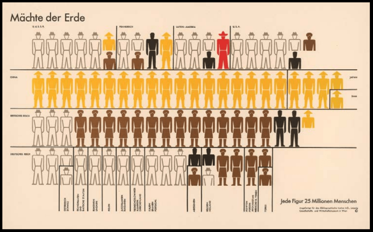
Isotype (International System of Typographic Picture Education),
Otto Neurath & Gerd Arntz,
c. 1935
Isotypes, International System of Typographic Picture Education for full, was developed by social scientist and philosopher Otto Neurath and designed by Gerd Arntz. It was a method for visual statistics, using icons and signs to symbolize data.
Otto Neurath had seen that people of the working class that began to break free from dictatorship at the time were mainly illiterate. He hence knew that for them to gain knowledge of the world, information should have been clearly and directly illustrated in a clear structure.
It also aimed to overcome language barrier across the countries; to be universally understood and was influenced by Otto Neurath’s fascination with the function of Egyptian Hieroglyphics; both their form and ability to convey a story.
Arntz eventually created about 4000 of such signs, which were then adopted worldwide to what is now termed as Infographics.
This was fun and amazing to learn about Isotypes as they are so commonly seen, but I had never gone to find how they came to be. Through these lectures, I truly understand how many things regarding Graphic Design many of us seem to take for granted of, or simply overlook, but actually have an interesting or deep history behind them. It was nice to finally put a name to who began the idea of infographics that have been widely used and also understand the creation was out of the hopes to increase the educated in the population, and escape from dictatorship at that time.
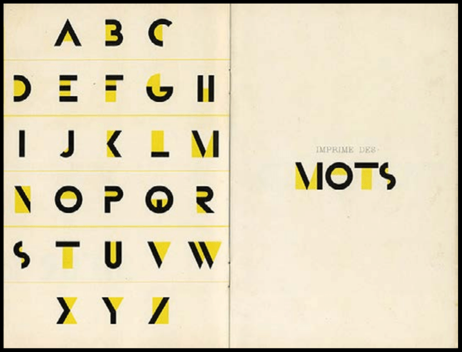
Bifur typeface,
A. M. Cassandre,
1927
Another thing I really liked was the Bifur Typeface created in 1929 by A.M. Cassandre, whose birth name was Adolphe Jean-Marie Mouron. It was bright yellow and really beautiful and I loved how big the contrast the colour was against the dark of the bold lines. However, upon further research, I learned it was initially like so:

The design combines very thick with incredibly thin line strokes, which is a striking and unusual type design, even for today. Other than that, the design is quite minimal without serif or flourish.
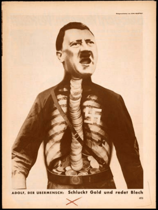
Adolf the Superman: Swallows Gold and Talks Tin,
John Heartfield,
1933
John Heartfield’s Adolf the Superman: Swallows Gold and Talks Tin was interesting because of the imagery, but also its title. An X-ray chest had been superimposed over Hitler’s torso in this image, creating a funny and eye-catching image. It ridiculed Hitler, which instantly amused me, and made me want to know more about not only the Artwork but also the artist himself.
The work was mainly based on world war and politics, with the artwork referring to Hitler’s receiving of financial backing from wealthy industrialists, and him spouting ugliness to move the country toward a profitable war. John Heartfield thus used this piece as a political medium, even going as far as to change his name from Helmut Herzfeld in protest. The powerful image was featured prominently throughout Berlin and John Heartfield was immediately targeted after the Nazis came to power, ordering several assassination hits on him. Nevertheless, John Heartfield survived the hits and passed away on 26 April 1968 due to illness.
It was interesting how John Heartfield did what he believed in and risked his life in doing so. The events that had occurred were frightening, yet the imagery created was rather humourous as though to mock Hitler and his ideologies.
http://www.designhistory.org/Symbols_pages/isotype.html
https://www.sessions.edu/notes-on-design/type-in-history-cassandres-art-deco-type/
https://fontmeme.com/fonts/bifur-font/
Adolf the Superman Swallows Gold and Spouts Junk
https://www.britannica.com/biography/John-Heartfield#ref1204496
History Of Design – Reflection 2
The main image that caught my attention during the lecture was Gismonda, by Alphonse Mucha, an artwork of the Art Nouveau period.

Poster for ’Gismonda’ (1894)
Art Nouveau, that lasted from 1890 to 1914, is an artistic movement that was practised in many fields of art, such as architecture and graphic design. The term “Art Nouveau” is the French term for “new art”, and the Art Nouveau movement is the first time that design had been promoted through mass communication.
When I first think of Art Nouveau, works like that of Alphonse Mucha’s come to mind instantly. Not knowing much about the history of Art Nouveau in Graphic Design, I was highly intrigued to learn that within the art movement, there had been many different variations of Graphic Design created, all over Europe, and that it had developed greatly over time.


The many styles looked rather different despite being in the same movement but had similar properties that stemmed from the art style that influenced them. Many of the artworks created during the movement had flat planes or were two dimensional, with an undulating asymmetrical line, that usually was elegant and graceful or infused with a powerfully rhythmic and whiplike force. This was strong violent curve was also referenced by the term “whiplash”.
These graphic art that had many organic and plant motifs were so heavily ornate that it was not desirable for text faces but great for display work. Thus, it had been more popular in poster printing and book production.
Learning that Art Nouveau developed from the Japanese art style Ukiyo-e, took me by surprise. I had never expected a connection between an Asian Art style and Art Nouveau, that felt highly westernized, but I soon saw some resemblance between the two styles. I had always thought Art Nouveau appeared rather comic-like and understanding its influence gave me some potential rationale to this connection. I think it was amazing that from an art style all the way from another continent, an array of styles all under Art Nouveau had been born.
It had been due to the Western culture beginning to exchange information and ideas through world trade, in which the start of Nouveau began. Famous makers of Art Nouveau objects were selling their ideas through magazines, journals, trade fairs, exhibitions, and they saw themselves as part of this larger world. Art Nouveau was the first style to sell itself and to be conscious of itself. At the beginning of 1890s, many artists reached out beyond their own countries for inspiration. Japonism was also a prominent trend then and thus had a strong influence on the artists.

Poster for ‘Job’ cigarette paper (1896)
Nevertheless, of all the different artists, I still liked Alphonse Mucha’s works the most. The bold lines and curves drawn, along with the colours used had caught my attention the most. I also really like his Poster for ‘Job’ cigarette paper. The sensual expression and flowy hair established the iconic image of the ‘Mucha woman’. His posters focused almost entirely on beautiful women in lavish settings with their hair usually curling in arabesque forms and filling the frame. Frankly, they were rather alluring and captivating.

The Seasons (series) (1896)
It was also very funny reading that Alphonse Mucha disliked being known as an Art Nouveau artist since he was one of the most well-known artists under Art Nouveau. Alphonse Mucha had apparently never wanted to associate himself with this newly born art movement, and he only wanted to communicate a spiritual message, insisting his paintings were entirely a product of his own imagination and Czech art. He even expressed his rage and frustration because of all the rapid fame he gained throughout his art. Thus, learning his name under Art Nouveau and hearing him known for his “Art Nouveau” works is absolutely hilarious.
All in all, I like his Gismonda work for Sarah Bernhardt the most. It was said to have the beauty and dignity of her personality onstage rather than representing her realistic features or the story. While his other works are more fluid and alluring, I think it was mainly the story of how this artwork had propelled him to fame that also fueled my love for it. The chances of him being the only one available to do the commission were odd, and for him to gain such fame overnight was truly a blessing in itself. The elegance of the work truly shined through.
https://www.thevintagenews.com/2016/10/04/the-slav-epic-was-alphonse-muchas-art-nouveau-masterpiece-he-was-arrested-by-the-gestapo-in-1939/
History Of Design – Reflection


Douce Apocalypse
Textura Script
1265
 , also known as Blackletter or Gothic Script, was used from around the 12th century up till the 17th century, and was first described as “Gothic” in 15th century Italy. While developed from the Carolingian Minuscule that was well-known for its legibility, Textura looked vastly different from its ancestor, having a narrower and taller form. Its letters were formed by sharp and angular straight lines, contrasting to the roundness of the Carolingian Miniscule, and their strong vertical strokes were made before serifs were drawn upon them.
The condensed and bold Textura rose as literacy increased in 12th century Europe. The want for books in different sectors rose as education grew in importance, creating a demand for written text outside of religious scripts. While the need for book production increased, the price of writing materials stood to be an issue; not to mention more need for labour and time to create these items. Thus, Textura was heavily used – its narrow form allowing for more letters to fit in a single sheet of parchment or papyrus.

As a person with zero background in Typography, I never really knew how or why fonts were created. Simply assuming someone had created fonts out of their own personal entertainment and joy, I was pleasantly surprised to know that many Fonts had such interesting stories as to how they came to be. Learning how the events during a certain time period affect the way people wrote, and how they created new fonts to overcome new challenges really opened my eyes and gave me a greater appreciation for typefaces.
During class, we were introduced to many types of fonts through different times and their advantages and disadvantages. But of all the fonts, there was one script that really caught my attention – Textura. When I first saw Textura, I really liked how beautiful and condensed it was. I was highly amused to know it had been termed “Gothic” but also saw how fitting it had been with the Gothic Style. The calligraphic script is highly aesthetically pleasing and elegant in my opinion, with the tightly condensed text making each page feel fully utilised. Paired with the highly intricate drawings, the script gave the page an antiquely “posh” look, and I imagine an entire book of such pages looked highly impressive.
Learning that Textura had been developed when the demand for books rose had been interesting since the text had seemed much more difficult to read than its direct ancestor, the Carolingian Minuscule, in my eyes. While I do love the script greatly, an entire book of condensed calligraphic text sounded like an extreme nightmare; adding to the horror of having to learn an entire book of business or law during that time.
Nevertheless, the idea that this script was formed to allow more to have access to textbooks and knowledge was heartwarming and highly fascinating. Saving costs so many others can afford a path to gaining new knowledge by creating a new typeface suggests the high importance of Typography in the past and also now. This lecture has enabled me to truly respect and appreciate fonts more, and consider the usage of the different fonts before I choose them.