Link to our game. 😀
Thank you!
Done by:

During this lecture, there were actually quite a few things that caught my attention, and I wanted to search more about them.
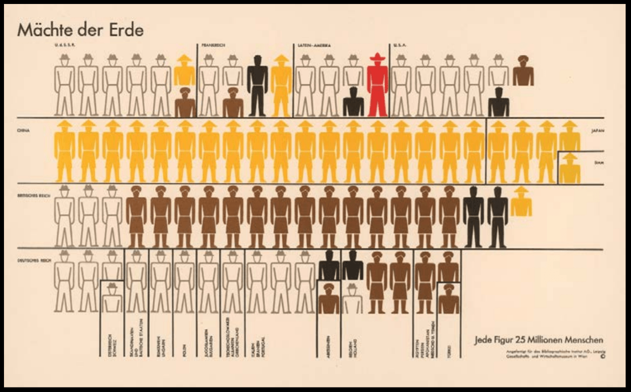
Isotype (International System of Typographic Picture Education),
Otto Neurath & Gerd Arntz,
c. 1935
Isotypes, International System of Typographic Picture Education for full, was developed by social scientist and philosopher Otto Neurath and designed by Gerd Arntz. It was a method for visual statistics, using icons and signs to symbolize data.
Otto Neurath had seen that people of the working class that began to break free from dictatorship at the time were mainly illiterate. He hence knew that for them to gain knowledge of the world, information should have been clearly and directly illustrated in a clear structure.
It also aimed to overcome language barrier across the countries; to be universally understood and was influenced by Otto Neurath’s fascination with the function of Egyptian Hieroglyphics; both their form and ability to convey a story.
Arntz eventually created about 4000 of such signs, which were then adopted worldwide to what is now termed as Infographics.
This was fun and amazing to learn about Isotypes as they are so commonly seen, but I had never gone to find how they came to be. Through these lectures, I truly understand how many things regarding Graphic Design many of us seem to take for granted of, or simply overlook, but actually have an interesting or deep history behind them. It was nice to finally put a name to who began the idea of infographics that have been widely used and also understand the creation was out of the hopes to increase the educated in the population, and escape from dictatorship at that time.
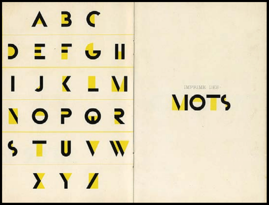
Bifur typeface,
A. M. Cassandre,
1927
Another thing I really liked was the Bifur Typeface created in 1929 by A.M. Cassandre, whose birth name was Adolphe Jean-Marie Mouron. It was bright yellow and really beautiful and I loved how big the contrast the colour was against the dark of the bold lines. However, upon further research, I learned it was initially like so:
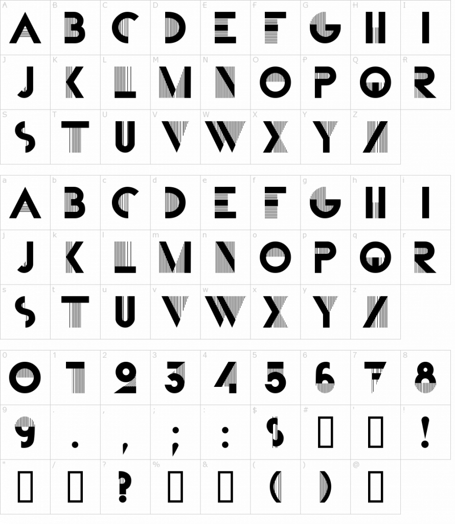
The design combines very thick with incredibly thin line strokes, which is a striking and unusual type design, even for today. Other than that, the design is quite minimal without serif or flourish.
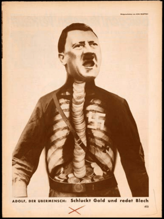
Adolf the Superman: Swallows Gold and Talks Tin,
John Heartfield,
1933
John Heartfield’s Adolf the Superman: Swallows Gold and Talks Tin was interesting because of the imagery, but also its title. An X-ray chest had been superimposed over Hitler’s torso in this image, creating a funny and eye-catching image. It ridiculed Hitler, which instantly amused me, and made me want to know more about not only the Artwork but also the artist himself.
The work was mainly based on world war and politics, with the artwork referring to Hitler’s receiving of financial backing from wealthy industrialists, and him spouting ugliness to move the country toward a profitable war. John Heartfield thus used this piece as a political medium, even going as far as to change his name from Helmut Herzfeld in protest. The powerful image was featured prominently throughout Berlin and John Heartfield was immediately targeted after the Nazis came to power, ordering several assassination hits on him. Nevertheless, John Heartfield survived the hits and passed away on 26 April 1968 due to illness.
It was interesting how John Heartfield did what he believed in and risked his life in doing so. The events that had occurred were frightening, yet the imagery created was rather humourous as though to mock Hitler and his ideologies.
http://www.designhistory.org/Symbols_pages/isotype.html
https://www.sessions.edu/notes-on-design/type-in-history-cassandres-art-deco-type/
https://fontmeme.com/fonts/bifur-font/
Adolf the Superman Swallows Gold and Spouts Junk
https://www.britannica.com/biography/John-Heartfield#ref1204496


Douce Apocalypse
Textura Script
1265
 , also known as Blackletter or Gothic Script, was used from around the 12th century up till the 17th century, and was first described as “Gothic” in 15th century Italy. While developed from the Carolingian Minuscule that was well-known for its legibility, Textura looked vastly different from its ancestor, having a narrower and taller form. Its letters were formed by sharp and angular straight lines, contrasting to the roundness of the Carolingian Miniscule, and their strong vertical strokes were made before serifs were drawn upon them.
The condensed and bold Textura rose as literacy increased in 12th century Europe. The want for books in different sectors rose as education grew in importance, creating a demand for written text outside of religious scripts. While the need for book production increased, the price of writing materials stood to be an issue; not to mention more need for labour and time to create these items. Thus, Textura was heavily used – its narrow form allowing for more letters to fit in a single sheet of parchment or papyrus.

As a person with zero background in Typography, I never really knew how or why fonts were created. Simply assuming someone had created fonts out of their own personal entertainment and joy, I was pleasantly surprised to know that many Fonts had such interesting stories as to how they came to be. Learning how the events during a certain time period affect the way people wrote, and how they created new fonts to overcome new challenges really opened my eyes and gave me a greater appreciation for typefaces.
During class, we were introduced to many types of fonts through different times and their advantages and disadvantages. But of all the fonts, there was one script that really caught my attention – Textura. When I first saw Textura, I really liked how beautiful and condensed it was. I was highly amused to know it had been termed “Gothic” but also saw how fitting it had been with the Gothic Style. The calligraphic script is highly aesthetically pleasing and elegant in my opinion, with the tightly condensed text making each page feel fully utilised. Paired with the highly intricate drawings, the script gave the page an antiquely “posh” look, and I imagine an entire book of such pages looked highly impressive.
Learning that Textura had been developed when the demand for books rose had been interesting since the text had seemed much more difficult to read than its direct ancestor, the Carolingian Minuscule, in my eyes. While I do love the script greatly, an entire book of condensed calligraphic text sounded like an extreme nightmare; adding to the horror of having to learn an entire book of business or law during that time.
Nevertheless, the idea that this script was formed to allow more to have access to textbooks and knowledge was heartwarming and highly fascinating. Saving costs so many others can afford a path to gaining new knowledge by creating a new typeface suggests the high importance of Typography in the past and also now. This lecture has enabled me to truly respect and appreciate fonts more, and consider the usage of the different fonts before I choose them.
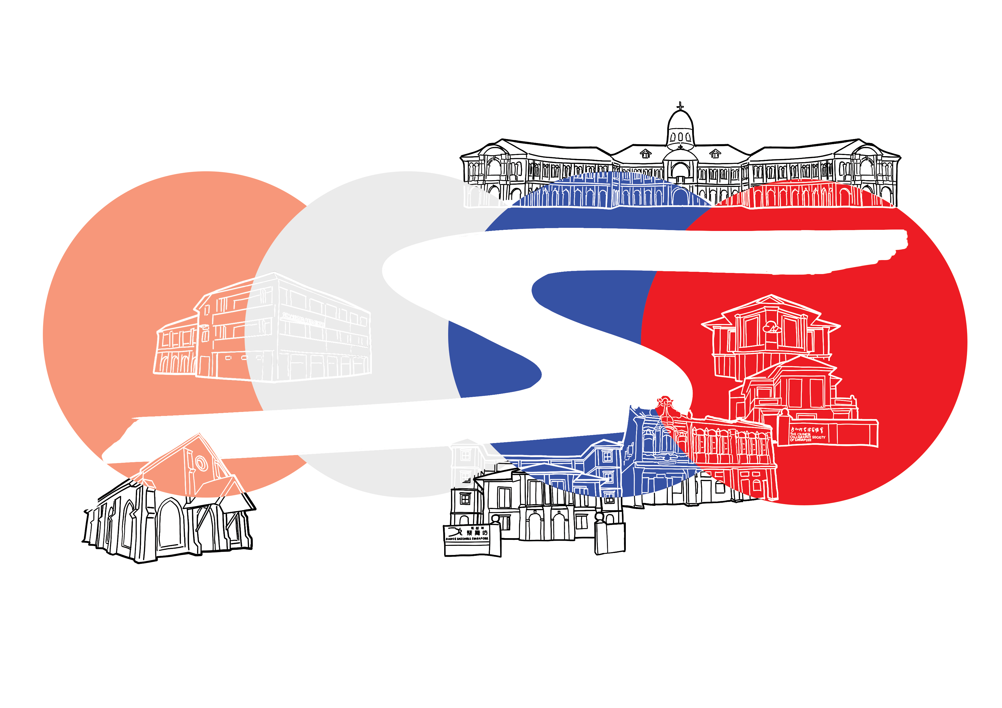
For the Zine, it had been suggested that I did on religion and architecture, which had also been things I had wanted to focus on. Thus, I began thinking up ways I could portray this, and soon decided to also incorporate the arts into the zine too.
Since it had been about the religion, there were a few things I had to take note, such as avoiding offending any religion, and also if I were to portray any Gods, I had to portray them accurately.
I decided I wanted to make use of the booklet’s format to do a two-way narrative, with the gods of the places of worship making way from the end to the middle, on a journey back to their place of worship, while passing the place of worship of the other gods.
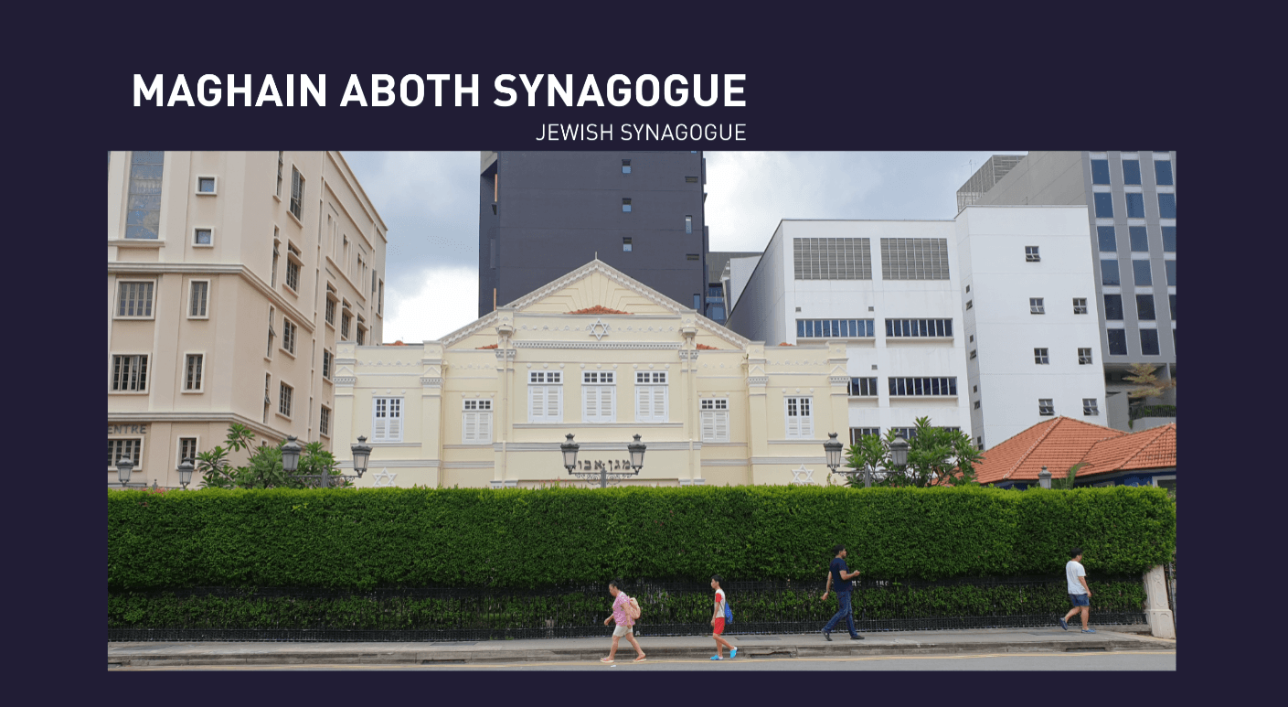
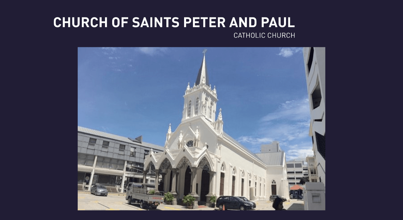
I decided to put the Hindu and Buddhist gods together, and the Jewish and Catholic ones together.
I.e. The Hindu and Buddhist gods, Sri Krishna and Goddess Guan Yin will be travelling past the Jewish Synagogue and Catholic Churches, past to the middle of the Zine with places of the arts, to get to their own place of worship. Likewise, the Catholic and Jewish God/Saint will be travelling past the Buddhist and Hindu temples, past to the middle, to get to their own place of worship.
I initially wanted to do a photo collage, however, after trying it out, I decided and it was also suggested that I switch entirely to illustrations instead. I had drawn my cover pages already, and it had been in line art, with a geometric shape. This hence became the style of my entire zine.
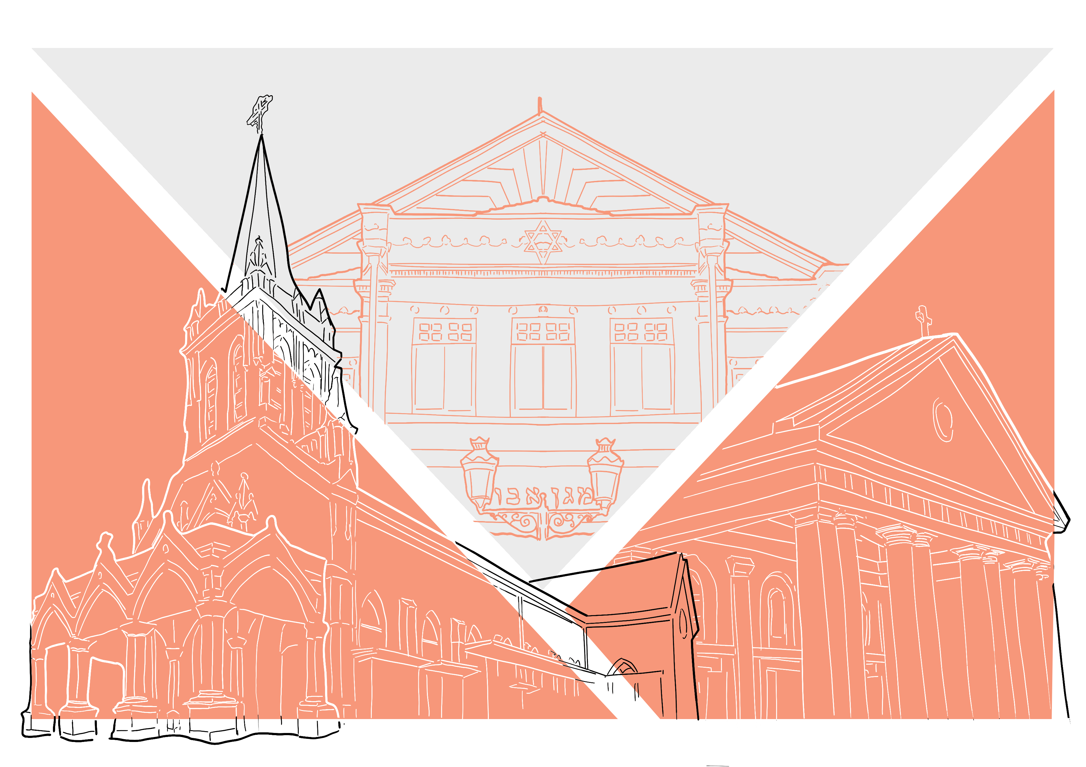
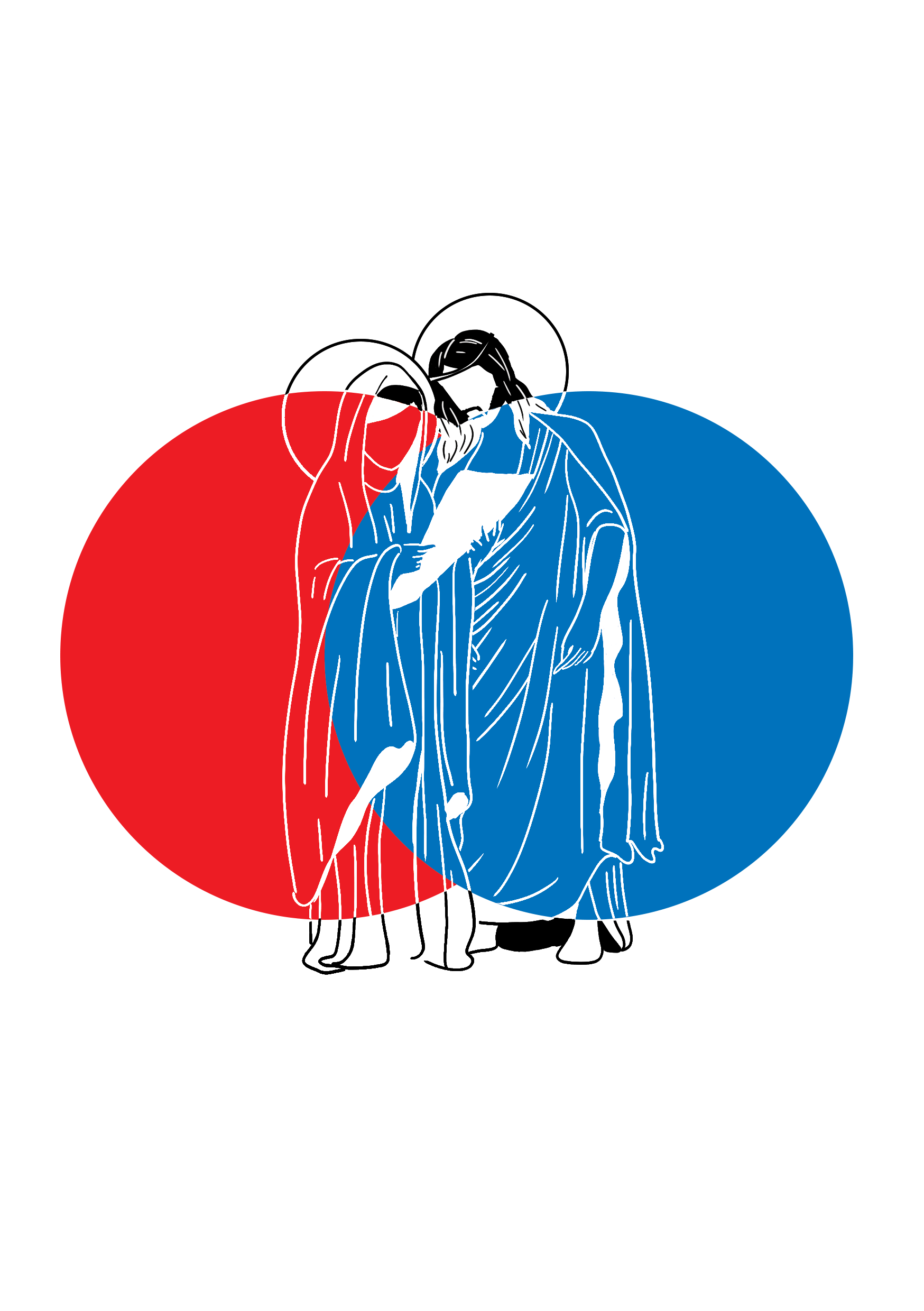
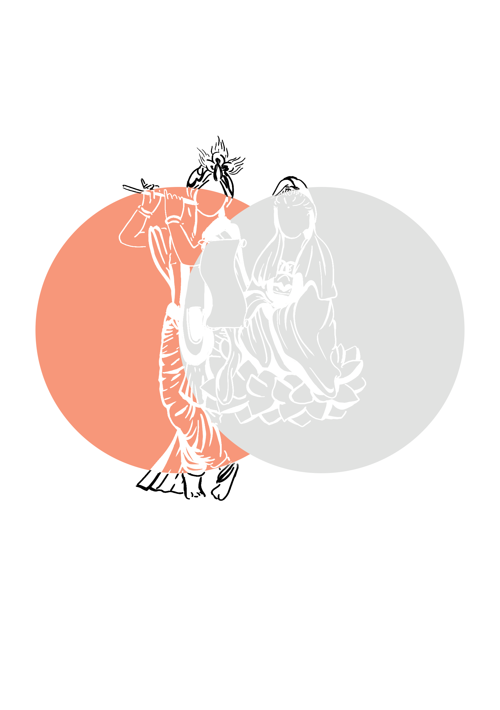
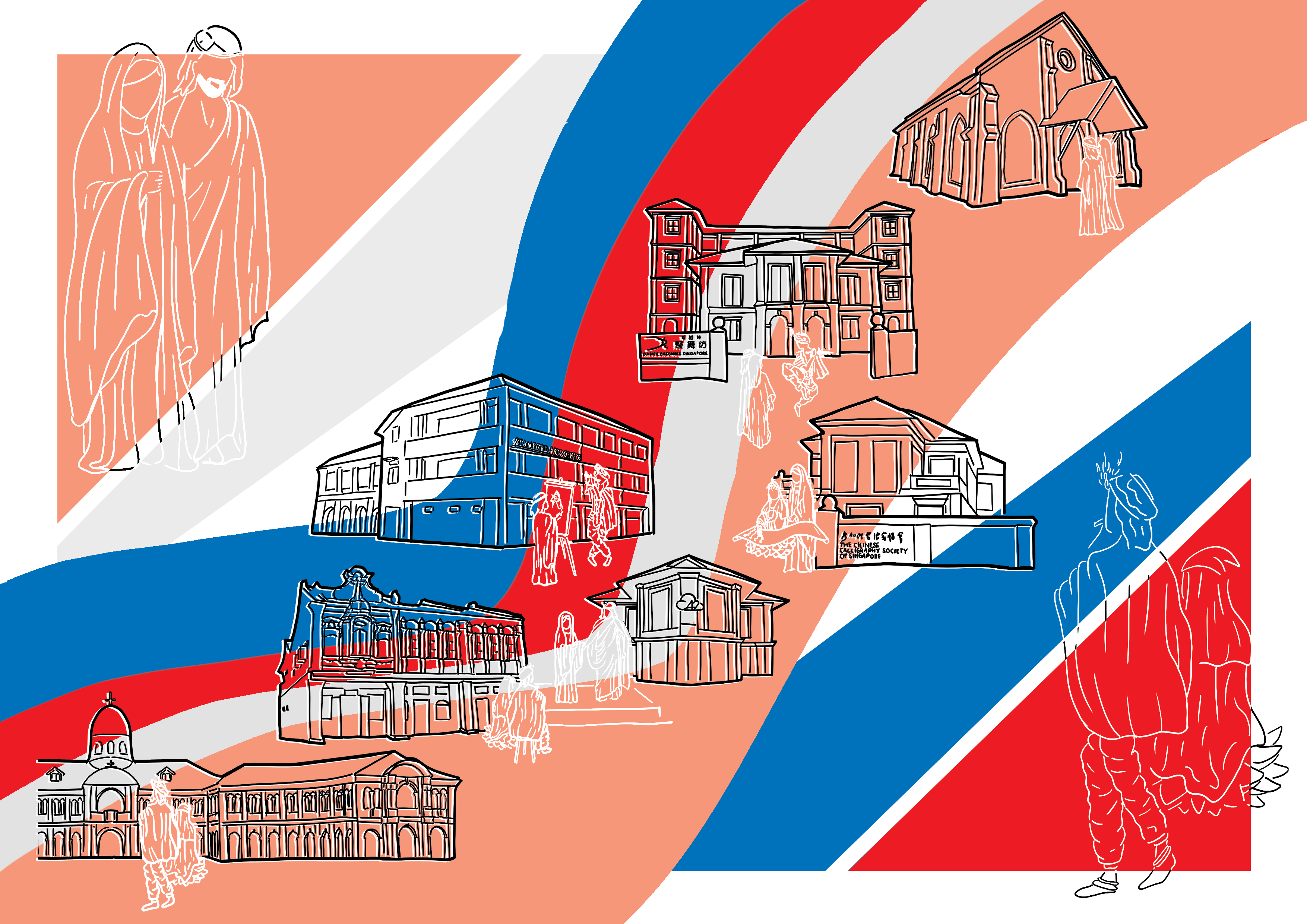
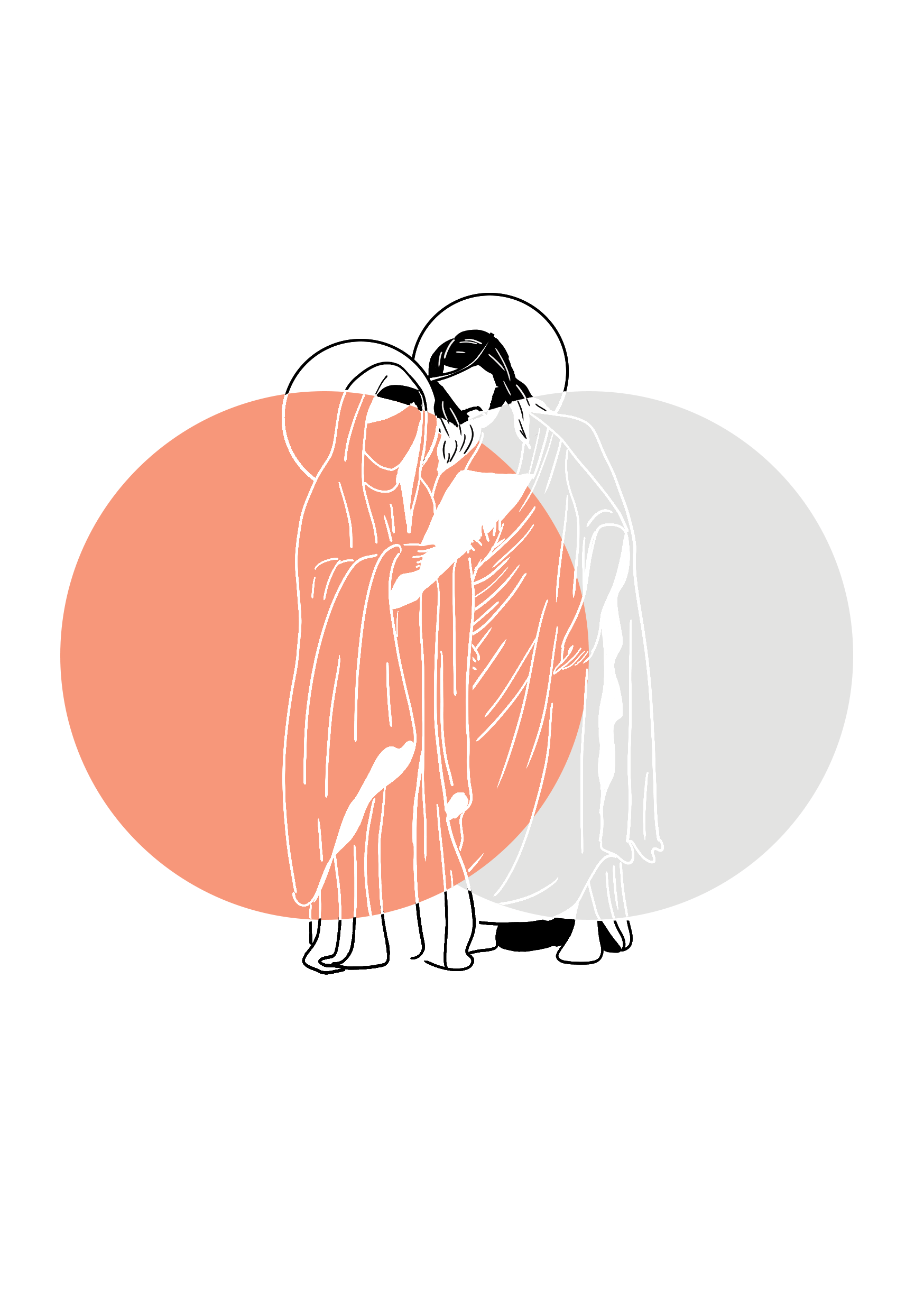
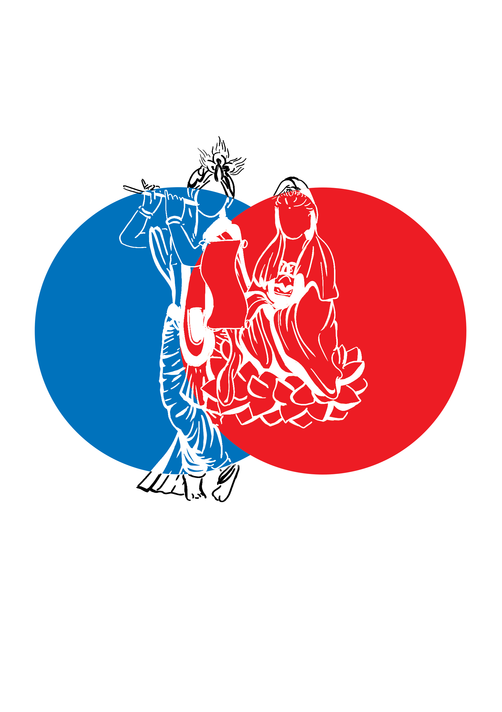
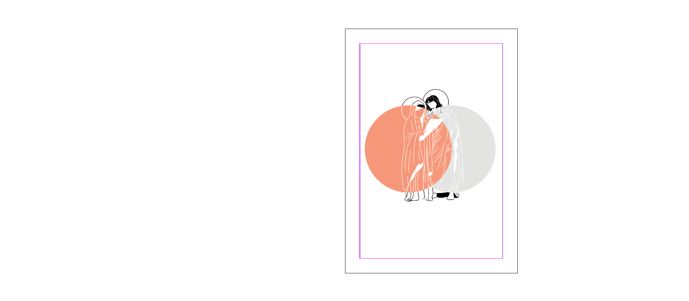
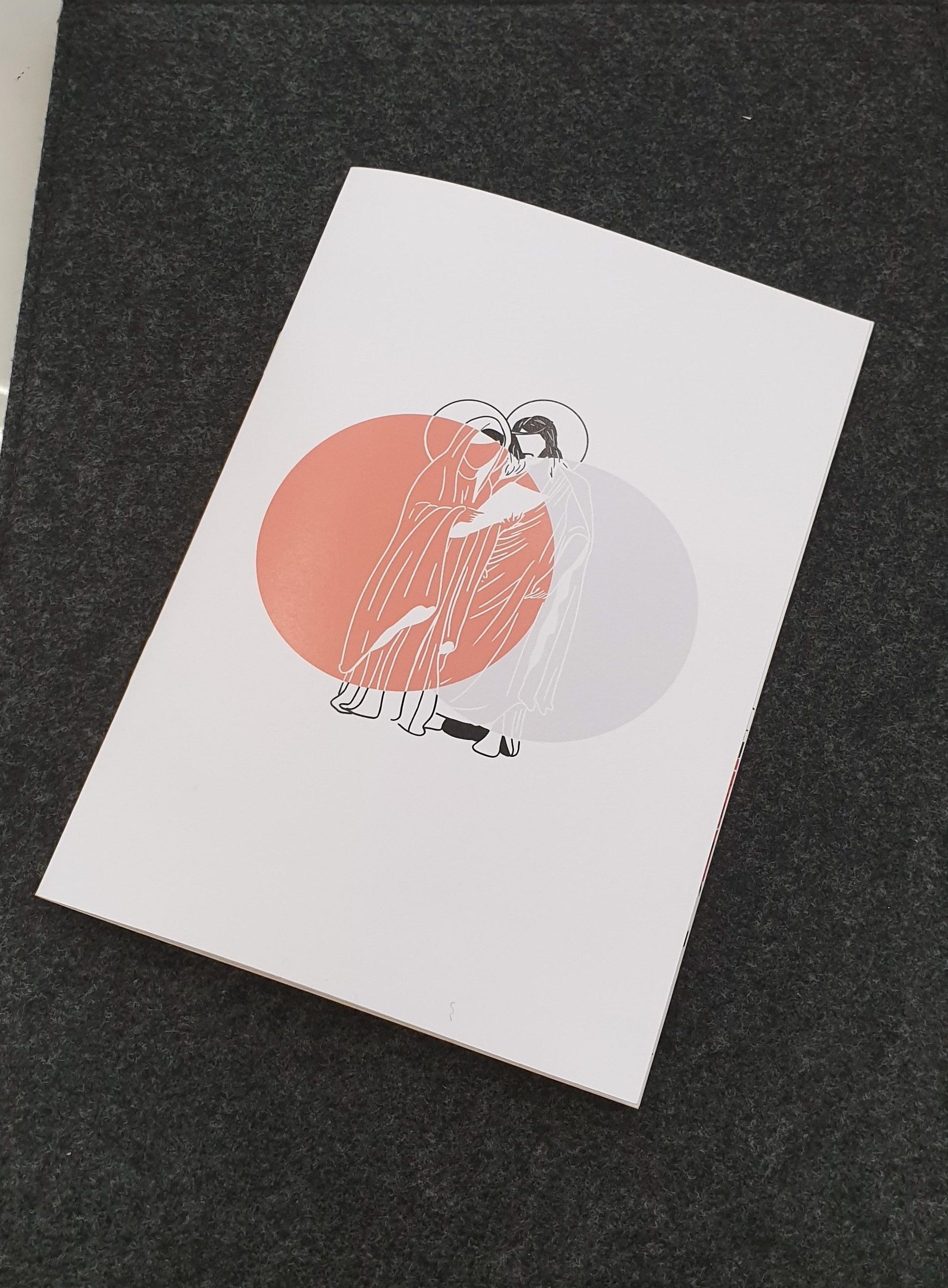
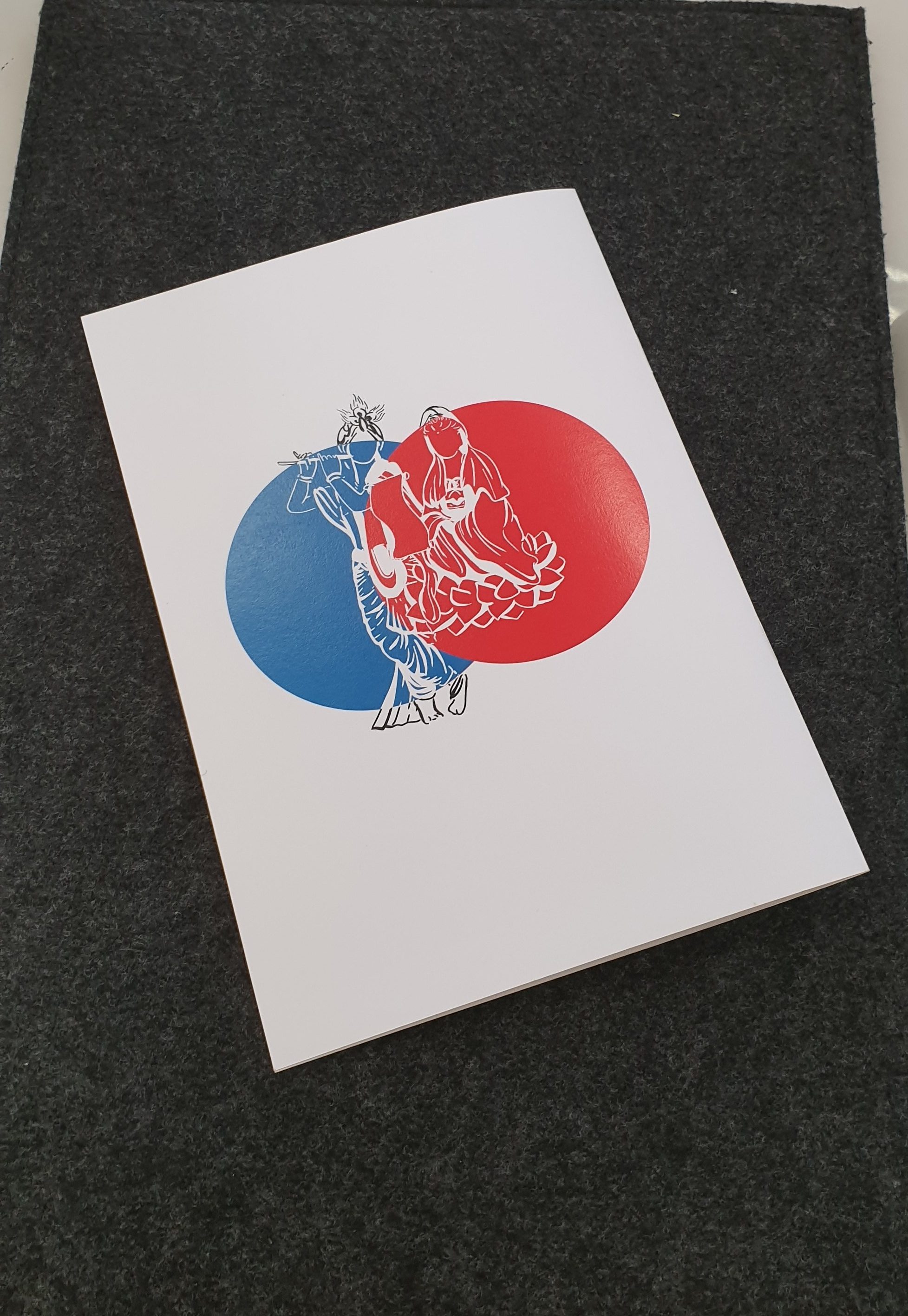
Below is Mother Mary & Jesus, and Sri Krishna and Goddess Guan Yin.
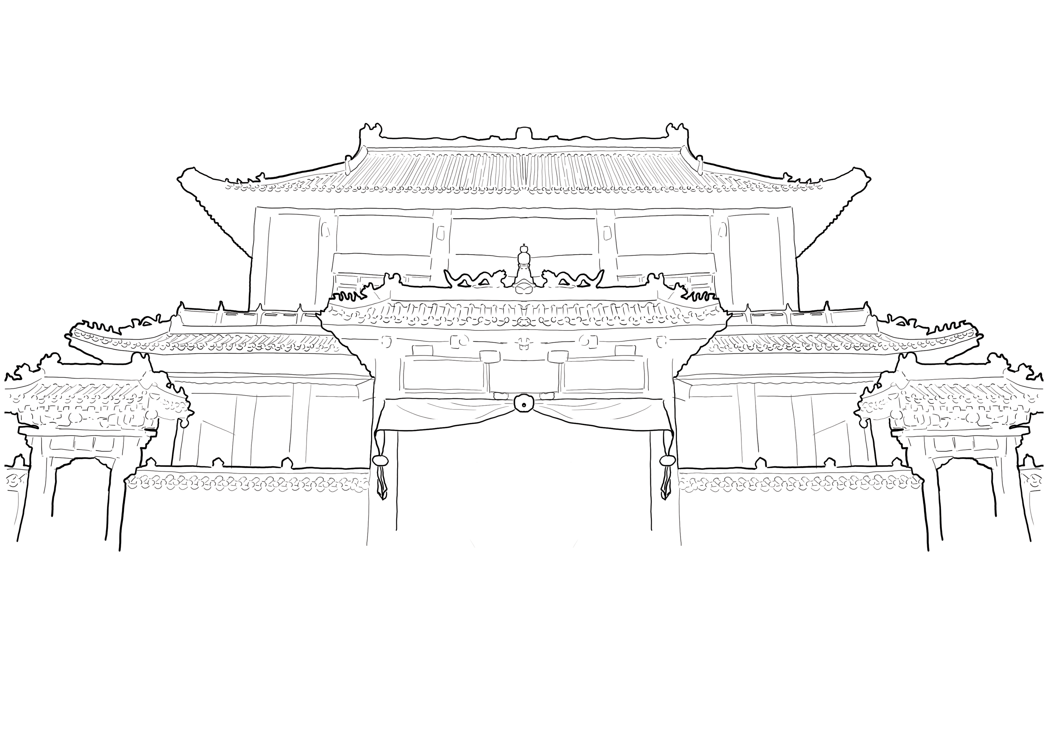
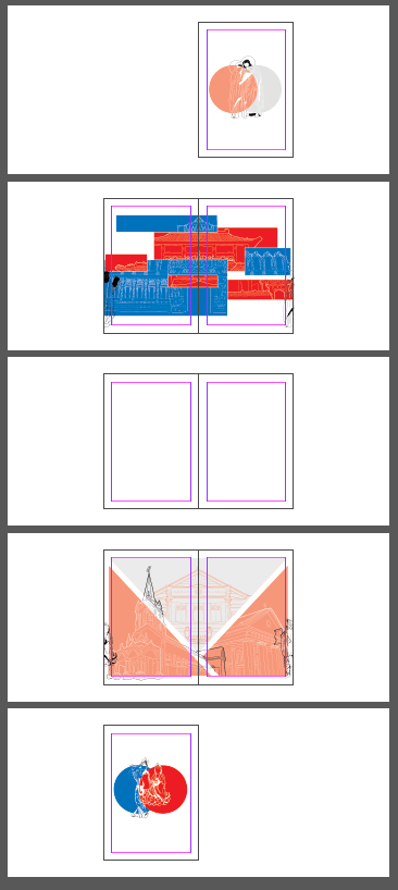
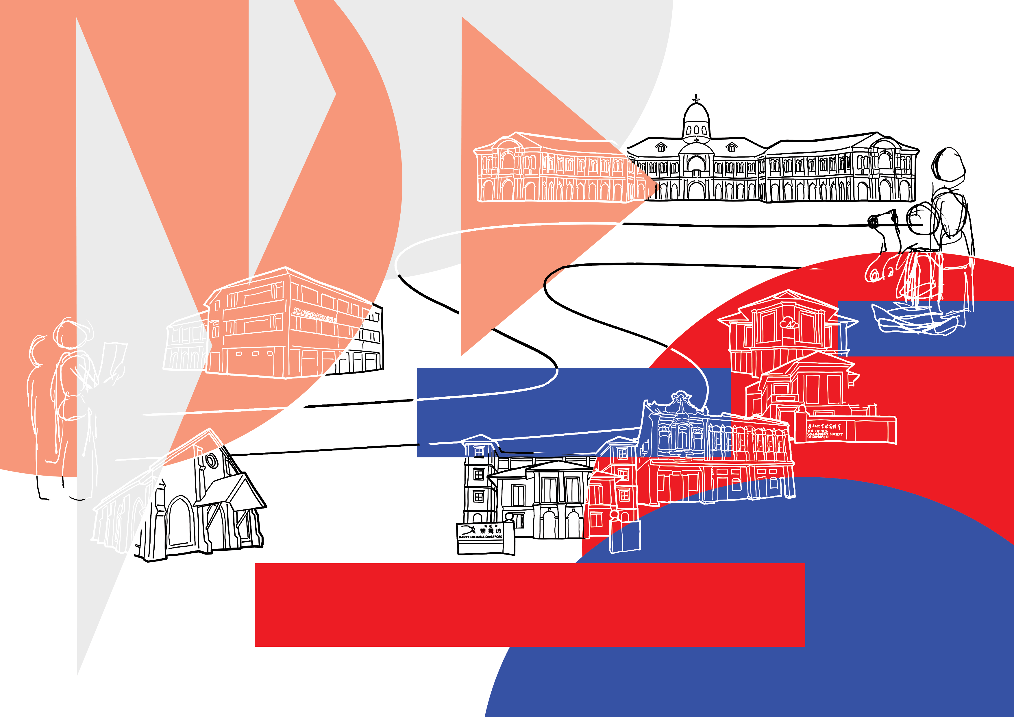
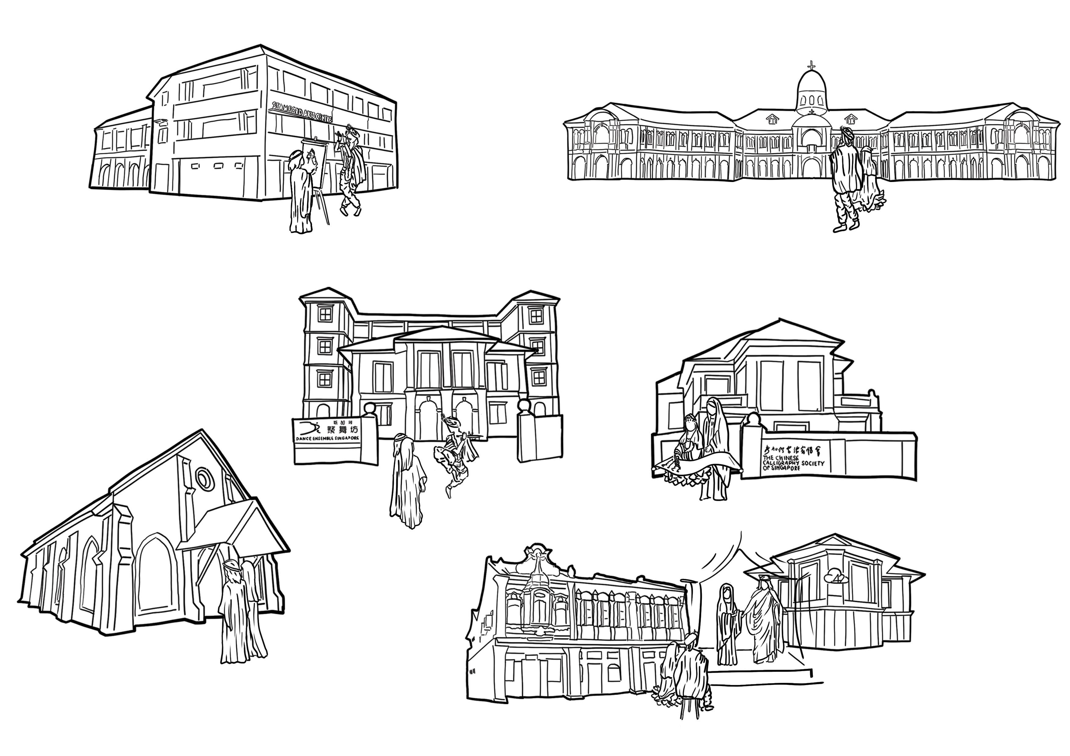
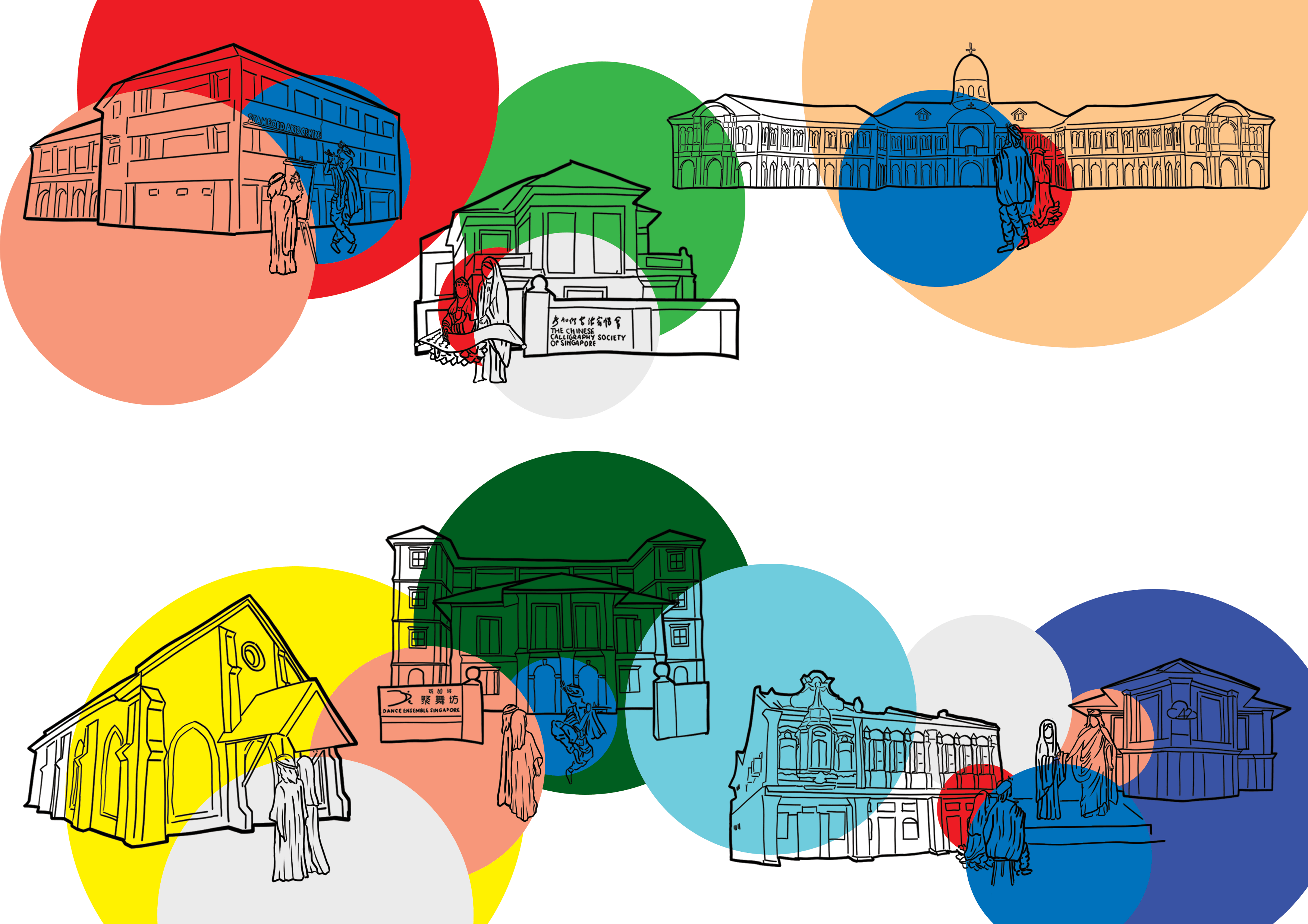
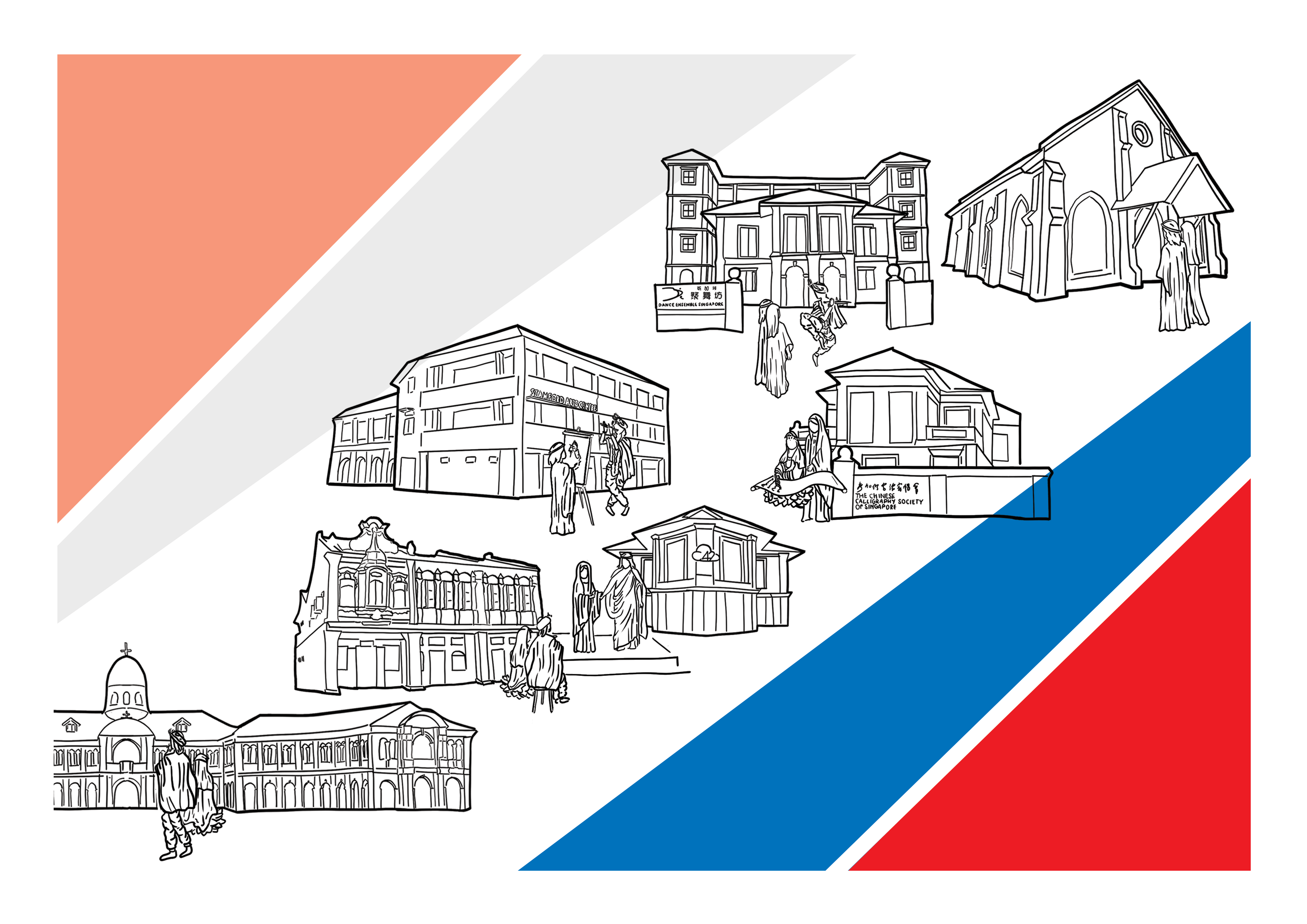
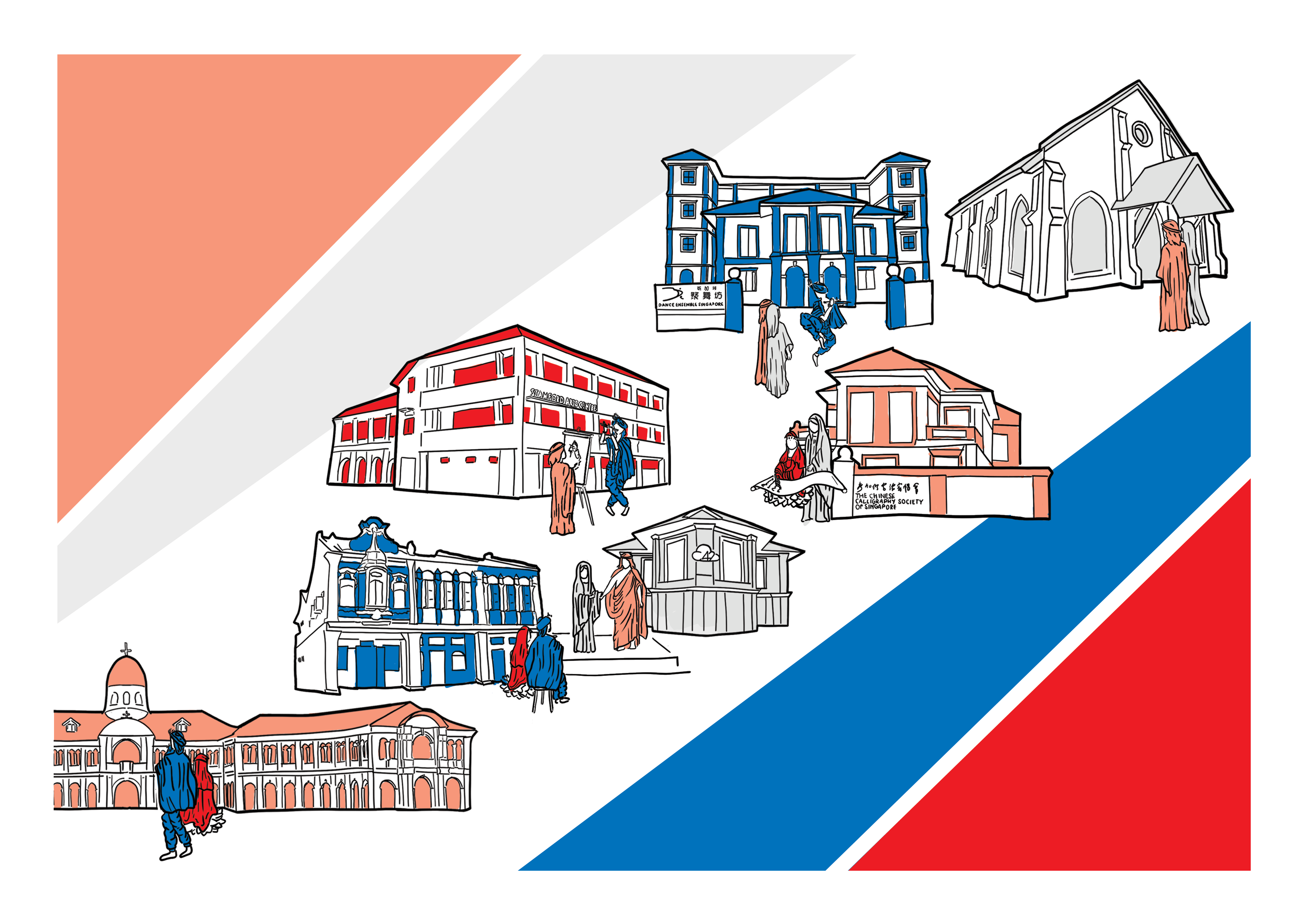
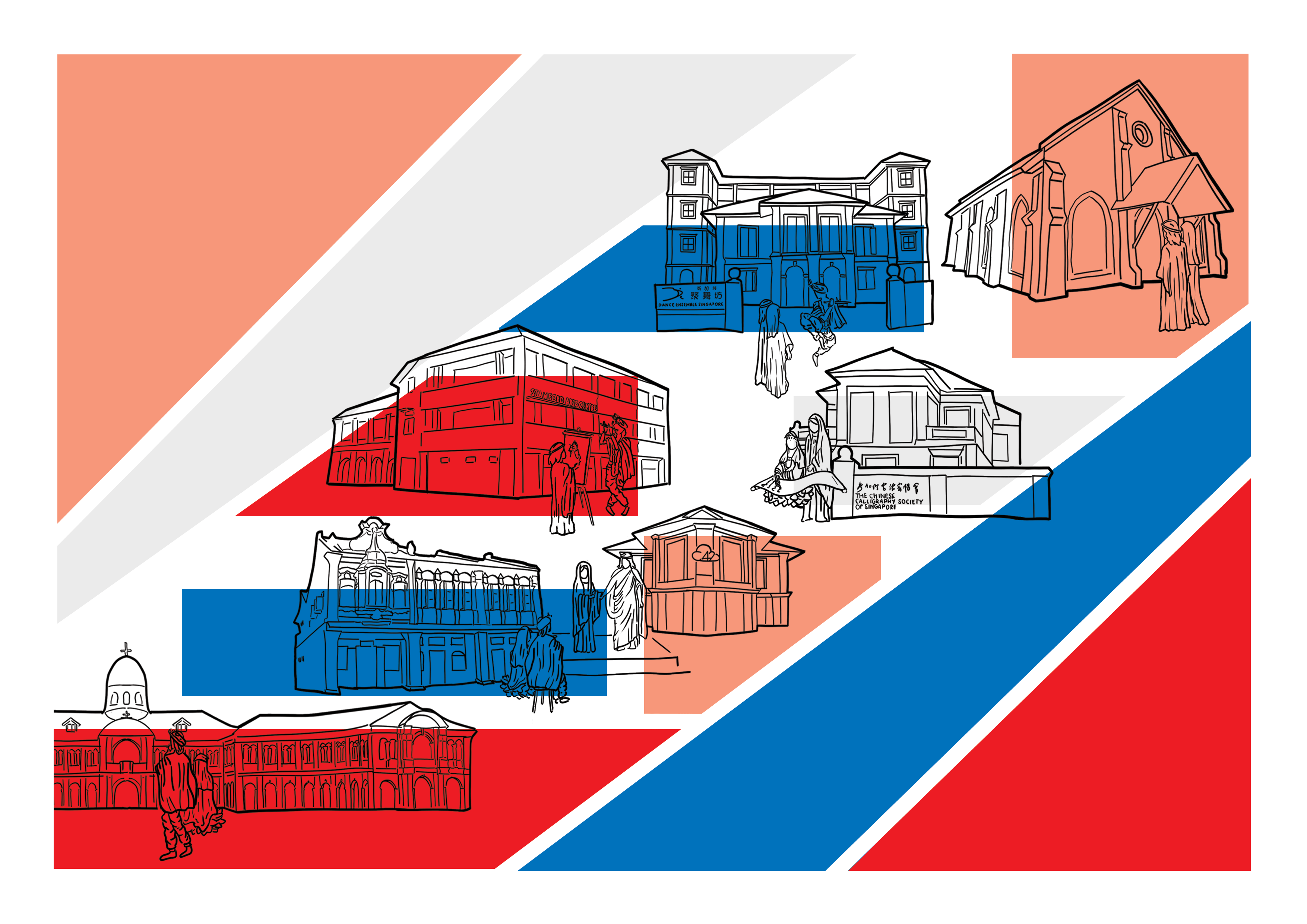
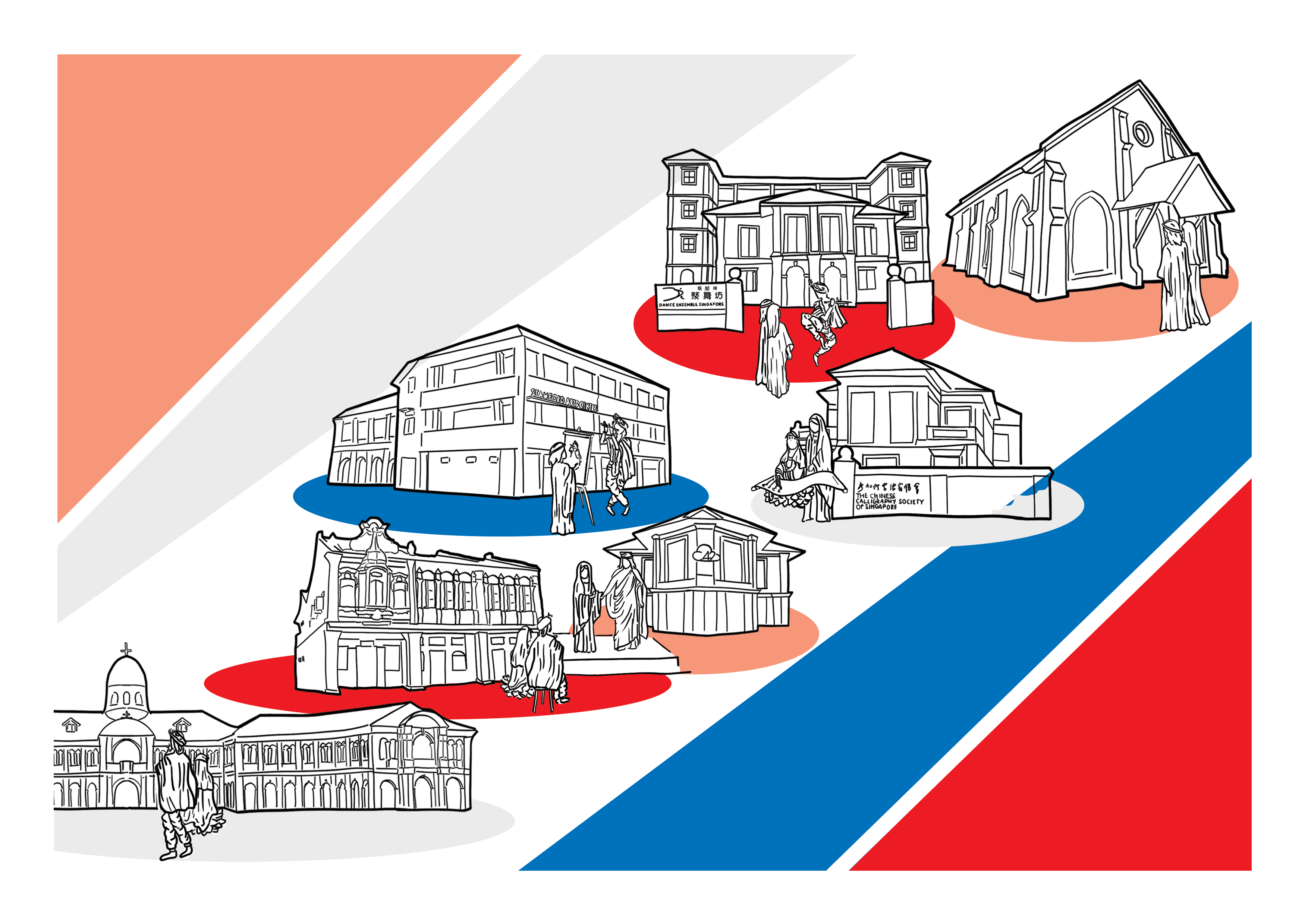
Following this style, I did the line arts for all the places of worship, showing their architectural features.
The above are:
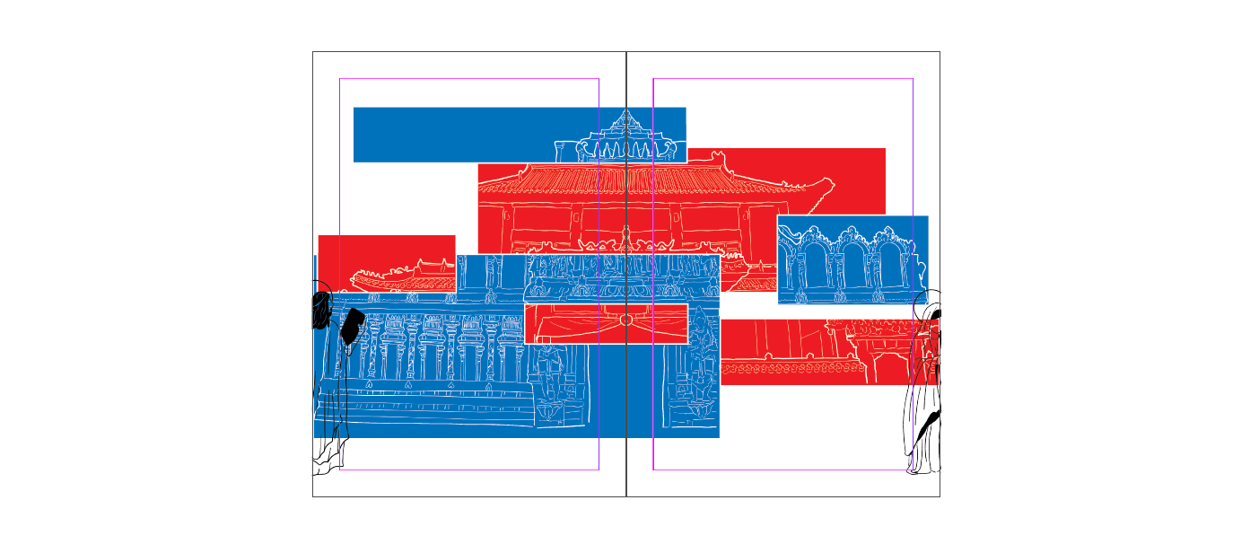
Spread 1
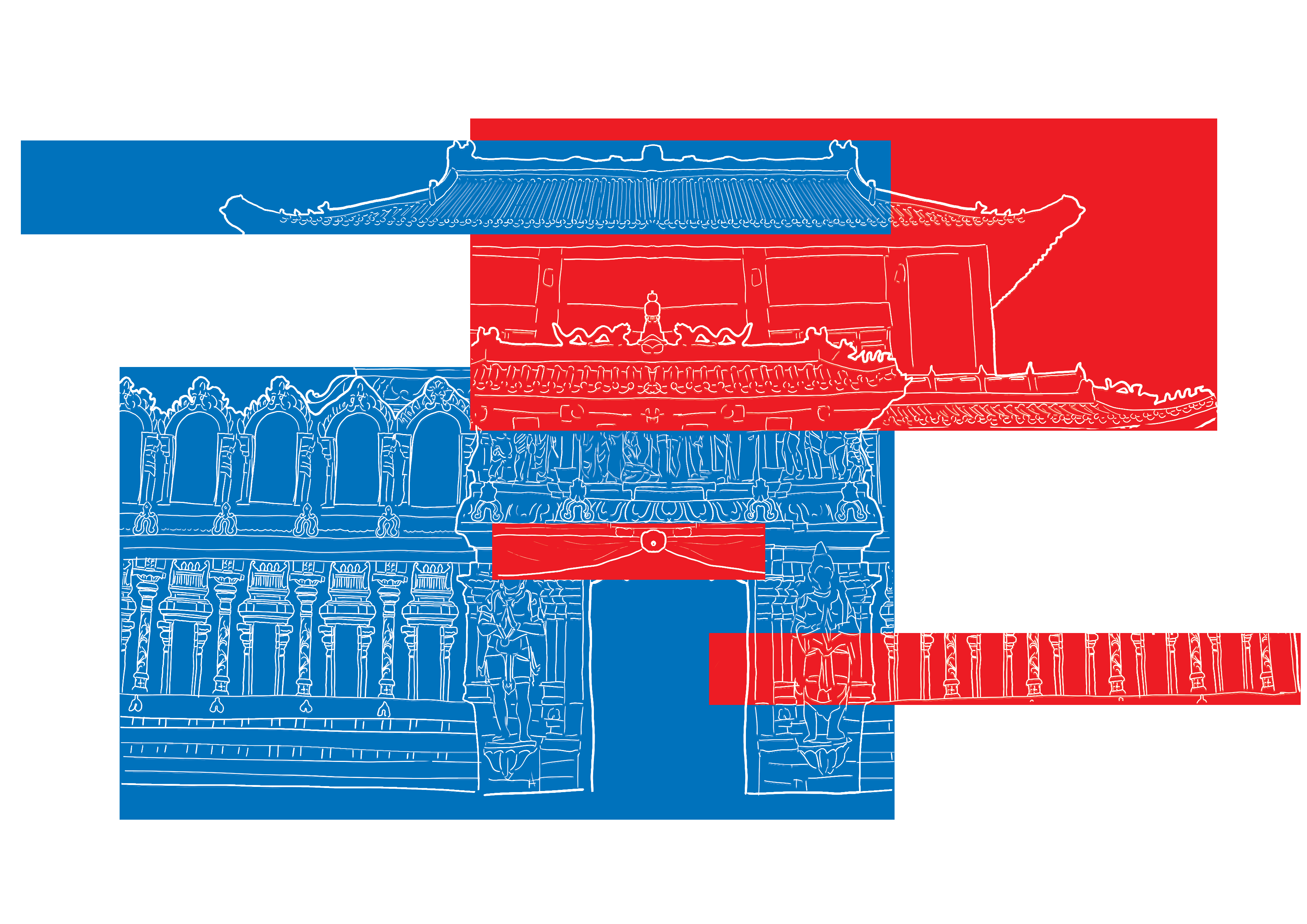
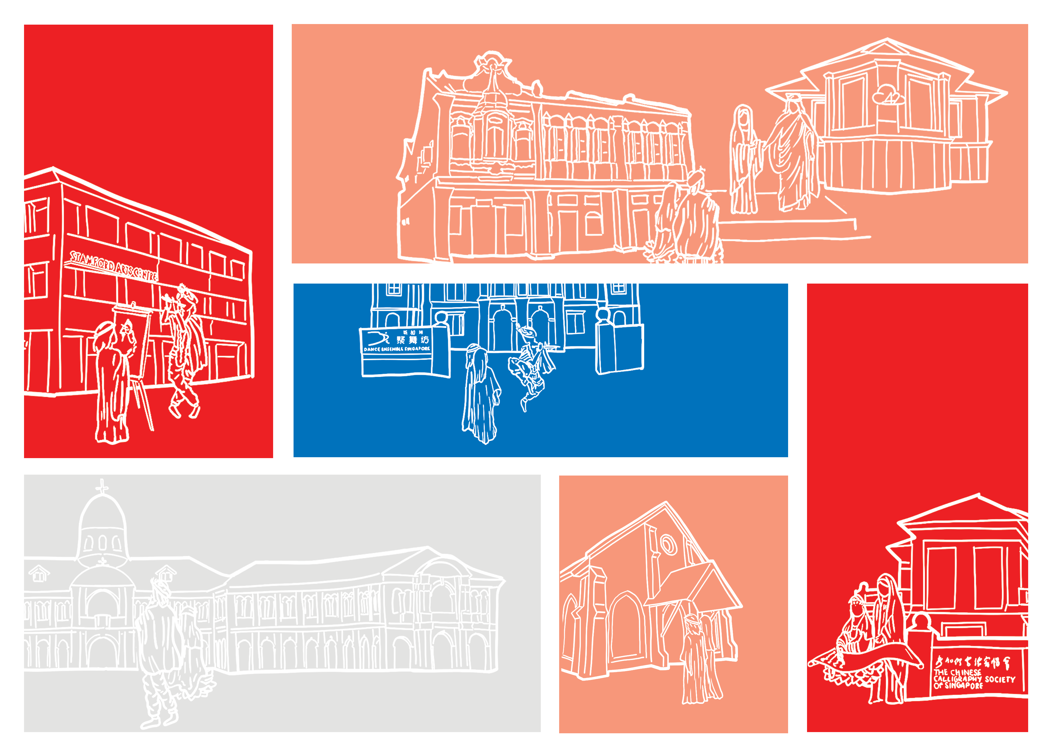
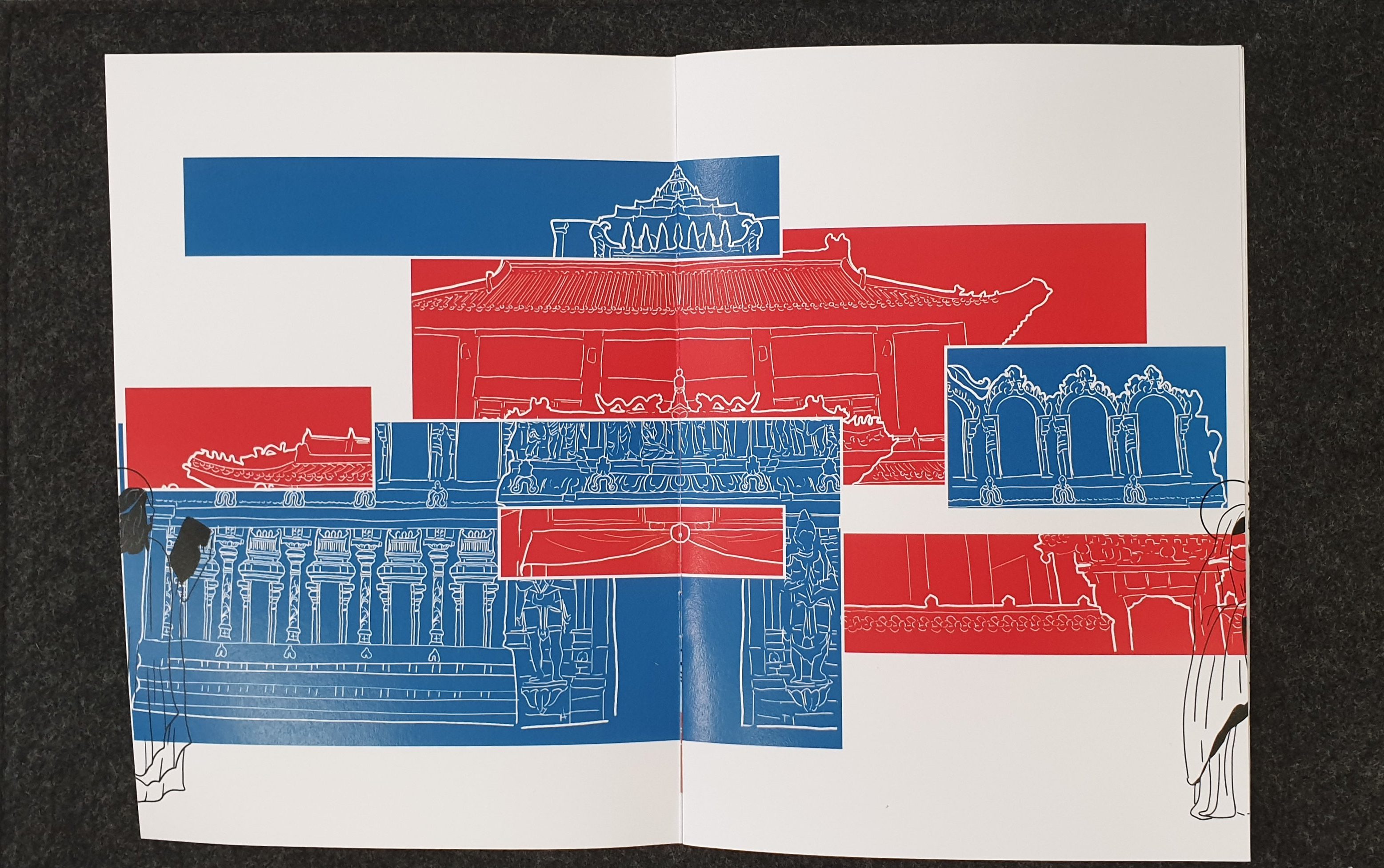
The Buddhist and Hindu temple had mainly rectangular shapes and thus, I decided to use rectangles to add colour in. Since the two temples had been greatly mixed and closely connected, with Buddhists praying to the Hindu temple, I wanted to show this mix through the use of intersecting parts.
The above was my initial design with the two temples joined and divided on a diagonal. The colours used are the colours of the architecture.
I soon received feedback that I should have proper reasoning for the colours of the squares that I had used, as the current design’s rectangles were randomly chosen.
Thus, I changed it such that the blues had been from the Hindu Temple and the reds were from the Buddhist Temple.
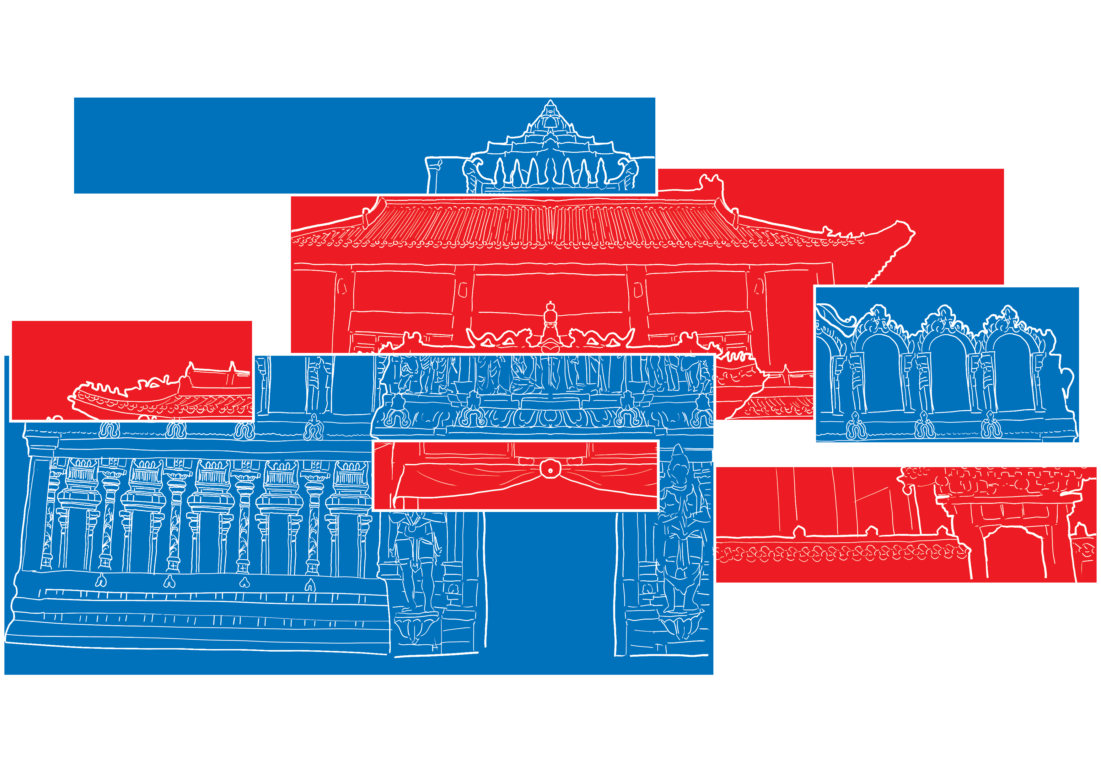
I also added white lines between the different rectangles to make it more obvious that the different colours had represented different places.
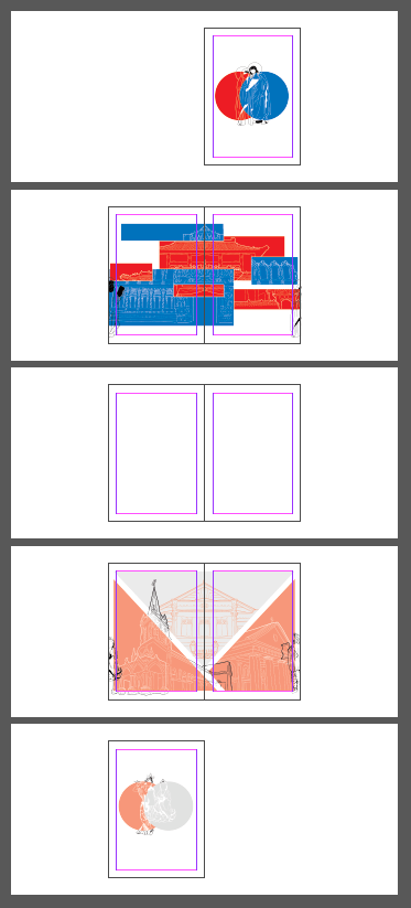
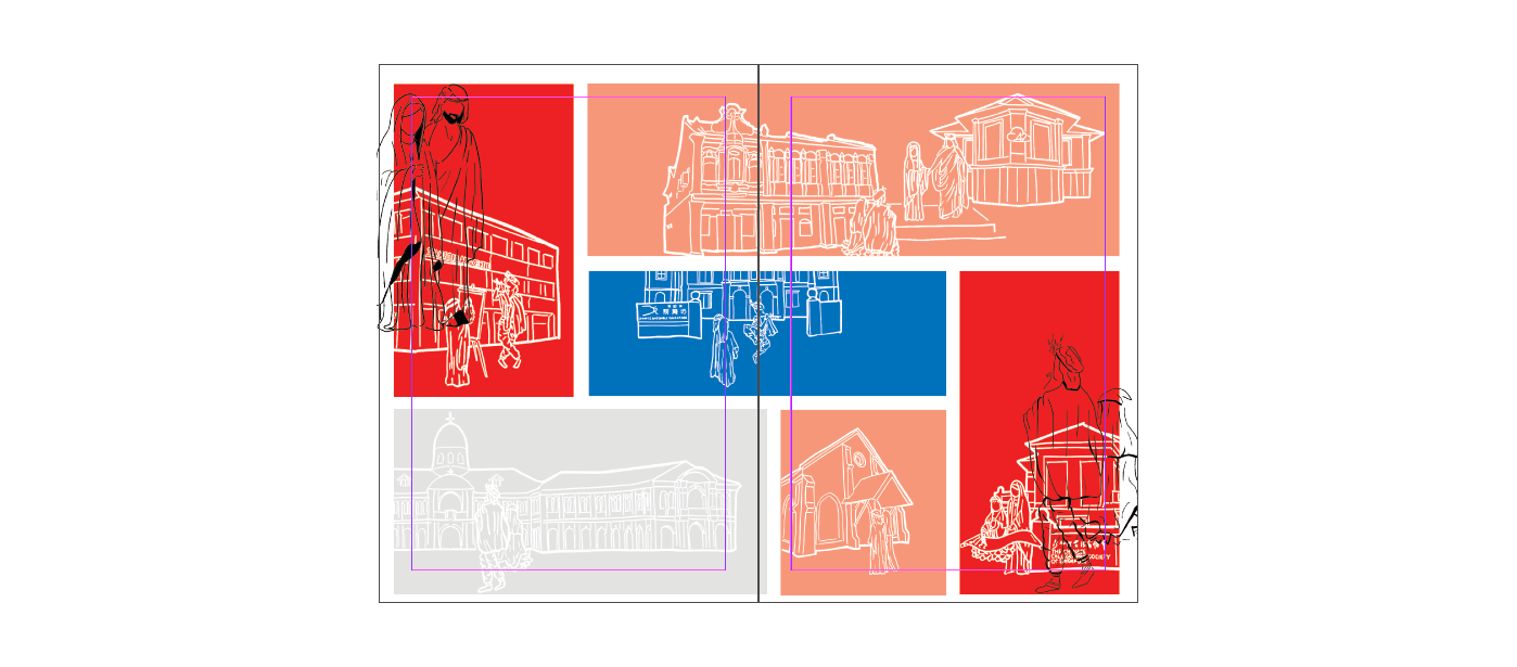
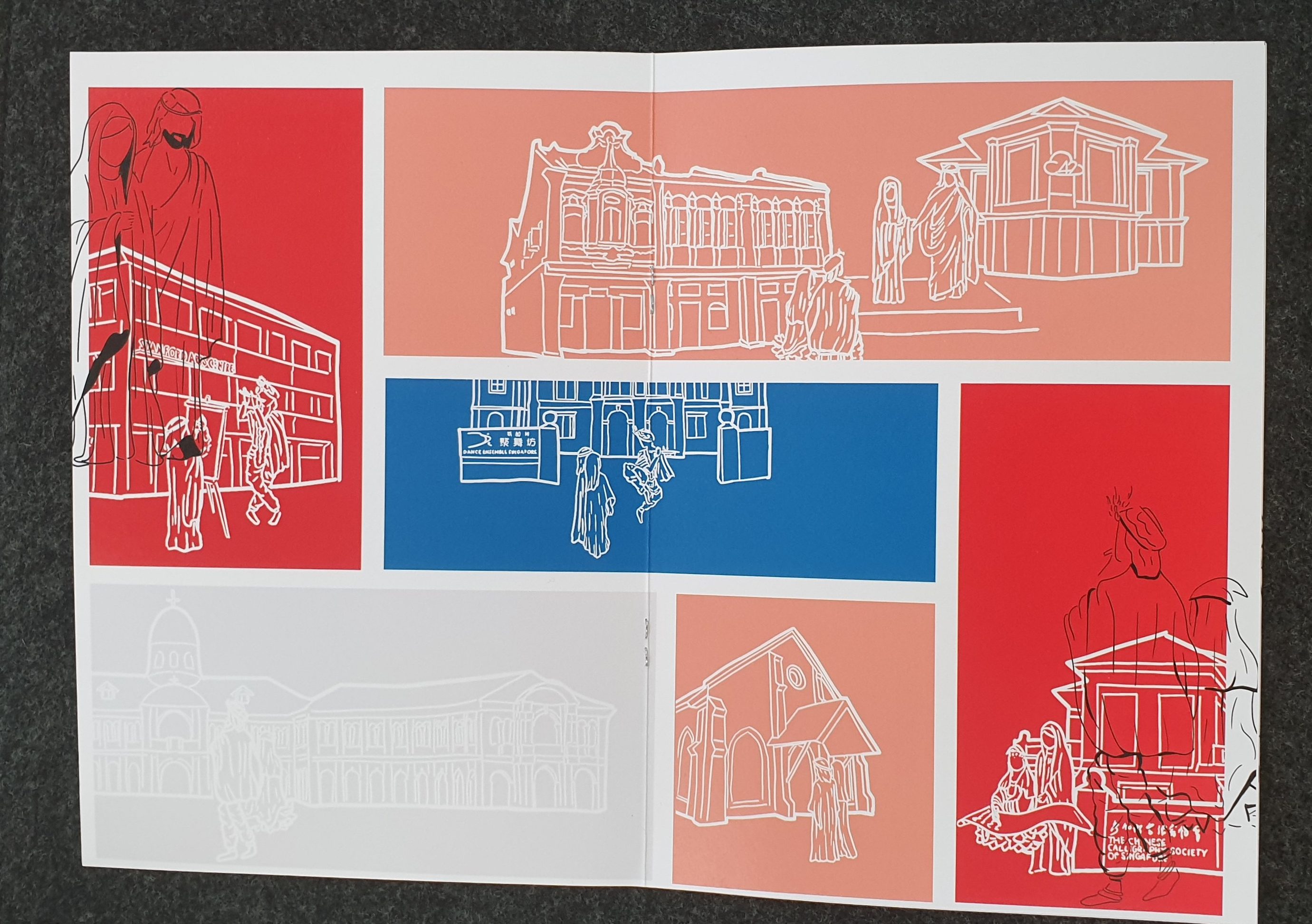
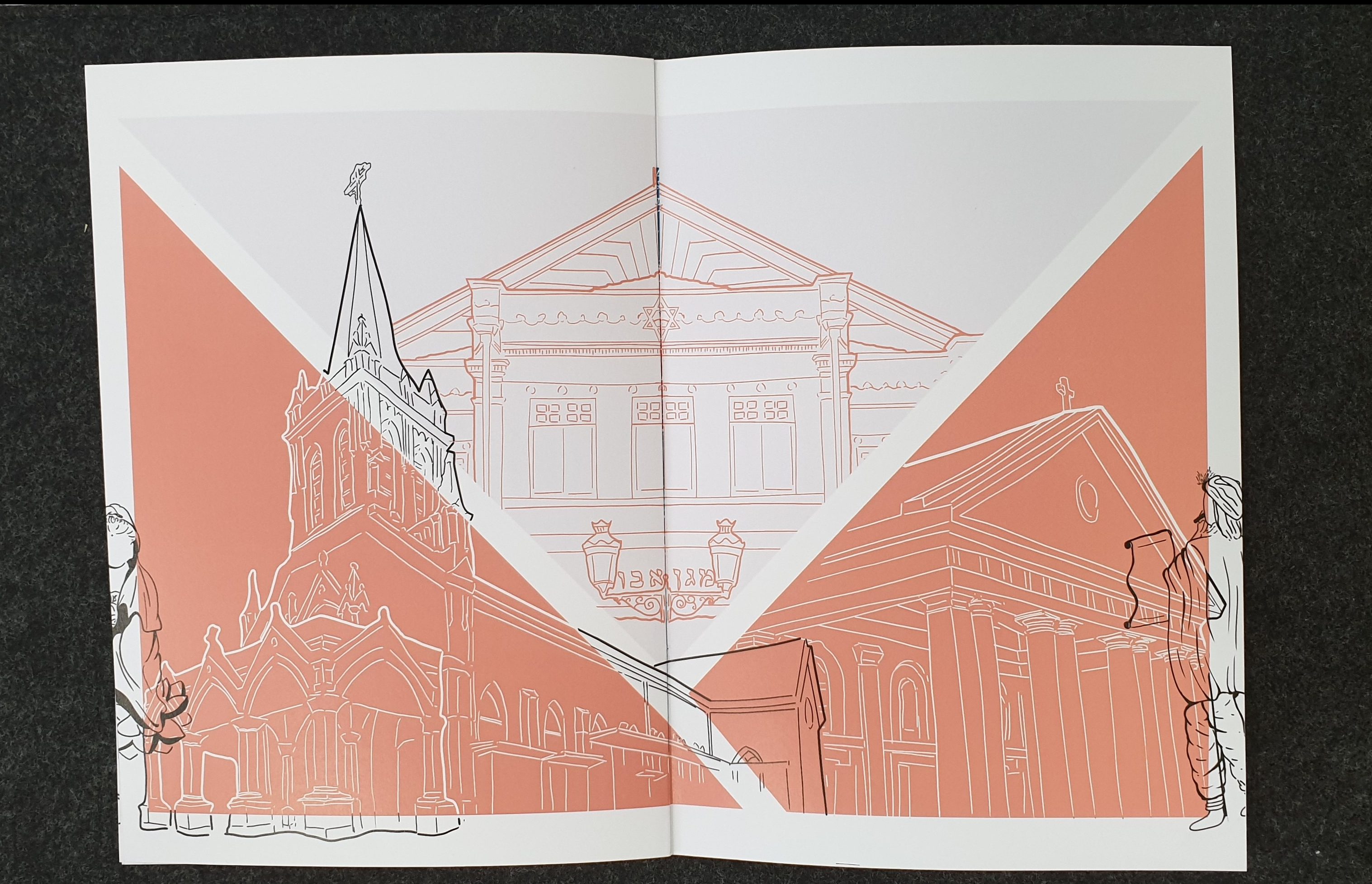
This was then repeated for the other spread which had the 3 other places of worship – the two churches and synagogue.
Since it was a journey, I decided that I had to add some sign or something to show the journey that the gods were taking. I initially wanted the gods to do something more, like interact with the place or enter the place of worship, but then felt perhaps that would be crossing the line beyond interfaith into syncretism – something some might be less open to.
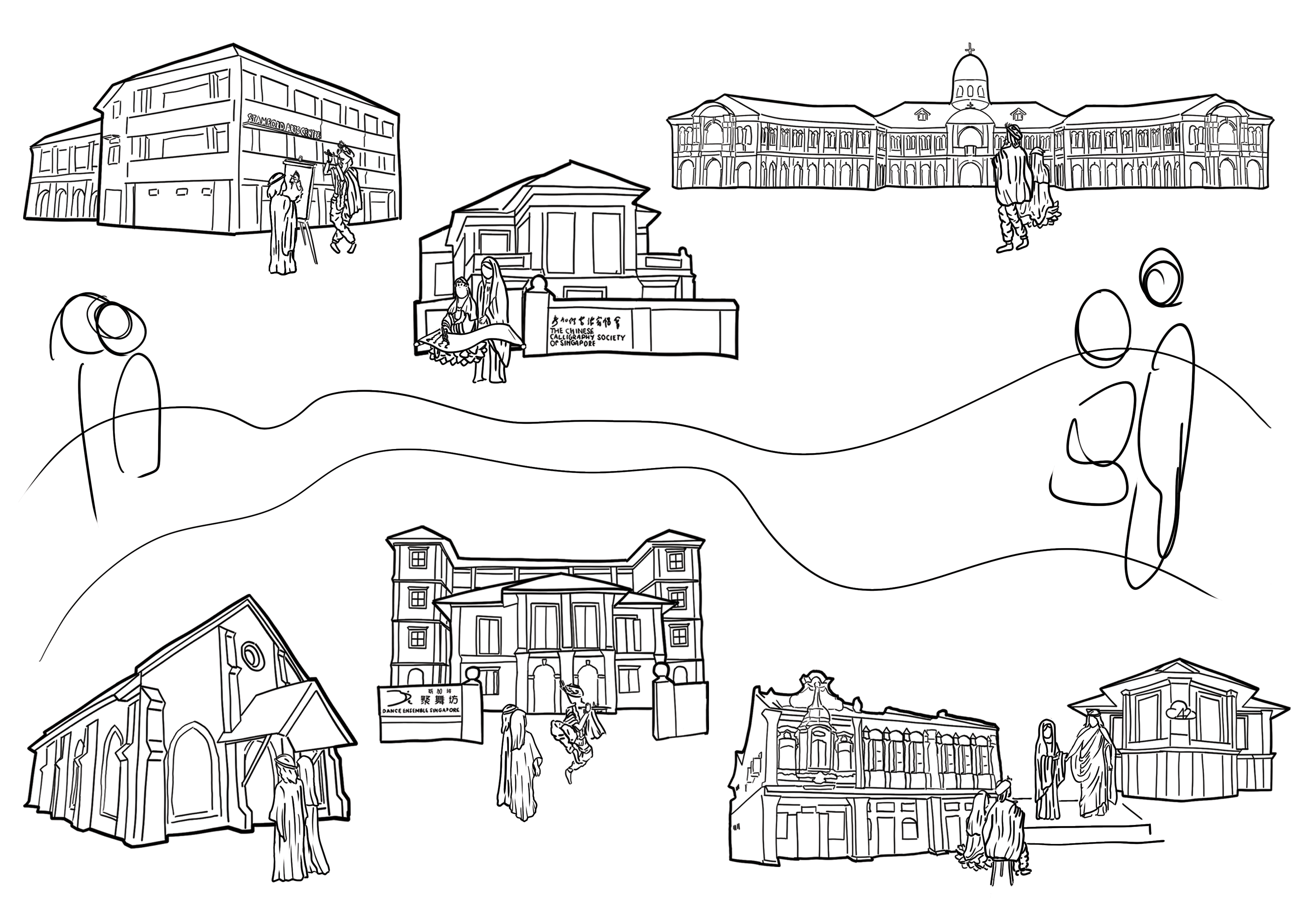
Thus I experimented and initially tried one with the gods and saints just floating about.
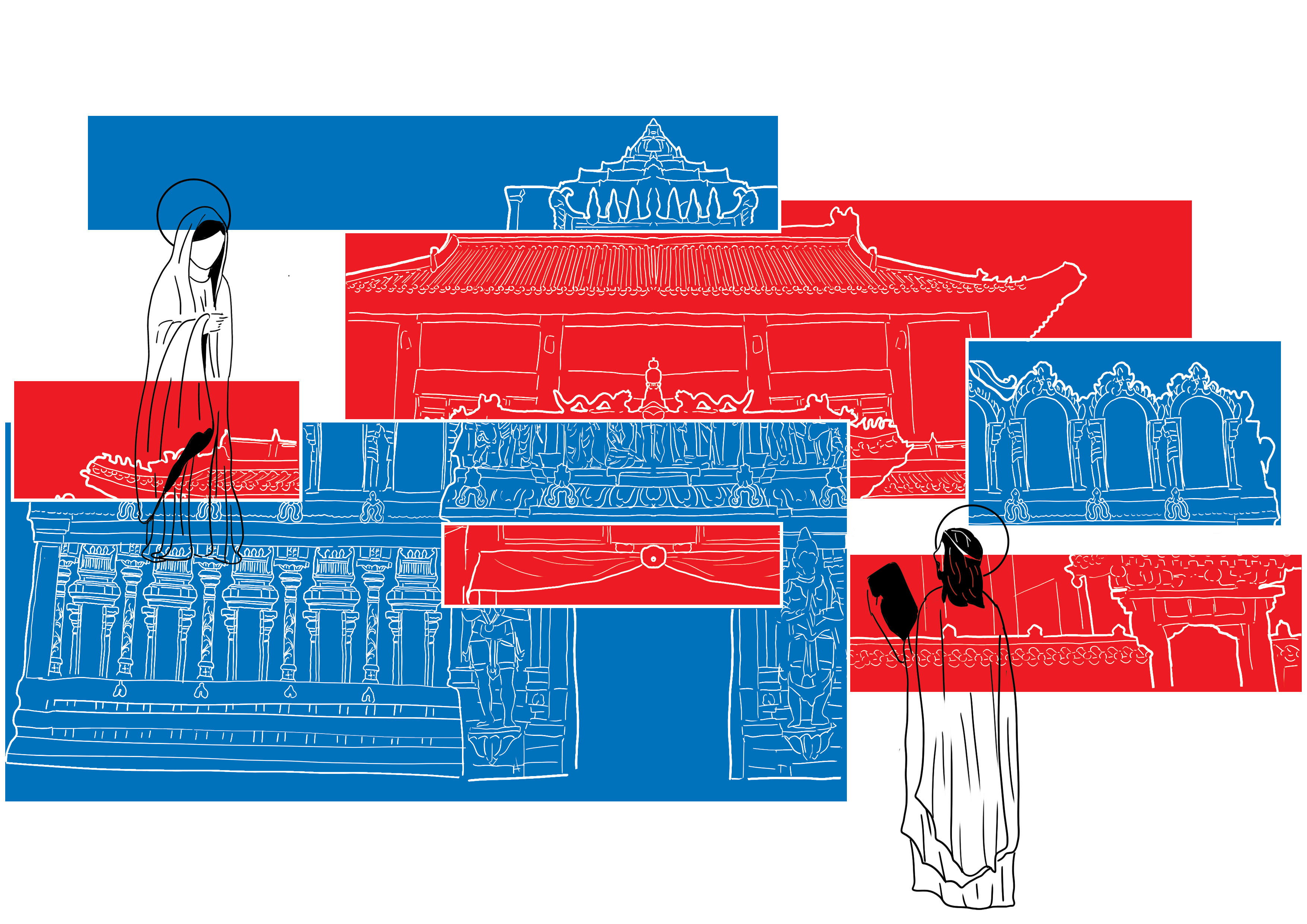
I felt it was quite odd and thus switched to another format, with the Gods/Saints coming out from the page on one end and leaving the other. I ended up really liking this layout and hence used it.
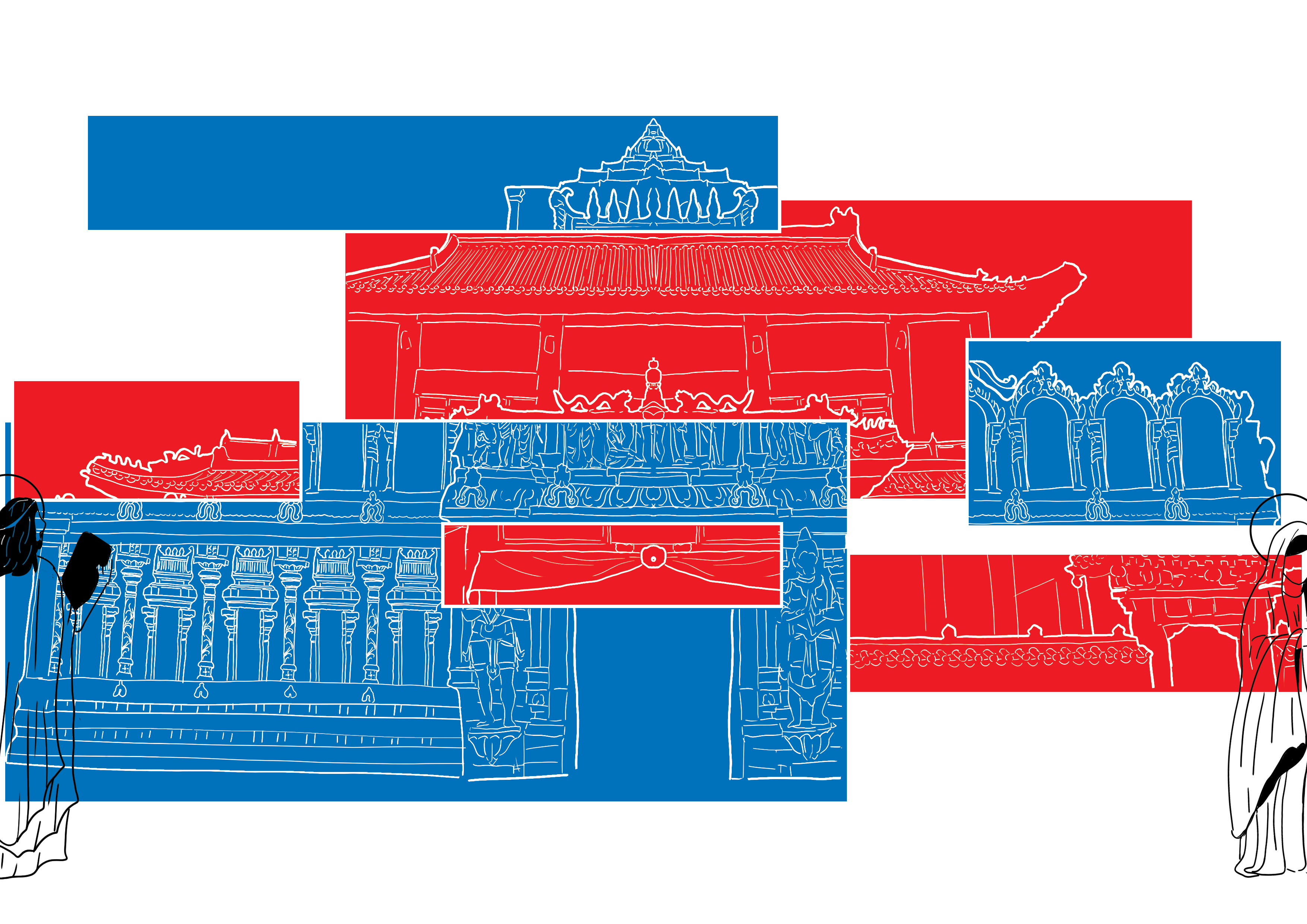
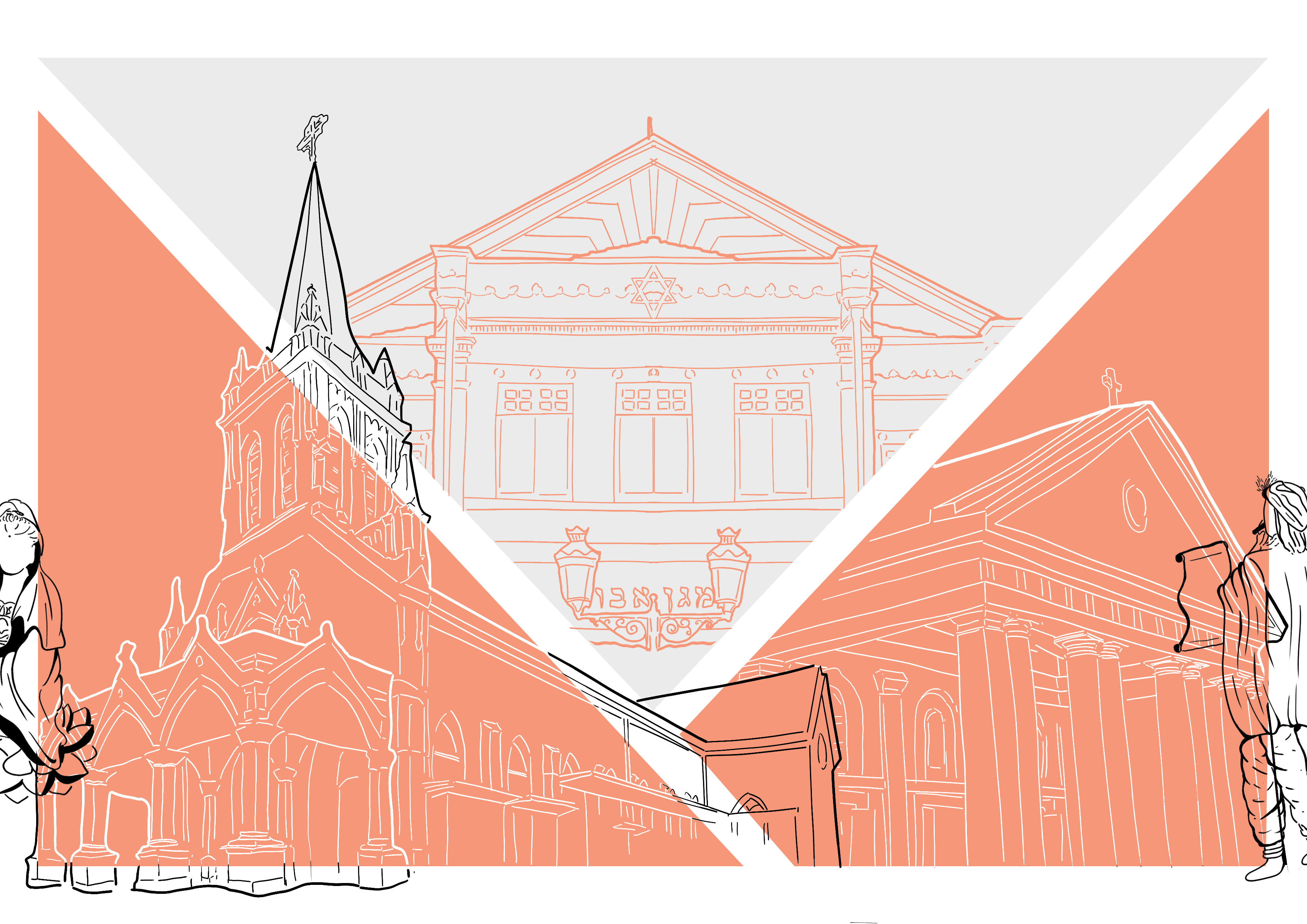
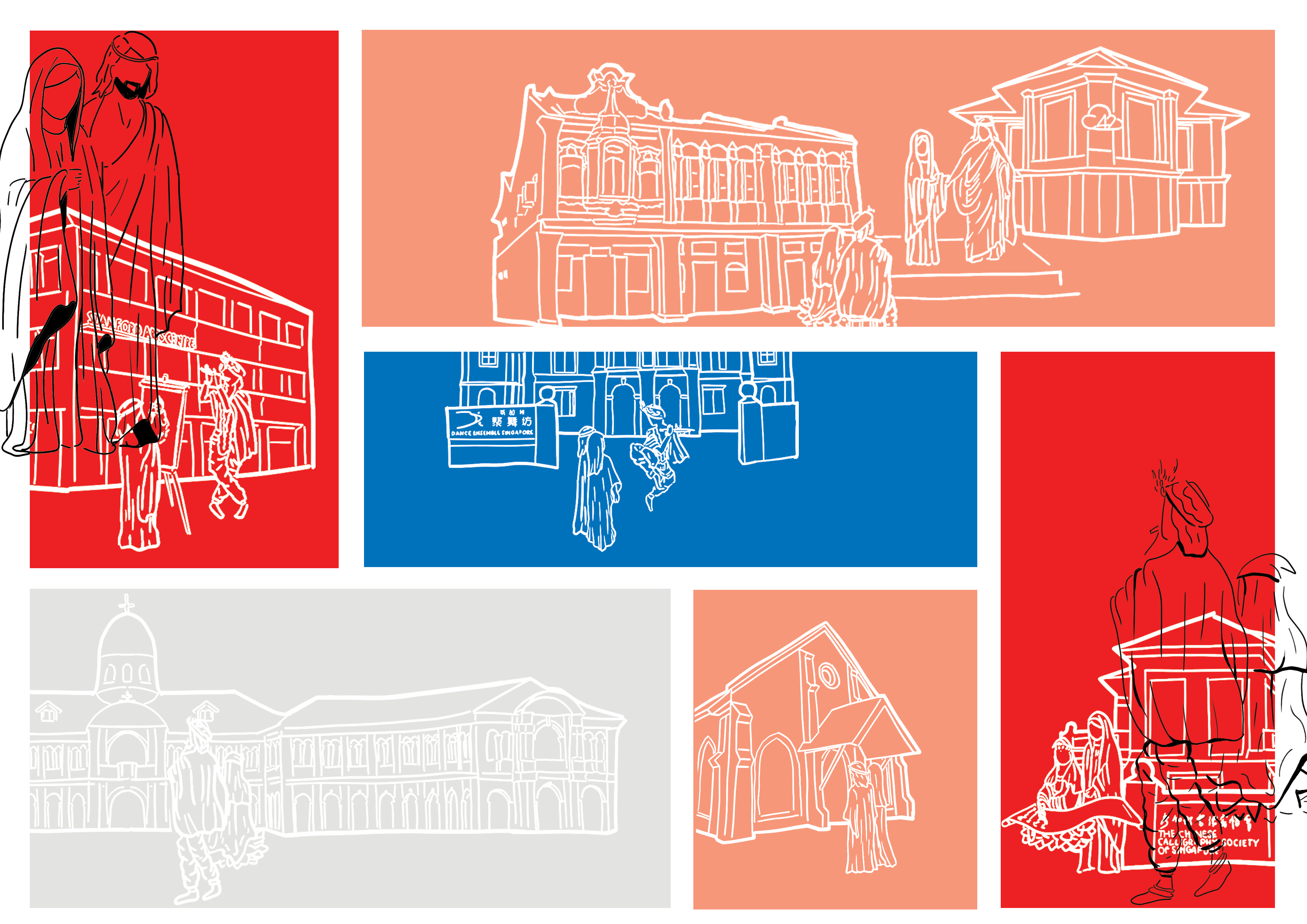
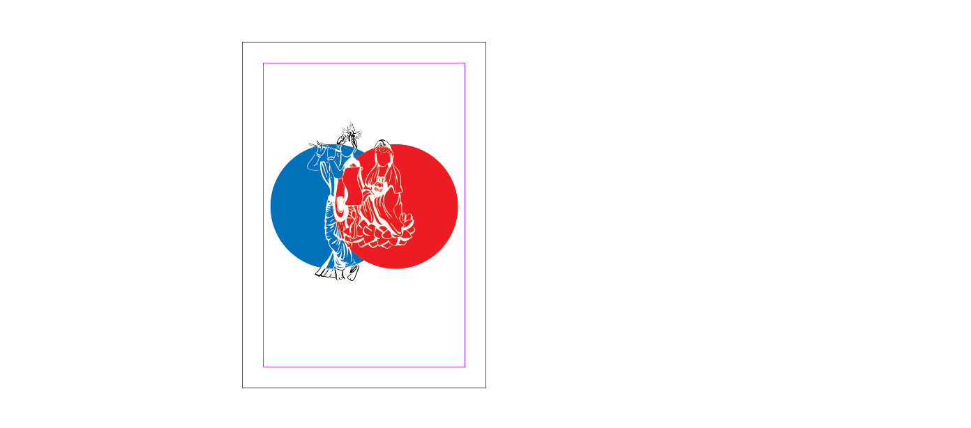
Initially, the layout had been as shown below, with circles for Mother Mary and Jesus being red and blue and that for Sri Krishna and Goddess Guan Yin being grey and peach. However, it had been brought to my attention that the colour of the circles should follow that of the God’s/Saint’s place of worship. I heeded this advice and swapped as it made more sense as well.
Middle Spread (AAAaaaAAaAh)
I had the most difficulty with the middle spread. This was because the other spreads had not had many elements or objects. However, my middle spread that involved the 4 Gods/Saint gathering to visit the many places of the arts proved to be a huge challenge due to its many elements.
It had been asked if I wanted to switch and focus on just religion, but I had been adamant on involving the Arts as I felt it was through the Arts that religion could possibly mix without offence, bringing about more open minds.
I hence started working on it, firstly by doing the line art of the different places.
After doing this, I began trying out different layouts and found myself in an extremely huge bind.
I initially tried placing the different places next to one other, but soon realised that the SAM would not have been able to achieve that effect due to its size and structure. Hence, though it was a nice layout, I scrapped it.
I also tried making it a map and tried different colouring methods. I ended up scrapping it however, as I felt it did not fit the theme of the zine.
Since I wanted to show that it was the Gods/Saint coming together through the arts, I drew them experiencing the different art areas there.
I initially wanted it to be a mix of the 4 colours only, but nevertheless tried to see if I should incorporate more colours. The conclusion was: no.
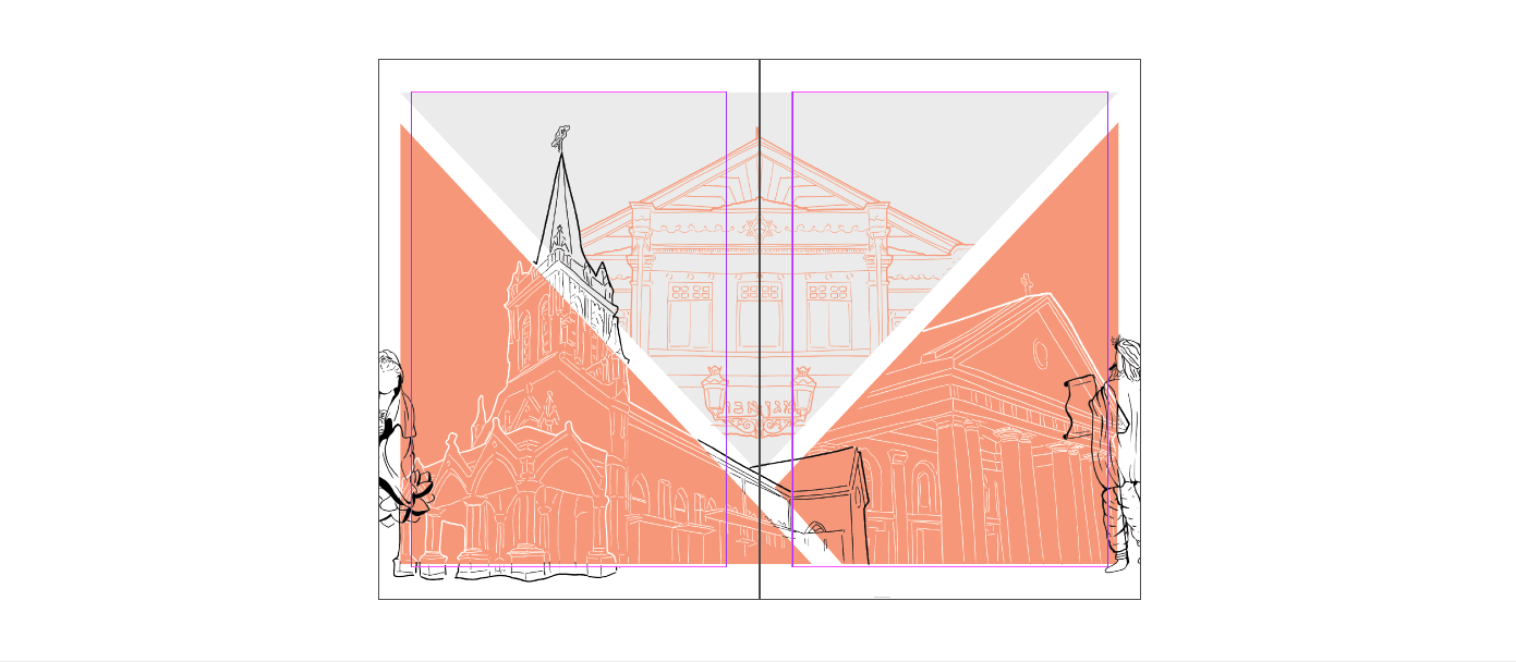
Sticking to the geometric shapes, I tried seeing if I should arrange them in the way below, and use triangles to frame it.
I tried adding colour to it too.
I felt it had all been different from the style of my zine and hence in the last minute scrapped all of it to do something that had fit it more.
Adding the Gods/Saint at the sides, my zine was complete.
OFC + OBC
Zine Final
All in all, this had been a fun experience, and I learned many new things. Though my middle spread had been unsatisfactory to me, I tried many different layouts and the journey had been interesting. I would definitely redo my middle spread if I had the time, and would also consider and learn more about colours and layouts.
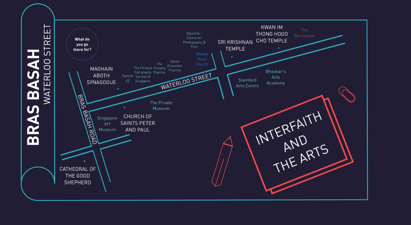
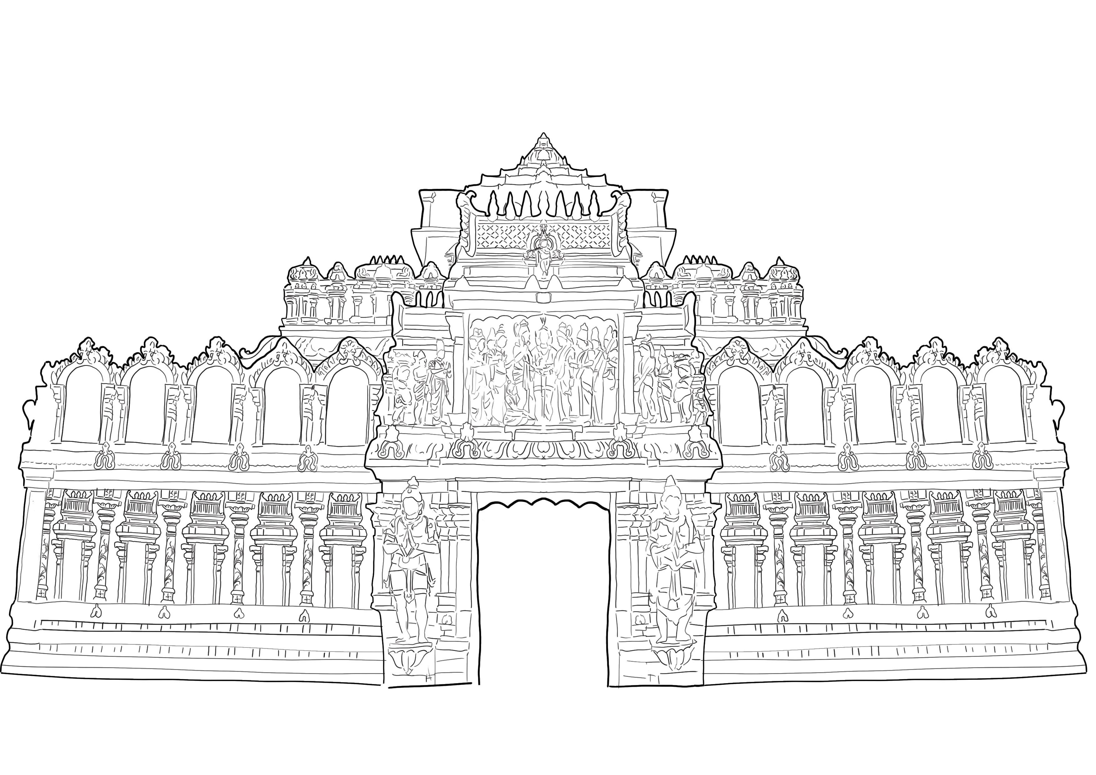
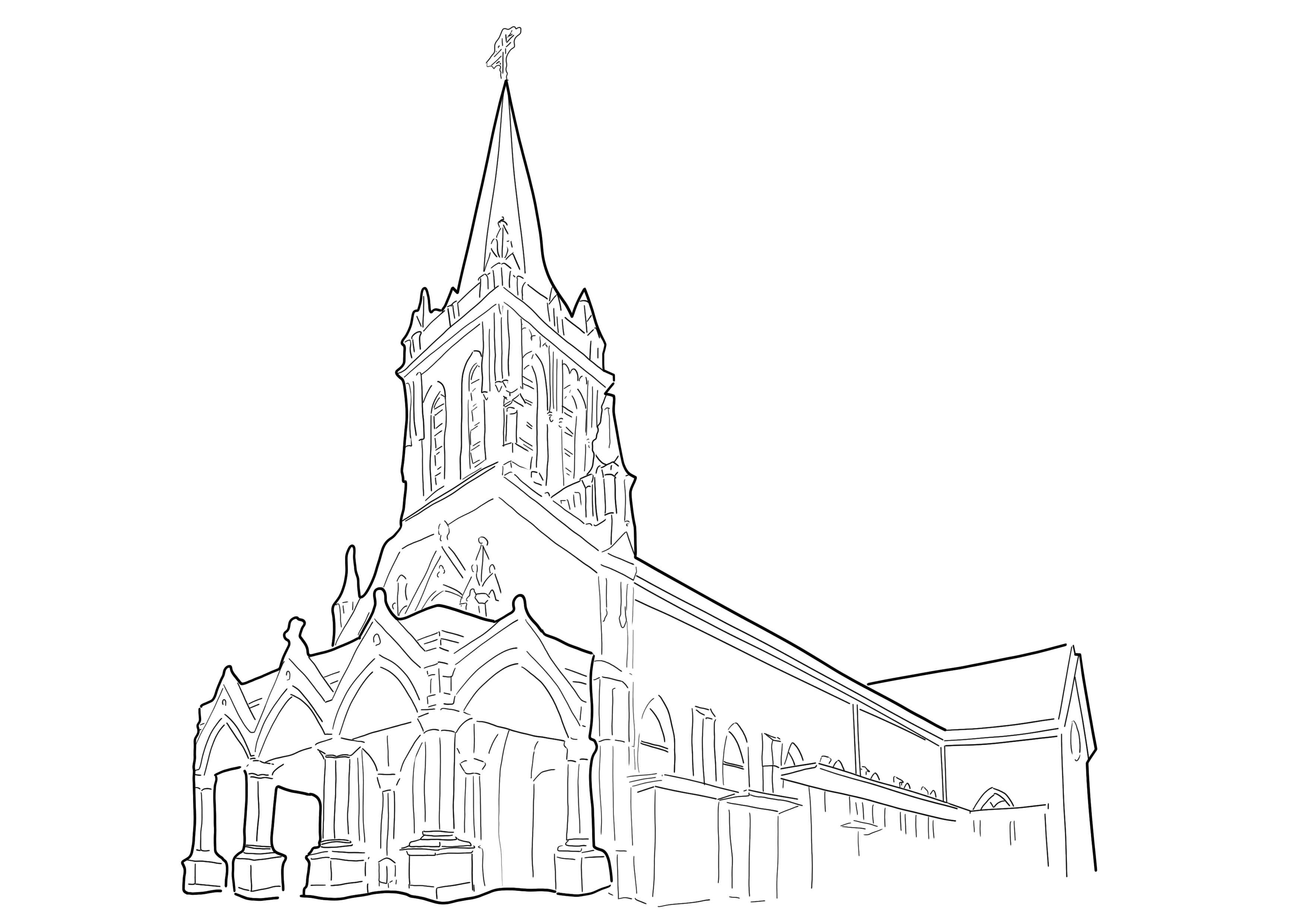
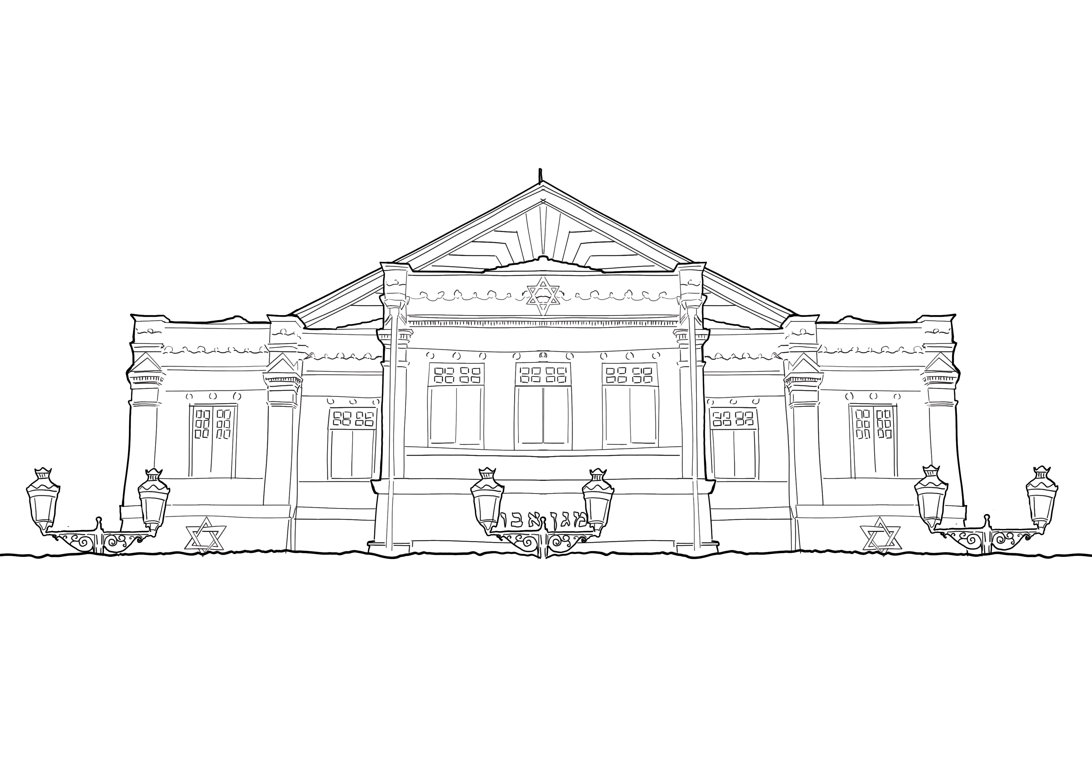
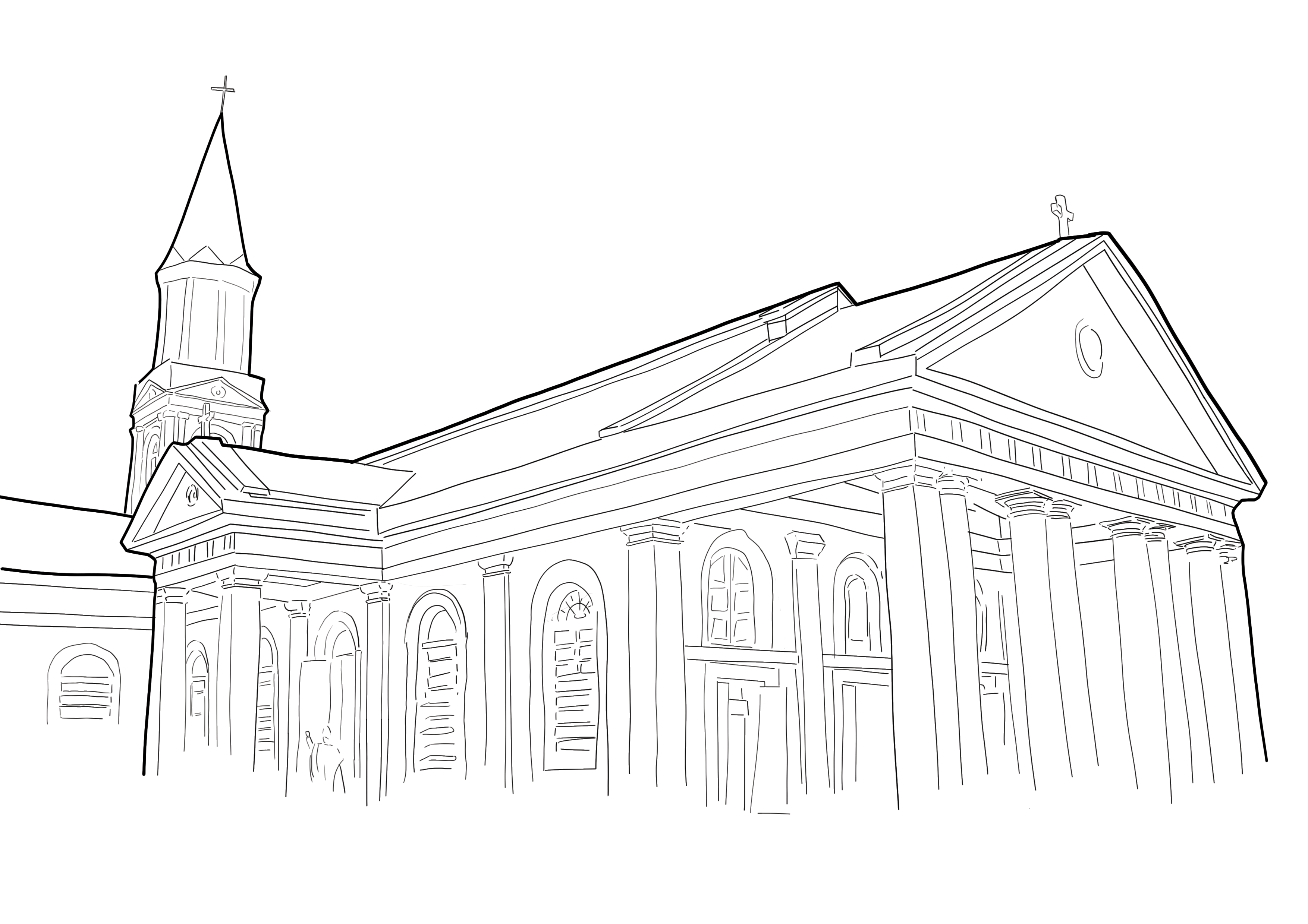
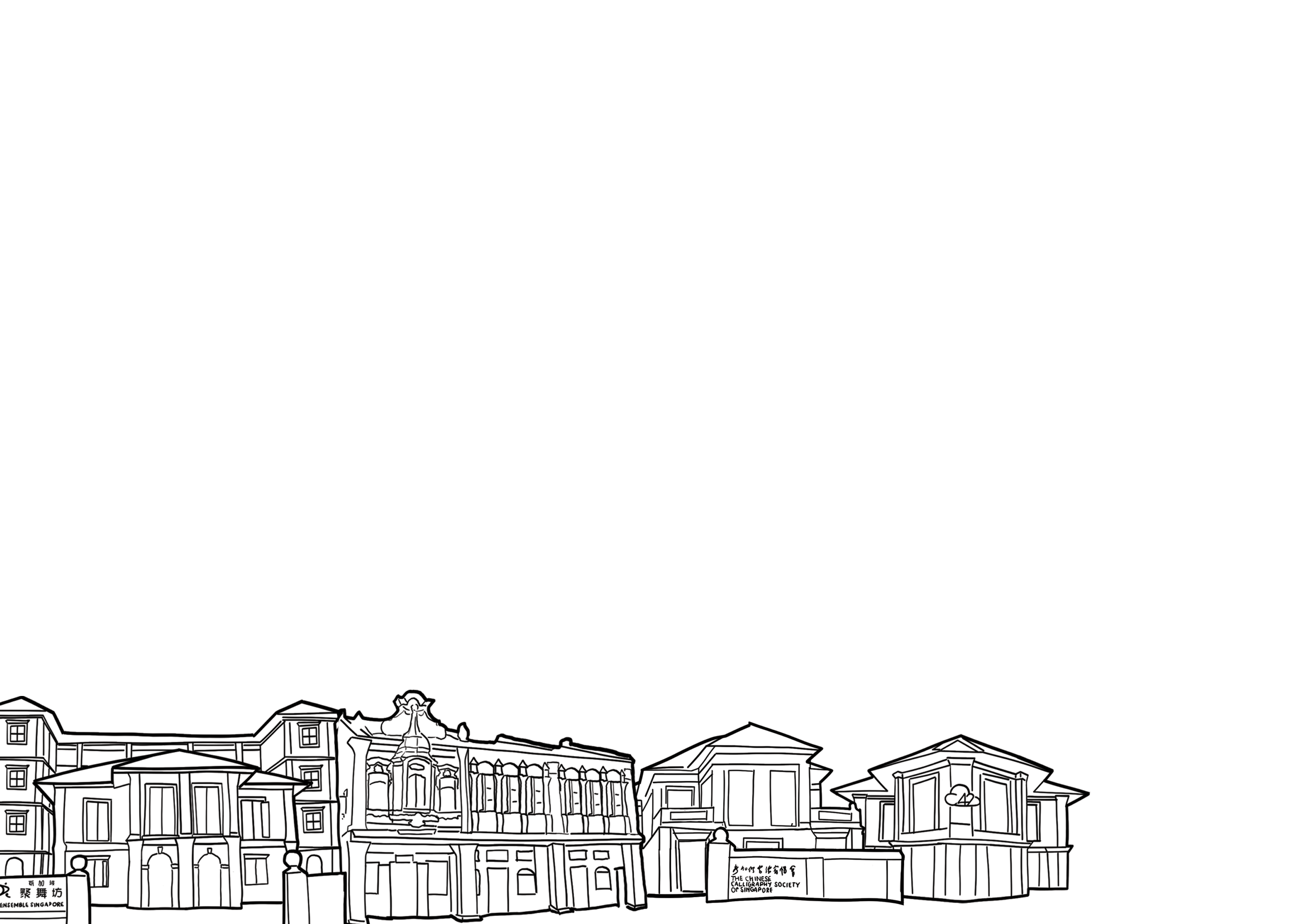
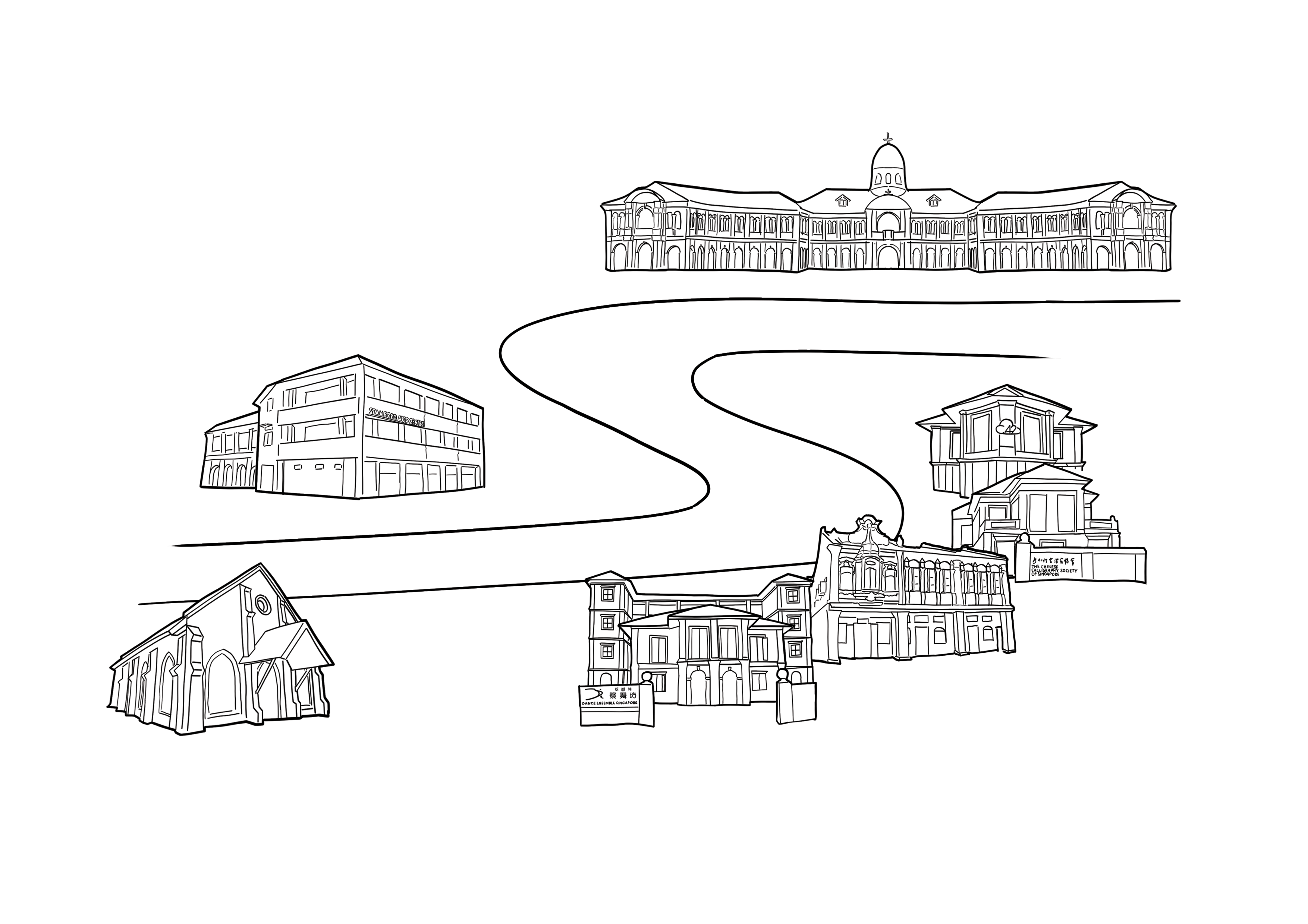
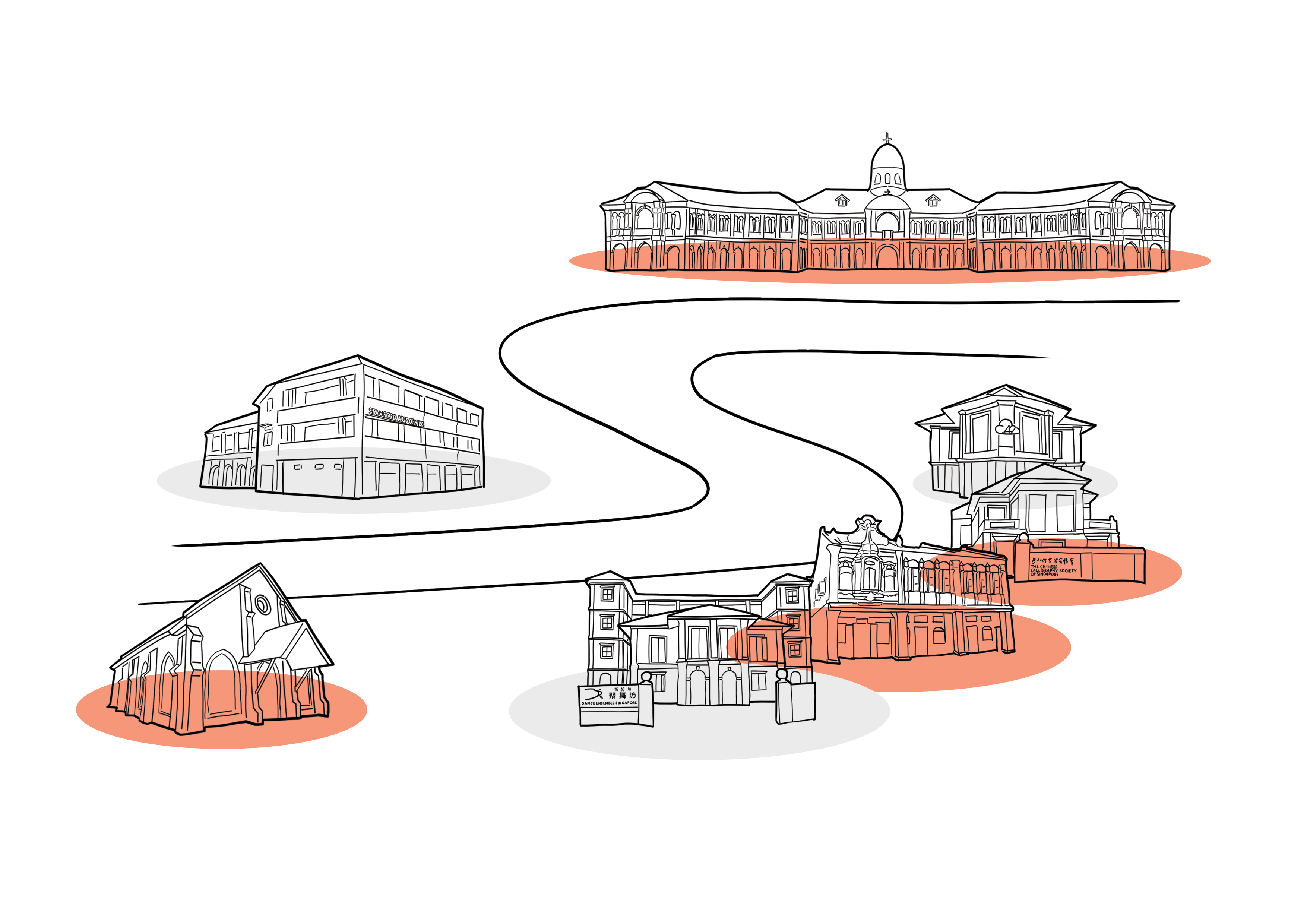
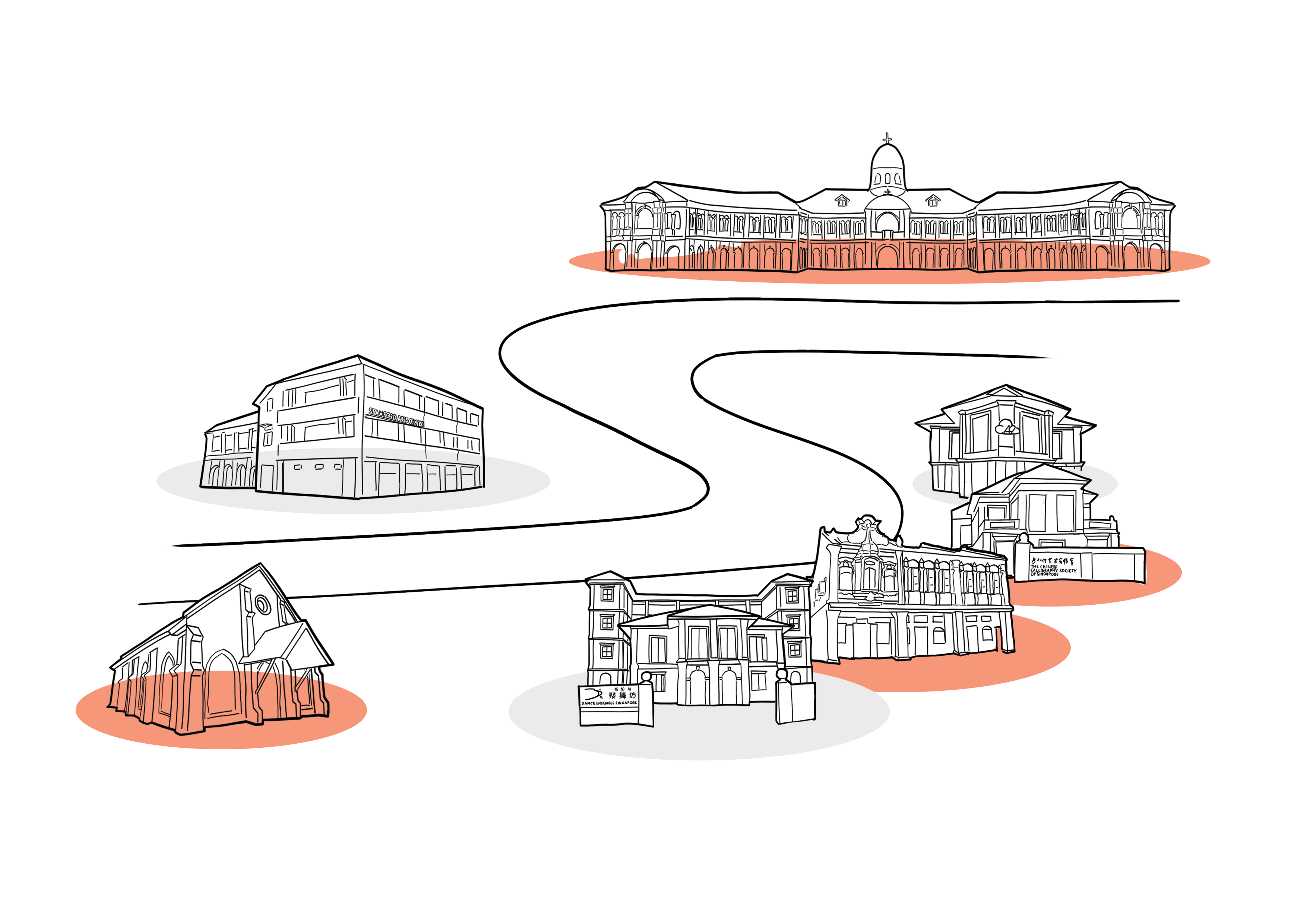
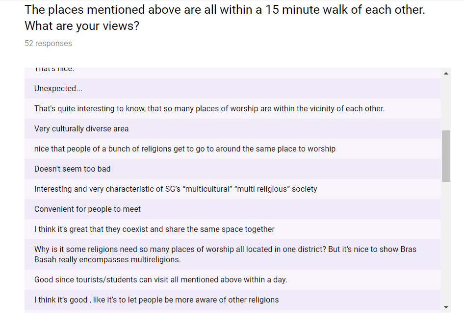
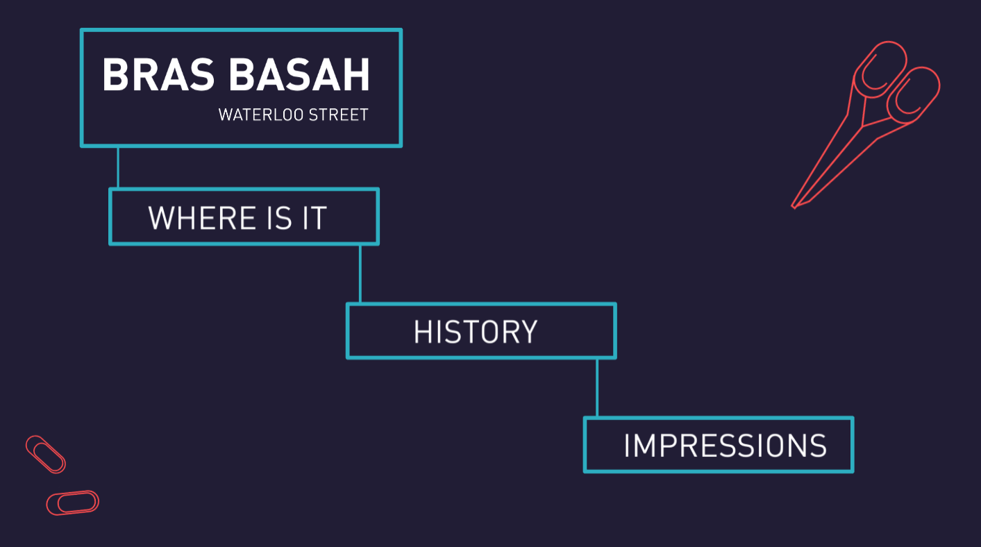
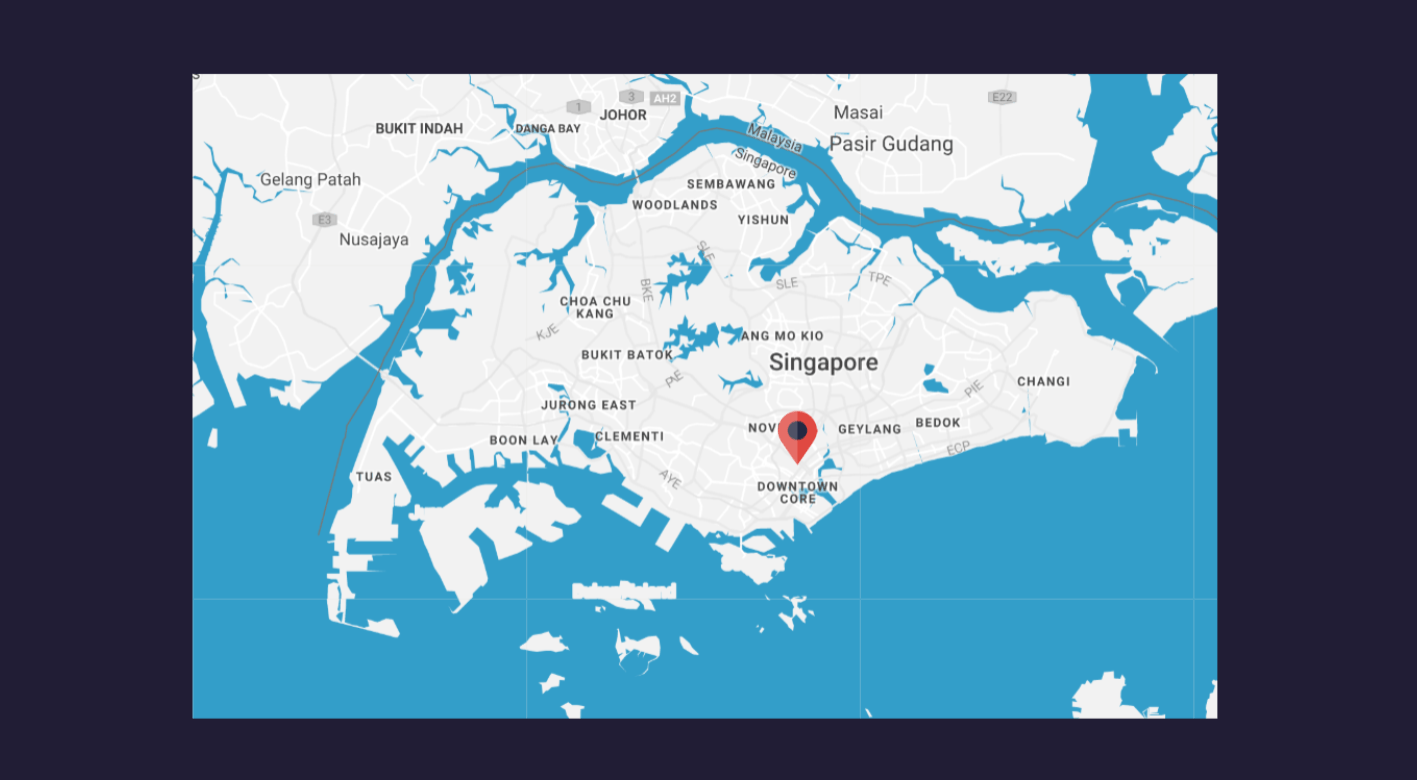
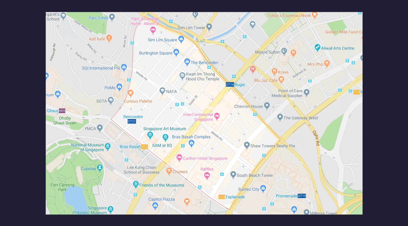
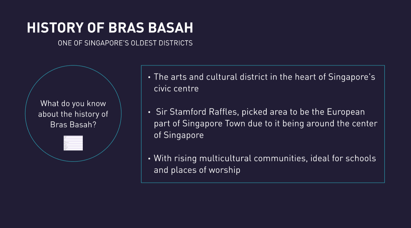
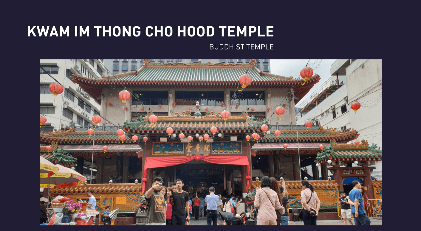
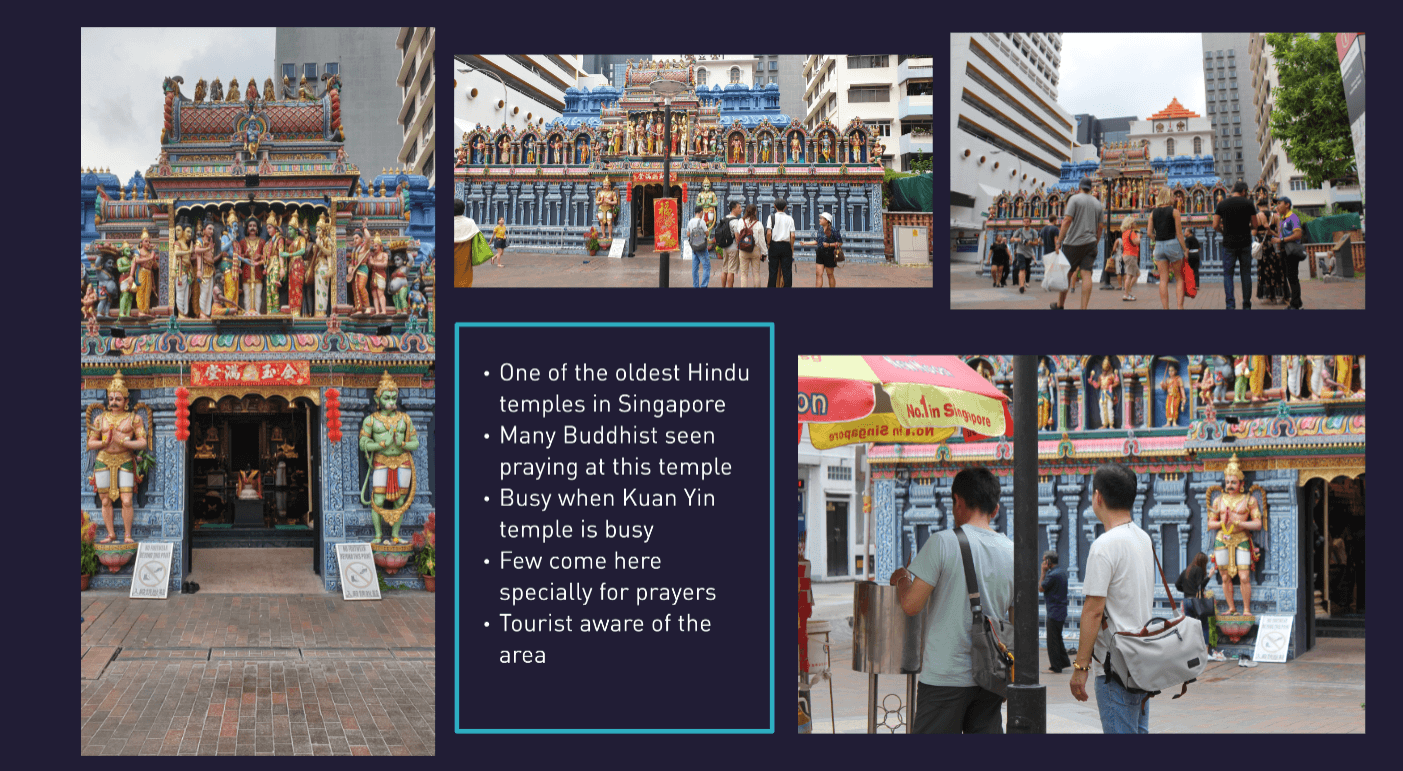
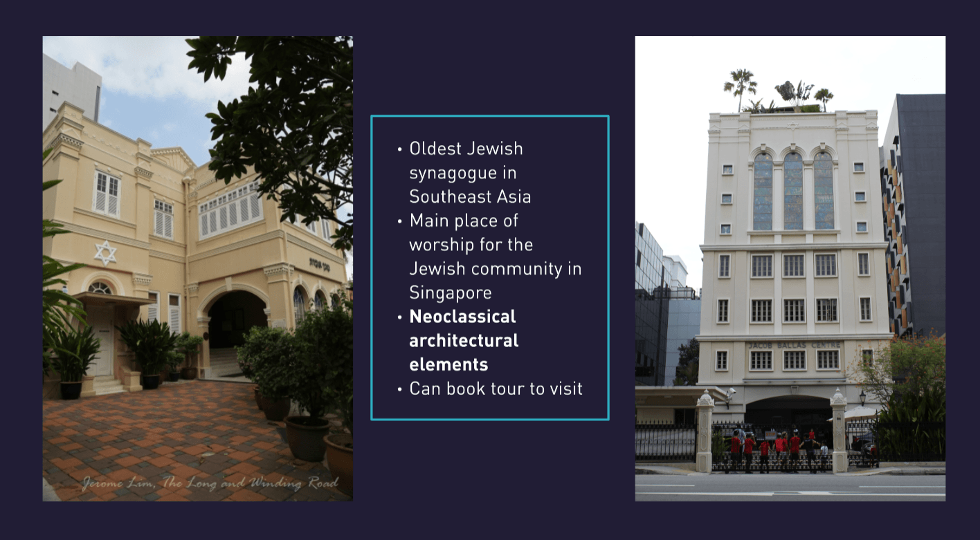
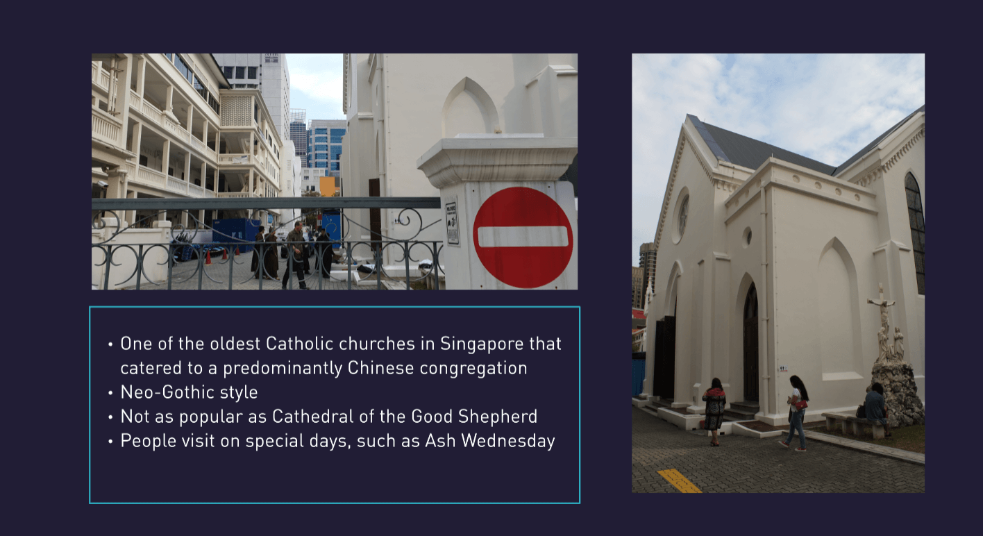
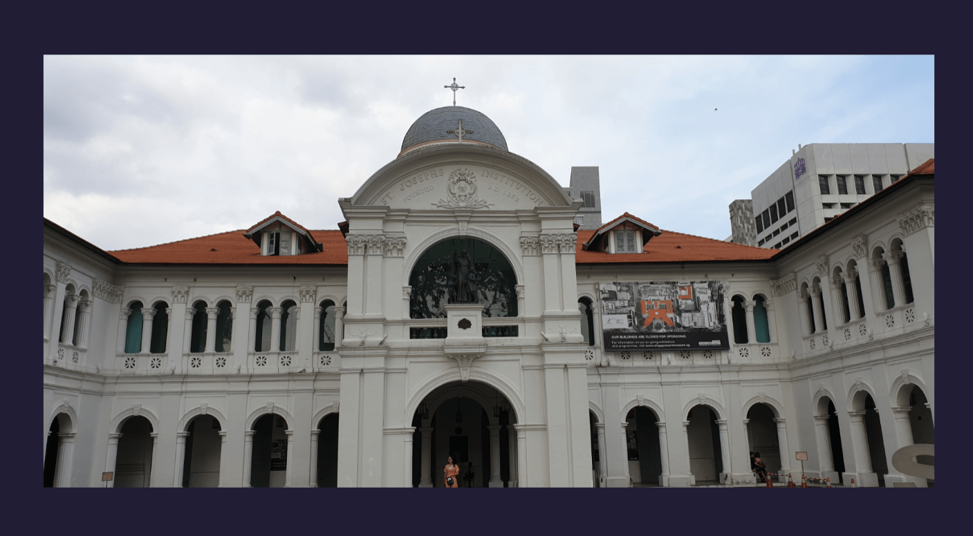
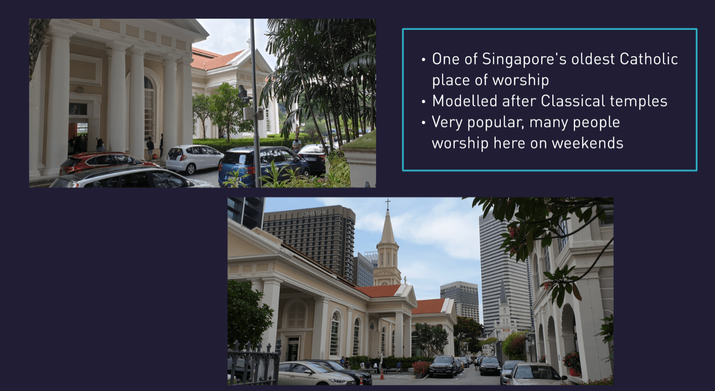
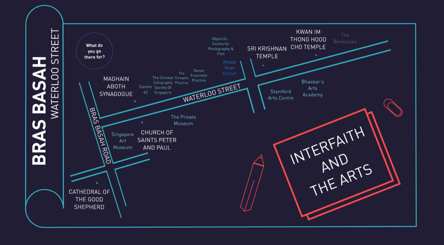
For this project, we could choose any location to work and research on. After much consideration, I decided on Waterloo street, an area that I often visit to pray at the Kwan Im Thong Hood Cho Temple. This area was chosen as it had been brought up to me that there had been a Hindu temple right next to the Buddhist temple. After more research, I found out that within a 15mins walk radius, there had been numerous places of worship, namely:
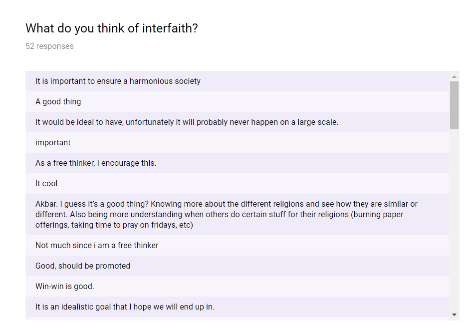
Realizing there were so many places of worship from different religions in the same area, I became interested in the idea of interfaith: a cooperative, constructive, and positive interaction between people of different religious traditions and/or spiritual or humanistic beliefs, at both the individual and institutional levels.
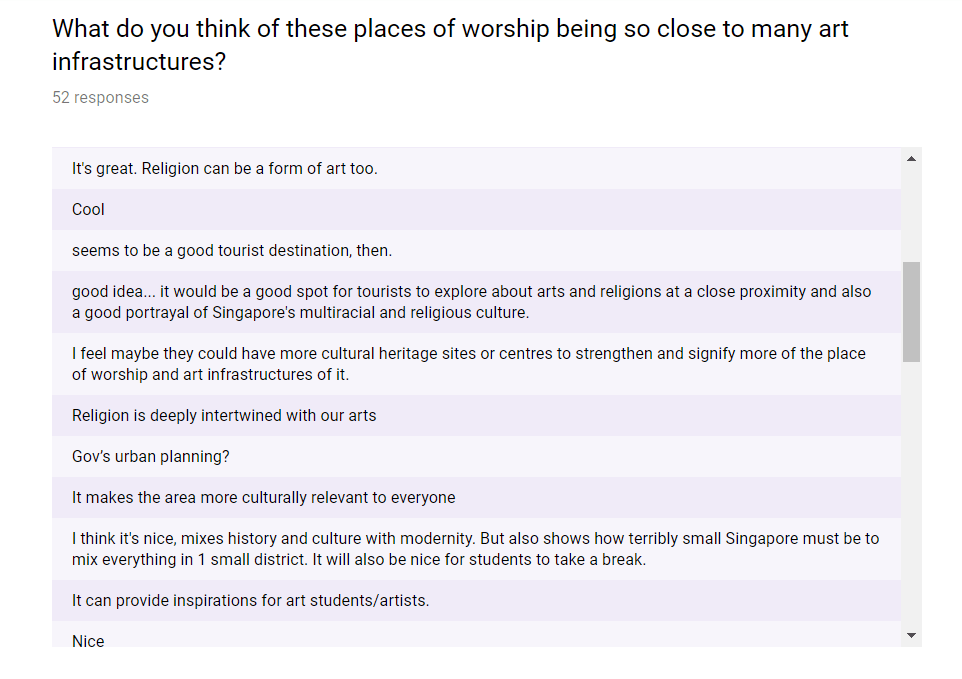
I thus decided to do on Waterloo street and scouted the area, only to find that there were many places regarding the arts that had been situated in there as well. It had been unique that the bras basah area, in general, had many areas of both the arts and faith.
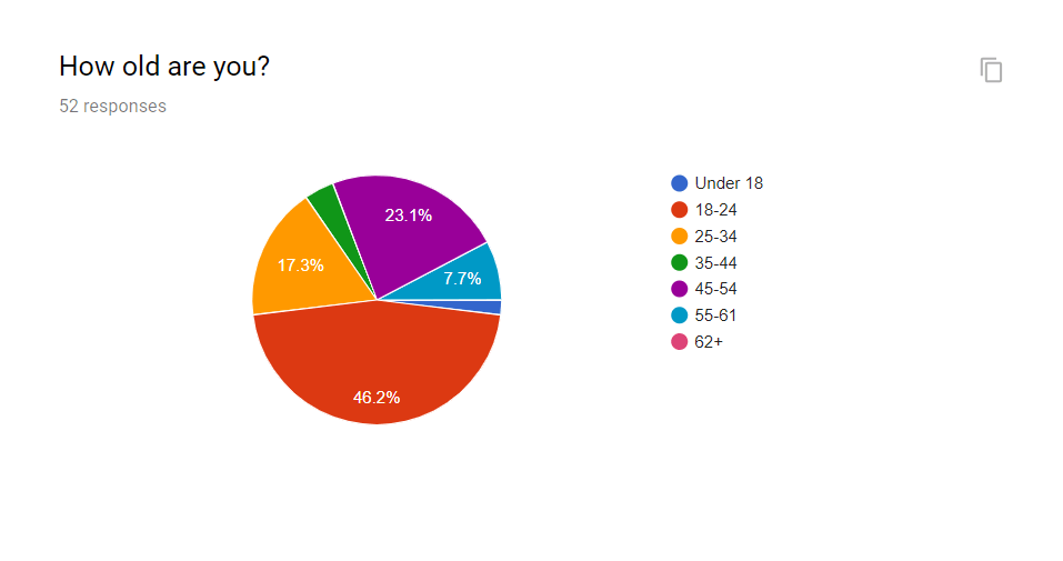
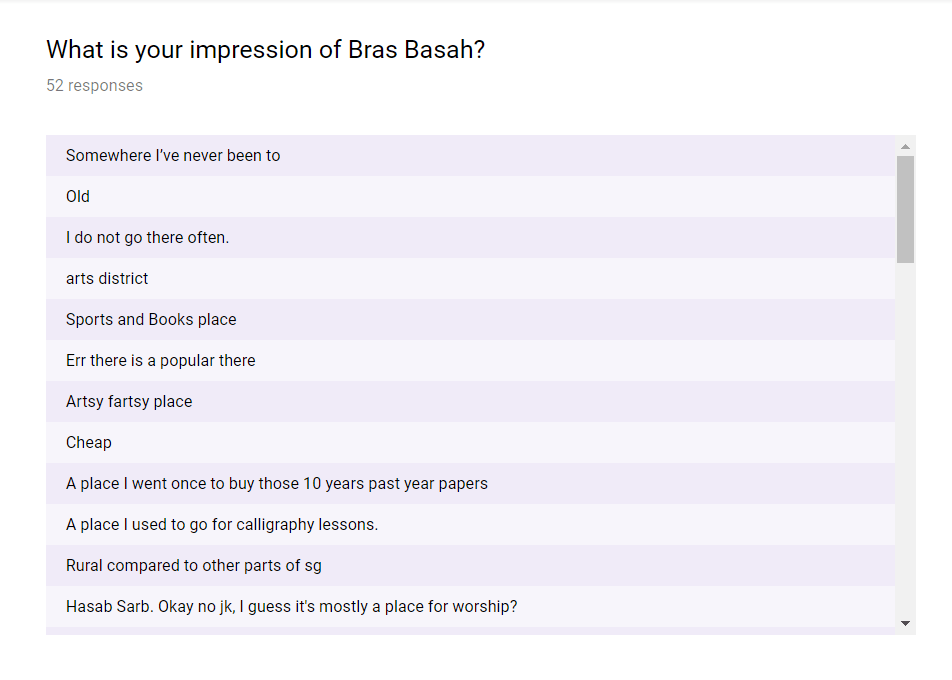
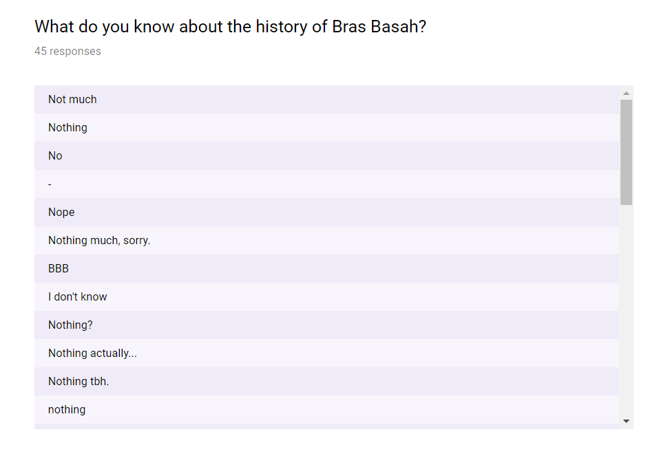
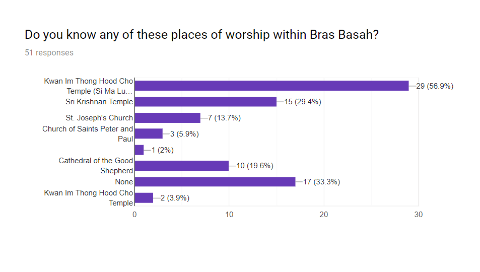
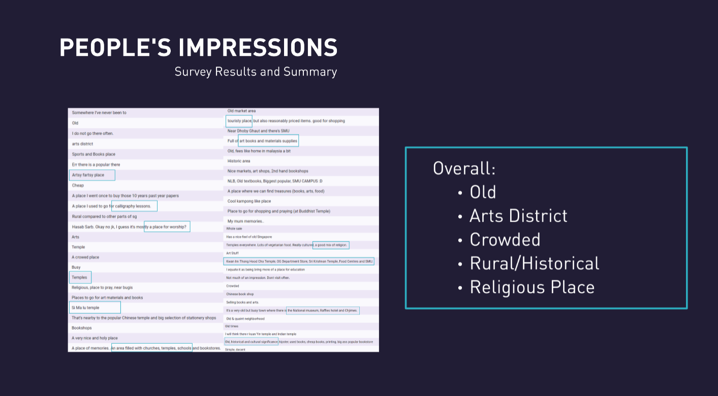
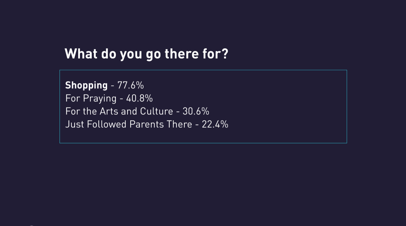
To see what people thought about Bras Basah and Waterloo Street, I made a survey to ask people of their views. I firstly asked people of around my age group, then spread to others, and the results had been highly amusing.
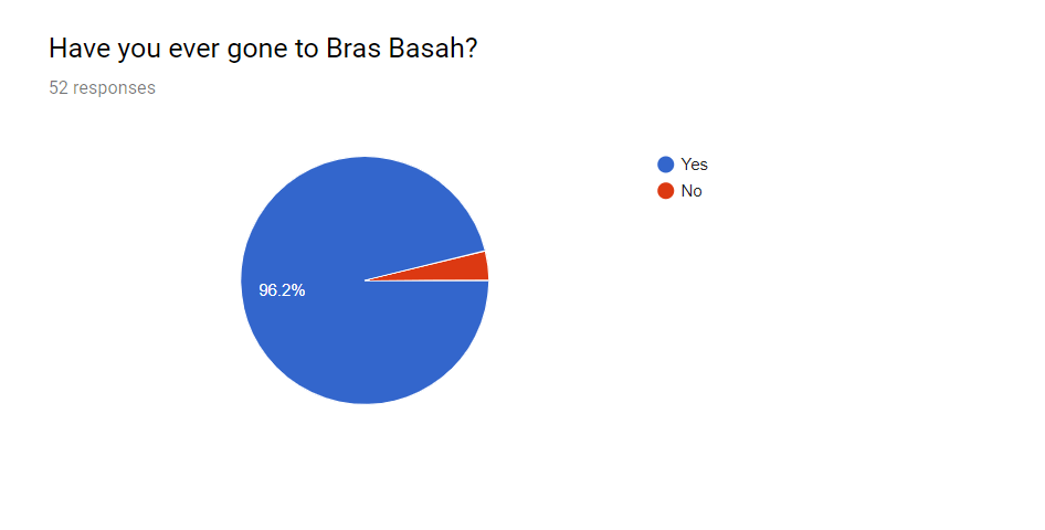
To begin, one question I had asked was if they had been to Bras Basah. To which the first few surveyees had answered “no”. Since they are my friends, I had been quite positive they had been there before and questioned them about it. I then realized that they had indeed been there but had failed to recognise that the place they had been to had been Waterloo street, or that Waterloo Street had been in Bras Basah. It was thus a very interesting discovery and I changed my survey so people better understood the place.
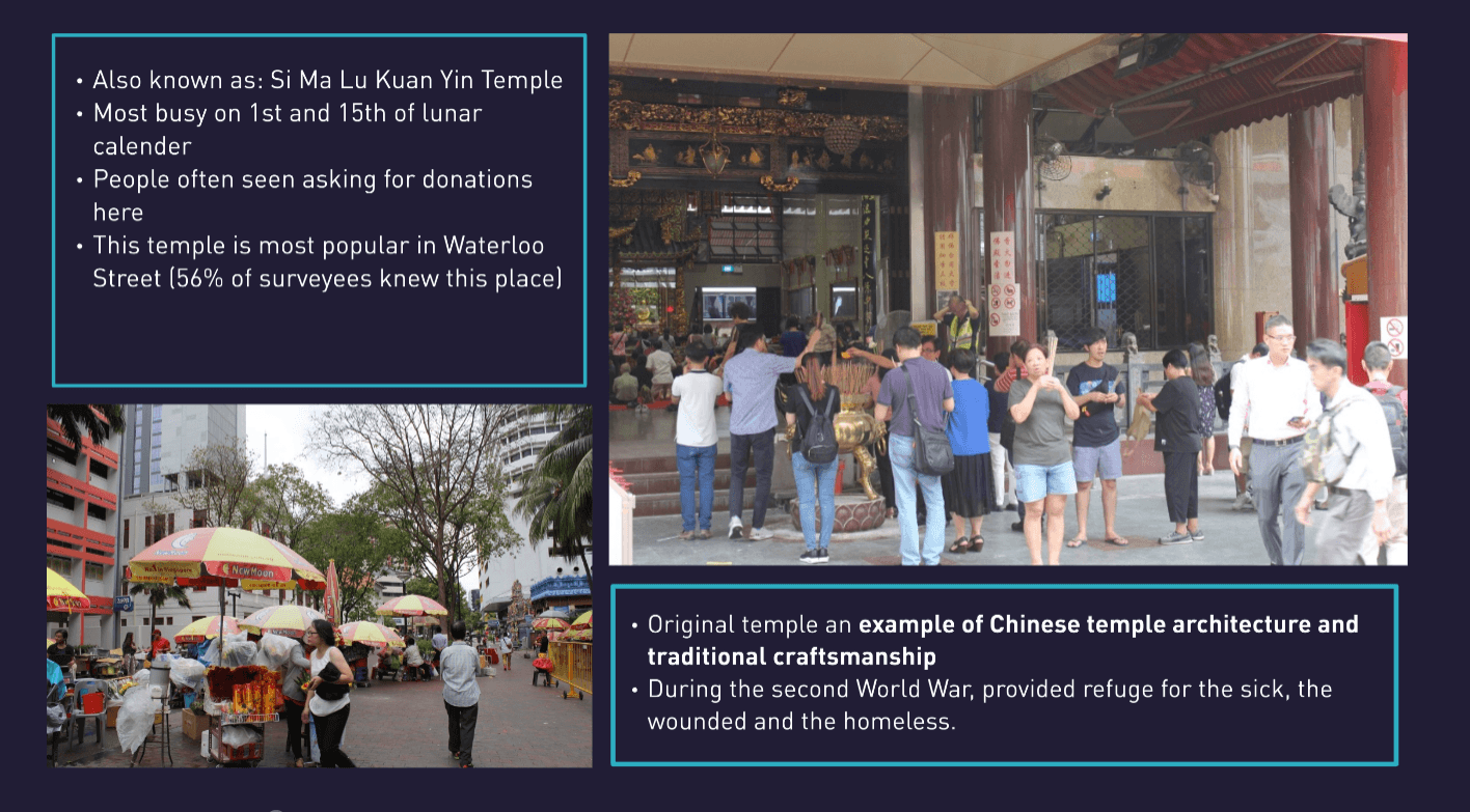
Since I had asked those in the 18-24 age group first, before moving to those in older age groups, I realised that those around 20 years old tend to think of Bras Basah as an old place with many places involving the arts. They did not know much about the different places of religion and if they did, they only knew of the Kwan Im Thong Hood Cho Temple.
The older generation, on the other hand, knew about the place and also were aware of the history of Waterloo street and why it was of importance to Singapore.
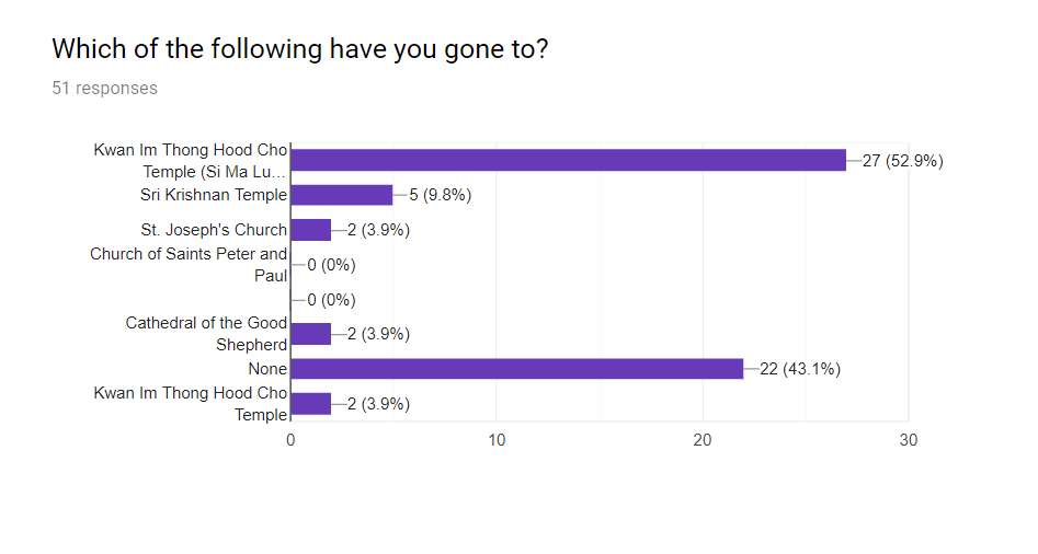
Below are the results of my survey.
Link to all surveyees’ answers: https://docs.google.com/spreadsheets/d/1-eeHRn0OU6t4j7SxGoH2Wd3Ze65D6zGMLhikP1j1jjo/edit?usp=sharing
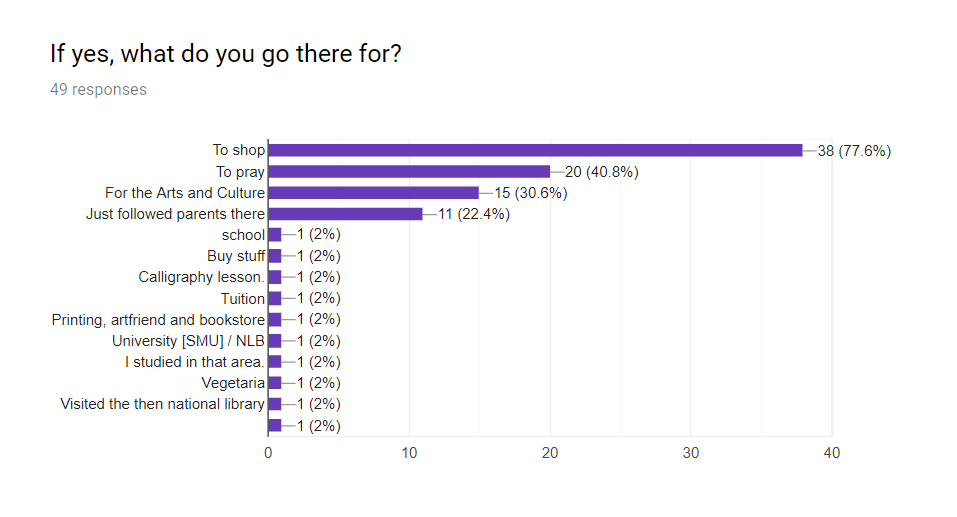
I had also gone there to interview a few people and also ask others some casual questions.
One person I interviewed had been a helper for charity; asking around for donations. He had specially chosen to do this outside of the Kwan Im Thong Hood Cho Temple due to the high traffic flow. He had single-handedly raised up to $2k in a single day because it had been the 15th of the lunar calendar.
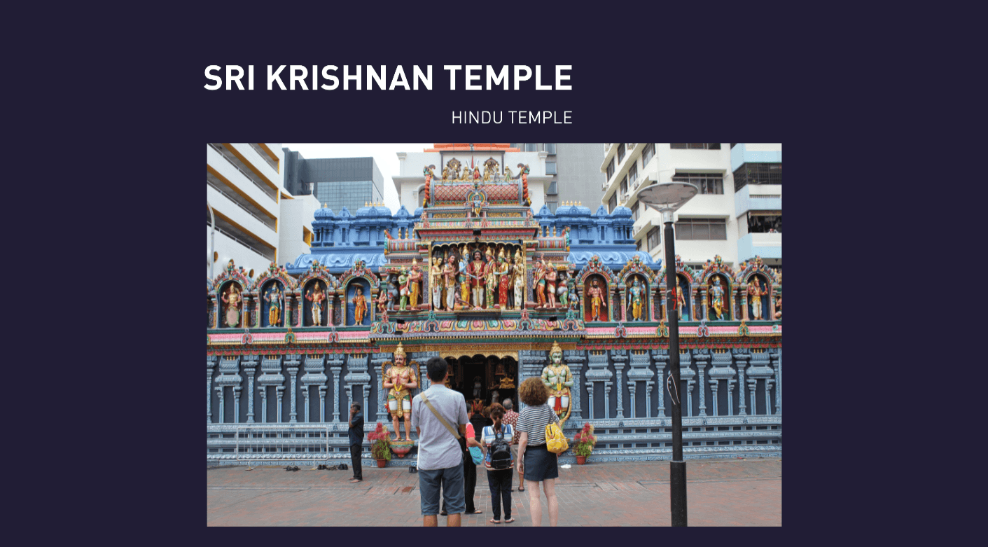
This suggested that among all the places of worship, the Buddhist temple had been the most popular. This was also supported by the Hindu temple’s helper saying that the Sri Krishnan Temple’s traffic flow followed that of the Buddhist one. He had mentioned that the 1st and the 15th of the lunar calendar meant that the Buddhist temple would be busy and thus the Hindu Temple would be busy as well.
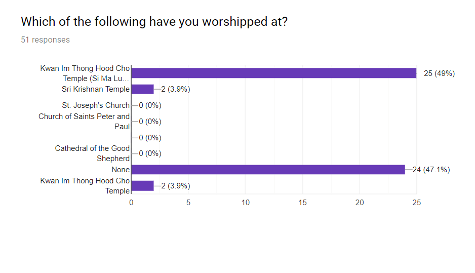
Apart from all these, I also realised through my personal observation that many people had actually prayed to the Sri Krishnan Temple despite being a Buddhist. I asked around and many had actually mentioned that they felt that paying their respects and praying to the different temples had been normal for them.
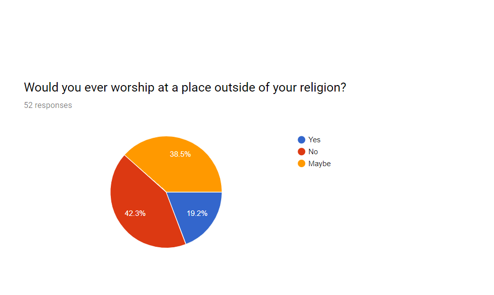
Others had mentioned Singapore being multi-religious to the point that they see Buddhists and Hindus in churches just to accompany their friends, and they also pray along with the people in there, just as a form of respect despite not following the religion. One lady also mentioned seeing people of other religions pray the way they do in their own place of worship in the Sri Krishnan Temple, i.e. Buddhists praying the way they do in Buddhist temples in the Hindu Temple. This is not done out of disrespect, but more of just acceptance of the different religions and believing that they are allowed to pray to the different gods, even ones of different religions.
When I asked those in the churches and cathedrals, the answers were generally similar, though I realise they tend to be less open to praying to other places of worship though they do accept and acknowledge the other religions.
One question I asked which received replies from both ends of the spectrum was about the arts. I had asked if they thought there had been a connection of the arts to religion. I received replies such as “The arts and religion have no connection at all” and also the exact opposite: “The arts help to strengthen religion and also open people to the acceptance of different religions”.
Thus, overall, it had been an extremely insightful and fun experience.
Audio clips: https://drive.google.com/open?id=1iBR3Thkmbpzs1Ssx7uFata1r33OXazkI
Photos I took: https://drive.google.com/drive/folders/1IvDIFRZBRljZXkLD08q8K2ESq5VyHcDt?usp=sharing
Presentation
Slides: https://prezi.com/view/CMtvVIVwk4bz8gMX6f2C/


For this assignment, we were tasked to make a build of minimum 15 pieces, that resembled any known object or form, using either Lego or ready made pieces.
I initially made a giraffe, which I really liked.

However, I decided to challenge myself and make something different. I tried making a sniper rifle, but then soon changed the whole build into a bus stop as shown below.


I then drew out the different parts, and some steps to get started.


Using Photoshop, I then removed the background and separated the respective pieces.

After that, I added colours and made the steps for how to rebuild the bus stop.

https://drive.google.com/file/d/1kYdf8WJj6C2Pzgac6PBTBizTMX7EGlb6/view?usp=sharing
Class Exercise 1: Signifiers


Class Exercise 2: Using Found Objects
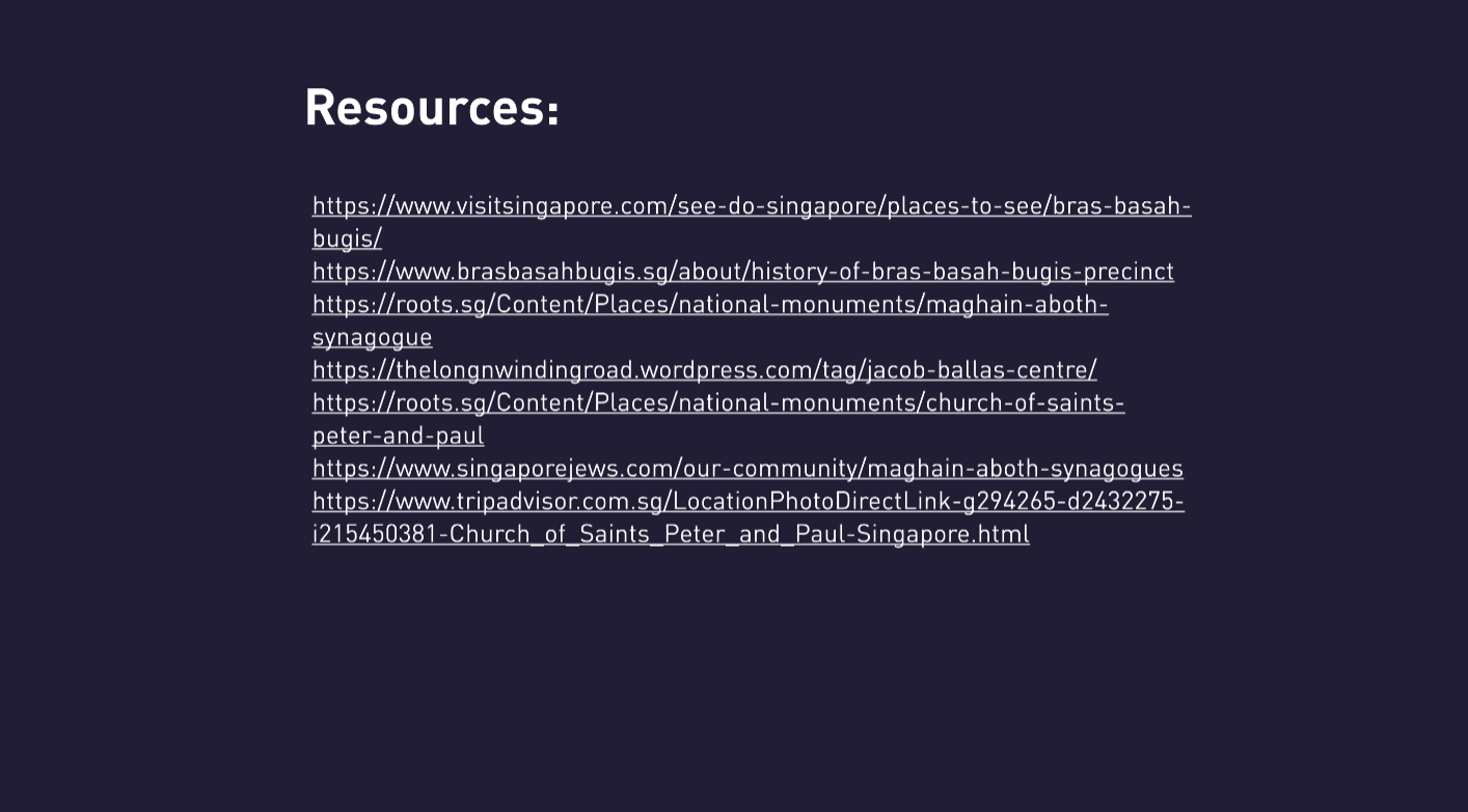
Not Applicable: Key required to open a locked door. But in this case, the key is the wrong kind. A key pin is required, and not an actual key.
Class Exercise 3: 3 Photos to Show Different Moods
Rigid

Mysterious

Sensual

Class Exercise 4: Photo Based on Story
Story

Photo

Class Exercise 5: Series With Theme
Theme: Doing weird things for class work


Class Exercise 6: 3 Different Scenes to Make Story
https://drive.google.com/file/d/1Bh3w8tHdVzOIG22C7Oh5y74Lbj8LcmT7/view?usp=sharing
Class Exercise 7: System With Own Rules
https://drive.google.com/file/d/1pcjoriTzlH4FnTlasZPYxBotWwbEH1EP/view?usp=sharing
Upon receiving the brief, the very first thing i did for this project was actually to research on Emiko herself, as well as the world of “Wind Up Girl”. I wanted to really make sure that my design had fit the world and also was able to carry out the functions that it was supposed to, in other words, be a cooling bio-radiator.
Upon research, I found out a couple of things about the premise of this world that Emiko lived in and herself:
With this, I decided to jump right into the project. With the basic knowledge on cooling and heat reduction that i had from my secondary and junior college days, along with certain common knowledge, i knew that the nape was the section whereby upon cooling, would result in the whole body cooling as well.
Thus, i decided from the beginning that i would create a design that involved the neck. Other options such as garters and arm guards, as well as head pieces did cross my mind, however, i felt for the purpose and functionality, the nape was still the best option.
Now, further looking at the premise of the assignment, with Emiko as a sex android and working in a sex club, i wanted to create something that was not obstructive to her activities and also tied in with her job. While it is true that she resents her job, i felt that she most probably had no choice and for something such as a cooling device, she would most probably have been gifted by a customer or provided by her workplace.
Taking into consideration the basic cooling mechanism and the fact that the world was using rather old technology, i was glad that my first section was using black nails, as i felt it fit the aesthetics and the functionality.

As shown above, my first part involved nails and it was held together with blue thread. We were tasked to find an SEM image and recreate it, however, i personally was intrigued by interlocking mechanisms and thus wanted to use nails and bolts. Upon further thinking, i decided to use thread and nails instead. I hence worked backwards, with me finding a picture to match a possible design that i wanted to create.
I managed to find an image of Silicalite-1-Octahedron, that is synthesized by repetitive branching. I think i managed to recreate the image well and was rather delighted with my result.
Following this, i decided to do more research to ensure my facts were right. A few things i looked up were cooling based on colour, increase surface area and how it results in increase cooling and also which area cools the body the best. Fortunately, my knowledge on cooling were not proven wrong and i carried on with creating a design.
i initially planned to a neck piece, but upon doing research, i chanced upon a spinal harness as shown in the bottom left of the above picture. It was very interesting and captivating. I felt that the usage of the nails were very suitable for this spinal design. This also made me realize that a harness had actually fit what i was looking for in a design.
Hence, i decided to made a harness.

The above is a process model broken down to its separate parts and functionality.
The main gist of the whole device was such that the metal piece that was situated in the nape would absorb all the heat from the body and then transfer it down to the spinal nail back piece, where through the increase in exposed surface area, the heat is cooled down using the second law of thermodynamics. This is of course with the assumption that the surrounding air is cooling than the device when it is heated.
The nape area was also made using leather, imitation leather in this case, real leather if it was actually in Wind Up Girl. The use of leather was due to leather being a cooling material compared to any other material. It was also important for the device to have comfort and thus it was used for the neck area where the wearer would not be pricked by the nails or metal parts.

Being a modified android human, I believe that with the chest having the most area and space, most of the parts of the android would be at the chest area. Hence, a chain piece was also added to the chest area as it would most likely have to be cooled down greatly as well.
All in all, i feel the harness is useful in its functionality and aesthetics with regards to the premise of “Wind Up Girl” and Emiko. I really liked how the spine turned out. Through feedback, it was mentioned that the nape area could have also been nails and rather than a single line, i could have played with the design as a skin. i do concede that the nape could have been nails but i wanted it to have a large surface area where it conducted heat away from the body easily as nails would have resulted in too much free space and hence compromise the function. As for the nails as a skin, it is most definitely something i would look into given the chance again.
For this project, i chose the very first video, which was AMA by Julie Gautier.
I chose this video as it caught my attention the most. I felt it was the most captivating and it made me think of waves and the ocean, with swirls. I really loved how the water made it seem as though there was little gravity and thus she was floating around.
The three words i thought about for this dance was Grace, Flow and Empowerment.
Research
I actually did not have much research or references for this project, and it was more of a very experimental experience. I had an idea that involved waves and swirls and went along sketching and trying out different ideas.
I went to search a few sculptures that involved swirls and ended up finding this particular sculpture which i thought was elegant, which fit the idea of Grace.

The ball paired with the swirls made a nice piece, and thus i wanted to incorporate that into my design.
Process


The above are a few sketches i made before searching online and finding references pictures. As shown, all the designs involve flow and swirls. I actually was very interested in the second design from the top. However, i had to think of the material to be used and was hesitant in going for that design.
I also initially wanted to use magnets in my design, allowing it to have a revolving mechanism and thus adding to the idea of flow. I wanted to use magnets also due to the fact that it was gravity defying, which was point i took from the dance video. However, magnets were restricted against for this project and i thus decided to look into other methods such as using balance to hold a whole sculpture on a point, allowing it to spin.


Before my research, these are a few trial designs i did. I made them using paper as i thought paper was the easiest to bend to make delicate curves, due to its soft and thin nature. I also knew i wanted my sculpture to be black and white, and thus the use of white paper also enabled me to envision how it would turn out in the final product.
After trying out with paper, i attempted to recreate the swirls using transparency sheets. However, i soon realised that the transparency was unable to retain its shape and thus was hard to work with. Below are a few pictures of my mock ups with the transparency. This time, i included the ball into the design. I really liked the idea of the swirls surrounding the ball and decided to roll with it.


I then decided to work with a new material, bought from Daiso, which was an air dry clay that was extremely light and hand wooden powder.
I played around with the shapes, making strands to curl around a ball. However, i realised this design looked rather fragile (though i later received feedback that this was an interesting composition).


I ended up making more sketches and then drawing the design below. In which it consists of two swirls joined at the top, with a tip coming from one of the swirls to stand on a ball purely with balance on that single needle tip.
The ball was meant to symbolise the dancer’s pain, and her power enveloping it in the form of white swirls. This was the section for empowerment. As for flow, it is evidently the curves of the structure. And the grace was the minimalistic design along with the fact it sat elegantly on a single pivot.

That said, i went along working with the clay, and to my dismay, i realised it was hard to mold the clay to the shape i wanted without it breaking.


And thus, i started to think of a way to ensure the shape of the curves could be retained.


I ended up using wire mesh to cut the shape of the swirls. I really liked the look of the wire mesh (and i was also given feedback that the wire mesh was more beautiful than the final product), but it was not the mood i was going for, as i wanted an elegant white and black sculpture.


I then covered the wire mesh strips with the material i bought, the airdry clay and then joined the pieces together, and painted it white.
This was a learning experience as i had never worked with clay or air dry clay before. Thus, it was rather unfortunate when i realised that the air dry clay would not have a smooth finish, and the one i bought it particular was unable to sand. However, it was light and that was what i required. Using the balancing technique required my structure to be light in general, with weights at the bottom. Thus, i was unable to opt for the normal clay as it would have been too heavy despite being able to have a beautiful smooth finish. My end piece ended up with many bumps and rough edges and it left me greatly dissatisfied.
Nevertheless, due to a time constrain, i had to work with it and continued pushing through.

The above is the ball piece for my design. I realised that the wooden ball i had bought was 1) too heavy and 2) too big. Thus, i opted to make a ball out of wire and truth be told, it is the part of my final piece which i liked the most.

Balancing the swirls on the ball, i then added the normal clay onto the ends such that the swirls would end up upright and not slanting to a side. This took much time and effort as the placement of the clay and the amount had to be specific.
I then paper mache the whole swirl structure but purposely using thicker strips of paper to create a texture, in attempt to guide the eye away from the uneven surface of the swirls.
Below is the final outcome, here supported with a stick, but in reality, it is able to stand on its own.
Final

Reflection:
I personally really liked the design of my final piece, but i feel my execution was greatly lacking, which i felt was very unfortunate. This project in general was a great learning experience for me as i was able to try using clay and other materials like transparency. I think learning about the different types of clay was fun. Despite the rather upsetting final product, i think it was a fulfilling project as i learned much from it, but given the chance, i would most definitely re-create this piece to produce a better piece.
https://docs.google.com/presentation/d/1nKj-x32K-3gYQ3ZOVo6XCXtK_XdxOlPeOA7FBV9OrGU/edit?usp=sharing