For the Zine, it had been suggested that I did on religion and architecture, which had also been things I had wanted to focus on. Thus, I began thinking up ways I could portray this, and soon decided to also incorporate the arts into the zine too.
Since it had been about the religion, there were a few things I had to take note, such as avoiding offending any religion, and also if I were to portray any Gods, I had to portray them accurately.
I decided I wanted to make use of the booklet’s format to do a two-way narrative, with the gods of the places of worship making way from the end to the middle, on a journey back to their place of worship, while passing the place of worship of the other gods.
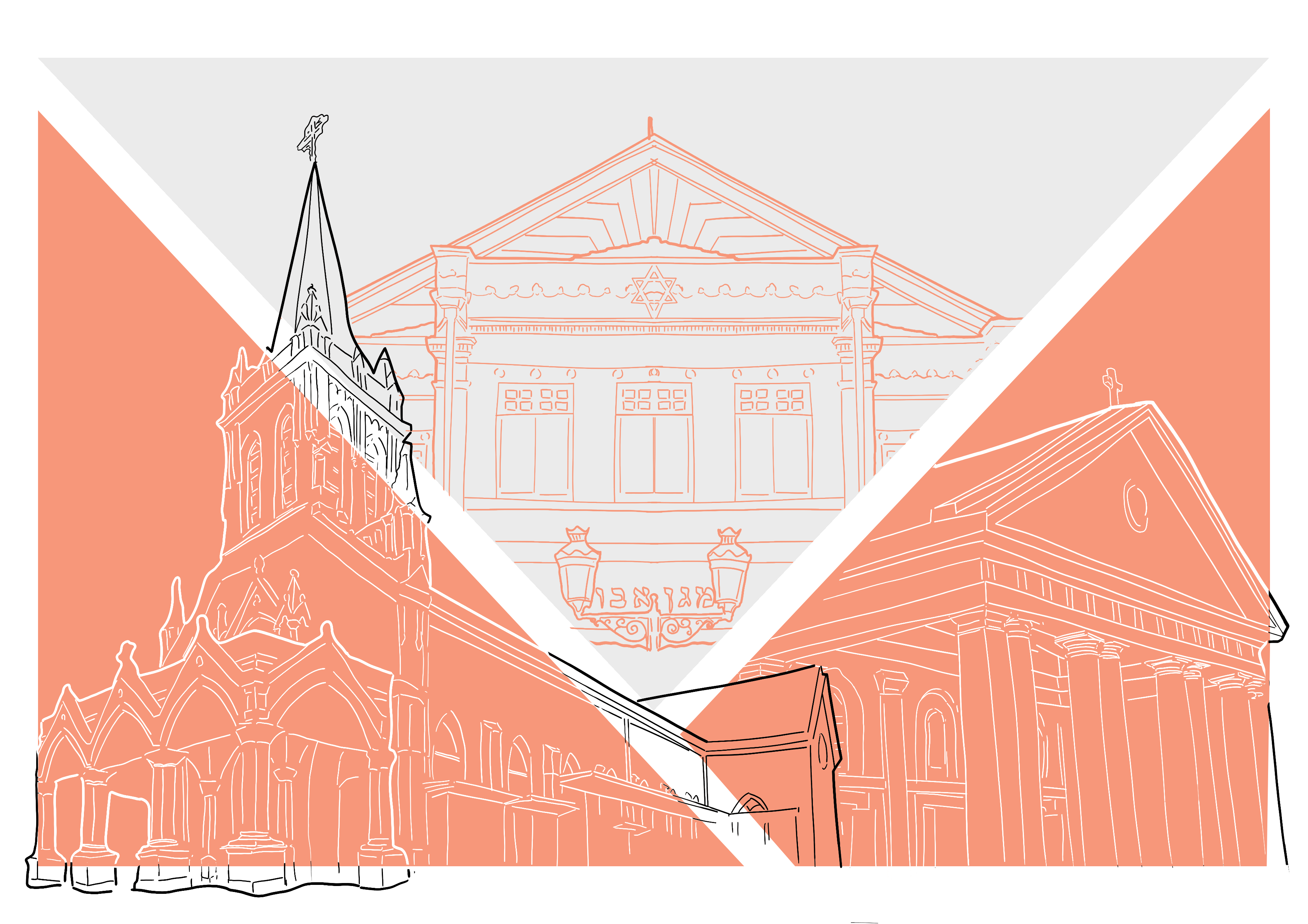
I decided to put the Hindu and Buddhist gods together, and the Jewish and Catholic ones together.
I.e. The Hindu and Buddhist gods, Sri Krishna and Goddess Guan Yin will be travelling past the Jewish Synagogue and Catholic Churches, past to the middle of the Zine with places of the arts, to get to their own place of worship. Likewise, the Catholic and Jewish God/Saint will be travelling past the Buddhist and Hindu temples, past to the middle, to get to their own place of worship.
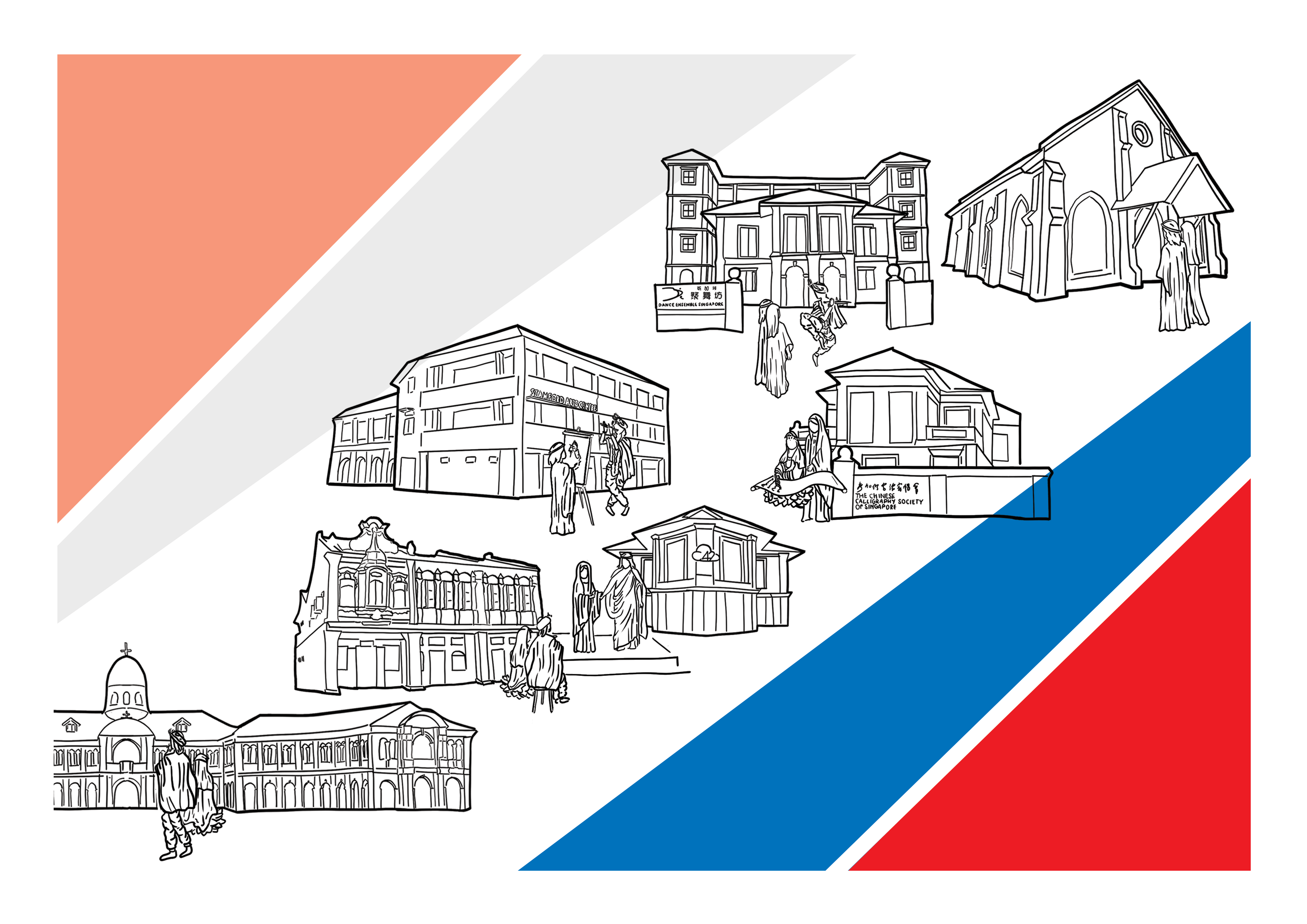
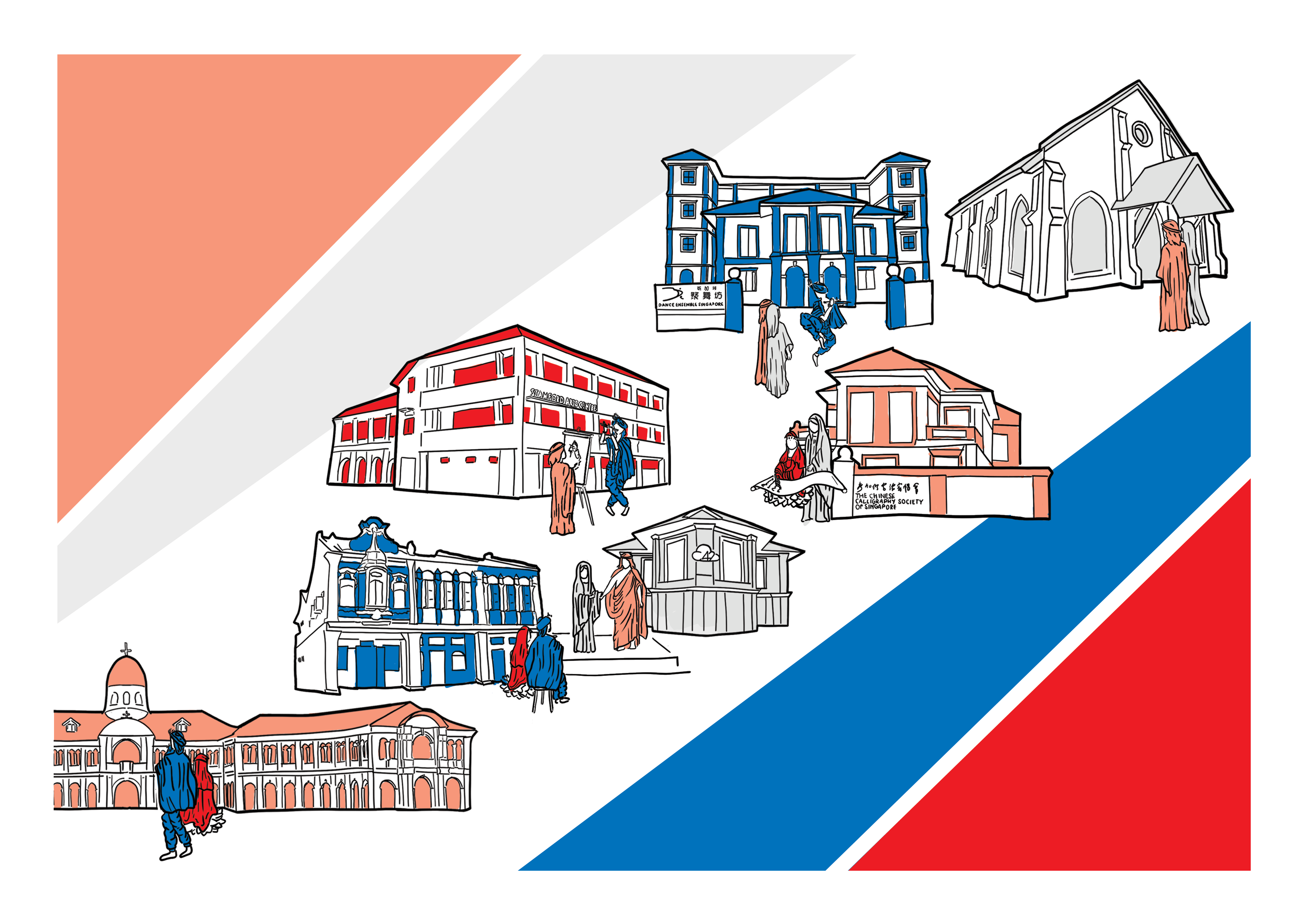
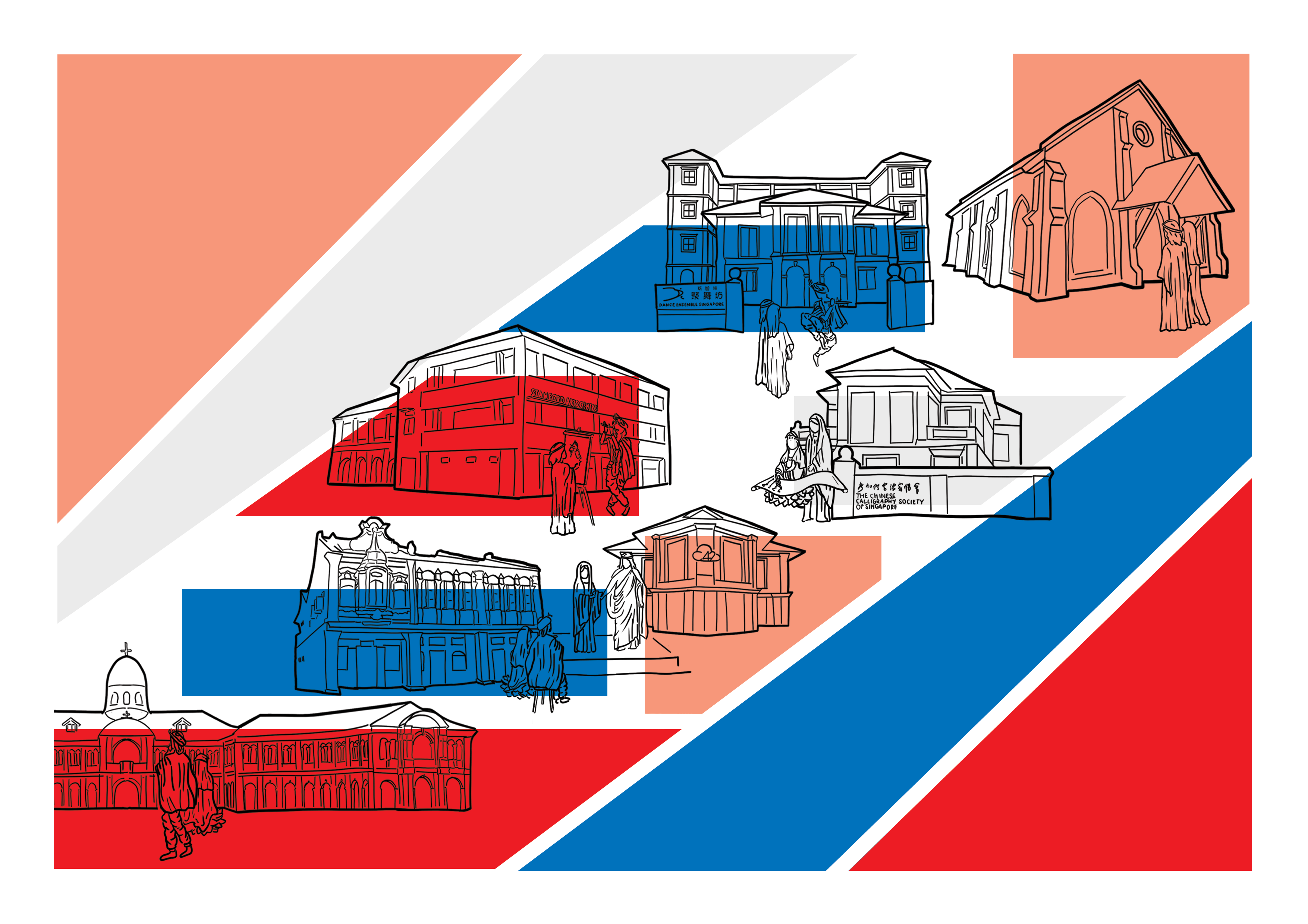
I initially wanted to do a photo collage, however, after trying it out, I decided and it was also suggested that I switch entirely to illustrations instead. I had drawn my cover pages already, and it had been in line art, with a geometric shape. This hence became the style of my entire zine.
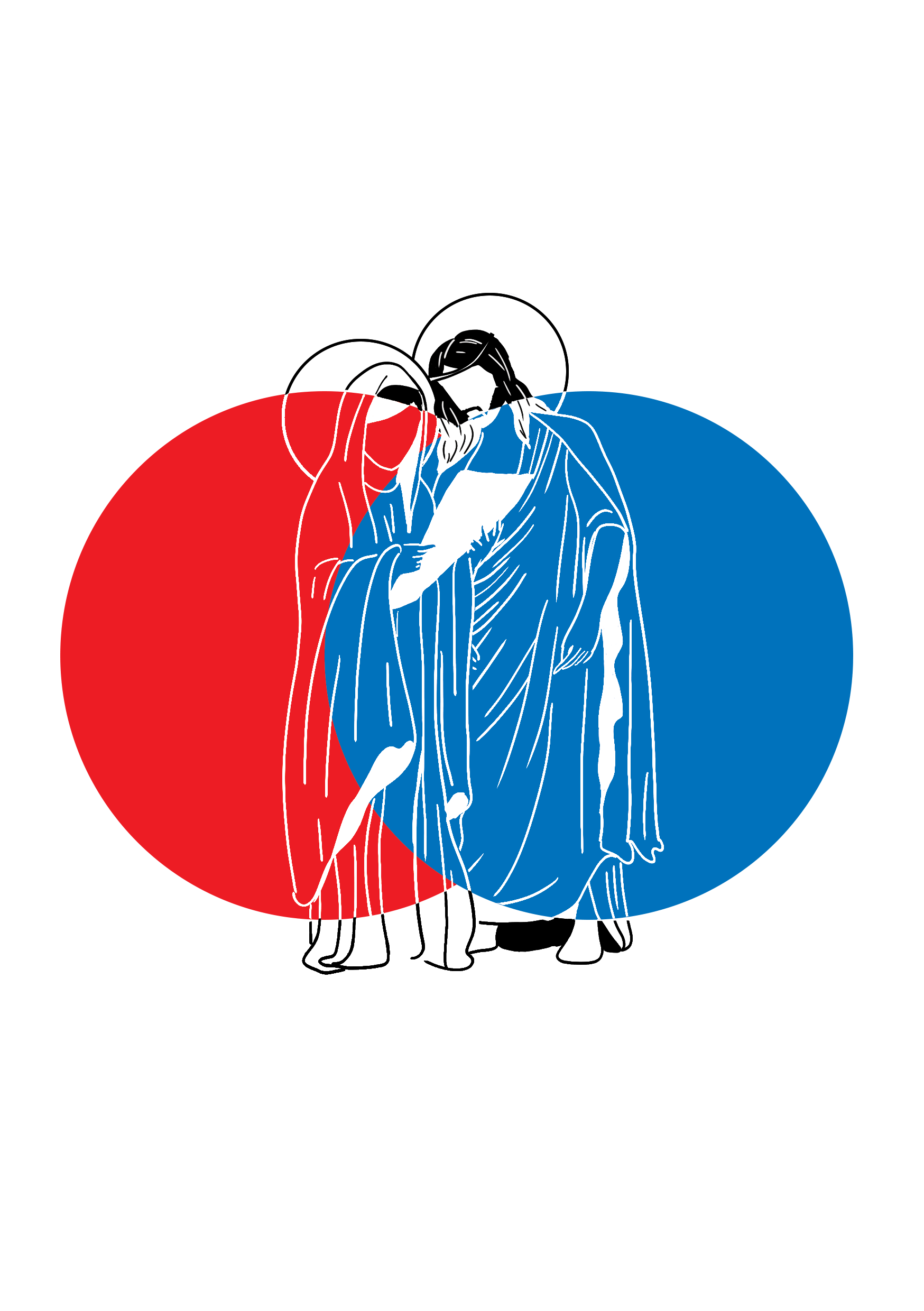
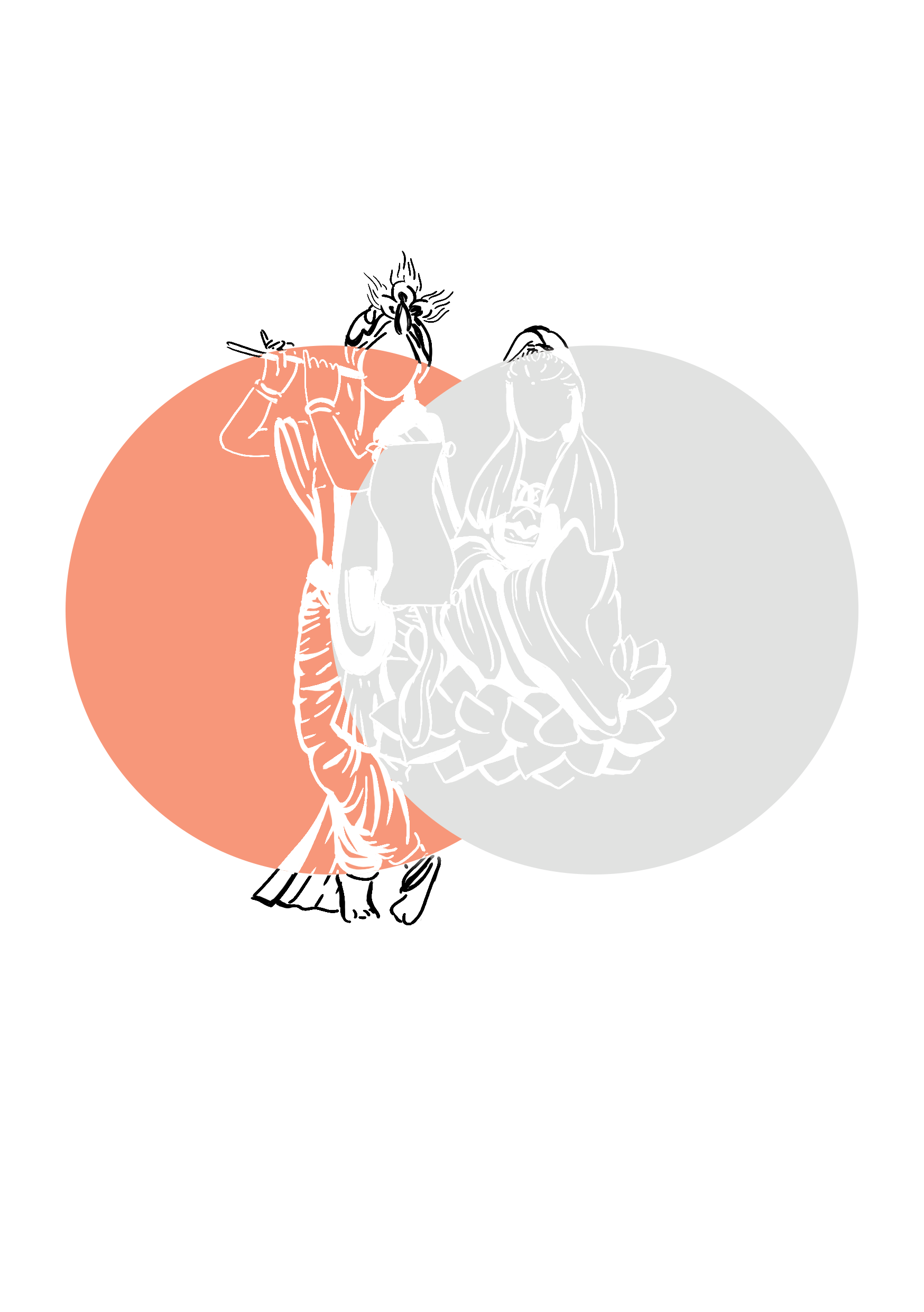
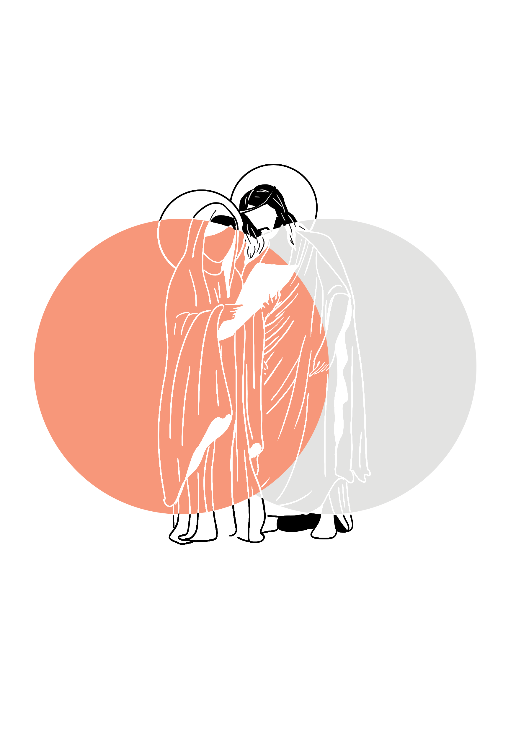
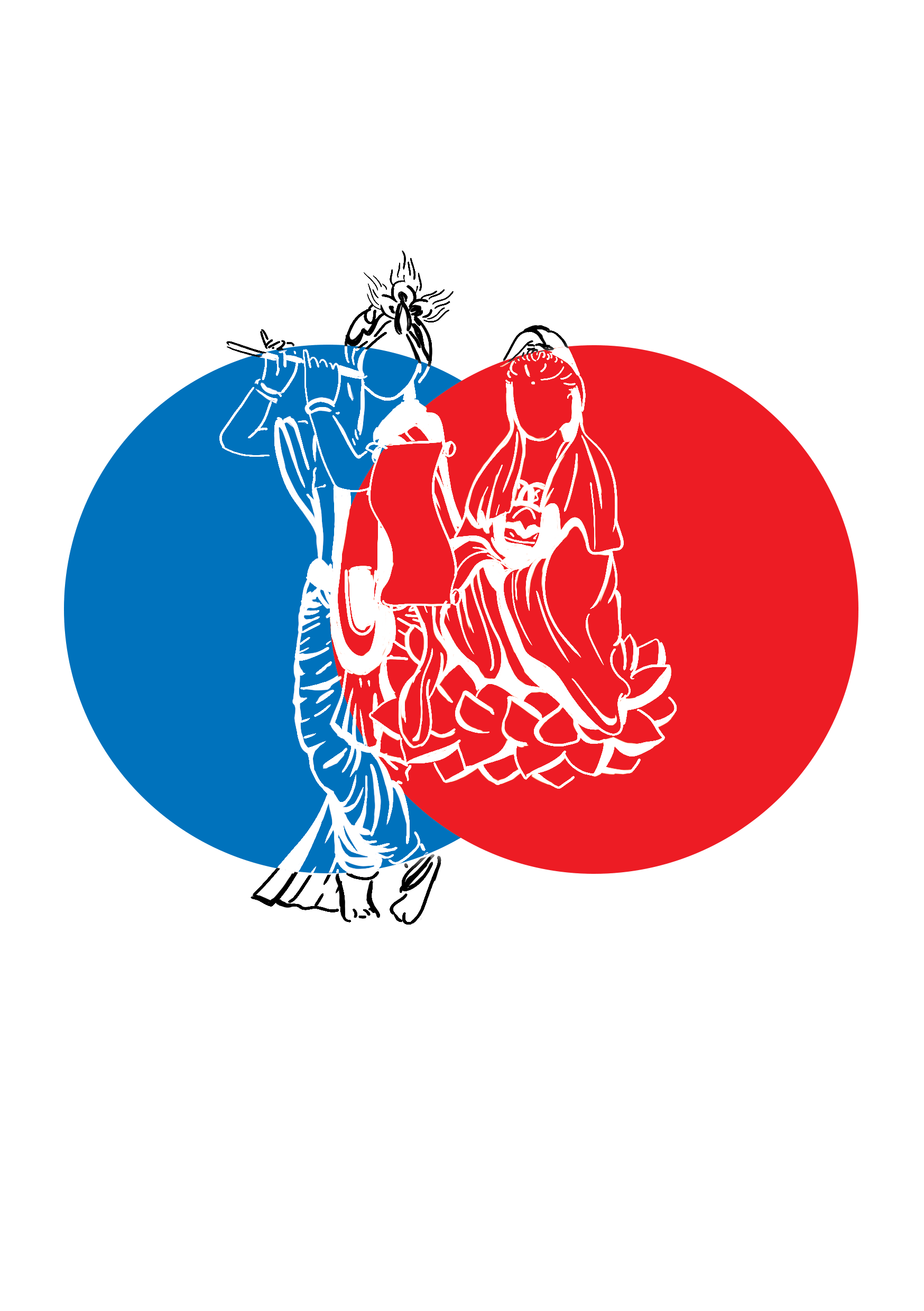
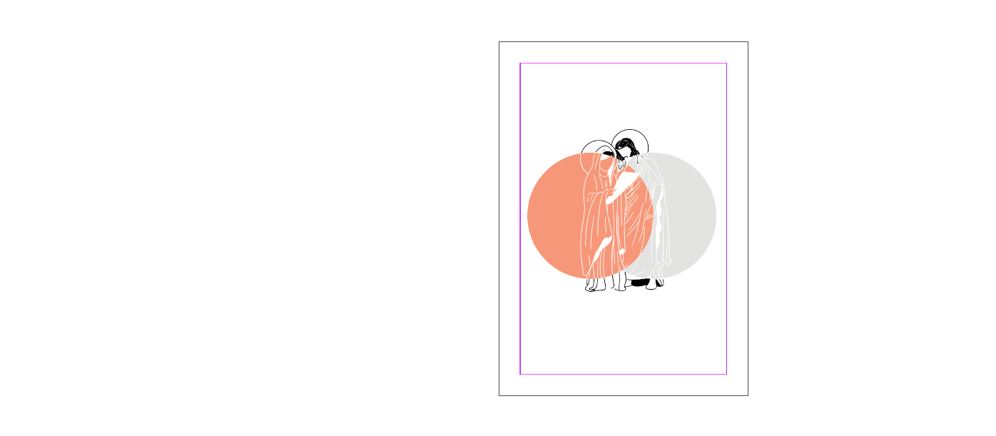
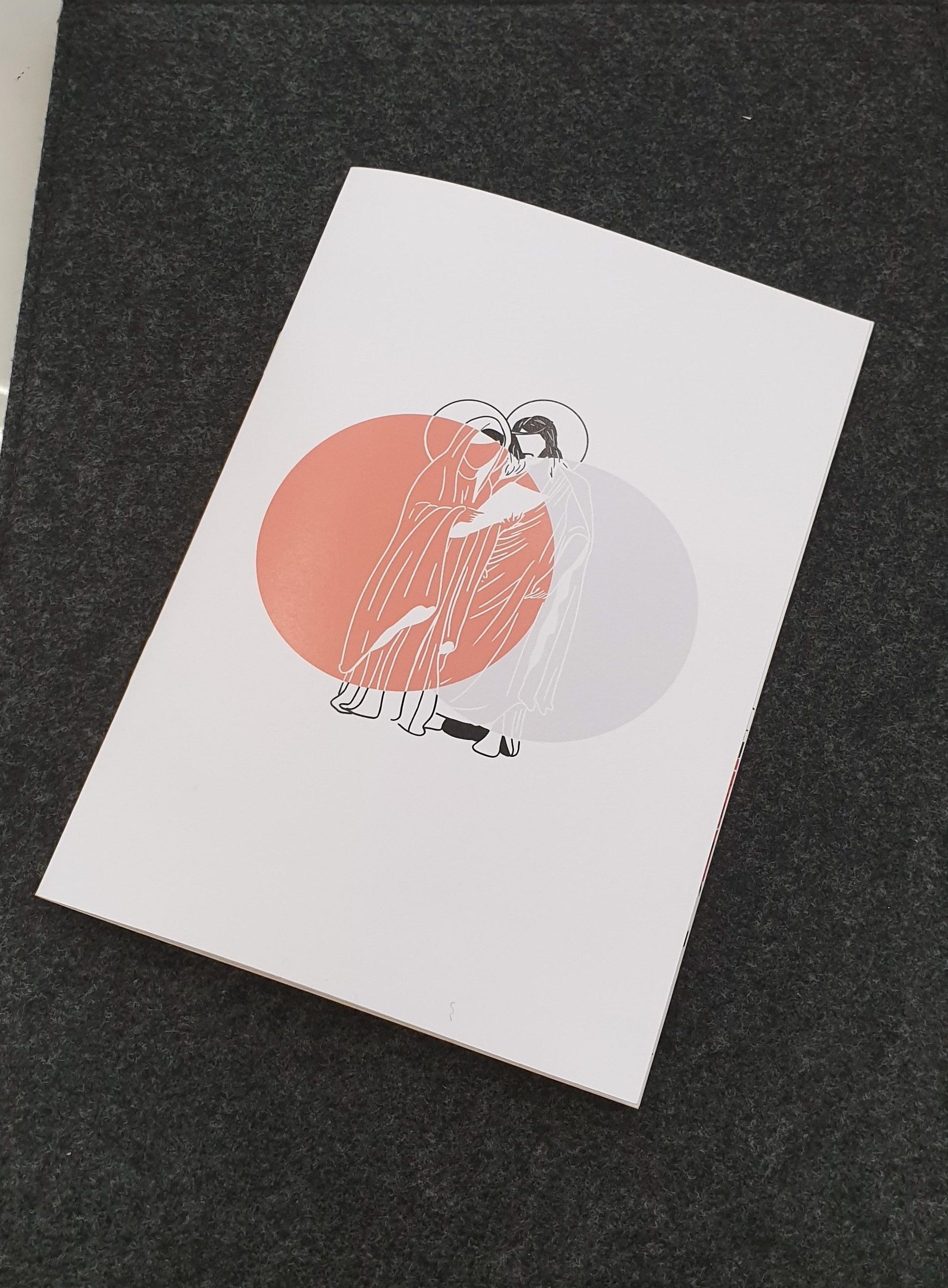
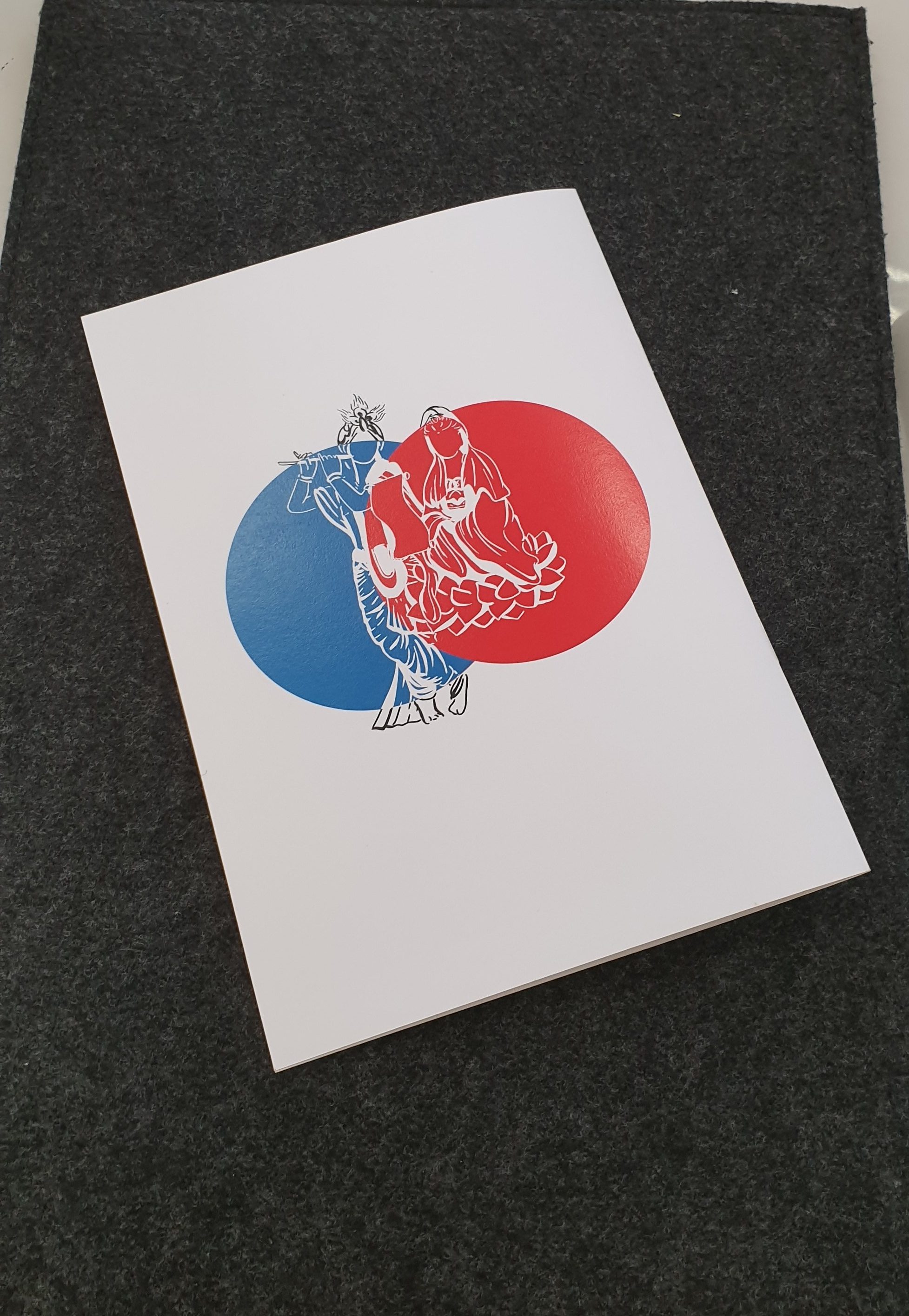
Below is Mother Mary & Jesus, and Sri Krishna and Goddess Guan Yin.
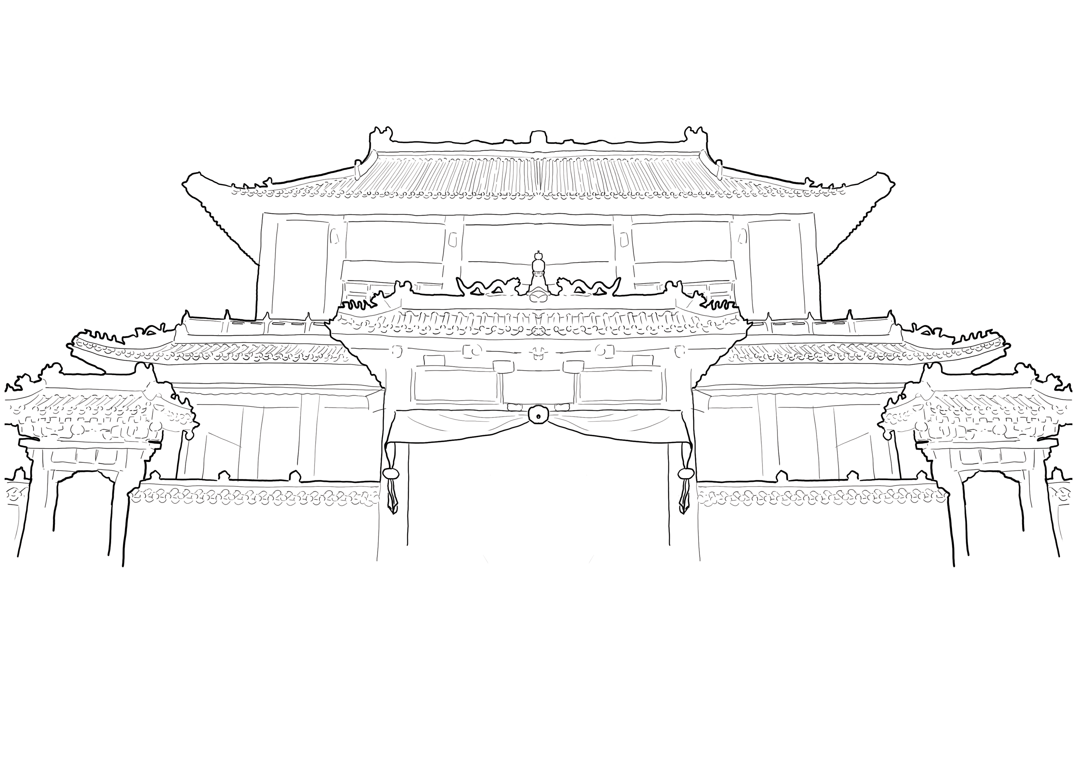
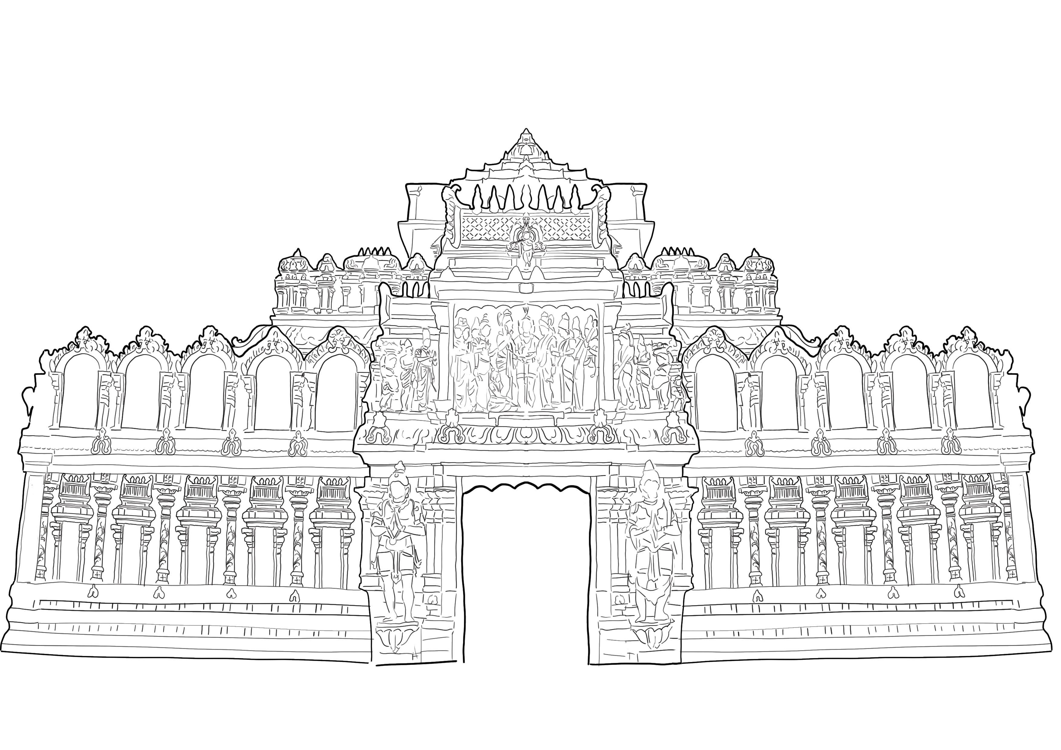
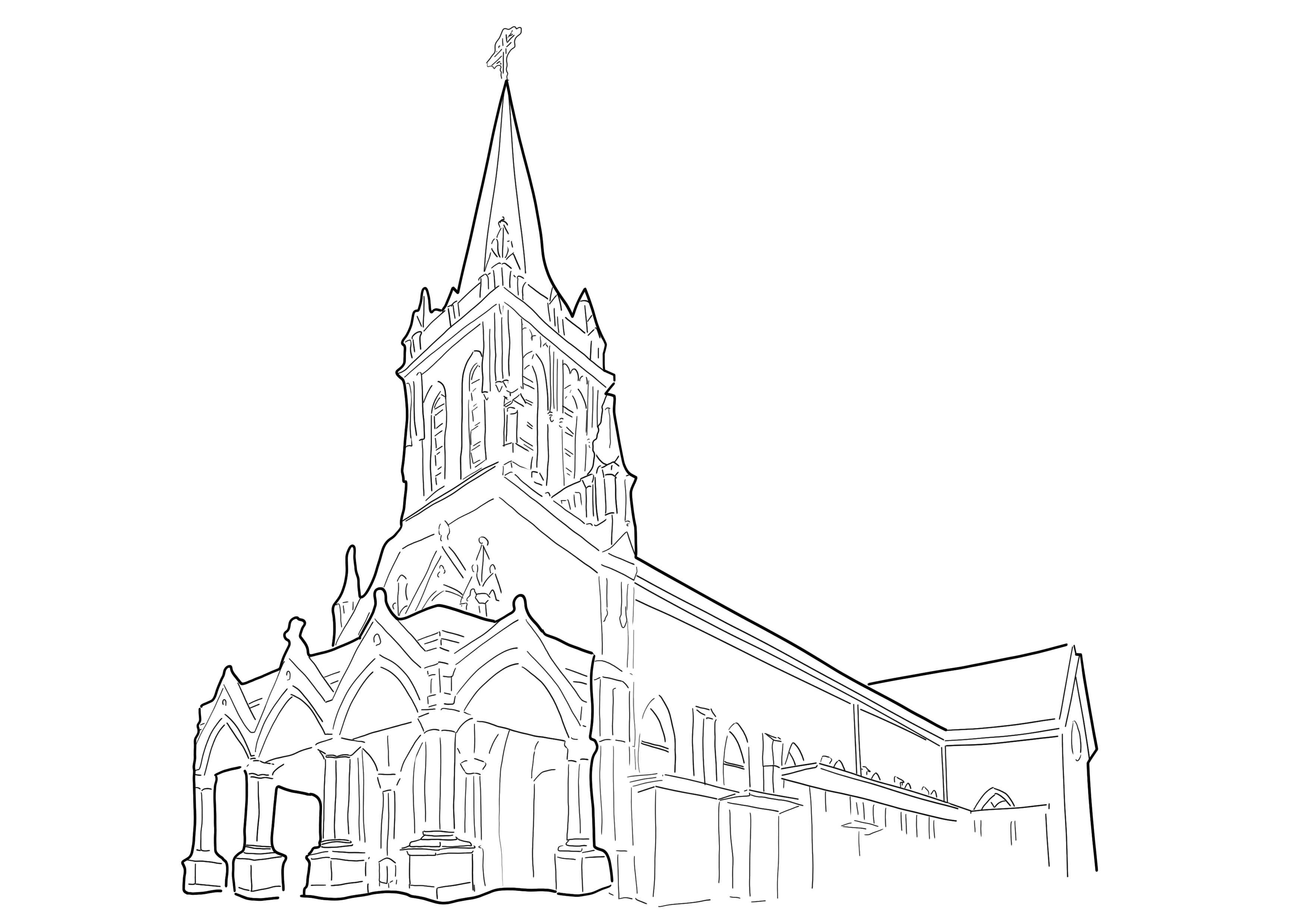
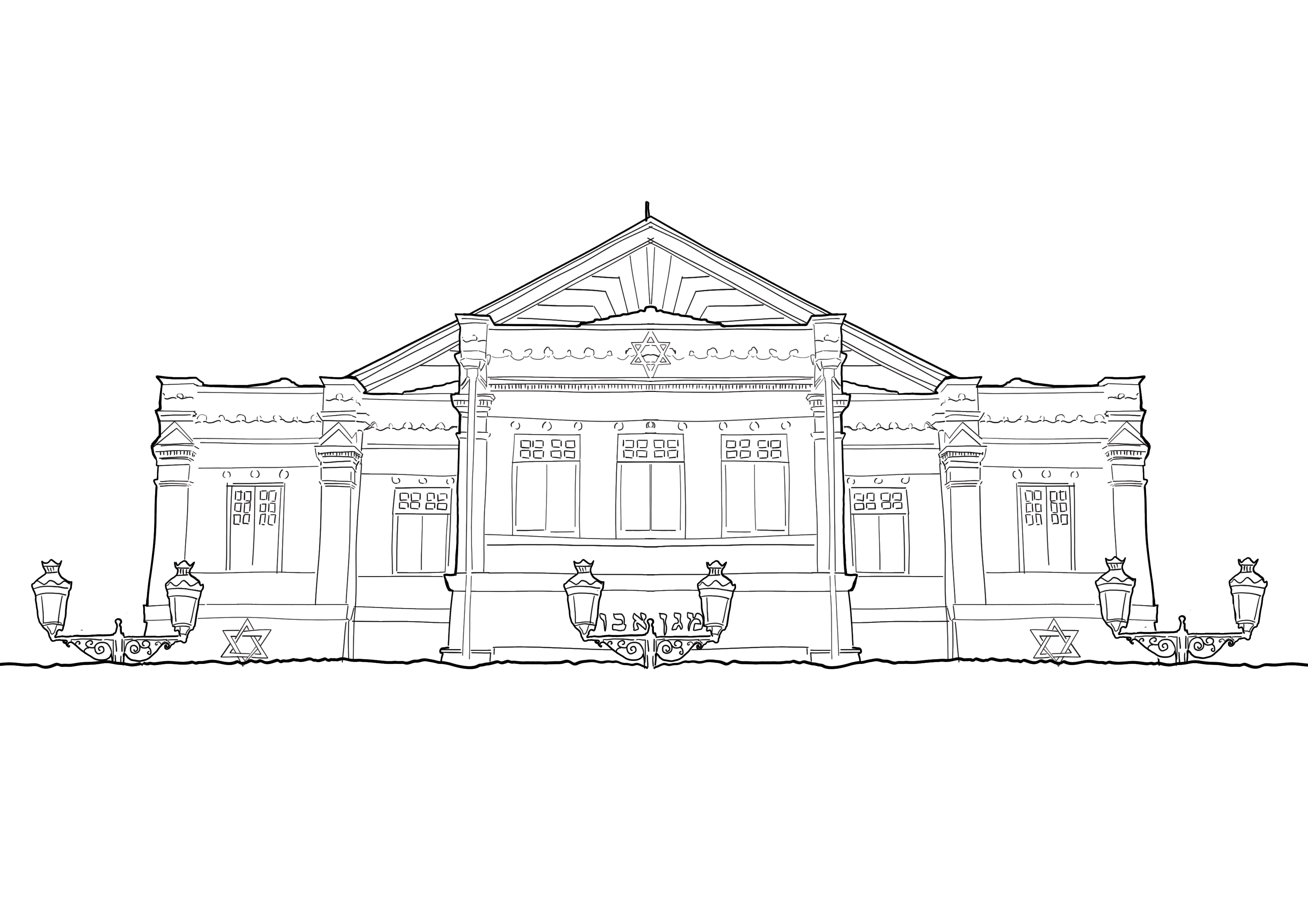
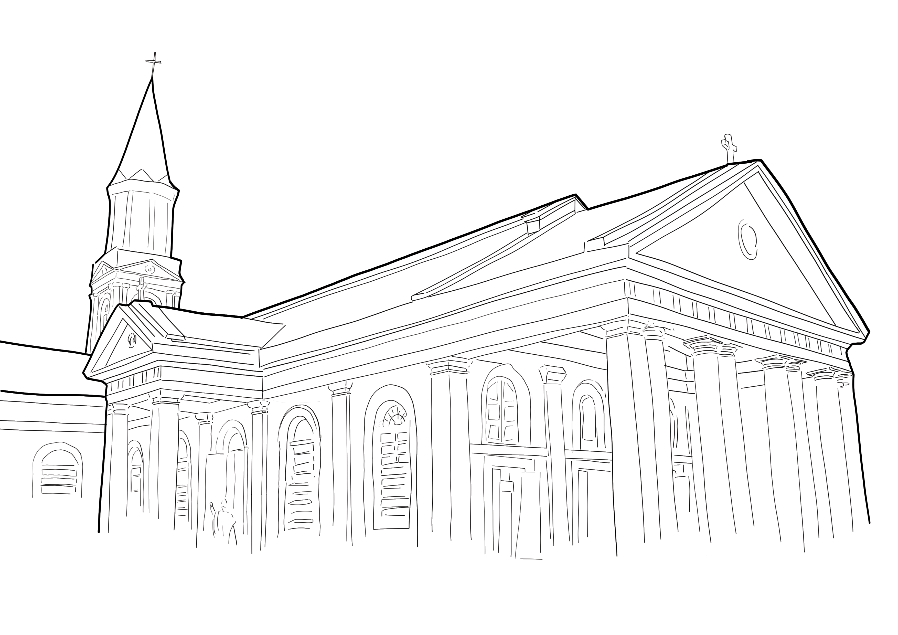
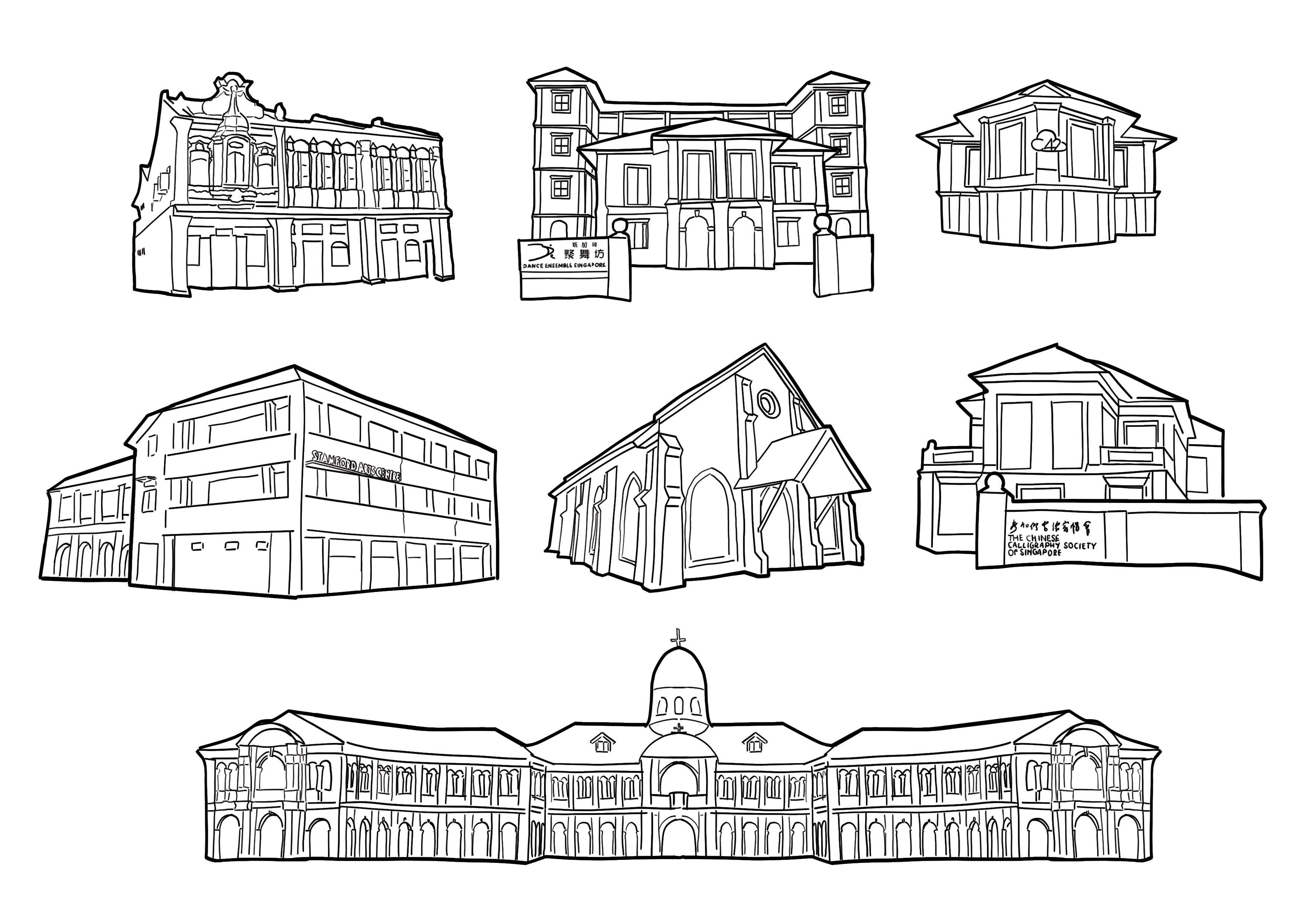
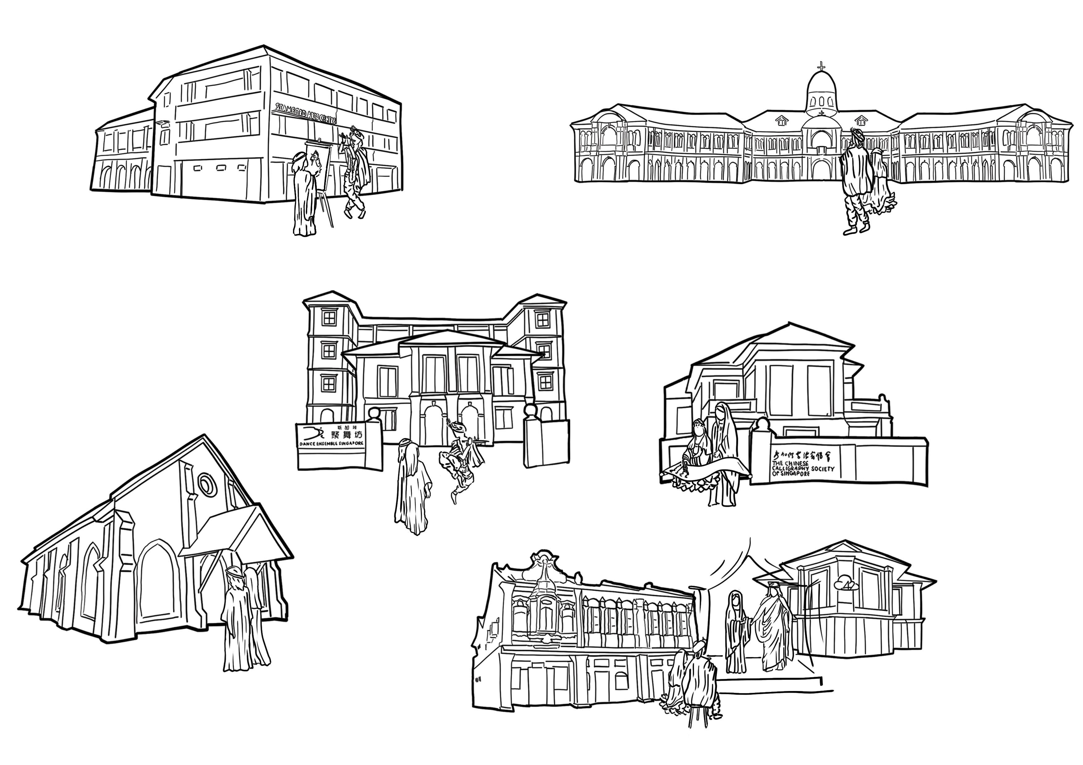
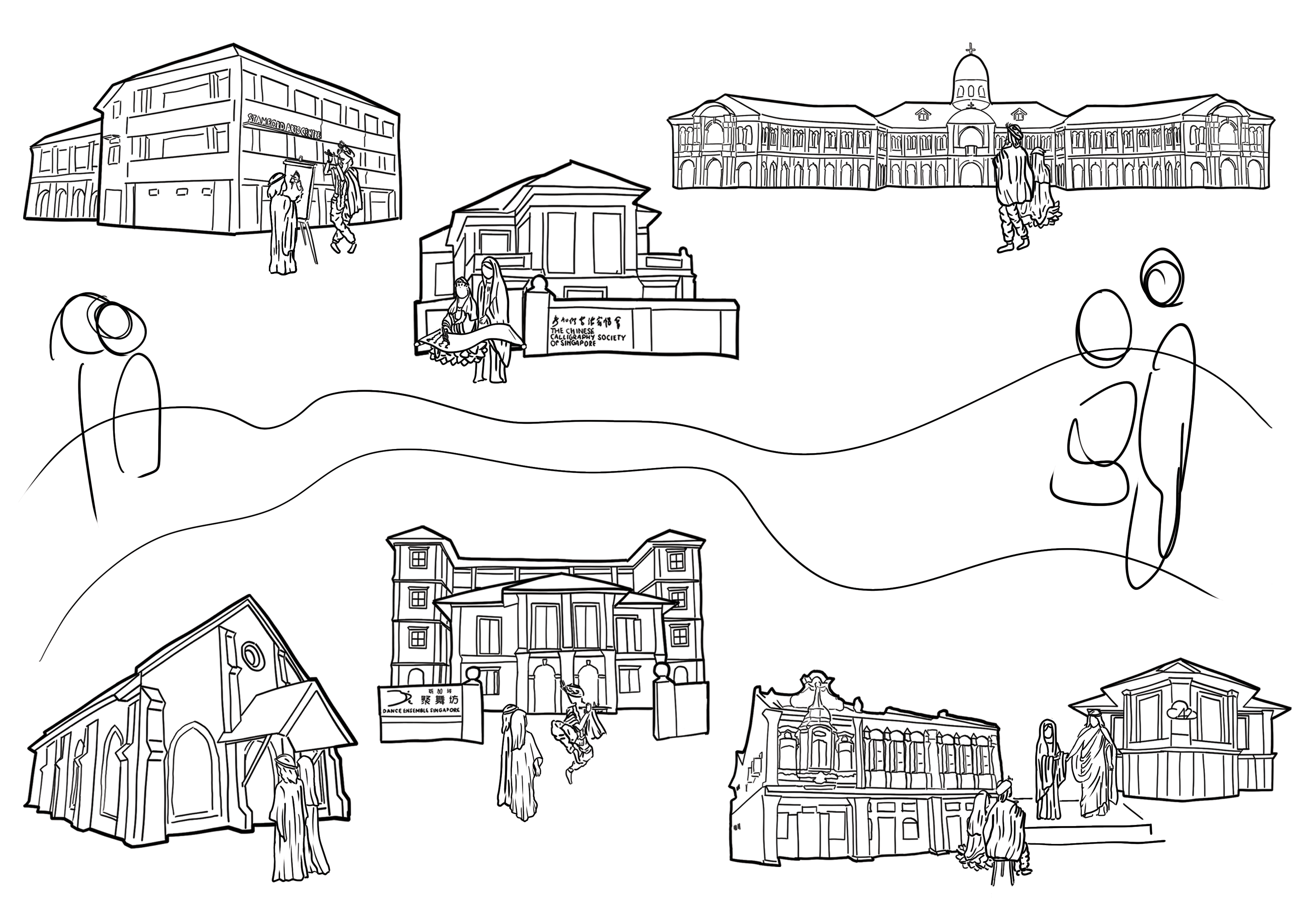
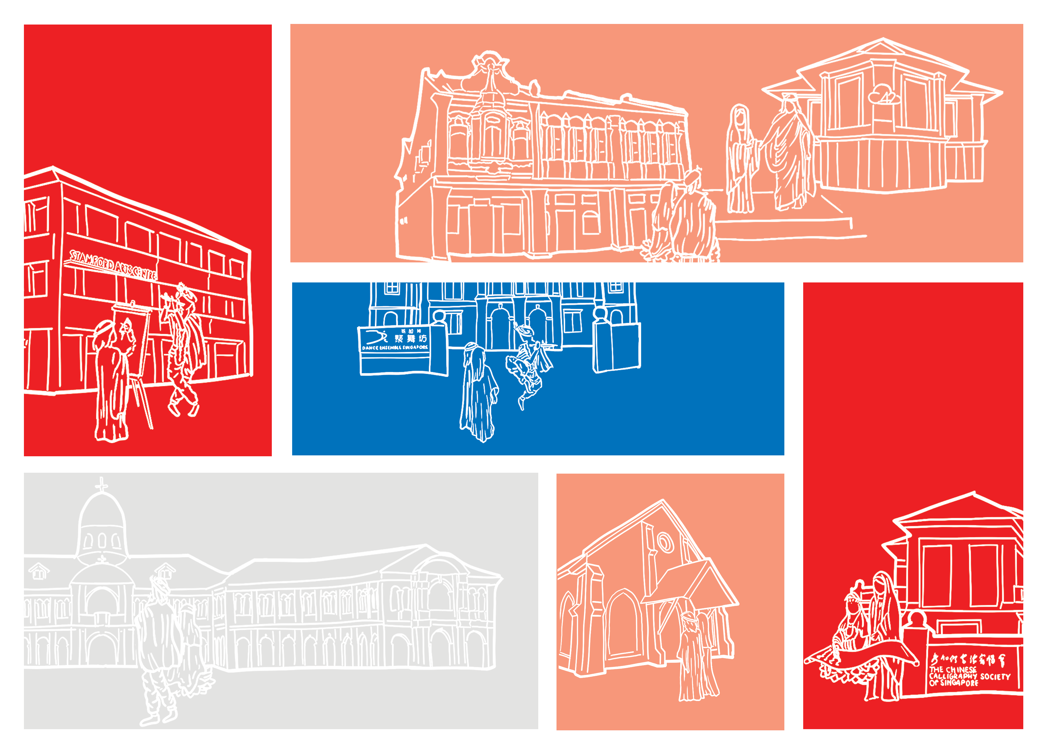
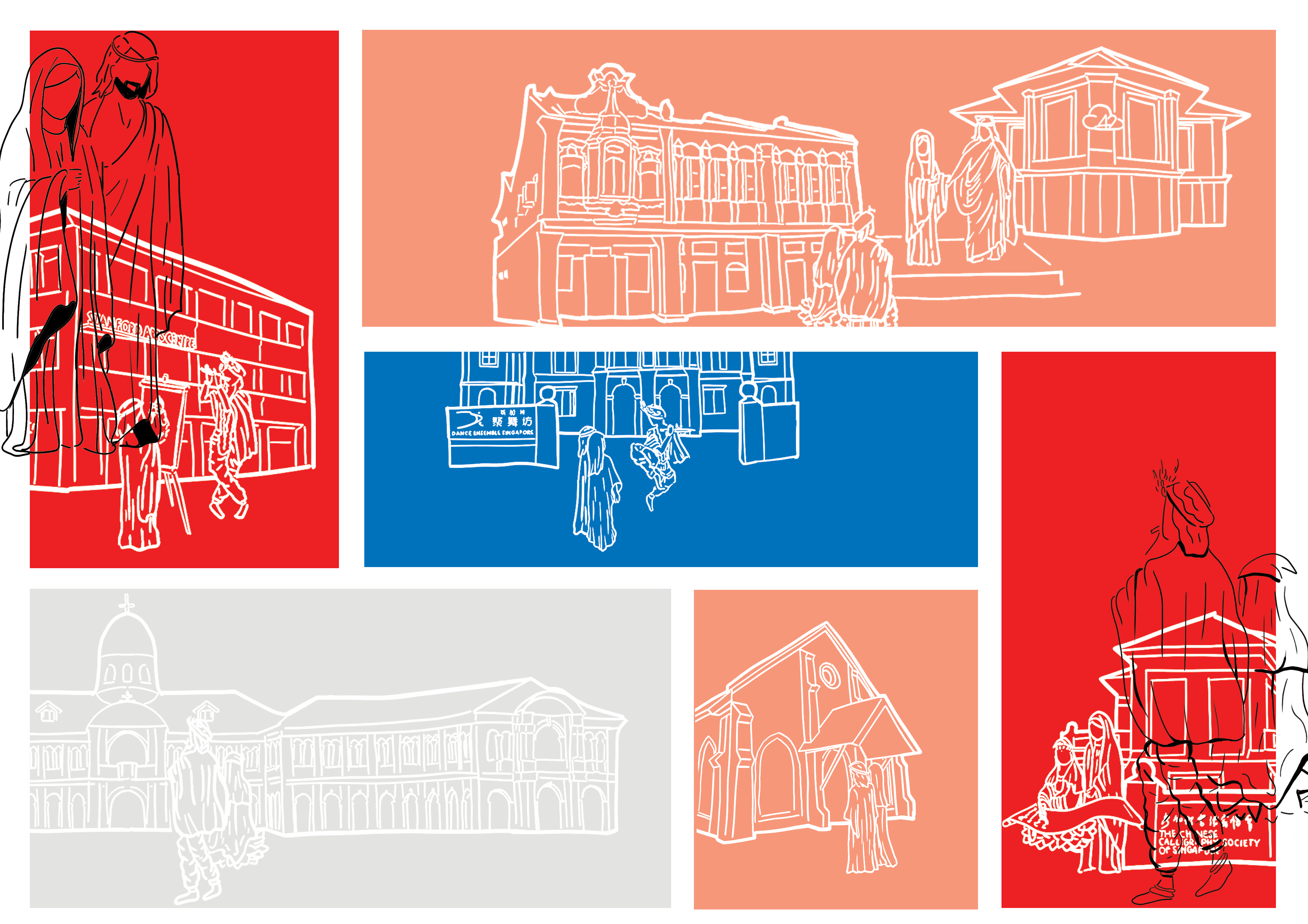
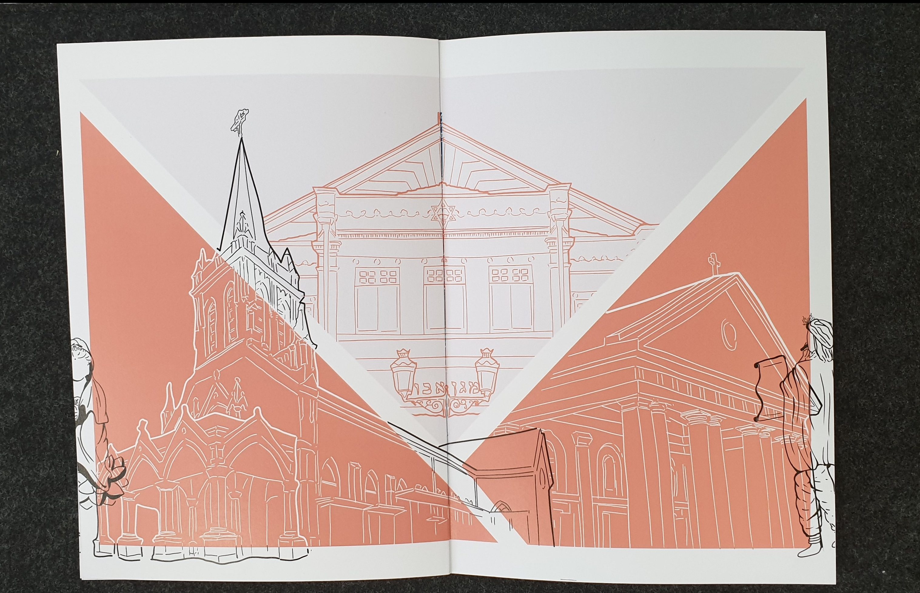
Following this style, I did the line arts for all the places of worship, showing their architectural features.
The above are:
- Kwan Im Thong Hood Cho Temple
- Sri Krishnan Temple
- Church of Saints Peter & Paul
- Maghain Aboth Synagogue
- Church of the Good Shepherd
Spread 1
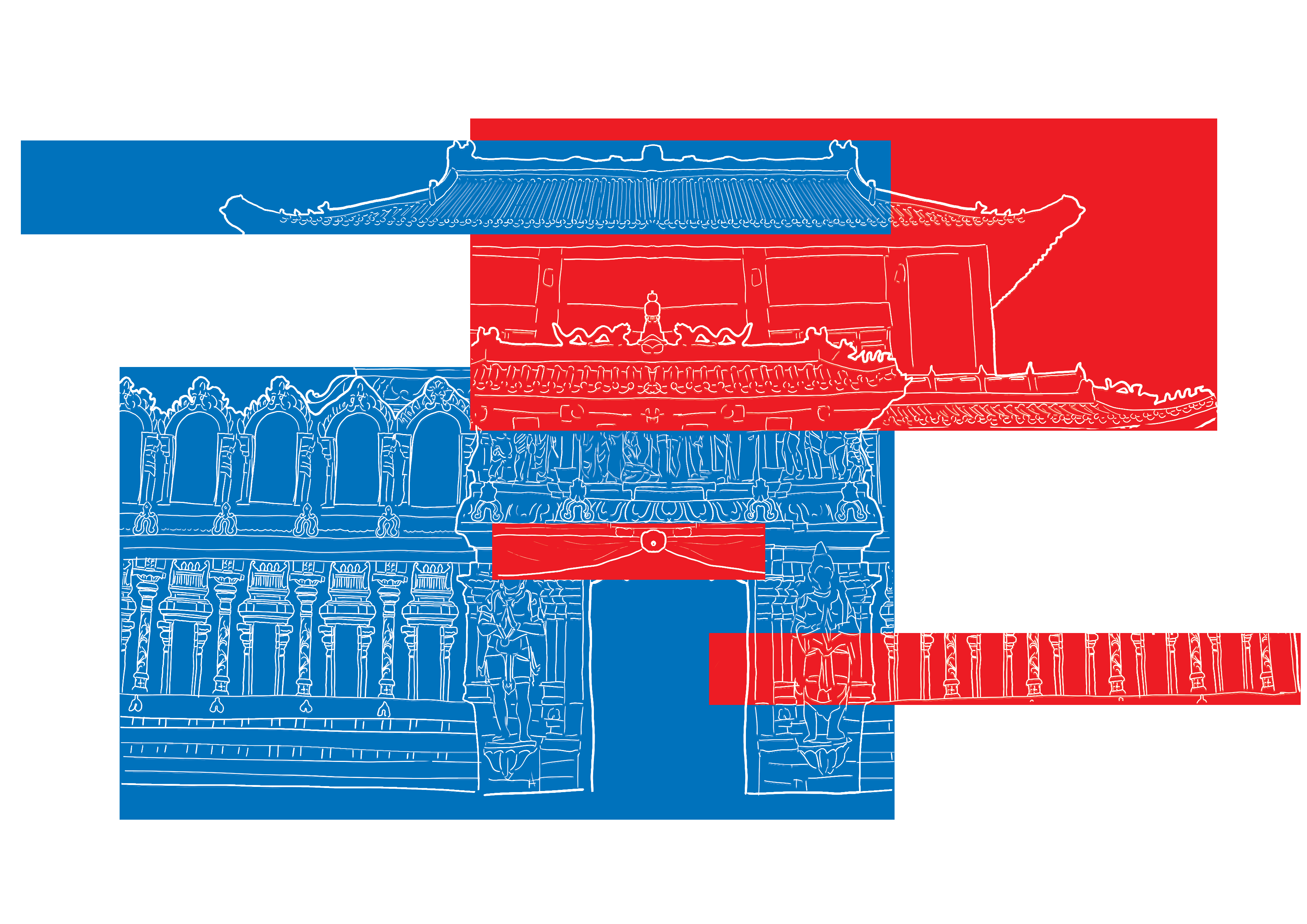
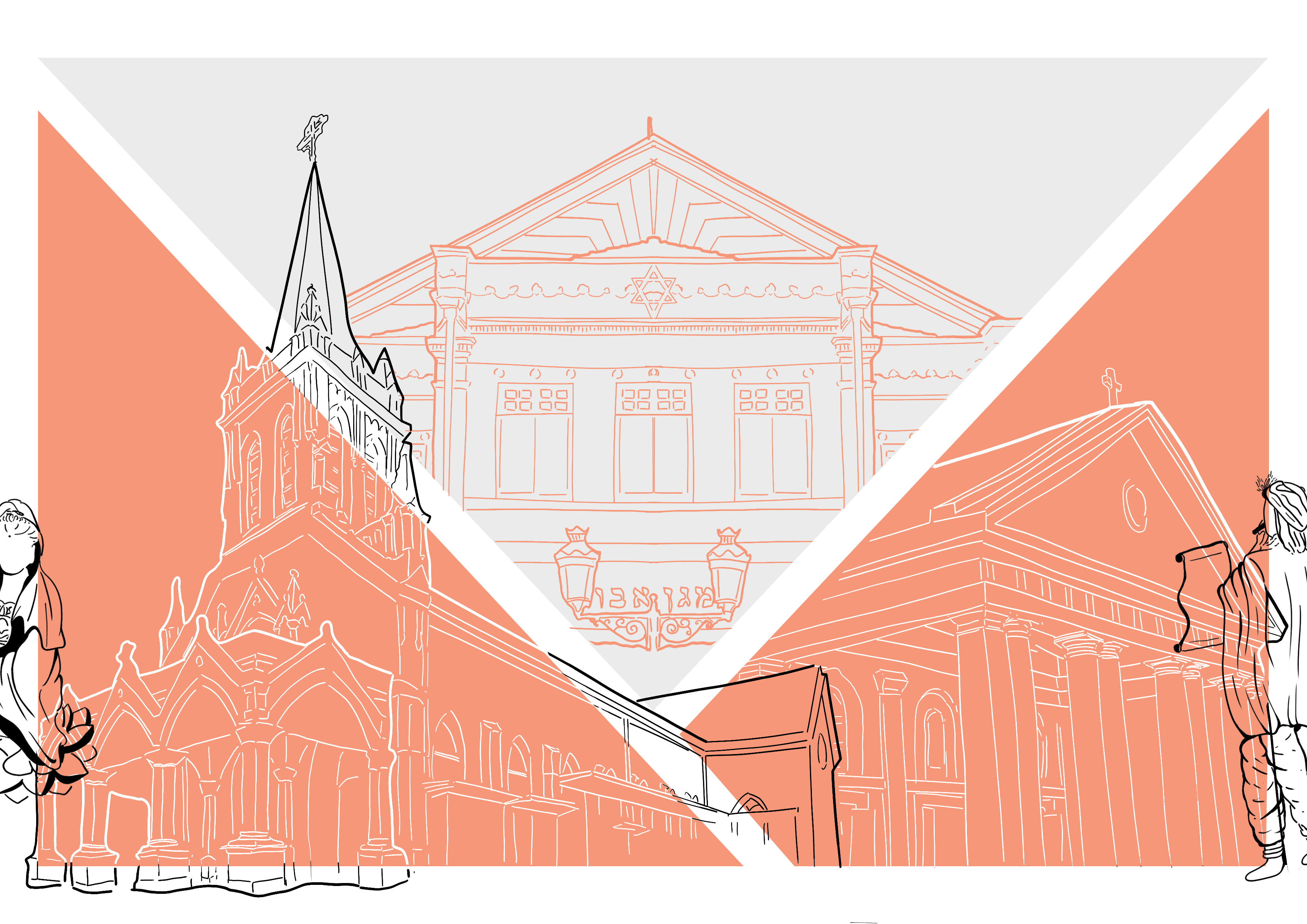
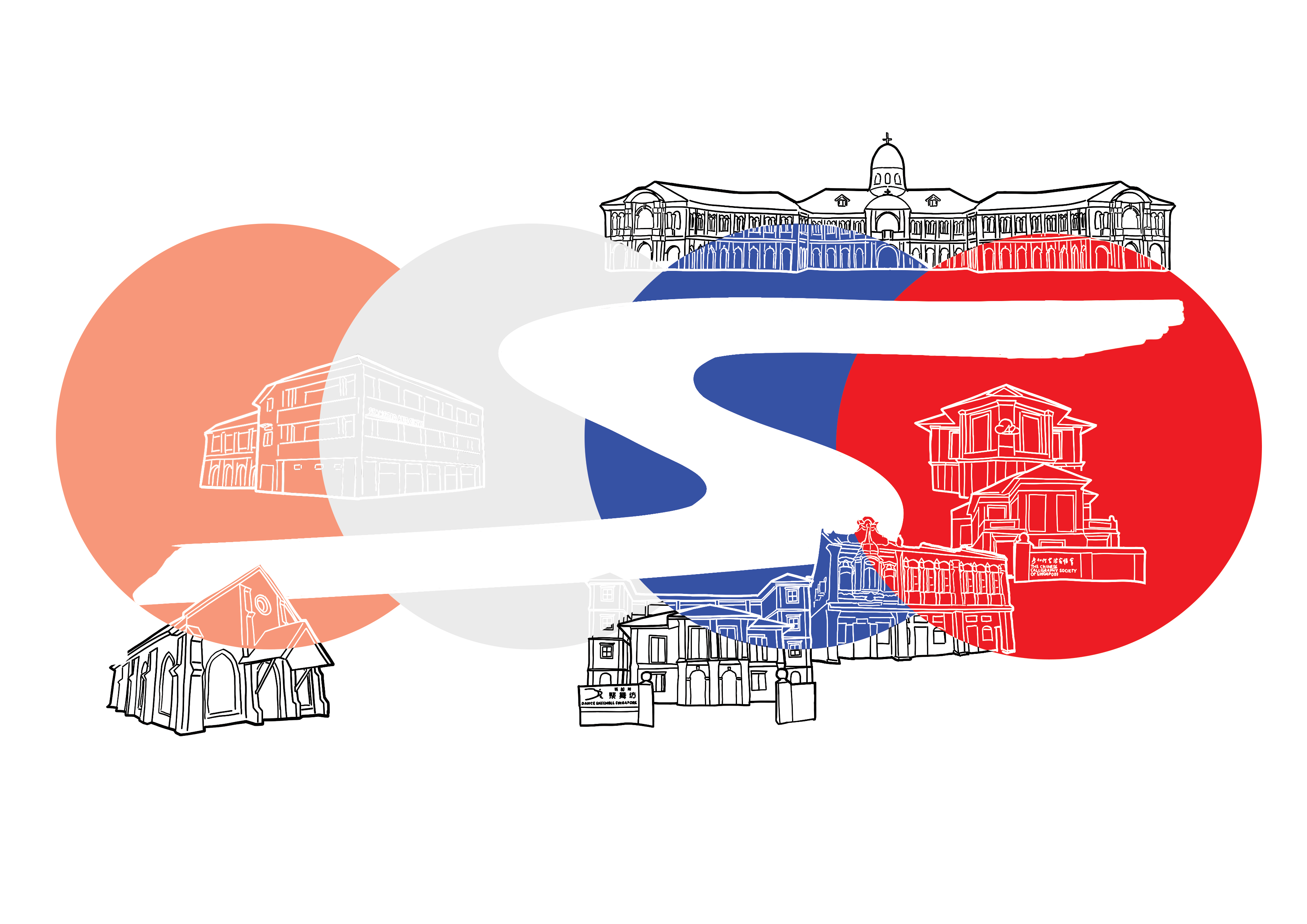
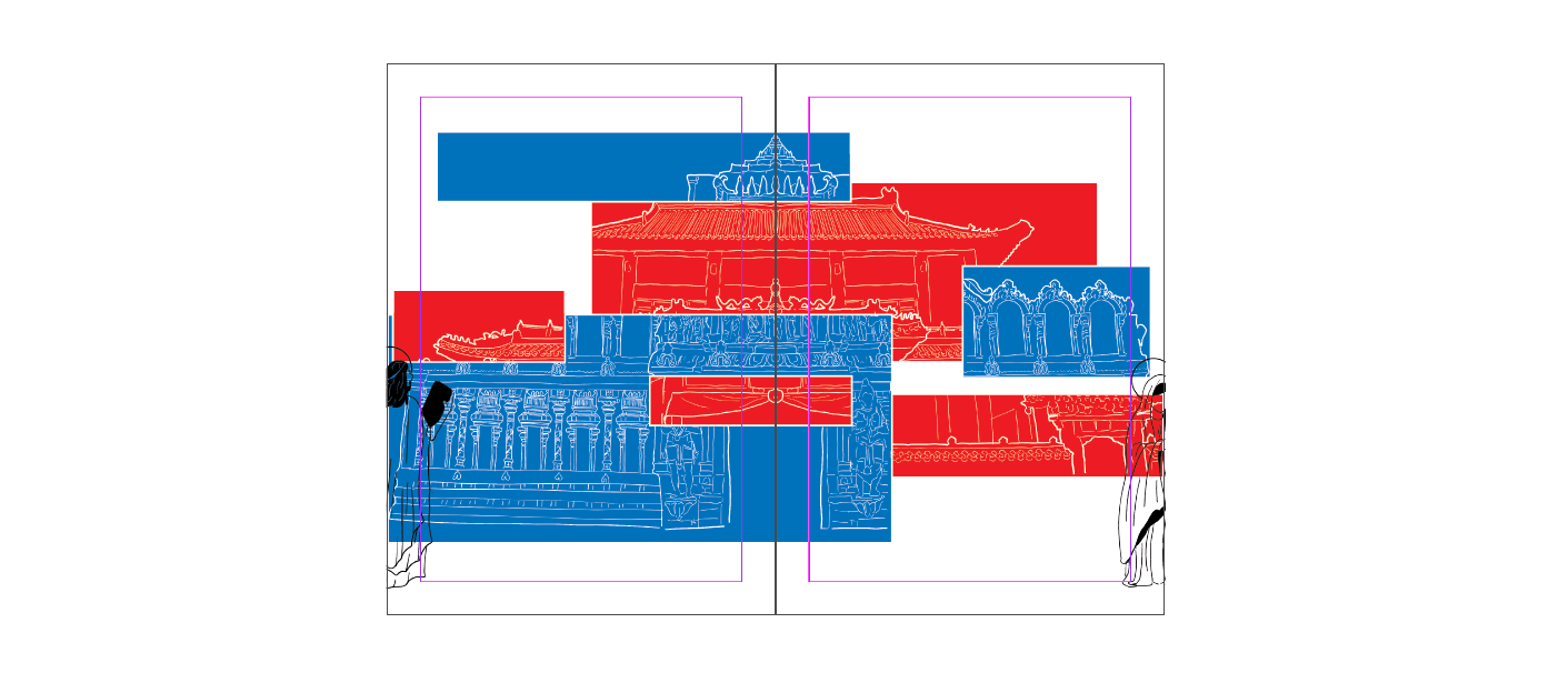
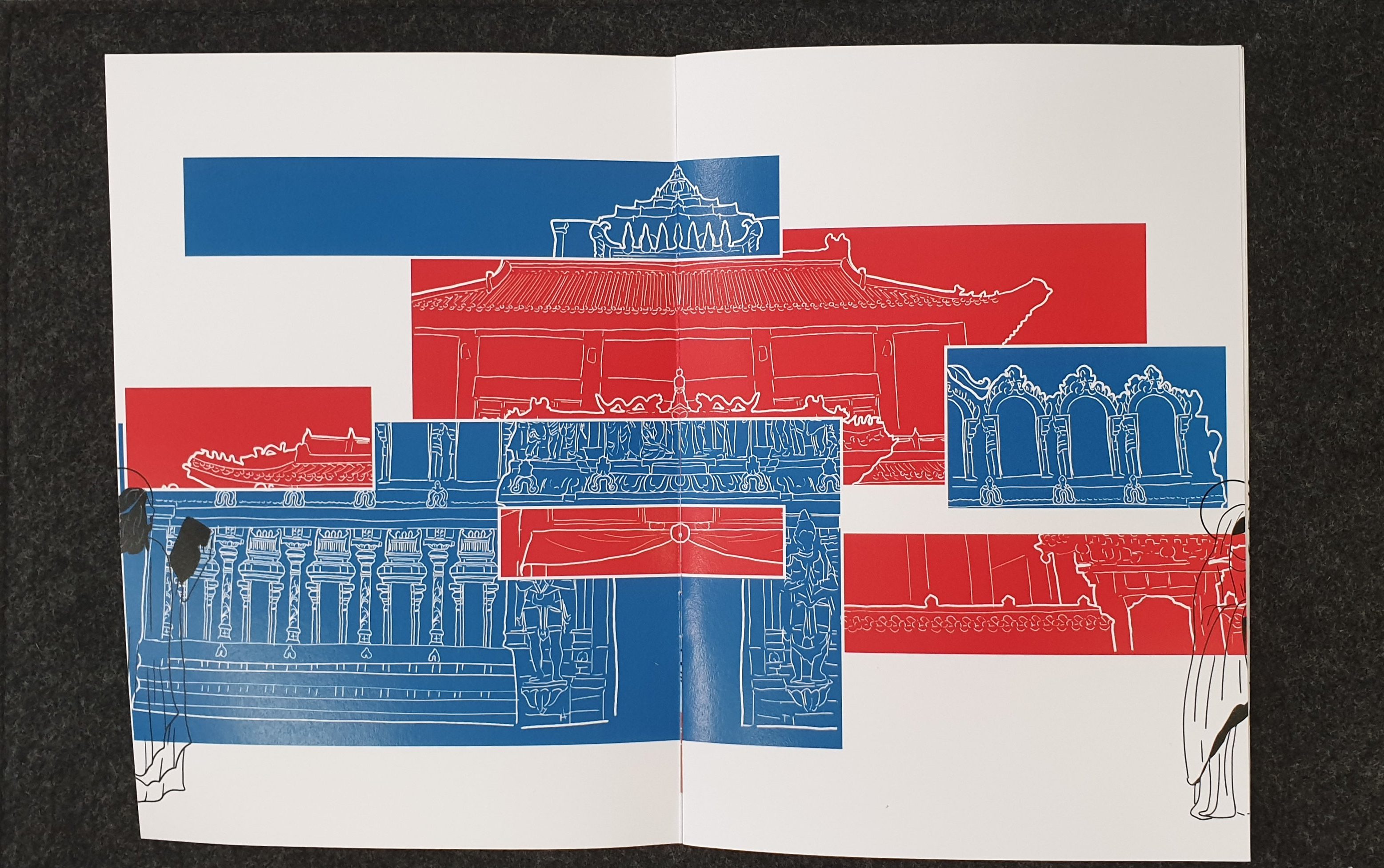
The Buddhist and Hindu temple had mainly rectangular shapes and thus, I decided to use rectangles to add colour in. Since the two temples had been greatly mixed and closely connected, with Buddhists praying to the Hindu temple, I wanted to show this mix through the use of intersecting parts.
The above was my initial design with the two temples joined and divided on a diagonal. The colours used are the colours of the architecture.
I soon received feedback that I should have proper reasoning for the colours of the squares that I had used, as the current design’s rectangles were randomly chosen.
Thus, I changed it such that the blues had been from the Hindu Temple and the reds were from the Buddhist Temple.
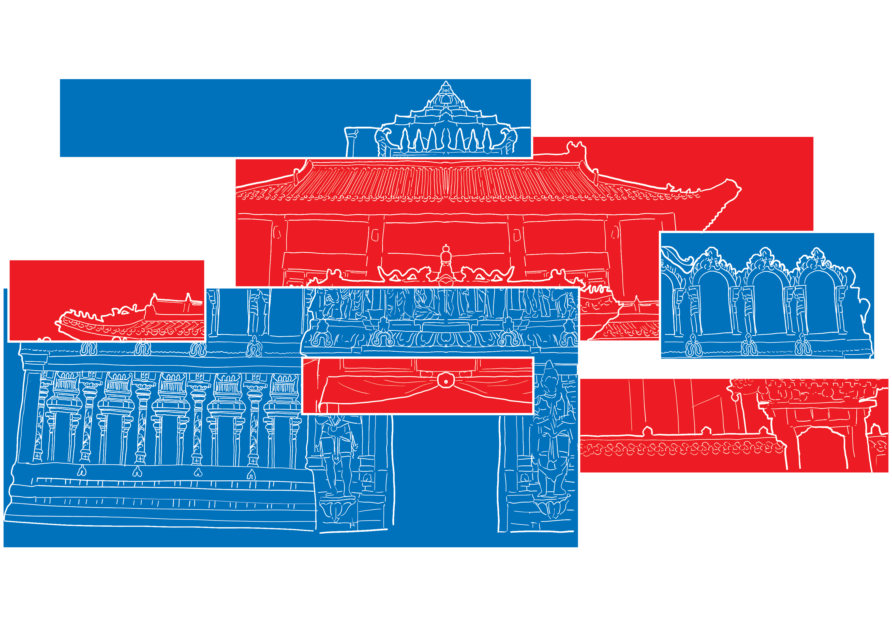
I also added white lines between the different rectangles to make it more obvious that the different colours had represented different places.
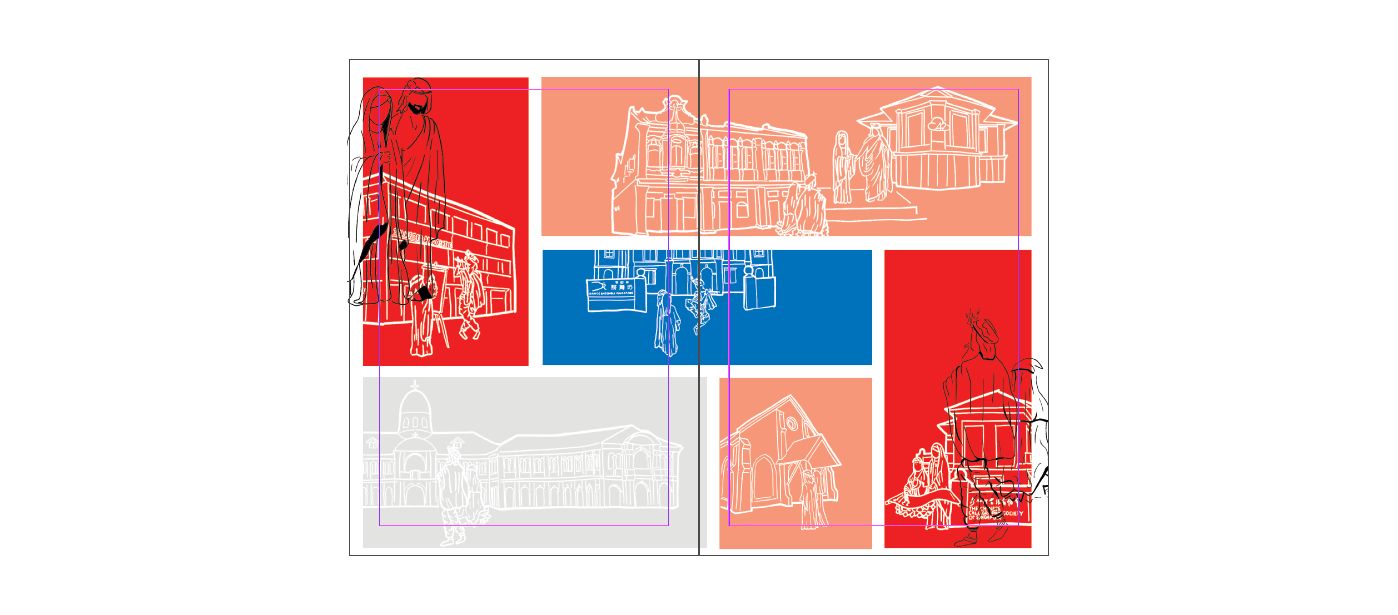
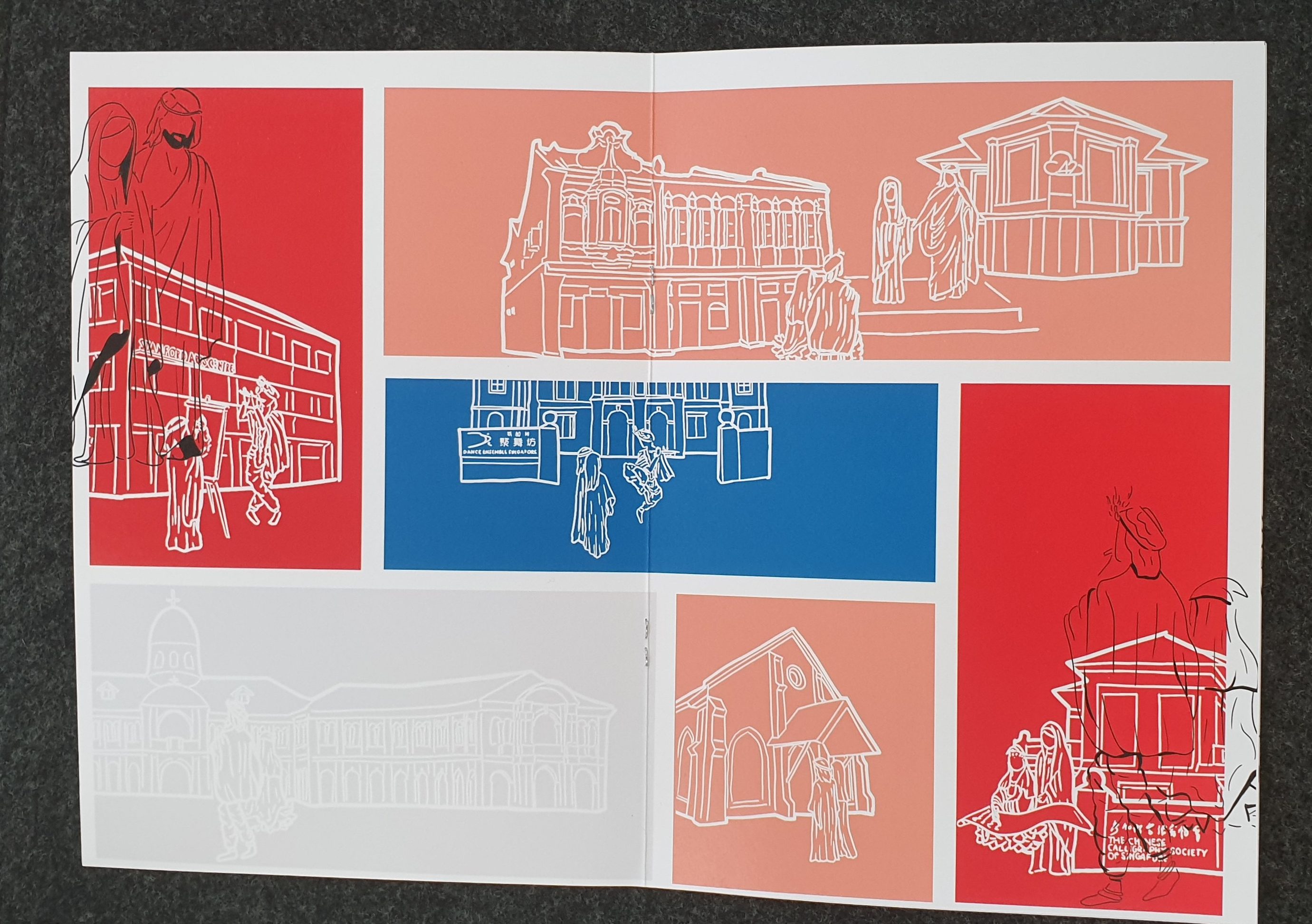
This was then repeated for the other spread which had the 3 other places of worship – the two churches and synagogue.
Since it was a journey, I decided that I had to add some sign or something to show the journey that the gods were taking. I initially wanted the gods to do something more, like interact with the place or enter the place of worship, but then felt perhaps that would be crossing the line beyond interfaith into syncretism – something some might be less open to.
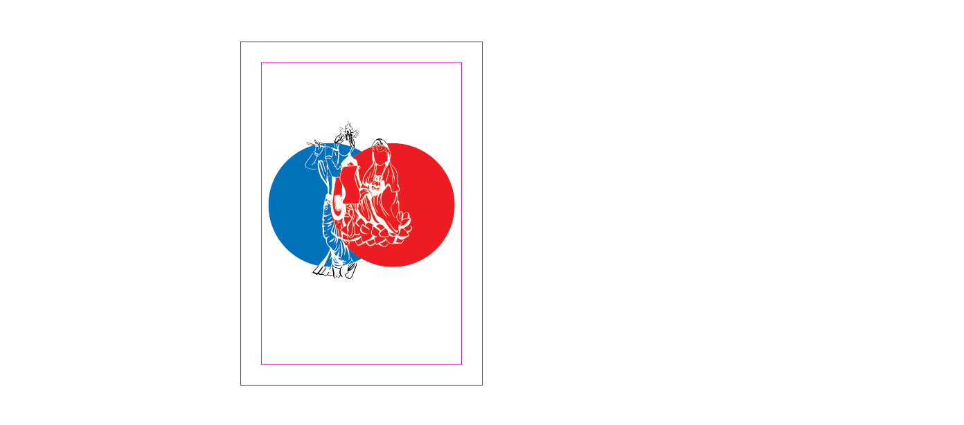
Thus I experimented and initially tried one with the gods and saints just floating about.
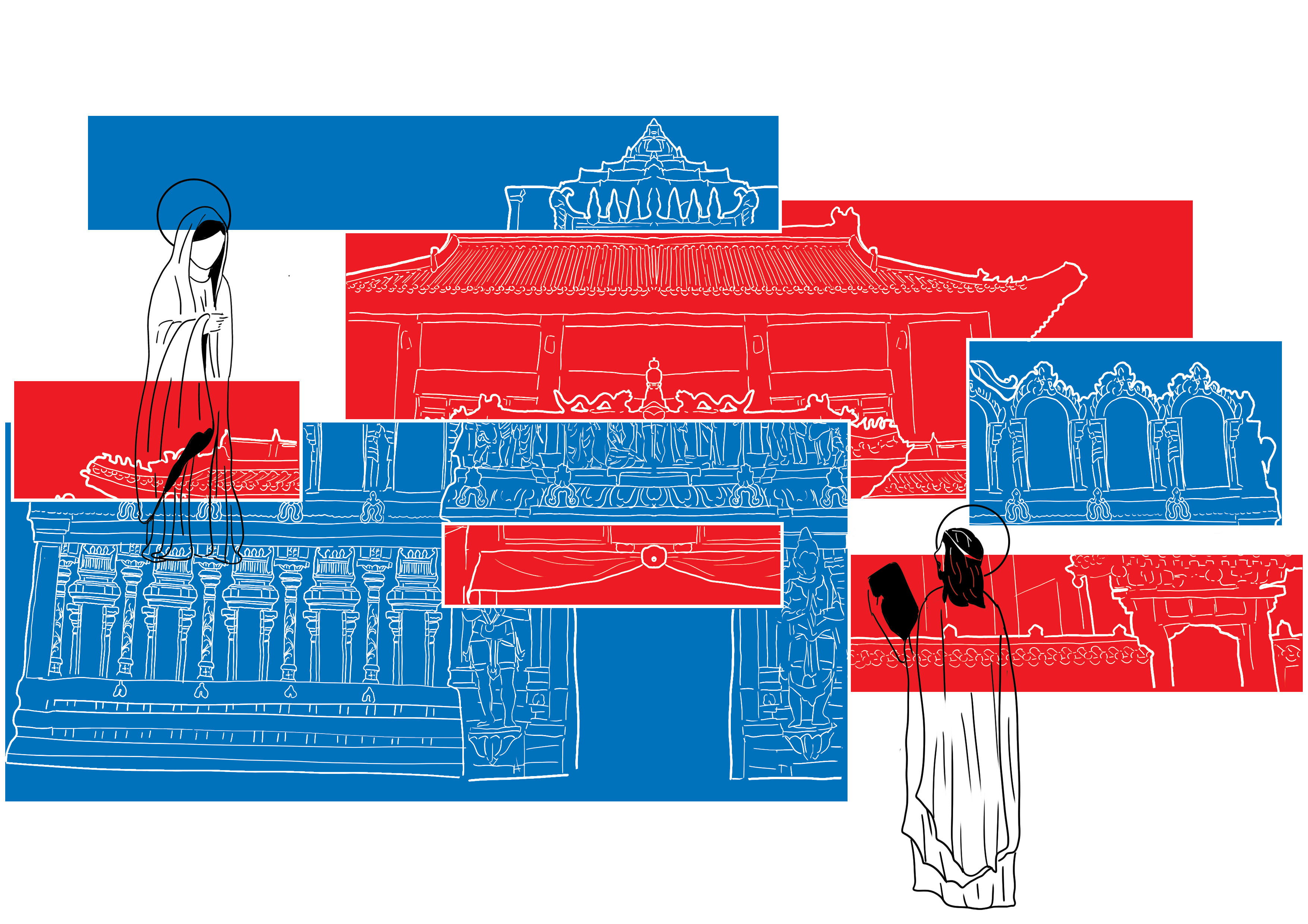
I felt it was quite odd and thus switched to another format, with the Gods/Saints coming out from the page on one end and leaving the other. I ended up really liking this layout and hence used it.
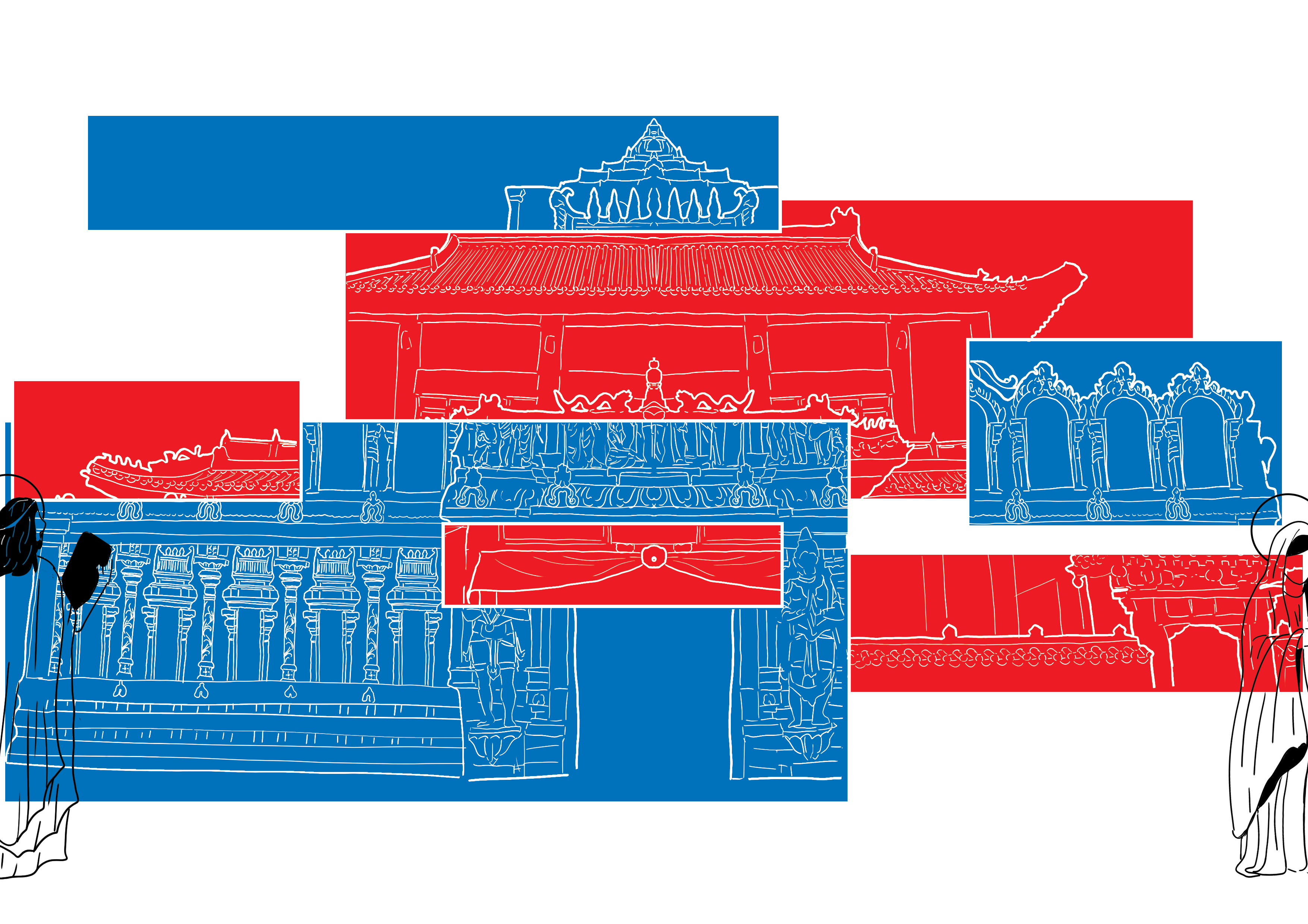
Initially, the layout had been as shown below, with circles for Mother Mary and Jesus being red and blue and that for Sri Krishna and Goddess Guan Yin being grey and peach. However, it had been brought to my attention that the colour of the circles should follow that of the God’s/Saint’s place of worship. I heeded this advice and swapped as it made more sense as well.
Middle Spread (AAAaaaAAaAh)
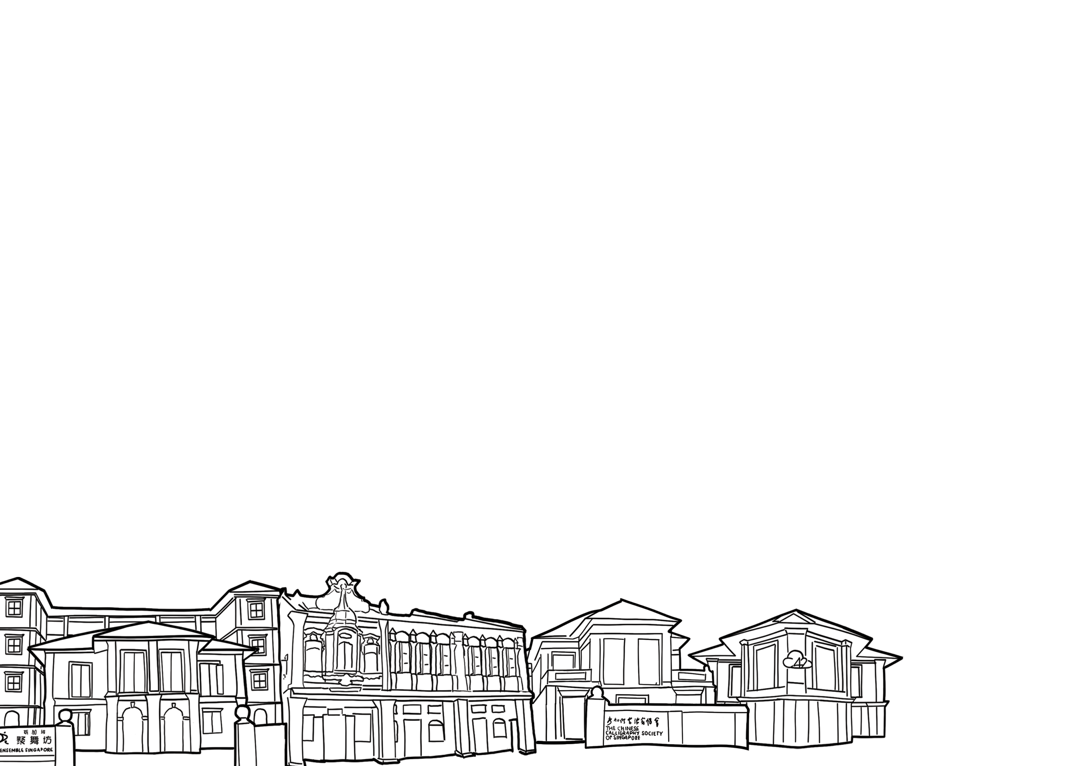
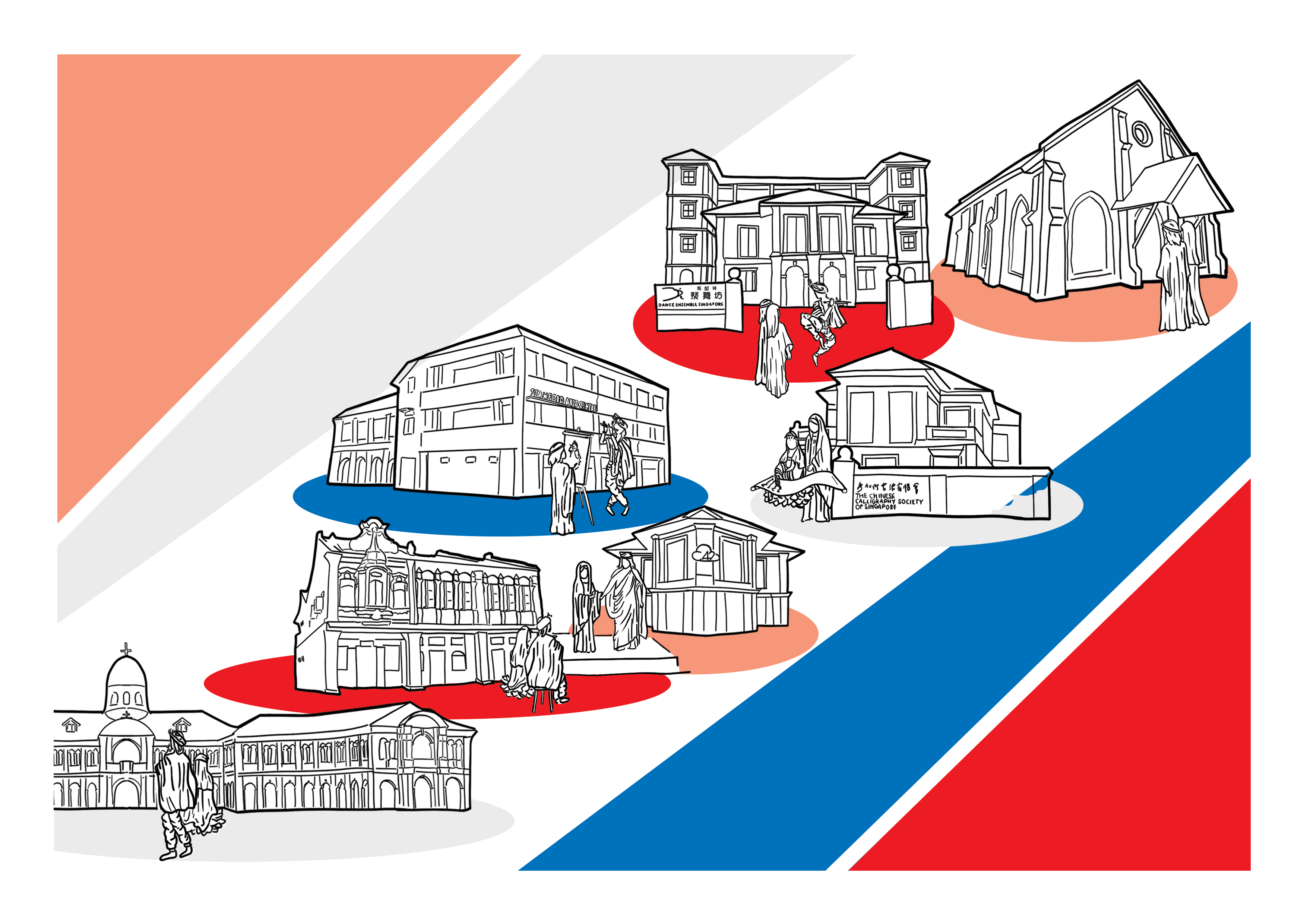
I had the most difficulty with the middle spread. This was because the other spreads had not had many elements or objects. However, my middle spread that involved the 4 Gods/Saint gathering to visit the many places of the arts proved to be a huge challenge due to its many elements.
It had been asked if I wanted to switch and focus on just religion, but I had been adamant on involving the Arts as I felt it was through the Arts that religion could possibly mix without offence, bringing about more open minds.
I hence started working on it, firstly by doing the line art of the different places.
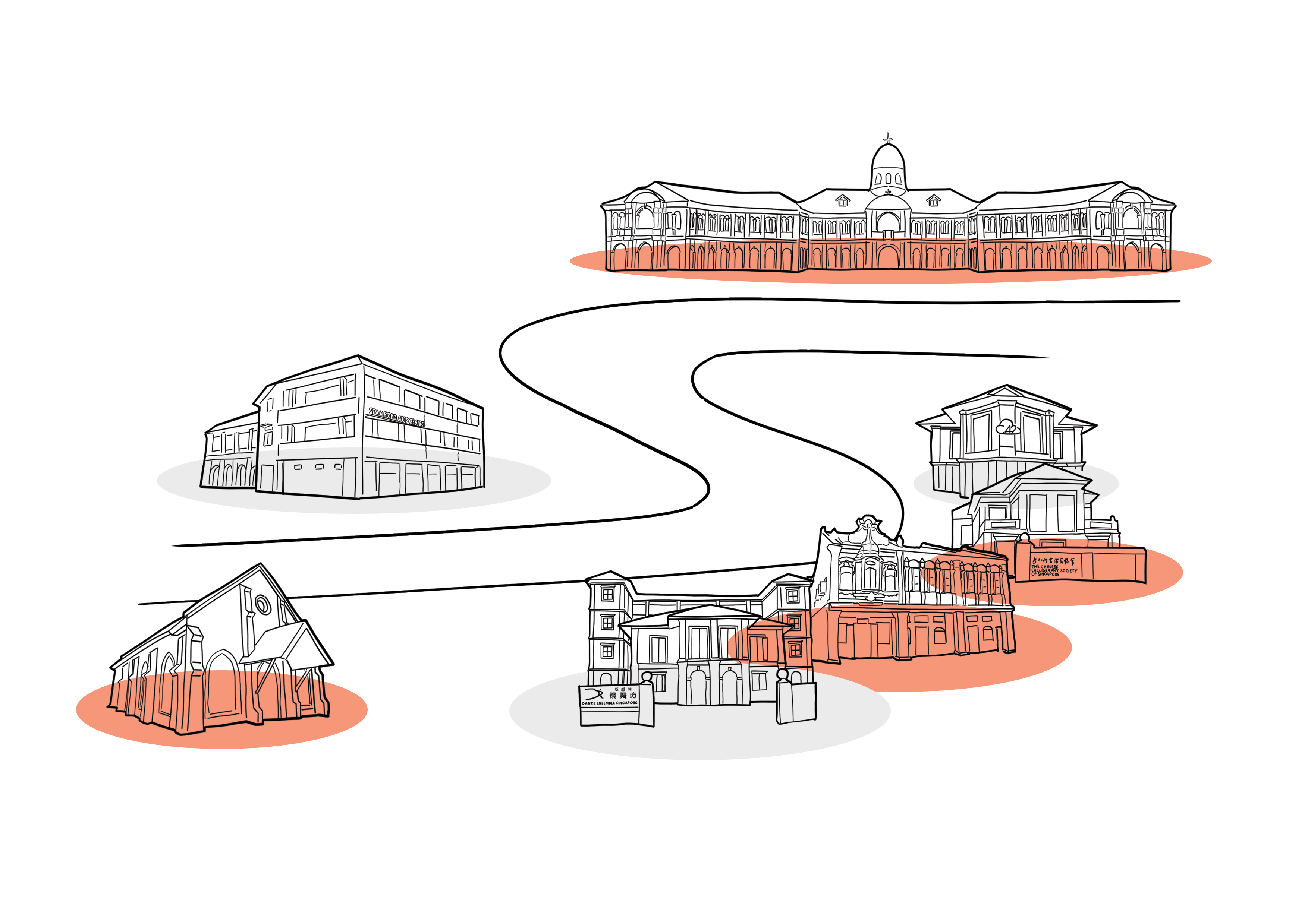
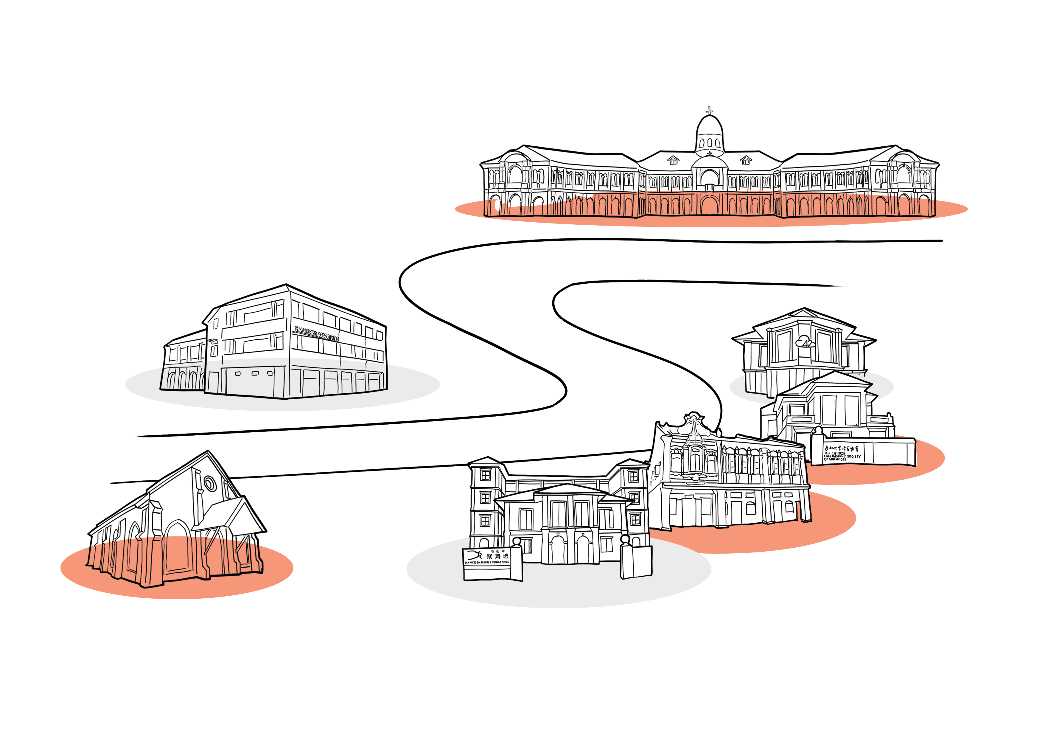
After doing this, I began trying out different layouts and found myself in an extremely huge bind.
I initially tried placing the different places next to one other, but soon realised that the SAM would not have been able to achieve that effect due to its size and structure. Hence, though it was a nice layout, I scrapped it.
I also tried making it a map and tried different colouring methods. I ended up scrapping it however, as I felt it did not fit the theme of the zine.
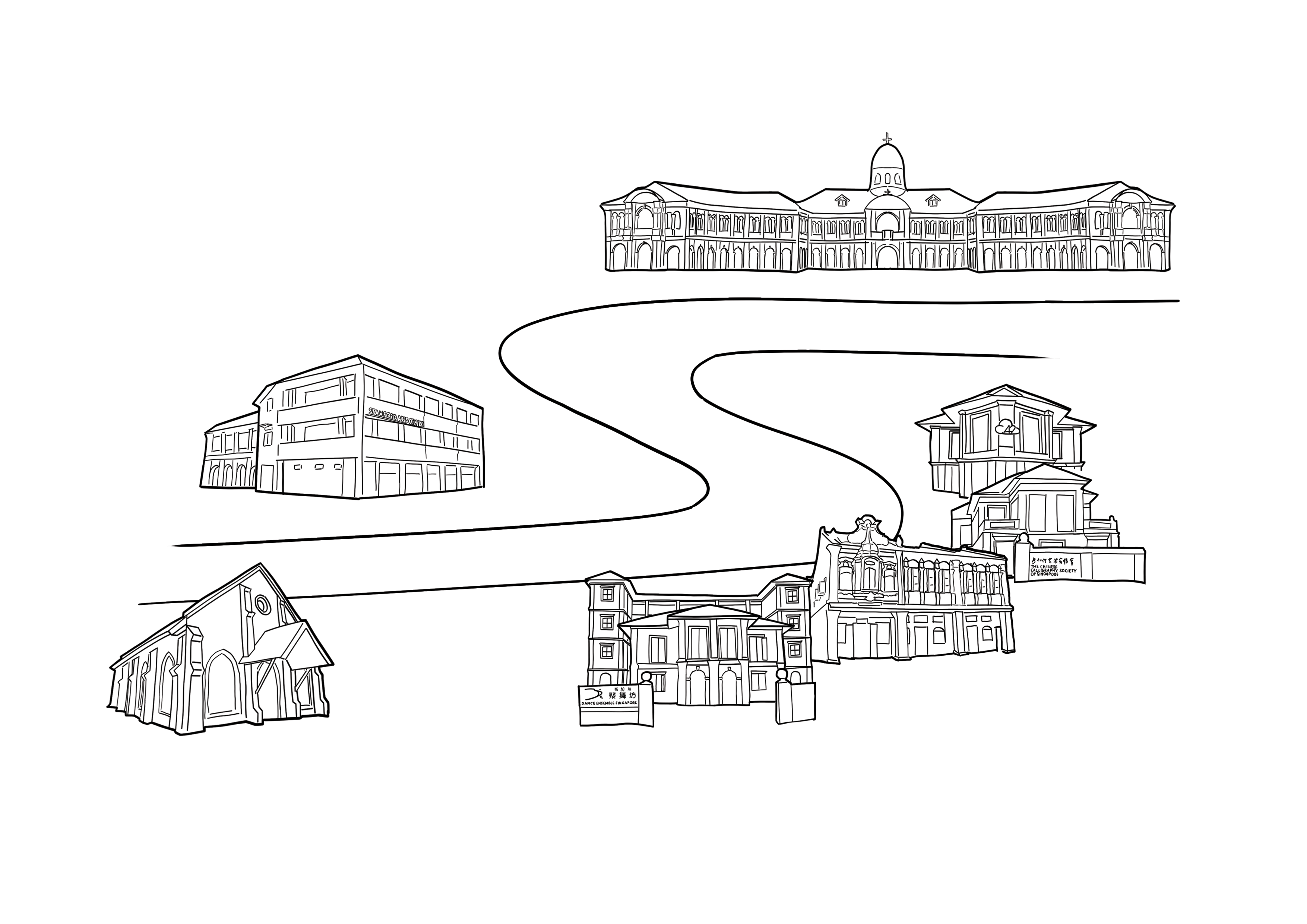
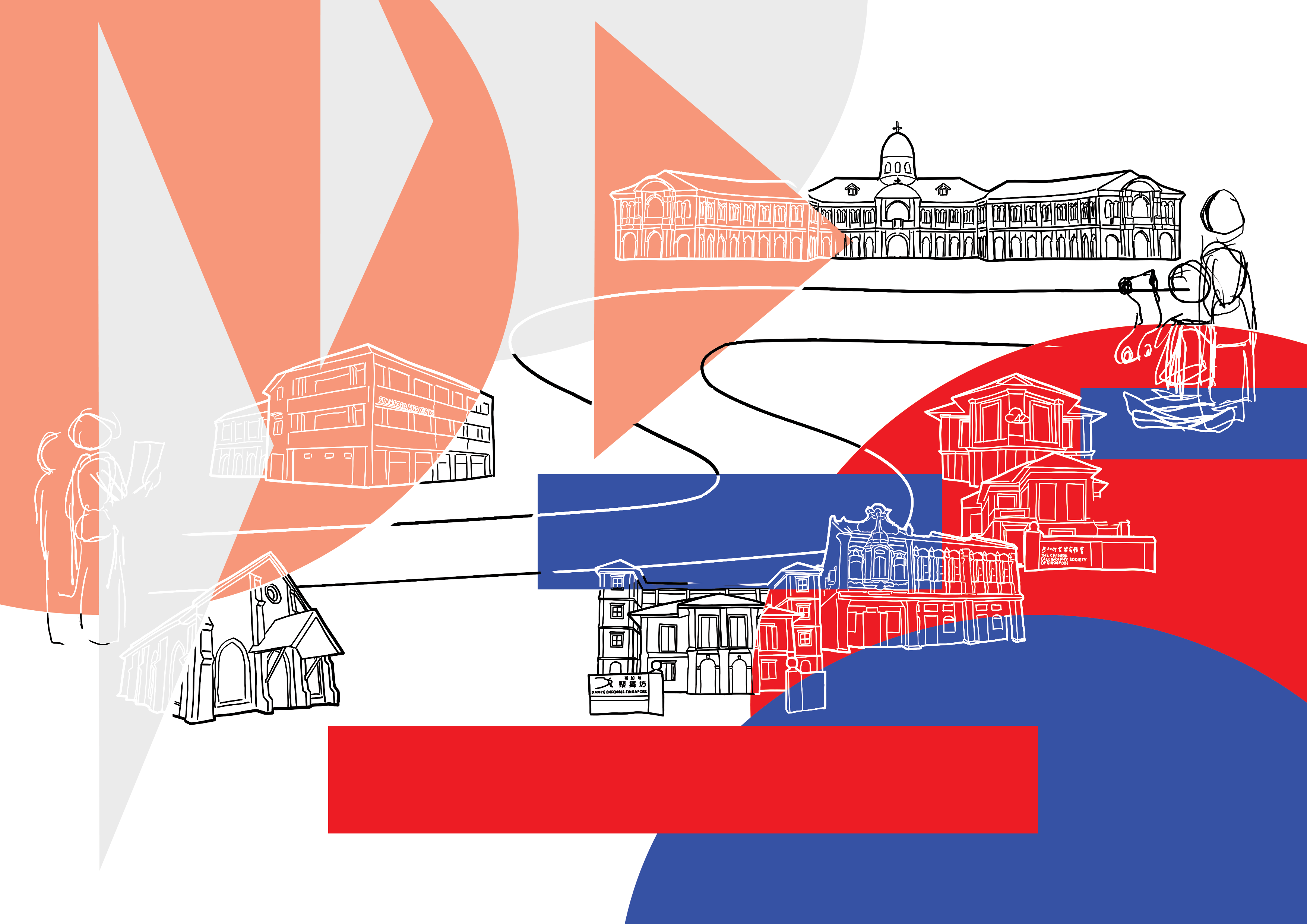
Since I wanted to show that it was the Gods/Saint coming together through the arts, I drew them experiencing the different art areas there.
- Jesus painting Sri Krishna at the Stamford Arts Centre
- Sri Krishna and Goddess Guan Yin going to SAM
- Jesus and Mother Mary watching Sri Krishna dance
- Goddess Guan Yin showing Mother Mary calligraphy
- Jesus and Mother Mary going into the Middle Road Church
- All four of them at centre 42 and the theatre
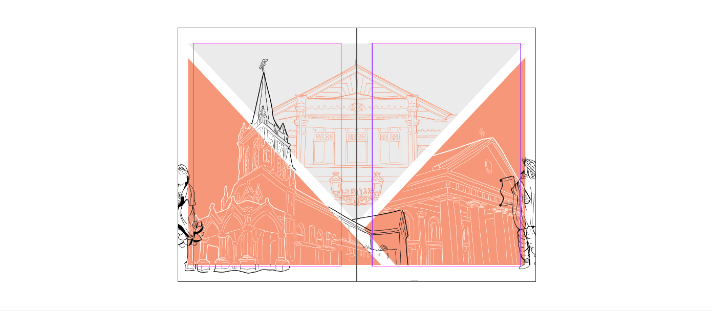
I initially wanted it to be a mix of the 4 colours only, but nevertheless tried to see if I should incorporate more colours. The conclusion was: no.
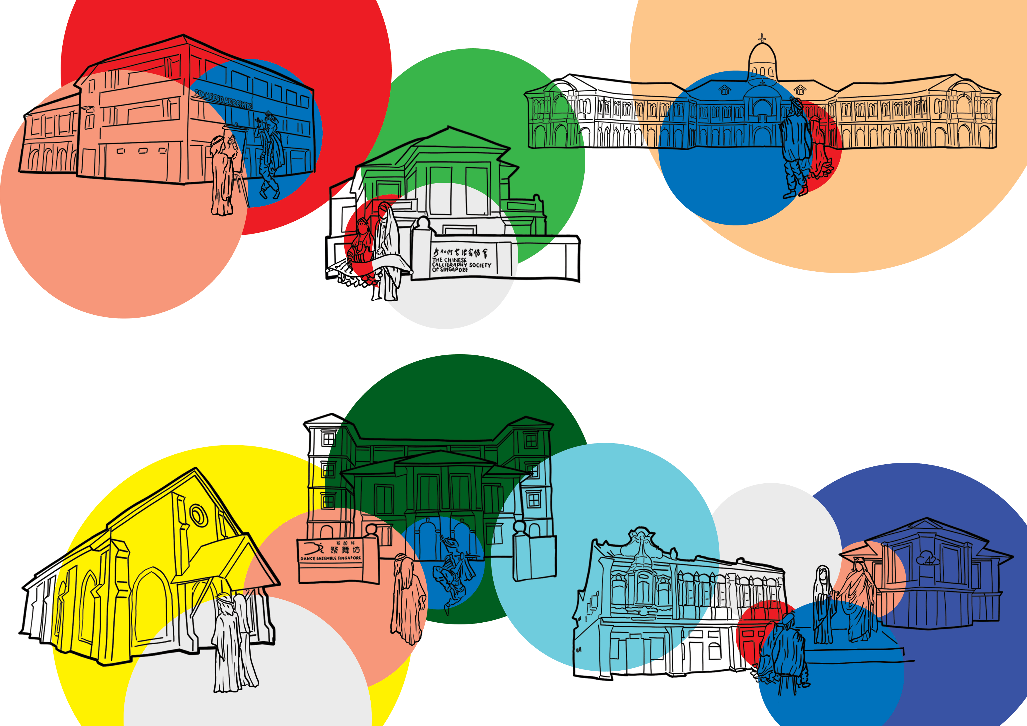
Sticking to the geometric shapes, I tried seeing if I should arrange them in the way below, and use triangles to frame it.
I tried adding colour to it too.
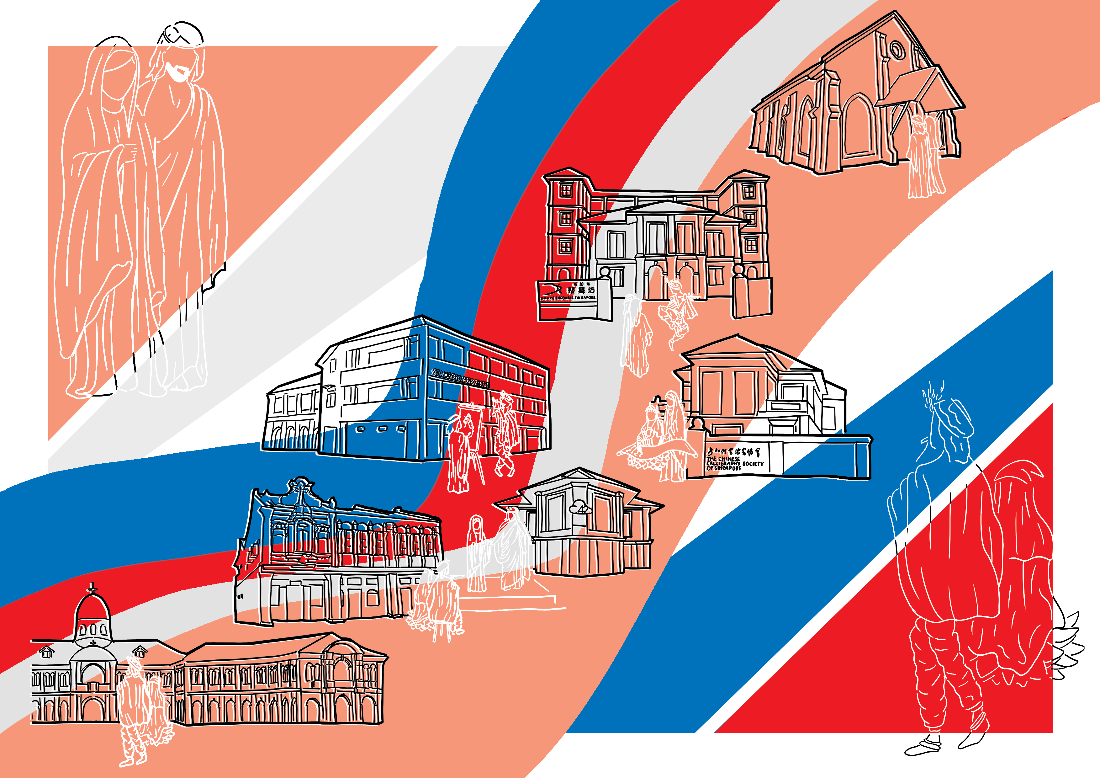
I felt it had all been different from the style of my zine and hence in the last minute scrapped all of it to do something that had fit it more.
Adding the Gods/Saint at the sides, my zine was complete.
OFC + OBC
Zine Final
All in all, this had been a fun experience, and I learned many new things. Though my middle spread had been unsatisfactory to me, I tried many different layouts and the journey had been interesting. I would definitely redo my middle spread if I had the time, and would also consider and learn more about colours and layouts.