While researching for inspiring interactive artworks, I chanced upon a plethora of different installations, and much to my amusement, realised the broadness of the term “Interactive Art”. Ranging from contemplative to experiential, these works could take different forms – music, dance, digital. To choose simply one work from this range was difficult, and thus I will be showing a few more. Some of these works, albeit old, still hold much value and are applicable even today.


Alex Davies’ Dislocation (2005)

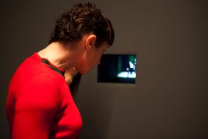
Dislocation is an interactive installation in which reality and the virtual mix. Perceptually real virtual characters intermingle with exhibition audiences as they look into their chosen portals, subverting the traditional ‘seeing is believing’ ethos of traditional video.

The audience enters an empty gallery room with four individual portals set into one of the walls. As they peer into one portal, a simple real-time closed-circuit video feed of the room they are in is shown. Using audio and locational data, the video images are digitally composited with images of pre-recorded video characters, creating an illusion of additional characters in the area.


“The auto-voyeurism of watching your own image is given an uncanny and disturbing twist when you also become the unwitting observer of a number of different scenarios that are apparently being played out in the room behind you. As you watch though the portal, you may see a man enter the room and walk up behind you or a young couple come into the room and start kissing, or a security guard enters with a barking dog. This uncanny sense of bodily presence behind you and your own possible vulnerability to these presences induces you to turn around to look behind you but when you do you are confronted with an empty room.”

Playing with the idea of appearance and reality, the real images of the viewer and virtually composited characters occupying the same viewing plan causes the viewers to be unable to trust their own eyes. Many state that one believes what they see, but the apparent reality is unfortunately shattered when the viewer turns around, only to face an empty space when they expect to see someone or something else there.

Thoughts

With this current age of virtual reality and augmented reality, it seems the day where one cannot tell reality from the virtual is not far away. With good rendering or composited images, it has become far too easy to edit and change images and videos one used to be able to use as ‘evidence’ and the ‘undeniable’ (now doctoring images and videos are common). This blur of truth and lies is highly applicable to this day and age of the digital, and the way the viewer would feel unease and begin to doubt the truth of the events in the room is highly intriguing. While the set up being simple and intuitive for the audience and participants, the contrastingly deep and inner fear of the unknown embeds itself into their hearts, definitely causing a long-lasting impression.


Sources


David Rokeby’s Giver of Names (1991-2004)


Giver of Names by David Rokeby is an installation that aims to challenge the viewers preconceptions of objects and push them to speculate and contemplate more. It hopes to represent a re-interpretation or alternate interpretation of the visual image of an object. An additional aim is highlighting the tight conspiracy between perception and language, bringing into focus the assumptions that make perception viable, but also biased and fallible, and the way language inhibits our ability to see.

In the room stands an empty pedestal, and a small video projection. A video camera observes the top of the pedestal. The installation space is full of random objects of many sorts. The visitor can choose a single or numerous objects from the space and place them on the pedestal. With the object/objects placed, a computer takes an image and performs multiple levels of image processing.

These includes outline analysis, division into separate objects or parts, colour analysis, texture analysis, etc.

These processes are visible on the life-size video projection above the pedestal. In the projection, the objects make the transition from real to imaged to increasingly abstracted as the system tries to make sense of them.

The results of the analytical processes are then ‘radiated’ through a metaphorically-linked associative database of known objects, ideas, sensations, etc. The words and ideas stimulated by the object(s) appear in the background of the computer screen, showing what could very loosely be described as a ‘state of mind’.

From the words and ideas that resonate most with the perceptions of the object, a phrase or sentence in correct English is constructed and then spoken aloud by the computer.

The phrase is, of course, not a literal description of the object. At the same, time, it is definitely not a randomly generated phrase. Everything that the computer says in some way reflects its experience of the objects. However its experience is in many ways quite ‘alien’. For example, it has no human real experience of the world. It has not burned its hand, scraped its knee, been hungry, angry, fallen in love, wanted something it couldn’t have. It does the best it can to talk about the objects from its very particular point of view. If you spend some time with the Giver of Names, you tend to find that the peculiarities of its perceptions and its speech begin to coalesce into a tangible and coherent character. Misused or mispronounced words become the character of a dialect.

Thoughts

At first glance, before reading the meaning behind this artwork, it reminded me of the Asian tradition of letting your kids pick an item from a range of objects to predict their future when they reach age one, thus standing out to me greatly. The idea of a phrase appearing upon analysing the objects was very similar to the tradition and it was interesting that the words created did not make much sense, allowing for newer interpretation and unique ideas.

Sources


George Khut’s Pillowsongs (1997-2001)

From his website:

“Pillowsongs is a sound installation exploring sleep and rest as a space for listening. Recordings mastered on eight different compact discs were mixed into speakers embedded inside pillows on beds installed throughout a darkened exhibition space, lit only dim blue light-bulbs.

Listeners hear these sounds by resting their heads on the pillows – resulting in a very intimate and ‘inside your head’ listening experience. The soundtracks combined field recordings, electronic drones, voices and short-wave radio transmissions. The programming of the CD tracks changed from day to day.

The slowly reconfiguring sound textures, dark lighting, and restful means by which the audiences engage with the work, engage listeners in a highly intimate, and hypnotic hypnogogic listening experience. Listeners often reported a high degree of uncertainty as to which sounds where coming from the pillows, and which sounds had emanated from outside the gallery space. Falling asleep can be an appropriate way of interacting with this work, given our ability to perceive sounds whilst in certain stages of sleep.”

In his sound installation Pillow Songs Poonkhin Khut has created an environment that seems strangely disconnected from the outside world… A violet light-bulb hangs over an unadorned bed, staining the white cotton sheets an iridescent blue. Somewhere a dog barks. Warily negotiating the shadows one becomes aware of other beds which are vaguely reminiscent of dormitories, cheap hotel rooms or convent cells. In the darkness the beds evoke a sense of familiar intimacy and the plain sheets reveal a sensuality which belies their ascetic frugality. Sounds emerge from the pillows like memories made manifest or half-forgotten dreams exposed and rendered audible.

Lying on the rough cotton sheets the inevitable association of light illuminating the darkness to traditional representations of transcendence is thwarted. Instead an overwhelming sense of the temporality of life marked only by fleeting sensations, thoughts and lingering memories is evoked. Implicitly the long hoarded pillows, vestiges of the artist’s past refer to the passage of time and the materiality of the body’s seeping flesh. These ideas are intensified by the physicality of the muffled vibrations of the sound transmitted through the pillows and the gradual awareness of the residues harboured in the crumpled linen of those who have visited the installation before. A strangely intimate and disquieting proximity revealed by the lingering scent of strangers, a stray golden hair and a damp smear on the pillow.

– Review by Mary Knights, Artlink magazine, Vol. 18, No. 2, 1998

Thoughts

I thought this artwork was unique as it was meant to be experienced in an intimate and uncommon way. Personally, the idea of lying in a bed in a public area is highly unsettling and instead a more private thing. Yet, the artwork’s attractive is so strong, one feels compelled to try and experience it instead of being turned off. The way this artwork manages to be so catching that people would put their unease aside was something that really amazed me.

The work is highly contemplative and the set up had fit the mood perfectly, with a strange calmness. While on a superficial level it can be seen as a bed and sound, the way the sound was emitted was truly different from the norm, making use of an interesting method of placing speakers in the pillow. I think this really gave a huge feeling of being enveloped and surrounded by the music, and the mood of the piece gives way to deeper thinking and being in a dreamland with our thoughts and emotions.

sources #1 #2

Sources


Mari Velonaki’s Fish-Bird (2006)

‘Fish-Bird’ is an interactive autokinetic artwork that investigates the dialogical possibilities between two robots, in the form of wheelchairs, which can communicate with each other and with their audience through the modalities of movement and written text. The two robots were Fish and Bird, who were explained to visitors that they could not be together due to “technical difficulties”. They took the form of an empty wheelchair so as to evoke a feeling of absence of a person and the chairs wrote intimate letters on slips of paper that they then drop to the floor. These letters were produced with a miniature thermal printer, and had “poetic lines and personal confessions such as “my heart is broken” or “I’m so lonely,” to produce empathy in the visitors”.

The personality of the robot was portrayed through the different fonts and scripts they used, and their more “outgoing” or “reserved” movements.

For example, they faced visitors as they entered, and rolled alongside them, acknowledging their presence. Visitors that spent more time with the robots received more intimate messages from them. The two robotic chairs have interacted with over 36,000 people in Australia, Austria, Denmark, United States, and China.

Through this, Mari Velonaki, whose practice and research is within the field of social robotics, learned that people loved the creations.

She says that, on average, visitors to Fish-Bird interacted with the robots for about 10 minutes. Some of them became so deeply absorbed that they spent 30 minutes or more in the installation space. “Kids were patting them to print messages,” says Velonaki. The engagement is remarkable in the context of an art exhibition, where visitors typically only spend a few minutes before moving on.

Thoughts

It was cute. I loved it. I can fully understand why the audience had been so absorbed into staying and interacting with these robots. With lives on their own, the supposedly lifeless wheelchair begins to seem more animated and adorable, and perhaps they could have been seen as a pet or a young child in the eyes of the audience. It touches on the obsession of wanting to be loved perhaps, and staying with these uniquely adorable wheelchairs would have granted them more cute and intimate letters.

The narrative element of two robots being unable to be together and their well-thought-out and meaning names – Fish and Bird, definitely strikes at the hearts of audiences.

I believe that this artwork tackled the core of people’s odd and perhaps unconventional love for the pitiful, the sad, and tragedies. Oddly enough, like how some people think tearful babies and animals are extremely adorable, perhaps this hit the same zone.

Apart from this, the usage of robotics to create art was also unique and interesting and something I would love to look more into.

Sources #1 #2 #3


Other sources

This four weeks learning about the History of Graphic Design had been a fun and enjoyable one. While we did touch about some of the Art Movements in the previous semester, I felt I learned much more through these lessons. Information I had for History of Graphic Design had initially been shallow and narrow, and I now have a new appreciation and respect for Graphic Design, after knowing its history and story.

The list of words that were provided to us had been very helpful in helping me stay in check with what information was essential to know. At the same time, we learned beyond the list of items, with many examples, helping us know better what it each typeface or art style was like, and its exceptions if any. Apart from missing explanation of a few words from the list, the list as a guide had been extremely useful and productive.

Taking breaks every 30mins was definitely essential for productivity. Reaching the 25mins mark, I could feel my mind slowing down, and the break was definitely good to rest for a while before continuing with the rest of the class.

Choosing an image to explore more upon had been surprisingly fun. While doing a post after each lesson initially sounded like a chore, I discovered many new things about graphic designers and fonts that caught my eye. This also helped in retaining information, and it made me find interest within graphic design.

The quiz had been rather fun, especially since we had time to go through it and check out answers after we were done. I feel it had been much more productive to do quizzes than presentations, considering little information apart from that of my own had retained in my mind from last year. It was also nice that the quiz had been split into two; heavy content splitting into two.

Overall, the class was really fun! とても楽しかったです!!これからもいろいろグラフィックデザインについて勉強したいと思います!!ありがとうございました!!

During this lecture, there were actually quite a few things that caught my attention, and I wanted to search more about them.


Isotype (International System of Typographic Picture Education),
Otto Neurath & Gerd Arntz,
c. 1935

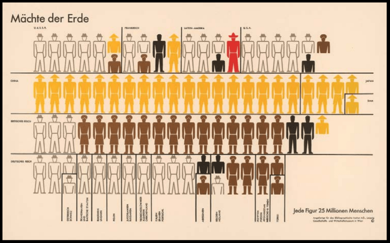
Isotypes, International System of Typographic Picture Education for full, was developed by social scientist and philosopher Otto Neurath and designed by Gerd Arntz. It was a method for visual statistics, using icons and signs to symbolize data.

Otto Neurath had seen that people of the working class that began to break free from dictatorship at the time were mainly illiterate. He hence knew that for them to gain knowledge of the world, information should have been clearly and directly illustrated in a clear structure.

It also aimed to overcome language barrier across the countries; to be universally understood and was influenced by Otto Neurath’s fascination with the function of Egyptian Hieroglyphics; both their form and ability to convey a story.

Arntz eventually created about 4000 of such signs, which were then adopted worldwide to what is now termed as Infographics.

This was fun and amazing to learn about Isotypes as they are so commonly seen, but I had never gone to find how they came to be. Through these lectures, I truly understand how many things regarding Graphic Design many of us seem to take for granted of, or simply overlook, but actually have an interesting or deep history behind them. It was nice to finally put a name to who began the idea of infographics that have been widely used and also understand the creation was out of the hopes to increase the educated in the population, and escape from dictatorship at that time.


Bifur typeface,
A. M. Cassandre,
1927

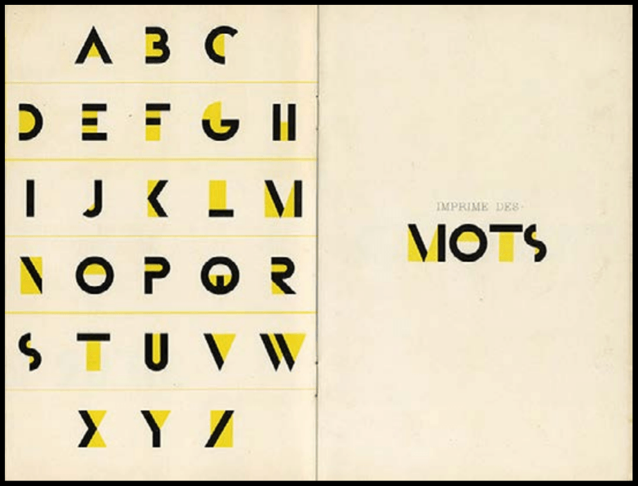
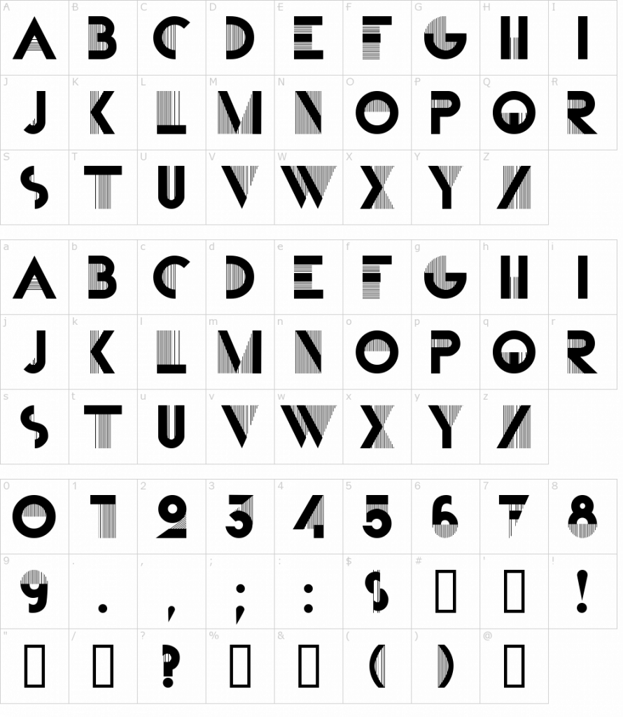
Another thing I really liked was the Bifur Typeface created in 1929 by A.M. Cassandre, whose birth name was Adolphe Jean-Marie Mouron. It was bright yellow and really beautiful and I loved how big the contrast the colour was against the dark of the bold lines. However, upon further research, I learned it was initially like so:

The design combines very thick with incredibly thin line strokes, which is a striking and unusual type design, even for today. Other than that, the design is quite minimal without serif or flourish.


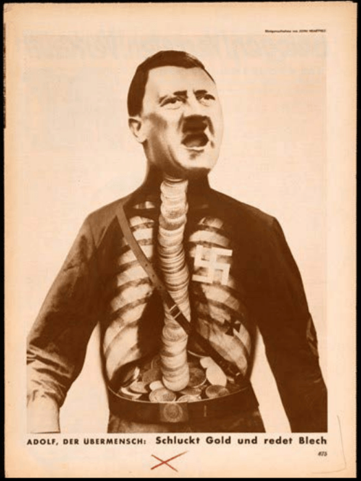
Adolf the Superman: Swallows Gold and Talks Tin,
John Heartfield,
1933

John Heartfield’s Adolf the Superman: Swallows Gold and Talks Tin was interesting because of the imagery, but also its title. An X-ray chest had been superimposed over Hitler’s torso in this image, creating a funny and eye-catching image. It ridiculed Hitler, which instantly amused me, and made me want to know more about not only the Artwork but also the artist himself.

The work was mainly based on world war and politics, with the artwork referring to Hitler’s receiving of financial backing from wealthy industrialists, and him spouting ugliness to move the country toward a profitable war. John Heartfield thus used this piece as a political medium, even going as far as to change his name from Helmut Herzfeld in protest. The powerful image was featured prominently throughout Berlin and John Heartfield was immediately targeted after the Nazis came to power, ordering several assassination hits on him. Nevertheless, John Heartfield survived the hits and passed away on 26 April 1968 due to illness.

It was interesting how John Heartfield did what he believed in and risked his life in doing so. The events that had occurred were frightening, yet the imagery created was rather humourous as though to mock Hitler and his ideologies.


ISOTYPE

http://www.designhistory.org/Symbols_pages/isotype.html

https://www.sessions.edu/notes-on-design/type-in-history-cassandres-art-deco-type/

https://fontmeme.com/fonts/bifur-font/


Adolf the Superman Swallows Gold and Spouts Junk

https://www.britannica.com/biography/John-Heartfield#ref1204496

https://www.johnheartfield.com/John-Heartfield-Exhibition/john-heartfield-art/famous-anti-fascist-art/heartfield-posters-aiz/adolf-the-superman-hitler-portrait

The main image that caught my attention during the lecture was Gismonda, by Alphonse Mucha, an artwork of the Art Nouveau period.


Poster for ’Gismonda’ (1894)


Art Nouveau, that lasted from 1890 to 1914, is an artistic movement that was practised in many fields of art, such as architecture and graphic design. The term “Art Nouveau” is the French term for “new art”, and the Art Nouveau movement is the first time that design had been promoted through mass communication.

When I first think of Art Nouveau, works like that of Alphonse Mucha’s come to mind instantly. Not knowing much about the history of Art Nouveau in Graphic Design, I was highly intrigued to learn that within the art movement, there had been many different variations of Graphic Design created, all over Europe, and that it had developed greatly over time.


The many styles looked rather different despite being in the same movement but had similar properties that stemmed from the art style that influenced them. Many of the artworks created during the movement had flat planes or were two dimensional, with an undulating asymmetrical line, that usually was elegant and graceful or infused with a powerfully rhythmic and whiplike force. This was strong violent curve was also referenced by the term “whiplash”.

These graphic art that had many organic and plant motifs were so heavily ornate that it was not desirable for text faces but great for display work. Thus, it had been more popular in poster printing and book production.

Learning that Art Nouveau developed from the Japanese art style Ukiyo-e, took me by surprise. I had never expected a connection between an Asian Art style and Art Nouveau, that felt highly westernized, but I soon saw some resemblance between the two styles. I had always thought Art Nouveau appeared rather comic-like and understanding its influence gave me some potential rationale to this connection. I think it was amazing that from an art style all the way from another continent, an array of styles all under Art Nouveau had been born.

It had been due to the Western culture beginning to exchange information and ideas through world trade, in which the start of Nouveau began. Famous makers of Art Nouveau objects were selling their ideas through magazines, journals, trade fairs, exhibitions, and they saw themselves as part of this larger world. Art Nouveau was the first style to sell itself and to be conscious of itself. At the beginning of 1890s, many artists reached out beyond their own countries for inspiration. Japonism was also a prominent trend then and thus had a strong influence on the artists.


Poster for ‘Job’ cigarette paper (1896)


Nevertheless, of all the different artists, I still liked Alphonse Mucha’s works the most. The bold lines and curves drawn, along with the colours used had caught my attention the most. I also really like his Poster for ‘Job’ cigarette paper. The sensual expression and flowy hair established the iconic image of the ‘Mucha woman’. His posters focused almost entirely on beautiful women in lavish settings with their hair usually curling in arabesque forms and filling the frame. Frankly, they were rather alluring and captivating.


The Seasons (series) (1896)


It was also very funny reading that Alphonse Mucha disliked being known as an Art Nouveau artist since he was one of the most well-known artists under Art Nouveau. Alphonse Mucha had apparently never wanted to associate himself with this newly born art movement, and he only wanted to communicate a spiritual message, insisting his paintings were entirely a product of his own imagination and Czech art. He even expressed his rage and frustration because of all the rapid fame he gained throughout his art. Thus, learning his name under Art Nouveau and hearing him known for his “Art Nouveau” works is absolutely hilarious.

All in all, I like his Gismonda work for Sarah Bernhardt the most. It was said to have the beauty and dignity of her personality onstage rather than representing her realistic features or the story. While his other works are more fluid and alluring, I think it was mainly the story of how this artwork had propelled him to fame that also fueled my love for it. The chances of him being the only one available to do the commission were odd, and for him to gain such fame overnight was truly a blessing in itself. The elegance of the work truly shined through.


Art Nouveau

https://www.thevintagenews.com/2016/10/04/the-slav-epic-was-alphonse-muchas-art-nouveau-masterpiece-he-was-arrested-by-the-gestapo-in-1939/


Douce Apocalypse
Textura Script
1265

Steelplate Textura Regular , also known as Blackletter or Gothic Script, was used from around the 12th century up till the 17th century, and was first described as “Gothic” in 15th century Italy. While developed from the Carolingian Minuscule that was well-known for its legibility, Textura looked vastly different from its ancestor, having a narrower and taller form. Its letters were formed by sharp and angular straight lines, contrasting to the roundness of the Carolingian Miniscule, and their strong vertical strokes were made before serifs were drawn upon them.
The condensed and bold Textura rose as literacy increased in 12th century Europe. The want for books in different sectors rose as education grew in importance, creating a demand for written text outside of religious scripts. While the need for book production increased, the price of writing materials stood to be an issue; not to mention more need for labour and time to create these items. Thus, Textura was heavily used – its narrow form allowing for more letters to fit in a single sheet of parchment or papyrus.

As a person with zero background in Typography, I never really knew how or why fonts were created. Simply assuming someone had created fonts out of their own personal entertainment and joy, I was pleasantly surprised to know that many Fonts had such interesting stories as to how they came to be. Learning how the events during a certain time period affect the way people wrote, and how they created new fonts to overcome new challenges really opened my eyes and gave me a greater appreciation for typefaces.

During class, we were introduced to many types of fonts through different times and their advantages and disadvantages. But of all the fonts, there was one script that really caught my attention – Textura. When I first saw Textura, I really liked how beautiful and condensed it was. I was highly amused to know it had been termed “Gothic” but also saw how fitting it had been with the Gothic Style. The calligraphic script is highly aesthetically pleasing and elegant in my opinion, with the tightly condensed text making each page feel fully utilised. Paired with the highly intricate drawings, the script gave the page an antiquely “posh” look, and I imagine an entire book of such pages looked highly impressive.

Learning that Textura had been developed when the demand for books rose had been interesting since the text had seemed much more difficult to read than its direct ancestor, the Carolingian Minuscule, in my eyes. While I do love the script greatly, an entire book of condensed calligraphic text sounded like an extreme nightmare; adding to the horror of having to learn an entire book of business or law during that time.

Nevertheless, the idea that this script was formed to allow more to have access to textbooks and knowledge was heartwarming and highly fascinating. Saving costs so many others can afford a path to gaining new knowledge by creating a new typeface suggests the high importance of Typography in the past and also now. This lecture has enabled me to truly respect and appreciate fonts more, and consider the usage of the different fonts before I choose them.


For this project, we were tasked to make an art installation that would be situated in a specific area of ADM.  It was stated that it should be about 2m x 2m x 2m, and we would be making a model that would be at a scale of 1:5 or 1:10. There were also many things we had to take note of and include in our design:

  • Aural Memory/Aural Heightening
  • Site-specific
  • Involve seating/reclining
  • Made from paper cups

Since it had been site-specific, we did an investigation and research on our site, along with seating ergonomics. This had been a pair work, and I did this with Yee Teng.

Our slides are here!


After this, it was individual work and we started to do our prototype models.

The aural memory I decided to work with was the sound of being underwater, having an enveloping feeling, one that is calm and peaceful. I thus made a sketch of a couple of designs to portray this.

However, I soon scrapped those ideas as it had been difficult to make those form using the unique form of paper cups. I hence decided to just experiment with paper cups.

I had a huge issue with this, trying out random forms. I didn’t really like most of my initial prototypes and had no interest in them. Soon, I switch to cutting strips and slits, and made many different forms from it. Of which, I became intrigued with one that happened to interlock when I left it alone, and adopted that design. I also created another curved form that worked well as a seat.

Other prototypes:

Plus many more I did not like one bit.

This became my chosen design and I pieced them together to form the installation shown below:

Spray painted it.

Added chairs.

Larger image here!

For my final model, I had tried making a 1:10 sized model, with different materials.

Initially, I had used a single sheet of paper, which failed spectacularly due to the thinness of it. I then attempted doubling the sheet, which then made it too flimsy. Ideas such as using corrugated cardboard and art card were considered but later also rejected due to it being either too thick or unsuitable.

Finally, I decided on making a 1:20 model by connecting two layers of shallow paper bowls first. This was done just to be safe; ensuring I had a model to work with. It was lucky I had done this as I ended up not having enough time for my other model.

The 1:10 model I wanted to try to make was not finished, due to the lack of time I had. It was made using paper mache and there had been a lot of drying time due to its sheer size.

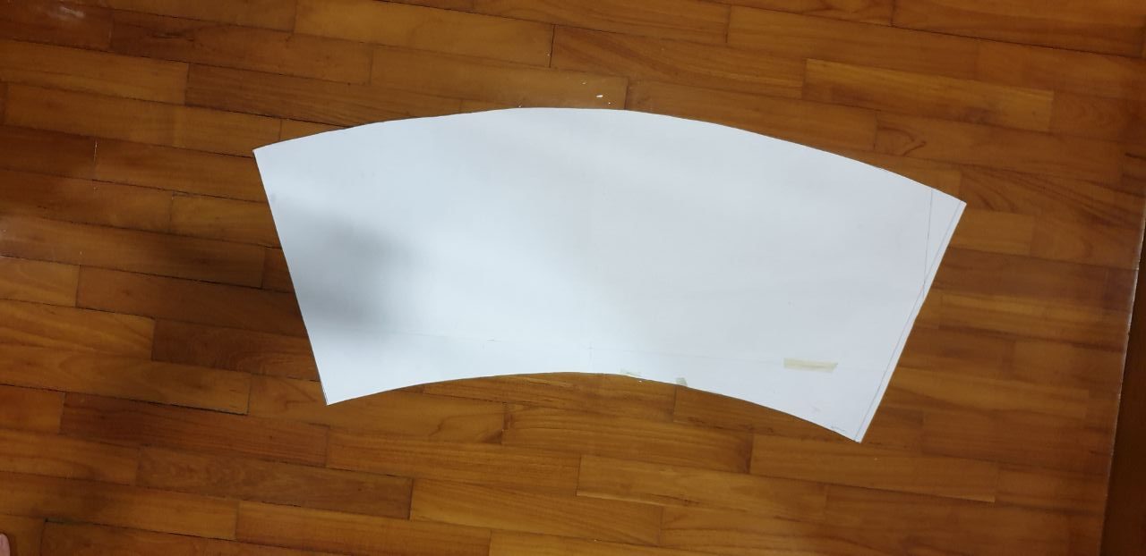
I first started by making measurements of the initial small cup I used to make the prototype. Then, calculated the different measurements should the cup’s size be multiplied by 4. I then drew it out on drawing block, making a template.

After making the template, I made two plastic cups from the template.

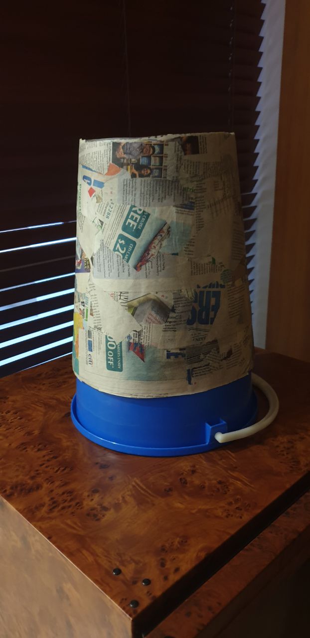
Propping it on a bucket, I made a newspaper cutout of similar size to the template, and then stuck it on the plastic mould, before beginning to paper mache it.

The glue had been self-made from starch and hot water.

I also had to spend much time in between layers, waiting for it to dry.

Dried large cups.

This was difficult to do as it was hard to gauge how many layers were enough. It had to be thick enough to hold its shape but soft enough to bend, making there many trial and errors.

Should I have time, I would attempt to make my model with this. But for now, it shall be left as it is. Paper mache-ing was a fun experience but no doubt a painful one. It took long hours and the results were not consistent, I had to retry multiple times.


All in all, this project had been excruciating and tough, but pushed me to think beyond what I normally would. It had been fun, I suppose, despite multiple sleepless nights and 7 am bleariness.

Link to my slides here!


Initially, for this project, I had some ideas on how I had wanted the story to go, however, I soon decided that it was more interesting to leave it open, and the story began!

I was in the mood for a more poetic way of writing during this project and this was reflected greatly in this project, with many metaphors and indirect way of writing. In my mind, my character was more of a cultured, elegant Englishman of sorts, who recorded his daily life in a journal, and so that was what I went with.

This way of writing required more brain cells, making it harder to write but was also a super fun experience for me to try out a new style of writing. (But also very sorry to my teammates who had to deal with this oops)

The story began in a dark world, with mainly world building of what was around, and what the character experienced. As we continued our replies back and forth, the story evolved into one about life and death, a topic I enjoy greatly :DDDD

The story is about a man who has passed on and entered an entirely new world where he sees his past and present, reflecting upon what had happened. This world opens his eyes to things he had not seen, blinded by grief from the death of his mother.

This story somehow led to an interesting end that was related to the title of this project, “The World Ends With You”, where the character realises his blindness to the world but yet accepts his weak self that only had eyes for one person. He meets her again, and his world which began with her, also ended with her.