For this project, we were tasked to create typography portraits using our names, be it full name or part of it, to describe our future job. This would be done while also taking into consideration the upper/lower case of the words, style, weight, etc of the letters. We also had to take note the reasoning for the jobs we chose, and portray it in our works.
Immediately, I thought up a few jobs that I wanted to do in the future. The four I had thought up were:
- Writer
- Animator
- Prop Designer
- Film-maker
They had all been proper jobs, and thus after considering further, I decided to change the jobs into something slightly more fun. I considered the following:
- Daydreamer
- Demon Lord
- Professional Soft Toy Hugger
In the end, I picked and mixed a few to come up with the four final ideas:
- Writer (which also incorporated daydreamer)
- Professional Soft Toy Hugger
- Demon Lord
- VR Designer
These four would be done with different themes:
- Writer – Surrealism
- Professional Soft Toy Hugger – Normal
- Demon Lord – Dark Fantasy
- VR Designer – Cyber
I also had to consider which parts of my name I would be using, to which I initially decided on just using my initials, but later decided to try using different portrayals of my name, some of which just using certain letters of my name.
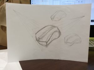
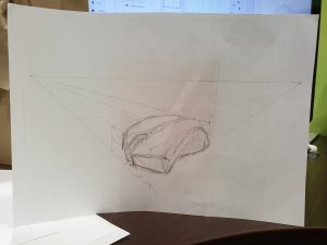
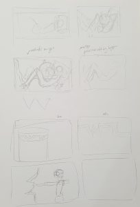
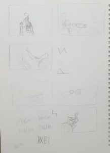
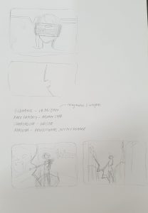
As a person who isn’t good at illustrations or photo-editing, I already knew I would have a hard time with the project, hence, I decided to start by drawing many different layouts for the different jobs so I could consult and get feedback.
I did my sketches on both paper and digital, though I already confirmed I would do digital for my final.
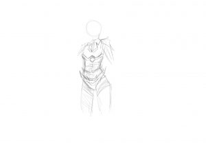
Writer
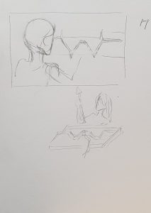
For writer, I initially wanted just a normal drawing of a person or typing to show the job. I used the body of a person to try and make the letter W. Below is one such example. This was before I changed it to fit the daydreamer idea.
I really love writing and so instantly I decided that one of the jobs I would choose would be “writer”. As a person who enjoys escaping reality, I daydream frequently and this is when I create stories in my mind, with many various scenarios that most often are fantastical or entire made up scenes, detached from my reality. An entire story is formed and I find myself getting absorbed into this world, which I then make concrete through the means of writing. Thus, I decided to add in the message of a new world opening and me going into it.
After searching around the internet, I also considered using a window frame to fit the person within it, etc. But soon changed the idea after changing my idea.
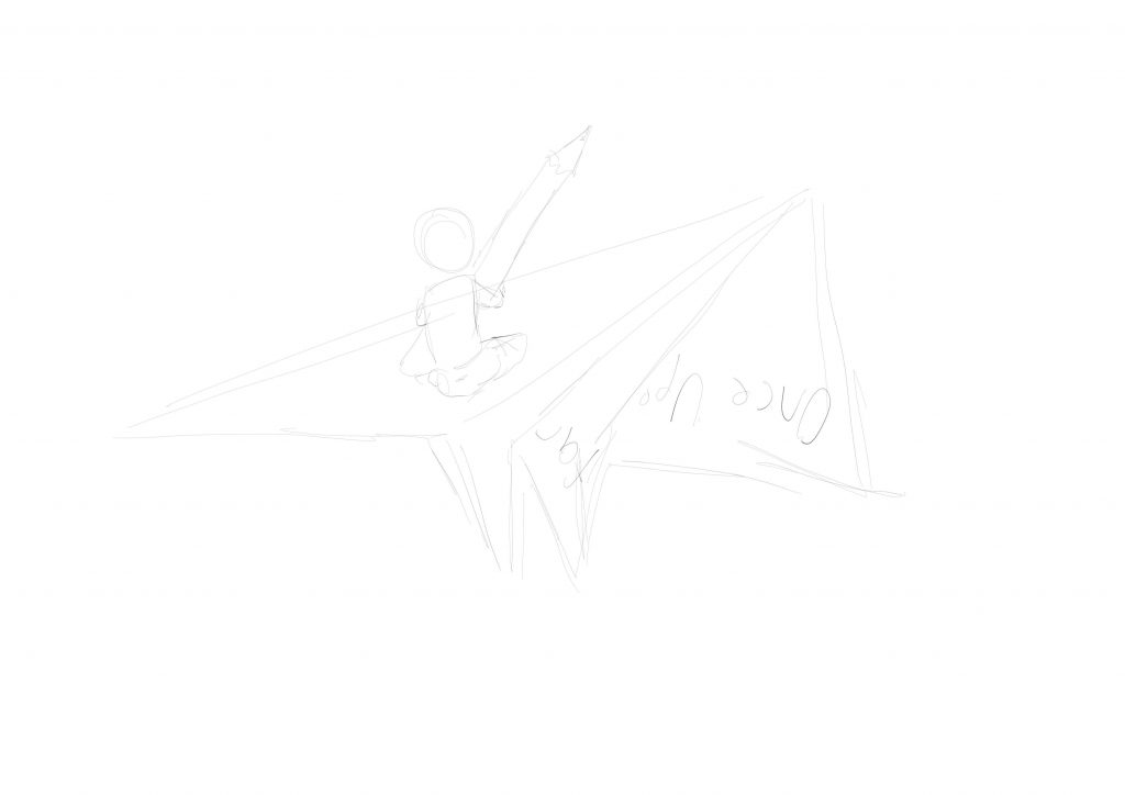
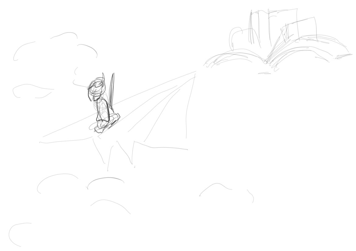
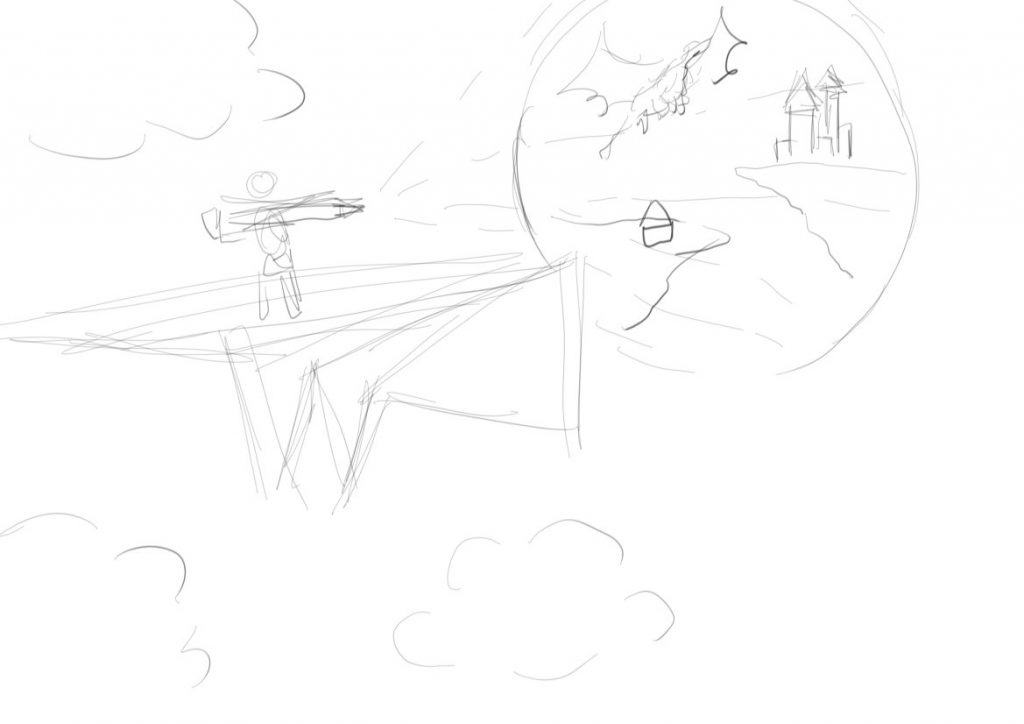
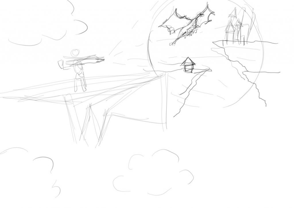
I initially drew a person on a paper aeroplane and decided to continue working on it, to show how I felt writing made me open and enter an entirely new world. The W from my name was incorporated into the folds of the paper aeroplane.
I then further pushed the idea, into a person on a paper aeroplane opening a portal into a fantasy world, and wanted the entire work to have a surrealistic feel, with the entire scene set in the sky.
Below is the process I took to reach the final.
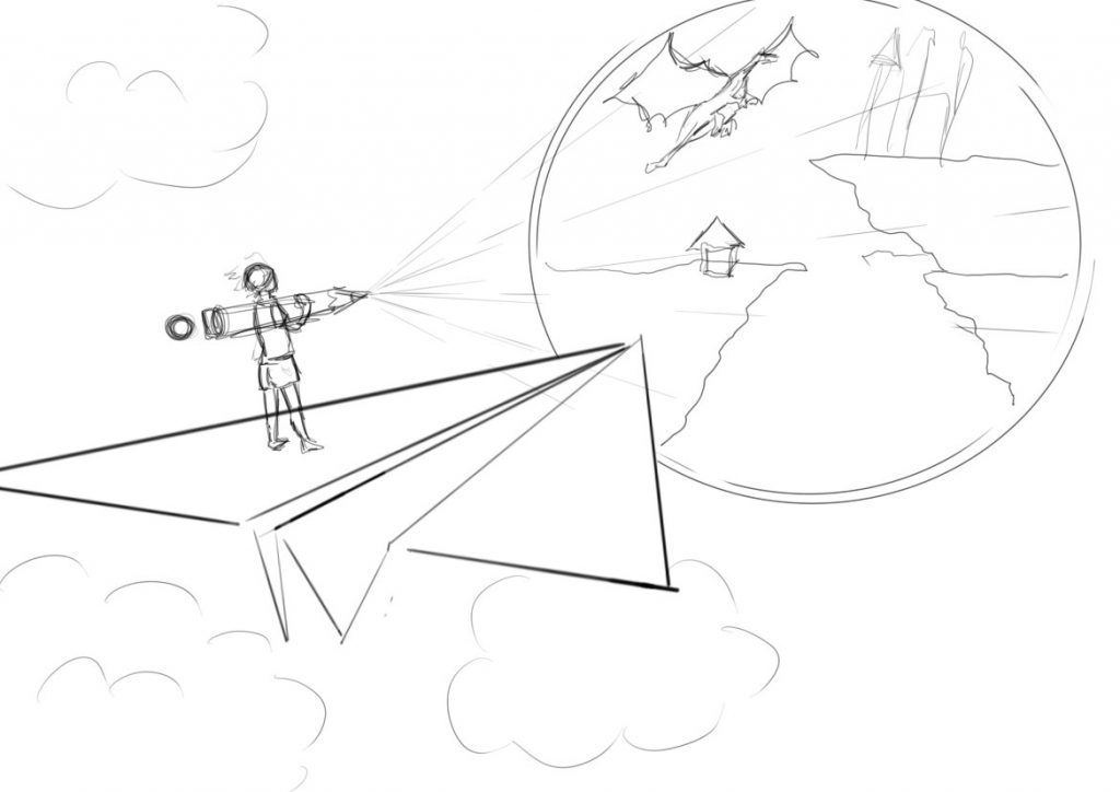
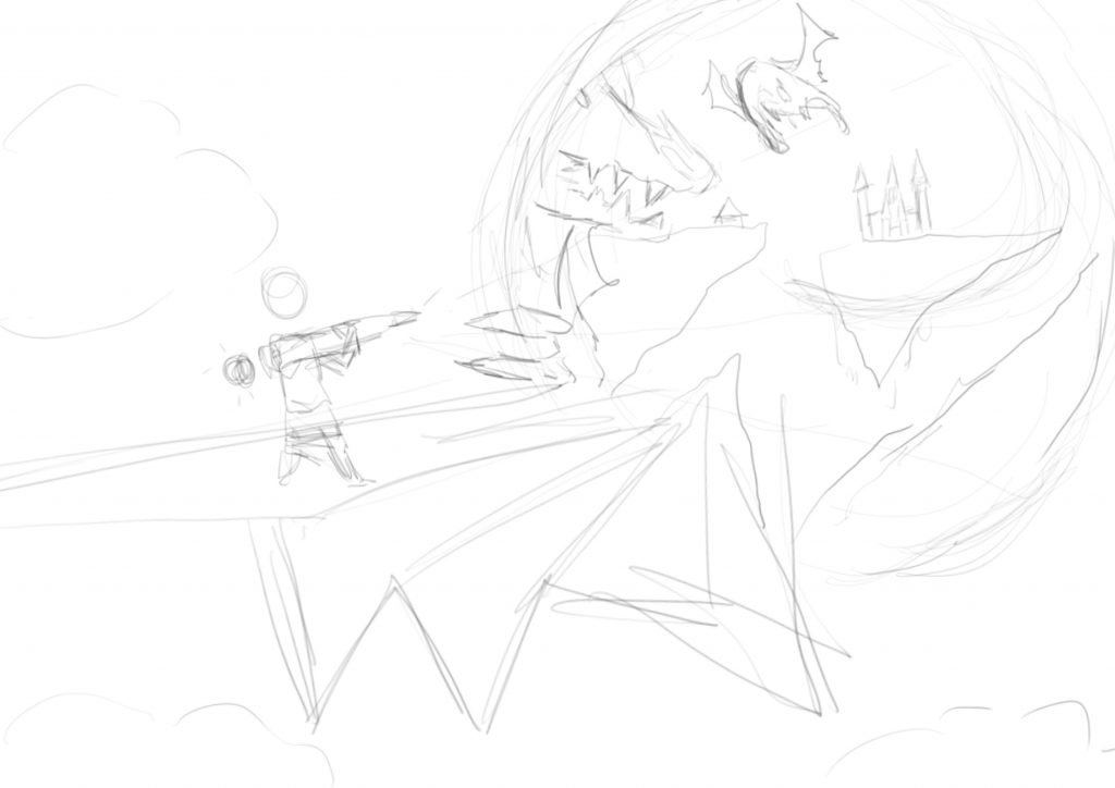
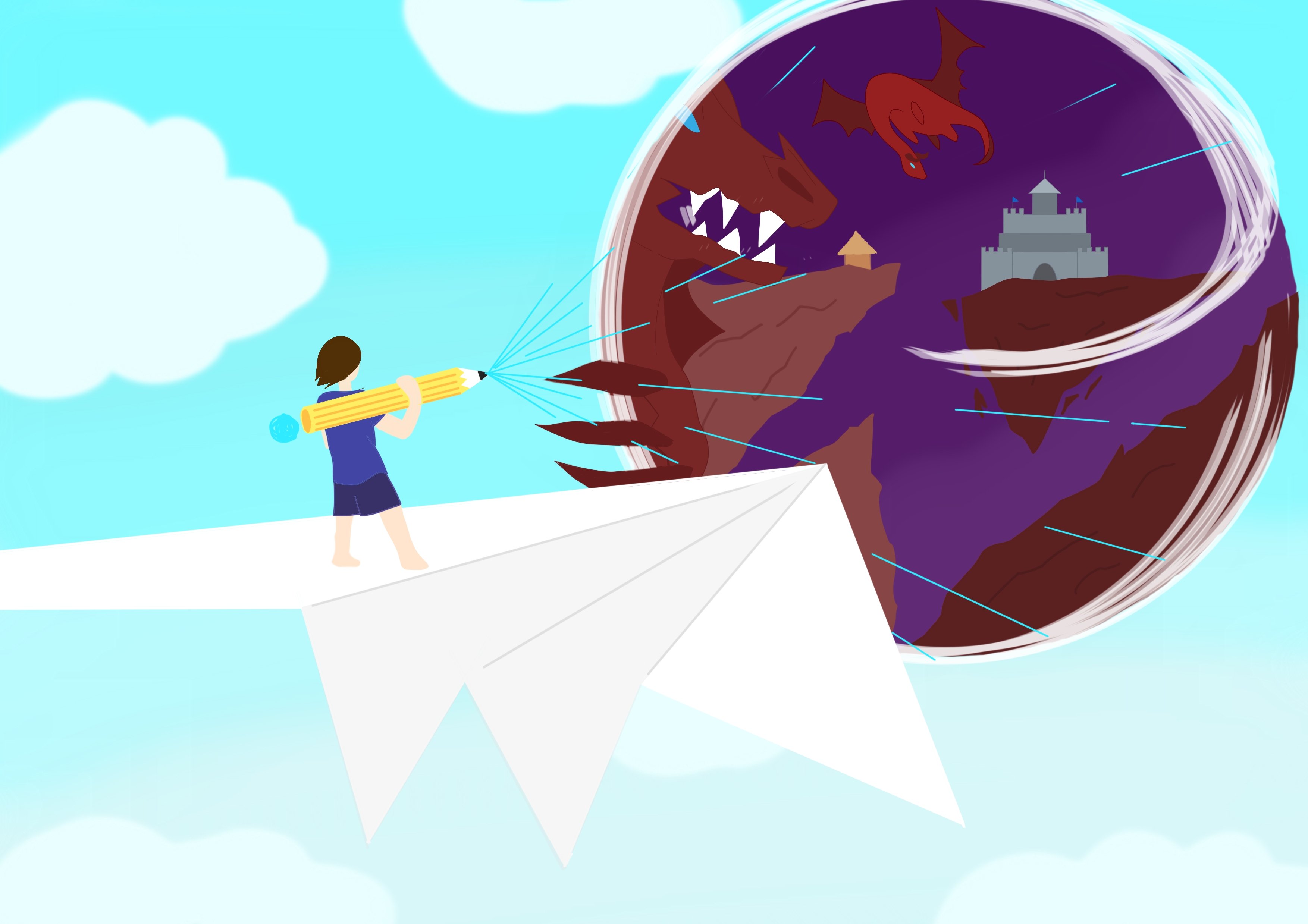
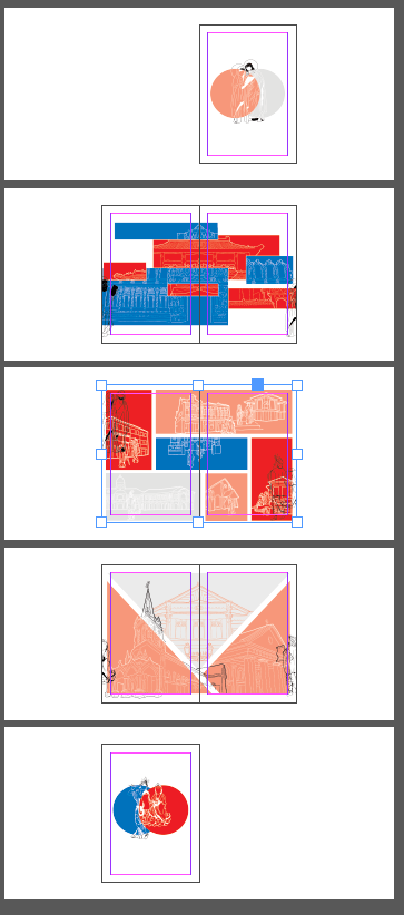
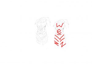
Final for Writer
Letters of name used: W, e, i, n
Where?
- W
- folds of aeroplane
- teeth of dragon
- E
- horizontally flipped uppercase E from claws of the dragon
- lower case e from portal swirl
- I
- N
- formed by negative space of the cliffs
Message: Writing opens up a new world and brings me into it, goes beyond the boundaries of real life.
Professional Soft Toy Hugger
Soft toys are great and I love hugging them. I have many toys and I often find myself only hugging certain ones due to their “huggability”. For me, I find comfort and joy in hugging my soft toys, using them as a way to de-stress. This results in me dreaming of simply hugging my toys all day and daydreaming about nonsensical things. I hence chose this as another job as it would be amazing if I could earn an income doing something as nice and comforting as hugging soft toys. Though, it is definitely but a dream.
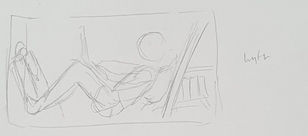
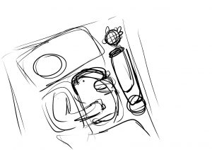
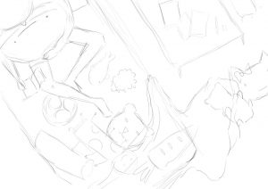
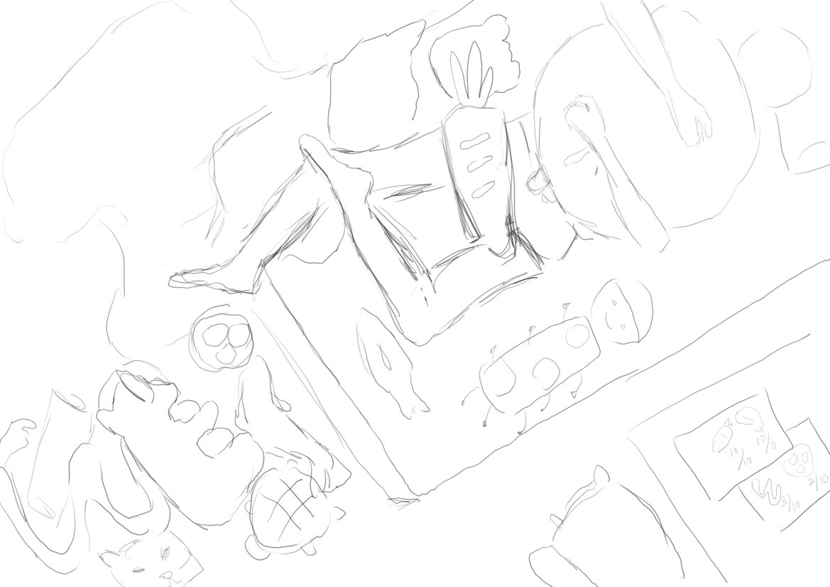
I wanted to use a person on a bed with many soft toys, but there were many objects in the drawing and many ways I could position them. Thus, I had many different layouts to see which fit best. I was insistent on the bed as I felt it best showed the comfort of the job and how carefree it was. Being surrounded by soft toys further add to the feeling.
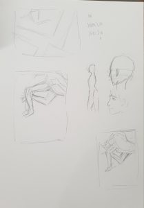
There were many different choices, such as using the legs to form a lower case letter E, or having the body form an uppercase E, etcetc. It was an interesting experience experimenting with the different layouts depending on the letters I had wanted to form.
Initially, I had wanted to use a character, paired with a bolster at her feet to form the letter w, however, it ended up looking quite forced, and I thus decided to look further into other layouts (Some in sketchbook as shown above, digital ones below). I had not wanted to force the letter form by bending and shaping items but soon realised the difficulty in doing so. Thus, I caved in and tried some bending of items that would logically be in the shape of the letter.
Sideways E, along with a rotated N from hugging of soft toy, i from soft toys.
(As shown in pic)
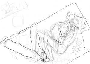
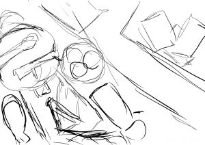
Lower case e from legs, N from blanket, W from papers, I from natural shape of soft toys. I really liked this view from above but then wanted to continue trying more ways to portray the letters.
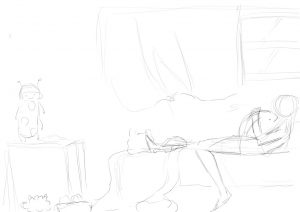
W from the crease of curtain, I from natural shape of the toy, forced N of body (not obvious). It had turned out disappointing to say the least. I did not really enjoy this layout and thus moved back to my original top view. Many of the letters here were not only forced but also hard to see.
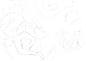
E from body, I from toys, W from papers and snake. This was one layout I considered but then felt it had been too rigid and boxy. Thus, I decided against it.
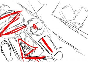
N created from hugging of soft toy, lower case e from legs. I had received feedback from this piece that the e from the legs had not been obvious and the N created from the hugging of the toy had been interesting. I felt the same way and thus worked with the N created.
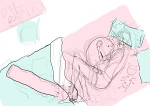
After deciding that the letters should not be all over the place, I came to a final layout that had my name in order – WEILIN so it would be easily viewed.

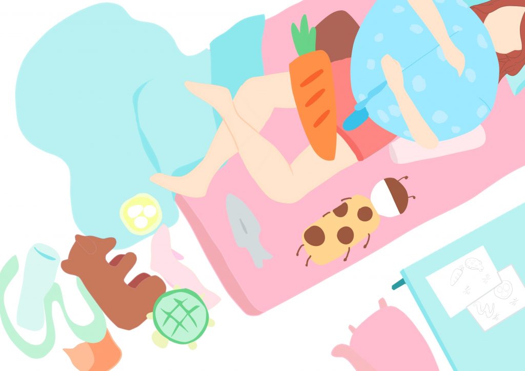
Final for Professional Soft Toy Hugger
Letters of name used: W, e, i, L, i, n (in order)
Where?
- W
- E
- natural uppercase E from bear toy flipped on its side
- I
- lowercase i from dolphin and round egg toy
- L
- I
- N
- N formed from hugging of soft toy
Message: A comfortable and light job. Hence shown on the bed -> comfort. Usage of pastel colours to show the softness of and happiness from the job.
Demon Lord
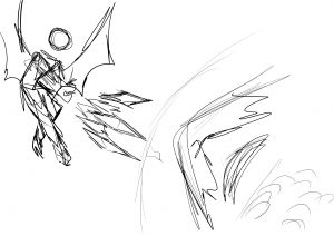
The demon lord one was something I had quite a lot of fun with, but also issues. It went through a lot of changes, and thinking back it was quite an interesting journey seeing my different layouts.
Demon lords had always interested me since young, as I watched a lot of anime and the demon lords were always extremely strong and cool. While slightly cynical-sounding, it was not as though I hoped to murder or massacre populations. Instead, it was the power that demon lords had individually that had me captivated. Should they choose to do good or bad, they had little to no repercussion due to their strength.
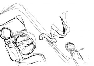
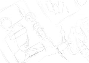
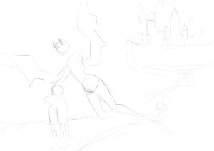
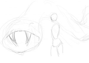
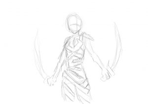
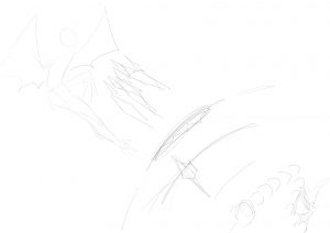
Thus I wanted to show this point and began sketching some ideas. Firstly beginning with one of a demon lord holding a weapon and castles behind.
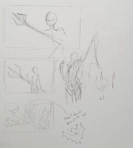
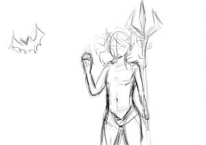
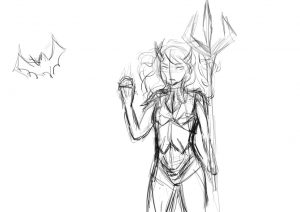
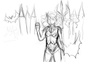
 This had been one of my first few designs for the project, and I had actually simply tried to plaster the letter w all over the place – in the character’s trition, the clothes design, castles, bats, etc. I then received feedback that this was not what the goal was and thus created more designs, with that in mind.
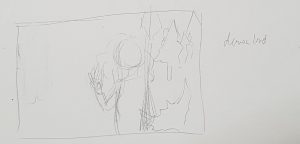
I also had tried one involving a narration, to show my message of why I had wanted to be a demon lord, but there had been too long a message to how in a single frame, and thus I had to think up more ways of depicting my point or changing the message.
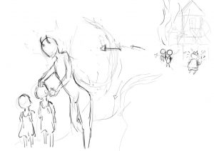
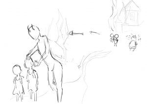
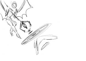
I then made some designs in reference to the apple tree from the story of adam and eve, using the tree branches as w.
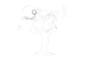
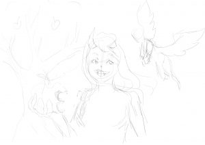
And also tried out other methods, incorporating a snake since demonlords are known to be able to control strong beasts.
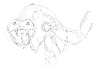
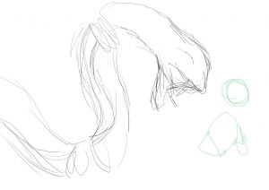
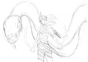
I actually really enjoyed this layout, but it had not focused on the letterforms that much as it was condensed into the armour only.
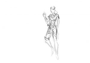
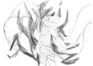
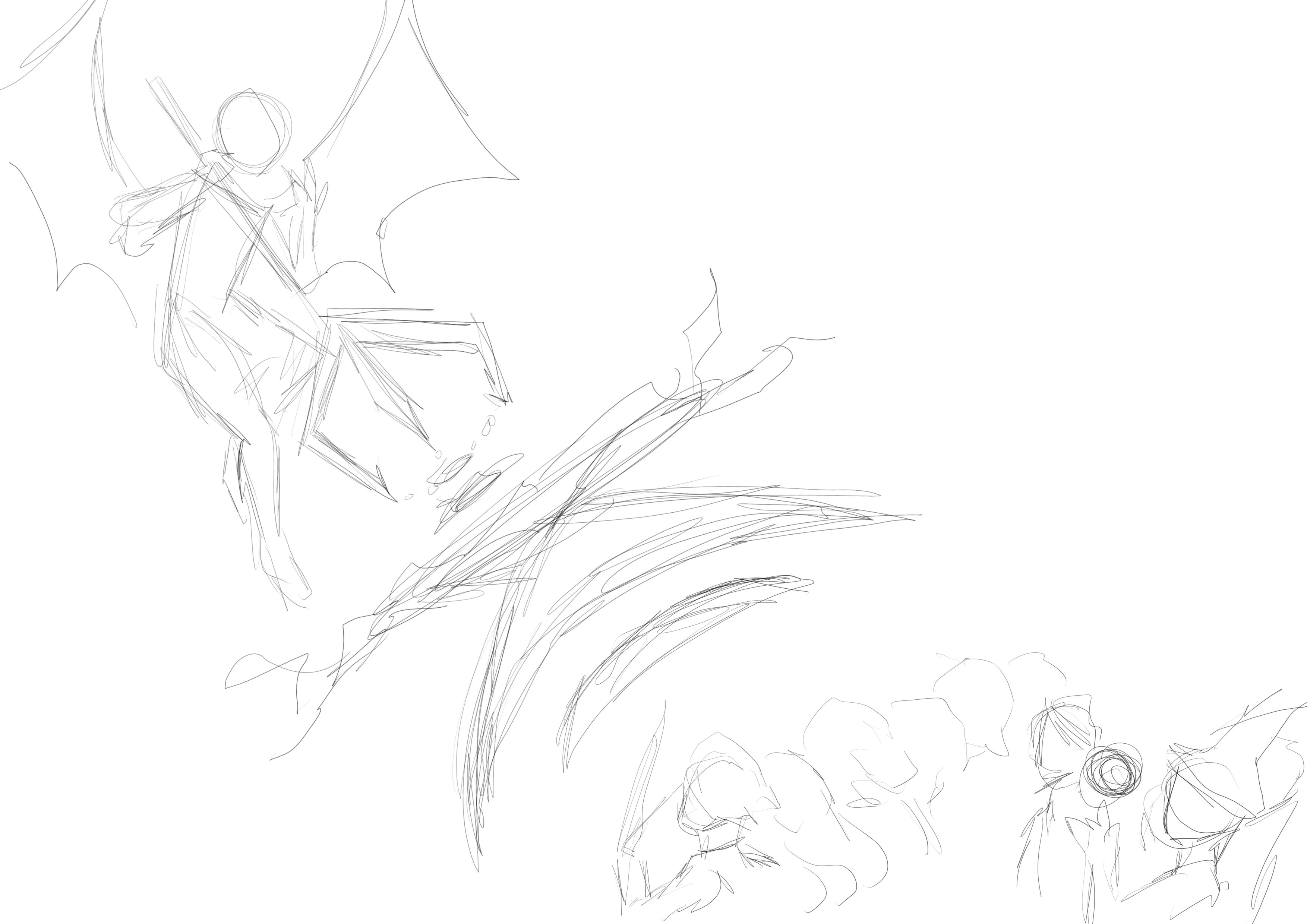
I then tried other ways to portray my name, mainly trying to make it more linear and using a battle scene as a way to show my message. The letters would span diagonally across the page
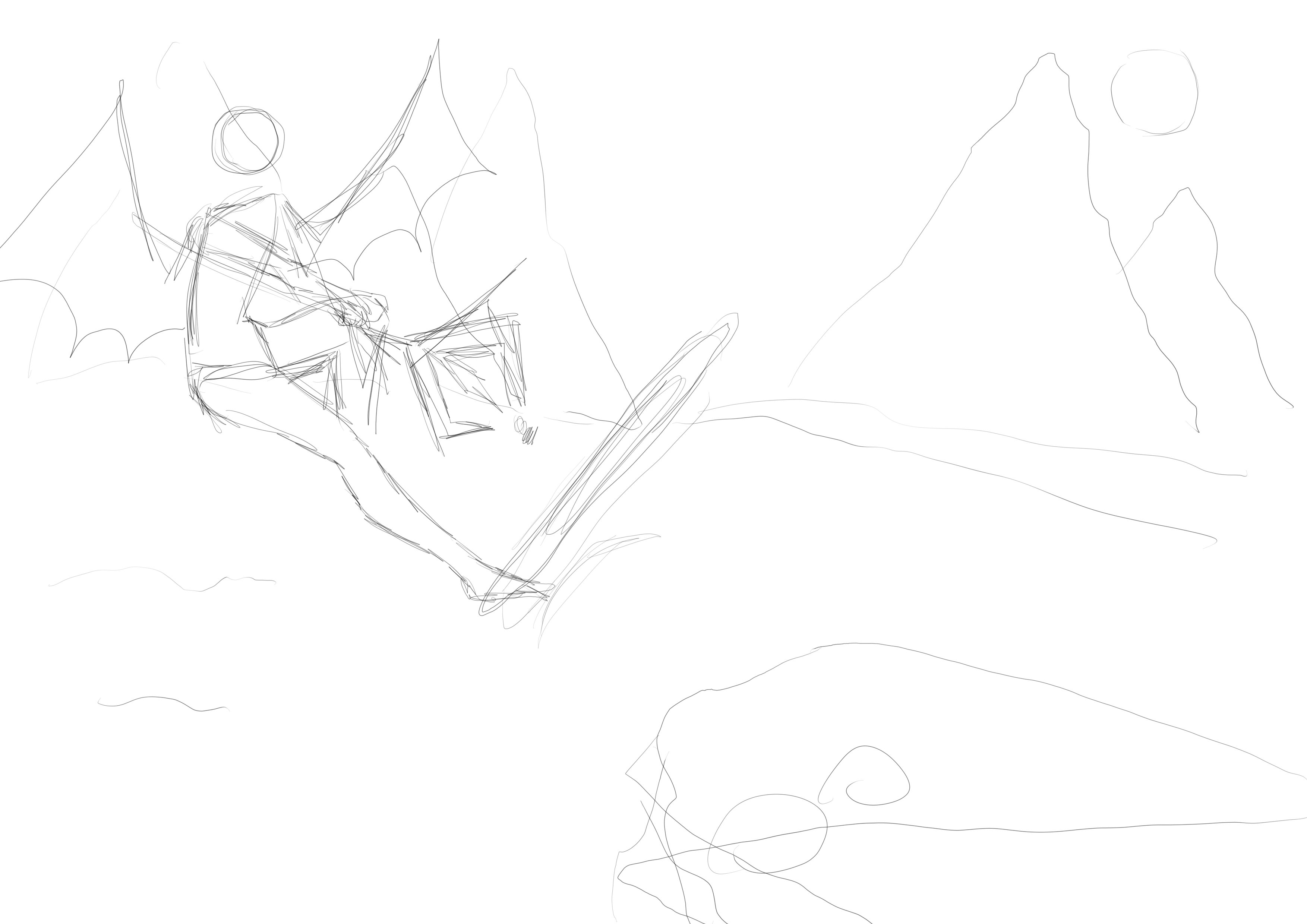
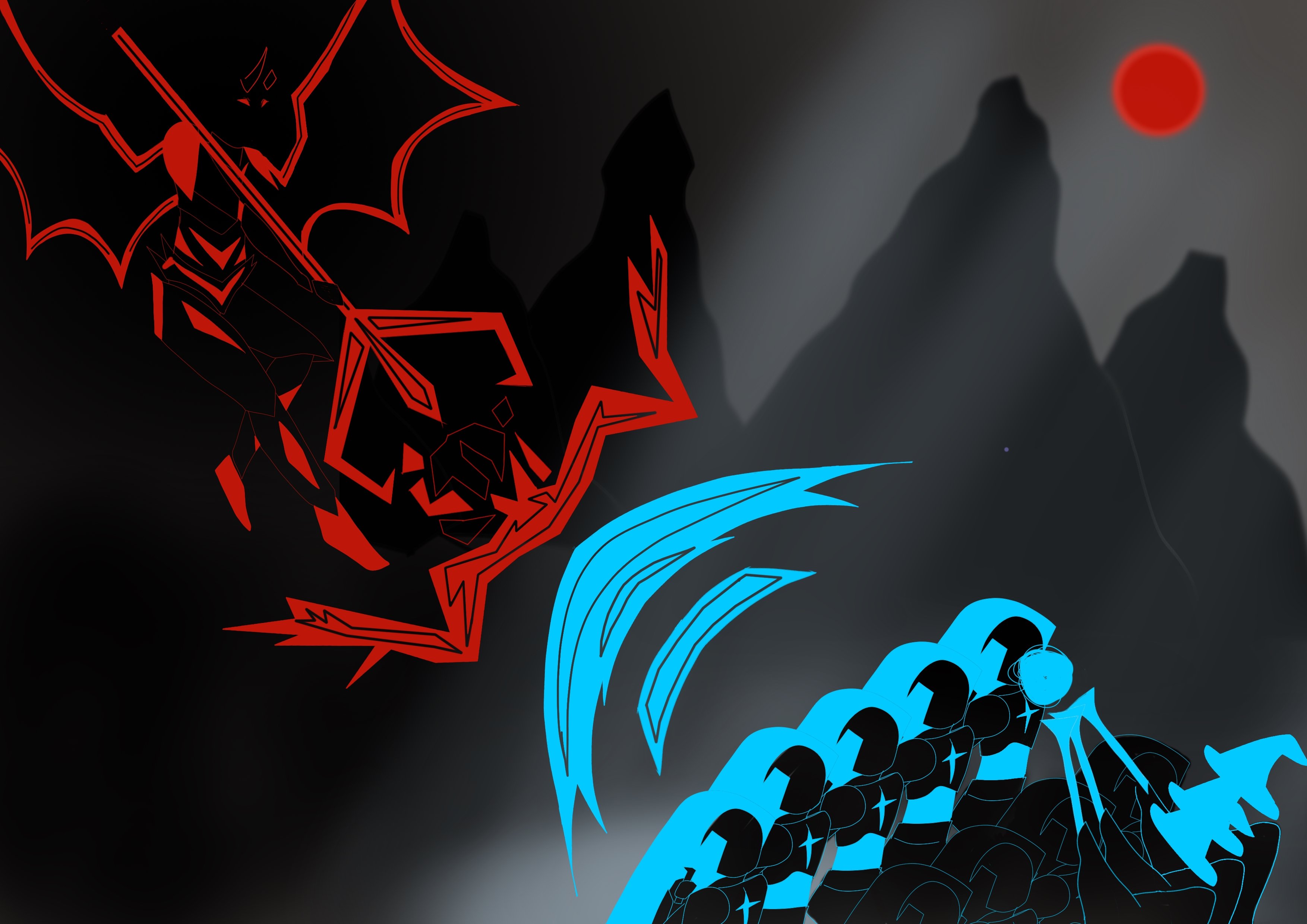
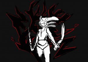
Final for Demon Lord
Letters of name used: W, e, i, L, i, n (in order)
Where?
- W
- E
- I
- L
- I
- N
- formed in the blues of the opponents
Message: To show that demon lords are strong and powerful, using singlehandedly defeating many enemies and even overpowering them. So dissimilar to heroes who often have to band together to defeat the demon lord -> demon lord having the high ground, being above a bunch of enemies.
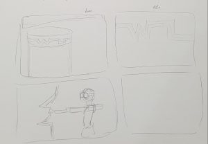
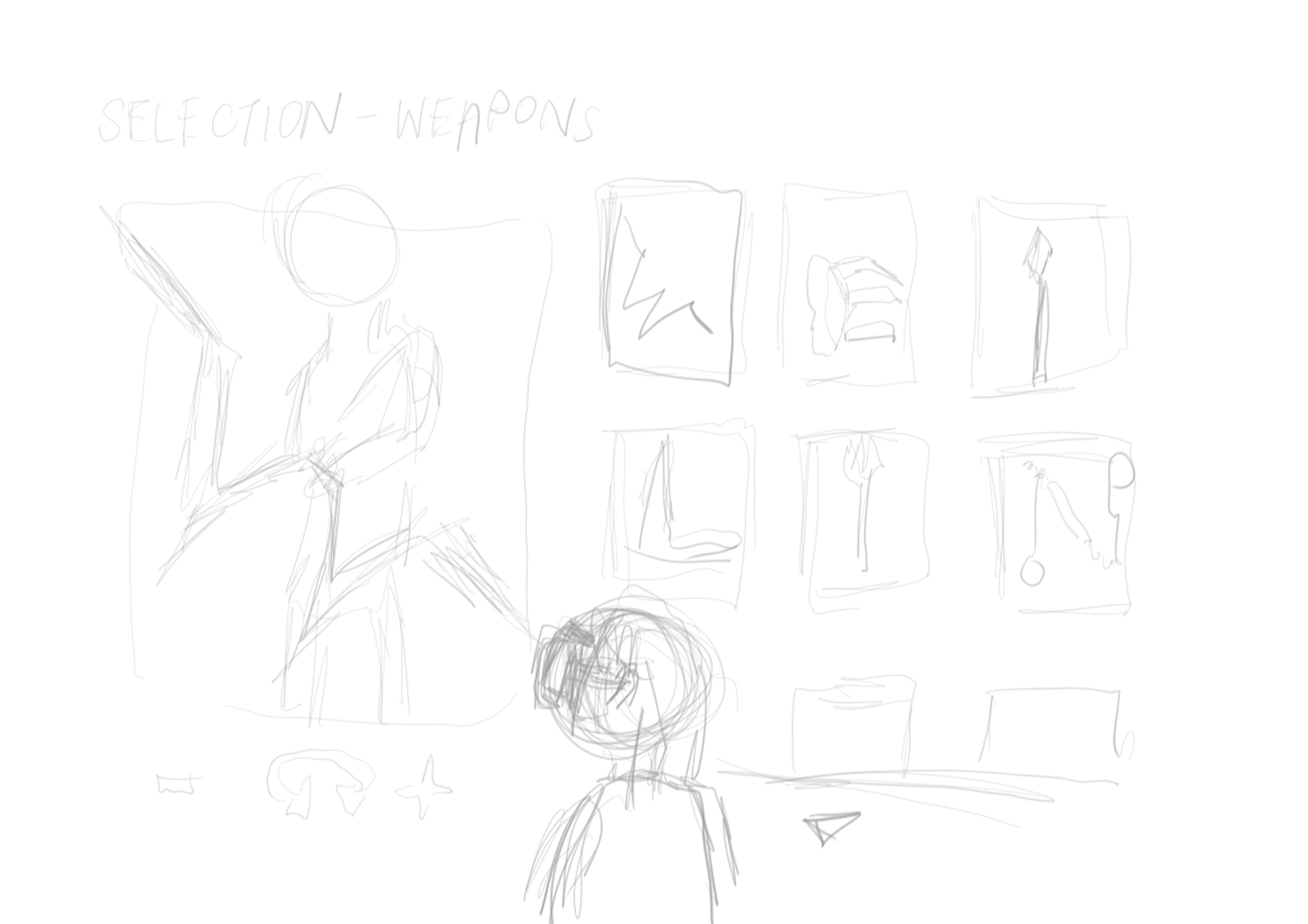
VR Designer
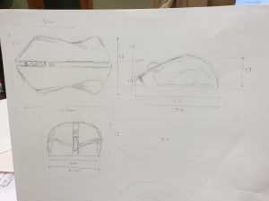
VR designer had initially been prop designer. Both choices were due to how different weapons could be made in VR or as props, and they did not to be realistic to work. This interested me and I wanted to make props or weapons for movies or games.
The creation of different types of weapons thus became my main focus, and I worked on it with this in mind.
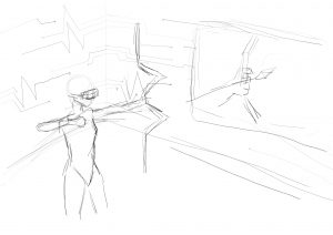
Below are some sketches for both prop designer and VR designer. This included a scene of one making props, one in a VR room, one within the game, etc.
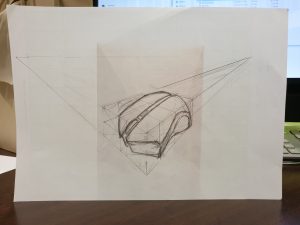
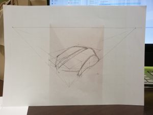
I went to search for various styles of layouts and then tried a few more designs. I also thought about using the lines of cyber styled arts to form my name.
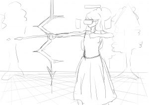
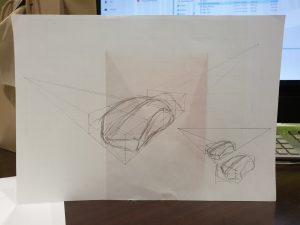
After consultation, it was advised that I use a game selection interface and I really liked the idea. I thus decided to form my name within the weapons created, tying in with the message of being able to create unique non-realistic weapons.
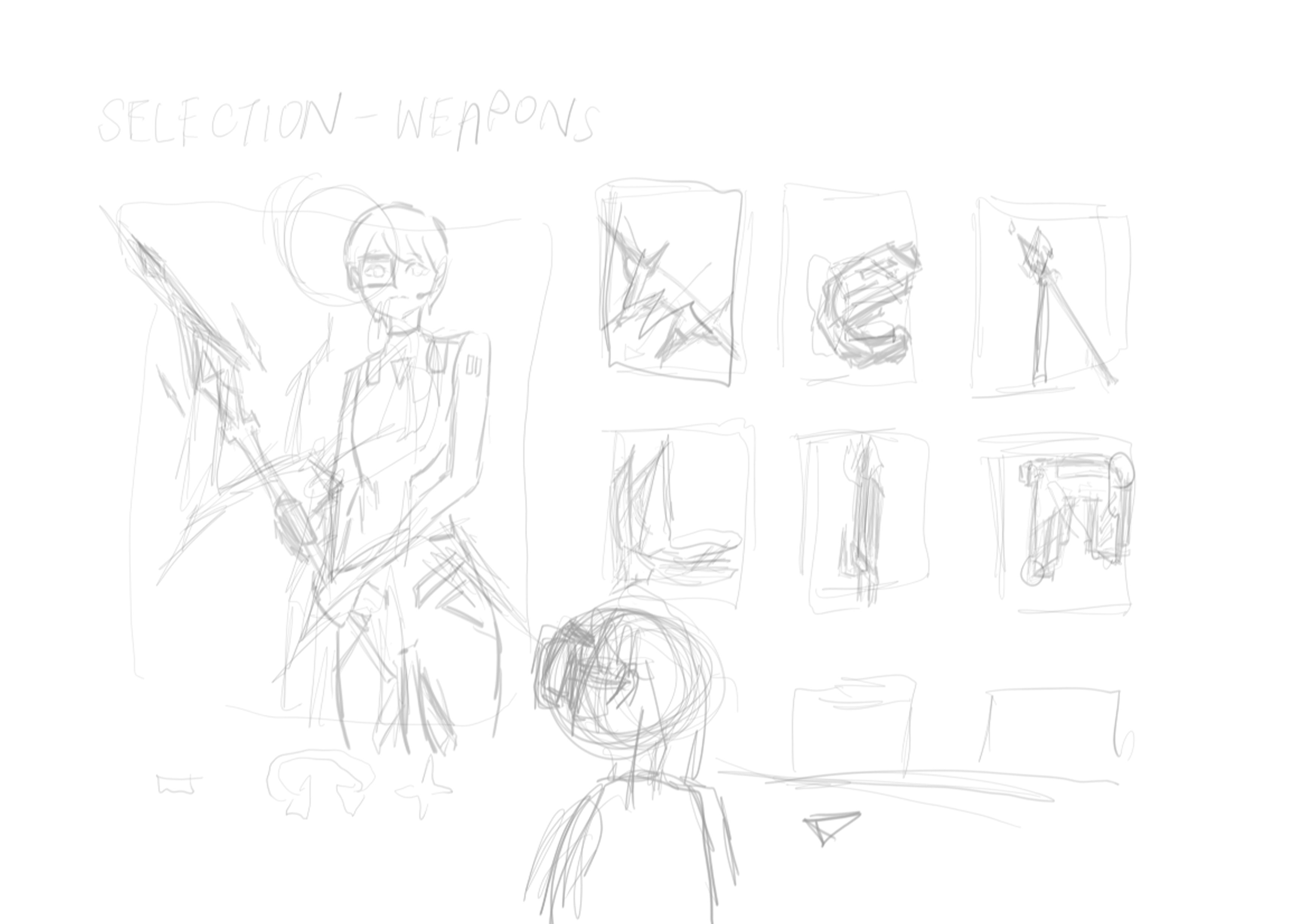
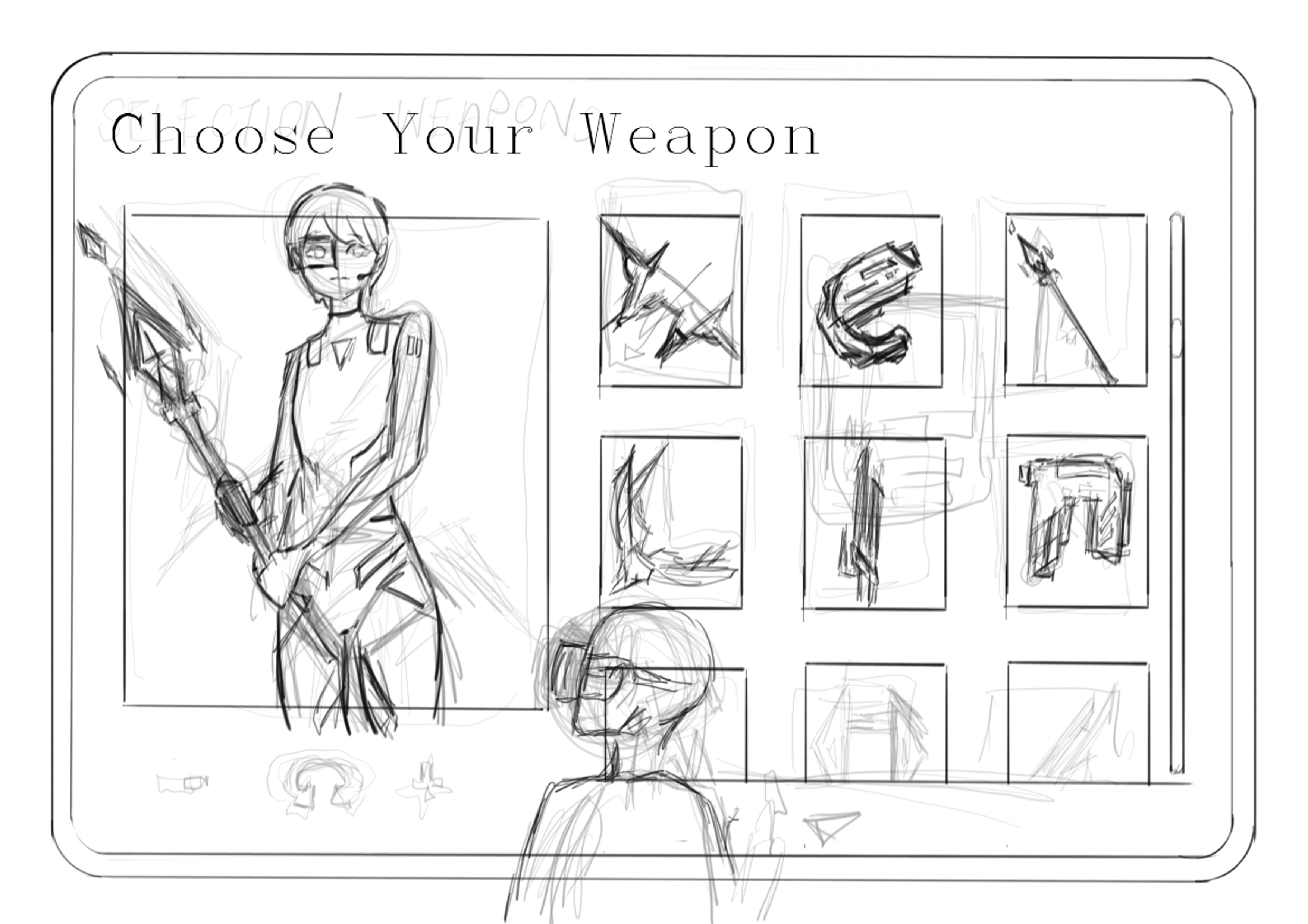

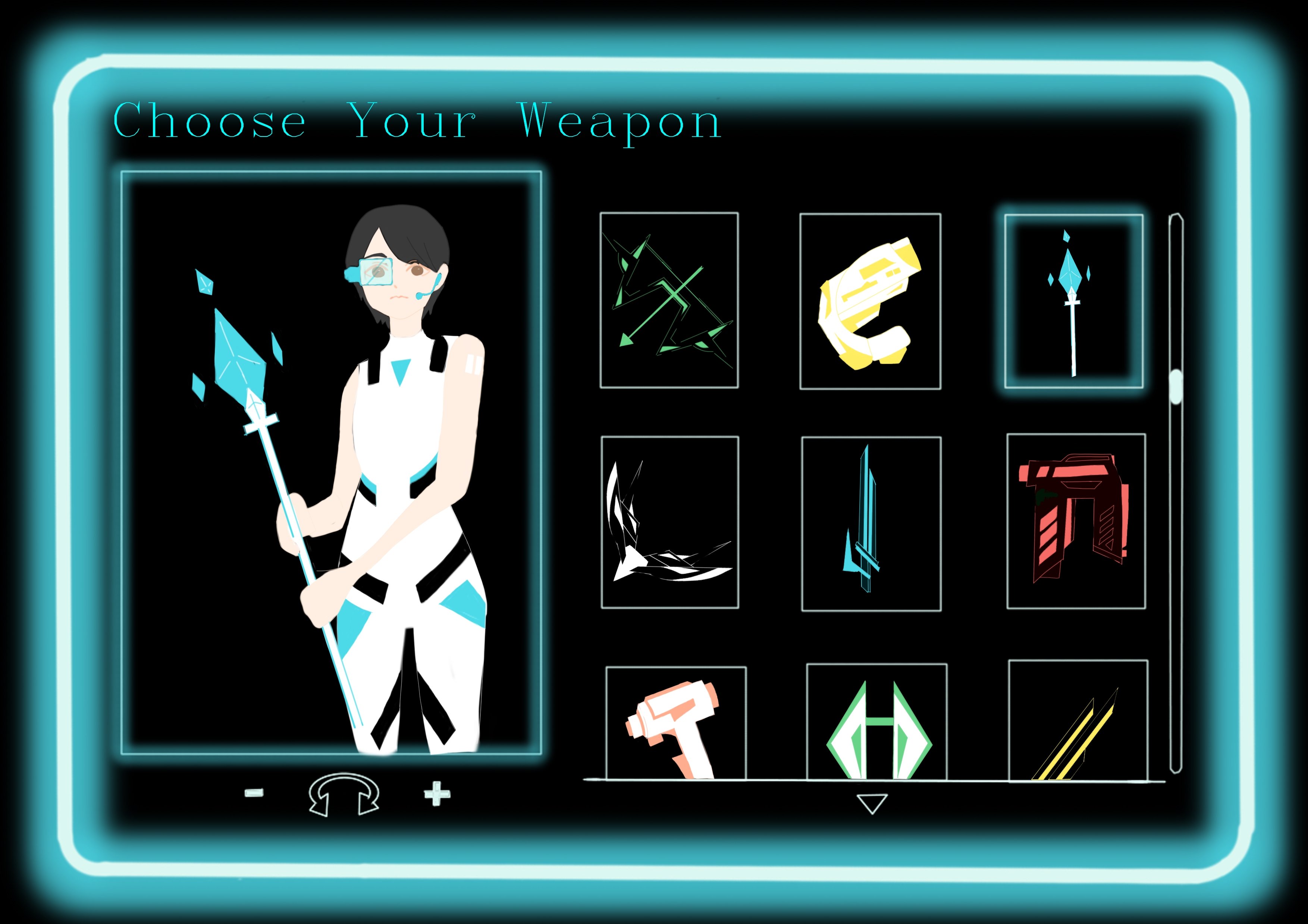
Final for Demon Lord
Letters of name used: W, e, i, L, i, n (in order)
Where?
- In the various weapons on the side
Message: Being able to create a variety of weapons regardless of realism, and then watching them be used in a game
Overall, this project had been a long ride and I learnt a lot about layouts from here. I felt I managed to push myself regarding illustrations and understood that I had many issues with colours – something I definitely plan to work on in the near future. Using letterforms to form images had been a challenge but most definitely a fun one.
For clearer images of all pictures, please click here: https://drive.google.com/open?id=1BpexTYIUQsPPJ-GegN75vwbN-8_yc2T1