Week 7+8 Reading

Chapter 1 from Kim Goodwin, Designing for Digital Age

This chapter gave an insightful viewpoint of the role(s) of design. I especially appreciate the point on how ‘no designer can determine exactly what experience someone has’. While we do design to achieve certain user experience as a projected outcome, we have to note that each person interprets designed experience and artifacts differently and may experience something different from what we, as designers, had set out to achieve. This was explained by Kim that each person brings her own attitudes, behaviors and perceptions to any situation; I feel that this is rather important concept that we have to be aware of, while designing.

The author mentioned a point that ‘some organisations may believe getting a best-guess product out the door is more important than taking the time to understand their users and customers in any depth, so there are ways to jump to design with little or no time spent on research’. I wonder about the extent of trade offs in such cases and how good research would value-add to the outcome, and how much the before-mentioned organisations would gain in the long run. If the long-term benefits outweigh the immediate returns, how and what can we as designers propose to these clients/ management?

Are there examples of optimal design teams that are small but has frequent contact with members of a larger design team? The way they work and collaborate with one another might give us a more concrete understanding on how these teams deliver effectively and efficiently.

Week 6 Assignment

Assignment: Over a two-day period, do the following:

DAY 1 – create a diary of when, why and what you use your mobile device for. Observe how others are using their mobile devices. What are the most common uses and where do you see these behaviors?

Day 1 (00:00am to 11.59pm 11 Sept 2016)

Personal Usage

Doing some research work at Starbucks and made impromptu plans with siblings;

caught The Happy Film at Shaw Lido, Orchard

*Safari— Googling something quick, checking for fast information on-the-go

*iMessage/WhatsApp— Messaging my siblings/ friends to make plans (impromptu and in advance)

*Notes/ Photos— Referencing photos/notes I’ve taken down (Retrieving my Archive)

*Calendar— Check for Plans (Calendar/ Organising time)

*Alarm/Unlock Screen— Alarm/ Time check

*Instagram/Facebook/Snapchat— Social Media (sharing interesting articles/videos, news- Paralympics, zika, finding out what others are doing)

What others use their phones for, and I don’t:

  • Music (on-the-go, in public and private spaces)
  • Video Streaming (on-the-go, especially on public transportations)

Reasons for the difference in usage behaviors; alternative devices for substitute

  • Music (limited memory space); substitute: iPod
    — curated music playlists / block out surrounding noise / environment
  • Video Streaming (keeping my data usage lower); substitute: Macbook
    — macbook uses: Research, Videos, Googling, Messaging, Social media (esp. Facebook)

DAY 2 – Do not use your phone, computer or electronic device for 24 hours. Create a diary documenting and describing the difference in your behavior patterns. How did you do the things you would normally do with your phone? What other alternative behaviors did you develop? What else did you notice about the difference in behavior?

Day 2 (00:00am to 11.59pm 12 Sept 2016)

Out running an errand at shopping centers— Marina Square

*Safari— googling made impossible. I have to rely on memory & recollection of data using my brain while I was out and trying to navigate to places. Looked at MRT maps, way-finding signages & directory at Marina Square.

*iMessage/WhatsApp— Leave written notes around on the kitchen table as form of communication with family members

*Notes/ Photos— Retrieving archive made impossible, whereas making notes are still possible with Paper & Pen

*Calendar— Couldn’t recall what I did for the past week/month. And time organisation for future appointments were to be handwritten/ make a mental note. Tried not to make plans too far ahead for time being. Reliance on my iCalendar is real

*Alarm/Unlock Screen— thankfully I didn’t need to set any Alarm as I do not own a physical alarm clock, oh the horror. Time check is still possible using my trustworthy watch

*Instagram/Facebook/Snapchat— Social Media not possible finding out about other people without my mobile phone.

Place, Location and Ubiquitous technology

Would like to share about Augmented Climbing wall technology; an interesting marriage of technology and Rock-climbing. You can watch the videos as per linked below:

https://www.facebook.com/AugmentedClimbingWall/videos/1023611264397351/

  1. Learning: you get to relook and learn from climbing patterns since each individuals’ way of climbing is different
  2.  Battle: Besides working out, you get to have an interactive fun game with someone else

More about:

Augmented climbing Wall is the world’s first global gaming platform for climbing walls.

We have combined in-depth knowledge about computer vision, exergames and user experience for providing an unprecedented climbing experience.

Our diverse team consists of experts in the fields of computer vision, game design, UX design, motor skill teaching and industrial design among others. Our startup is a spinoff from Aalto University Game Research, Finland.

Week 5 Reading Response

Reading: Ch. 4 from Chipchase Hidden in Plain Sight

Upon reading the first paragraph of the text, I found it strangely familiar and realised that we have watched a TEDtalk by Chipchase some time ago. Similarly, the TED Talk talked about the trend of ownership > consideration > carry > use. I found this visualising of the circles really interesting and as I go on with the reading in Chapter 4, we can clearly see the relationship with the advancement of technology. With reference to the diagram in reverse, ‘mobile technology has dramatically changed people’s behaviors outside the home’, from carrying less > remembering less > owning less.

However, it seems that our reliance on mobile technology affects our behavior in some ways like memory and sensitivity to our surroundings. For example, having the option to remember less allows us to be less active about utilising our memory space. Also, personally, my reliance on GPS systems like Google Maps allows me to aimlessly drive to my destination and not making mental notes about where and how I am navigating. If my phone were to run out of battery, it would be challenging for me (and I believe most of us) to get to unfamiliar places.

Qn—How can the user find a balance on the reliance and how can the designer intervene?

I like the idea about having no way to steal something that has no owner. I am excited to see this theory come to fruition if we are able to get there some day as it seems viable if there is a strong network power and efficient distribution network.

Chipchase talked about the art of delegation. He said that from a design perspective, it’s about understanding what you can delegate to technology and what you can delegate to other people. And in this chapter, he brings the point of delegation to automated systems like algorithms. It does not seem like a far-fetched future that we leave tasks to algorithms and formulated systems, it is just a matter of time. For example, the fintech industry are already tapping into the Blockchain technology, a publicly distributed ledger that works similar to what Chipchase’s ‘a public networked infrastructure’, and that could potentially disrupt the financial industry in the way we trade value in the future. 

Qn—We are foreseeing how technology can potentially take the place of many tasks and roles, but what are the limitations of technology? How will that change the way we design or the experience on the user’s end? 

Visualising Everyday into Data


View more on: http://www.dear-data.com/theproject

This is an interesting take on 2 designers who decided to document and reveal their daily observations to each other across continents by sending personal postcards weekly. The project turns small observations about their lives into data through visualisation. Also, we get to see the different approach and styles comparing the 2 and it is simply intriguing, I love it.

In the above example, the designers even visualised how much they swore in a week (and what were those about). What if this technique can be used to map sounds we hear everyday and turn them into diagrams? We can also map other different emotions and perhaps mapping our experience in a larger context.

Assignment Week 3

Footway / pavement / sidewalk; british or american english

The sidewalk is indeed an interesting and undervalued subject of interest as the common area has so much potential to be something more than merely a walking space.

The subject of sidewalk reminds me about the historical context of Singapore’s five foot way, an ubiquitous pedestian pathway that is literally five feet wide in the past. In Malaysia and Singapore, five foot ways date back to the time of the Colonial Government; the feature was integral in many settlements in neighbouring British colonies, and remains a prominent element in modern architecture in Singapore, Malaysia and Brunei. It is a space where people used to set up small businesses for trading, providing inexpensive commodities and services. On a brief research, I found that attempts in Singapore to clear the walkways of hawkers in the 1880s led to the so-called “Verandah Riots”. 

On my exchange in USA, I enjoyed how the sidewalks are used by food trucks to stop by the campus during lunch hours. It is a flexible alternative that is convenient and easily accessible for students and faculty.


Week 2 Assignment

Reading Response: Jan Chipchase, Hidden In Plain Sight: How to Create Extraordinary Products For Tomorrow’s Customers. (2013)

The reading gives us a quick recap on the author’s various experience around the world the global examples reminds me on how the process of user experience applies to everyone and everywhere, and enjoyed the descriptions about the little details about each cities’ ritual’ and found myself nodding. I would think that the approach to the exploration of techniques are less structured and detailed for research use and are kept opened to exploration, less conclusive at times. I enjoyed reading up on them but I wonder if there are more structured ways to get myself actively started on observing and/ or research.I thought that the point on ‘perceptions, and social norms, change’ is a good one to note-to-self as we to constantly observe and understand the world around us, which is intriguing and exciting.

The author encouraged us to consider how the city’s signage might evolve in a more digitalised future on page 145, and that reminded me of a video I have recently viewed on hyper reality (see below) of the future —exaggerated but well, food-for-thought. Is this farfetched/is this what we are tending towards/ is it the interaction that we want?

Questions:
— To get started, where and how can we apply observations we found around us?
i.e. making mental notes/ keeping an physical/ digital archive..? do we archive at all / Too trivial to archive?
— How do we strike great balance of practicality using the cultural calibration techniques?

potential problems of oversaturated augmented reality

‘hyper reality’ is a visual illustration by keiichi matsuda that presents a different vision of the future, where physical and virtual realities have merged with a city saturated in media. with physical and virtual realities become more intertwined with the likes of oculus ‘rift’ and microsoft’s ‘hololens’, the internet of things are pointing to a world where technology will envelop every aspect of a user’s life. it will be the glue between every interaction and experience, offering surprising possibilities, while also controlling the way people understand the world. ‘hyper reality’ attempts to explore the platform’s trajector

Week 1 Assignment

Part 2: Find two maps of a building or place you have visited – one map is badly designed and the other is well designed.  Be prepared to explain your examples and bring maps to class.

Case Study: MAPS OF MUSEUMS 

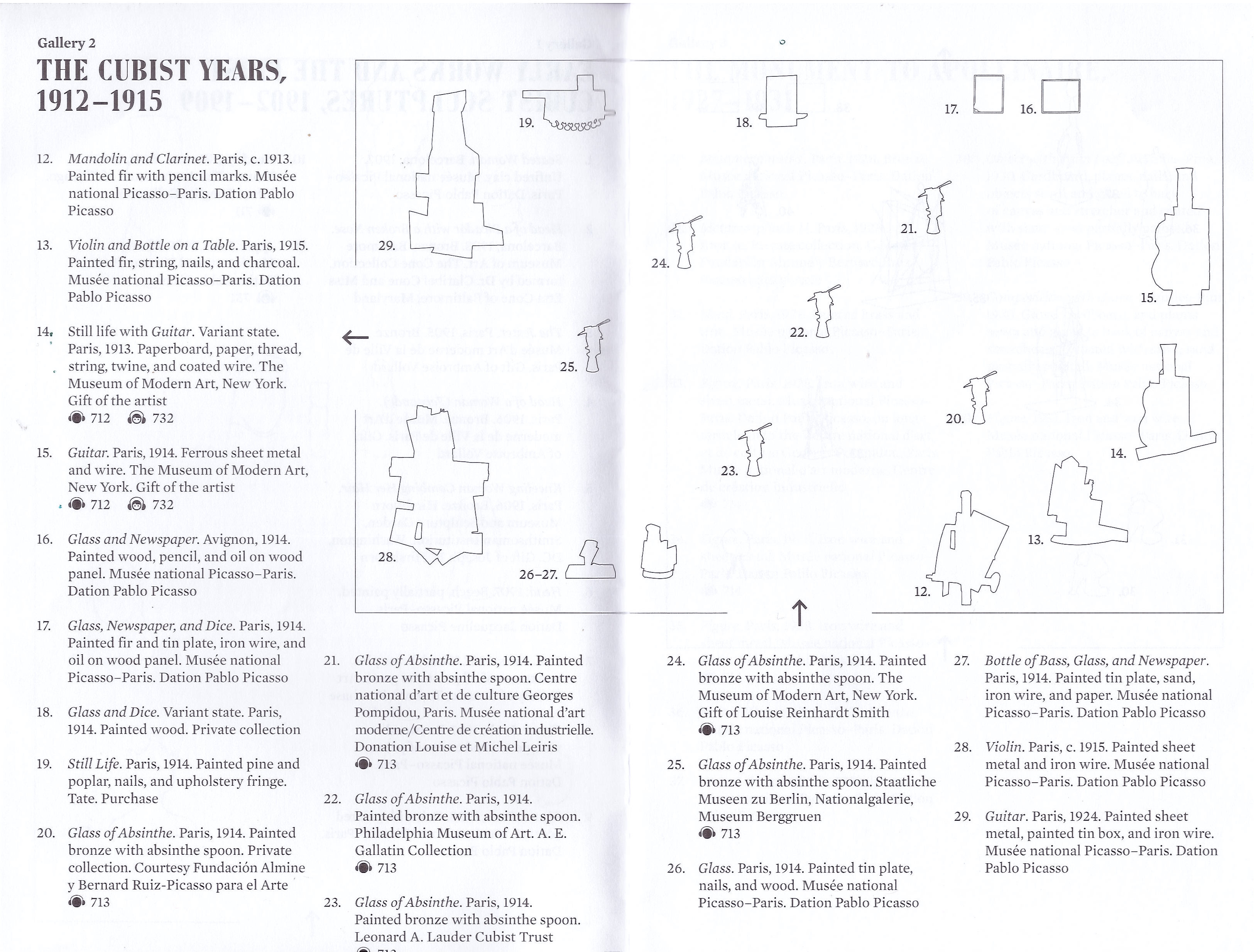
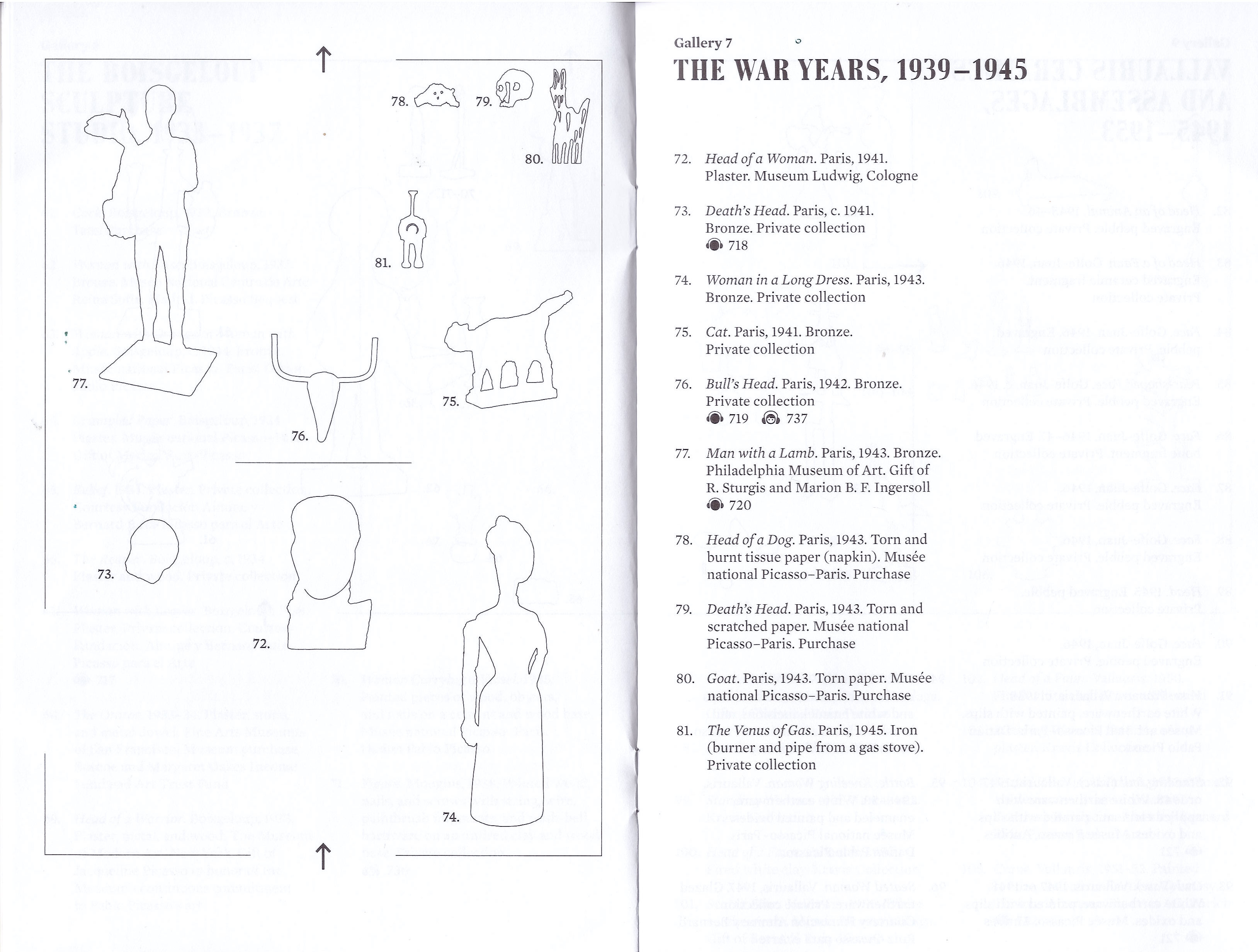
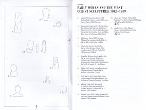
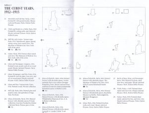
Well Designed: Picasso Sculpture Exhibit Guide

Museum: MoMa, Museum of Modern Art | Location: New York City, NY, USA

Picasso_coverMoMa Picasso_1Picasso_2 Picasso_3

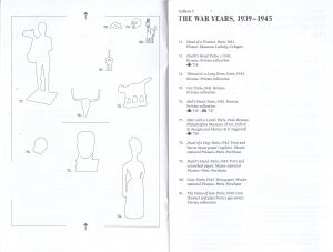
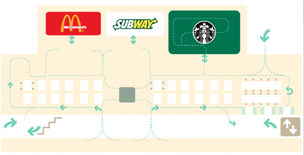
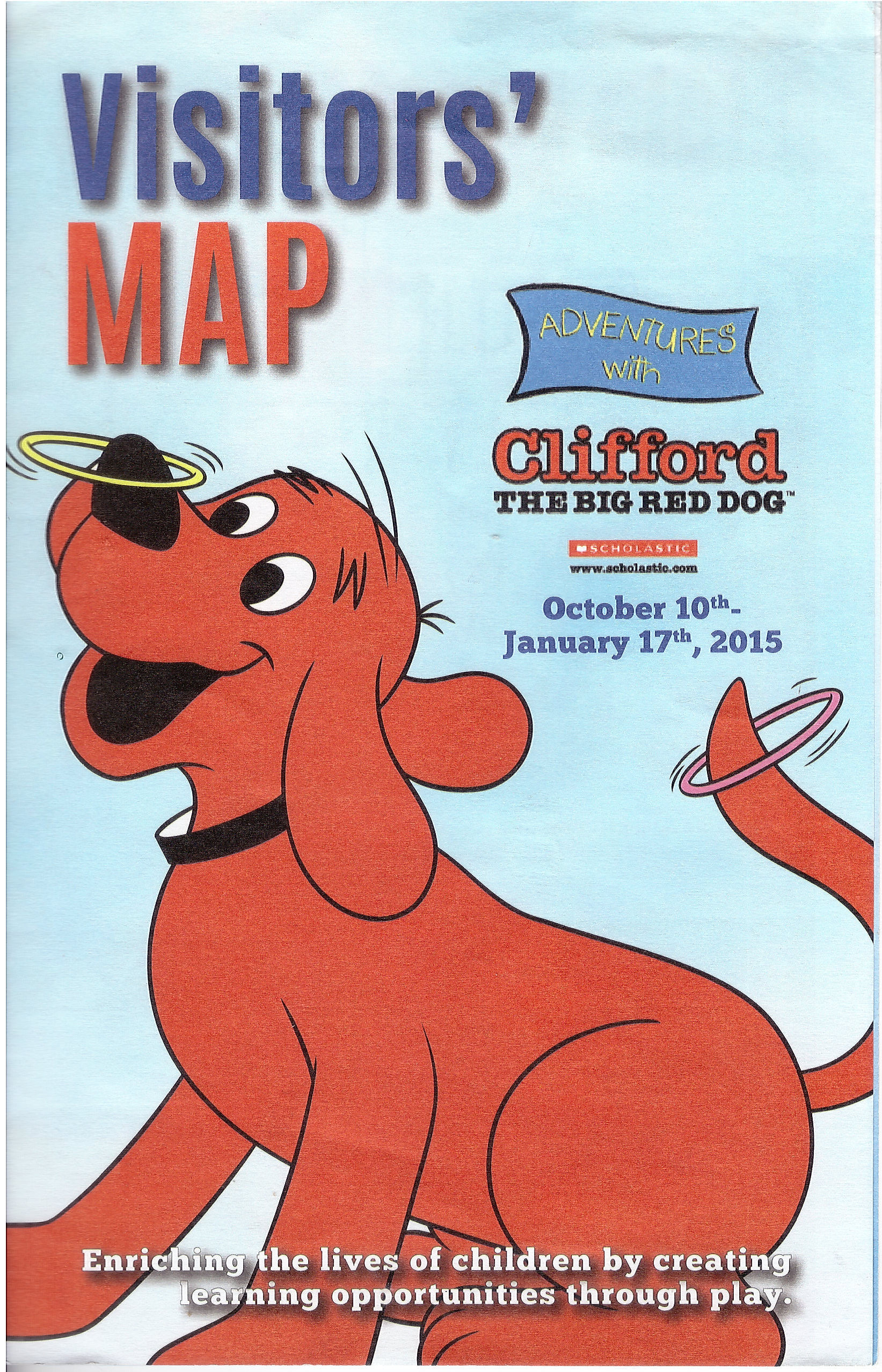
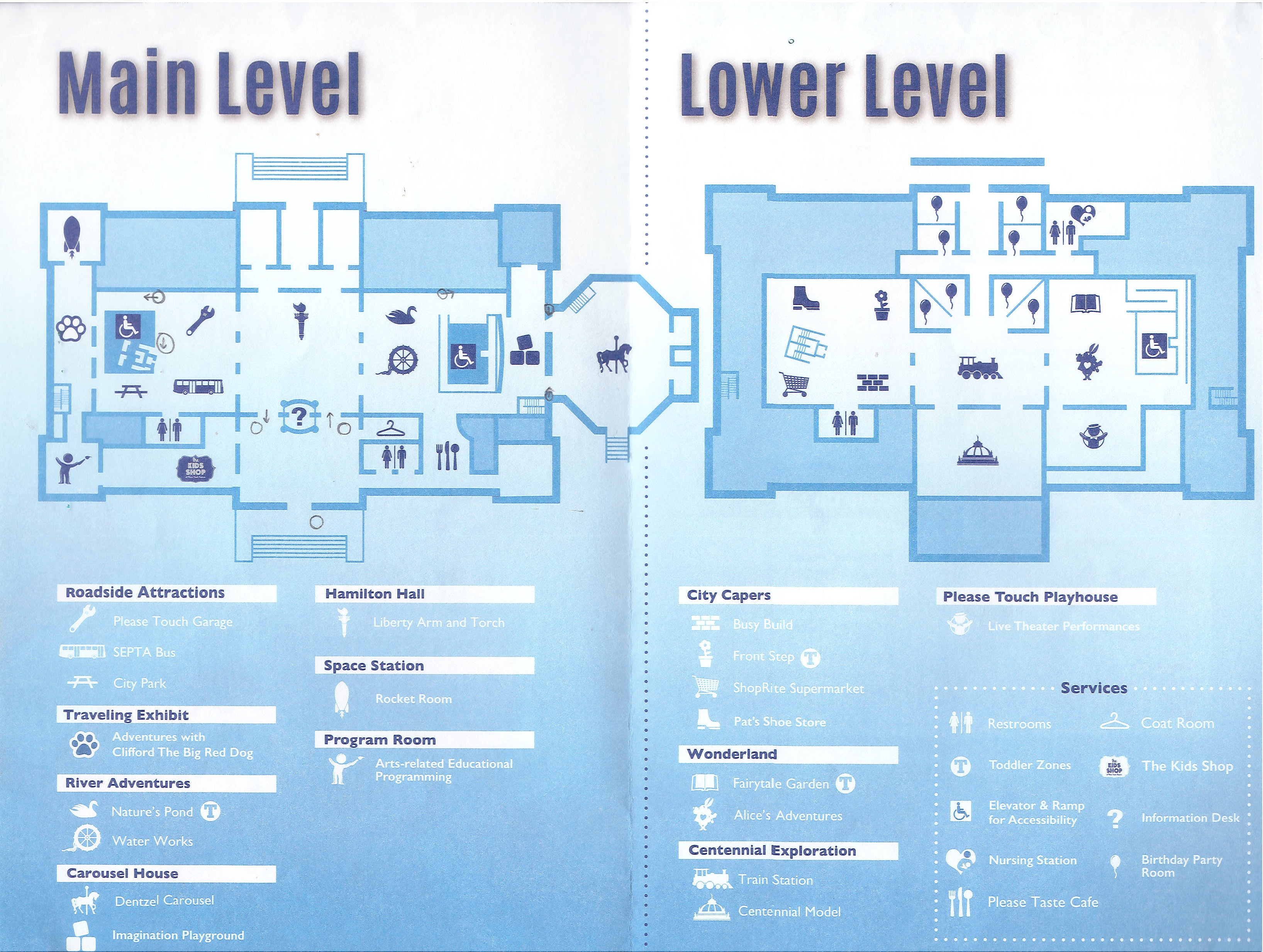
Badly Designed: Visitor’s Map, Please Touch Museum

Museum: Please Touch Museum (Children’s Museum) | Location: Philadelphia, PA, USA

PleaseTouch_coverPleaseTouch_1

What worked for the MoMa brochure guide is the simplicity, clarity and relevance of image and text; the essential elements are put together to guide the visitor efficiently. Although the sculptures are reduced to its simplest forms, the outlined silhouettes and placement on the map are clear indication on the relativity of their actual placements and therefore able to visually communicate effectively.

On the other hand, the visitor map for the children’s museum is inconsistent in the colour treatment of type and iconography, the general colour scheme used is unappealing and there is disconnection between the upper and lower section of the map. Furthermore, there are many idiosyncrasies in its way-finding system.

Lost_The Hive

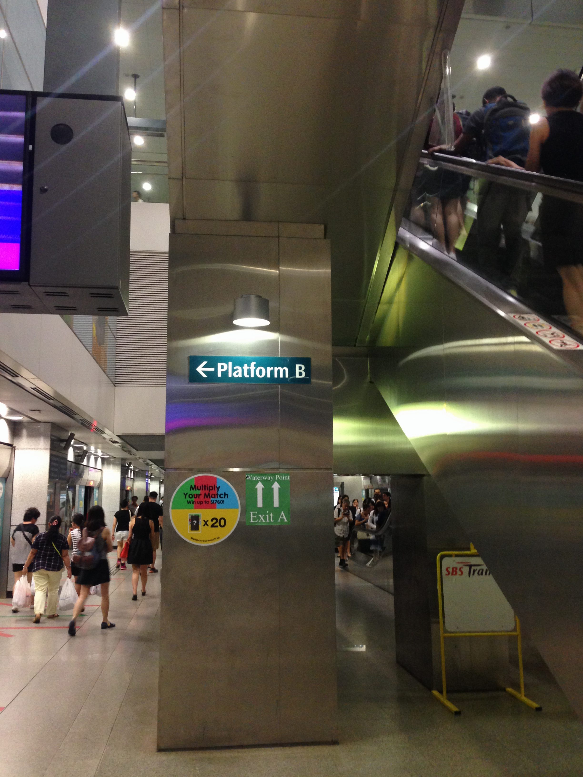
A time that I got lost in a place

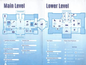
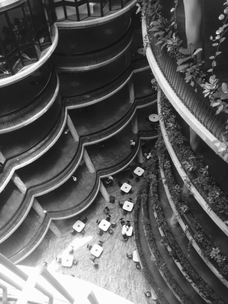
Where— The Hive, NTU

What didn’t work for me—The signs were obscure and not visible. The brass/ gold signages almost camouflaged with the brick/ wall/ background. It is beautiful indeed, but for someone who went there for the first time and rushing for time, I was initially confused about the seemingly lack of directional/ signages to direct me to where I wanted to head to.

Part 3: Choose two objects that you use every day (you cannot pick mobile phones or laptop/computer) and analyze their design using the principles described in Chapter 1 of The Design of Everyday Things.  Imagine describing what the object is and what it’s designed to do to someone who has never seen it before.  Is it intuitive or frustrating? Come up with three ways to alternate the design for that object and see how it changes its function.  Make drawings and notes in your journal.

Part 4: Response to Reading 

CH 1 Donald A. Norman, The Design of Everyday Things (1988) 

In the reading, Norman discussed about the frustrations in our everyday life in relation to the objects and things we interact with daily, of which it is unnecessary to be putting up with it. We are introduced to the principles that constitute the psychology of how people interact with things, they are: visibility, appropriate clues, and feedback of one’s actions. Furthermore, designs using principles of good design (i.e. good conceptual model & making things visible), with the synergy of technology would notably further improve our experience and interaction with everyday things. Examples given are mostly dated, namely the telephone, floppy disk etc. and it is amazing how far we have come in technology.

Some of anecdotes used were interesting, and I especially enjoyed the one on the refrigerator(Fig. 1.8); I took the effort to figure out the confusing instruction, visualise and understand but to no avail. It clearly substantiate the idea of how having a good concept model and system image would improve understandability and usability. This example also furthers my interest in information visualisation.

Q1— Noting that this book was published and printed in 2002, I am interested in finding out the scope of application. Do principles discussed in The Design of Everyday Things apply to web interfaces too? Or are they specific to objects/products etc.

Q2 — How do you create a design system that makes adaptation easier? When designing any experience, how do you balance aesthetics and functions?