< Research & Process >
Through Project 2a, I have decided to focus on YELLOW COLOUR as the element of my zine.

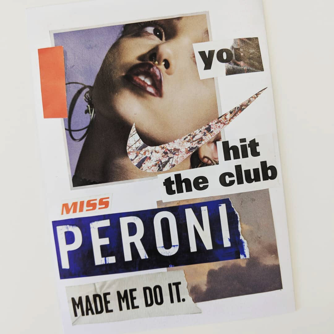
Back cover (left) and cover (right) tryout
/ Initial idea /
Foodie adventure photozine
- Empty stomach on page 1 (cover) to indicate the state before feasting the good food from Bedok
- Filled tummy on page 8 (back cover) with checkpoints (food places intro) to indicate state after going through the recommended food places in Bedok

Reference (left) and Spread 1 tryout (right)
- Initial spread 1 layout was referencing towards pop art cover layout instead of spread layout. Therefore, spread did not look appropriate.
- Barely any visual hierarchy as the images appear to be of similar sizes.
- Use of split complementary colors to make the spread look more harmonious.
/ Comments /
- Zine is about food so cover page should include the food that will be featured instead for anatomy.
- Photo angles can be limiting when shooting food stores, like the bakery. Illustrations of more interesting angles can be included.