Before the start of this course, I did not have a clear idea of how the different art movements came about and all of them just appeared to me as separate entities. Throughout these 4 weeks of graphic design history, I have a better understanding of how the different art movements are related to one another and how the modern graphic design came about. It also allowed me to understand the importance of typography in the world of graphic design as it was something that many people overlooked/could not understand.

With topics briefly touched on during class due to the constraint of time, I find it difficult to pick out a topic that I find especially interested in to explore deeper. Hence, I find myself trying to squeeze out something to write about for the weekly reflections. Despite so, I find that the reflections useful in allowing me to grow interests in the topics that I was researching on.

The quizzes have reinforced my knowledge of graphic design as it forces me to remember things that were shared in class. If possible, perhaps fewer questions can be tested on the names which were only introduced to us on the day of the quiz as it can be difficult to remember the similar names related to different design movements. Or maybe you can introduce some questions related to the visuals of the specific design movement.

Overall, I find that the history of graphic design has widened my exposure in graphic design and I think that has helped with my sources of inspirations in my works. So thank you Desmond for your effort!

I particularly liked the editorial designs of Harper’s Bazaar magazines by the Russian designer Alexey Brodovitch. Other than the interesting cropping of photographs which he was famous for, there was an intensive use of white space to bring emphasis to the visual elements on the cover page. The dynamic grid columns was interesting to me as well as it was very different from the regular horizontal and vertical grid system.

Brodovitch was the art director for Harper’s Bazaar magazine in the United States from 1934 to 1958 and revolutionized the mainstream American publications with his experimental editorial layouts – “the use of text and image in dual page layouts; the use of color photography; cropped and off center images; and the extensive use of white space”. (The Art Story) Brodovitch’s legacy was something worth mentioning as his experimentations are still relevant even as of today.


“All designers, all photographers, all art directors, whether they know it or not, are students of Alexey Brodovitch.” – Irving Penn (The Art Story)


If you don’t like full skirts…
Article in Harper’s Bazaar, Photographs by
George Hoyningen-Huene
March 1938 (Iconofgraphics)


The Consensus of Opinion
Article in Harper’s Bazaar, Photograph by Man Ray
March 1936 (Iconofgraphics)


Through his designs, I see how type and image can flow together to make a well-designed layout as he often relate his images to his typography within a spread. That showed how we can view typography, not only as plain text but also as an image on its own to achieve a layout that is dynamic and interesting. His works have played a very important role in the world of editorial design and they have inspired me to create something that can be as interesting.


References:

“Alexey Brodovitch Paintings, Bio, Ideas.” The Art Story, https://www.theartstory.org/artist/brodovitch-alexey/.

“Alexey Brodovitch.” Iconofgraphics, http://www.iconofgraphics.com/Alexey-Brodovitch/.

Fig. 1. Gismonda, Alphonse Mucha, 1894 (Art Renewal Center)

The huge poster created by Alphonse Mucha, Gismonda, appeared relatively interesting to me as it reminded me somewhat of the Byzantine art with its use of yellow and brown. (I, later on, found that Mucha came from Czech and was, therefore, very much inspired by the Byzantine art – he “regarded Byzantine civilization as the spiritual home of Slavic culture”.) (Mucha Foundation)

Gismonda poster was done using chromolithography and was commissioned by Sarah Barnhardt, a Parisian actress and director, to promote for the new production in early January 1895. Despite the lack of experience in poster design, Mucha created this in merely 6 days and this was what made him famous. That got me curious and therefore, I decided to research further.

            File:Vin mariani publicite156.jpg

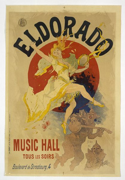
Fig. 2. Eldorado Music Hall, Jules Cheret, 1894 (Victoria and Albert Museum) | Fig. 3. Vin Mariani, Jules Cheret, 1894 (Collection Angelo Mariani)

During that period, the colour schemes used in poster designs were bolder (Pound), as seen from the examples above by Jules Cheret, who was very much in demand then. (Jules Cheret Biography) Also, the figures that appeared in Cheret’s posters were dynamic.

Gismonda, on the other hand, stood out from the rest with its muted pastel palette and stillness of Barnhardt in character. This work was revolutionary as no other works had the same extremely narrow composition with an almost life-size figure. This format could likely be inspired by the Japanese scrolls which were heavily imported into France then. (Pound)

His partnership with Bernhardt after this provided him with more opportunities to develop artistically, alongside with more commissions and eventually, a commercial contract from Ferdinand Champenois, the Parisian printer. With roots from Czech, his works started to include Slavic motifs in the form of florals eventually. Those “natural motifs and flowing, organic lines” in his works, led to his association with Art Nouveau and its significance in the popularization of the movement’s aesthetics. (Pound)

References:

  1. “Biography of Jules Cheret.” Jules Cheret – The Complete Works – Biography, 2017, http://www.jules-cheret.org/biography.html.
  2. “Byzantine Heads (pair) (1897)”, Mucha Foundation, 2019, http://www.muchafoundation.org/gallery/browse-works/object/240.
  3. “Collection Angelo Mariani.” LA BIBLIOTHEQUE ELECTRONIQUE DE LISIEUX, http://www.bmlisieux.com/litterature/bibliogr/mariani.htm.
  4. “Eldorado Music Hall: Chéret, Jules.” Victoria and Albert Museum, 2017, https://collections.vam.ac.uk/item/O1037601/eldorado-music-hall-print-cheret-jules/.
  5. “Gismonda by Alphonse Maria Mucha.” Art Renewal Center, 2019, https://www.artrenewal.org/Artwork/Index/4431.
  6. Pound, Cath. “How Alphonse Mucha’s Iconic Posters Came to Define Art Nouveau.” Artsy, 13 Nov. 2018, https://www.artsy.net/article/artsy-editorial-alphonse-muchas-iconic-posters-define-art-nouveau.


Fig.1 The Rosetta Stone on display in Room 4. (The British Museum Blog)

The Rosetta Stone from 196 BCE particularly caught my attention during the lecture as it was an important discovery that helped with the decoding of hieroglyphs.

Hieroglyph, a character used in a system of pictorial writing, particularly that form used on ancient Egyptian monuments. Hieroglyphic symbols may represent the objects that they depict but usually stand for particular sounds or groups of sounds. (The Editors of Encyclopaedia Britannica)

After the 4th century CE, people could barely read and write hieroglyphs due to their lack of use. As such, the fact that it consisted of 3 different scripts, hieroglyphs, Demotic and Ancient Greek, all with the same content contributed to the understanding of the Egyptian pictorial writing when it was discovered in 1799. (The British Museum Blog)

In the early 19th century, scholars who were able to read Ancient Greek eventually decoded some of the hieroglyphs. An English physicist, named Thomas Young, discovered that some of the hieroglyphs on the Rosetta Stone resemble the sounds of “Ptolemy”, the king then. Jean-François Champollion, a French scholar also found that the hieroglyphs could relate to the sound of the Egyptian language. Through the study of the stone inscriptions, with reference to other texts as well, he made further breakthroughs in the understanding of hieroglyphs. (The British Museum Blog)

Just an extra note, I noticed Chinese characters started out as pictorial representation as well, from 甲骨文, the oracle bone script. Hence, I actually find it interesting to note how things have evolved differently in the East and the West to become the languages we have today.


Reference:

  1. “Everything You Ever Wanted to Know about the Rosetta Stone.” The British Museum Blog, 2 Aug. 2017, https://blog.britishmuseum.org/everything-you-ever-wanted-to-know-about-the-rosetta-stone/.
  2. The Editors of Encyclopaedia Britannica. “Hieroglyph.” Encyclopædia Britannica, Encyclopædia Britannica, Inc., https://www.britannica.com/topic/hieroglyph.