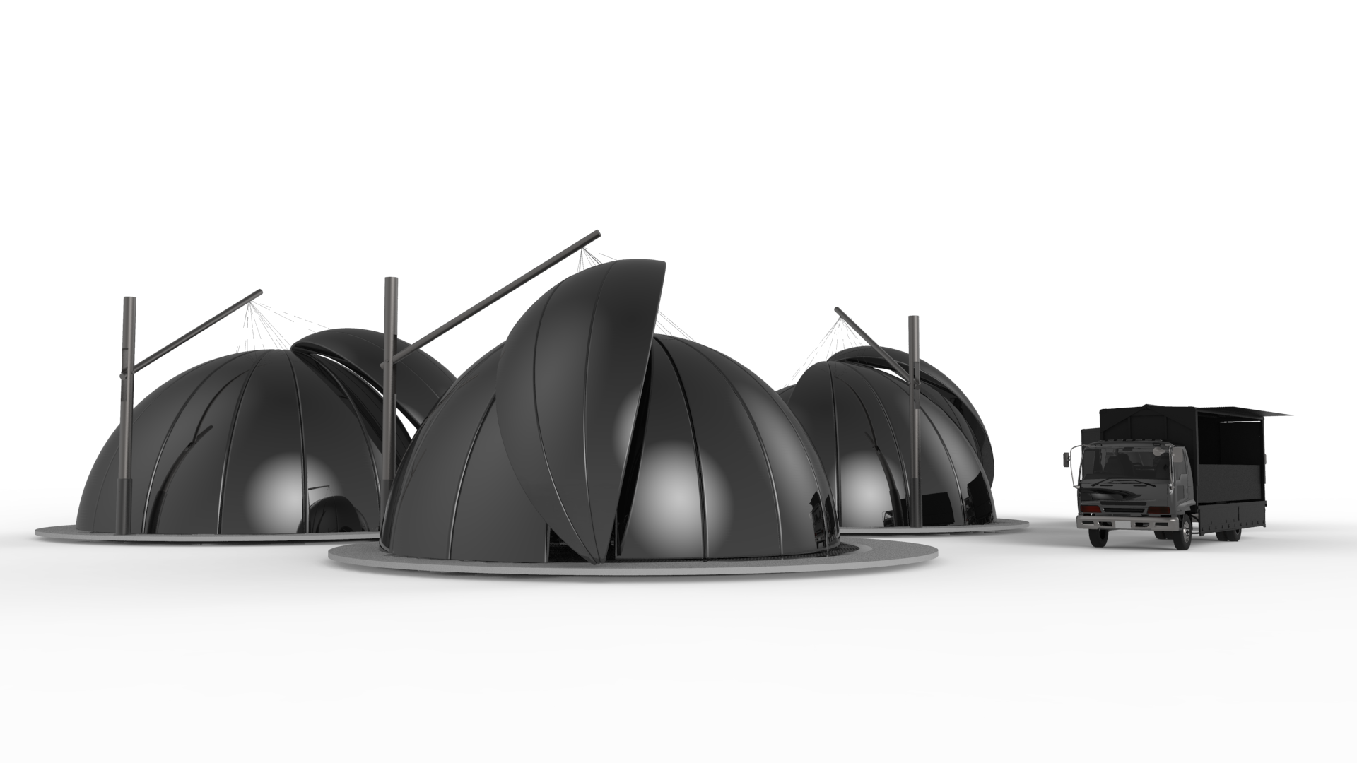
Photoshopping light from the projector on to this sceneAn option inheriting the Netflix style – black as base colour makes it mysterious but unnecessarily dark. Designing the graphics to go with it, will upload tomorrow. Interior – white screen. From Wikipedia: In commercial movie theaters, the screen is a reflective surface that may be either aluminized (for high contrast in moderate ambient light) or a white surface with small glass beads (for high brilliance under dark conditions). Seats has been changed to white with silver metal base. Other equipments in the cinema are metal silver as default until style is confirmed.
Just an alternative idea to the style which I’m giving option to.
An option with bright colours. Inspired from orchid colours again. A festive feel with a brand on its own.
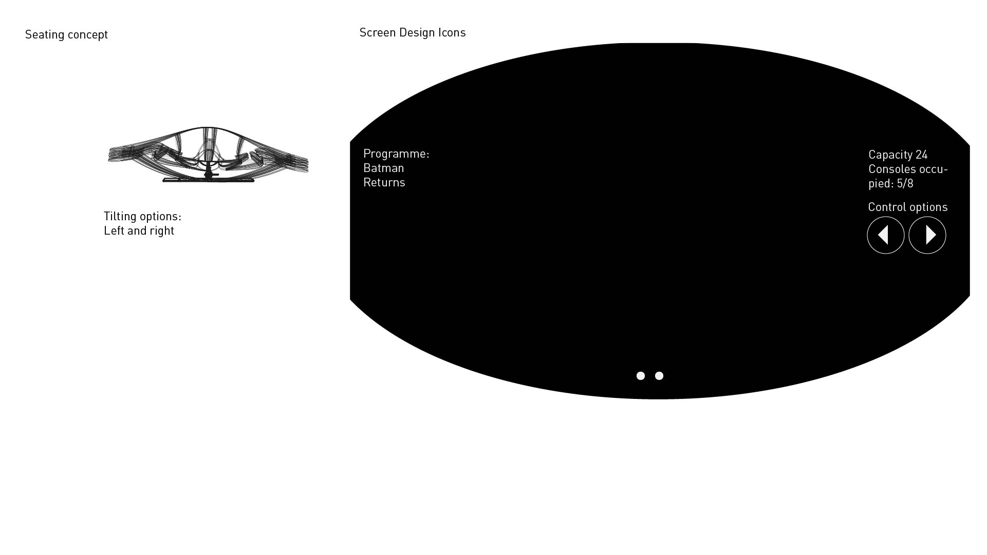
Working on this now. The display of the screen and the short animation of the tilting chair. Will I be penalised if I rely heavily on graphics and minimal images of renderings?


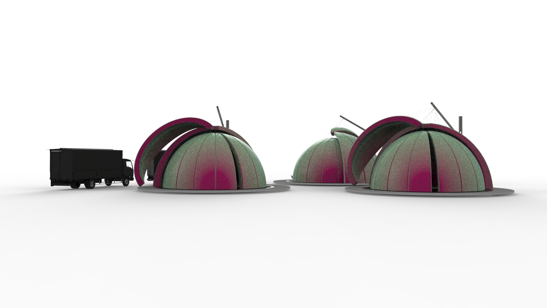 An option with bright colours. Inspired from orchid colours again. A festive feel with a brand on its own.