Zine: Inspirations and Initial exploration

I had some idea of what a Zine is before this project, but mostly from the poets (?) on Tumblr, so I think they might be my biggest inspiration for this project.

I also looked around a bit on Pinterest, and I’m sure I picked up one or two ideas along the way, although there wasn’t anything particularly specific. So.

Moving straight to exploration~

I was a bit indecisive about which of my previous assignments to use because since the Ego project, the Typographic portrait and POV, I like aspects of all of them and wanted to combine them, but the styles are so drastically different I have some difficulties…

These are some of my initial attempts:try lum-mintry div-min

I’m trying to mix my Typographic portrait and POV object through changing the blend mode. It was interesting, but soon became apparent that it was not the most effective way to go about my zine, since I was still quite uncertain about what my Zine will be thematically.

That was around the time of the first consult, and instead of creating so much patterns and trying to merge my different works, Prof pointed out I have enough materials to work with just from my POV project..

More experimentation… They were all pretty dark, and while I was certain I wanted to include some words in my zine, at this point I wasn’t sure how…

Plus, unless I am downright doing horror, I did not want to generate any artwork that is plain dark or negative. I realize the mostly monochromatic color scheme possibly resulted from my limiting my experimentation to the line drawings instead of the colored ones.

While the line drawings showcase more details and intricacies, I couldn’t help being drawn to the colors from the watercolor completed work as well. This was when my work took a turn into a lighter, “pastel” direction.

And below are the exact sequence in which the pages were generated..

Moving onto test prints in the next post~

Zine: Test Prints

My main purpose of doing the test prints were to explore the formatting of the pages. Firstly because I was not very good at InDesign…

In my sleep deprived mind that night, for some reason I thought formatting on Microsoft word might be a good solution to removing the borders from the printed images… (It wasn’t. which is why I did not do that for my final… @A@)

And the other reason was because I discovered I have an extra page, so I was trying to figure out how to fit it in nicely.

I did consider simply removing or adding 2 more pages to resolve the problem, but it was not an ideal solution because I felt the content of my zine was “just right” the way it was, and it would not be appropriate to delete or add more content just for the practicalities…

So the two solutions I tried was to stick the extra page in (so that it is at least not a loose leaf, or to print it together with another page and fold it like a pop out card – this inspiration came from videos I saw online recently.

IMAG6515__1461556176_155.69.161.30

It was perhaps a cool idea, but in the end I opt for simply sticking the page. This was because I did not like the effect of the folding lines on the pages…

Simply sticking the pages does make the middle pages thicker though, and it was perhaps still not the most perfect solution…

The 2 test prints together with my final!IMAG6517__1461556193_155.69.161.30

Zine: Final! (+ a bit of reflections)

A gallery of the digital pages (In the way I arranged them for printing, not the proper reading order >_<)

I think, in the end, my zine turned out to be a good extension of my POV project…

IMAG6540__1461556340_155.69.161.30

For the cover page I chose a shimmery paper because I just couldn’t resist, I love shimmery paper XD

No but seriously the way that kind of paper tend to shimmer and shine reminds me scattered stars, the glow of the sky, and other magic like that. So I felt it worked well with my cover page.

IMAG6541__1461556429_155.69.161.30

Prof suggested I write something on the first page. Perhaps a short description or the artist/artwork? I stared at the page for half an hour and felt that my usual way of writings will be too clumsy for the elegance I was hoping for for my zine. So I dug around my embarrassing stash of writings from the past few years and picked out this line that will ideally convey the mood I want to achieve with the zine, in a more succinct manner.

IMAG6542__1461556439_155.69.161.30

Pollution and overcrowding (Overwhelming)… General unpleasant things that.. people can live with once they accept I suppose… (Despite the constant desire to escapeeee >_<)

IMAG6543__1461556447_155.69.161.30

The idea of travelling, but also we each lead our own life and are on our own path to different locations and goals in life.

IMAG6544__1461556454_155.69.161.30

The center page @w@

IMAG6545__1461556950_155.69.161.30

This some-what mirrors the “We are going places” page, but with more emphasis on how we will never completely know another person. Partly due to how hectic city life is, but also due to essentially.. how life is I guess. Most of us only meet at one point of our lives and zoom past each other really fast…

IMAG6546__1461556474_155.69.161.30

And of course, the last page mirrors the cover page. The message too. Both are about how the universe love us…

I guess, to me, it’s a calming thought that no matter how much we rush through life and it’s pleasant and unpleasant aspects, we will one day all be accepted back by the universe equally… I’m not sure if this random reference to death is creepy or morbid but.. to me, this insight is comforting and sort of beautiful (?)

(The back cover was photographed but the photo turned out badly so please just look at the digital version earlier >_<)

I am not sure what to explain about the back cover except “Where is my path of flowers back to the sweet pastel sky?” is a line from… something longer that I wrote, and it’s positioning on my Zine is up to interpretations.. The “thing that I wrote” wasn’t entirely relevant, but personally I feel like this line close the theme of my zine quite well..

Overall Reflections:
I love most of how my Zine turned out in the end, but I think might have limited myself from the beginning with my perception of how a Zine “should” be.

I still can’t help but wonder if I should have tried more ways to merge my different projects for my Zine, since I did really want to include more than my POV project. (It would have been a lot of content, but it might have been worth it? I mean, perhaps I should have pushed harder in that direction at least in the exploration stage..). For example, perhaps instead of taking the separate elements of the different projects to merge into 1 image, I could try balancing the them by having different image from different projects on each page, but mirroring each other… hmmm…

Then again, that is just me speaking in hindsight as I feel very inspired by a lot of classmates and how they executed their zines, some of which were really cool OwO!!!

Of course, they way I execute my own zine was semi-intentional because not only did I want to try the “simple” look of most zines, I also knew I would be busy at the end of the semester. I actively decided to devote lots of time to my first 2 projects in 2D, but give more time and focus to my other final assignments (Such as foundation drawing…) instead. I don’t regret how it turned out, but perhaps… *^* \I’ll have to push myself even further next sem!!/ *^*

The entire semester has been immensely rewarding though, and since I did my best the best way I know how… I have my fair share of learning and exploring, and what more can I ask for? ^w^~ (Thanks Prof Ina!!)

POV: Final City!

IMAG6411

A City from the Point of View of a Weed is a Struggle.

This is actually inspired by something I wrote a long time ago, comparing a person in a city and a weed growing out of concrete, thus the positioning of the paper cut out such that a small person is visible as part of the weed.

IMAG6412

A City from the Point of View of Animals is Poison.

Needless to elaborate, about pollution.

IMAG6413

A City from the Point of View of a Migrant child is the Unknown.

Here, I wanted to go for the effect of the buildings towering over the child. The gloomy atmosphere is such that I focused more on the negative aspect for a child to migrate… I considered other words like “Loneliness/Not Home” as well, but in the end settled on the more neutral “Unknown” because it will be an exaggeration and almost a lie to say that there are no positive aspects of migrating either. Such as Hope and Opportunities..

The constructions in the background mirrors how a child’s changing and growing state, especially after a drastic change in surrounding. I feel it is most suited to express the dual meaning of “Destruction”, noise, overwhelming changes, but perhaps also the new “Possibilities” thereafter…

IMAG6414

A City from the Point of View of a Wanderluster is a Cage.

The perspective is that the “Wanderluster” has yet to become a “Traveler”. Although the towering buildings are again used to indicate being overwhelmed by the city, I think when the concept of “Cage” came up, I refer more to the duty and responsibilities someone has to endure to live in a modern and developed city..

IMAG6415

A City from the Point of View of A Traveler is a Map.

Pretty straight forward. The art style however changed a little because I wanted the buildings themselves to resemble a map~

IMAG6416

A City from the Point of view of the Universe is Nothing.

A bit of contrast from the first one (Weed) going from the micro to the really macro perspective. And maybe also just a tiny bit of mockery towards human accomplishments (and failures~).

But really the execution of this last one also came from something I wrote long ago, comparing the light of a city to stealing the star light off the sky…

IMAG6445IMAG6449 IMAG6447 IMAG6448

final ring-min

Together.. and..

glow ring-min

Bonus back-lit version~ The photos doesn’t do it justice, but I think if given the time and ability I would like to have set up my final presentation with the artworks in a loop, and lights in the middle. It works especially well for the “Universe POV” but even for the rest, I always like to use lights when I do paper cuts because it shows the layering very well..

Honestly the “looped” version here is closer to my original idealized final mode of presentation, and I am very happy with how it turned out ^^

POV: City Construction

Mostly pictures of the process~

The paper cuts was the easy part, and the first things I completed. Also because I need the silhouette to know which part of the city I want for it to show through~

t1t2t3t4t5jpg

Then, starting on the illustrations.. It looked intimidating but… well, it was. @@

IMAG6124

But I’d like to think it was worth it QwQ

n1 n2n3n4n5 n6
It’s cool cause it loops!!

line circle-min

Additional illustration for the “universe”..

t6

Watercolors for the background.. (I did a bit more tryout, and that is the featured image)IMAG6408 IMAG6409

(would upload the color ring but its still over size limit after compression >A<?)

And finally!! the “titles” or the actual point of views! IMAG6410

I was particularly happy to get to this stage because for the previous few assignments I almost always forget about it until the last second >< But this time I planned for where to insert them and wrote them in pretty colors that match my work! *w*

Next Post for final~

POV: Extra (?) Process

Extra because about none of this shows up in my final work X”D

Some sort of very simple animation sequence key-frames because I did briefly consider animating my project for a bit.. Probably over ambitious as later confirmed >A<

Because I was using pen and watercolor, and also because I am always influenced by music videos due to interest and past experiences… I would say if I had the chance to do it it will be a bit of this style

POV: City Planning

From the beginning:

IMAG6028IMAG6029

The initial brainstorming for this project worked out quite well for me.

Although I was a bit apprehensive that the “city” might be an overdone concept, I was inevitably drawn to the idea due to I think it’s significance to me, personally… Having migrated when I was younger and thereafter always wanting to travel, be it to other cities or to nature to escape the sometimes overwhelming noise, light, pollution, and endless work in the cities…

So yes, the concept was the easy part. And then came the compositions…

IMAG6032IMAG6073 IMAG6051 IMAG6053 IMAG6054

The paper cut compositions where pretty straight forward. Theres one or two I was a little uncertain about and also a few I was concerned if it was too simple. But I did not dwell on it because I know that the “hard” part will be the background illustrations…

And so, onto the medium of said illustrations.
I did the initial research in my last post, and also some exploration on my own:

IMAG6440

Mainly with watercolors and pen since doing traditional instead this time~IMAG6441

And also looked back at some past personal works for inspiration.

Mainly pen works because I prefer the vibrancy as compared to the more dull and muted colors of the watercolors I have, so that’s what I wanted to go for. However, after consulting Prof Ina she actually prefer the less “finished” look of the last drawing (of the 3 above). It was surprising, but that set me thinking I can combine the 2 mediums, and possibly add the digital aspects for Zine.

As the illustration was not the only part of my artwork, I have to make sure it fits with paper cut outs I have already done before (Mainly the contrast stands out as much as I would want it to). So I set them against different backgrounds/ mediums before I started drawing, just to be sure.

IMAG6098 IMAG6120 IMAG6121 IMAG6122

Watercolors and pen looked tedious, but doable, so.. the technicalities are settled. Onto the actually doing part (Subsequent Post)!!


POV: Research

All the sources of the images should be linked (if you click on the image itself)

I’m working with the idea of a silhouette, so here are some ideas on how they should/could look~:


The background of my silhouettes will be cityscapes though, so I looked into the different style and medium this could be done.

Most are in traditional medium as that is what I want to explore this time. Specifically, I was considering color pencils, but should I need to scan it in, perhaps paint will have more saturated and vibrant colors:

Same source as featured image

This is not a skyline in the anticipated sense, but it is cool one the less and could be a way to explore perspectives if I go with variations of only 1 unchanging sentence.

The oil paintings below are closest to (one of) my desired effect and I find them absolutely stunning. It’s slightly dreamy and abstract~

CG which I will try to avoid this time, but a good reference none the less:

More illustration style, which is the other direction I could go (instead of painting). Perhaps I’ll make it more colorful and fantasy-like though:

And finally, some photo reference of the city at different times of the day. I’m thinking if I’m going to draw a continued cityscape I might as well make it varied, and changing the time of the day is one way to do it.

Mostly, the reference are for the transitioning stage (I’m thinking of having 1 dawn, 2 daylight, 1 twilight and 2 nighttime cityscape):

The first 3 are from the same photographer, linked to image source only in the first photo. But he has a ton of other wonderful city images I feel could help me.

Others:

Danraxelia Lore: Festivities

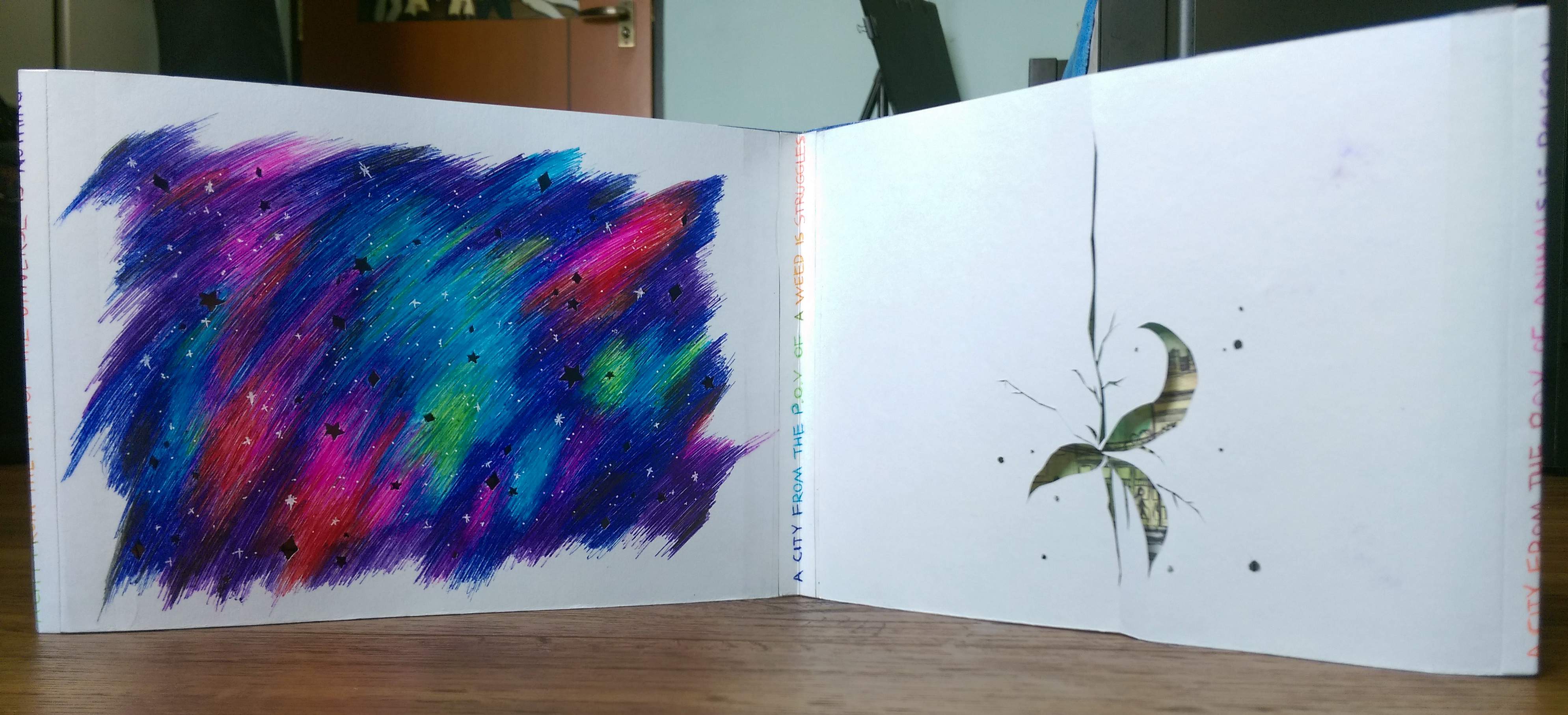
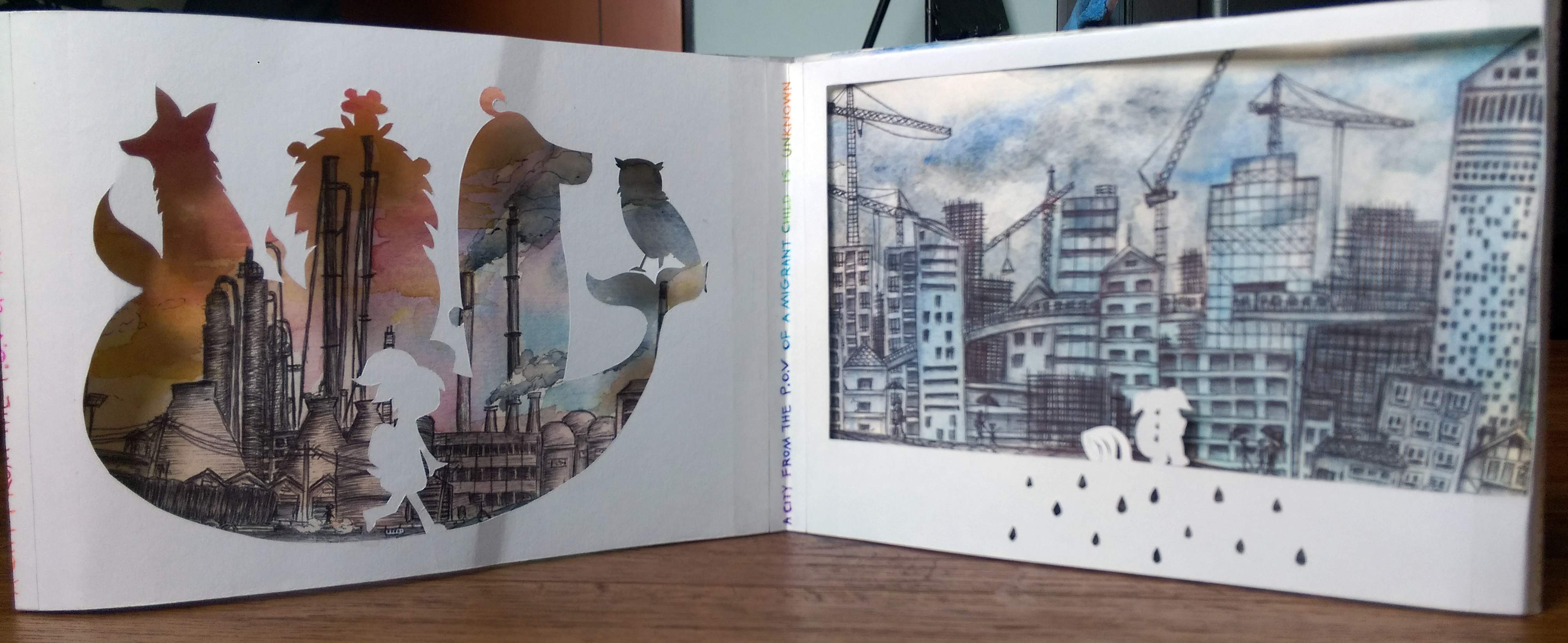
(OOC: Say hi to another long post… This is no surprise anymore @@ )

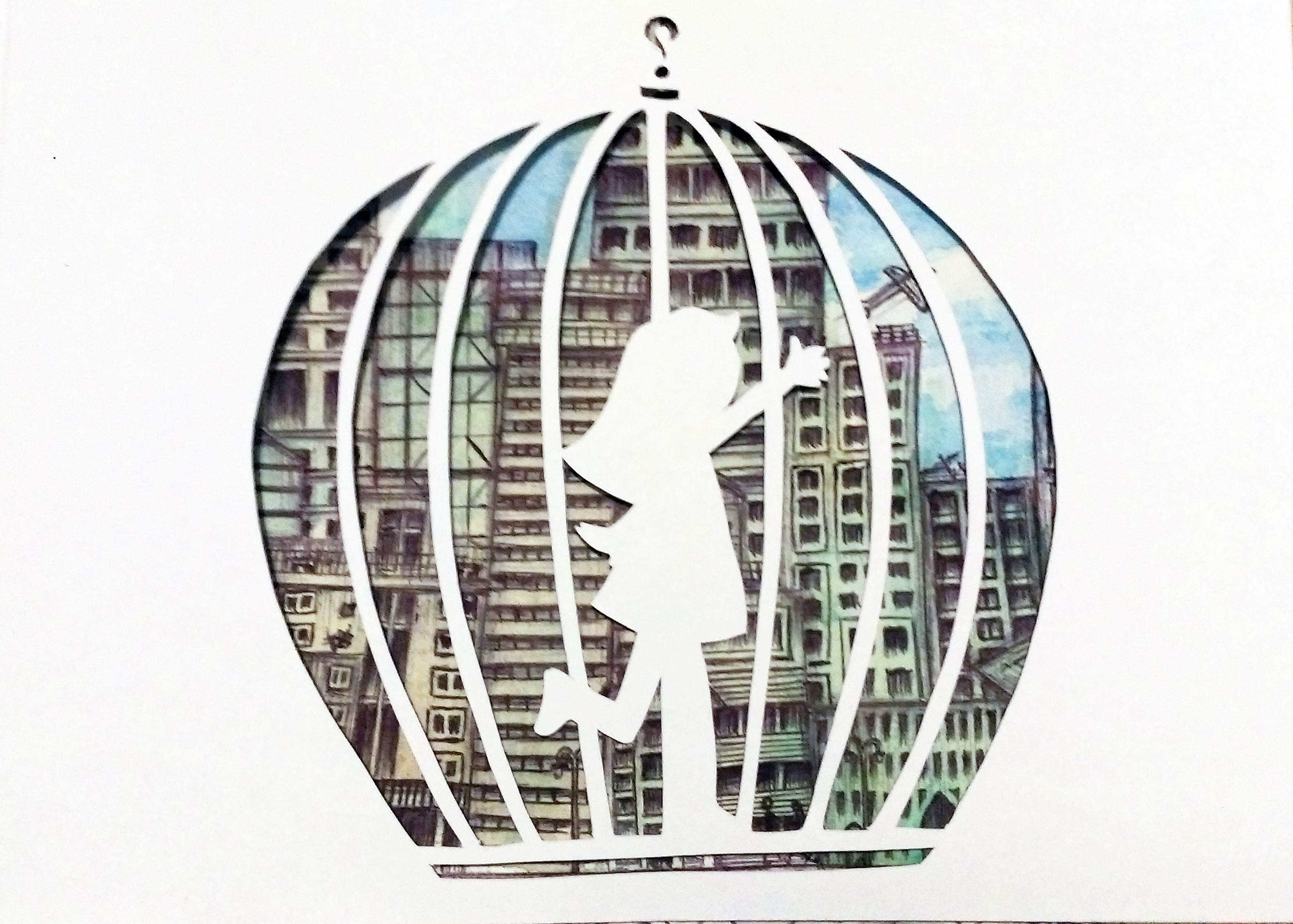
New Year: Birth of Vo’a and Danraxelia (the world)

Unsurprisingly, the biggest and grandest celebration each year is for New Years.

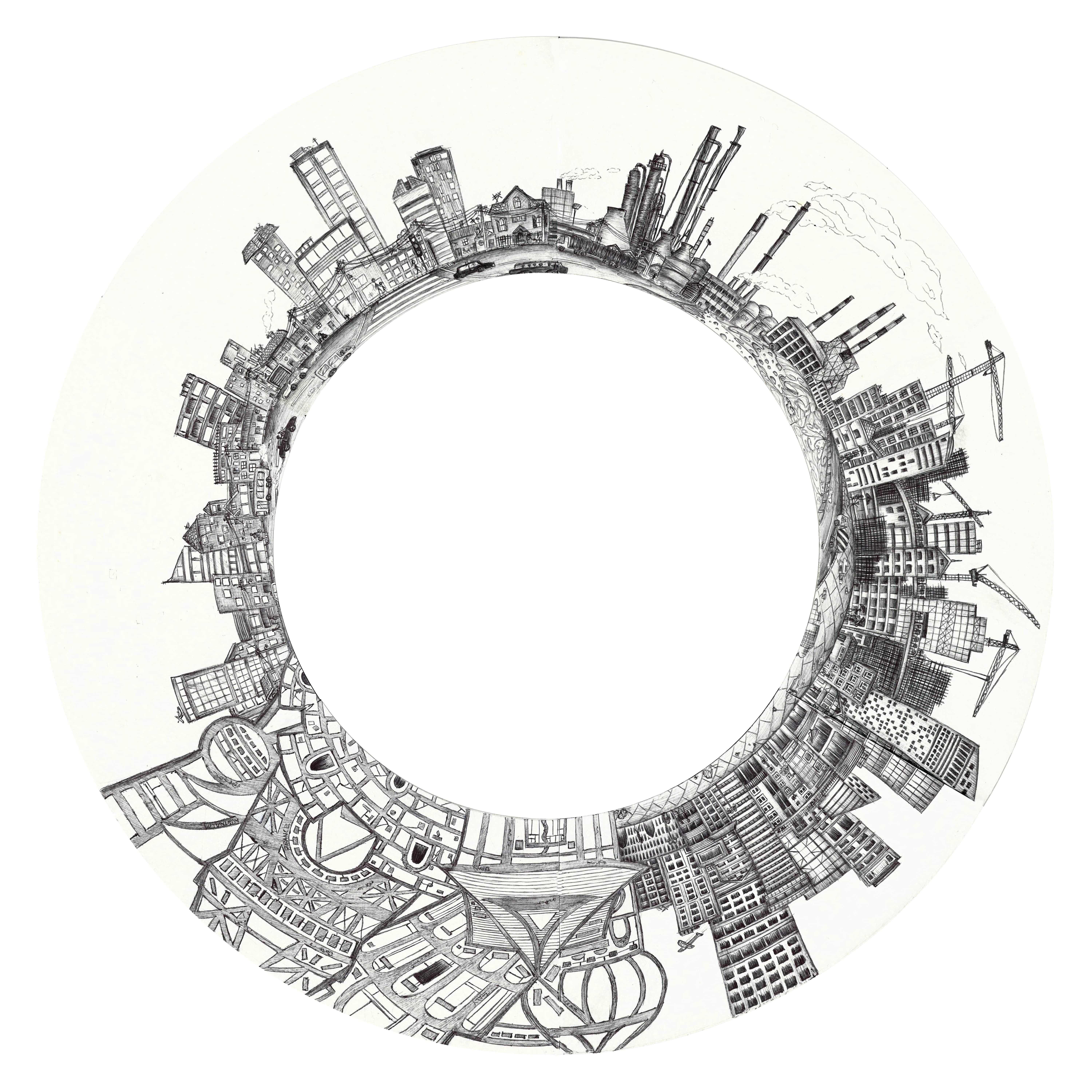
The citizens of Danraxelia believes that the city is a unique blessing to them, and has existed since the beginning of time. It makes sense to them that the world began at the start of the year, so New Year holds the dual significance of welcoming the year ahead, as well as celebrating the birth of their beloved city.

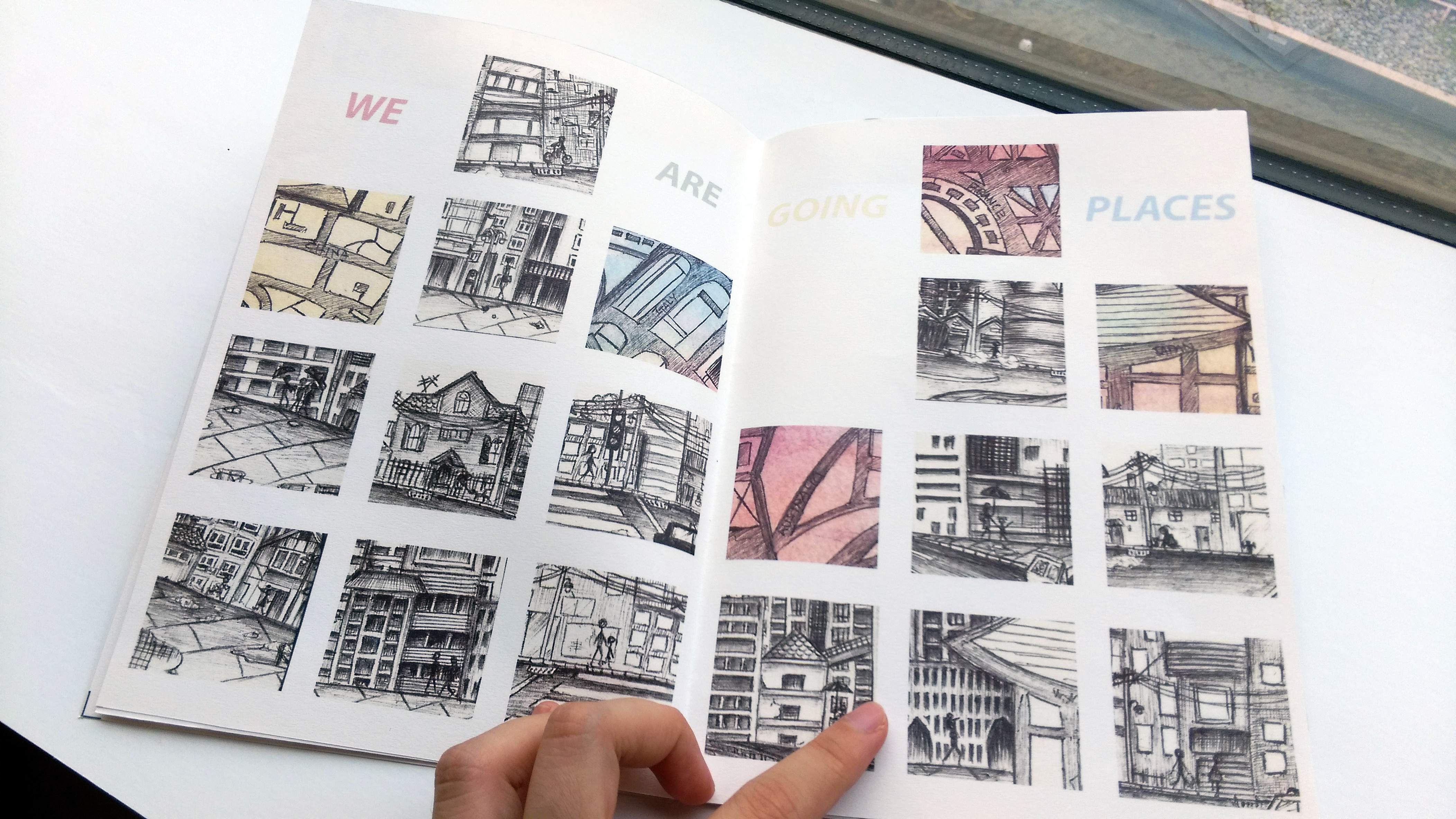
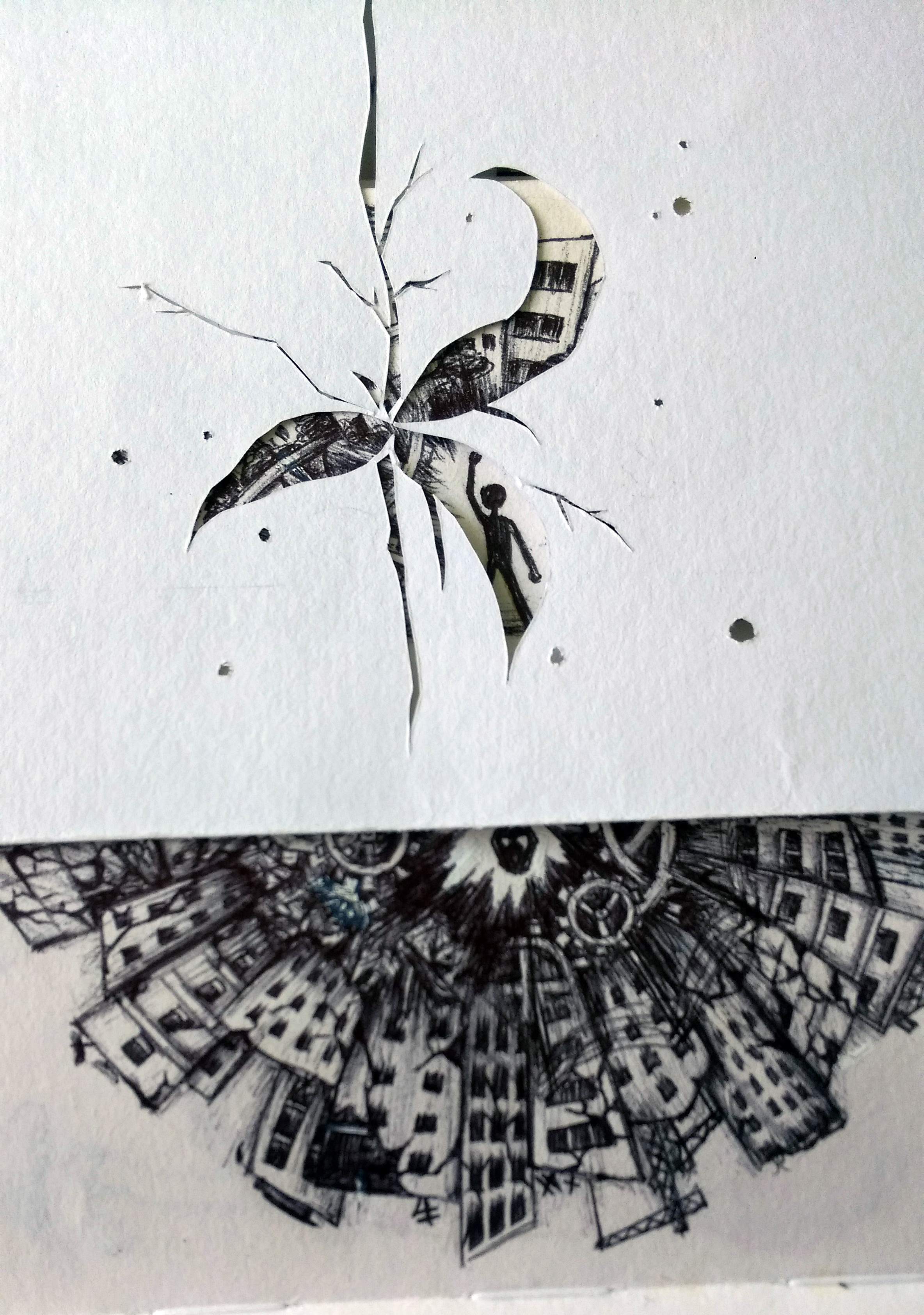
This last for about 10 days, from the last few days of the previous year all the way through the first week of the New Year. Aside from general feasting and merrymaking, the main event starts with a parade involving every race and social class in the city. Months are spent preparing the Carnival floats and costumes for the parade.

The trip of the parade starts from the bottom, with the simple floater done by the farmers, or the surprisingly detailed and delicate floater done by the crafters heading the parade. As the course of the parade winds up, it is joined by floaters done by industrial workers and merchants, entertainers and other organisations, some of which are sponsored by wealthy individuals. Even the Library, the Scribes and the Parliament each has their own float joining the parade at the end.

Of course, how could the biggest celebration of the year be without the participation of the Oracles? While they and their disciples never produced their own floats, they will join in the Parade towards the end as it pass around their level, up through the parliament level and finally ends at the Sky Gardens. This parade last for five days, and on the last day of the year, in the Sky Gardens, around the Bell Tower, the Oracles will lead the ritual of burning all the floats.

To the commoners, the construction of the floats signify their thanks to both Vo’a (OOC: the world they live in, if you recall) for letting them have another peaceful and abundant year, as well as to the Oracles whom they view as Gods that protect their city and guide them.

The final burning of the floats signifies Vo’a receiving their gratitude, and commoners usually dress in their best clothes to flood the gardens and watch the spectacle. After all, it is also one of the only chance most of them get to see the Oracles themselves and are allowed into the Sky Gardens. (Usually only accessible to working Parliament members and Scribes and Oracles, even individuals from the upper class are rarely allowed up there).

For most, the burning of the floats is the end of the large scale celebration. Usually the next few days in the New Year are for everyone to rest, recuperate, have fun in their own little circles, and of course, prepare for the new working year ahead.

However, the next five days are also the only chance for some individuals to see the Oracles one on one, and gain their advice on their fate. This is limited to 5 people, one on each day, and if you are chosen, it is considered a great honour as you are lead up to the living areas of the Oracles.

Yet aside from the chosen few, nobody ever hears about what actually takes place with the Oracles, and it is assumed that speaking of your experiences with the Oracles are forbidden.

Remembrance of the Dead and celebration of Living:

This is another significant festival when the Oracles appear, although unsurprisingly this is usually starts as a much more sombre “celebration”, if it could be considered that at all.

In the day, the Humans and Tierans makes a long trip outside the living areas and beyond the farms, all the way to the edge of the forest at the bottom of the city where the graves usually are. There, they leave food, gifts and offerings to their deceased loved ones. Some set lanterns and offerings into the rivers flowing into the forest, for those deceased who are sent off in the same way, as they might prefer.

For Giowels though, as their death are rare and signify their return to the elements, with no graves to mark their demise, it is usually a much more private affair. Perhaps with alters set up at home and quiet remembrance of the life of the deceased.

When nightfall, the Oracles will stand at 3 corners on the outside (balcony?) of their living level, facing the rest of the city below. Although barely visible, their voice will be heard by all, guiding them to remember the good of the life passed, the fortune of being alive, and the importance of celebrating life, together with death. Their voice sooth the emotions of the living and a sense of calm, peace, and quiet will come over the entire city. Many will claim that that would be the night they have the most peaceful and restful sleep in the entire year.

The next two or three day, festive markets and carnivals will be set up at various locations and individuals will go around to mingle, socialize and basically have fun.

The markets and carnivals have all sorts of interesting games, food, crafts, and any other unique creations the living might have come up with through the year. It celebrates life with all its blessings, innovations and creativity, especially in a city as peaceful and self-sufficient as Danraxelia.

Others:

Of course, there are other minor festivals that different people celebrates base on their race, social class, beliefs and significance they place on any natural events, but for City-wide large scale celebrations, it would just be these two.

Danraxelia Lore: Entertainment

The entertainment available in Danraxelia is as varied as the individuals living in the city, and one man’s job could easily be another man’s hobby. Most of the entertainments are not unlike the ones available in our own.

Central Library is a main source of entertainment for the citizens of Danraxelia. There are compulsory schooling in Danraxelia, and, as the school is a part of the Library, most citizens are introduced to it since young. Learning is not a boring process there, as individuals get to decide which topics or books they wish to study. Most come to grow up enjoying the company of books.

The library contains more books than one could finish in a lifetime, as well as parts of it which functions as museums that contain important relics of the past. All residents are allowed into the library from their residential level, although the top few level are almost exclusive to the upper class, and of course, the Scribes who works in the Library, both as followers of the Oracles and as teachers to guide the students.

Of course, it is absurd to expect all to love books, let along having that as the sole entertainment. Thus, the residential area surrounding the central library slowly developed to be the arts and cultural centre where there are theatres, dance and opera houses and circuses (Imagine the tricks Tierans and their animals, Giowels and their elements could perform~!).

Aside from cultural activities, mindless fun such as singing, dancing drinking at bars or gathered around a campfire telling stories are all valid forms of entertainment as well.

Individually, aside from picking up a new skill (Pick up a book from the library!), tending to pets and small mushroom gardens are popular past times as well. (Mushroom because unless you live inside the library or really close to the “corridors” at the outside of Danraxelia structure, there will be some difficulties for plants to get enough light..)

For those more inclined to sports, there are competitive sports and fighting rings. Watching the sports and fights are common entertainment, but the ones who participate in it are doing it either professionally, or occasionally to settle personal disputes. Fighting to the death are not legally allowed, but incidents do happen…

Worthy to note though, is that the games and sports in Danraxelia do tend to differ at least slightly from those in our world, due to the different environment and races.

Of course, in the dark corners of the city, there always exist unsavory forms of entertainment such as drugs, gambling and prostitution…