Rhymes: Carried away by Mary’s Lamb

Below are the edited images. Most of them I did a posterize version and a treshold version, but here I just upload the ones I prefer.

Tried to insert a gallery with the sources at the bottom of each image.

Perhaps evidently, my train of thoughts can diverged quite a lot… My first thought was “Mary has a little lamb”… in what way?

So… lamb chop was the first thought (hungry ops >A<)

…so then theres cuts of a lamb (to make lamb chop..), and maybe she only has a lamb skeleton? (okay yes my thoughts turned dark pretty fast)? What if she is part sheep/lamb? (Has a little lamb…as a part of her… And then I thought of Satan because Satan is said to have horns and hooves right? Then that became Baphomat girl.. Then I remembered Eygptian Gods tend to be part animal so is there one thats part sheep? (Yes I found out Banebdjedet is part ram))…

What if she is a lamb intending to commit cannibalism *cough*  Or what if the lamb is a person? (Thus the virgin Mary and Jesus… then to fit the vintage theme i thought of cameos which I love because they are beautiful) Then looked for paper cuttings after woodcuts, chanced upon paperdolls which are pretty creepy because disembodied body parts (That might be better for the humpty dumpty group..)

And also theres horoscopes (Aries, Capricorn), fairytales (Red riding hood and the wolf in sheep skin? others?), songs (I just wanted to find a group of creepy children and the song “Circle you Circle you” came to mind though the style might not be entirely suitable…)…………… And yes I can go on and on and on and theres so many more nice images I feel like could be used! X”D

Journey in Progress: WIP so far

After I finalized my idea:

Initially I considered between arranging my feet neatly…IMAG3903

Or not so neatly (naturally) IMAG3896

One has the benefit of consistency, while the other, although the positions are not always flattering, has the benefit of adding more character to my work.

In the end I decided on the latter because as the work will only last a short week, I think the character might be more important than the consistency, which is already present by the system.

Fast forward a week, putting the photos together:

The process involves a lot of stress eating and literally endless technical difficulties. Small rant: Murphy’s Law and Everything I touch dies.

… but I shan’t go too much into that >A<

Oh one of the non-technical difficulties though, was to work through the hundreds and hundreds of photos I had through the week. It was decidedly challenging because not only must I sieve out the ones not meant for the project (Some of them are surprisingly similar), I have to match the photos of the feet to the photos of the things in front of me… And no, due to human error, not all of them match accurately by the end of the week, I had to remove 2-3 photos that couldn’t find the other half of the “pair” ><.

Then, a lot of my “research” involves more of the technical aspects of using premiere than any artists references.

One of the first things I did was look up how to create split screen.Screen Shot 2015-09-14 at 8.37.55 PM Screen Shot 2015-09-14 at 9.58.02 PM These are my split screen try outs in the orientations I initially planned, I was not sure of the orientations so I had both vertical and horizontal photos initially.

I was more inclined towards the latter (With ideally better cropping). but yes in hind sight it was weird and what was I thinking.

Screen Shot 2015-09-14 at 10.20.08 PM

Thats more like it. This was an orientation I only thought of while looking for the split screen tutorial.

I also added some transitions, which was simply the fading effect. I did try most if not all the transitions readily available, but that was still the most effective one.

Link to WIP video

 (I tried to download it from google drive 5 times and it failed. Dropbox also failed. And the mac doesn’t like my external drive.)>

By this point I had the general idea that I would be exploring the “flow” in life… which given my hourly photos, should be pretty consistent right.

But the consistent pacing is quite boring. Or at least not engaging to the viewers at all. I wasn’t quite sure what to do about that until some advice by the prof and classmates ^w^

I have been changing the pacing of some of the photos. My video will be aiming to portray how life is experienced instead of the dull consistency at which the photos are taken.

I was also a bit stumped by the audio to incorporate into the video. Initially I considered poetry (because I love slam poetry…but that’s a bias) or narration. But I did not know what poetry nor narration could be suitable for this… I am quite unaccustomed to these kind of experimental videos haha >A<

Then I considered instrumentals… which would be easier to fit I think. I might still consider adding that at some points… it might be atmospheric but it will largely depend on my selection of them ><”

Finally, prof recommended ambient sounds! Ah… it’s… not something I considered initially, but right now I have been recording some sounds and it might actually work ^^

Let’s see how far these experimentation can take me! ^^

Journey in Progress: Initial deas/thought process

Featured image is, again, my brainstorming list. It went from I have no idea what I’m going to do, to I have too many ideas, back to I have /almost/ no idea because I didn’t really like any of my ideas.

Of the list I shortlisted 3 or 4 ideas.

One involved Green Corridor, or the “Wild place” as my friend and I used to call it. I had a vague idea that I want to take photos of plushies in the jungle/foresty place (And I still do), but I had no solid plot (This is going to be a recurring problem..). I did not find any of my plushies suitable, not any props since I had. No. Plot. D<

The second one…

IMAG4087IMAG4091IMAG4088IMAG4085IMAG4089IMAG4086

I wanted to play with the idea of the body as a temple, so going through part of the body (scars and markings..) would be a pilgrimage of sorts, and likening the body to some sort of landscape.

I really like the idea, and I attempted some shots. Unfortunately I was not entirely comfortable with the execution of the idea in more than one ways… plus I would prefer to use a better camera (Macrophotography) which will be difficult for me to use at my current skill level >A<

I also briefly considered the idea of books… again. Link to what I did for the similar topic for the the portfolio application earlier in the year.

It’s more of photomanips, so I’m not sure how suitable it’ll be. Plus, I felt a bit redundant when I keep using the same subject matter in my works, so it was swiftly rejected.

In the end, I decide to try something I have never done before: “system” work.
It’s inspired by the artist Prof showed us in class, Tehching Hsieh’s “Lifework”

It was, in a way, simple. I take two photo once every waking hour for a week, one of my feet, and one of whatever is in front of me. The journey is, of course, just my life.

This kind of video is unlike anything I have ever done before X”DD


The actual Journal + Final

IMAG4543Picture of the final!! Done!! >w<

IMAG4259IMAG4438And these are some photos from when I was still arranging them. That part took longer than I expected O.O

IMAG4561 IMAG4563And the Journal! I bound it when I thought we still needed to submit the hardcopy, but haven’t gotten around to wrap it and add endpaper (the plan was to use some left over monoprints x3).. Well, the pages are a bit messy at the back because I actually bound the extra strips into the journal too ><

The featured image is actually the cover of the journal before I decided to add the “hardcover”.

IMAG4656IMAG4657IMAG4660IMAG4567  Most of the pages are in my separate posts before, so these are mainly just the consolidated Artists Reference pages.

I will briefly explain why I cite Ed Moses as an inspiration since he wasn’t included in any of my previous WIP Journal posts..

I didn’t take any direct technique references from him, but mainly what inspires me about him is the quote ” I don’t create drawings or paintings. I construct drawings and paintings”.

This speaks to me as both the desire for his artworks to more than 2D (*cough* I mean less flat, with the inclusion of other materials xD) And the control he has over his artworks. To me it suggest that he still has an ideal of how the artwork will turn out, despite the techniques being spontaneous.

Complete!!! ^^

Journal: Nature and Flow

IMAG4017IMAG4022IMAG4127 I’m not sure why I ended up using watercolor.. I mean, if I have more time I’m sure I’ll try other paints too… (I really wanted to try impasto!)

For “exhausted”, I actually like what I (accidentally) did in my journal (center picture, right) the most, but it was an accident and I was unable to duplicate the effects again despite multiple attempts! D:

I guess the drips of paint are somewhat inspired by Jackson Pollock, although admittedly it doesn’t contain the “energy” in his works.

To be honest I don’t like Pollock’s work a lot.. but from this assignment I’m starting to see why he is so famous…inspiring? Perhaps it seems intuitive now that splashes of paint in itself could convey emotions, but I’m guessing it wasn’t common until he came along and did what he did…

IMAG4019IMAG4163

More fluid mediums: Nail polish!

Semi inspired by paper marbling technique, but also I have seen people do marbling with nail polish online…

But more surprises, my nail polish doesn’t work like that! x”D The effects are not bad though.

I tried adding feathers since for some reason I associated them with “sensual”… But nope, it insisted on being “Bizarre” X”D

IMAG3640

Bonus: Sometimes drips of nail polish sinks to the bottom..

IMAG1280

Finally! For nature, “Sakura Ichirin” is where the petals came from >w< I kept them since… April… for some reason… they were actually meant to be edible but I didn’t realize until I kept them…

IMAG3758

The petals are reallyyy thin, so perfect for fragile! I experimented…

IMAG4020

And part of the arrangement process..

I’ll cite Andy Goldsworthy as an influence… not just for this assignment, it’s just that his use of natural elements tends to inspire me in general. It always helps to notice the beauty in nature…

There are more natural objects that I wanted to incorporate into my lines but didn’t get around to.

IMAG3642_1Pattern in Obsidian when light pass through it.

IMAG3810 Tree roots…

Journal: Monoprint

IMAG3791 IMAG3790 IMAG3789 IMAG3811 IMAG3814 IMAG3836(This one, with the feather and clouds (cotton) was meant to be an angel.)

I think, what surprised me most about monoprints was that, I ended up using more of the monoprints I initially considered “failed”. Perhaps because they are more abstract.. and surprising.

IMAG4041Psychotic. This one was my first experiment with rearranging the monoprints and I liked it so much I kept it. It’s basically the cut up monoprint of my palm, each small piece rotated 45 degrees from the previous, and mixed with the abstract whiter pieces… which have some interesting patterns… (There seem to be a skull in the final..)

IMAG3812 IMAG4039This one was… rubbish. Or so I thought. Prof spotted something like a person in it. So I worked upon that and joint it with more shadows and figures. And turned out to really like it. Unfortunately (?) I considered it for both “Sensual” and “Indecisive” but in terms of fitting the emotions, I had better options.

IMAG4043IMAG3837IMAG3839IMAG3838Attempts for “Lyrical” because they look like piano keys. Unfortunately didn’t work out as the framing cuts out that effect…

IMAG3855IMAG3854IMAG3857IMAG3858IMAG3861IMAG3859IMAG3862IMAG3863IMAG3864IMAG3869IMAG3866IMAG3865        Process for “Systematic”. I didn’t intend for it to be systematic… actually feathers are more for sensual… but it just… happened. ^^”

IMAG4040One was originally for “Distracted”, while one ended up being “Lyrical”.. It might not be obvious here, but one of the strips (top) seem to have a trail of “white spots” like light running through it. I can’t say I was too happy with the lyrical, but a lot of surprising things seem to happen in the process of working on this assignment and it stuck.. ^^”

IMAG4042 IMAG4168Some other random experiments after I realize I could paint on the monoprints with water.


Journal: Destruction and Reconstruction

IMAG4037Acts of aggression. The idea was that cuts in paper tend to absorb water/paint. I tried on both water color and some sort of cardboard. Initially I expect the cardboard to turn out better because it’s surface doesn’t absorb as much water and thus the cuts might be more obvious. However, it turns out that the cuts on the watercolor paper has more.. personality.

IMAG4030Playing with fire! >w< This was so fun because I always liked burning stuff and playing with candles xD. I started out being quite bad at Fumage and set a lot of my experiments on fire.

It did remind me of the artist we were researching, Cai Guo Qiang though. In particular, his quote “I wanted to investigate both the destructive and the constructive nature of gunpowder, and to look at how destruction can create something as well.”

It inspired me to use the destructive energy of fire and the resulted burn marks as a part of my artwork. In particular, I use it for “Anxious” because to me, anxiety is always a very warm, burning, and terribly destructive feeling. It’s most reminiscent of the heat of anxiety when I could still smell the scent of burnt paper on the strip…

IMAG4118I didn’t give up on fumage, although it took a while before I tried it again. This time finally with more success! Again, it is for an emotion I associate with heat, “Embarrassed”, yet it is not as destructive and… “sharp”? “distinct”? As anxiety.

IMAG4119At the same time it’s a feeling that slowly “creeps up”, thus the burnt edges.

Oh it’s also interesting that some of the burning/fumage techniques affects both side of the paper, so sometimes the side I end up liking is not the side I worked on intentionally.

The wax dripped on paper is used for “Sloven”. Some of the melted wax created… oil/wax marks on the back? I still wonder if thats a better effect.. though it’s not as distinct…

IMAG4570

Finally, words. These are inspired by the artist Henri Michaux. 

I started with random scribbles. They didn’t create my intended effect, I moved on to disassemble the strokes of the languages I’m familiar with and resemble them together. In strips in the photo is reconstructed from English, and attempting to create something lyrical… which I was unsatisfied with.

The strip included in the final piece consist of both Chinese and Japanese Hiragana strokes, and it pleases me when I have several people asking me what language is it when it’s basically nonsense xD. “Distracted” words bumping together ^^

Bonus:

IMAG3671 My lighter ran out of lighter fluid, so these are the matches I used for burning and fumage.

IMAG4116

Wax sealed bottled pieces of rose petals. I saw something similar on tumblr so I did this while playing with wax for the strips. It seats on a complete rose petal.

These were really fun >w<

Journal: String theory!

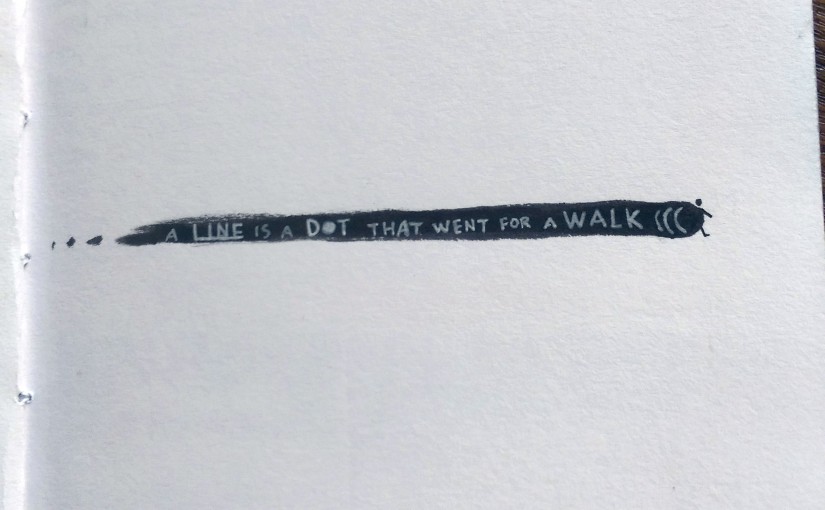
“String theory describes how these strings propagate through space and interact with each other. (From wikipedia)”

Physics aside xD. I shall start with some artworks that might have influenced my work.

IMG_5577 
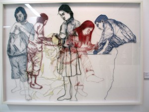
This is a piece I saw at an exhibition at Lasalle. When thinking about using threads as a medium, this kind of artwork is the first that came to mind.

Ana-Teresa-Barboza Chiharu-Shiota

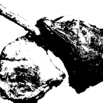
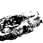
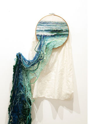
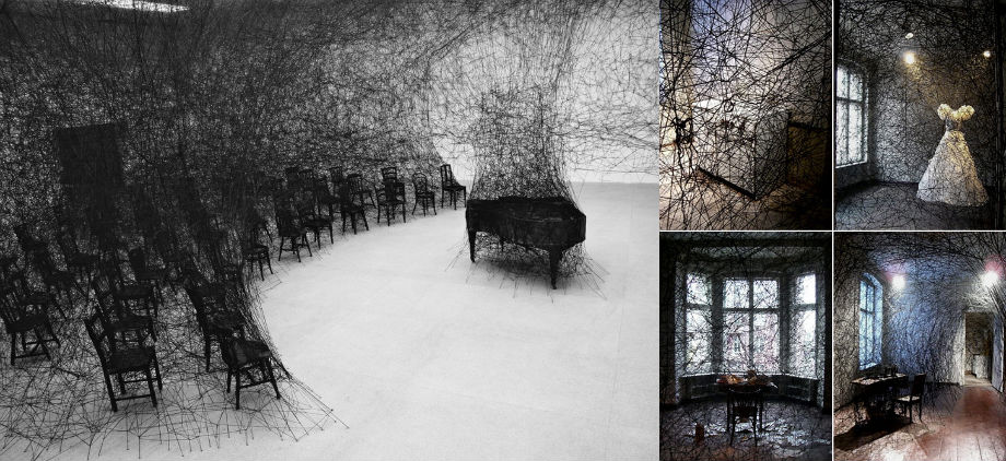
And these are artworks by Ana Theresa Baboza and Chiharu Shiota respectively. While they might not have directly inspired me for this assignment, having seen their amazing works online certainly left a deep impression on what we could create with threads.

1 
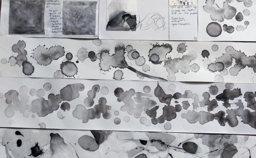
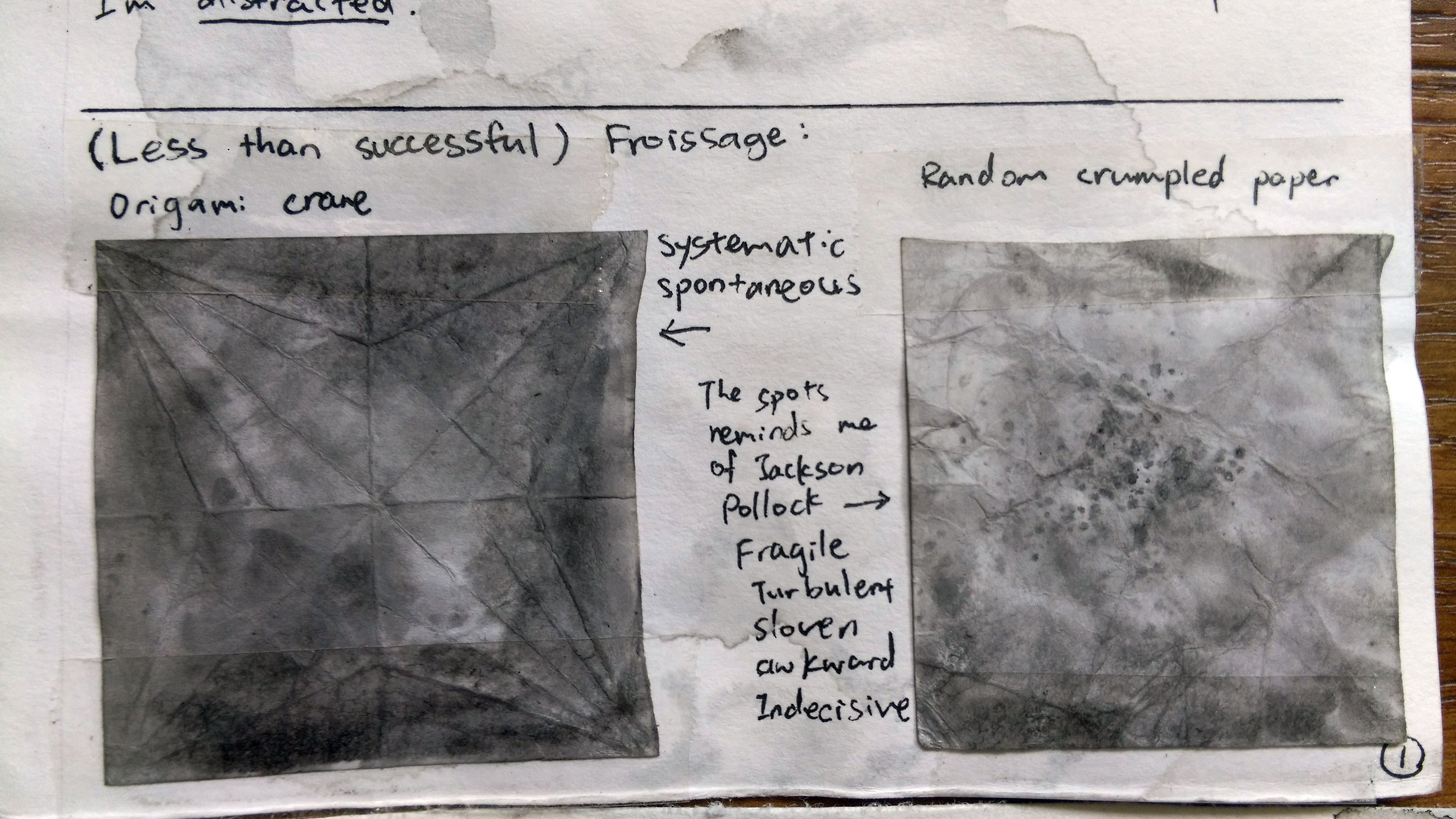
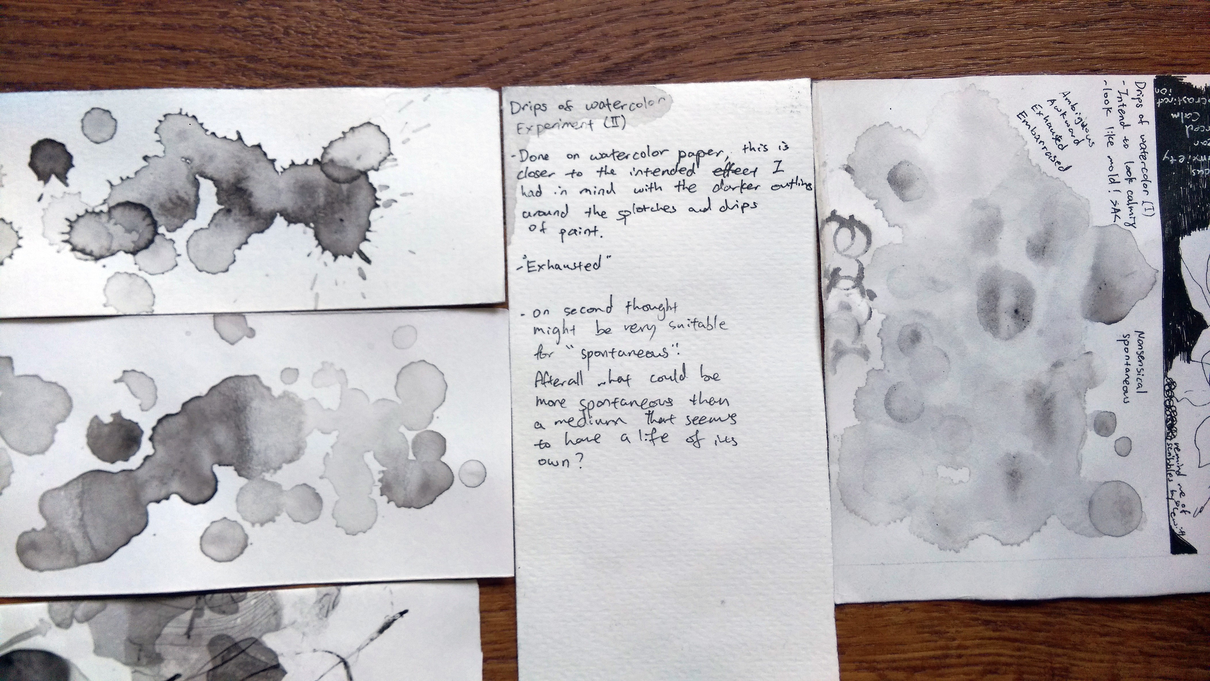
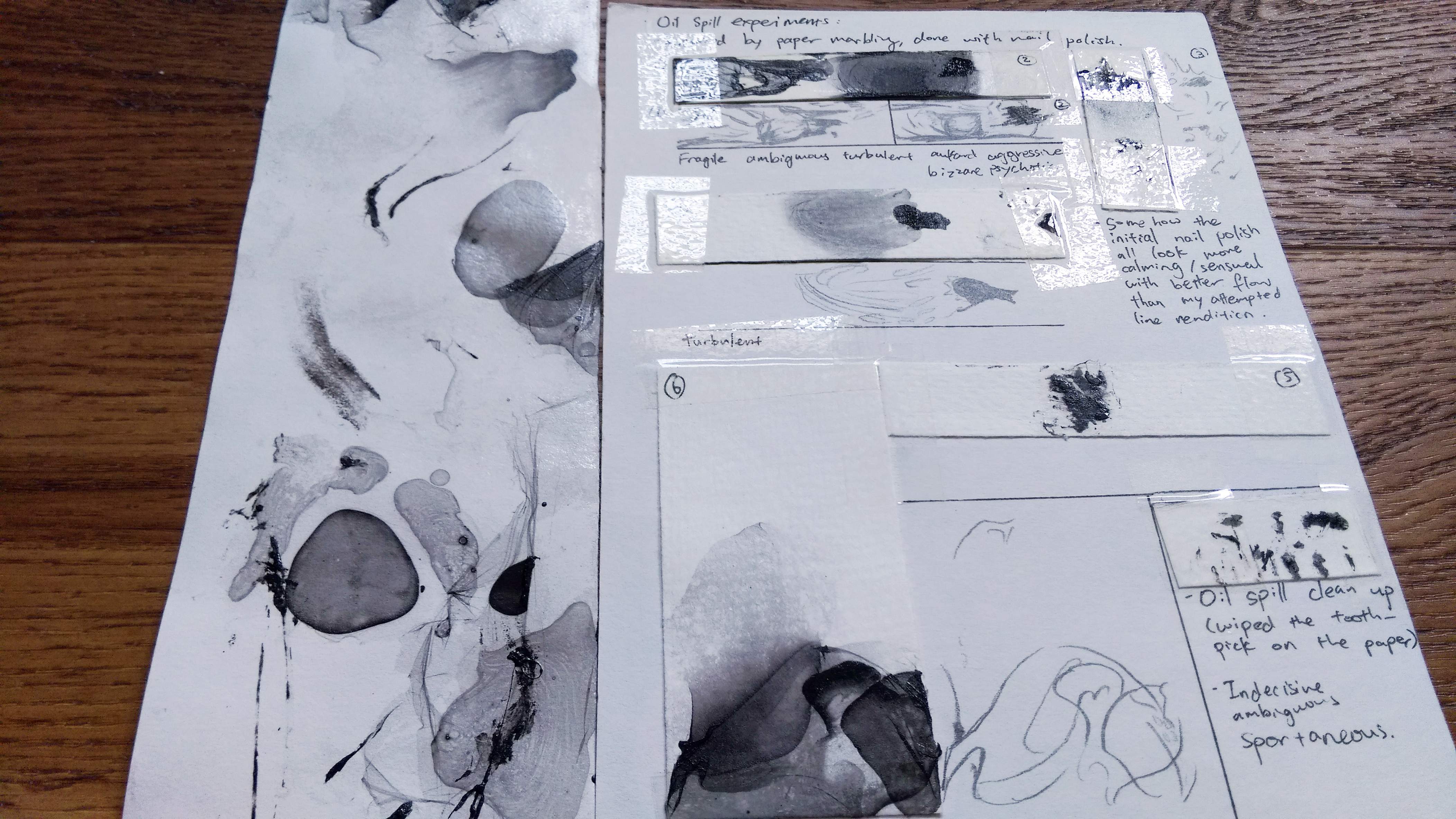
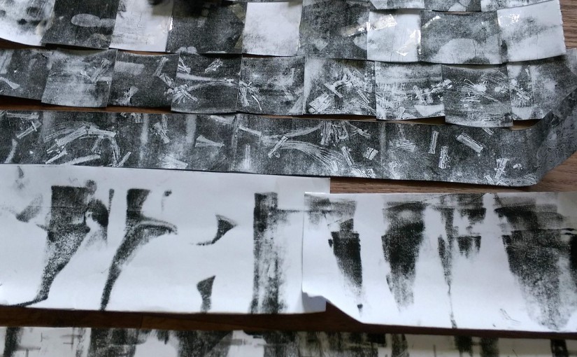
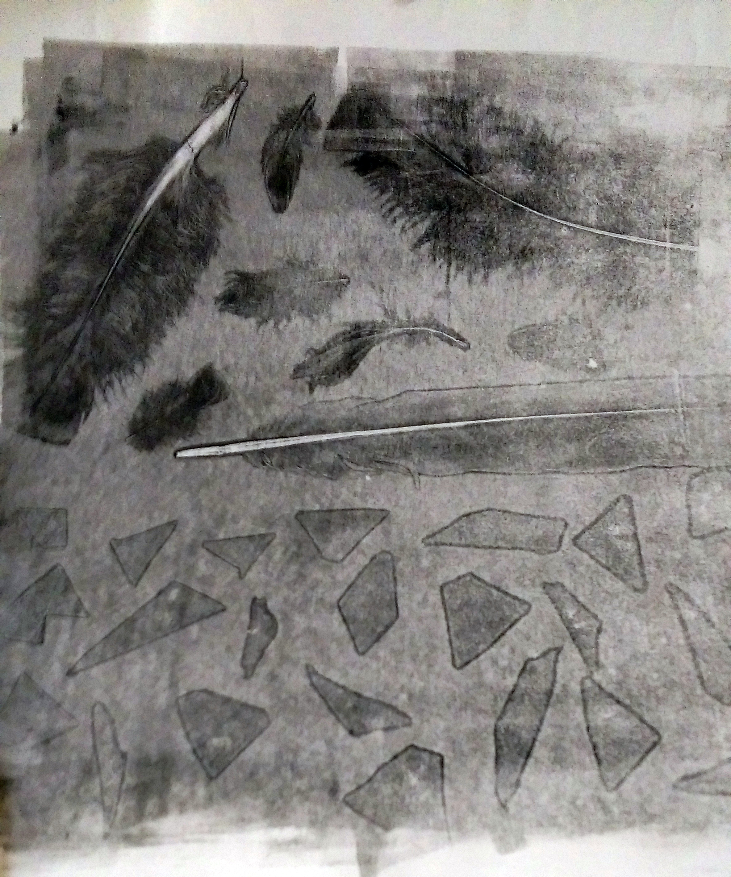
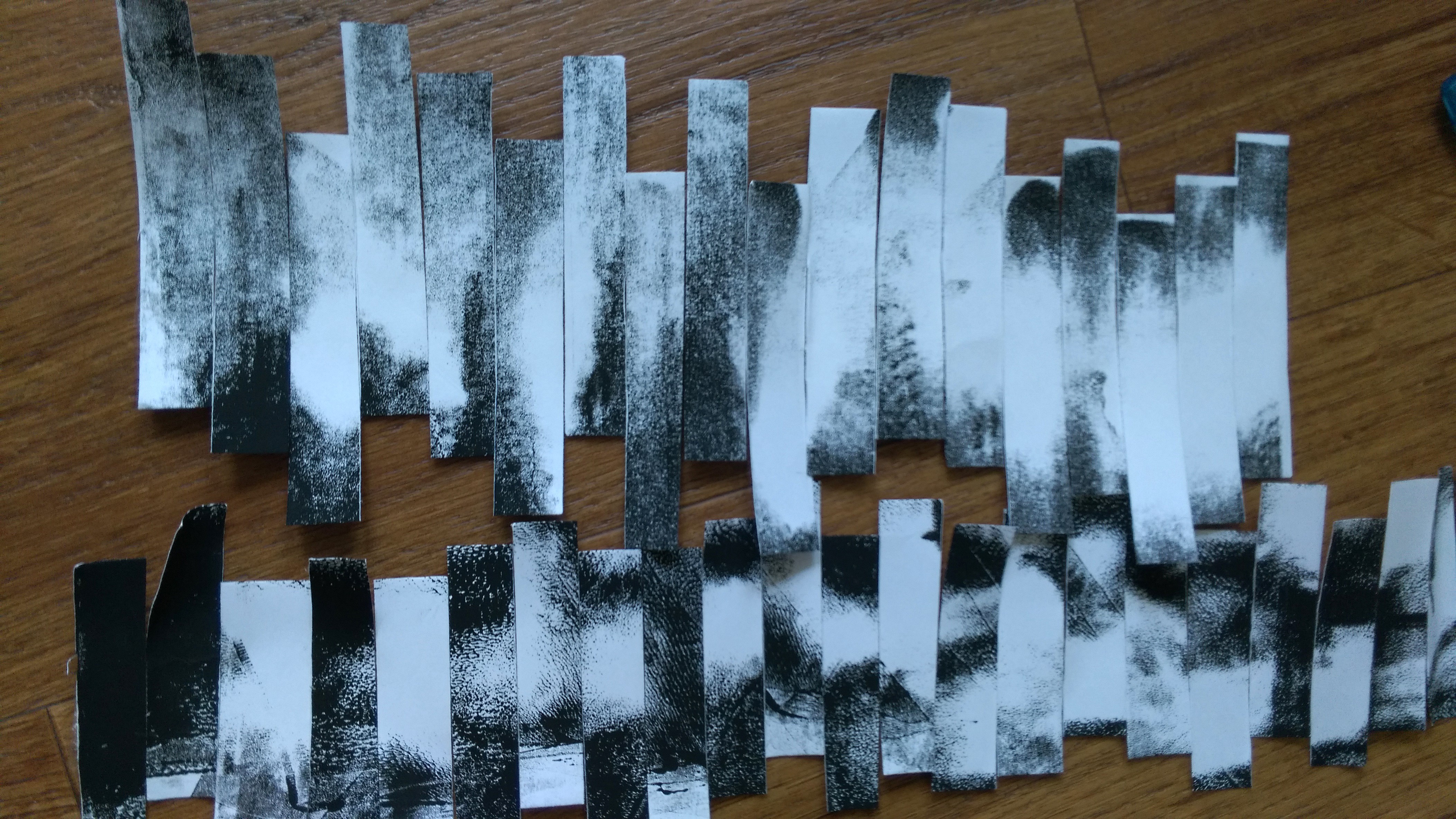
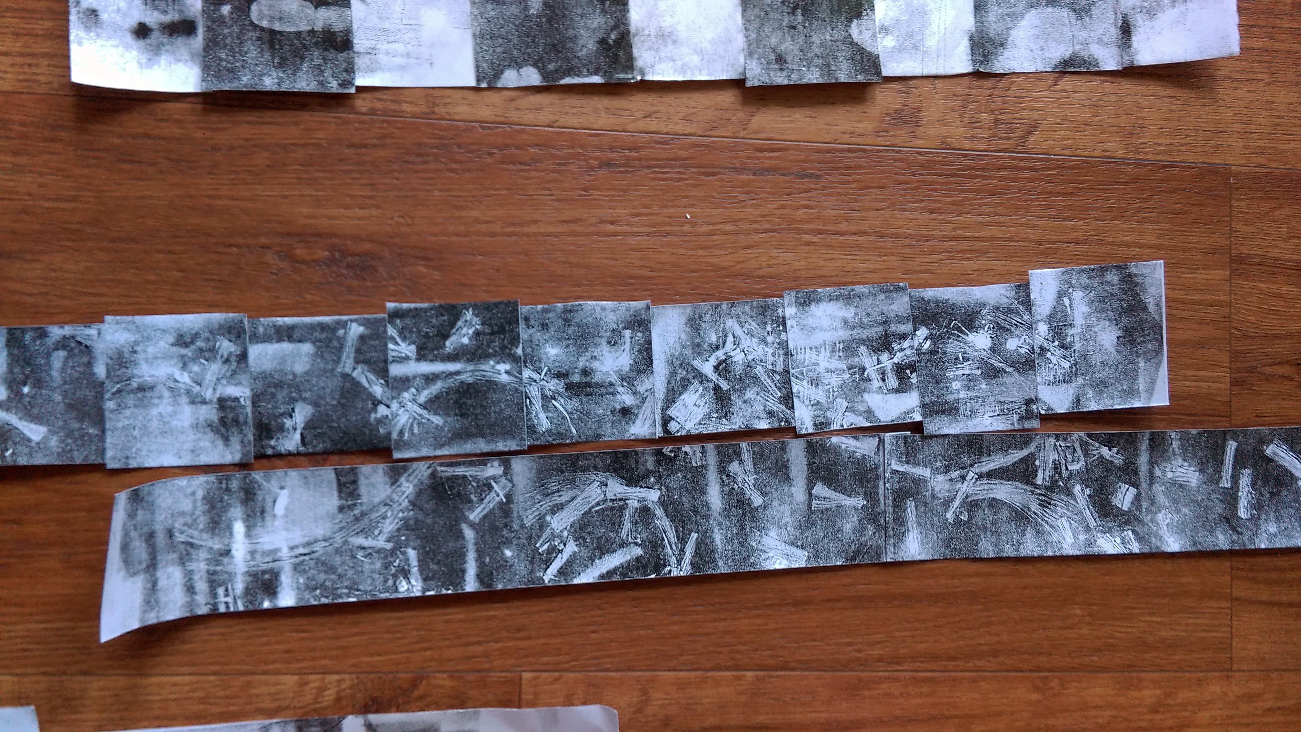
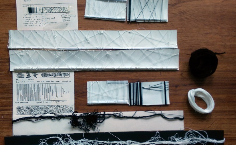
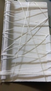
This is the first page of my journal, I started approaching it as “systematic”, merely playing around with the shades of black, white and grey.

To me, it did not yield very unique results. However, as the paper was uneven, while I was doing it I noticed the shadow the thread cast upon the paper. It started me thinking about using the shadows as part of my work.

Also I realize as my experimentation is done small, the thread will look much thinner on the actual artwork. I needed to different threads to experiment on bigger pieces so I put the exploration on hold until last week.

IMAG3815IMAG3817 
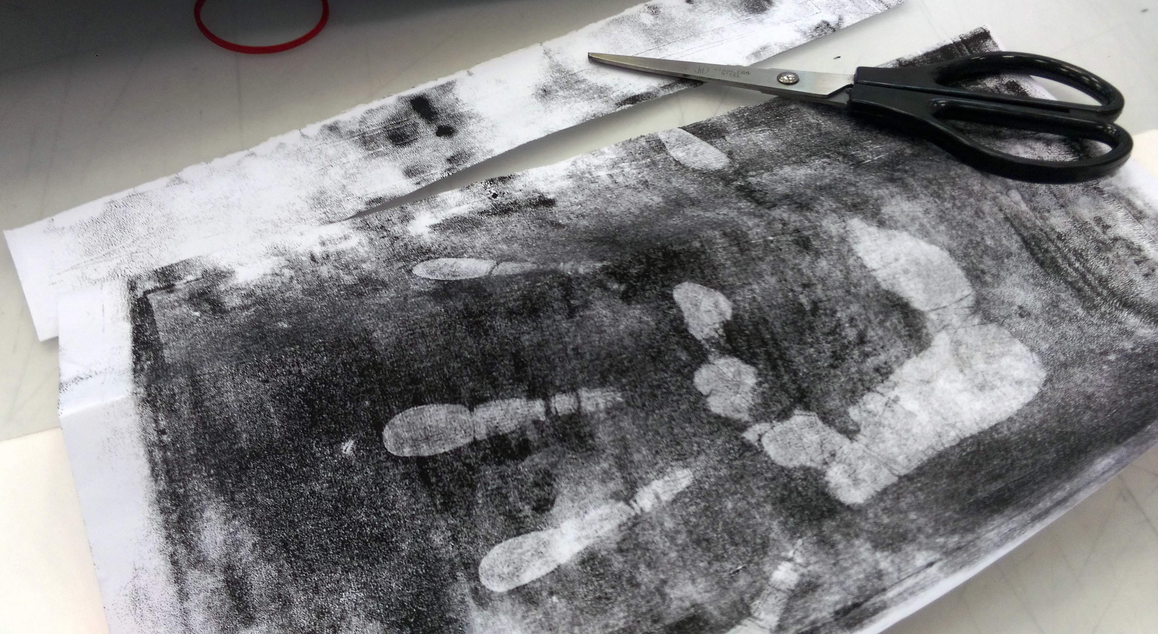
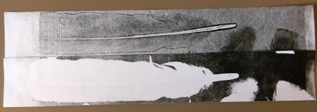
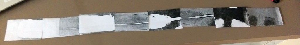
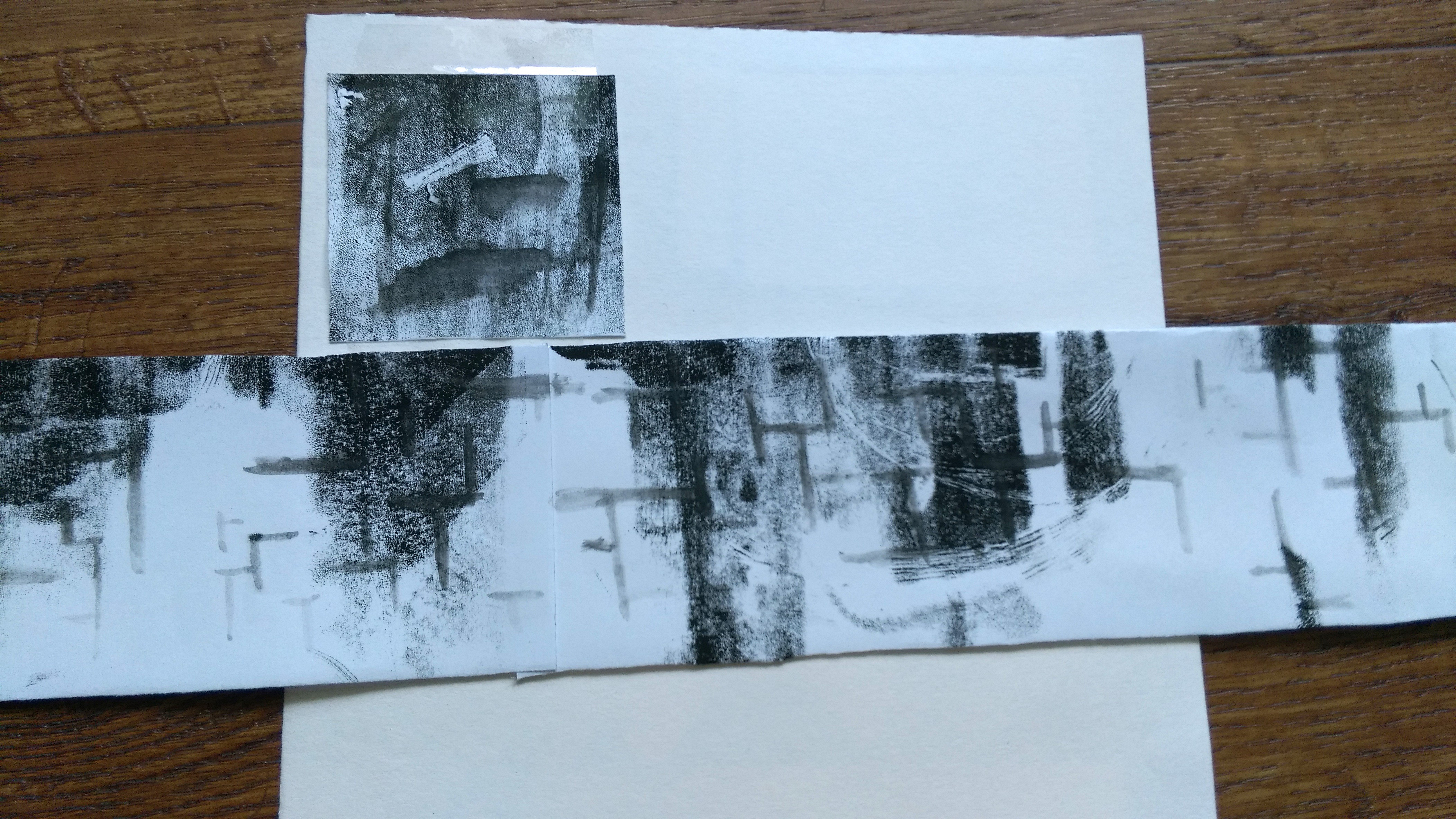
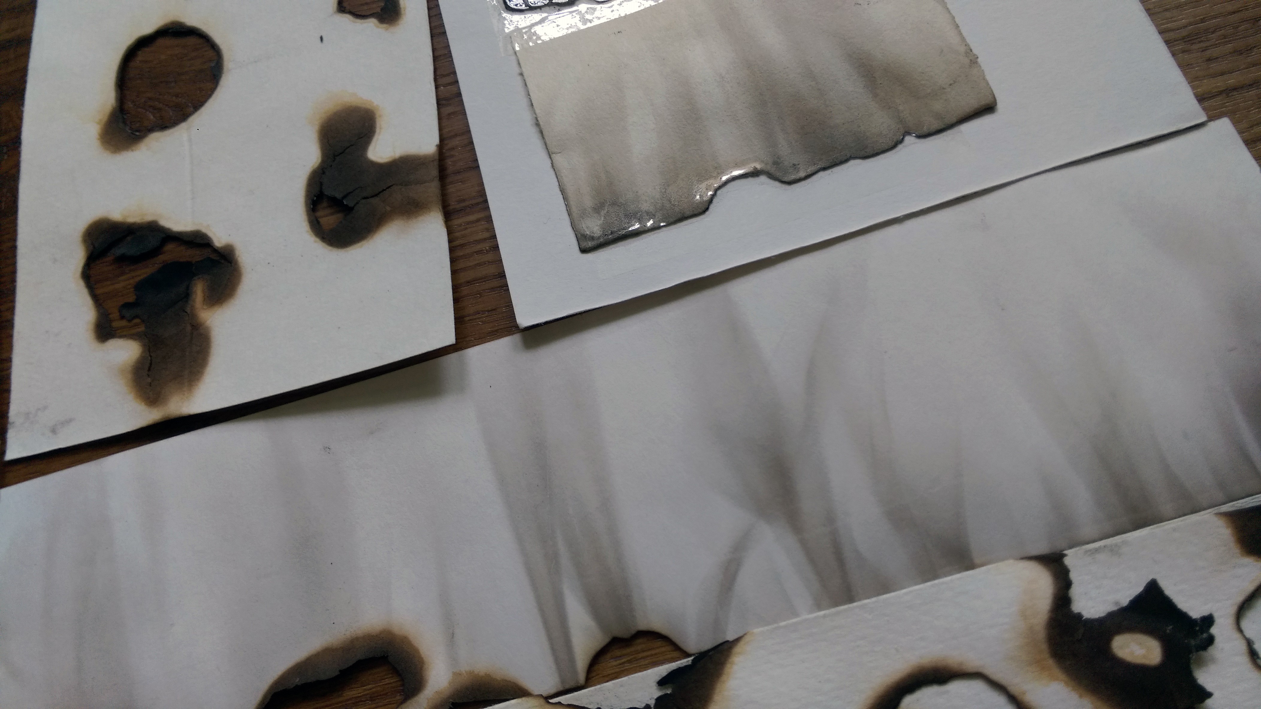
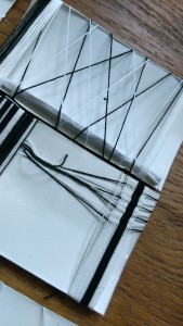
This are the first one I attempted after getting new thread. I made both edges thicker with folded paper and tape.

I’m glad I tested this out because only after did I realize the top edge will block the light and make the shadows less distinct than I would like.

By this point my idea for the thread has become using the shadows (which change with the lighting) to portray “Ambiguous.”IMAG3818IMAG3819 
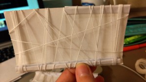
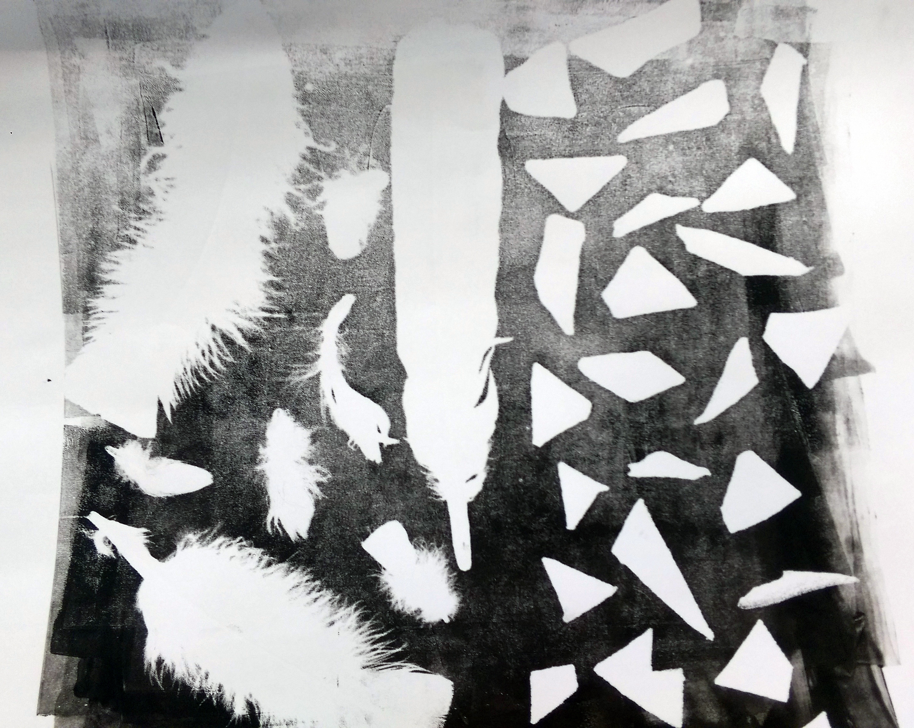
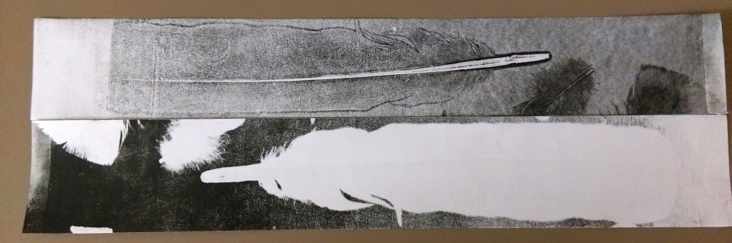
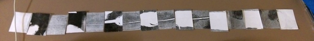
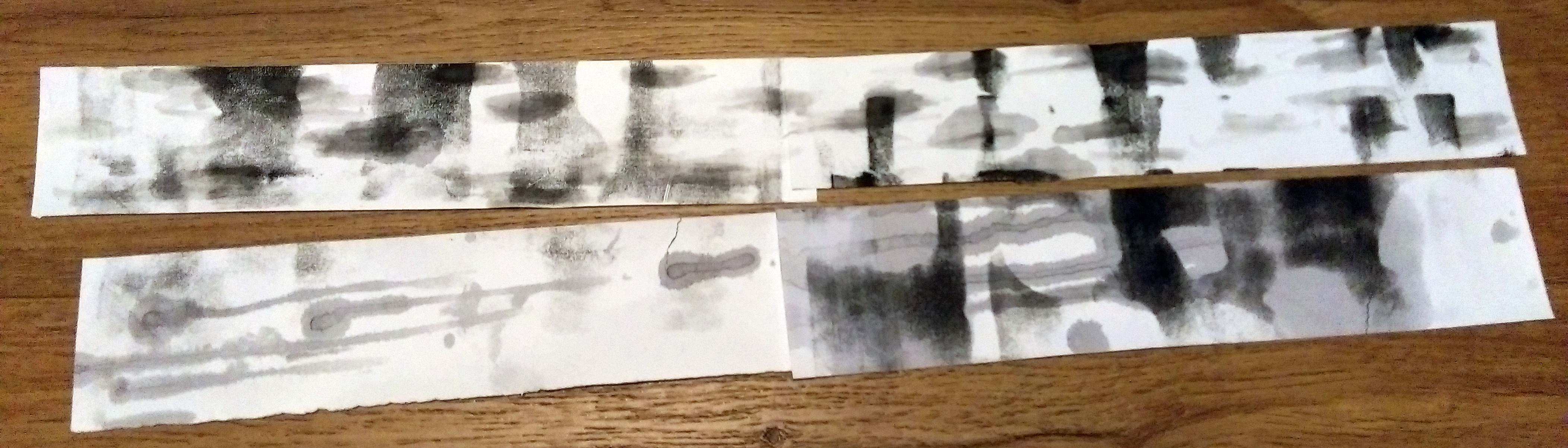
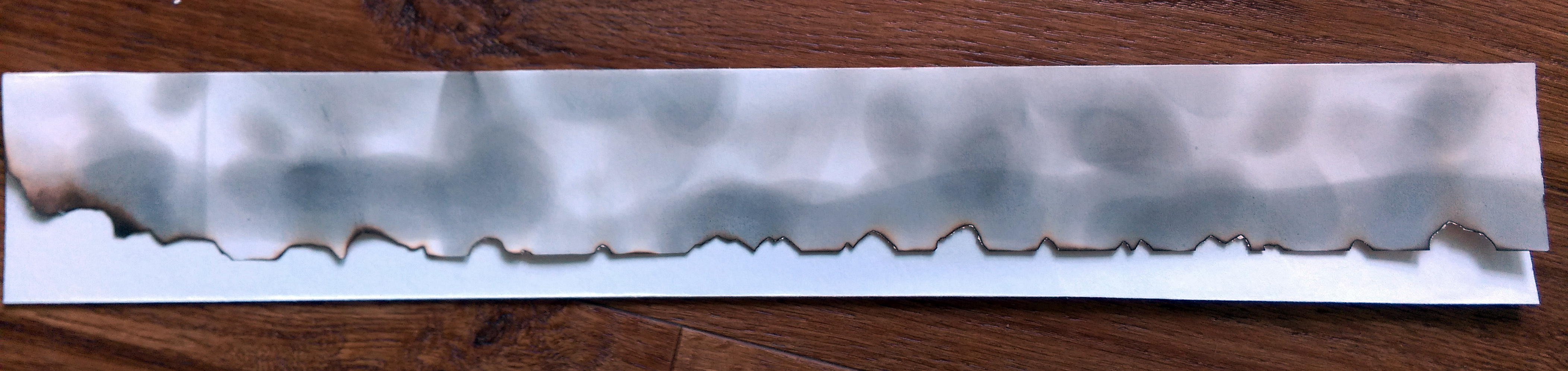
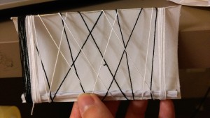
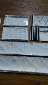
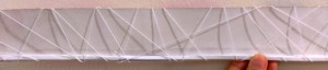
Anyways so I moved on to try thinner edges on one side of the paper. It was better.

IMAG3821IMAG3822IMAG3820 
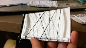
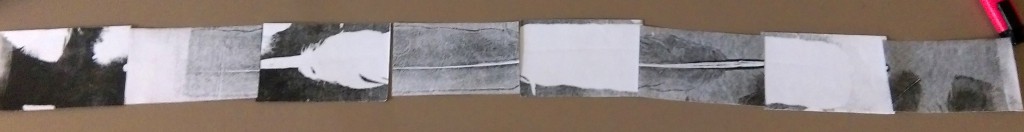
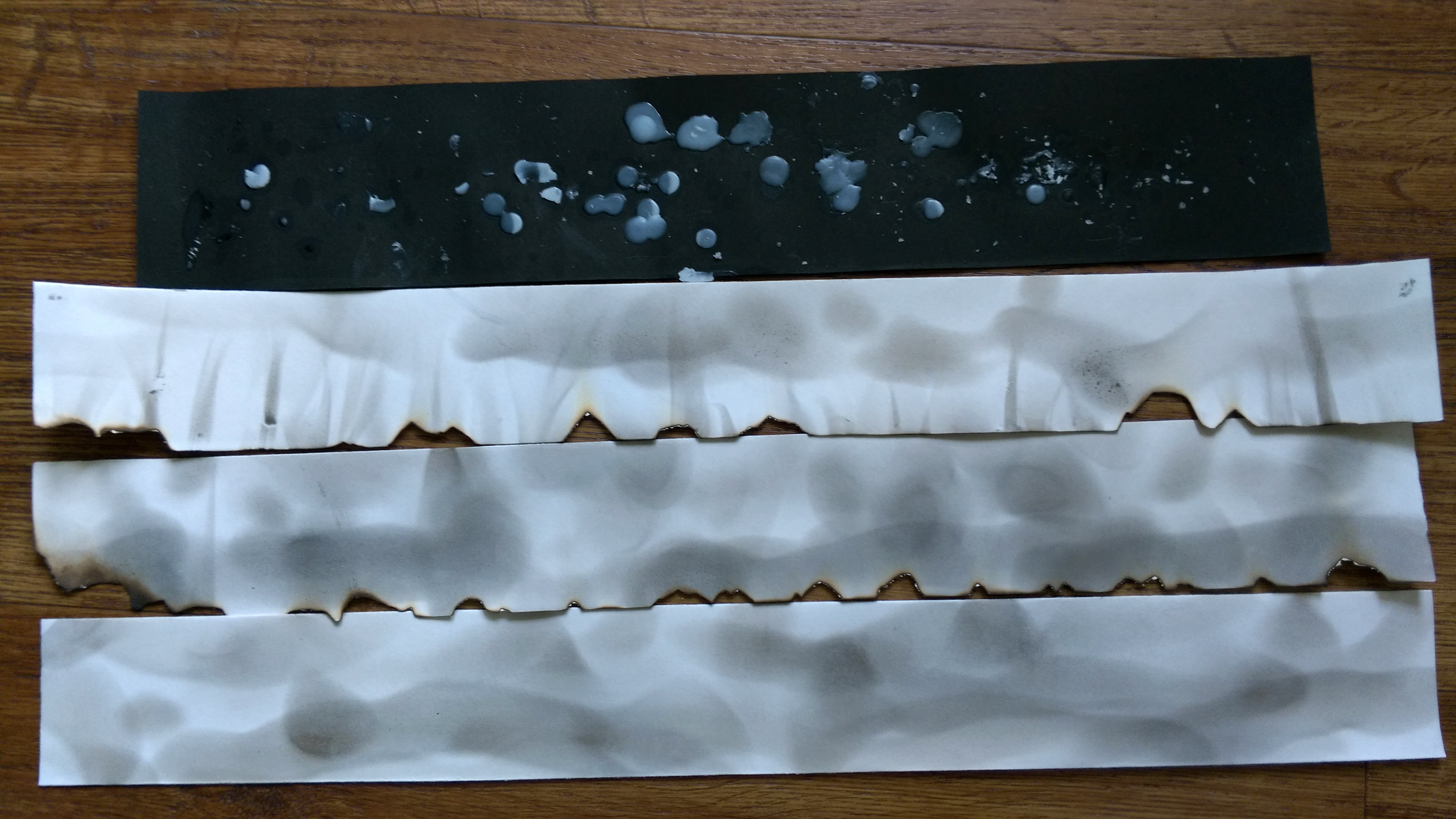
While I was prettyyy sure I was just going to be using white thread only (Such that the shadow would stand out more), I made an attempt with the black threads anyways. In a way I was (and still am.. a little) insecure about the thread blending into the paper completely, but I decided it’s okay.
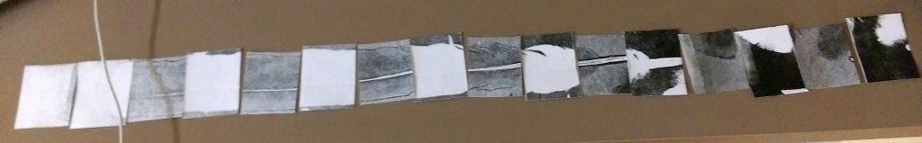
IMAG4028 IMAG4027Moving on!

IMAG3921IMAG3922

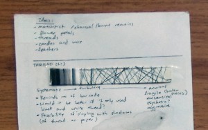
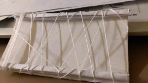
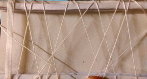
I used to do cross stitch before, and I suddenly decided to try weaving in the studio… I thought that if I should use thread as an option for “systematic”, weaving would be a more interesting idea.

While it turned out quite nicely, it was immensely tedious and right now I’m not so sure about including something like this for my final piece due to time constrains… perhaps an incomplete weave as “Indecision” instead?

IMAG3923

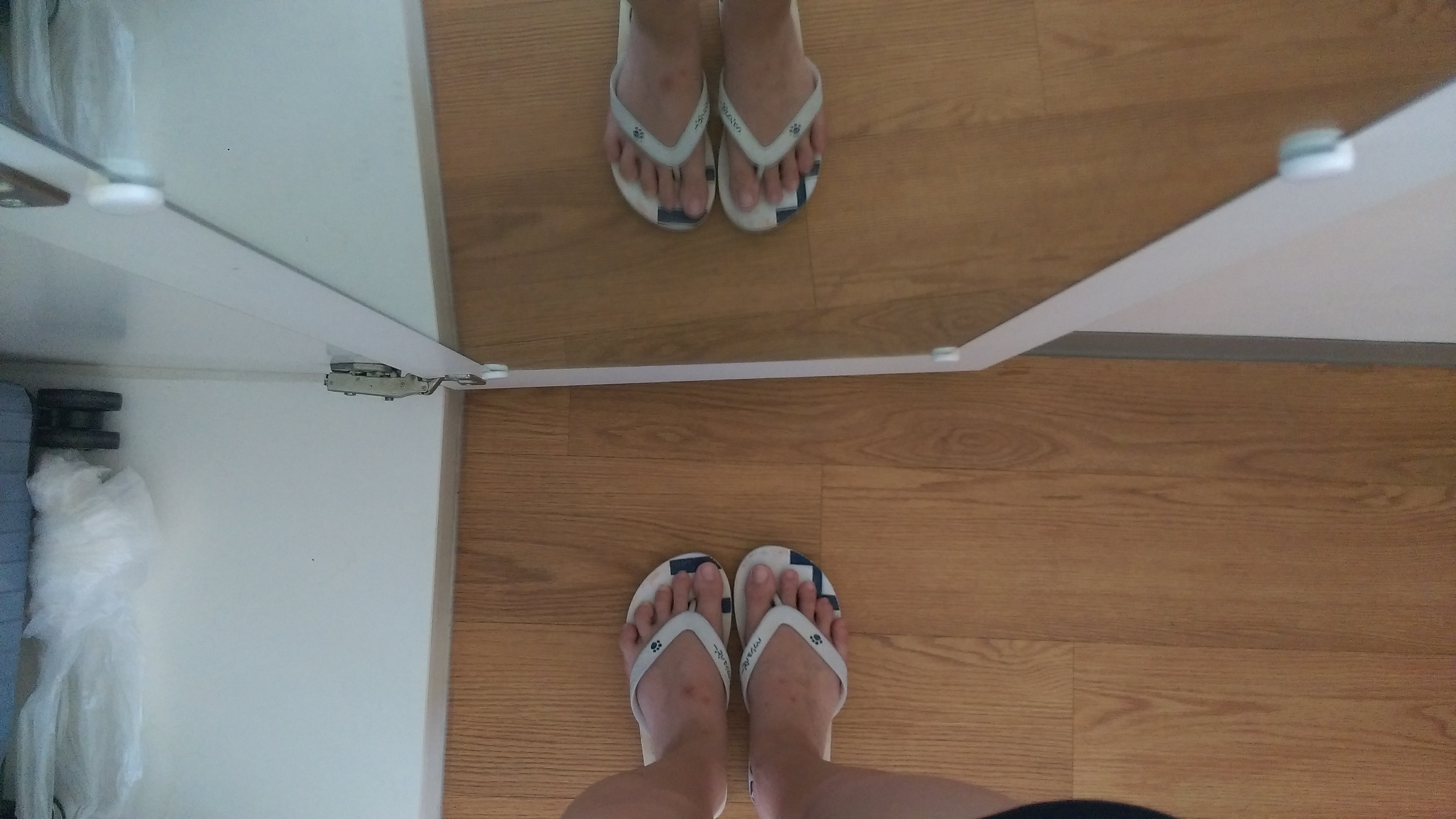
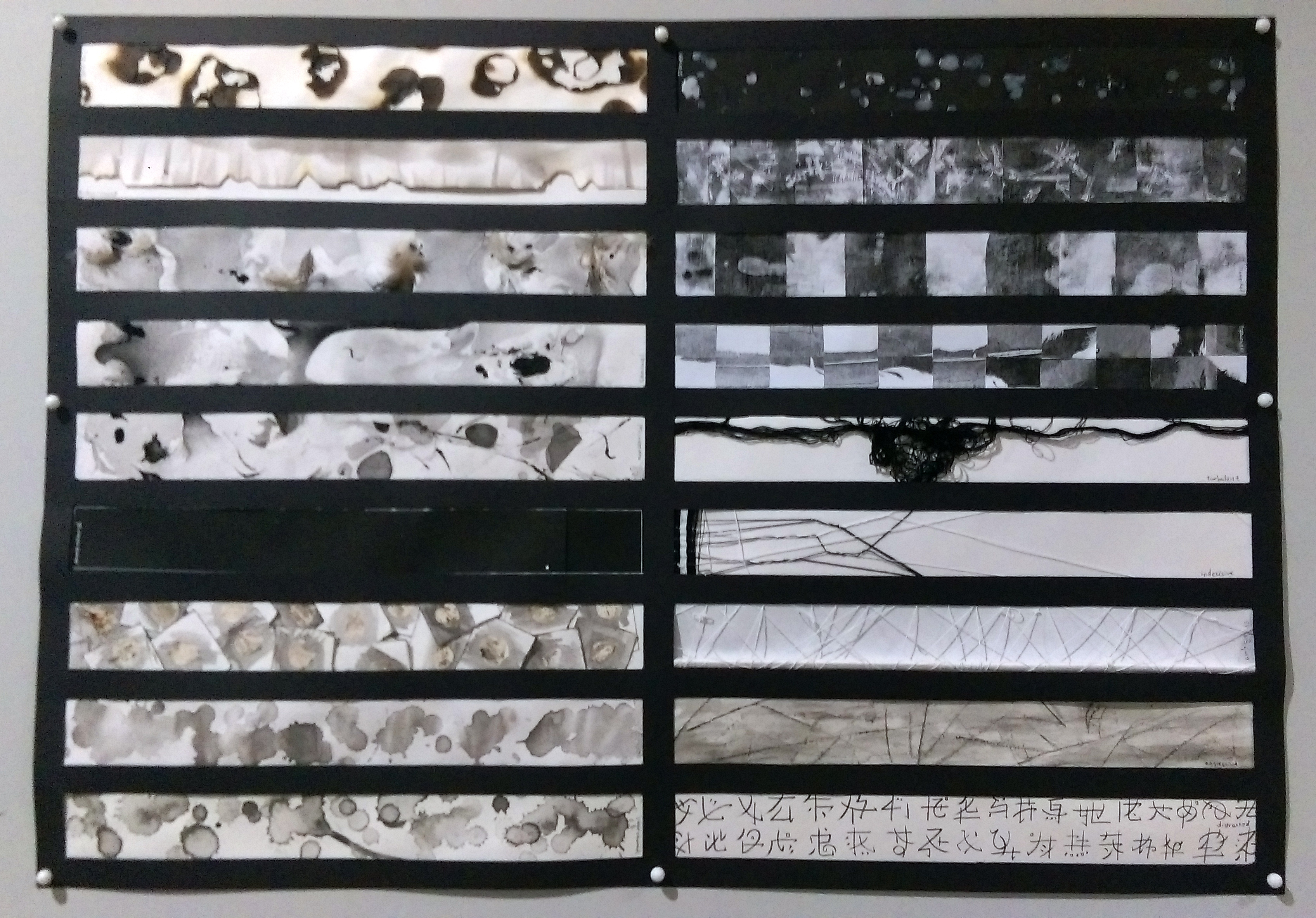
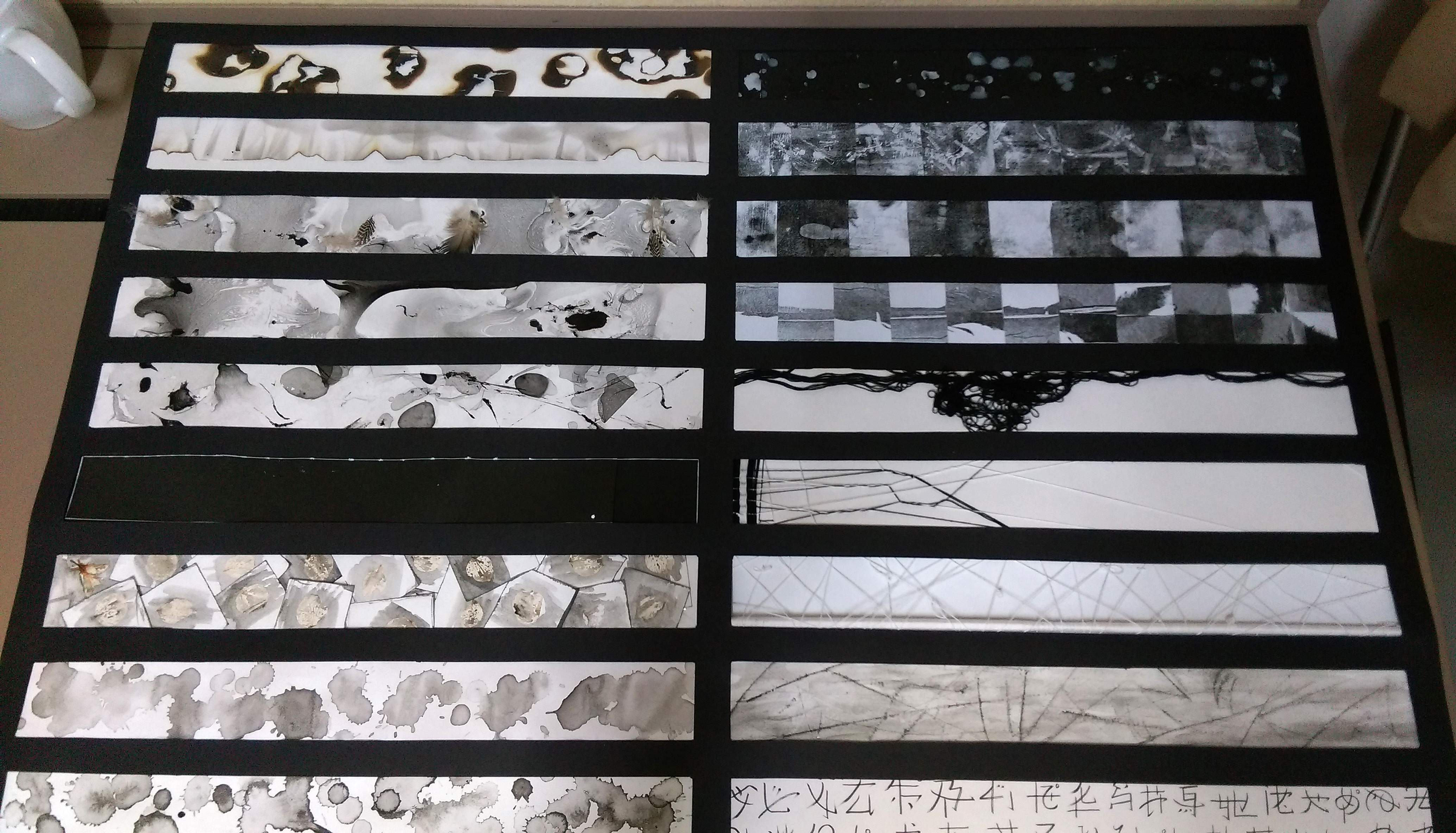
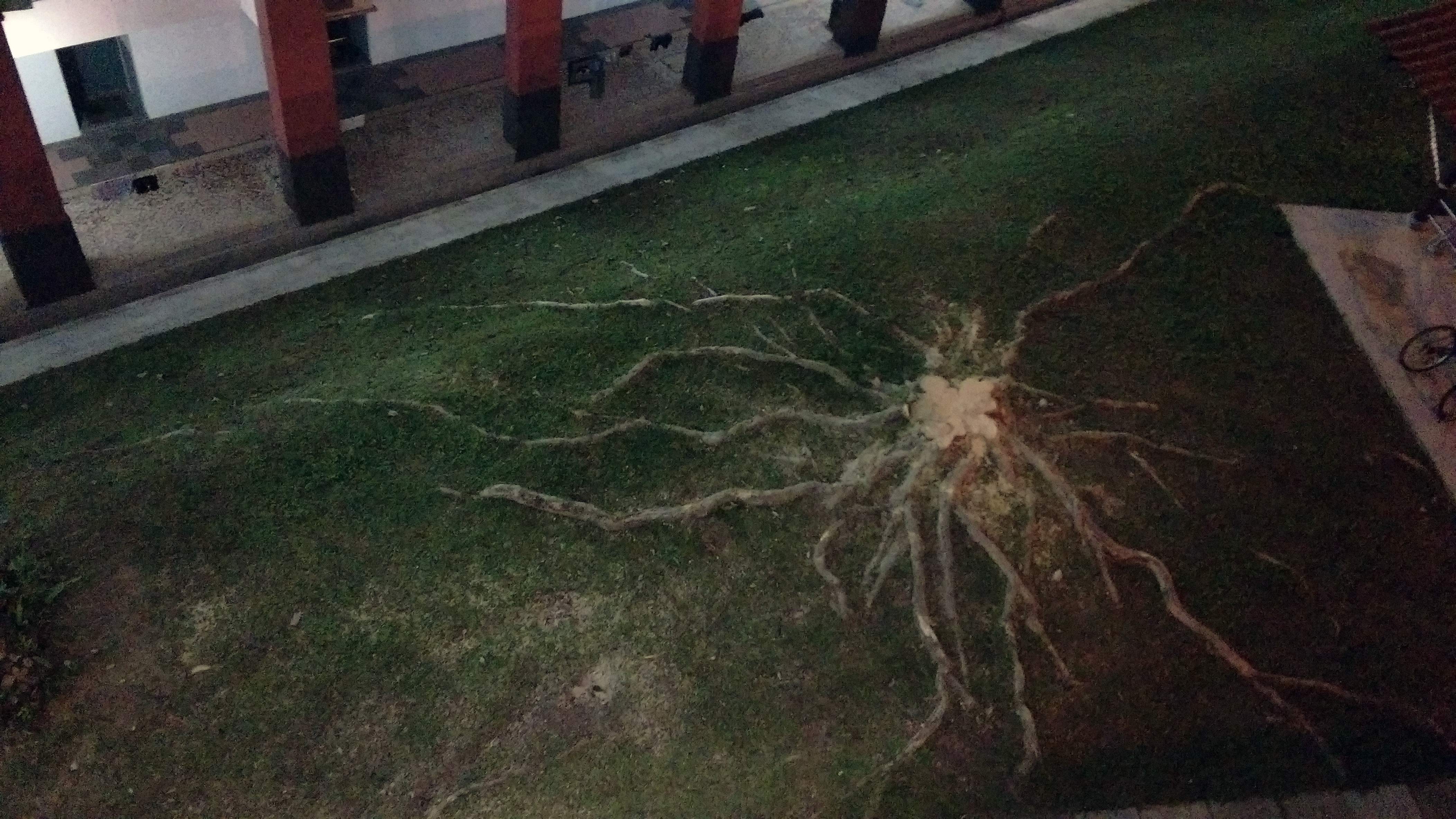
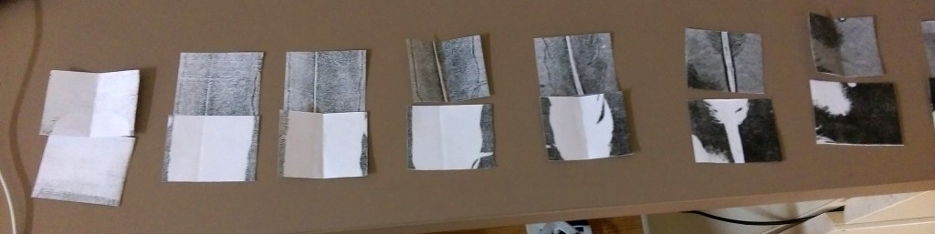
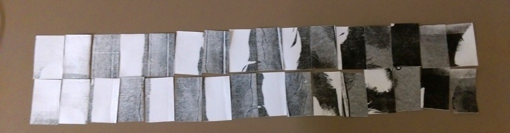
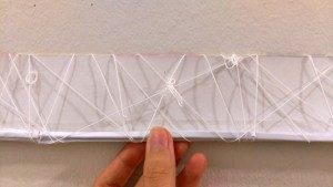
This is what I initially did for the final “Ambiguous”… The photo is taken at the corridor in Adm, as I figured that’s where the final work will be displayed and I wanted to make sure the shadows will work there, as well.

IMAG3929IMAG3928

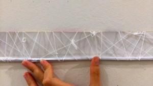
And I decided it wasn’t “ambiguous” nor interesting enough, so I added some knots for good measure.

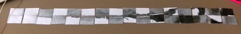
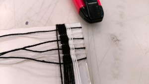
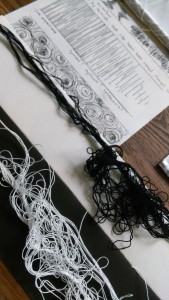
This would have been my final had Prof Joy not point out that the reflective scotch tape at the bottom affect the overall composition. Welllll to be honest I suspected that might happen but I was hoping it wouldn’t, because I didn’t have a better idea at that point in time. She suggested I try using the glue gun to make the strip at the edge though ^^

It was a good idea, and I’m glad she set me thinking, because I felt like I was struck by a stroke of brilliance when I remembered I had spare disposable chopsticks in my hall! It will match the mood of the strip much better if I wrapped them with thread and use that as the edge. The end result is the strip in the middle of the featured image, and will likely be a part of the assignment in the end.

IMAG4023 
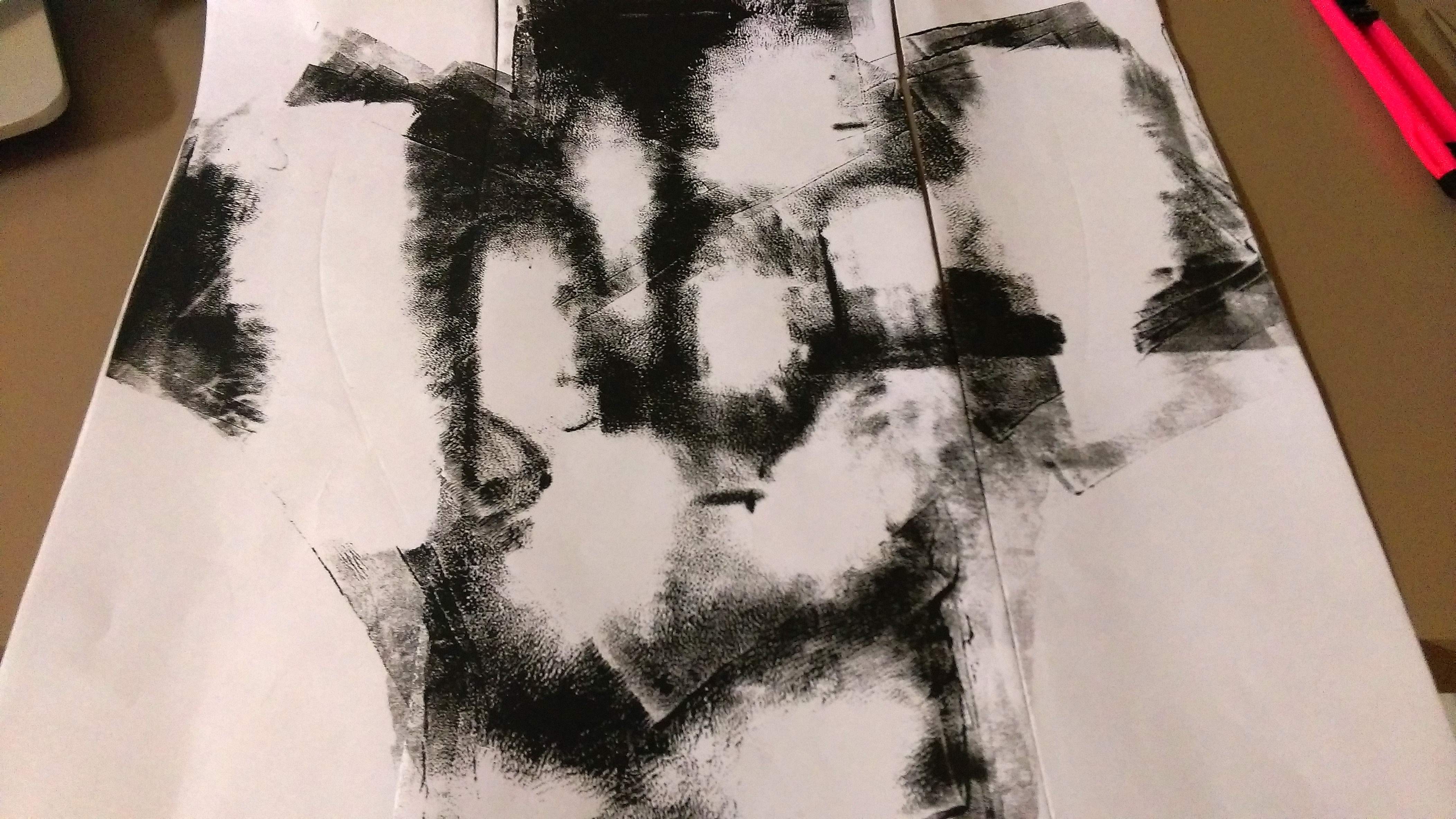
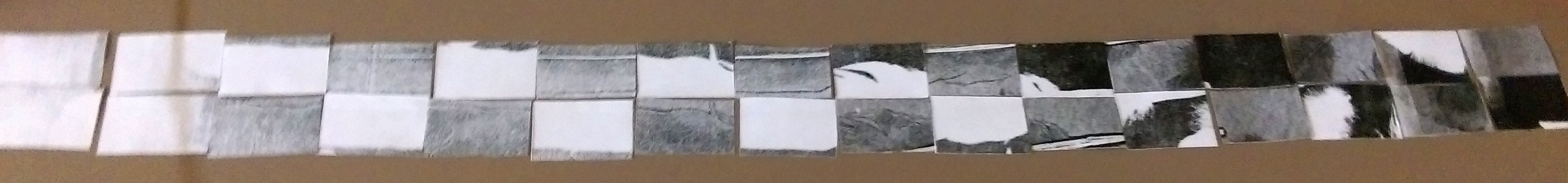
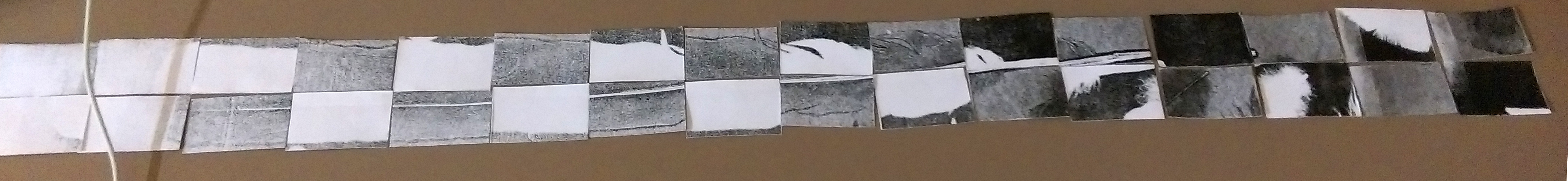
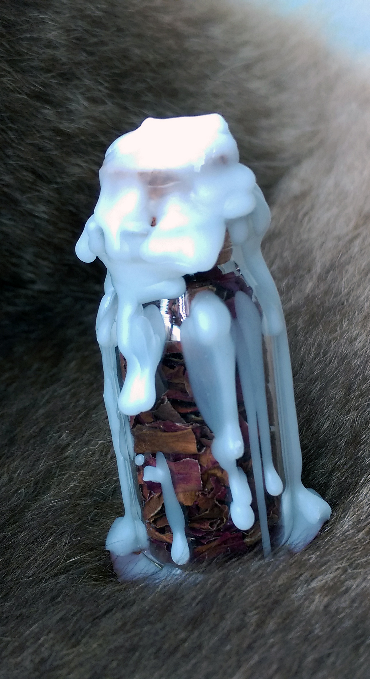
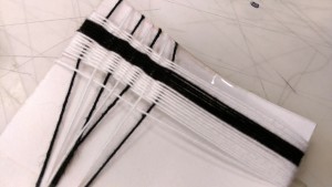
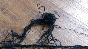
Lastly, this happened while I was working on the strips. I failed to ever untangle it…

IMAG4024IMAG4026 
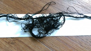
So I decided why can’t I use it as a strip as well? I think it’s interesting that this allow me to explore the other quality of the thread, instead of pulling it taunt and neat. Plus it works perfectly for “turbulent” which I had lacked until then. In this way, some mess can be god-sent. xD