From the beginning:


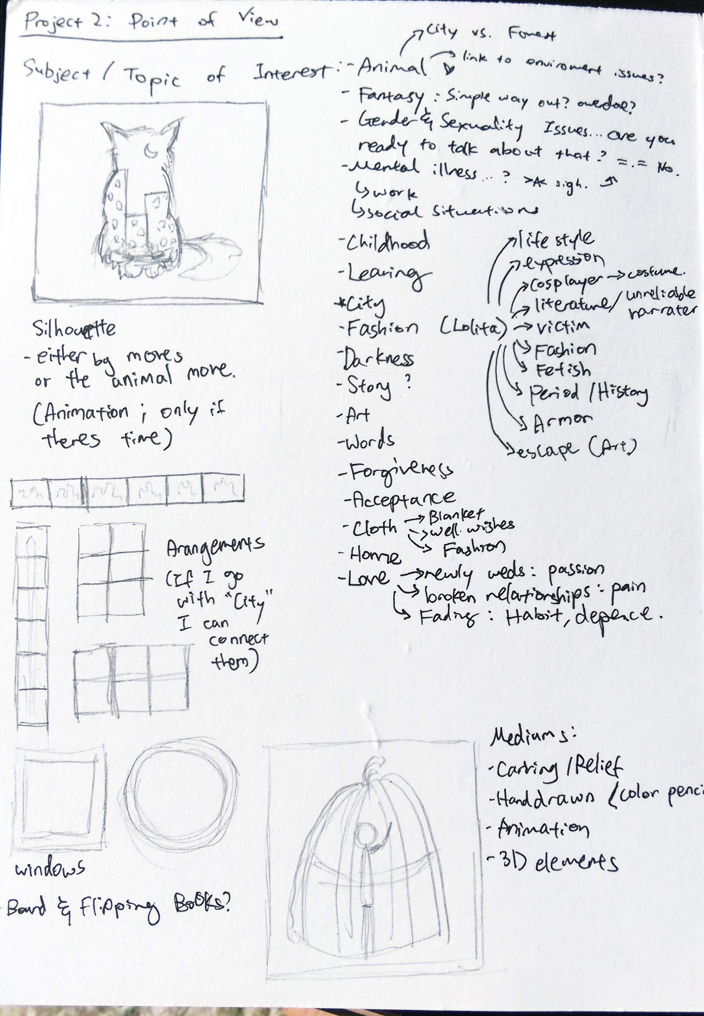
The initial brainstorming for this project worked out quite well for me.
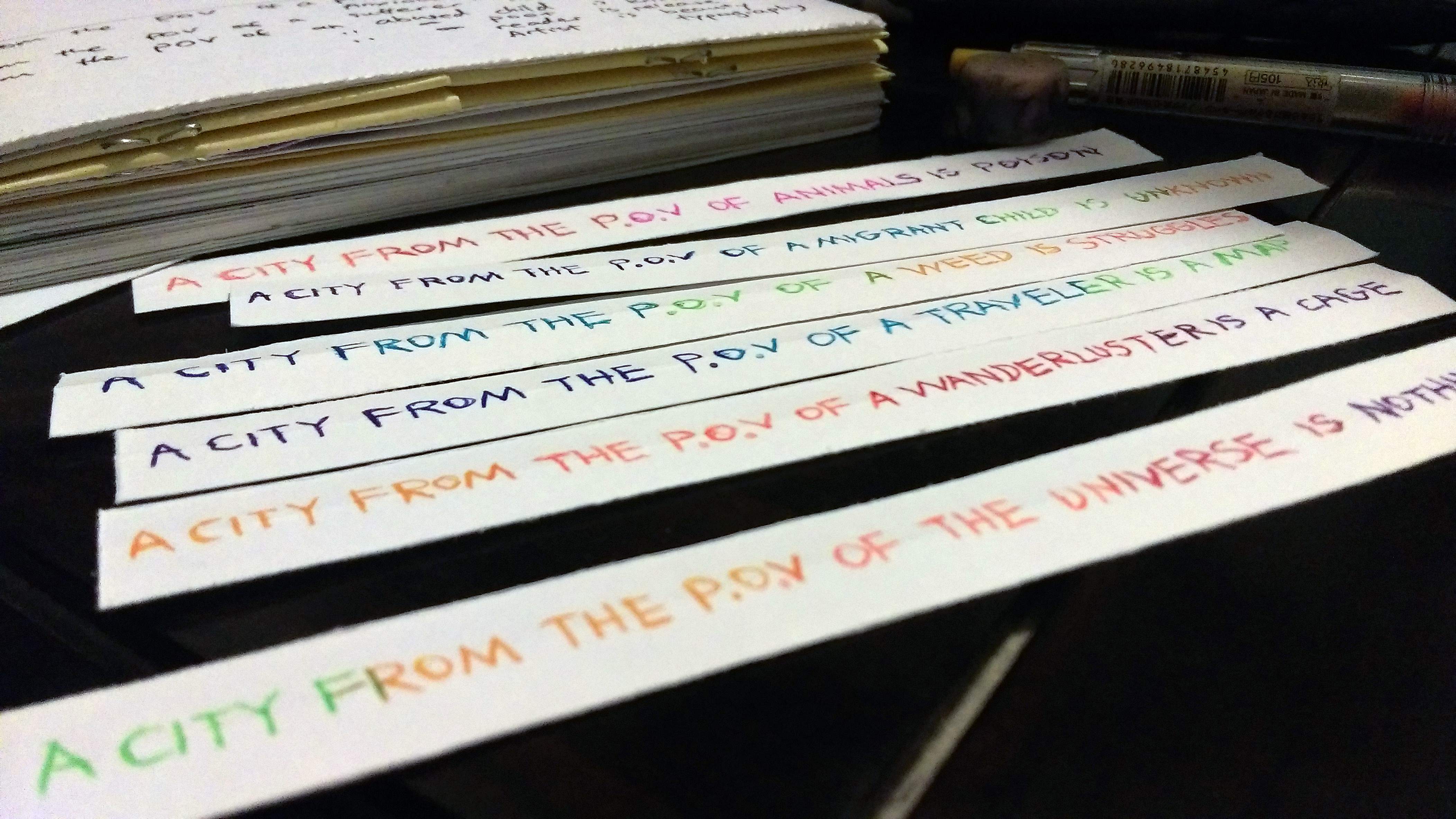
Although I was a bit apprehensive that the “city” might be an overdone concept, I was inevitably drawn to the idea due to I think it’s significance to me, personally… Having migrated when I was younger and thereafter always wanting to travel, be it to other cities or to nature to escape the sometimes overwhelming noise, light, pollution, and endless work in the cities…
So yes, the concept was the easy part. And then came the compositions…


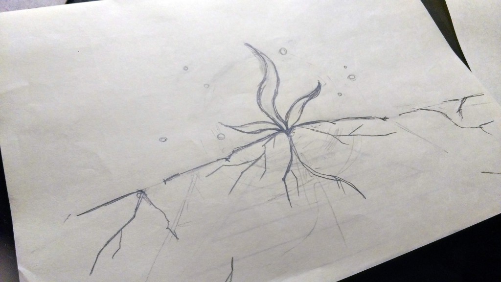
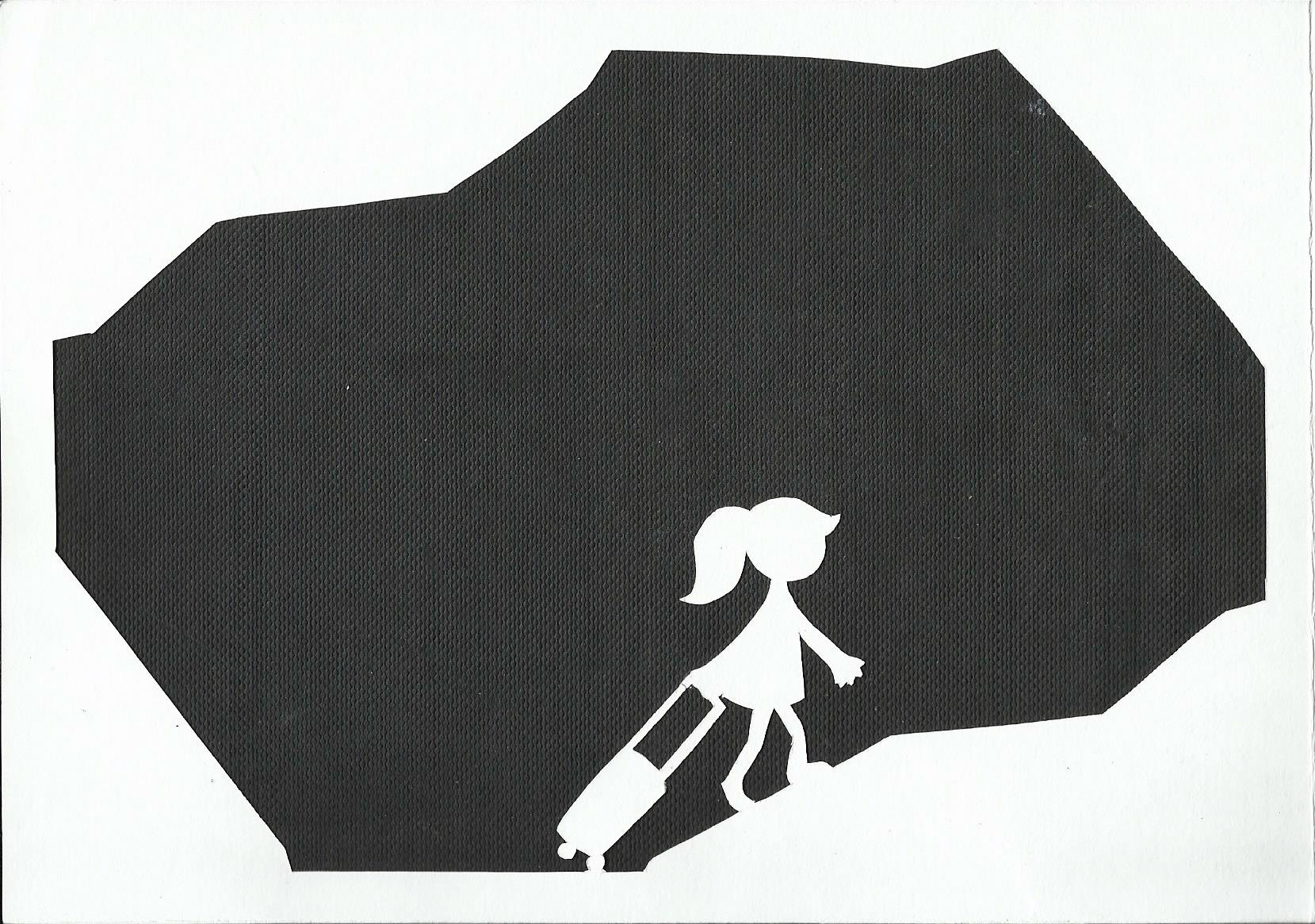
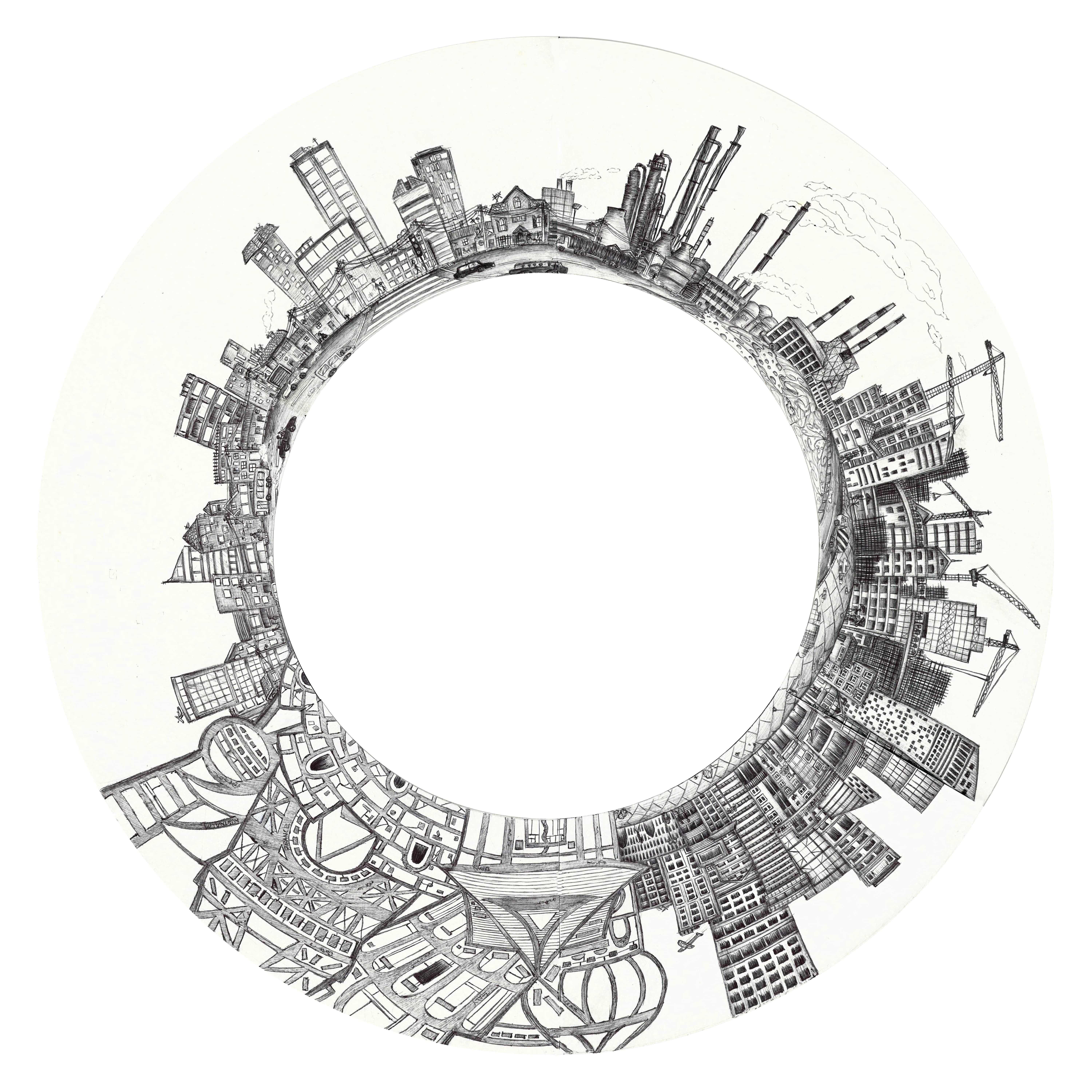
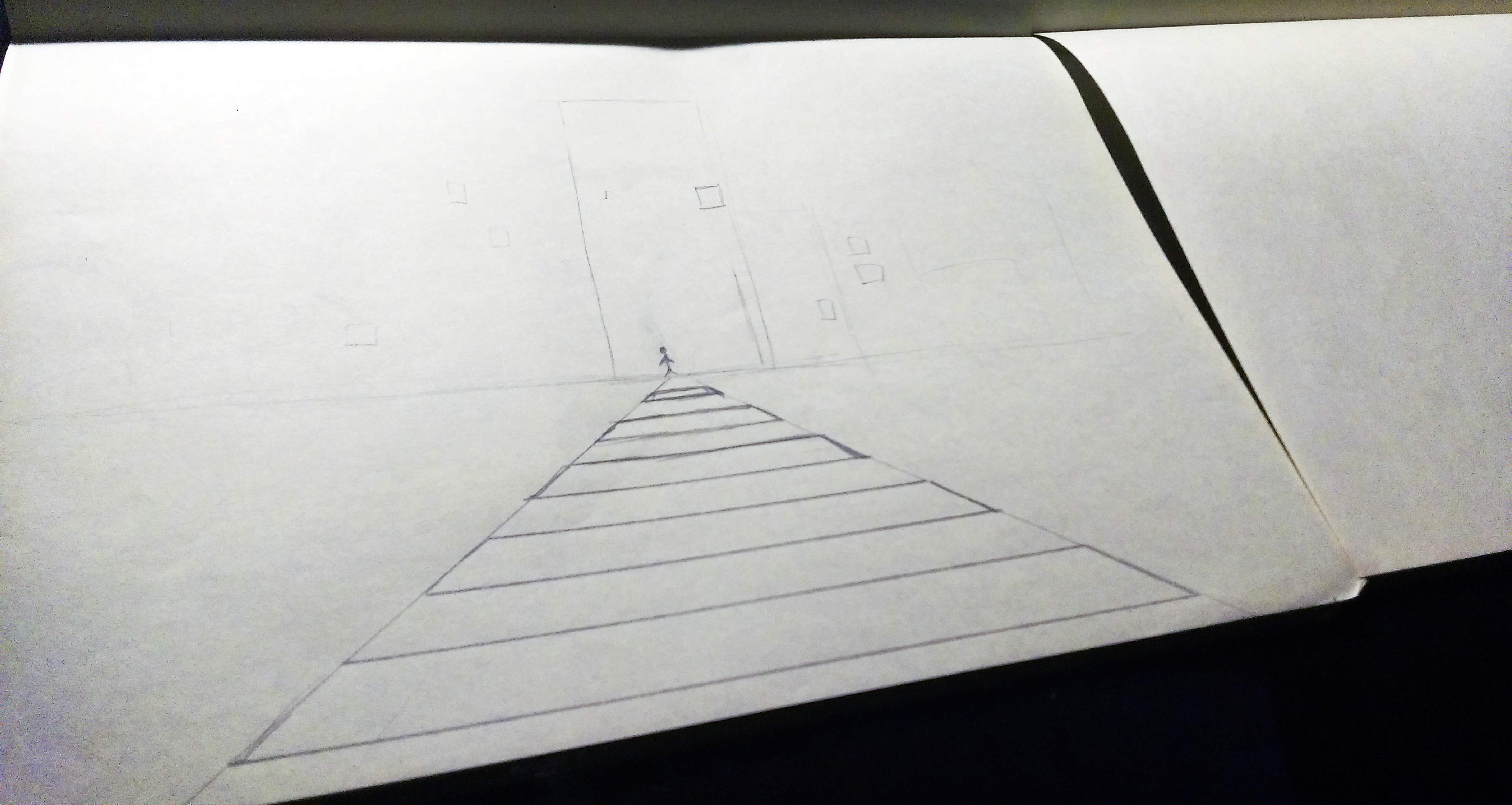
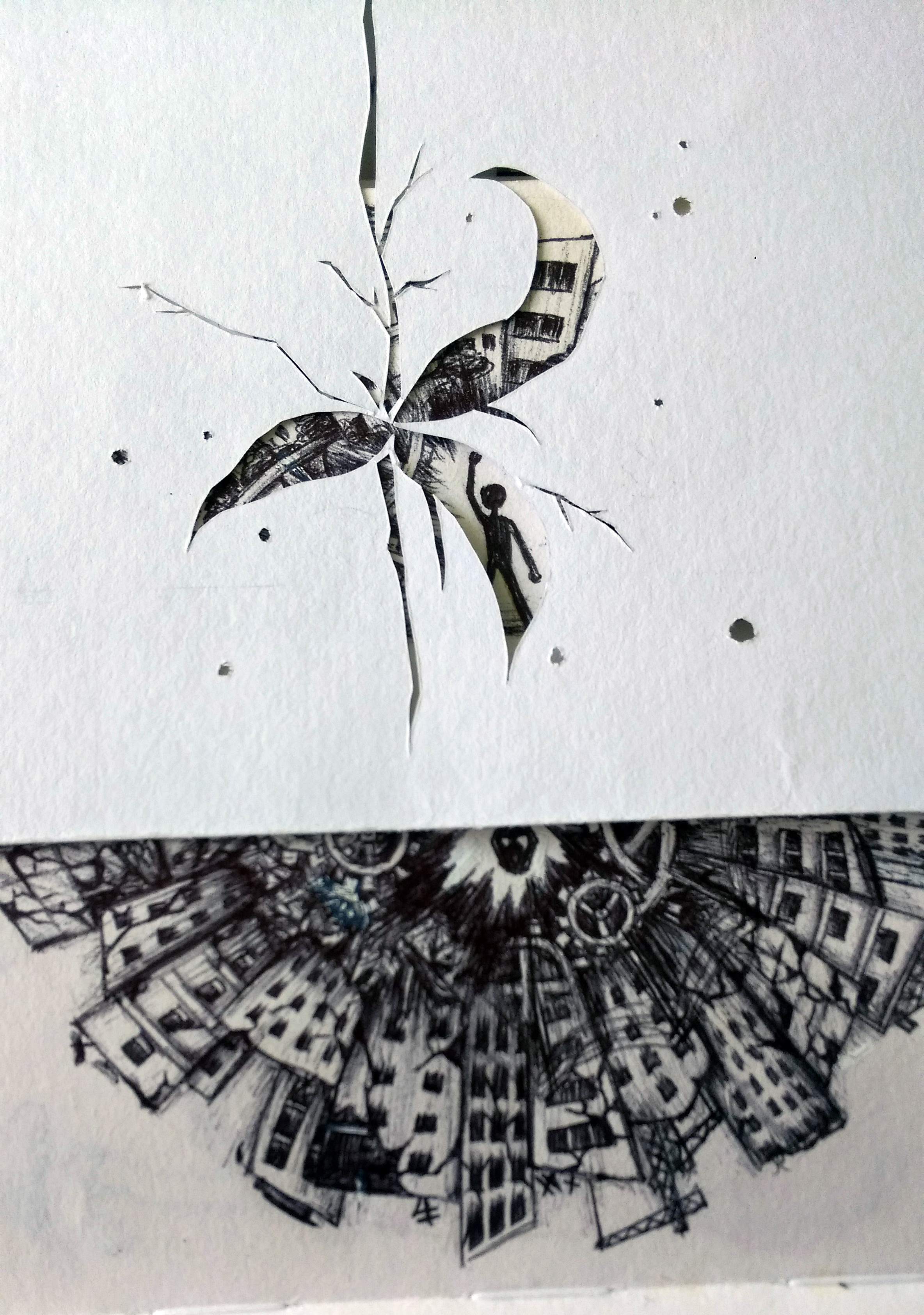
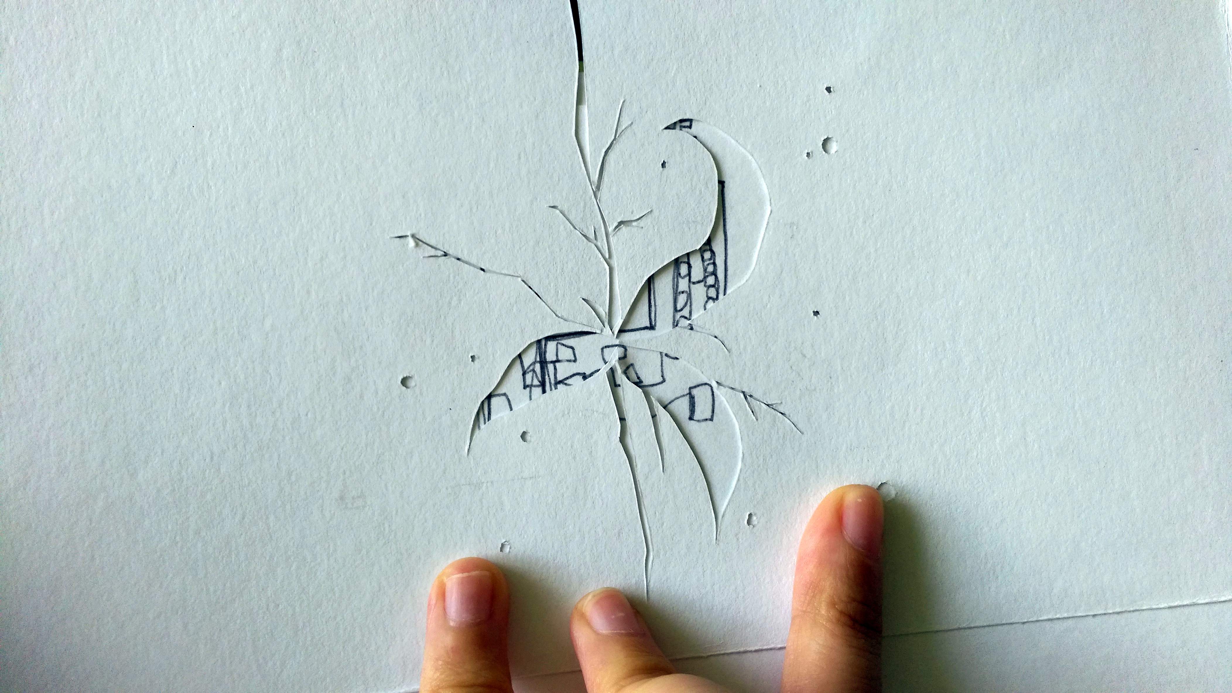
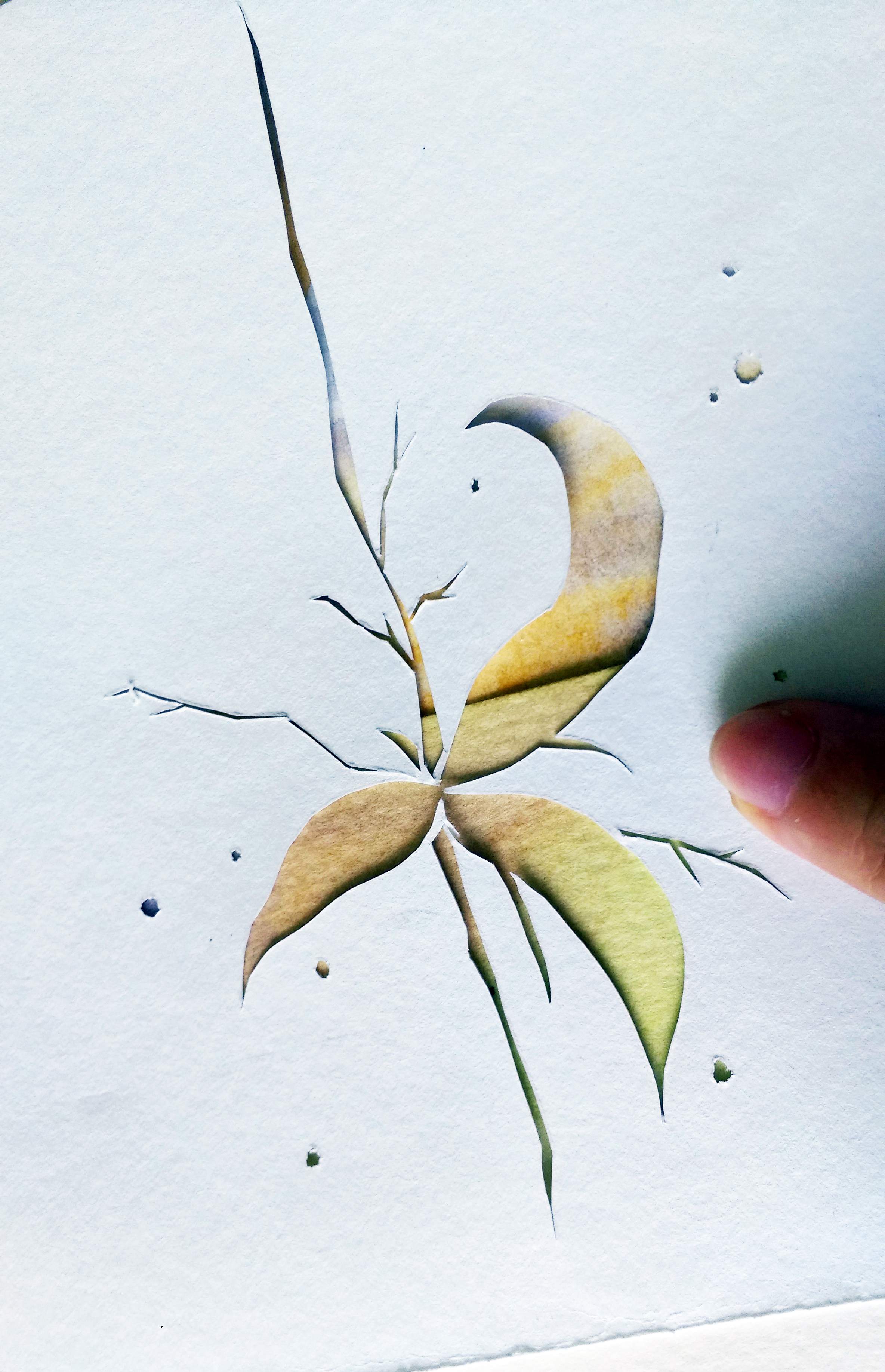
The paper cut compositions where pretty straight forward. Theres one or two I was a little uncertain about and also a few I was concerned if it was too simple. But I did not dwell on it because I know that the “hard” part will be the background illustrations…
And so, onto the medium of said illustrations.
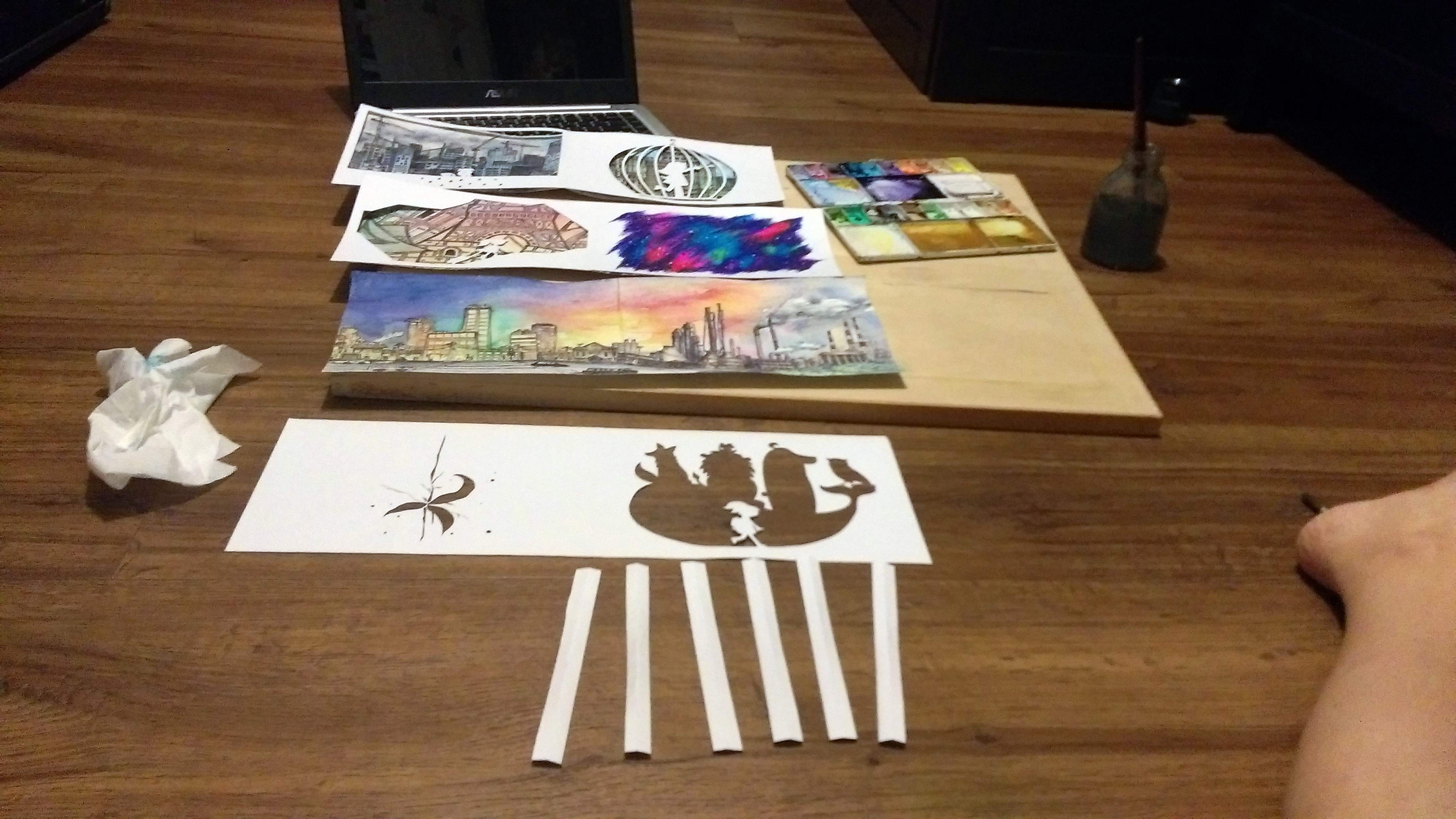
I did the initial research in my last post, and also some exploration on my own:

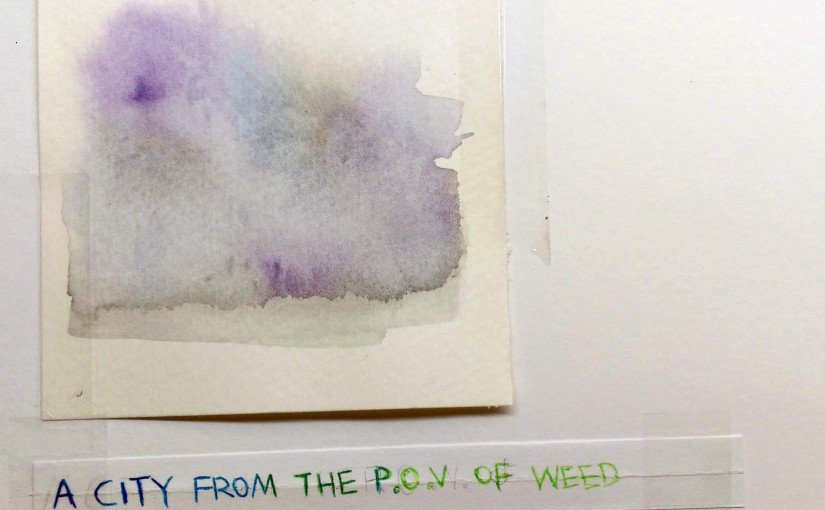
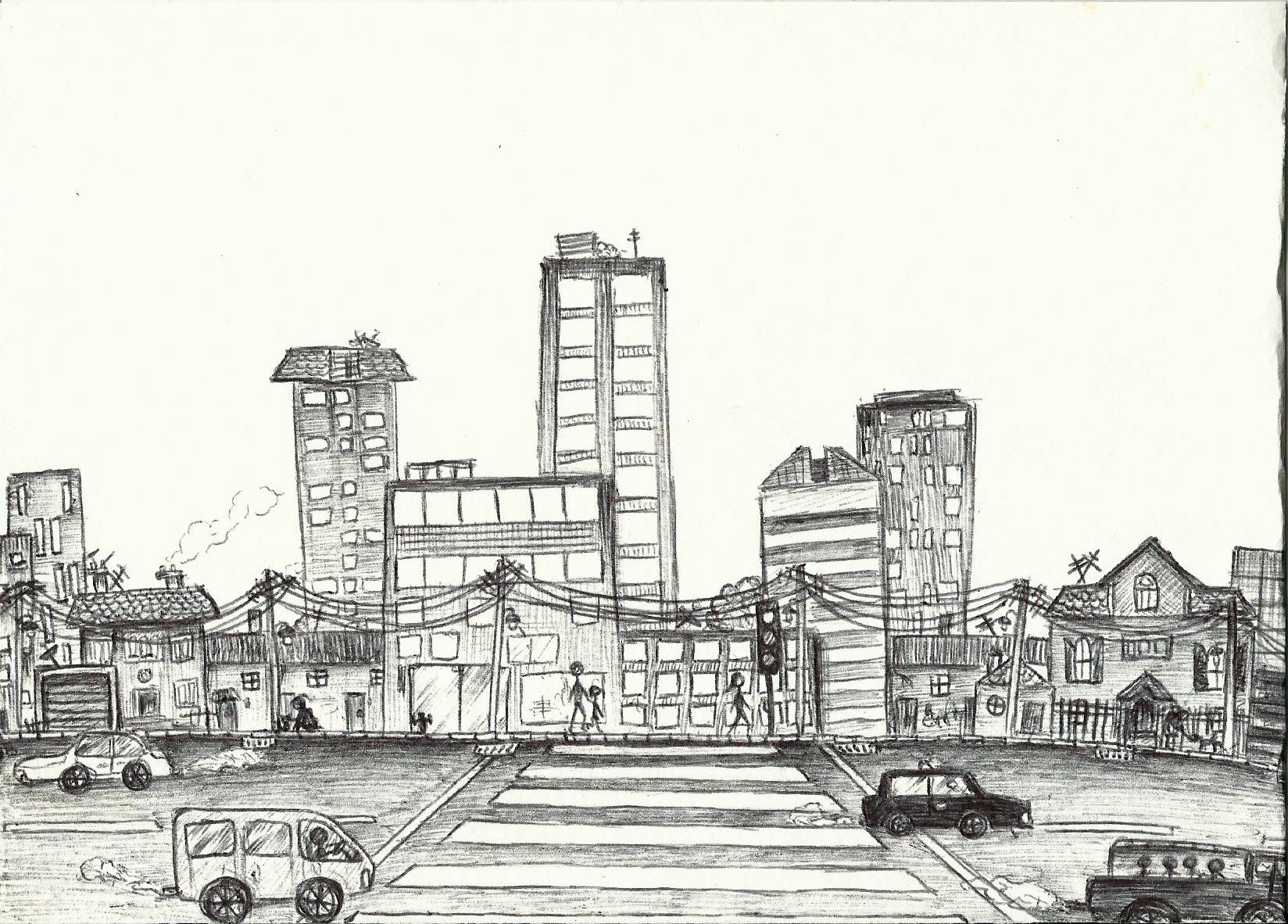
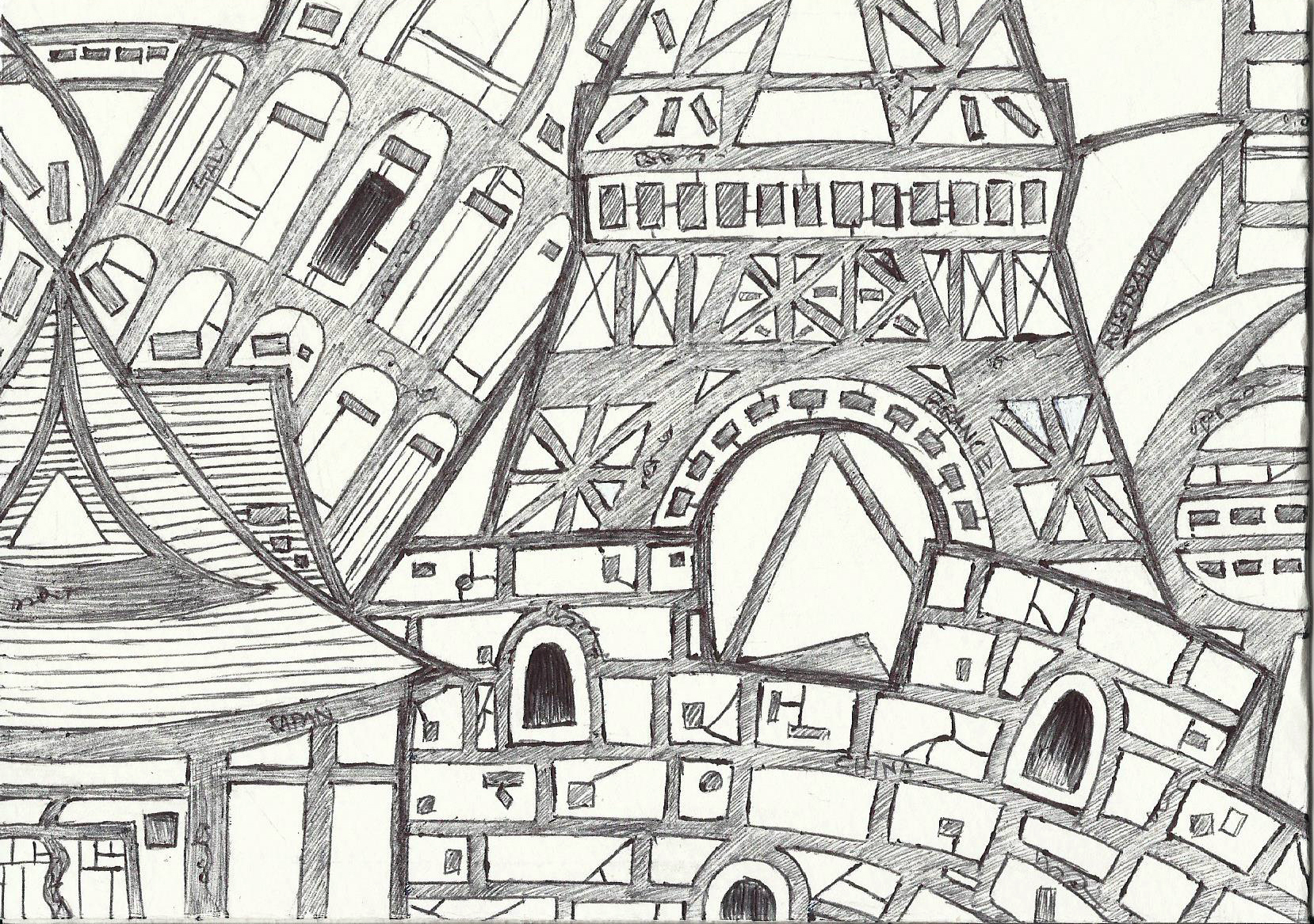
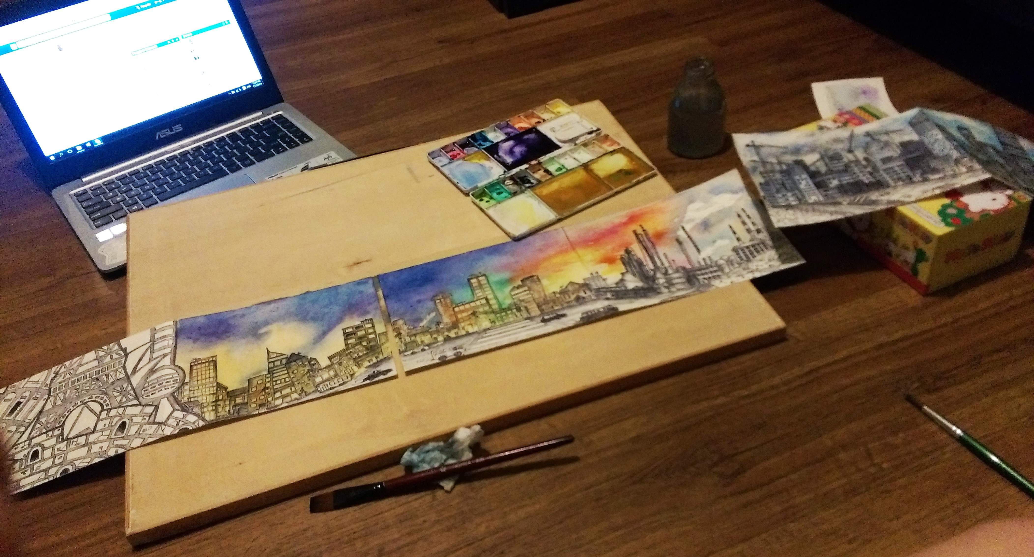
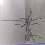
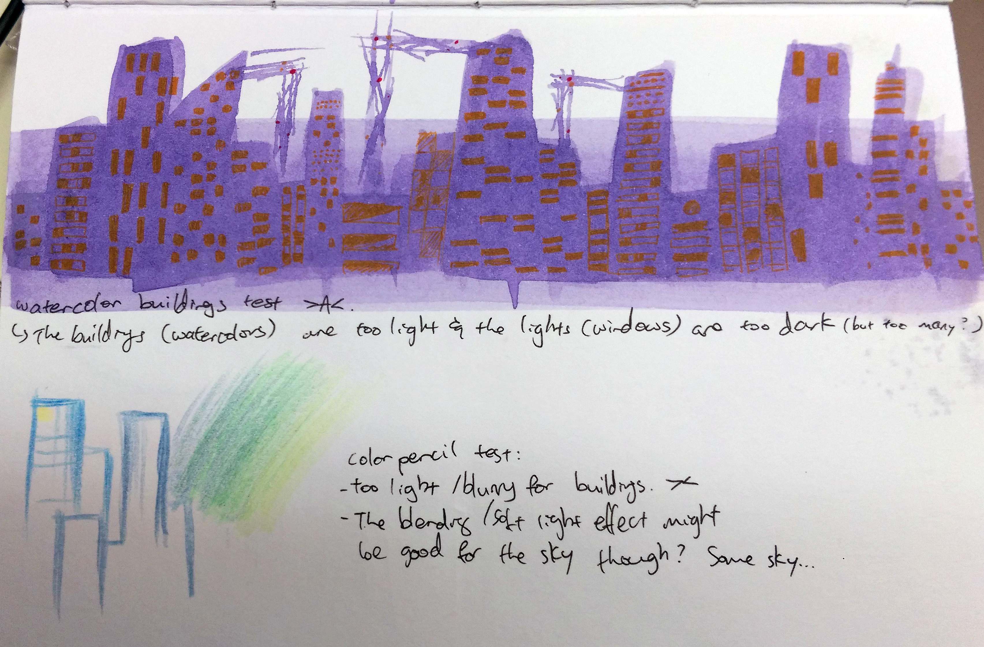
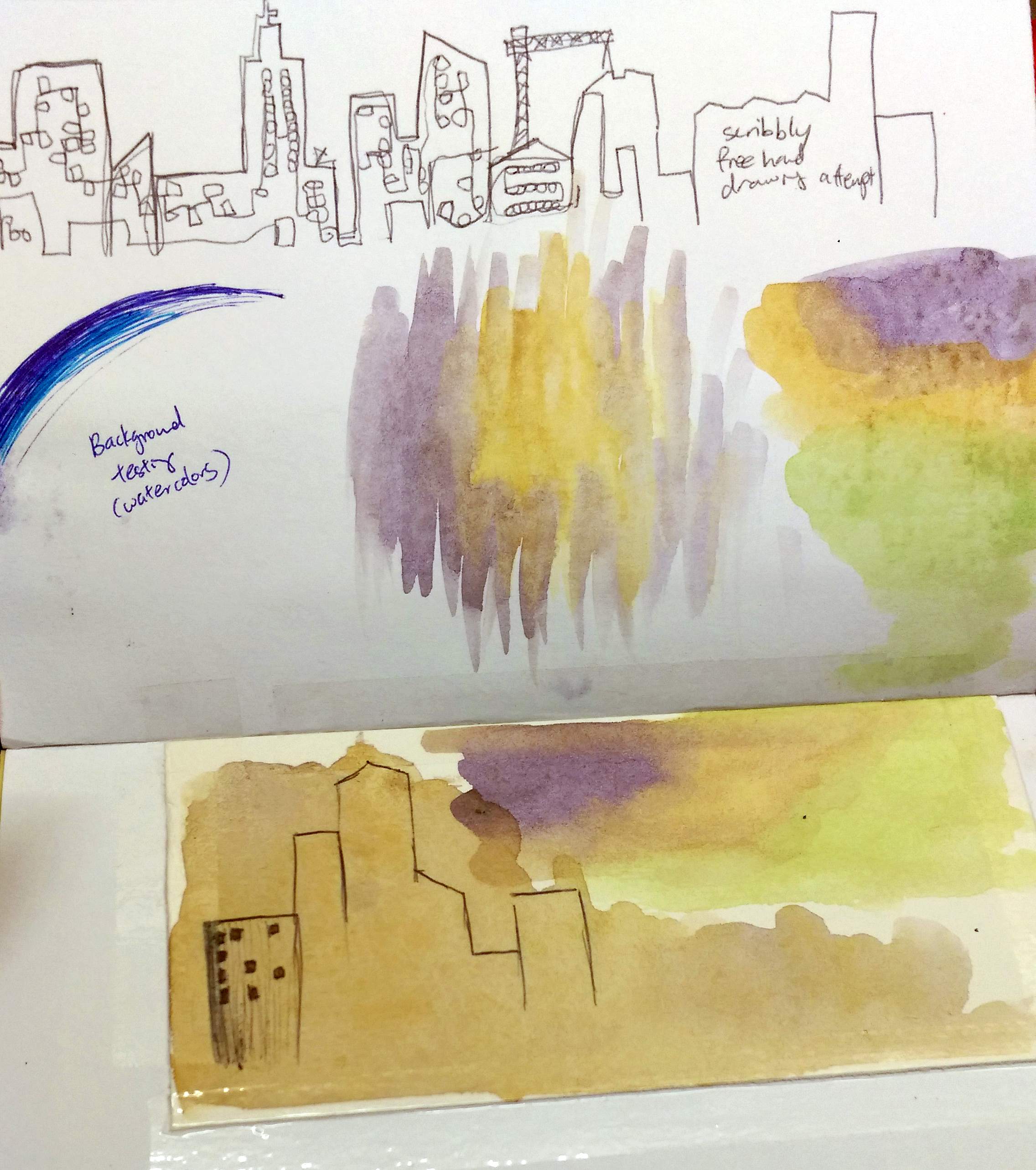
Mainly with watercolors and pen since doing traditional instead this time~
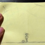
And also looked back at some past personal works for inspiration.
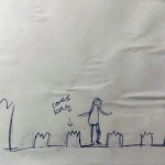
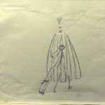
Mainly pen works because I prefer the vibrancy as compared to the more dull and muted colors of the watercolors I have, so that’s what I wanted to go for. However, after consulting Prof Ina she actually prefer the less “finished” look of the last drawing (of the 3 above). It was surprising, but that set me thinking I can combine the 2 mediums, and possibly add the digital aspects for Zine.
As the illustration was not the only part of my artwork, I have to make sure it fits with paper cut outs I have already done before (Mainly the contrast stands out as much as I would want it to). So I set them against different backgrounds/ mediums before I started drawing, just to be sure.


Watercolors and pen looked tedious, but doable, so.. the technicalities are settled. Onto the actually doing part (Subsequent Post)!!