Zine: Inspirations and Initial exploration

I had some idea of what a Zine is before this project, but mostly from the poets (?) on Tumblr, so I think they might be my biggest inspiration for this project.

I also looked around a bit on Pinterest, and I’m sure I picked up one or two ideas along the way, although there wasn’t anything particularly specific. So.

Moving straight to exploration~

I was a bit indecisive about which of my previous assignments to use because since the Ego project, the Typographic portrait and POV, I like aspects of all of them and wanted to combine them, but the styles are so drastically different I have some difficulties…

These are some of my initial attempts:try lum-mintry div-min

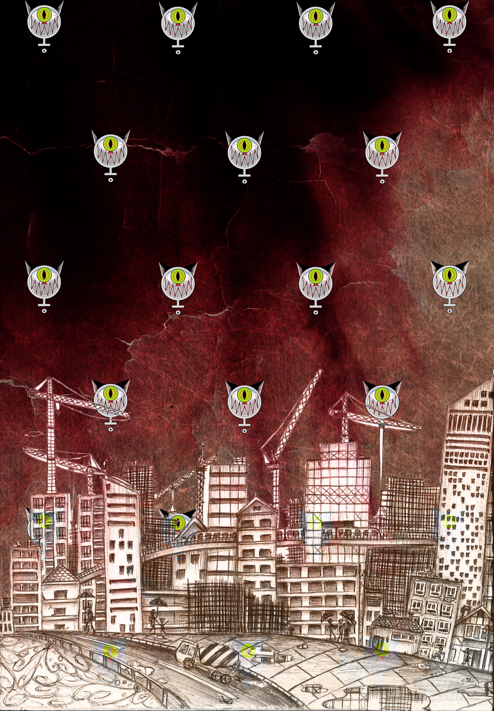
I’m trying to mix my Typographic portrait and POV object through changing the blend mode. It was interesting, but soon became apparent that it was not the most effective way to go about my zine, since I was still quite uncertain about what my Zine will be thematically.

That was around the time of the first consult, and instead of creating so much patterns and trying to merge my different works, Prof pointed out I have enough materials to work with just from my POV project..

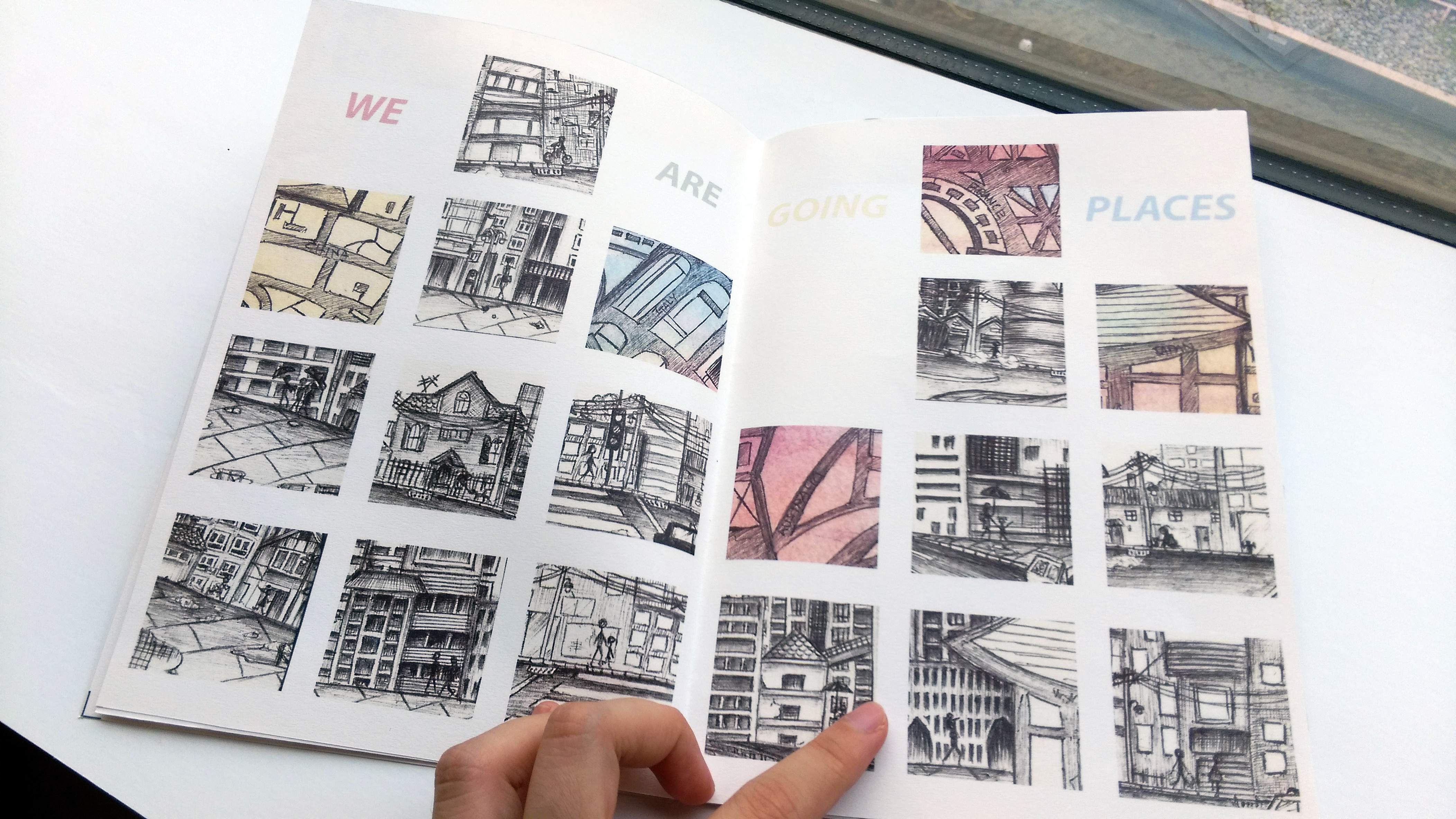
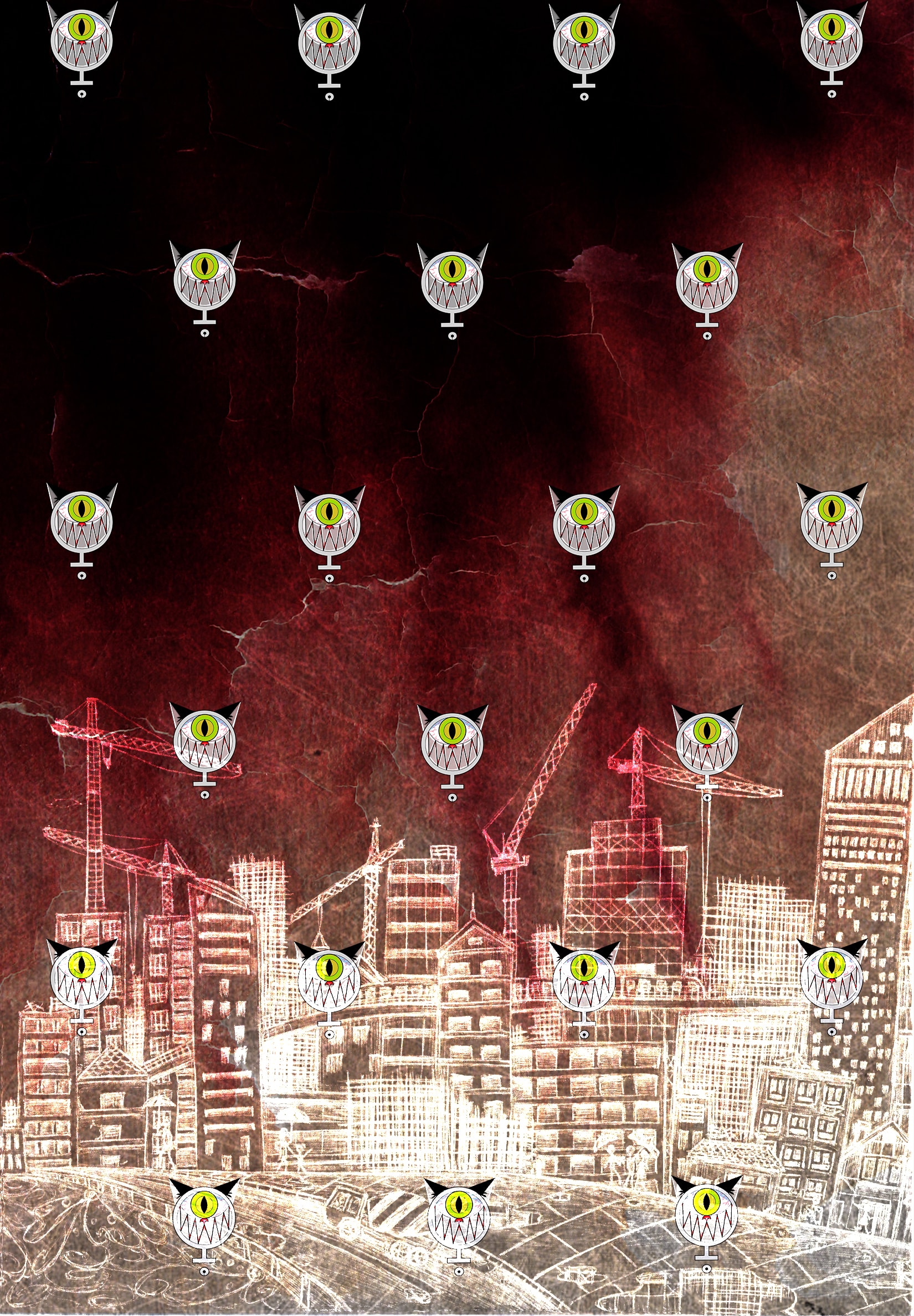
More experimentation… They were all pretty dark, and while I was certain I wanted to include some words in my zine, at this point I wasn’t sure how…

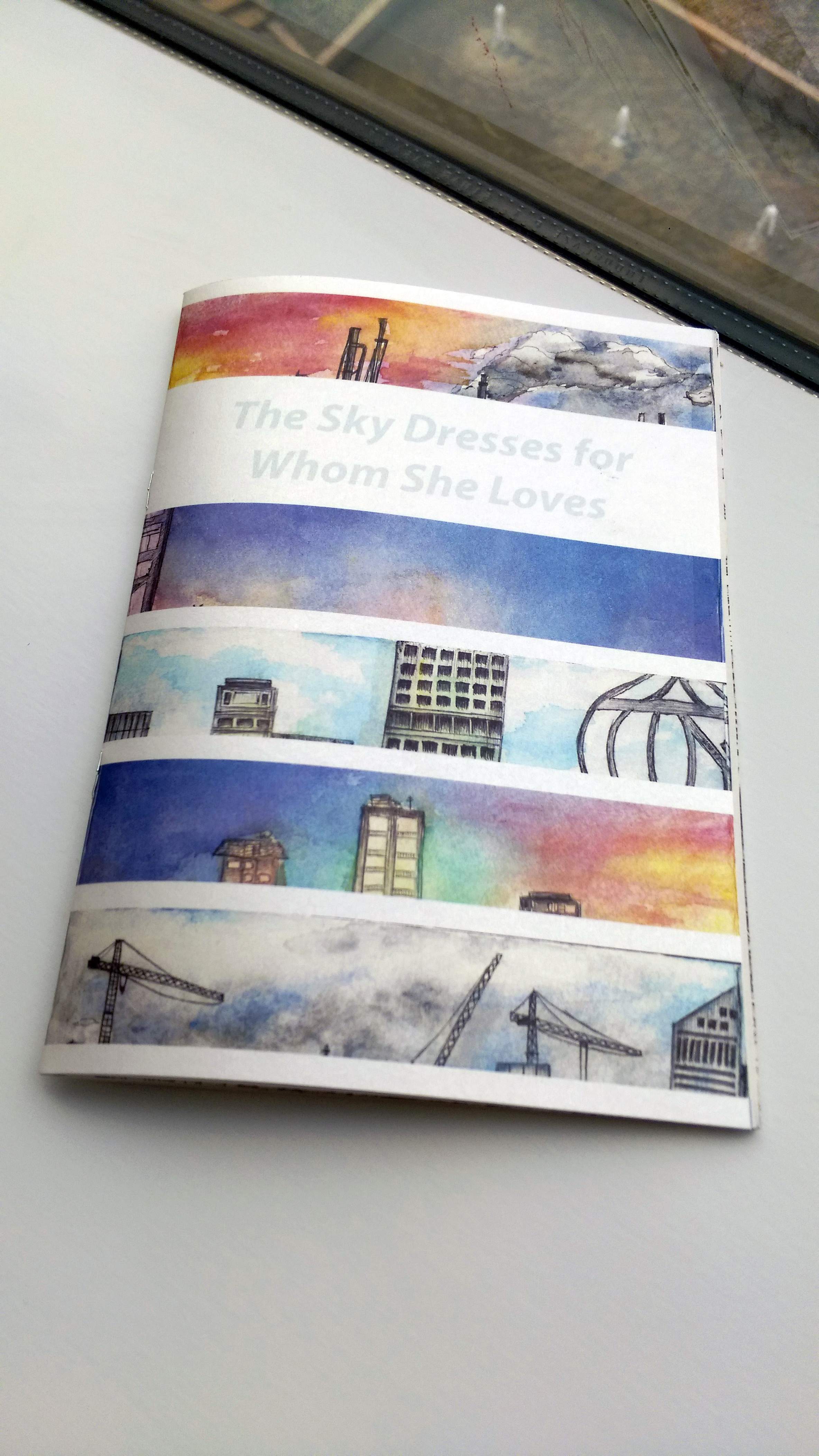
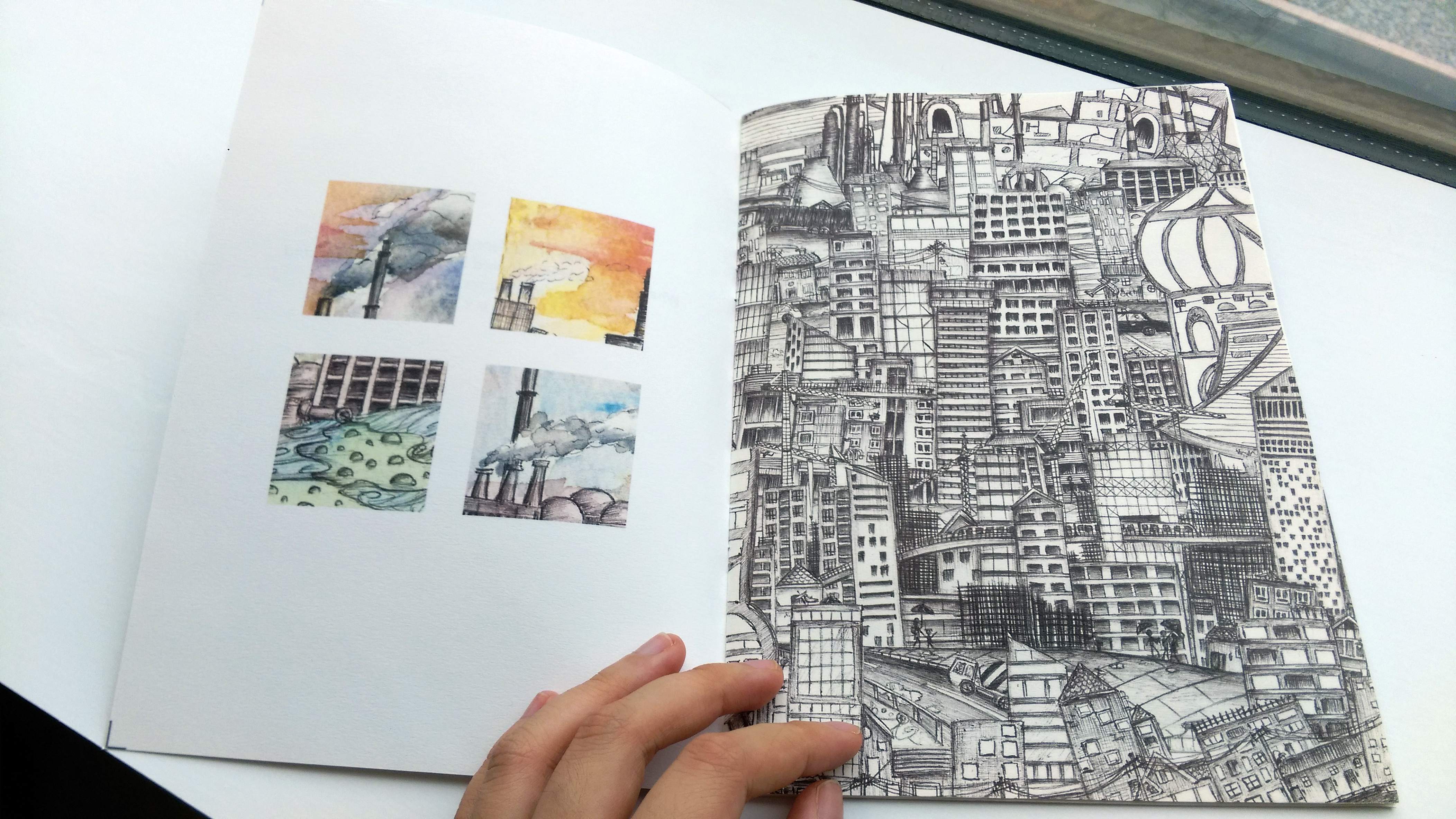
Plus, unless I am downright doing horror, I did not want to generate any artwork that is plain dark or negative. I realize the mostly monochromatic color scheme possibly resulted from my limiting my experimentation to the line drawings instead of the colored ones.

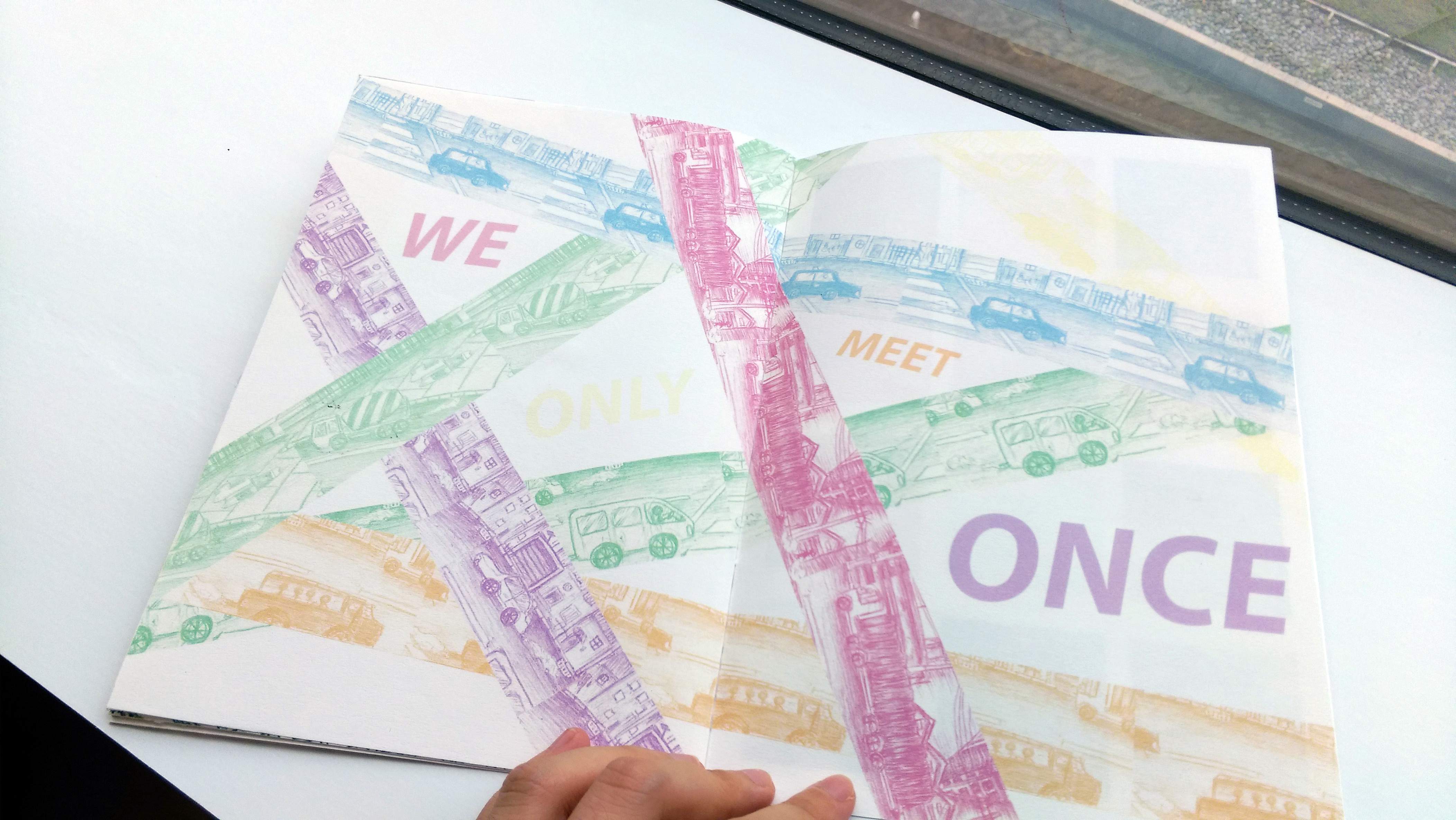
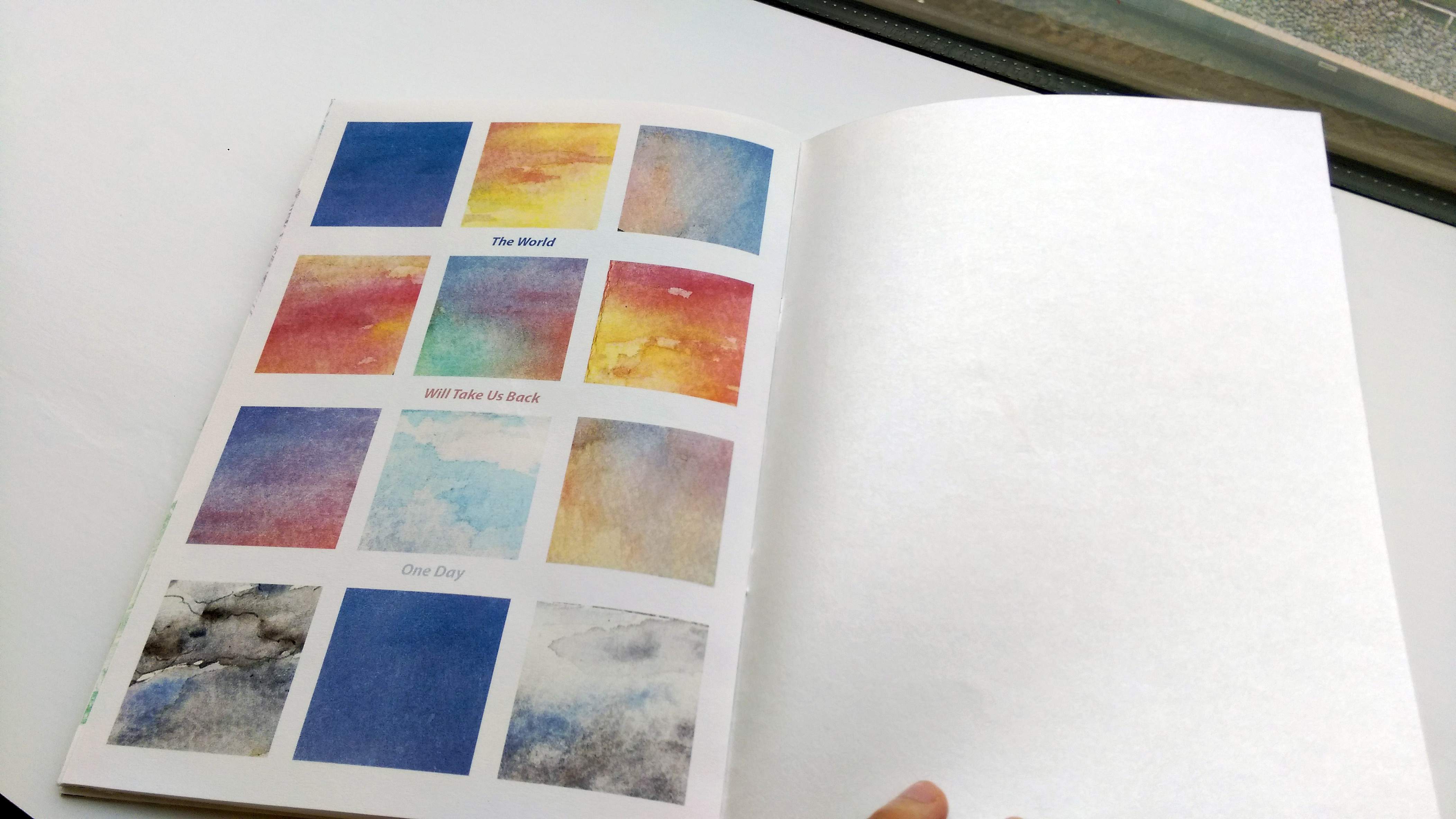
While the line drawings showcase more details and intricacies, I couldn’t help being drawn to the colors from the watercolor completed work as well. This was when my work took a turn into a lighter, “pastel” direction.

And below are the exact sequence in which the pages were generated..

Moving onto test prints in the next post~

Zine: Test Prints

My main purpose of doing the test prints were to explore the formatting of the pages. Firstly because I was not very good at InDesign…

In my sleep deprived mind that night, for some reason I thought formatting on Microsoft word might be a good solution to removing the borders from the printed images… (It wasn’t. which is why I did not do that for my final… @A@)

And the other reason was because I discovered I have an extra page, so I was trying to figure out how to fit it in nicely.

I did consider simply removing or adding 2 more pages to resolve the problem, but it was not an ideal solution because I felt the content of my zine was “just right” the way it was, and it would not be appropriate to delete or add more content just for the practicalities…

So the two solutions I tried was to stick the extra page in (so that it is at least not a loose leaf, or to print it together with another page and fold it like a pop out card – this inspiration came from videos I saw online recently.

IMAG6515__1461556176_155.69.161.30

It was perhaps a cool idea, but in the end I opt for simply sticking the page. This was because I did not like the effect of the folding lines on the pages…

Simply sticking the pages does make the middle pages thicker though, and it was perhaps still not the most perfect solution…

The 2 test prints together with my final!IMAG6517__1461556193_155.69.161.30

Zine: Final! (+ a bit of reflections)

A gallery of the digital pages (In the way I arranged them for printing, not the proper reading order >_<)

I think, in the end, my zine turned out to be a good extension of my POV project…

IMAG6540__1461556340_155.69.161.30

For the cover page I chose a shimmery paper because I just couldn’t resist, I love shimmery paper XD

No but seriously the way that kind of paper tend to shimmer and shine reminds me scattered stars, the glow of the sky, and other magic like that. So I felt it worked well with my cover page.

IMAG6541__1461556429_155.69.161.30

Prof suggested I write something on the first page. Perhaps a short description or the artist/artwork? I stared at the page for half an hour and felt that my usual way of writings will be too clumsy for the elegance I was hoping for for my zine. So I dug around my embarrassing stash of writings from the past few years and picked out this line that will ideally convey the mood I want to achieve with the zine, in a more succinct manner.

IMAG6542__1461556439_155.69.161.30

Pollution and overcrowding (Overwhelming)… General unpleasant things that.. people can live with once they accept I suppose… (Despite the constant desire to escapeeee >_<)

IMAG6543__1461556447_155.69.161.30

The idea of travelling, but also we each lead our own life and are on our own path to different locations and goals in life.

IMAG6544__1461556454_155.69.161.30

The center page @w@

IMAG6545__1461556950_155.69.161.30

This some-what mirrors the “We are going places” page, but with more emphasis on how we will never completely know another person. Partly due to how hectic city life is, but also due to essentially.. how life is I guess. Most of us only meet at one point of our lives and zoom past each other really fast…

IMAG6546__1461556474_155.69.161.30

And of course, the last page mirrors the cover page. The message too. Both are about how the universe love us…

I guess, to me, it’s a calming thought that no matter how much we rush through life and it’s pleasant and unpleasant aspects, we will one day all be accepted back by the universe equally… I’m not sure if this random reference to death is creepy or morbid but.. to me, this insight is comforting and sort of beautiful (?)

(The back cover was photographed but the photo turned out badly so please just look at the digital version earlier >_<)

I am not sure what to explain about the back cover except “Where is my path of flowers back to the sweet pastel sky?” is a line from… something longer that I wrote, and it’s positioning on my Zine is up to interpretations.. The “thing that I wrote” wasn’t entirely relevant, but personally I feel like this line close the theme of my zine quite well..

Overall Reflections:
I love most of how my Zine turned out in the end, but I think might have limited myself from the beginning with my perception of how a Zine “should” be.

I still can’t help but wonder if I should have tried more ways to merge my different projects for my Zine, since I did really want to include more than my POV project. (It would have been a lot of content, but it might have been worth it? I mean, perhaps I should have pushed harder in that direction at least in the exploration stage..). For example, perhaps instead of taking the separate elements of the different projects to merge into 1 image, I could try balancing the them by having different image from different projects on each page, but mirroring each other… hmmm…

Then again, that is just me speaking in hindsight as I feel very inspired by a lot of classmates and how they executed their zines, some of which were really cool OwO!!!

Of course, they way I execute my own zine was semi-intentional because not only did I want to try the “simple” look of most zines, I also knew I would be busy at the end of the semester. I actively decided to devote lots of time to my first 2 projects in 2D, but give more time and focus to my other final assignments (Such as foundation drawing…) instead. I don’t regret how it turned out, but perhaps… *^* \I’ll have to push myself even further next sem!!/ *^*

The entire semester has been immensely rewarding though, and since I did my best the best way I know how… I have my fair share of learning and exploring, and what more can I ask for? ^w^~ (Thanks Prof Ina!!)