Just to consolidate.


Just to consolidate.
..the featured image is a lace pattern i made by drawing a heart shape, duplicating, flipping vertically and horizontally and turning and etc. ^^” It appears in drawing 1 and 3.
I would like to take a video of how I draw but I struggled with technology so.. I just saved my images periodically. Click the image to enlarge and.. I’ll explain as best as I can ><


Oh hmm.. and I don’t usually use image stability to line the drawing. Just..swift lines to make it clean.. it might be slightly more tedious but the line quality is more..organic? natural? idk I just like it better. When I need to taper the lines I just go over them at places where i want it thicker..
Next. Red for passion and activity!


Actually I explored the nuances in the bg colors for all the compositions, but it’s mostly at the start when I didn’t save the pics.. cause there isnt much… but colors..


…It occur to me my explanations are probably kind of terrible but. I tried.. I’ll try harder to take videos next time..
Anyways no explanation for the last one. Again all the layer clipping, duplicate and flipping and such~


That’s all.
The longest but most detailed explanation behind my project. I was a little conflicted about how much I should explain and thus was not sure what to say during the verbal presentation but since this is a class assignment… I shall try to be coherent here.
First one. Me currently..
I felt like I am not doing enough right now and is very… “static” and “still”, and perhaps not entirely in control of my life, which is why the person is a mere “doll”. Initially I considered having the person sitting in a corner, but I felt like a person hanging upside down is more interesting.. (the tarot card “the hanged man” briefly crossed my mind.)
The background filled with eyes and the cat looking up is how others perceive “me (the character)”, which might not be entirely accurate because my back is facing everyone and my head is semi-covered with flowers.
On the topic of flowers, I’ve always found flower languages (and their subtleties in art) very interesting. I did in fact look up flower languages and picked some flowers accordingly.
The list of flowers I picked are: Gladiolus, Geranium, Cyclamen, Amaryllis, Azalea, Hyacinth and Hydrangea.
However, I am facing the mirror so presumably I can see myself very clearly, including how I might be tied up. The similar idea of being in a bind is also conveyed in the corset.
As mentioned in the previous post, I considered traditional Japanese clothing for this picture. But i did not think it fitting for this position, so instead it is semi inspired by lolita clothing (Japanese street fashion) which I love.
In the end, the position of the legs and the semi hidden knife hope to imply I will be setting myself free.

 The second one..
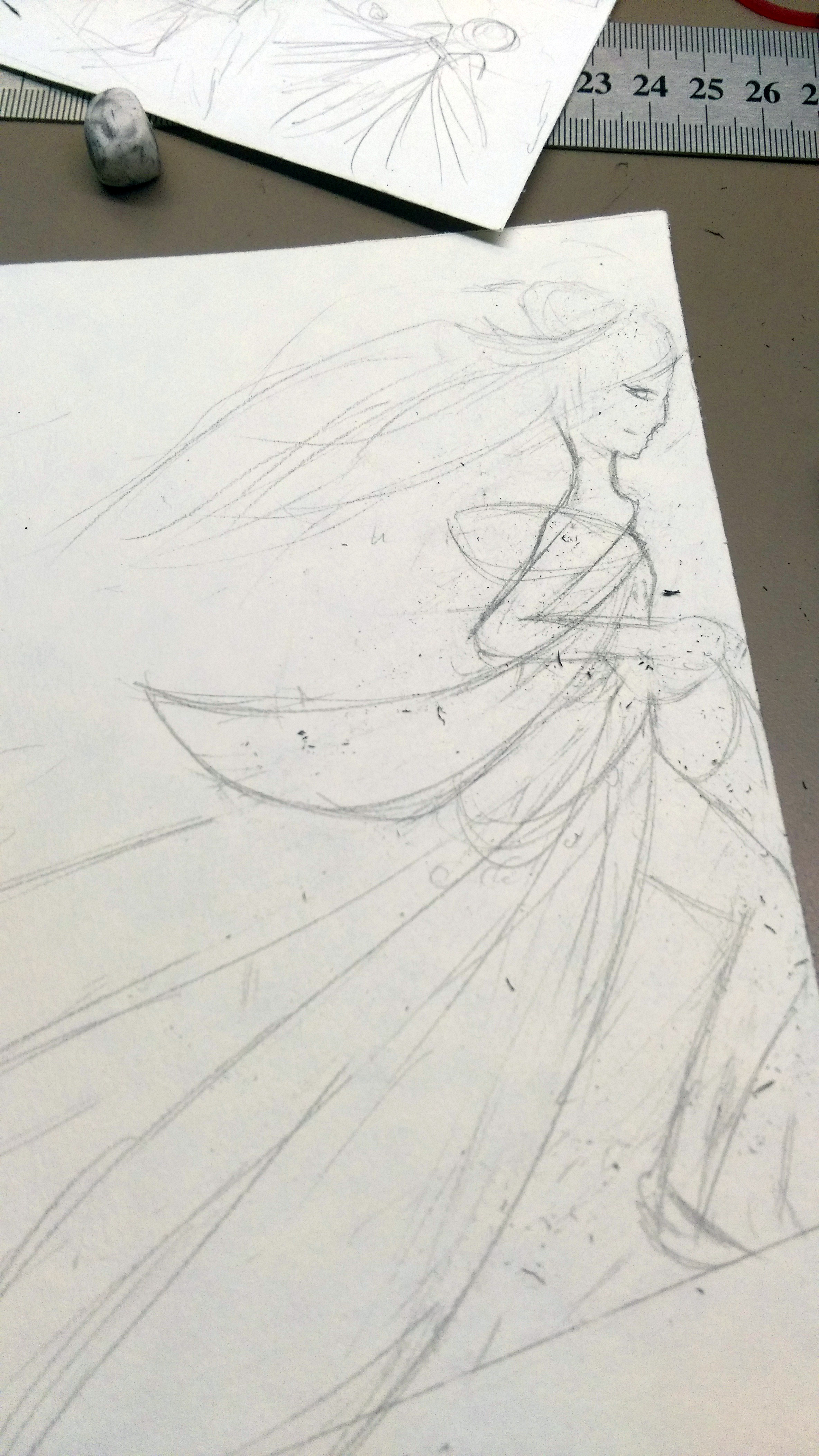
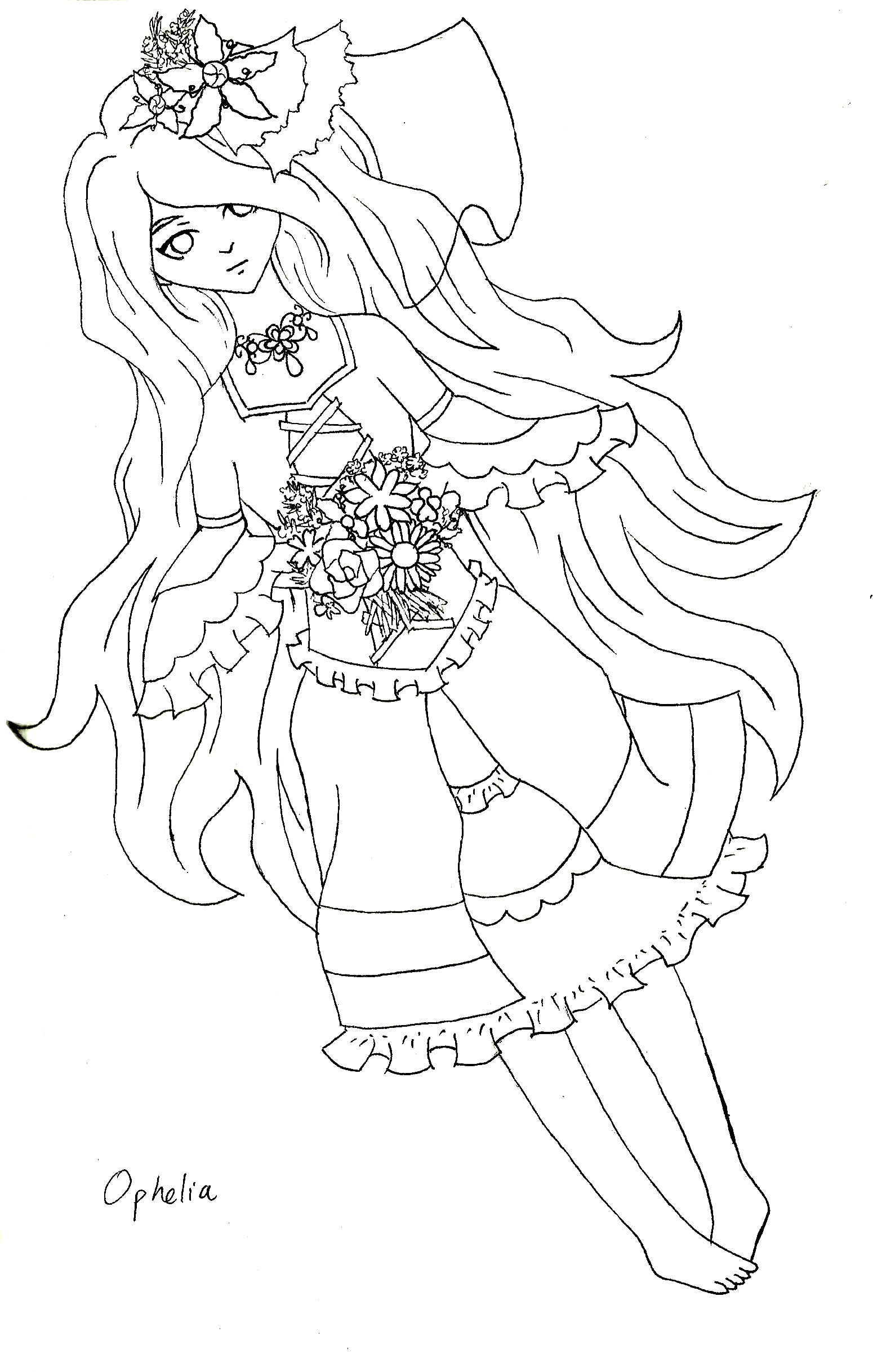
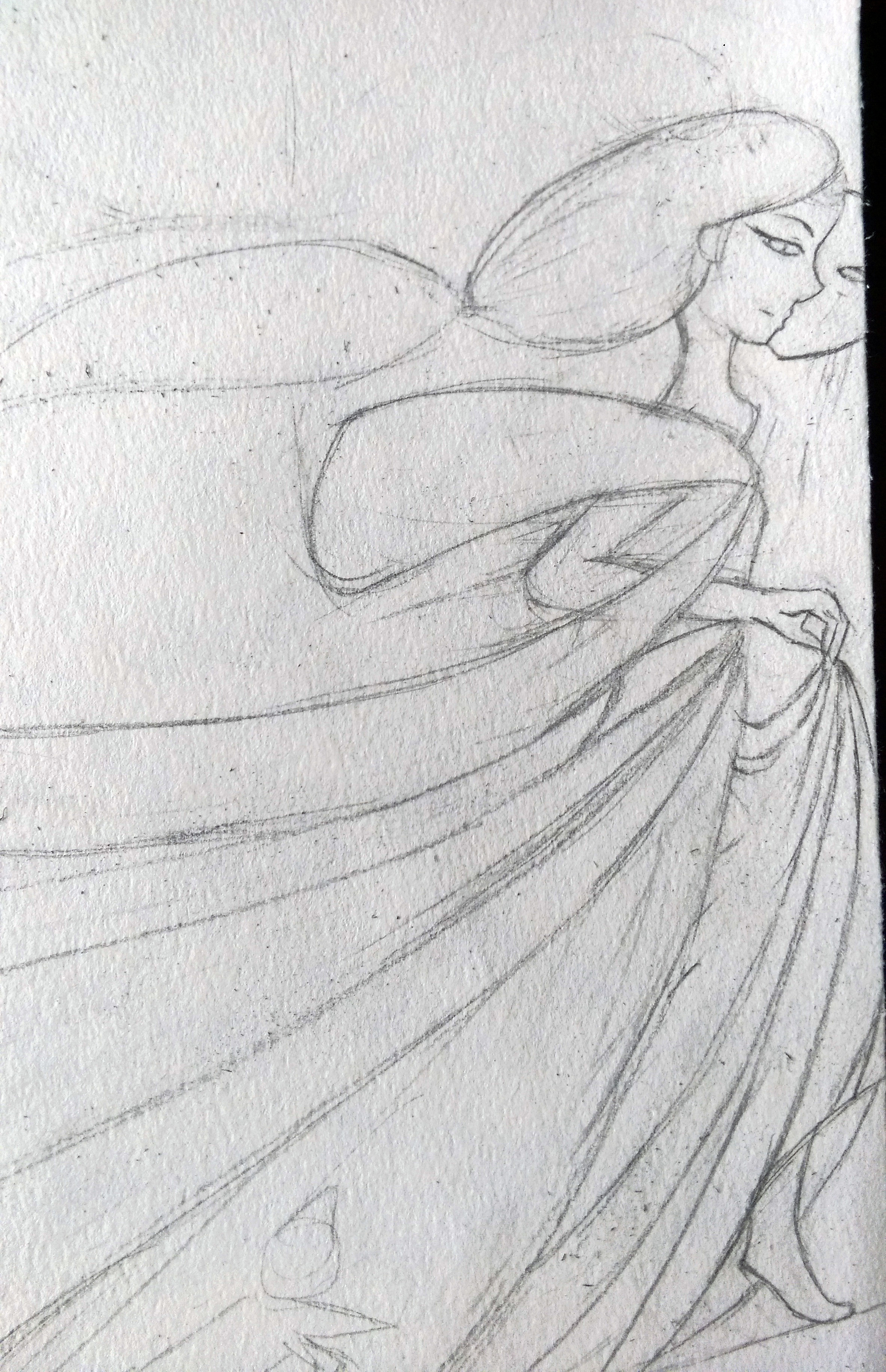
I remembered to take some process photos, so it is easier to tell how I have explored and changed some details along the way.. (the hair, The flow of the fabric, the position of the person and cat both required reference and were slightly challenging.. and there were like 22 hands @@)
This is probably the drawing that had the most of “Aubrey Beardsley” in mind in terms of composition and style. I wanted a flowy dress that is akin to some form of ancient Chinese dress, and of course the hair style has to match… But as a “Better me” shouldn’t be bound by too many things, I didn’t want it to be too complicated either..which is a difficult balance.
Aside from that, the “slope” in the composition, and the mask.. these came quite naturally. A key point of this picture is the “action” of the person moving because I need to express that a better me is going to be physically progressing. But I think the interaction between the pose and fabric turned out nicely..

Third..
5 years later… I want to be.. somewhere. To be honest I almost “confused” “ideal me” and “me 5 years later” (which, btw, time frame aside I just thought of as “future me”.)
It might be unrealistic to expect these two to coincide, but it’s more like there are two ways I can develop and right now I’m not sure which way I want to go.. or how the two…desires? of mine will develop together..
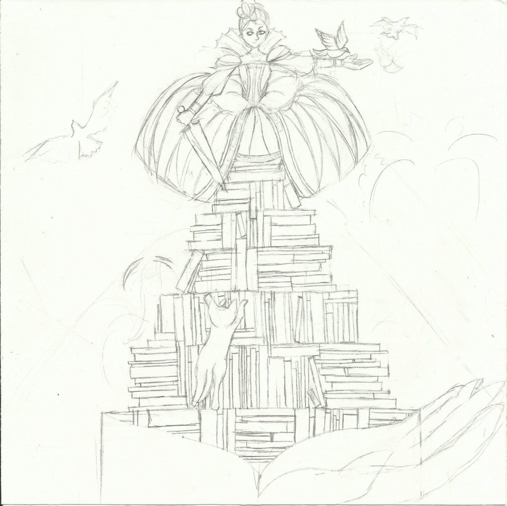
Anyways. For “me in five years” I went with the more realistic desires.
My first thought is. I want to achieve something. I want to be at the top of something… yes vague. But firstly the attire of the queen haha, and standing at the top of a mountain.
But then.. it’s pretty lonely and sad, and tiring to get there. And what is a worthwhile mountain to scale? I mean of course I wanted success like fame and fortune and stuff, but it might not be so achievable.. and in five years too.. So yea, knowledge. I guess what I really wanted to achieve is to mentally push myself and be the best that I can be.
With the lingering thought of material success though, I also considered why I wanted success so desperately.. To me there is always the sense that I can only help more people when I have already helped myself, so to speak. But now I don’t think that’s the right way to go about being.. kind?
I considered a composition where I am setting a bird free, or reaching down to grab the hands of people below me. But those were rejected because I feel like there’s too much of that sense of.. privilege… Like.. it’s hard to convey because certainly the ability to offer help indicates a certain form of privilege but. um. I guess I don’t want the people I help to lose a sense of dignity.
Right now it might make my “help” or “kindness” seem more “insignificant” though so I’m not sure if this composition is successful. But I tried..
The sword is there to portray both determination and the physical means I will use to get there. To be honest I wanted it to look like a painting palette knife but it was just funky and didn’t really work.
Also the Elizabethan dress.. hmm I wanted it to be overwhelming, like the person might be buried in it. Because, although the queenly attire convey the pride and success a part of me feels is necessary for living and acquiring the ability to be more useful in society.., it is also something that I’m not sure if I can handle. Which brings me to the final composition of the “ideal me”.

Finally. Ideal me.
This comes after “Me in five years” because chronologically, I somehow imagined my falling off that mountain of achievements and lying in a patch of grass just relaxing forever.. eternal sleep..
But it’s a lot more complicated than that..
Mainly, it represents finally being at peace with wherever I am.. (My desire that conflict with the tiresome pursuit for success..)
But from another perspective also possibly letting go again after I have experienced a lot… Emphasis that I feel this stage is impossible before living my life to the fullest. In a sense what right do I have to talk about “letting go” before even achieving anything?
 The wings and the flowy dress are again, about freedom. This time I am looking at the Chinese 汉服 (Han fu), and the Greek toga. Greek because of their belief in art and freedom, and Chinese because of course cultural identity. I specifically chose the 齐胸襦裙 (Qi xiong ru qun), the one that ties above the chest because I don’t want the restricted and bound feelings of clothing that tie at the waist. The sleeves of traditional Chinese clothing also tend to be long and burdensome thought, so I undertook the challenge that involve getting rid of the sleeve, including a teeny bit of Greek element and still make it look somewhat Chinese.
The small detail in it, the decoration over the chest and the extended green strip was actually suppose to represent “open heart”, where the shape resembles a real heart slightly. Together with the book representing an “open mind”. But I admit that might be a bit of a stretch, and in hindsight perhaps the book should have been open since even I forgot what I wanted to convey during the presentation! >A<
The hair was easier to decide, but I wanted to include some animal elements as well.. I guess it’s almost like I want to transcend being human haha.. I mean, now it distinctly contain something that resembles cat ears, but I also considered deer antlers. But what with the winds and halo that was really too much.
And the halo (with sword shapes) is.. well yea, transcend being human.. almost some form of godliness because I still want some “power” to remain in me so I can do what I want.. help who I want.. and no one can stop me… basically being as idealistic as I can with this.
Lastly, the background I already decided to use the elements. It started with just leaves and how beautiful the leaves shadow will be, but when I reach the “desire for godliness” (Haha) It became all the peaceful elements (earth, water and air) and basically being more in-tune with nature.
…This should be all.
Scans of my physical “journal” and planning
Most of them look like doodles that probably only I can understand. But really they serve as mental “hints” to me who has all the compositions in my head ><
It is possible to somewhat decipher the few which made it into my final works though…
About the scribbles and words:
Prep 1: at one point I considered using masked faces for my compositions. It was at the point that I still thought I could do 12 illustrations, so at the top right hand side you see a list of 12 “masks” I considered drawing.
Bottom left i wrote out which aspects of possible compositions do i want to draw in more detail, and bottom right I considered the colors and how they could interact and flow in the entire 12 pictures.

Prep 2: The main words in these is the ones in pen on the right. In the 3 columns, it says:
“Seat, Run, Stand, Lie”
“Purple, Red, Turquoise, Lime green”
“Jap?, Chinese, Elizabethan, Chinese/Greek”
These refer to my initial considerations for my final four compositions in terms of position, color and clothing/style respectively. They all needed to include parts of myself yet I did not want any of them to be redundant. Some of them changed as I went along… I will try to explain the thoughts and considerations in every composition in the next few posts.

There is a myriad of reasons why I chose to do illustration for the final project, but I guess this guy is a good place to start.
Since “Ego” is all about the self identity, my first instinct is to go with everything that I like. And I certainly adore his work, which I first got to know from researching Oscar Wilde (Whose book he illustrated), and the love is rekindled when Foundation drawing Prof brought one of said books to class recently.
Here are some of his artworks that are particularly inspiring to me:


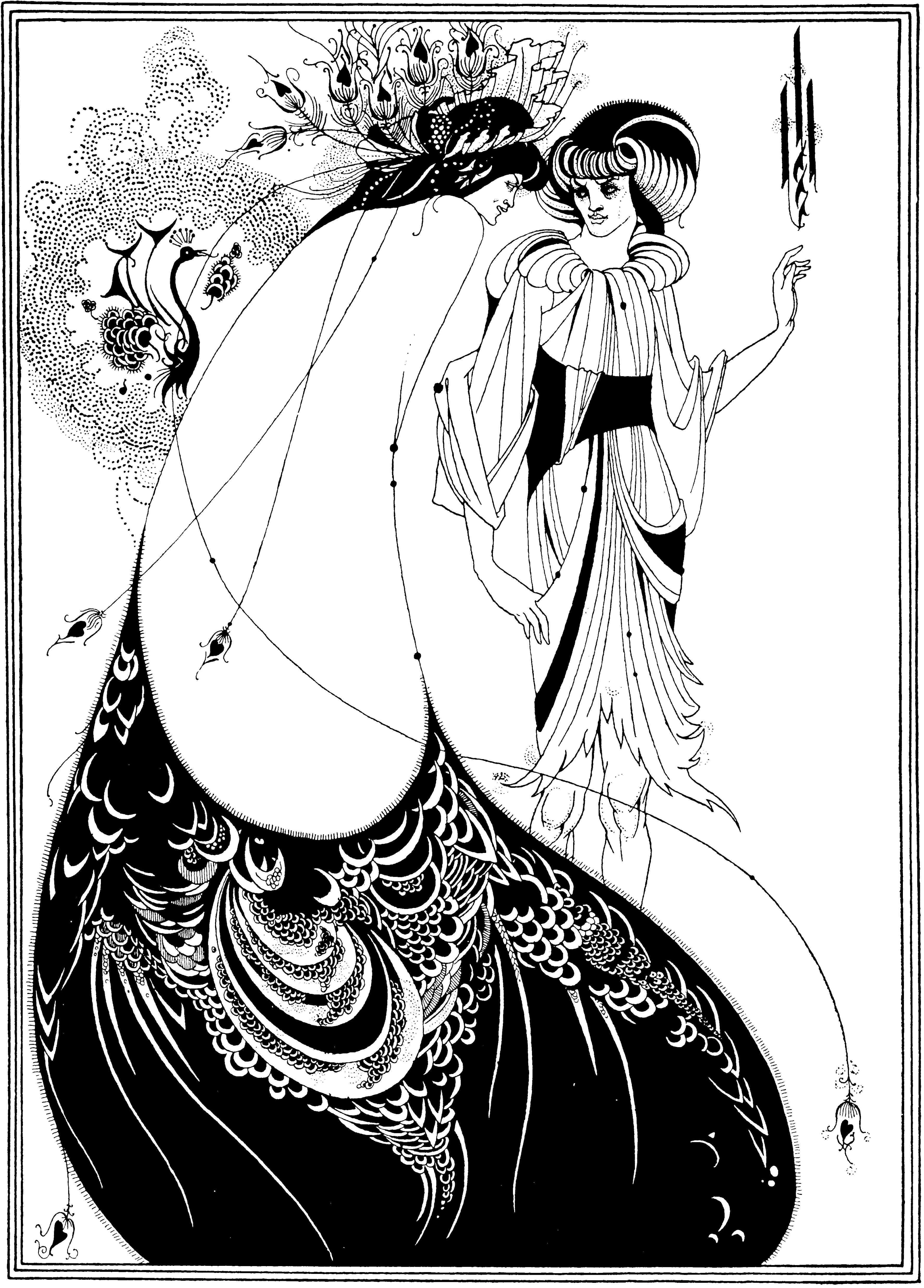 Look at those details and patternsss QwQ The time of Oscar Wilde was a lot about aestheticism and Aubrey Beardsley’s works are also a little like art nouveau. Decorative, natural forms and art for art’s sake~ what’s not to love~
His work reminds me of woodcuts and deals with positive and negative space very effectively, his choice of medium is pen mostly. Both are elements which I like to play with in my art recently.
However, this is the point when I decided to use digital medium to create a similar effect instead, since his clean lines and lack of obvious texture reminds me of digital artworks.
I have to admit I didn’t study his style almost as hard as I should before getting down to drawing though. But again, since “Ego” is about self identity, Aubrey Beardsley is but one of the many influences in my art, although he is the only one I can pinpoint right now…

