“String theory describes how these strings propagate through space and interact with each other. (From wikipedia)”
Physics aside xD. I shall start with some artworks that might have influenced my work.
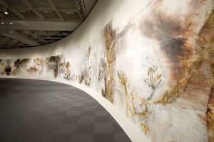
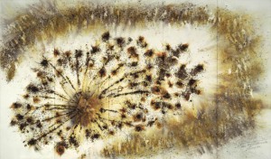
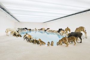
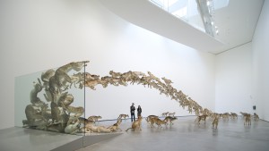
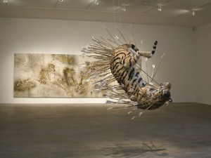
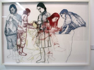 This is a piece I saw at an exhibition at Lasalle. When thinking about using threads as a medium, this kind of artwork is the first that came to mind.
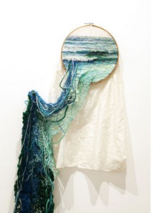
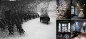
And these are artworks by Ana Theresa Baboza and Chiharu Shiota respectively. While they might not have directly inspired me for this assignment, having seen their amazing works online certainly left a deep impression on what we could create with threads.
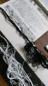
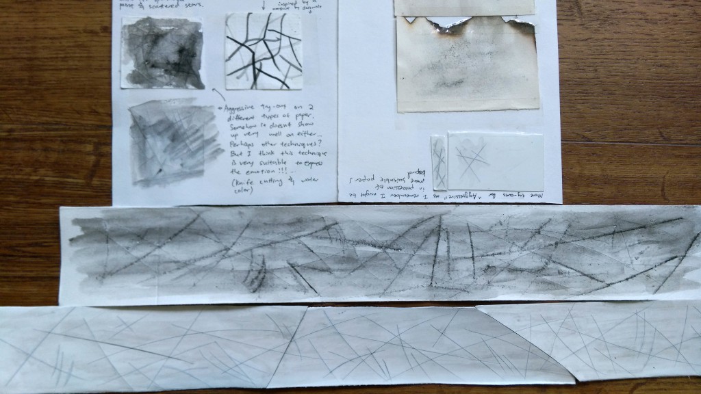
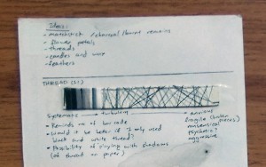 This is the first page of my journal, I started approaching it as “systematic”, merely playing around with the shades of black, white and grey.
To me, it did not yield very unique results. However, as the paper was uneven, while I was doing it I noticed the shadow the thread cast upon the paper. It started me thinking about using the shadows as part of my work.
Also I realize as my experimentation is done small, the thread will look much thinner on the actual artwork. I needed to different threads to experiment on bigger pieces so I put the exploration on hold until last week.
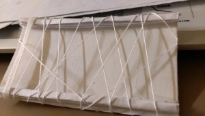
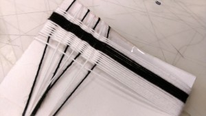
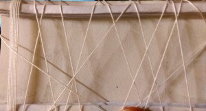 This are the first one I attempted after getting new thread. I made both edges thicker with folded paper and tape.
I’m glad I tested this out because only after did I realize the top edge will block the light and make the shadows less distinct than I would like.
By this point my idea for the thread has become using the shadows (which change with the lighting) to portray “Ambiguous.”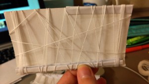
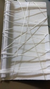 Anyways so I moved on to try thinner edges on one side of the paper. It was better.
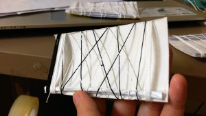
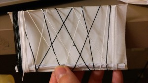
 While I was prettyyy sure I was just going to be using white thread only (Such that the shadow would stand out more), I made an attempt with the black threads anyways. In a way I was (and still am.. a little) insecure about the thread blending into the paper completely, but I decided it’s okay.
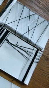
 Moving on!


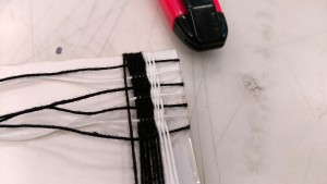
I used to do cross stitch before, and I suddenly decided to try weaving in the studio… I thought that if I should use thread as an option for “systematic”, weaving would be a more interesting idea.
While it turned out quite nicely, it was immensely tedious and right now I’m not so sure about including something like this for my final piece due to time constrains… perhaps an incomplete weave as “Indecision” instead?

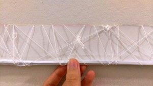
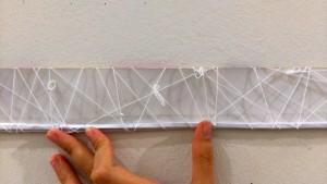
This is what I initially did for the final “Ambiguous”… The photo is taken at the corridor in Adm, as I figured that’s where the final work will be displayed and I wanted to make sure the shadows will work there, as well.


And I decided it wasn’t “ambiguous” nor interesting enough, so I added some knots for good measure.
This would have been my final had Prof Joy not point out that the reflective scotch tape at the bottom affect the overall composition. Welllll to be honest I suspected that might happen but I was hoping it wouldn’t, because I didn’t have a better idea at that point in time. She suggested I try using the glue gun to make the strip at the edge though ^^
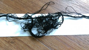
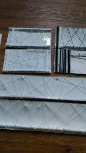
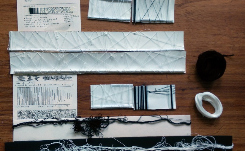
It was a good idea, and I’m glad she set me thinking, because I felt like I was struck by a stroke of brilliance when I remembered I had spare disposable chopsticks in my hall! It will match the mood of the strip much better if I wrapped them with thread and use that as the edge. The end result is the strip in the middle of the featured image, and will likely be a part of the assignment in the end.
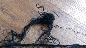
 Lastly, this happened while I was working on the strips. I failed to ever untangle it…

 So I decided why can’t I use it as a strip as well? I think it’s interesting that this allow me to explore the other quality of the thread, instead of pulling it taunt and neat. Plus it works perfectly for “turbulent” which I had lacked until then. In this way, some mess can be god-sent. xD
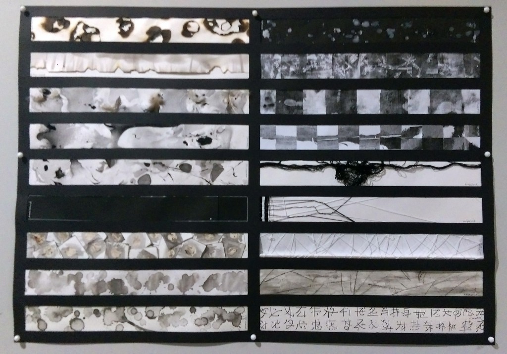 Picture of the final!! Done!! >w<
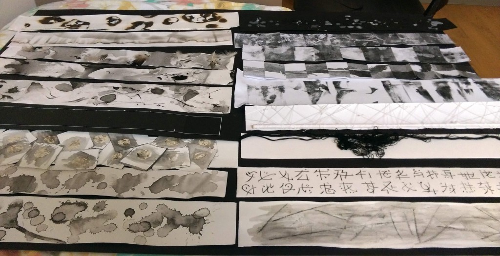
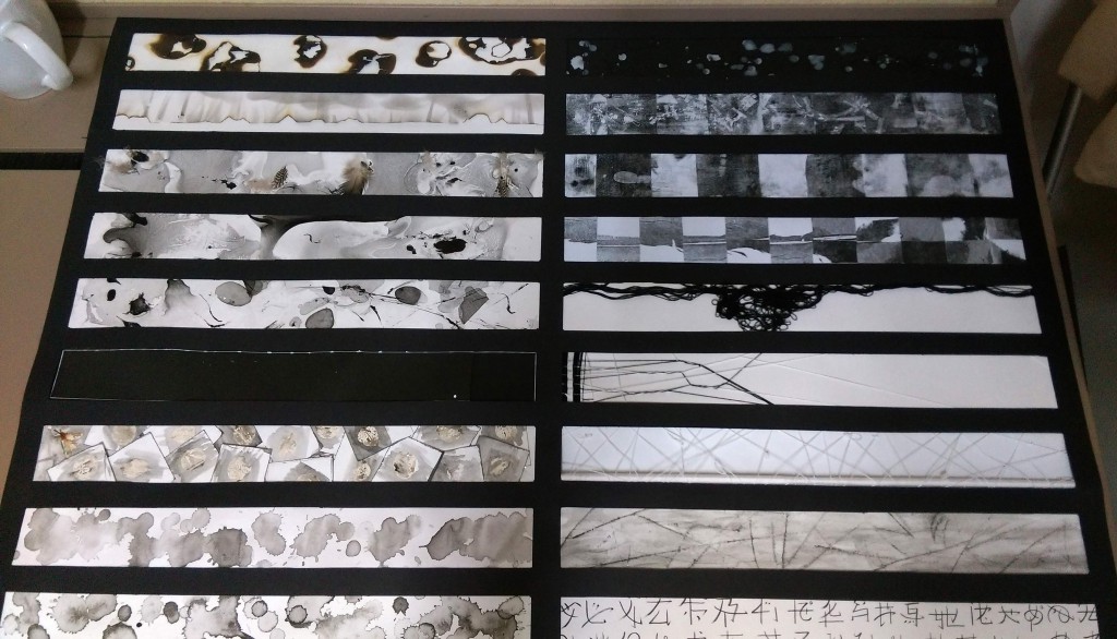 And these are some photos from when I was still arranging them. That part took longer than I expected O.O
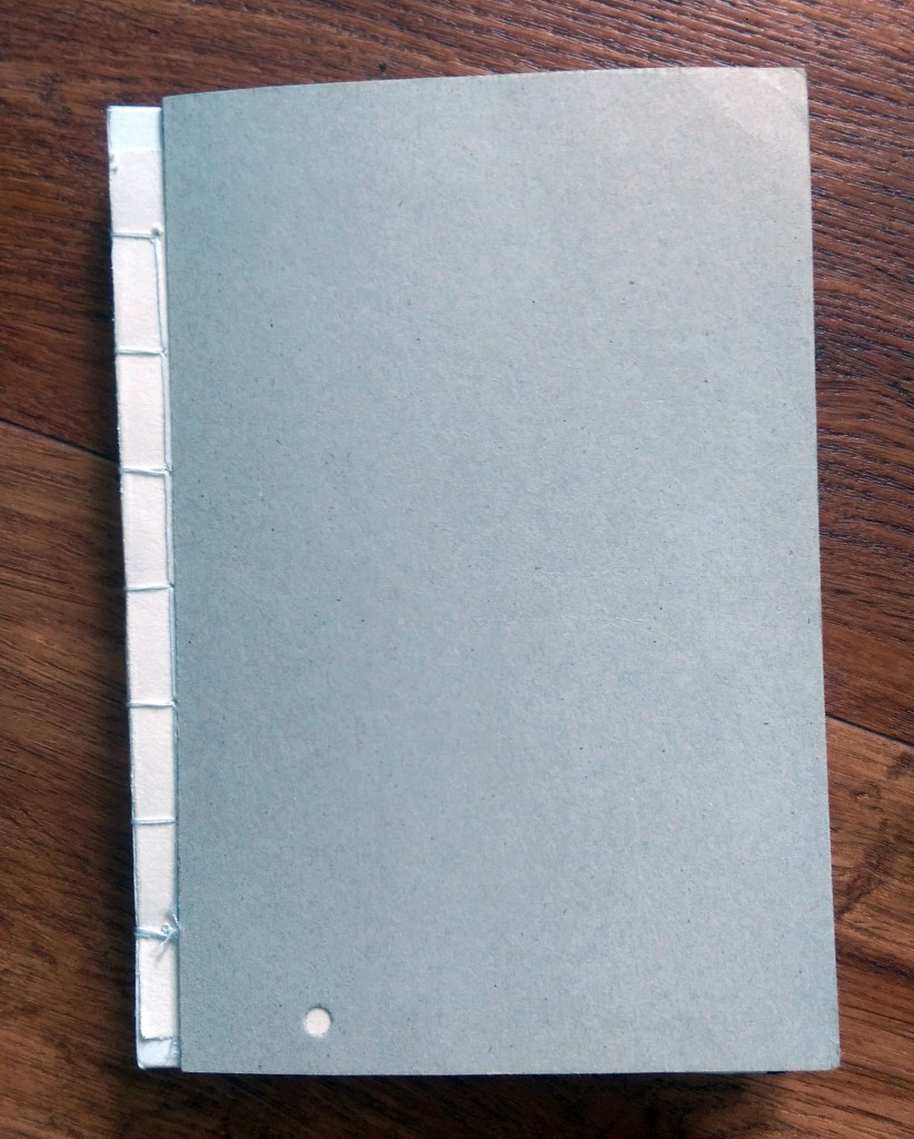
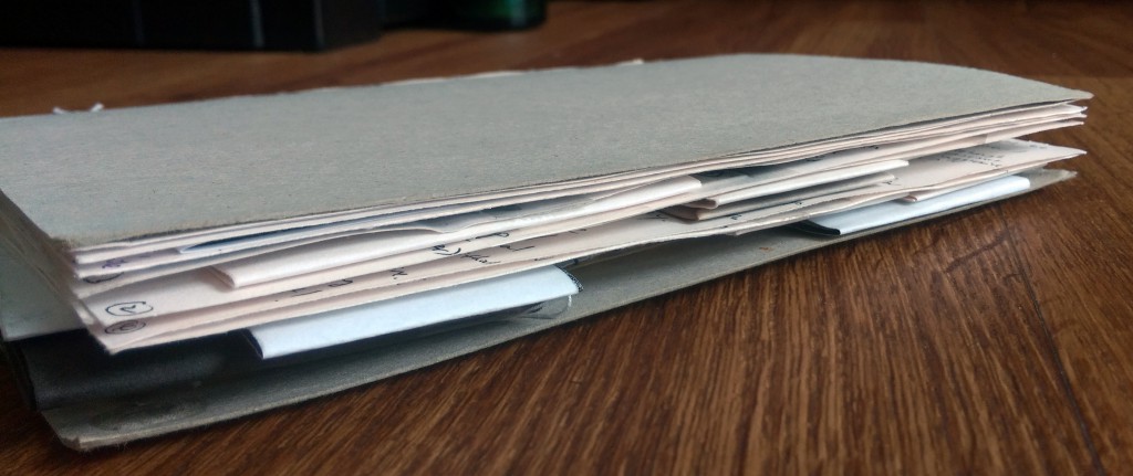 And the Journal! I bound it when I thought we still needed to submit the hardcopy, but haven’t gotten around to wrap it and add endpaper (the plan was to use some left over monoprints x3).. Well, the pages are a bit messy at the back because I actually bound the extra strips into the journal too ><
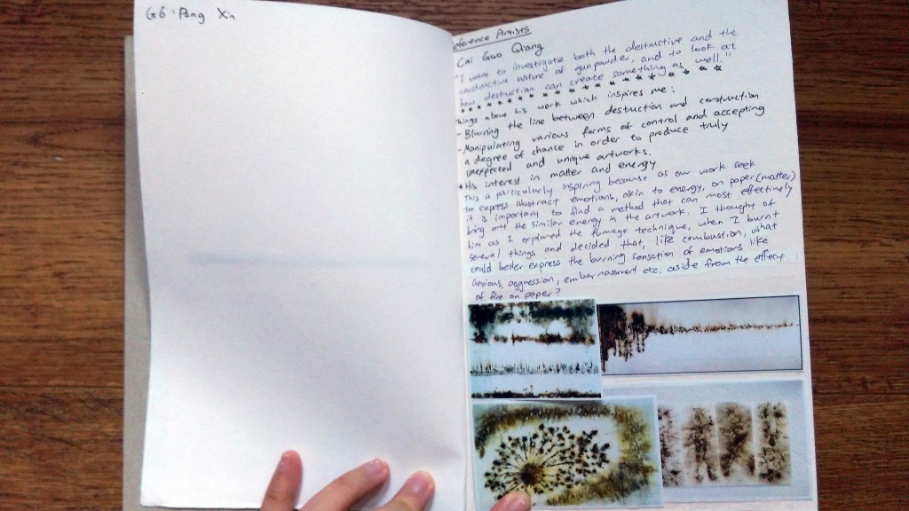
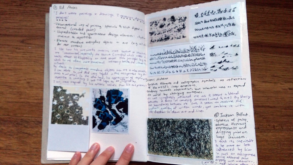
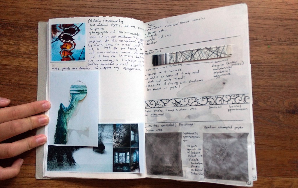
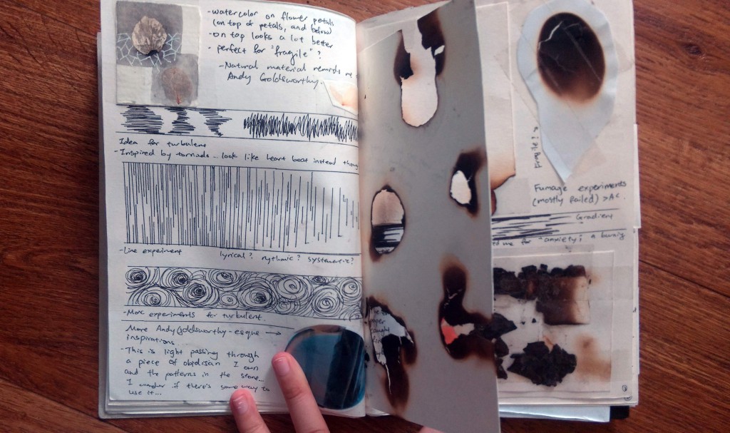 Most of the pages are in my separate posts before, so these are mainly just the consolidated Artists Reference pages.
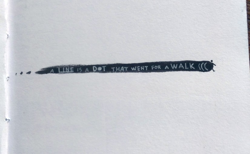
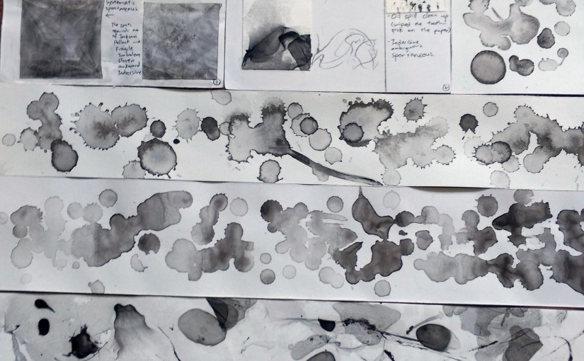
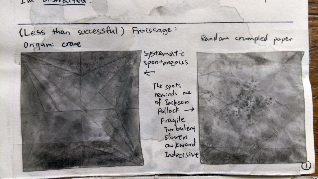










 Moving on!