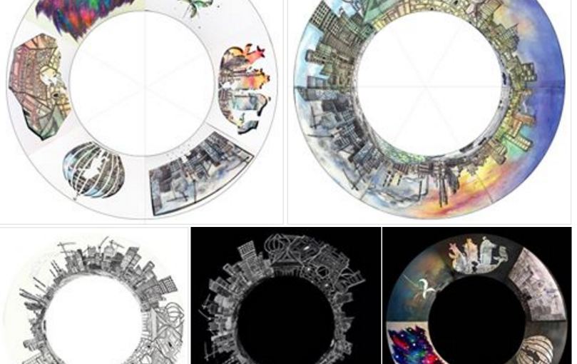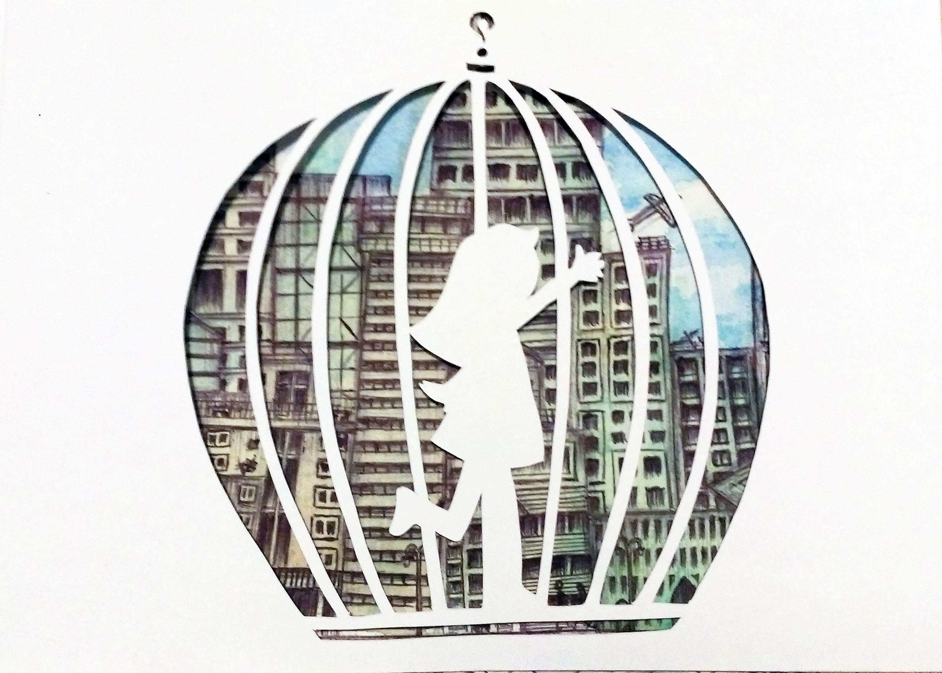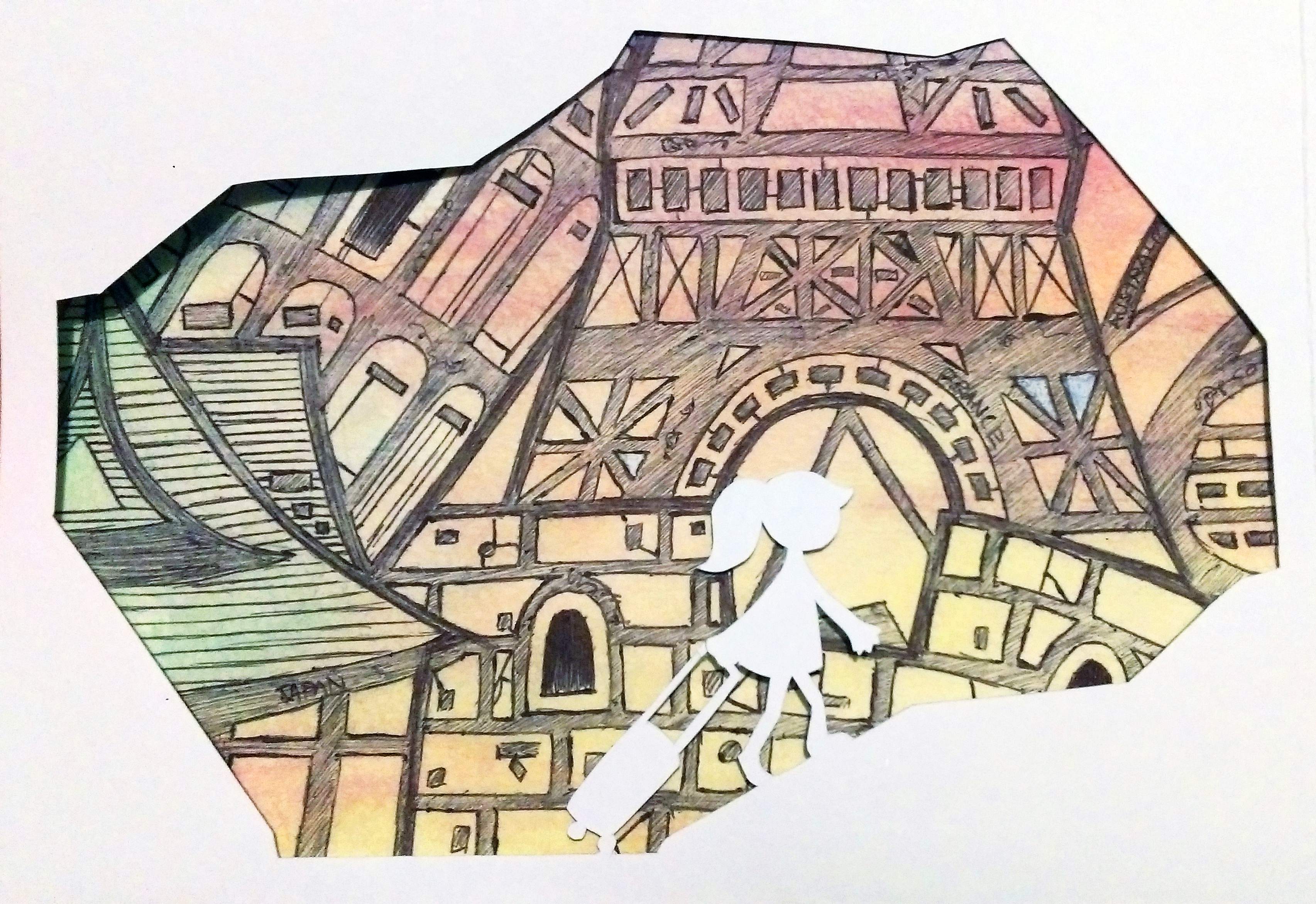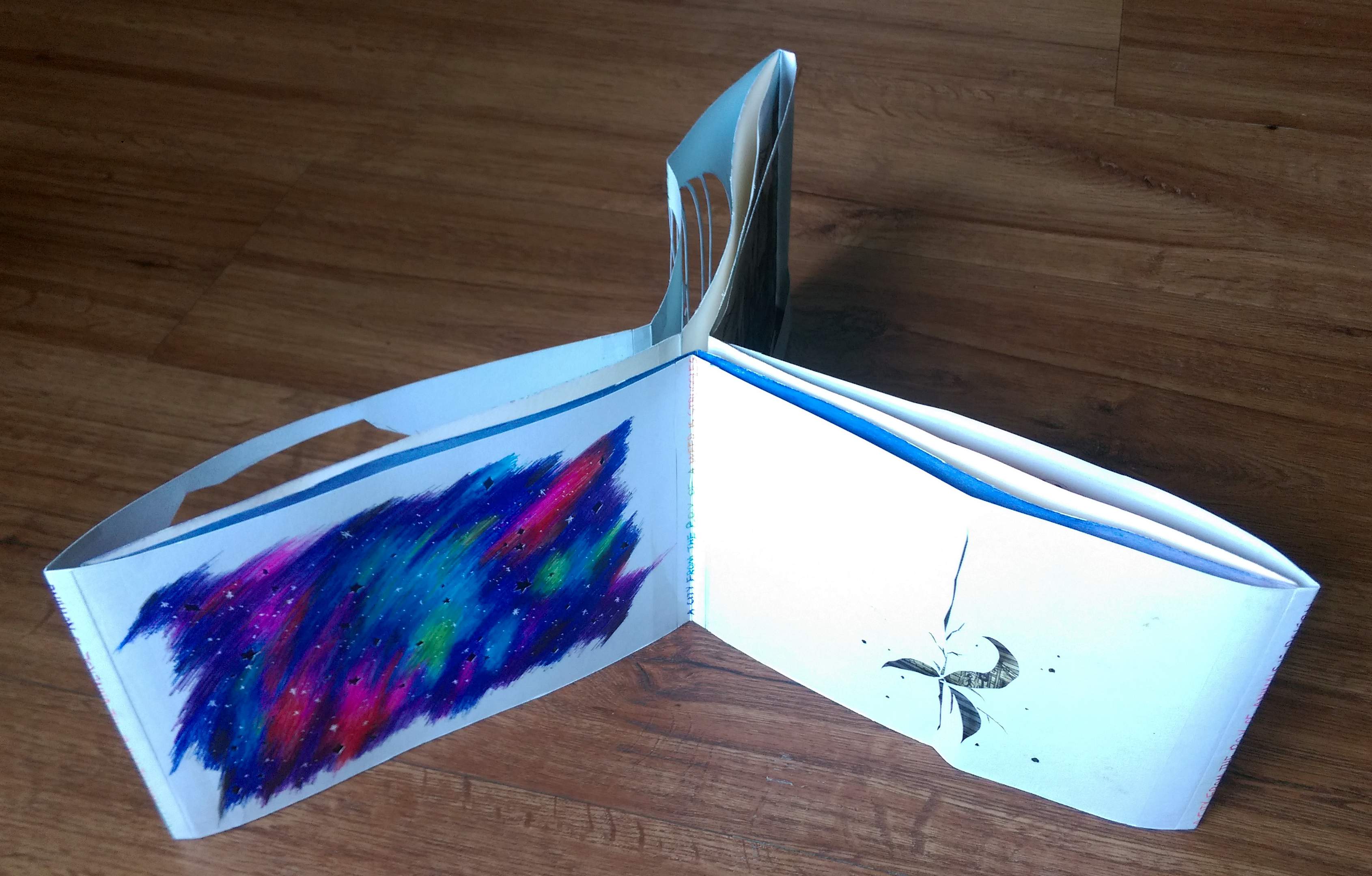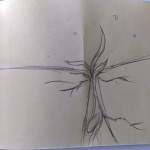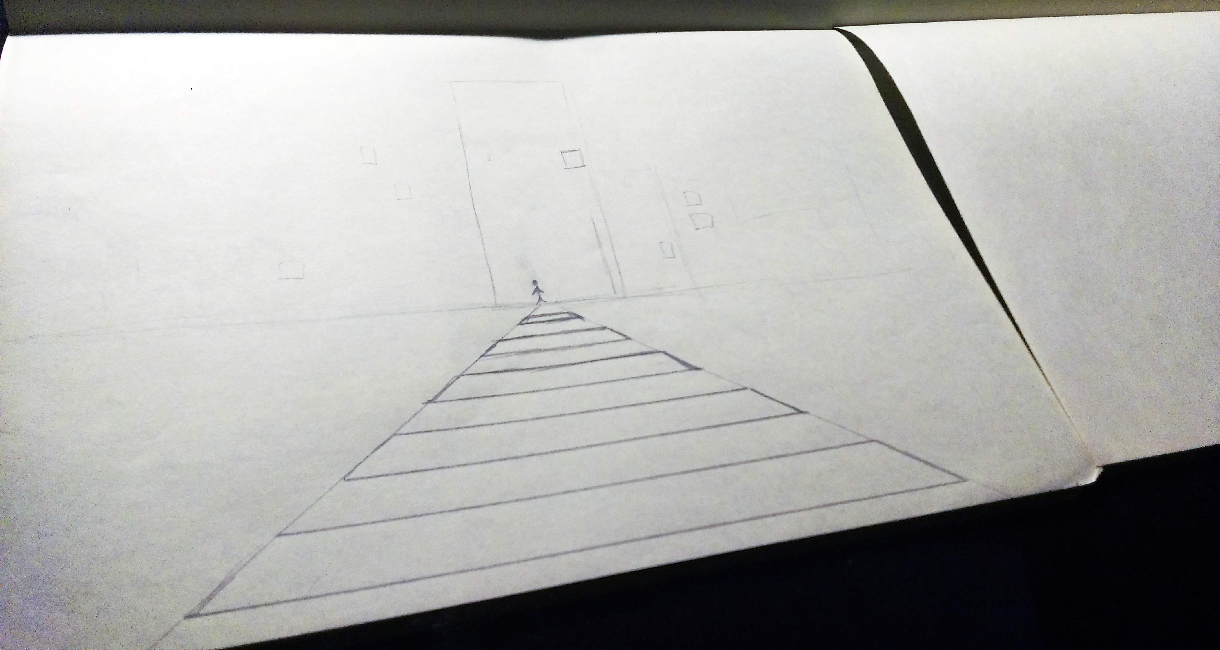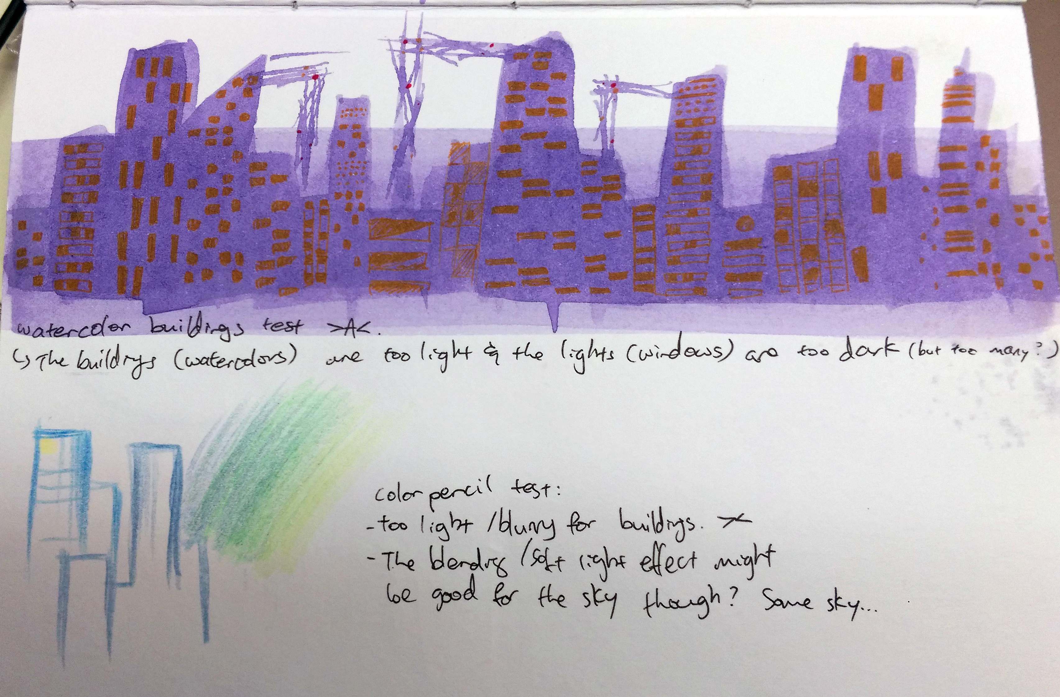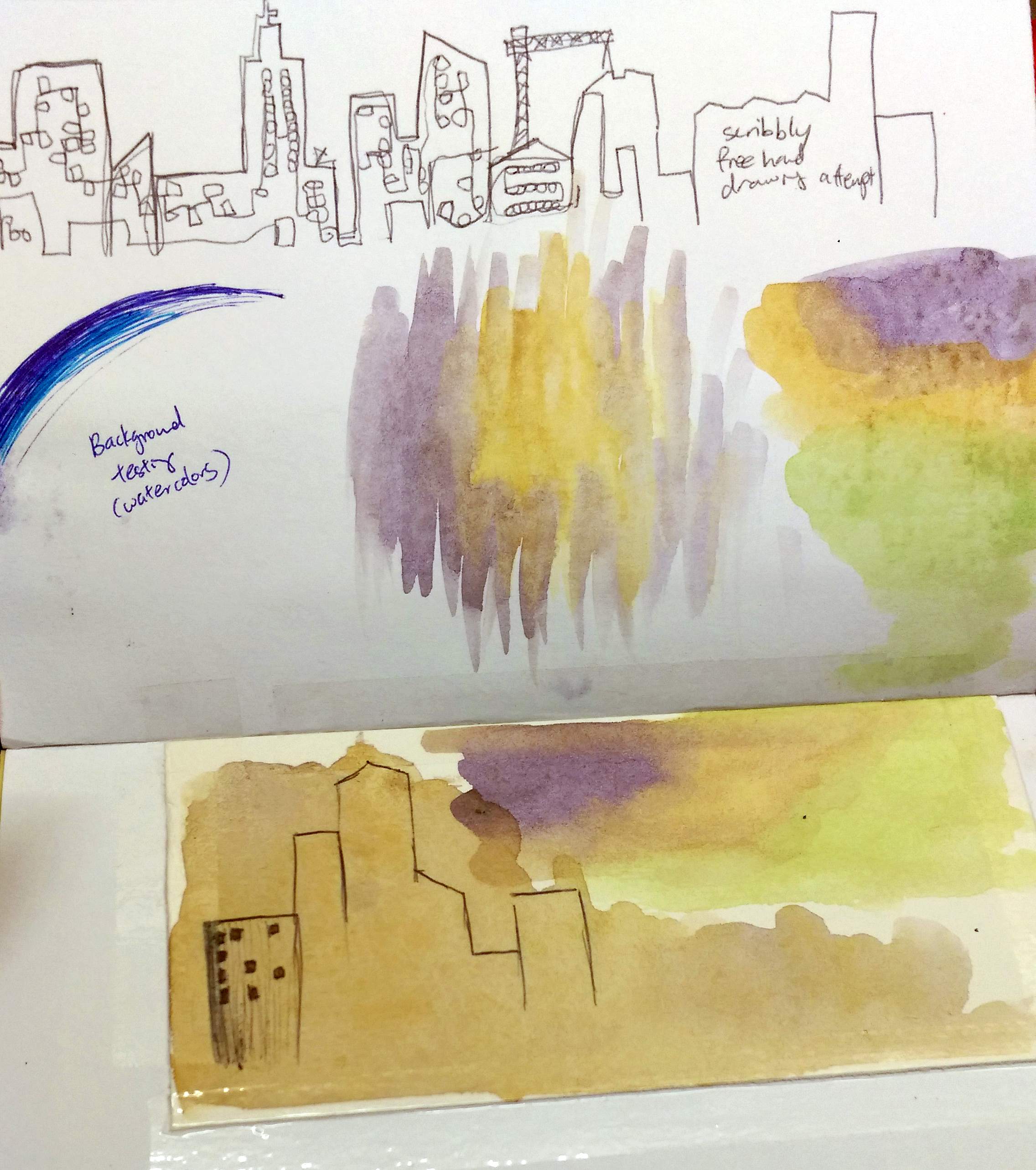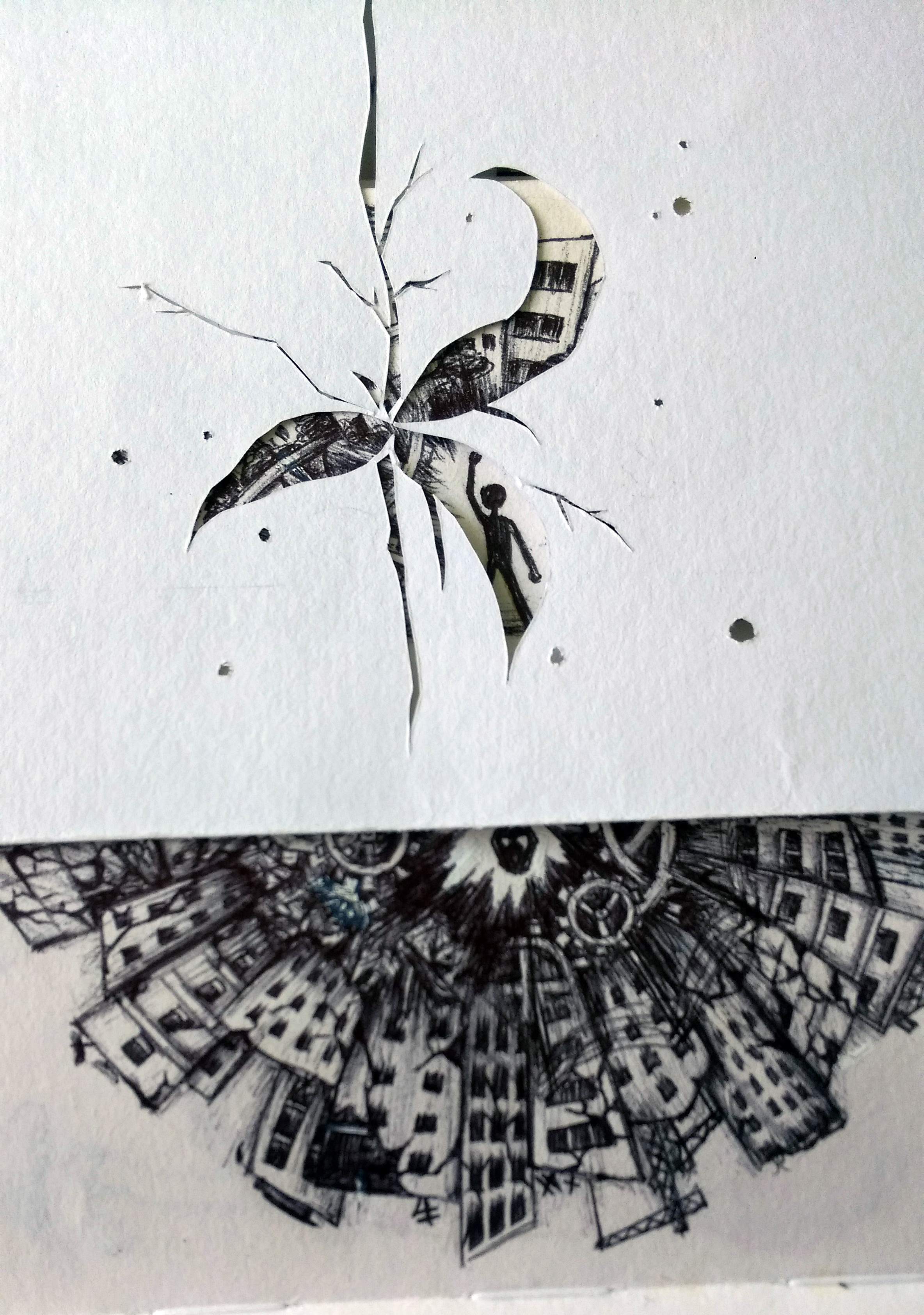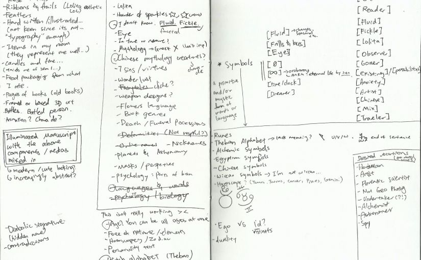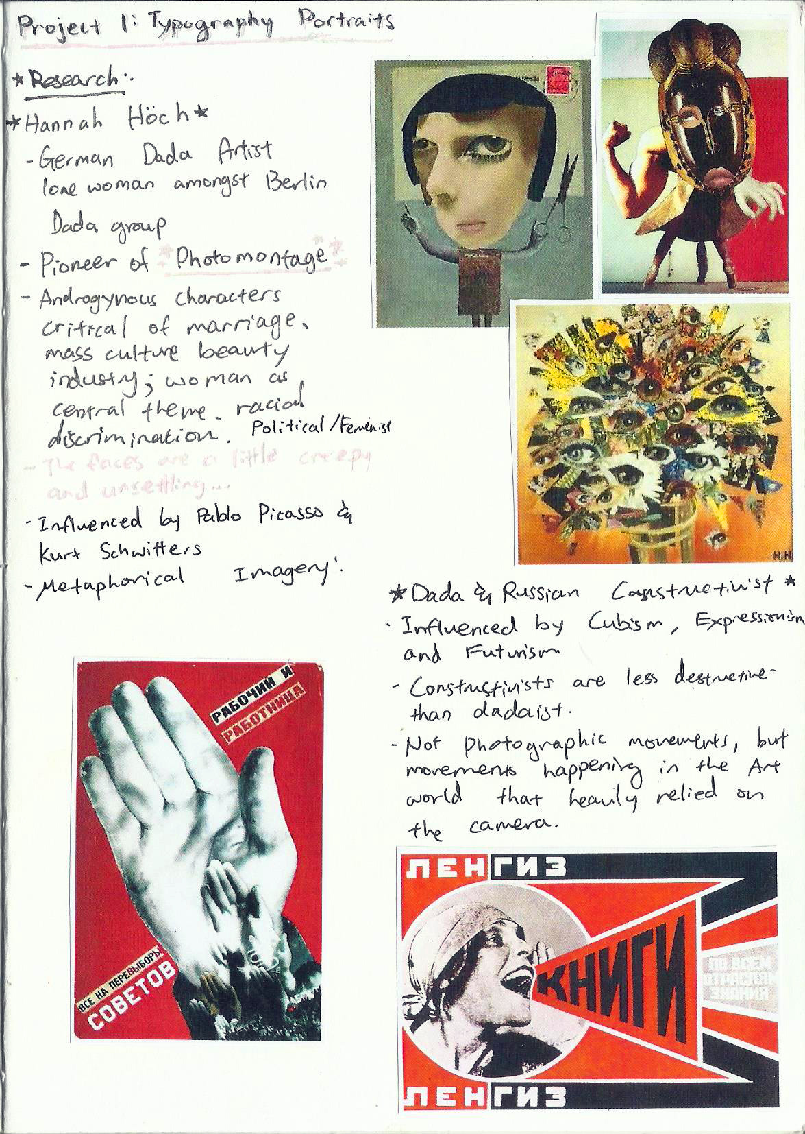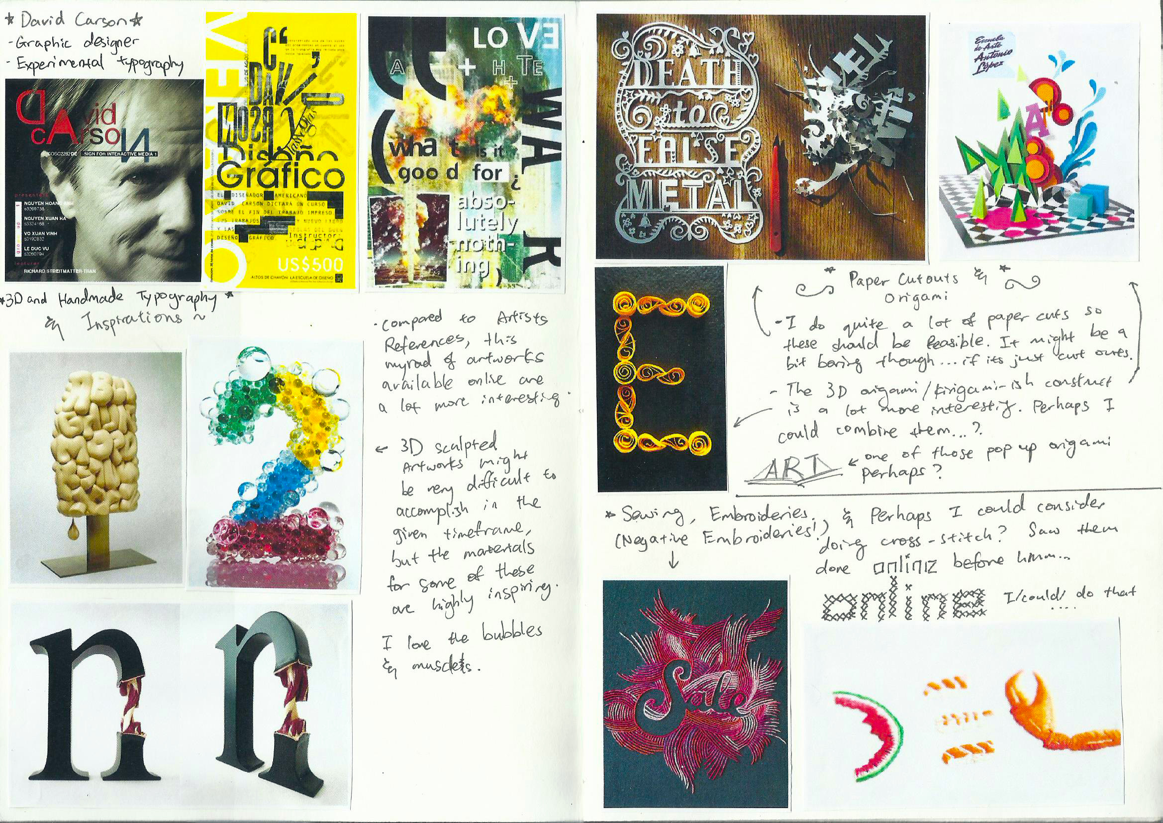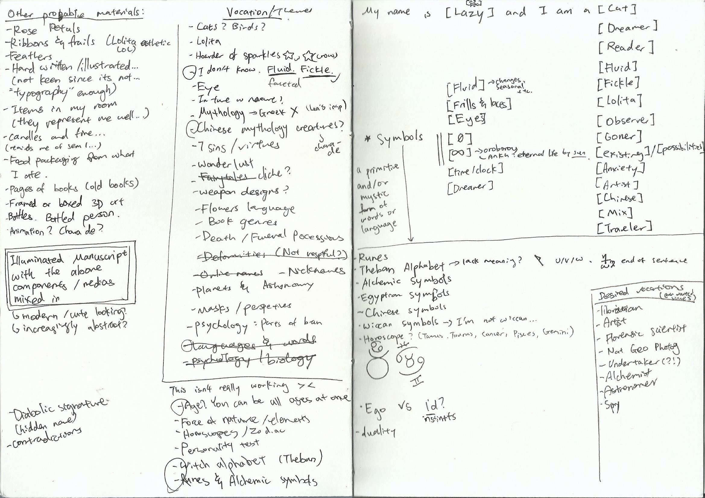
Above is how my Journal looks like after my previous research. Although I researched a lot on the methods, I was quite stumped as to the theme. I love doing artworks about myself, but sometimes it’s hard to keep it interesting.
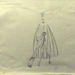
As I went along my thought process, I eventually drew the conclusion that I should use symbols in my typography portraits. They will fit more neatly into the size of the artworks without compromising the meaning.
Moreover, symbols in Alchemy and Pagan religions has always been of interest to me, so I proceed to the second part of my Research.
http://symboldictionary.net/ is a very helpful website, and all pictures and info are from them.
Below is the list of symbols that struck my fancy, as well as some keywords regarding their meaning:
Web of Wyrd (Skuld’s net)
 Norse Legend fates (Nornir) woven Matrix of fate (wyrd). Contains all the shapes of the runes, therefore all possibilities. Consequences and links between past, present and future.
Interconnected timelines.
Tree of life.
Mercury (Alchemical Quicksilver)
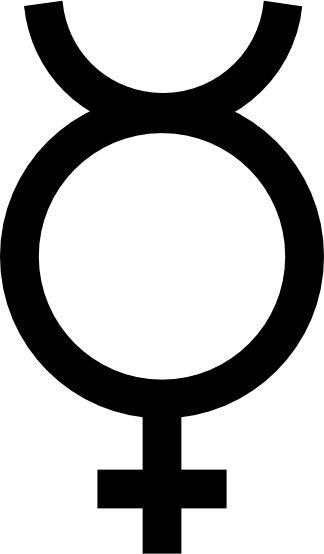 Glyph derived from Ancient Greek God Mercury.
Previously emblem of the Punic Goddess Tanit.
Alchemical quicksilver
Magical element mercurius.
Human spirit.
Sulfur (“Leviathan Cross”)
 Human soul.
Masculine, hot and dry.
Combined with Mercury (feminine, cool and moist), the pair were considered the parents of all metals.
Historical association with the devil.
Fire triangle surmounting a cross of the earth.
Salt
.svg/1024px-Salt_symbol_(alchemy).svg.png) With Mercury and Sulphur, that make up base matter.
With Mercury and Sulphur, that make up base matter.
Physical matter of the body; its earthly elements.
Hermetic Seal of Light (Quintessence)
 Synthesis of alchemy or the Hermetic Seal.
Ancient Pythagorean philosophy
The square, circle, the and the triangle are the emblems of the material body, the soul, and the spirit, three elements believed to be necessary for alchemical transformation.
Fire (Elemental Fire, “Blade”)

Heat and dryness
“Fiery” emotions
Apiritual aspiration,
Rising force, rising energy.
Derived from the medieval magical Seal of Solomon.
Air (Elemental Air, Alchemical Air)
 Warmth and moistness
Breath, life, communication, and the holy spirit.
Earth (Alchemical Earth)
 Cold and dry
Physical sensation.
Medieval temperament: melancholic.
Esoteric tradition :manifestation of matter.
Pentacle
Water (Elemental Water, “Chalice”)
 Downward flow.
Ancient symbol of femininity
Cold and moist
Intuition, the unconscious mind, the enclosing, generating forces of the womb.
Taurus
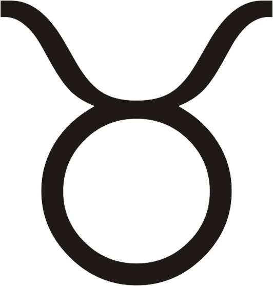 My sun and moon sign
Head and horns of a bull.
Fixed, feminine, Earth sign
Ruled by the planet Venus.
Governs the throat/neck.
Gemini
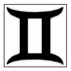 My Venus Sign
The twins.
Mutable air sign.
Ruled by the planet Mercury.
Cancer
 My ascendant/rising sign
The crab
Cardinal water sign.
Pisces
 My mid-heaven sign.
The fishes.
Water sign.
Ruler of the current equinoctial age
Emblem of early Christianity.
Womb of the fish
Venus
 Alchemical metal, copper.
Copper mirror of Venus/Aphrodite
May be related to the Egyptian emblem of the goddess Hathor.
May be a variation of the ankh.
Saturn
 Alchemical metal, lead.
Scythe of Saturn, the god of the harvest and time.
Limitation, protection, and restraint
Alchemically, lead was the prima matera, or primal matter
Putrefaction and decay necessary for new life.
Similar to the Hebrew letter Tau, associated with time and death.
Moon
 Alchemical symbols for silver.
Hermetic sciences, feminine, liquid, passive principle- alchemical Mercury.
Hieros gamos (divine marriage) combining solar and lunar principals to form the divine androgyne- the highest form of spiritual attainment.
Silver repel or even kill demons.
Purity (Silver = pure metal
Wiccan moon symbol of blessing.
Sun (Alchemical Gold)
 Alchemical symbol for Gold.
Ancient Egypt symbol for the sun God Re.
Pinnacle of spiritual development and human achievement.
Ouroboros (Infinitysnake)
 “Tail swallower.”
Egypt as a symbol of the sun, travels of the sun disk.
Gnosticism, solar God Abraxas,
Eternity and the soul of the world
Spirit of Mercury
Continuous renewal (resurrection)
Cycle of life and death
Harmony of opposites.
A double ouroboros signifies volatility.
Spiritually, balance of the upper and lower natures.
Infinity symbol (Lemniscate)
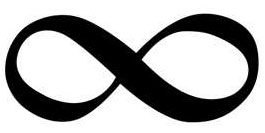 Mathematical symbol
Patterned after mobius strip.
Balance of forces
Associated with Magician tarot card.
Enso (Zen Circle)
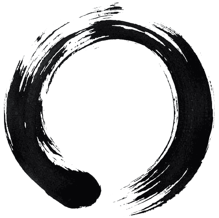 Zen Buddhism.
Symbol of infinity
Infinite void
Perfect meditative state
Satori (enlightenment.)
Tomoe (Mitsu tomoe, Futatsu tomoe, Tomoe-mon, Fire-wheel)
 Turning or circular, referring to the motion of the earth.
Play of forces in the cosmos.
Akin to Yin/Yang
Threefold division of Shinto cosmology, earth, the heavens, and humankind. Associated with the Shinto war deity Hachiman.
Eye of Horus/Eye of Ra (Udjat, Wedjat)
 Resemble the eye of a falcon
Right eye of the Egyptian Falcon God Horus.
Udjat (or utchat) = sun, associated with the Sun God Ra (Re).
Left eye, represented the moon, and the God Tehuti (Thoth).
Flower of Life (Fisherman’s Net)
 Associated with New Age permutations of Sacred Geometry.
Contains a number of other shapes within its deceptively simple pattern
“Blueprint of creation.”
By connecting points in the pattern, a multitude of patterns and shapes can be traced, including a tree of Life, pentagram, and various representations of three dimensional objects.
The six-fold “seed” pattern used as a basis = seed of life.
Other Wiccan Symbols:
 Integration of body and spirit, and the spiritual mastery of the four elements.
The Wiccan emblematic pentagram faces point upward to symbolize the triumph of spirit over matter
Point downwards, to symbolize earthly gratification, or the triumph of the individual over dissolution.
Medieval Christians = five wounds of Christ
Proportions of the human body.
 Horned God
Masculine polarity of the universe.
Related to the ancient Gods of vegetation and the hunt: Greek Pan, the Celtic Cernunnos, and the Egyptian Ammon.
Hhorn moon,” symbol of the Goddess Diana, especially in Dianic Wicca.
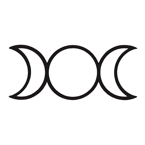 Lunar Triple Goddess symbol
Three aspects of the moon (waxing, waning, and full)
Three ages of womankind (mother, maiden, crone)
Fminine polarity of the universe