I had a very hard time deciding what type of stylistic illustration should I do, so I tried a few tradition and a few vector illustrations.
For my traditional medium I tried both acrylic and color pencils.
first I used acrylic paint, but because the, paint was very thin, I had to apply three coats before the base couldn’t be seen anymore. but this made the painting became fatter as I couldn’t keep in the lines. The shades were too similar to each other so I had to use the pen to outline to bring focus and definition to the character. if I were to do this again, I would definitely choose to do this with gauche or poster paint.
The second traditional medium that I used is cloud pencil. As the composition looked to bare I added a tent, I had greater control over the medium in this case. in additions the clouds are more vibrant which I greatly preferred. However, as much I love this medium, it was too slow and I had other projects due to…
So I went back to illustrations, but I couldn’t find a balance between the complexity and simplicity.

in the first one, I felt like the line work is flat and lack variations. (but if you zoom in and see the line works actually have variations) I lack the proper brushes on illustrator to do the line work so I had to forgo this style
As the line =works wasn’t doing justice to the actual sketch I removed it completely. However, that made the character look unfocused and lack definition…
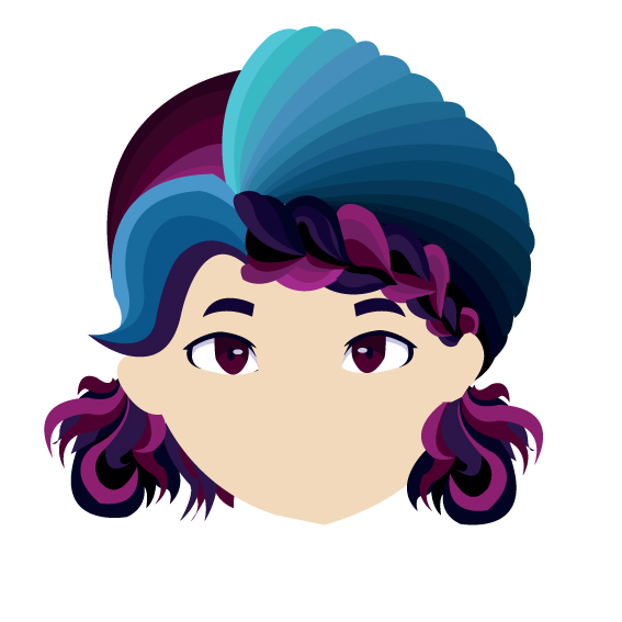
So I thought to myself that I need to simplify my illustration by only using maximum three colors: highlight, mid tone and shadow. that worked out pretty well, and I decided to use this stylistic illustration instead.