


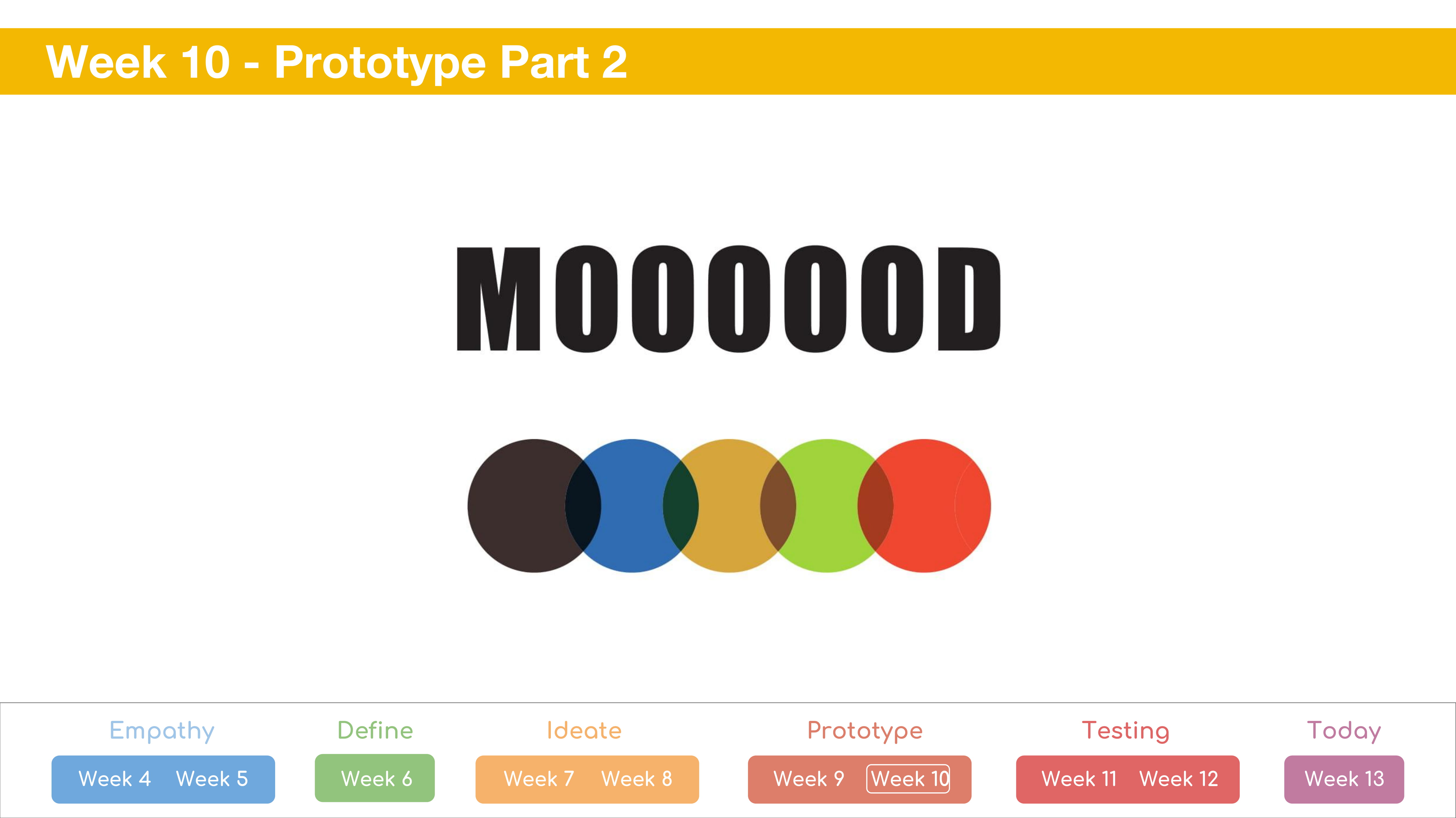
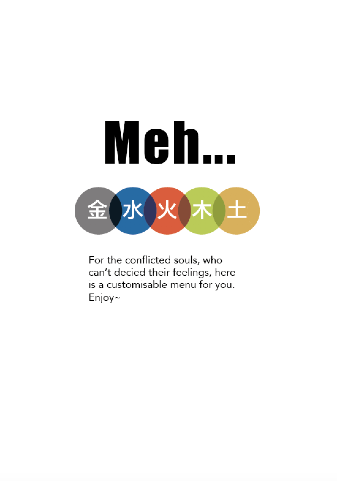
Research:
I wanted to tackle the theme of style and how fast fashion is purely toxic. There was 2 main topic I wanted to address in my magazine: Human Rights and Environmental Pollution.
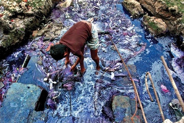
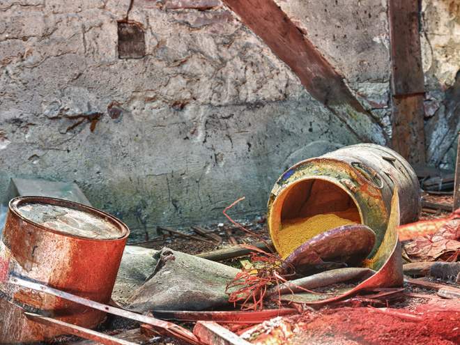
The textile dyeing is the second largest polluter of clean water globally, after agriculture. These dyes used to dye our textiles are incredibly toxic. In China, the factory of the world, it is estimated that 70% of the rivers and lakes are contaminated by the 2.5 billion gallons of wastewater produced by the textile industry.
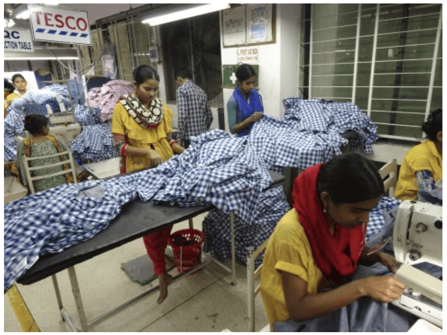
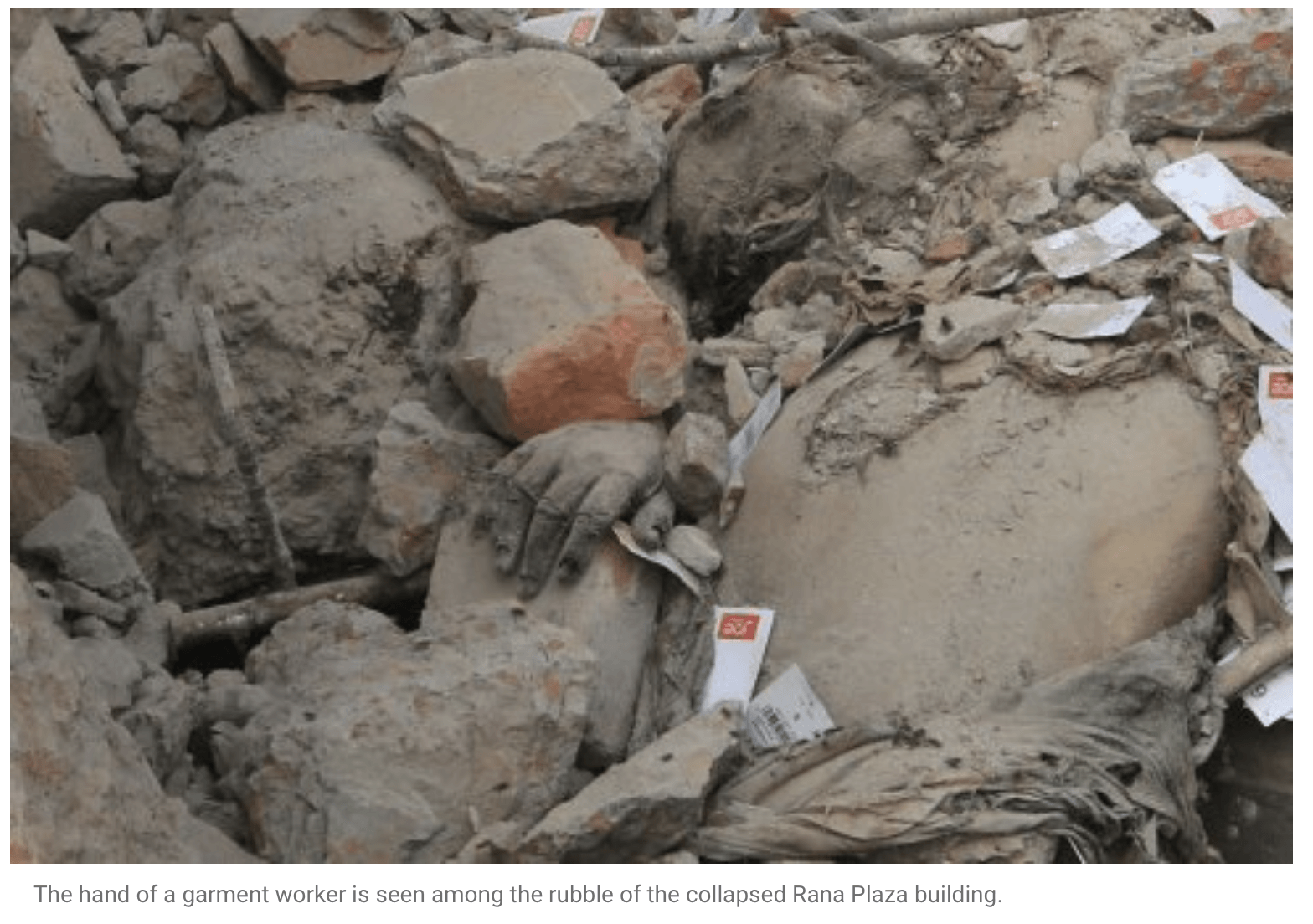
In addition, not only is the working environment for the garment workers horrid, they are paid the bare minimum. workers are forced to meet an insane quota per day. if they are unable to hit the quota, they would have to work extra hours and are not allowed to go for toilet breaks or drink. In fact, many are being conned of a decent wage and are then forced to slave away in the factories. Furthermore, the Rana Plaza disaster highlight how unsafe their working environment is.
target audience:
sketches:
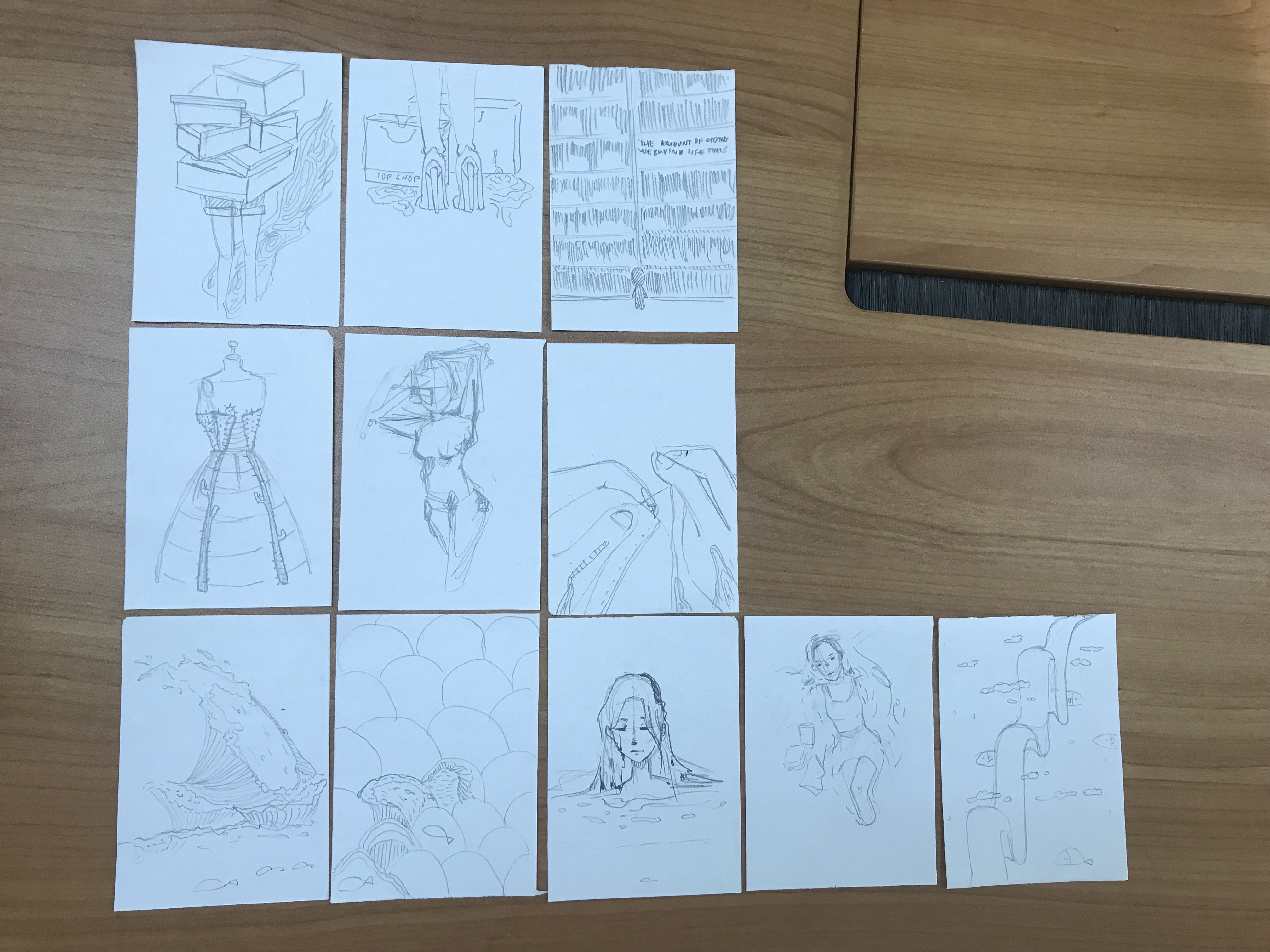
I separated my sketches into three categories:
Top: shopaholic behaviour of consumers
Middle: the human rights of the worker
Bottom: environmental pollution derived from the fast fashion industry.
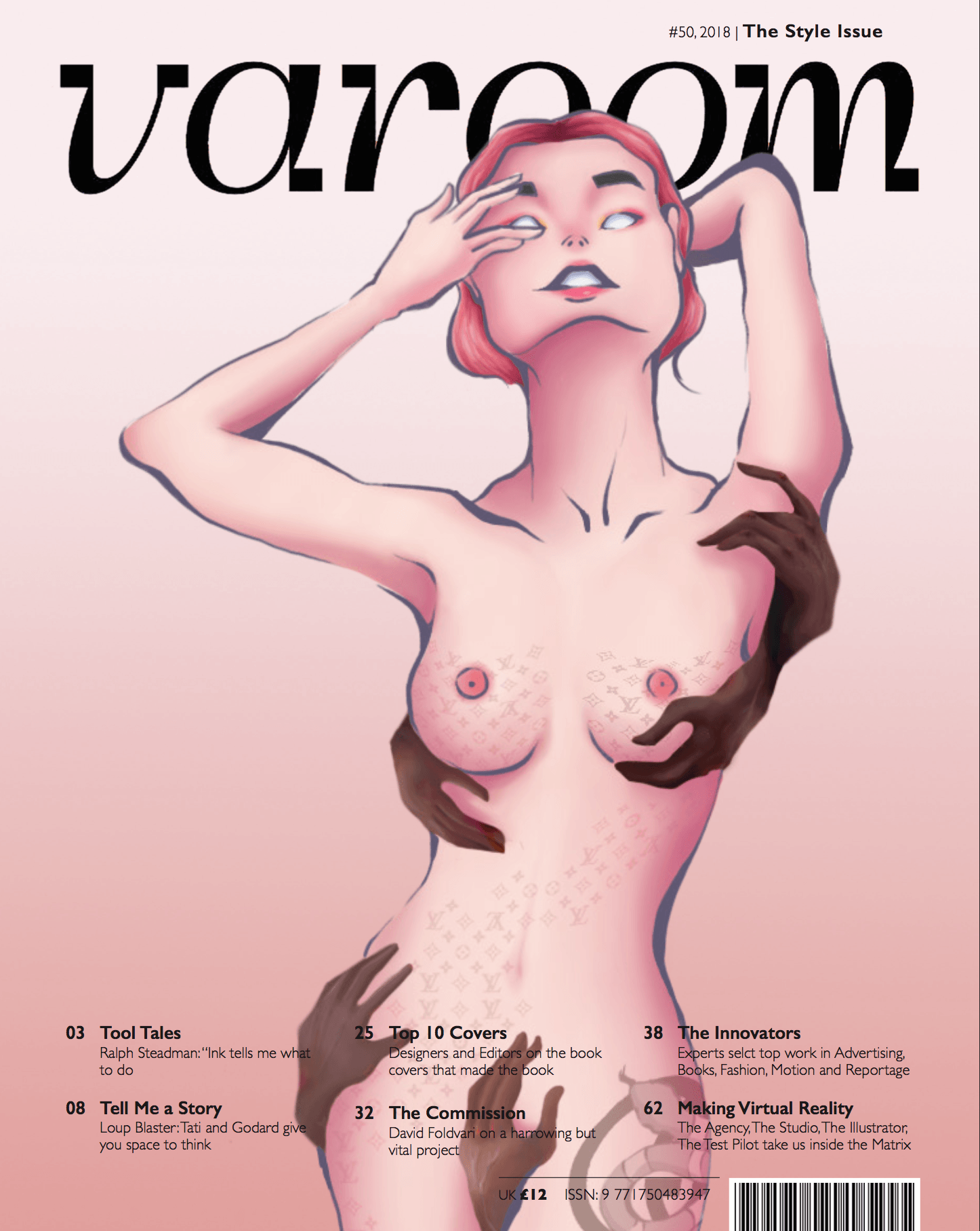
I decided to work further on these two thumbnails further: the shoes of shopaholic surrounded by bags, depicting the excessive consumption of fast fashion. the bags will be slowly melting to a puddle of toxic colours depicting rivers polluted by the textile industry.

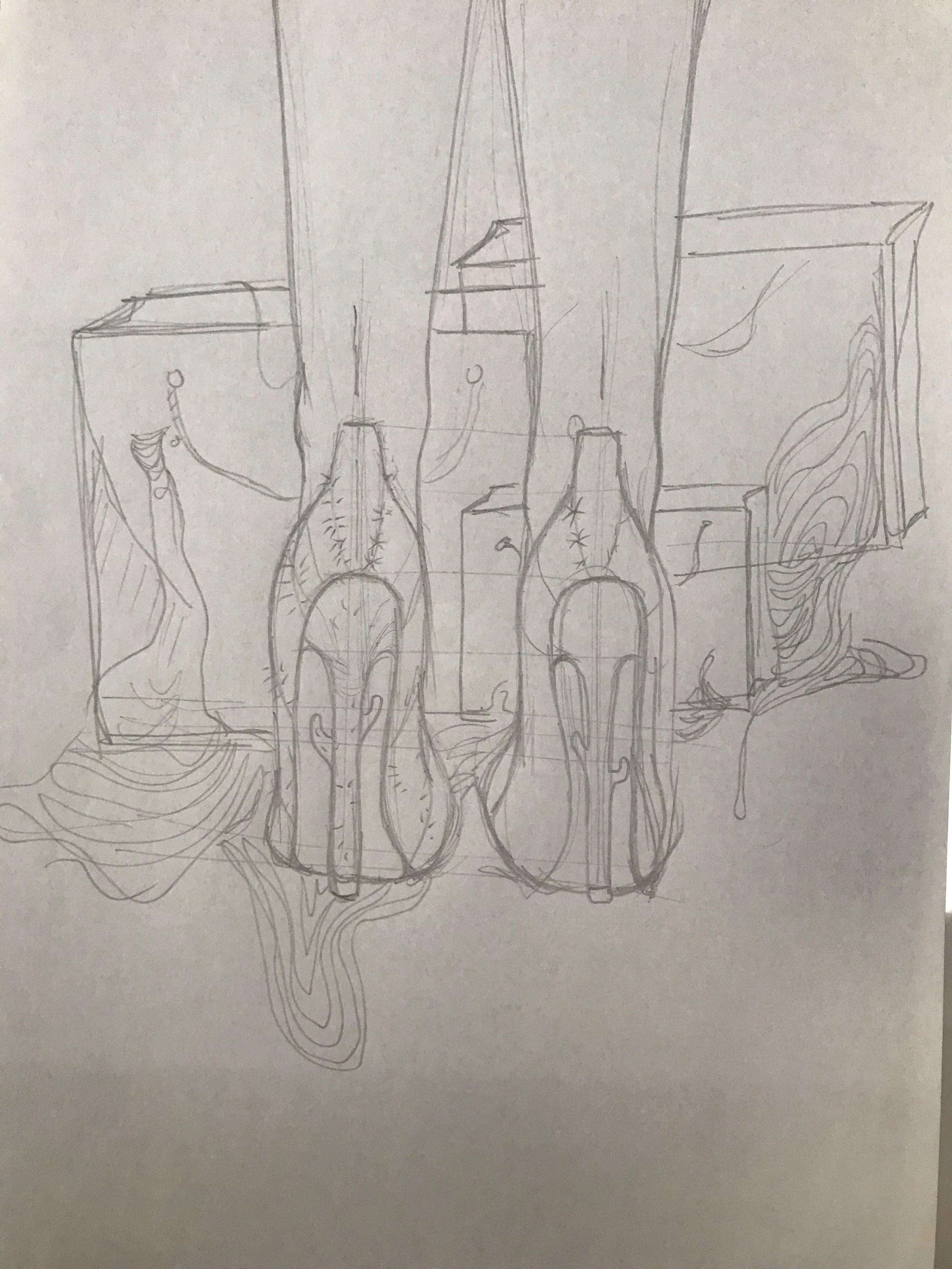
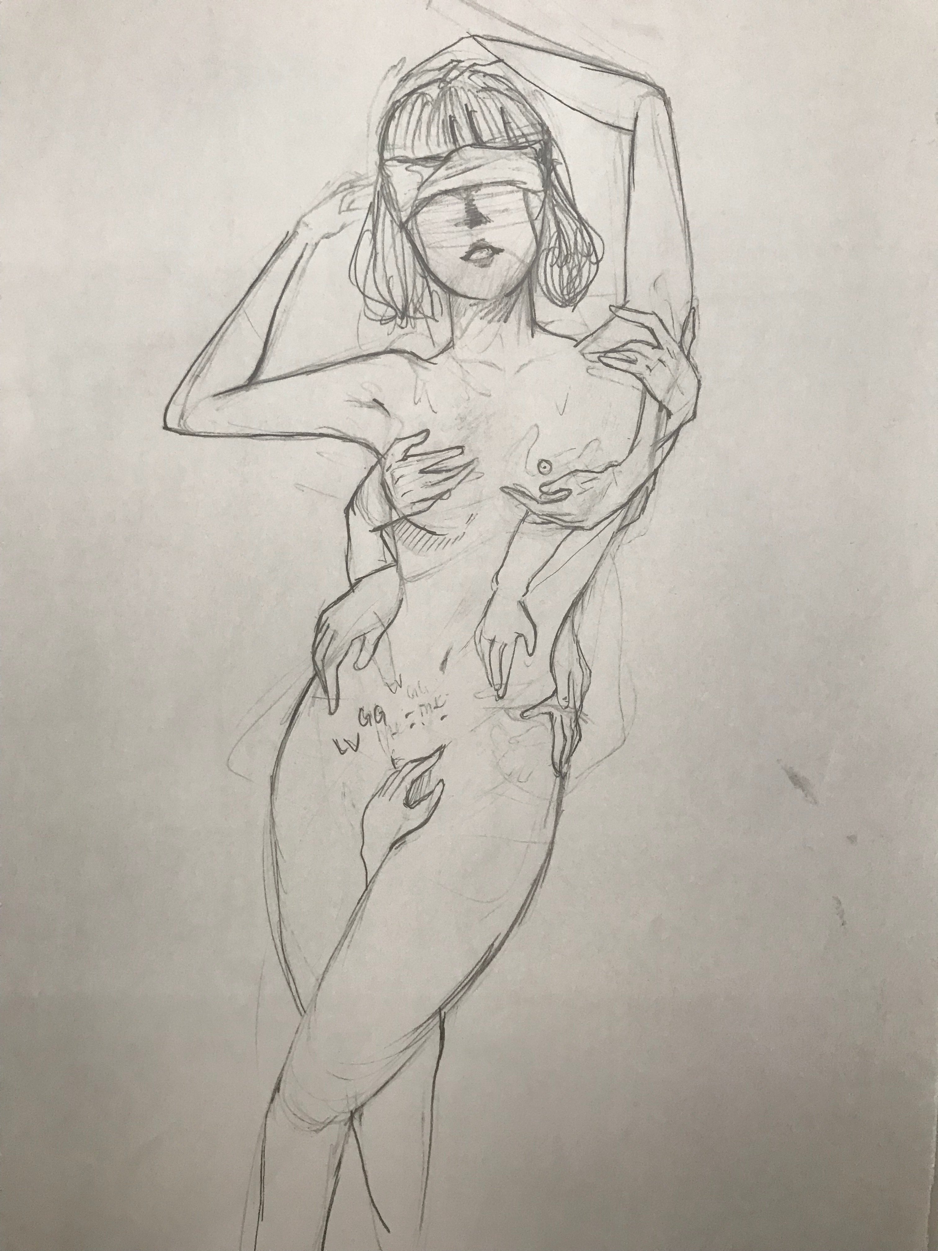
the structure of the skirt is illustrated with cactus to show how beautiful yet painful it is for the workers.
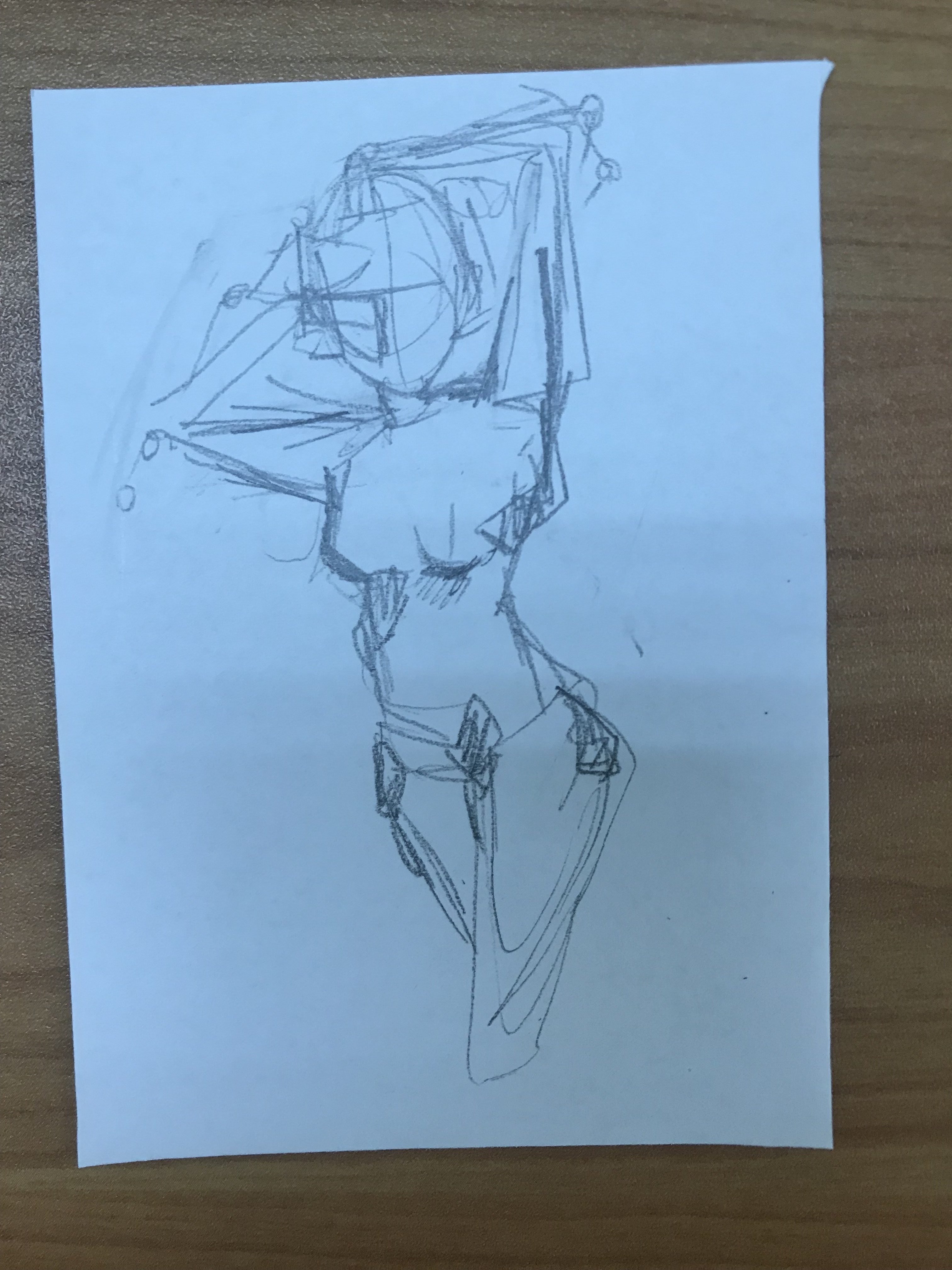
the body of a young model will be covered by the worker’s hand. this shows the hands behind the laborious production of fast fashion and how horrid their working conditions are.
refined sketches and mood boards:
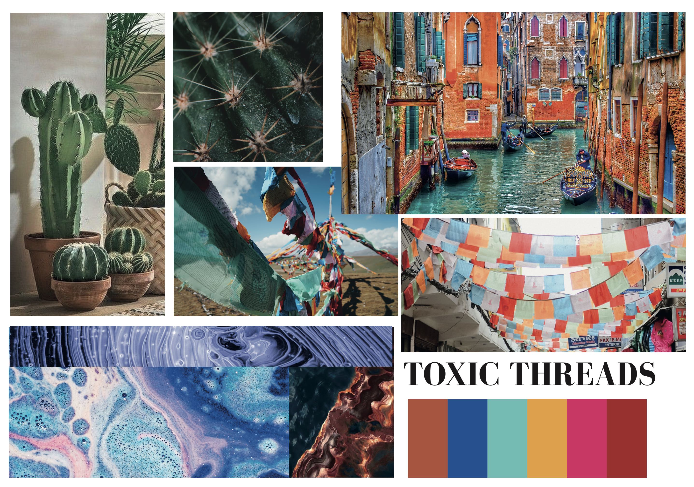

in the end, I decided to work on the second idea, as it has a stronger and more impactful concept. some of the pointers I received was that:
final draft:

Topic 1: childhood education
is undeniable that early childhood education is crucial to the development of a child. However, when is too much too much? according to or a survey done in 2015, 7 out of 10 parents send their toddlers to tuition. And the tuition industry itself is worth 1.1 billion in singapore. Children are given tuition for the languages as young as 3 years old. Kindergarten education focus has greatly shifted from a play model to a more academically focus model. I would love to explore the importance of play in childhood development and incorporate it back into the classroom
https://www.todayonline.com/lifestyle/do-4-year-olds-really-need-private-tuition
https://www.straitstimes.com/singapore/education/7-in-10-parents-send-their-children-for-tuition-st-poll
Topic 2: Food security in Singapore
With the consistent threat of Malaysia cutting our food supplies, is Singapore realy self sufficent enough to withstand the threats. This is greater highlighted by the recent tense relationship with Malaysia as they threatened to cut the egg supplies. Singapore retailers scramble to find other alternatives from other countries such as Thailand. I would love to explore how to make the consumers more educated when picking produce, supporting local produce.
https://www.channelnewsasia.com/news/asia/malaysia-may-stop-or-limit-egg-exports-to-maintain-local-market-11020310
https://www.straitstimes.com/singapore/singapore-has-hatched-plan-b-if-malaysias-egg-supply-dries-up-ava
Topic 3: Global warming: electronic waste
Every time iPhone releases a new phone, many scrambles to get the latest iPhone. The culture to consistently switch our gadgets in exchange for the latest technology is taking a toll on the environment. 60,000 tonne of electronic waste is produced yearly by Singaporeans. Singapore is the second largest e-waste generator in Asia right after Hong Kong. The earth has been consistently hit by multiple heat spells, global temperatures have been soaring these past few decades. I would love to do a campaign advocating for healthy consumer behaviour along with proper electronic waste disposal.
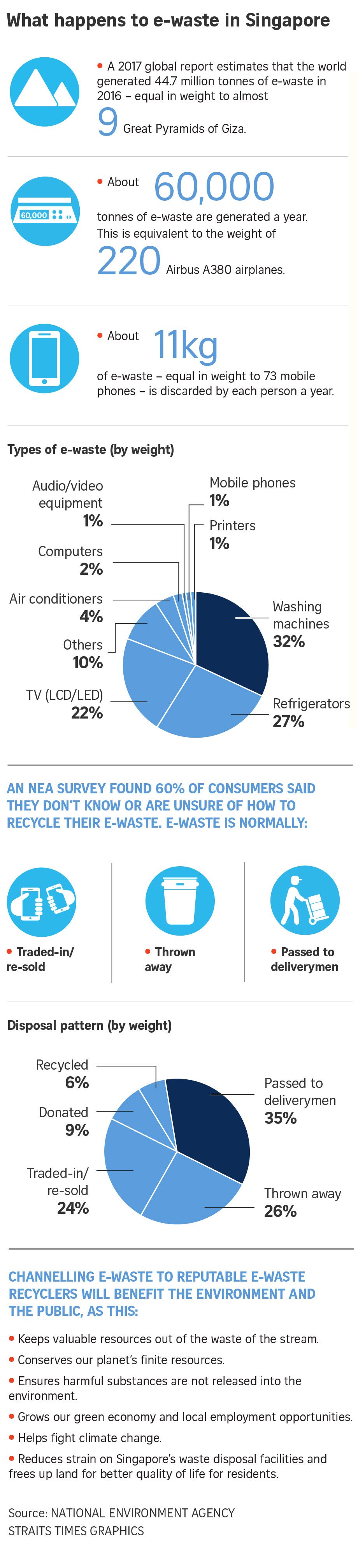
https://www.straitstimes.com/singapore/environment/singapores-mountain-of-e-waste
Topic 4: loss of dialects in Singapore
The use of dialect is slowly dying out in the younger generation in Singapore. Singapore has become more globalised over the years, and most younger Chinese Singaporeans are unable to speak their respective dialects — Teochew, Hokkien, Cantonese, Hakka, Hainanese and more — to their elders, such as their grandparents, who may speak primarily in dialects. These languages hold many traditions, stories and feelings. This dilution in language may be accorded to the government banning the use of dialect on national television and the dominance of English in the younger generation life. For this I would love to create a series of work, teaching the younger generation dialects.
https://www.todayonline.com/voices/youth-must-learn-dialects-or-risk-losing-part-their-culture
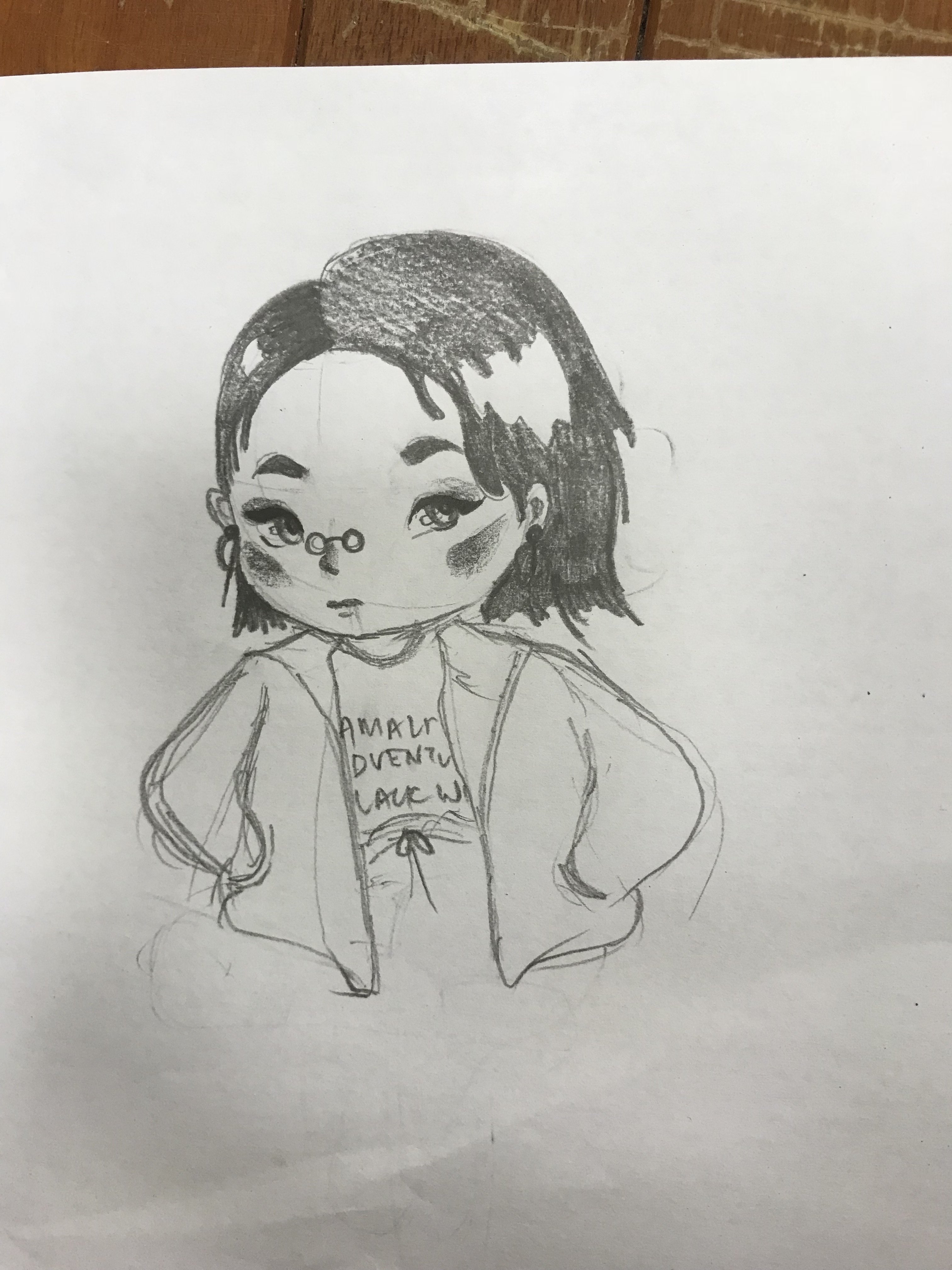
I drew Jannah 😀
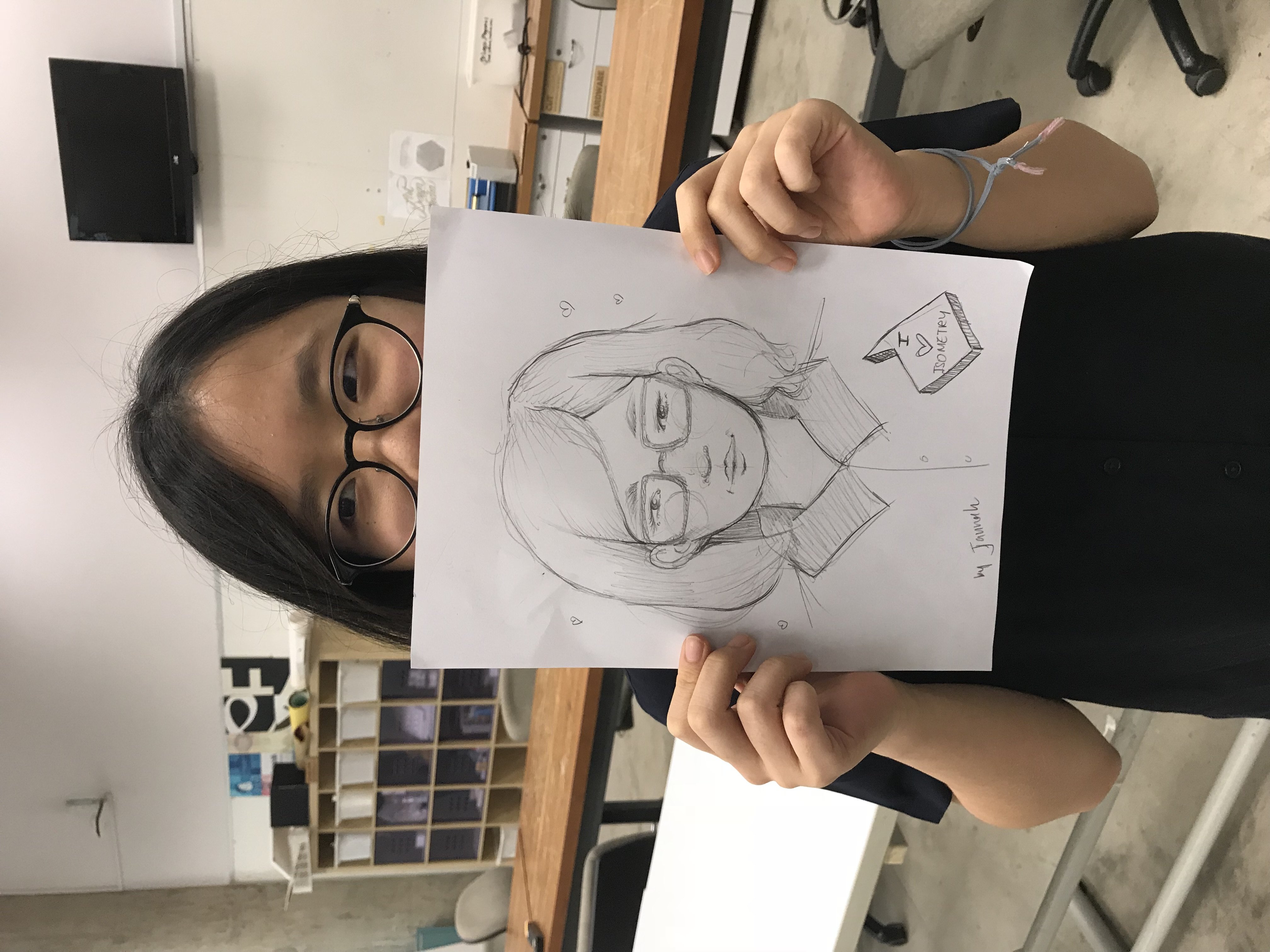
And Jannah Drew me :3
I was really afriad when we first entered the room. When they told us to remove our hands off our friend’s shoulders I freaked out. Even in broad daylight, I can’t even do a trust fall with a trusted friend. Much less a stranger (the guide) leading me through the unknown. I was so afraid of getting lost and being left behind in the complex. Suddenly all my insecurities were placed in front of me, and I was forced to face them. I took comfort in the fact that I could rely on my friend’s voices and helpful hands guiding me to the right places.
I also realise how important sight is to me. I was overreliant on my sight. Everything that I did, was depended on my sight. When it was taken from me, I realised how to slow down and appreciate other things base on my sense of touch and smell. This made me a lot more aware of how a visually impaired person encounters and experience graphic designs. In our eyes, the visual aesthetics are the most crucial aspect of graphic designs. However, for the visually impaired, the texture, the smell and the audio were their words. It also made me more aware of the type of font that we chose when designing for a client. In the room, we touched and felt the text on a signboard and a sculpture. The non-cursive font was so much easier to decipher as compared to the cursive one. In addition, I found out that braille is not commonly understood among the visually impaired. This made me realise how important is it to understand the client that we are designing for.
By taking on roleplaying, we are better able to understand and emphasise with our clients. There are some things that we take for granted in life, things that we won’t pause to think about. By roleplaying, we are able to immerse ourselves in their shoes. Through feeling for them, from their perspective, we are able to uncover more things that we never thought of before. However, there is an aspect of roleplaying where it can never fully mimic the reality of the visually impaired. In the setting of dialogue in the dark, we had the help of the guide, the never-ending walls and our friends to help us navigate through the place. It was a safer and more controlled environment, as compared to the reality they face on a daily basis.
However that being said, roleplaying is still an essential part of design thinking. The designers can better understand the needs of the clients, thus are better able to design to their needs. After all function over form.


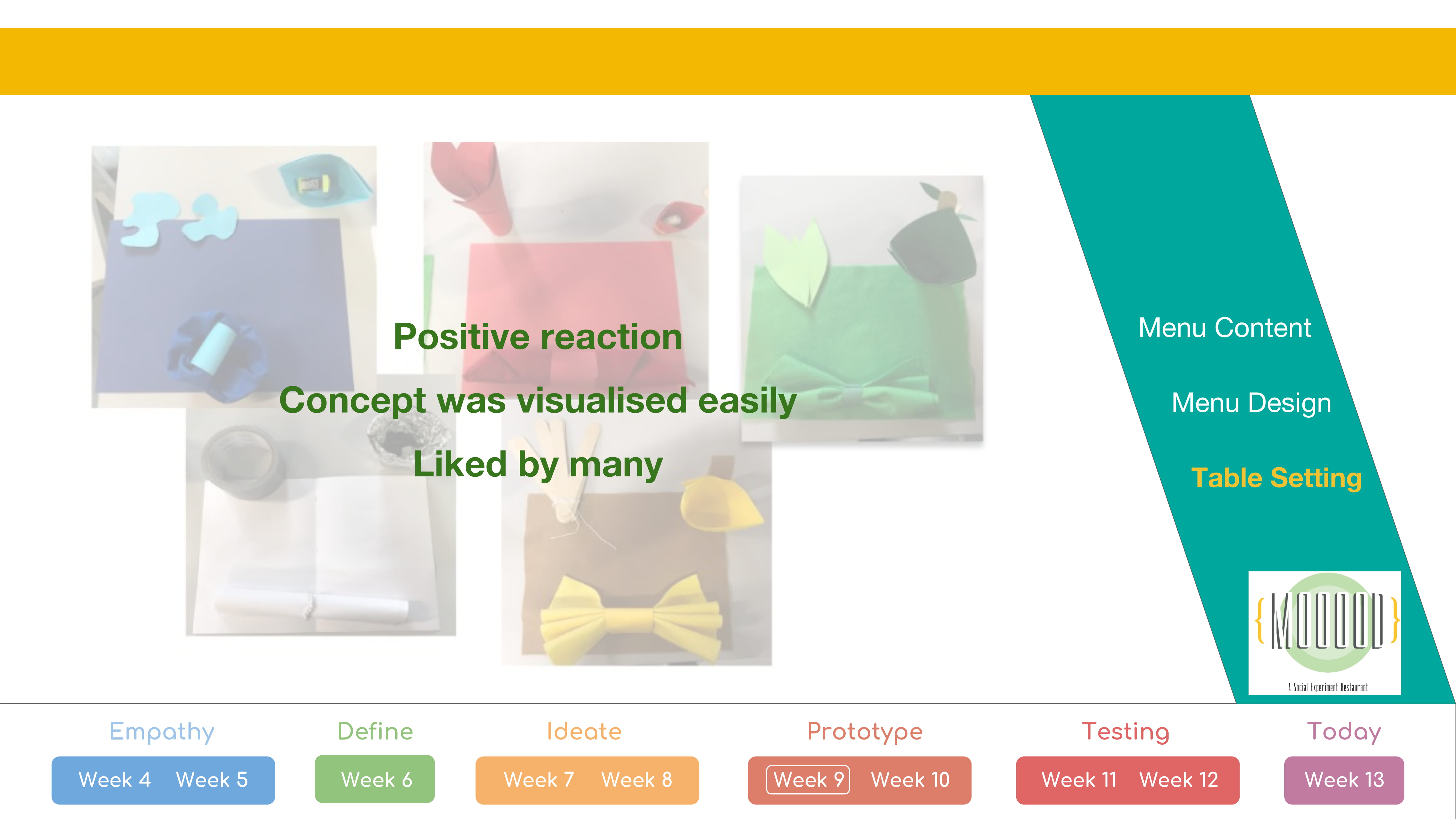

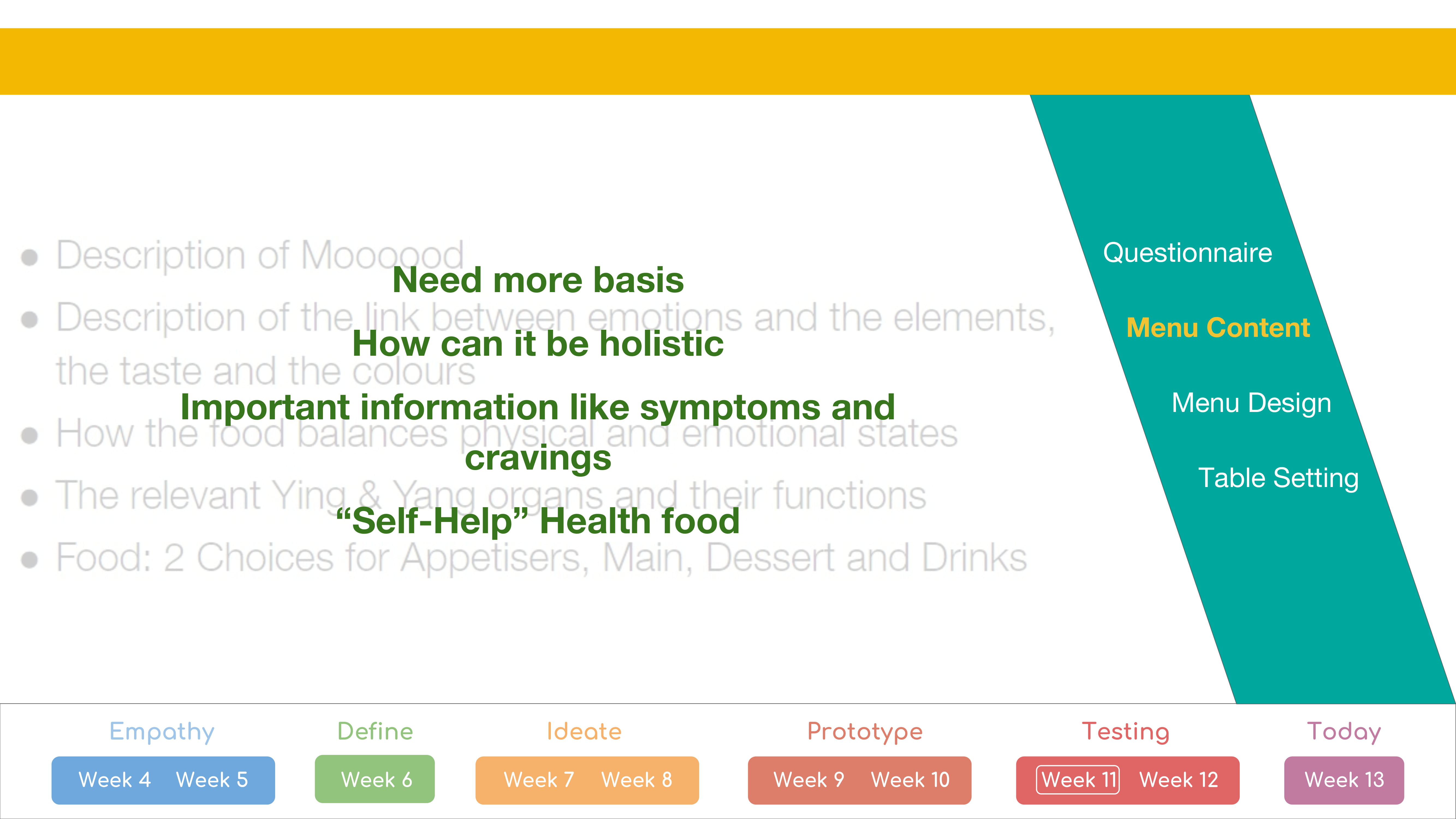


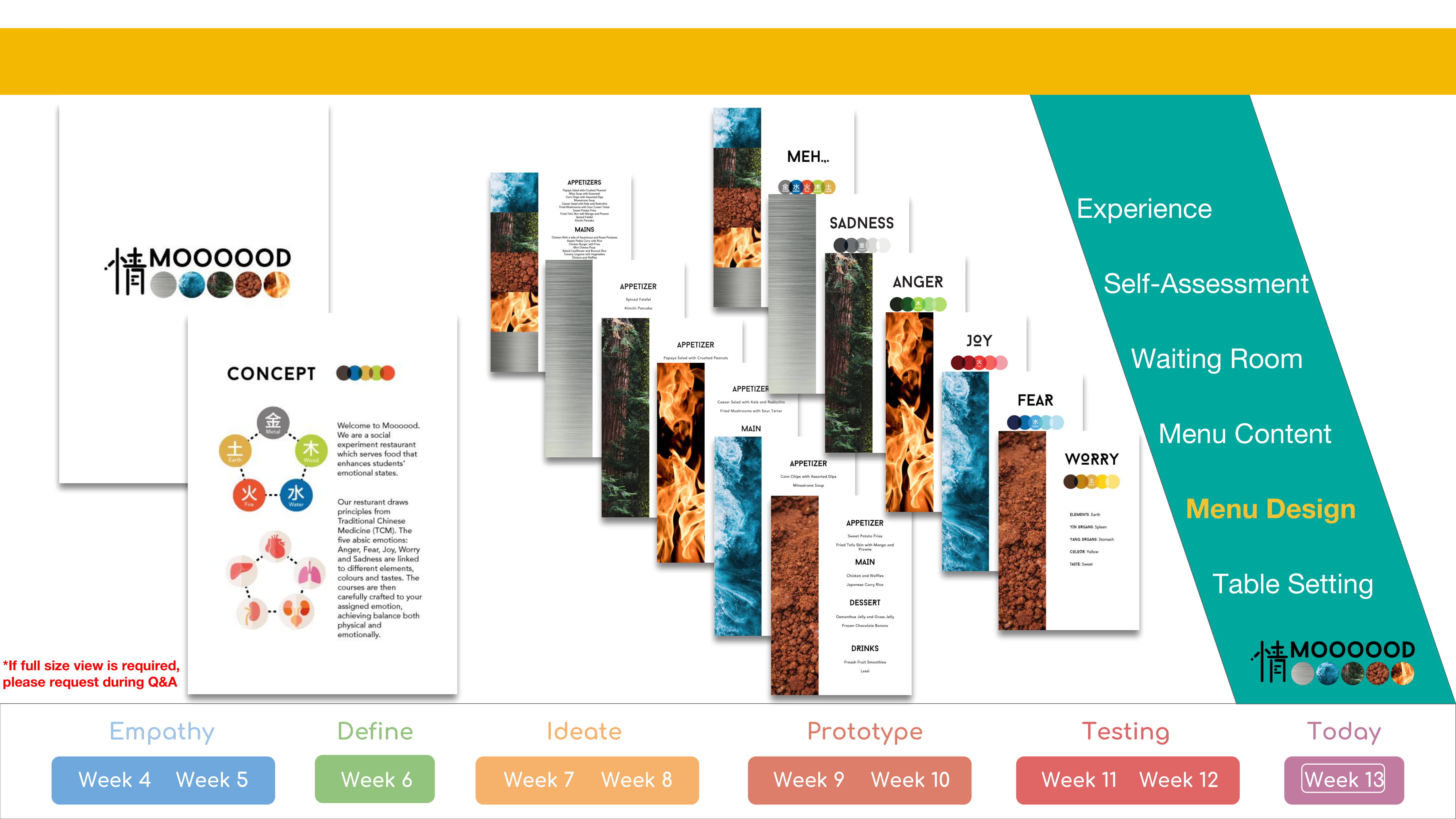


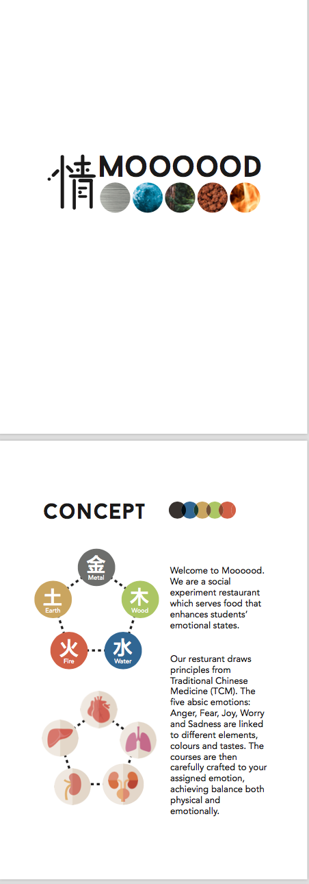
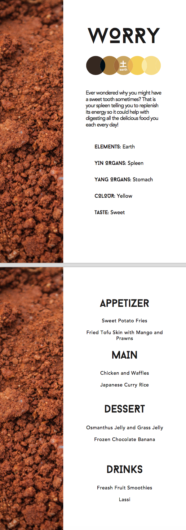
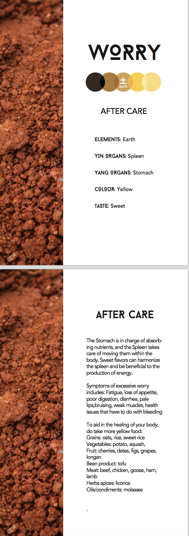
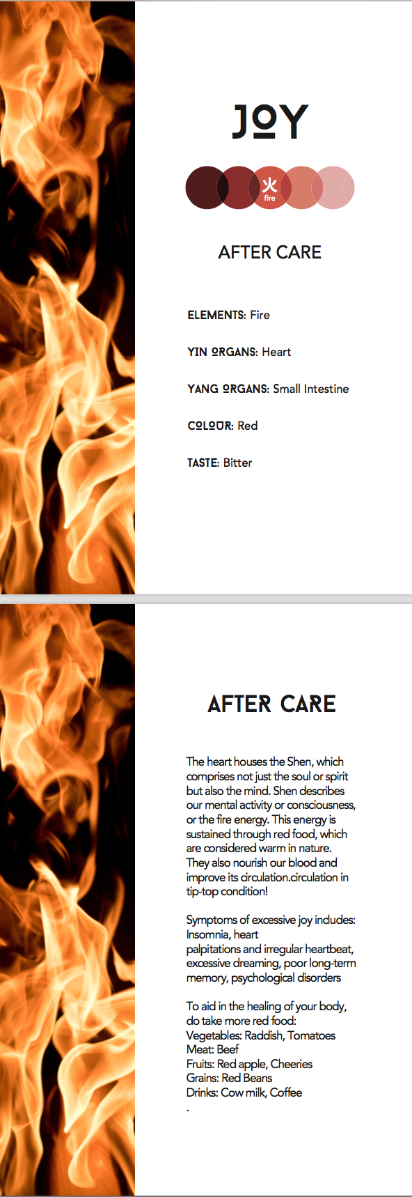
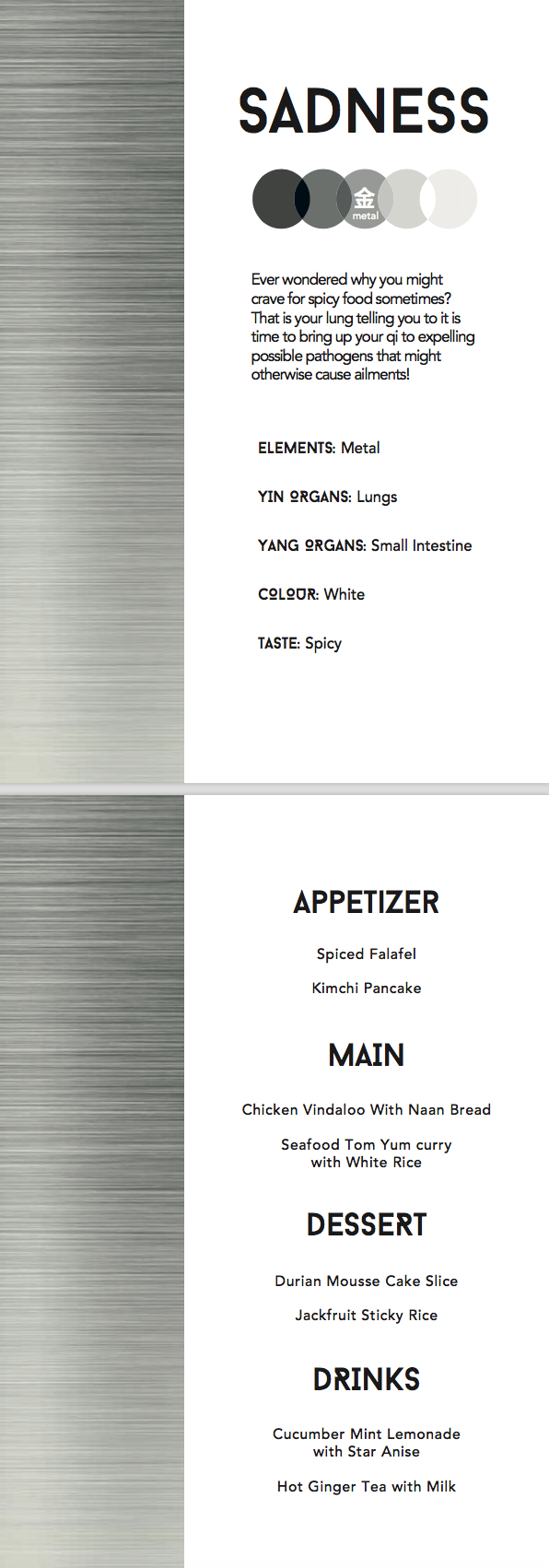
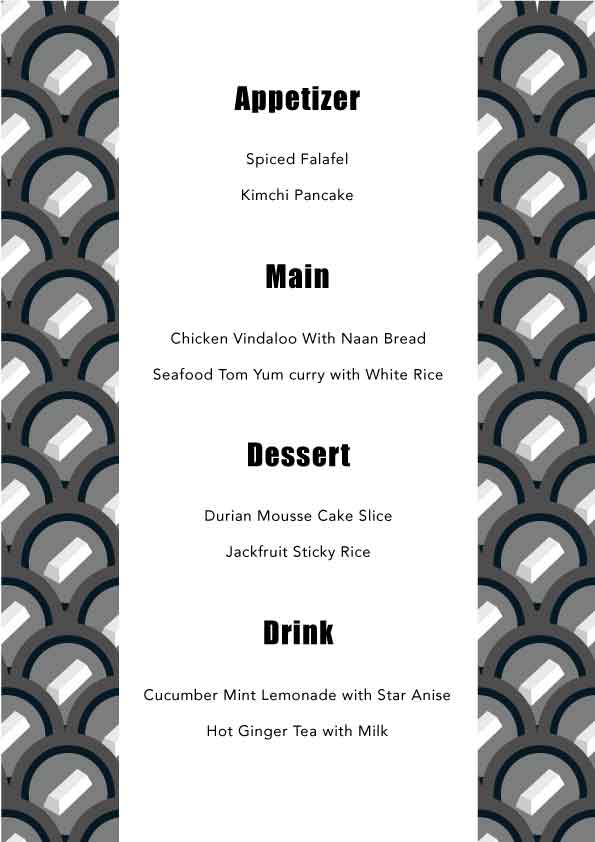
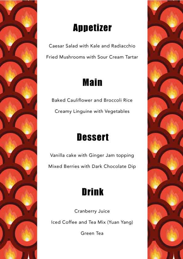
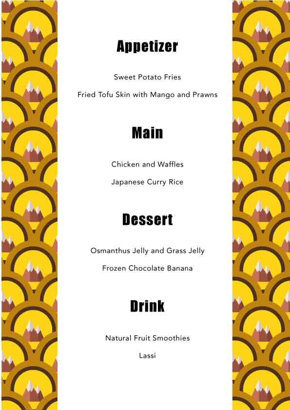
Revised menu design: (done by Rei, Advised by Ranveer)


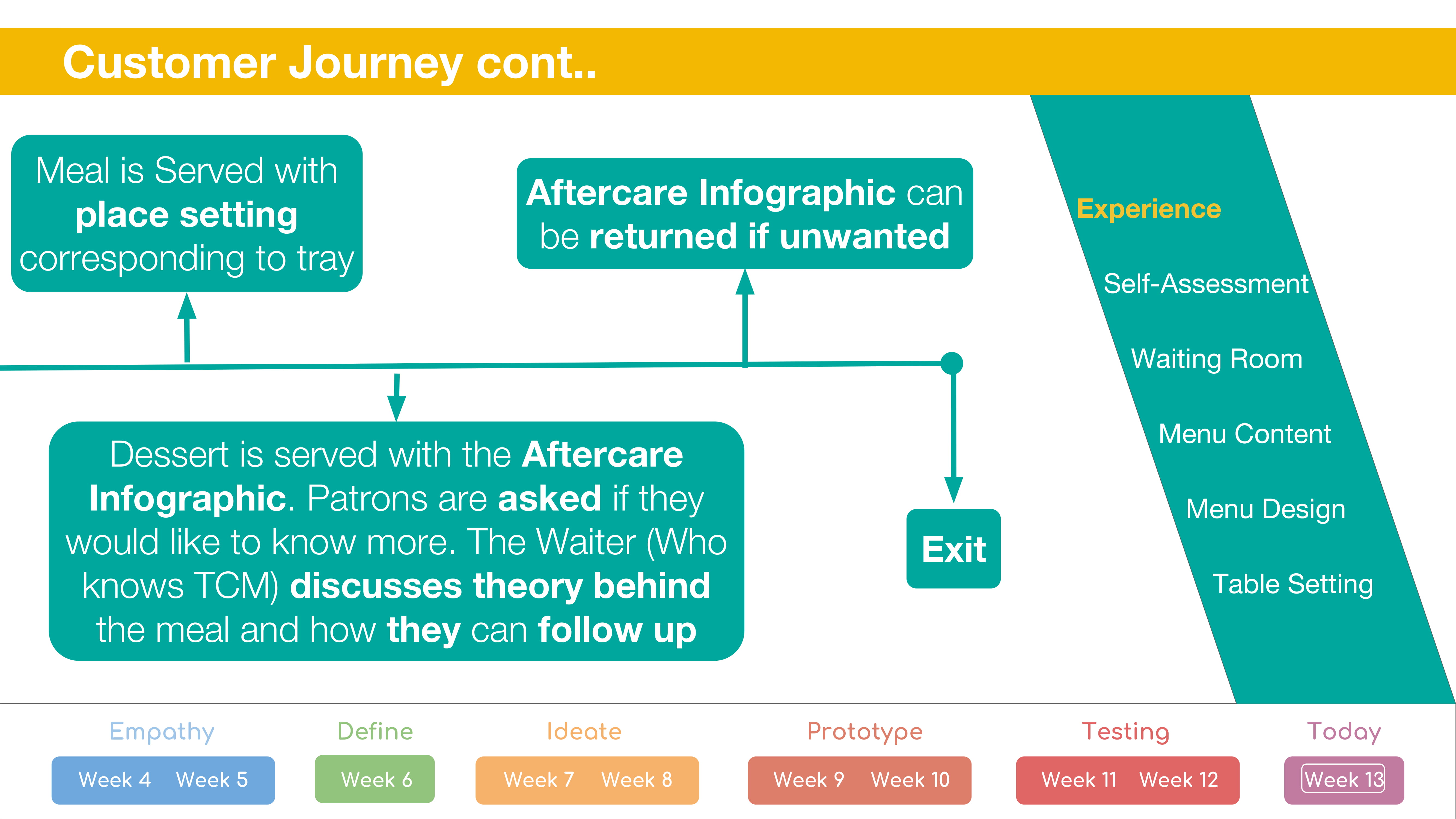
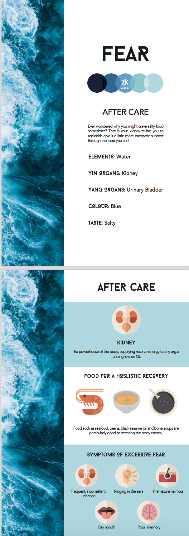
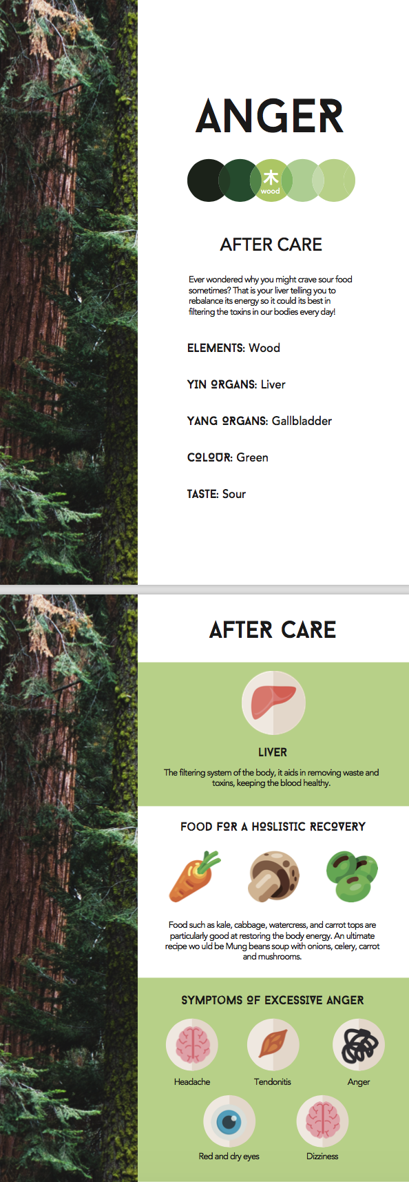
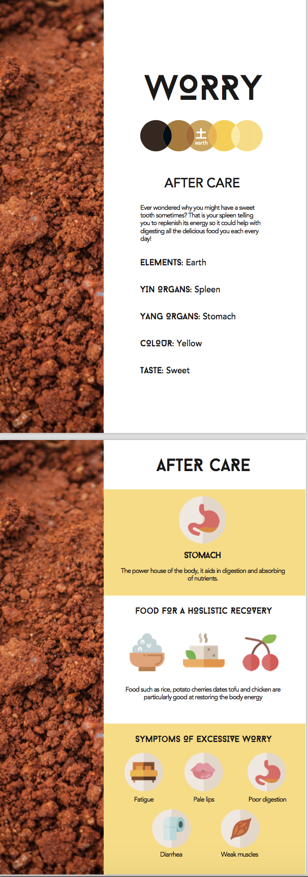
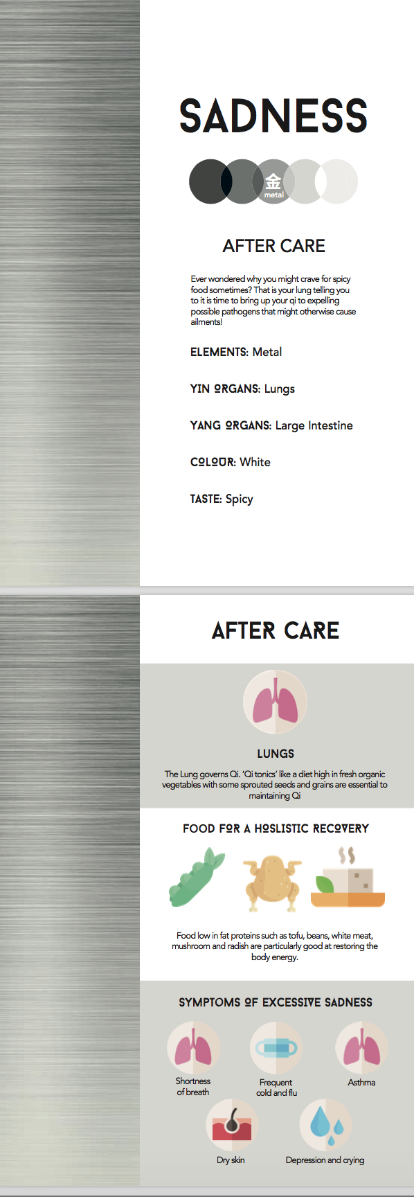
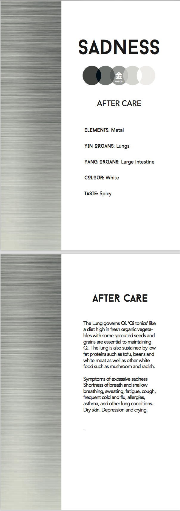
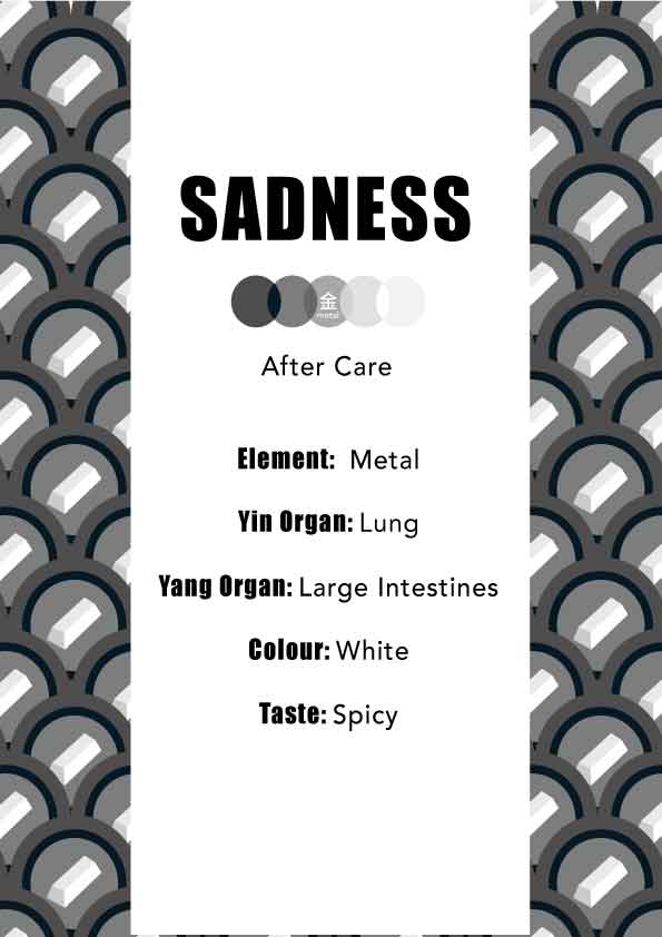
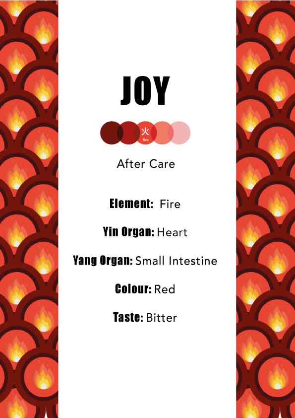
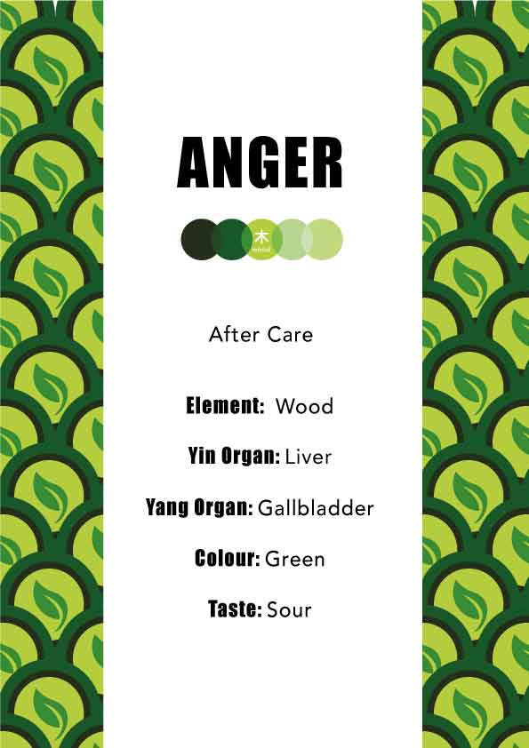
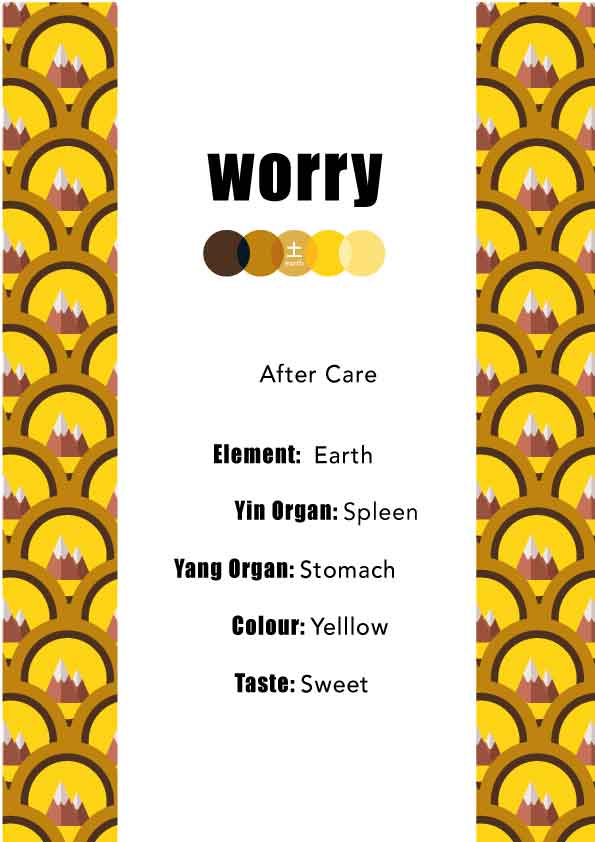
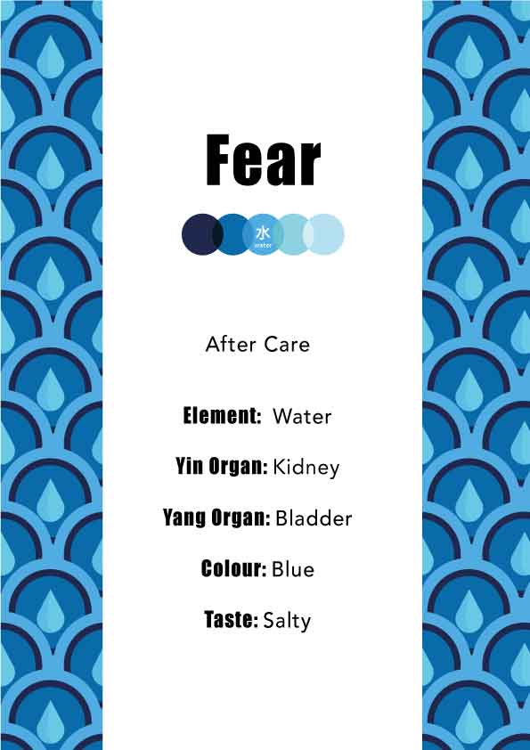
Aftercare

Restaurant Posters:


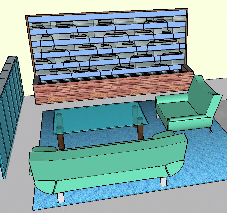
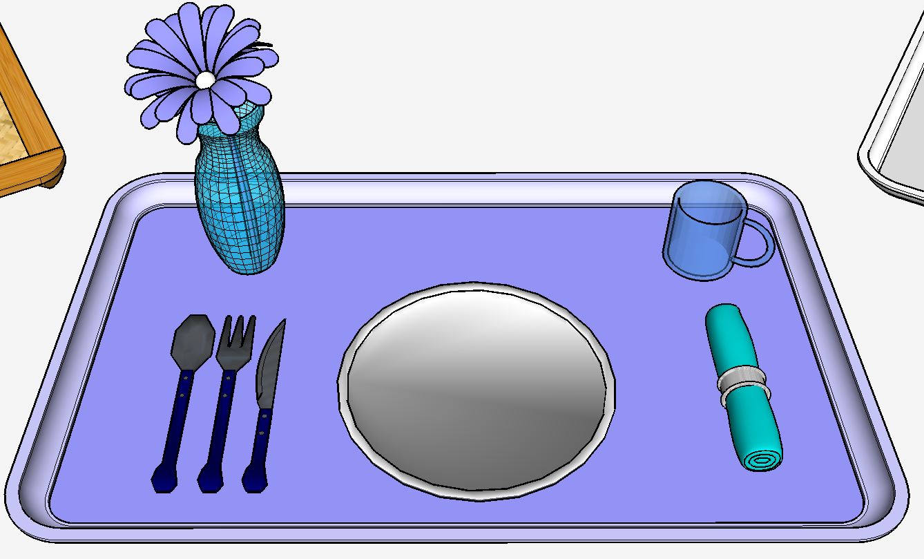
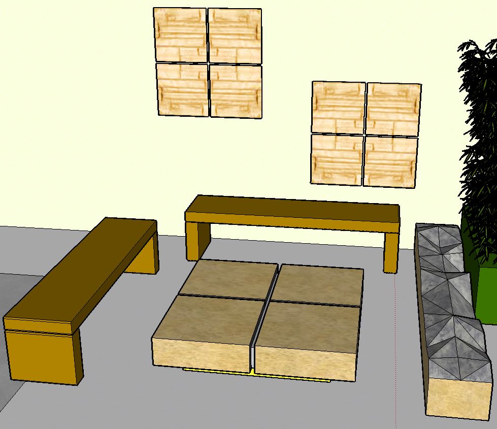
Digital 3D rendering of the resturant (done by ranveer)
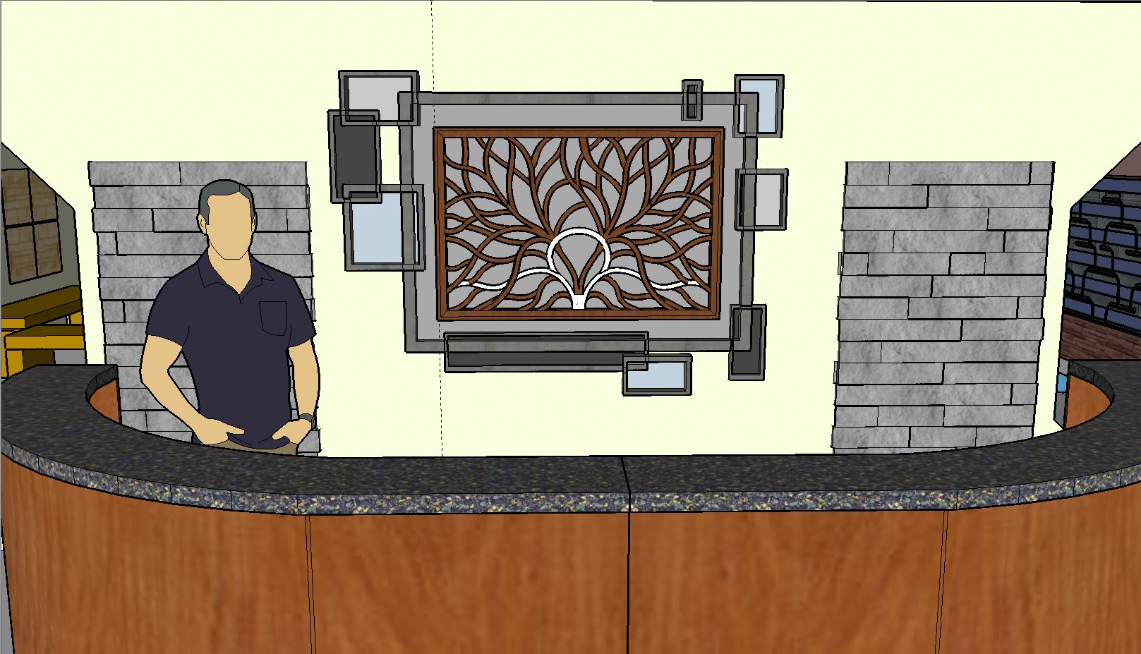

Main entranvce


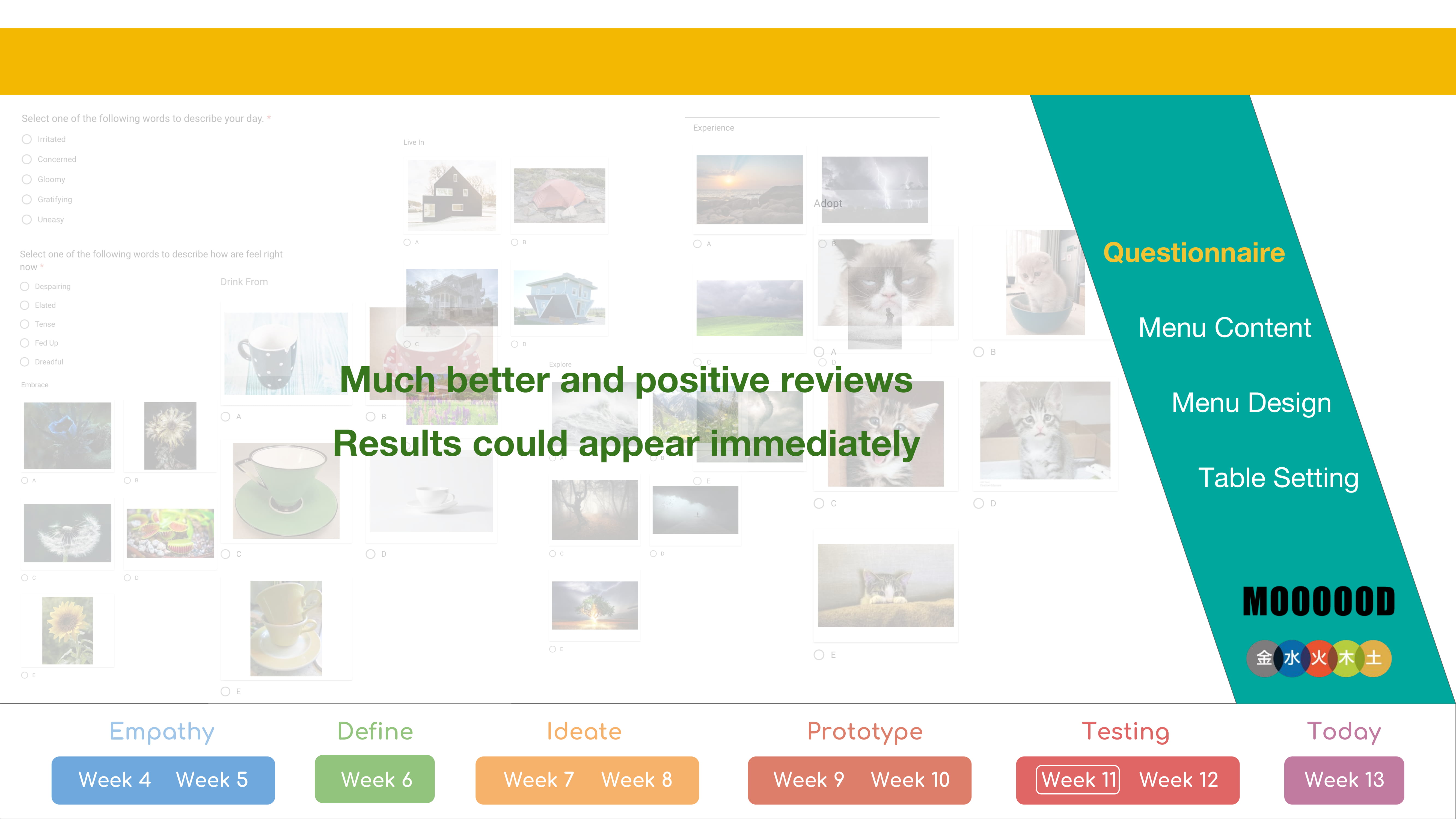
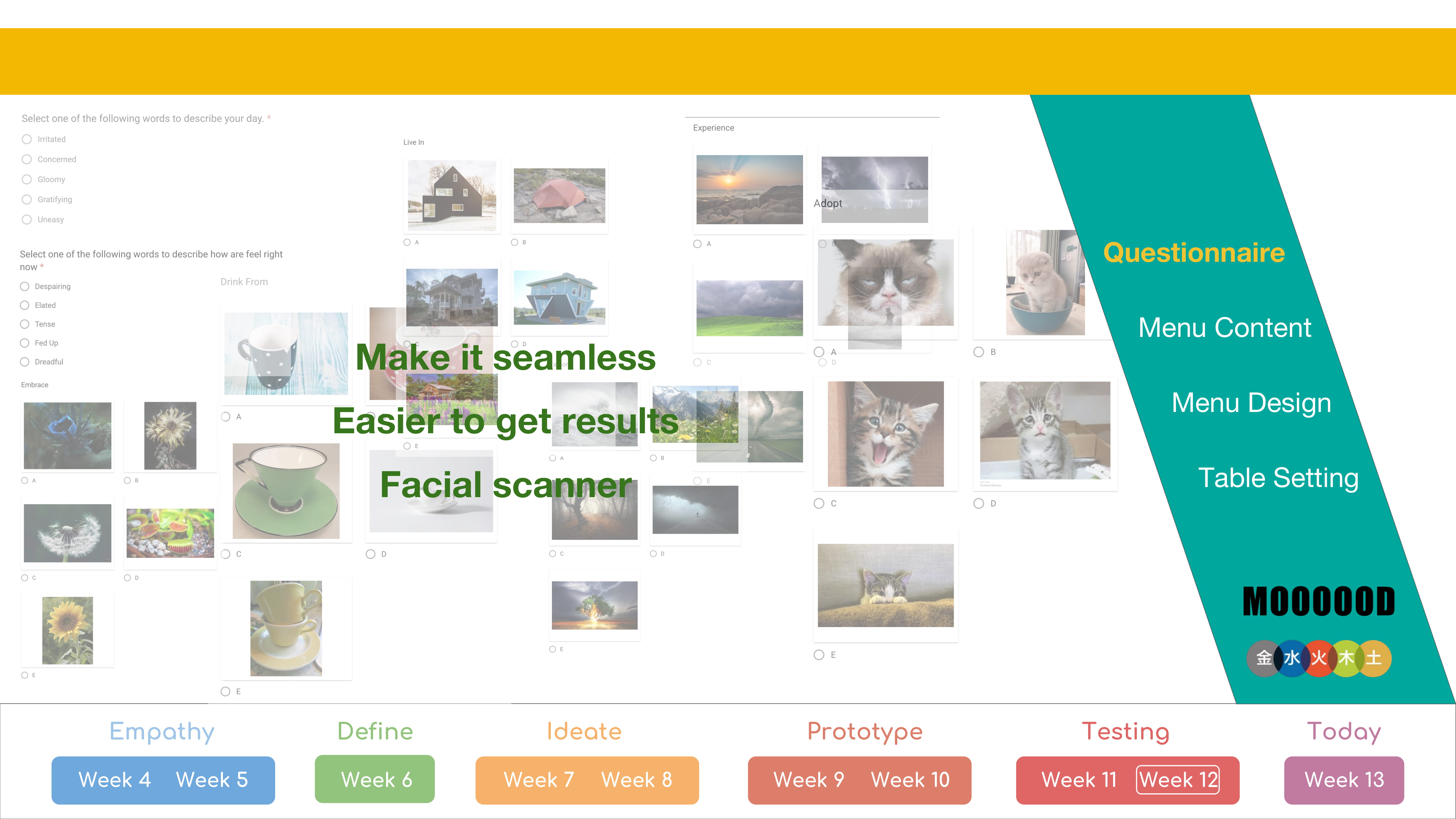
Survey:
No Changes was done to the survey
Comments:
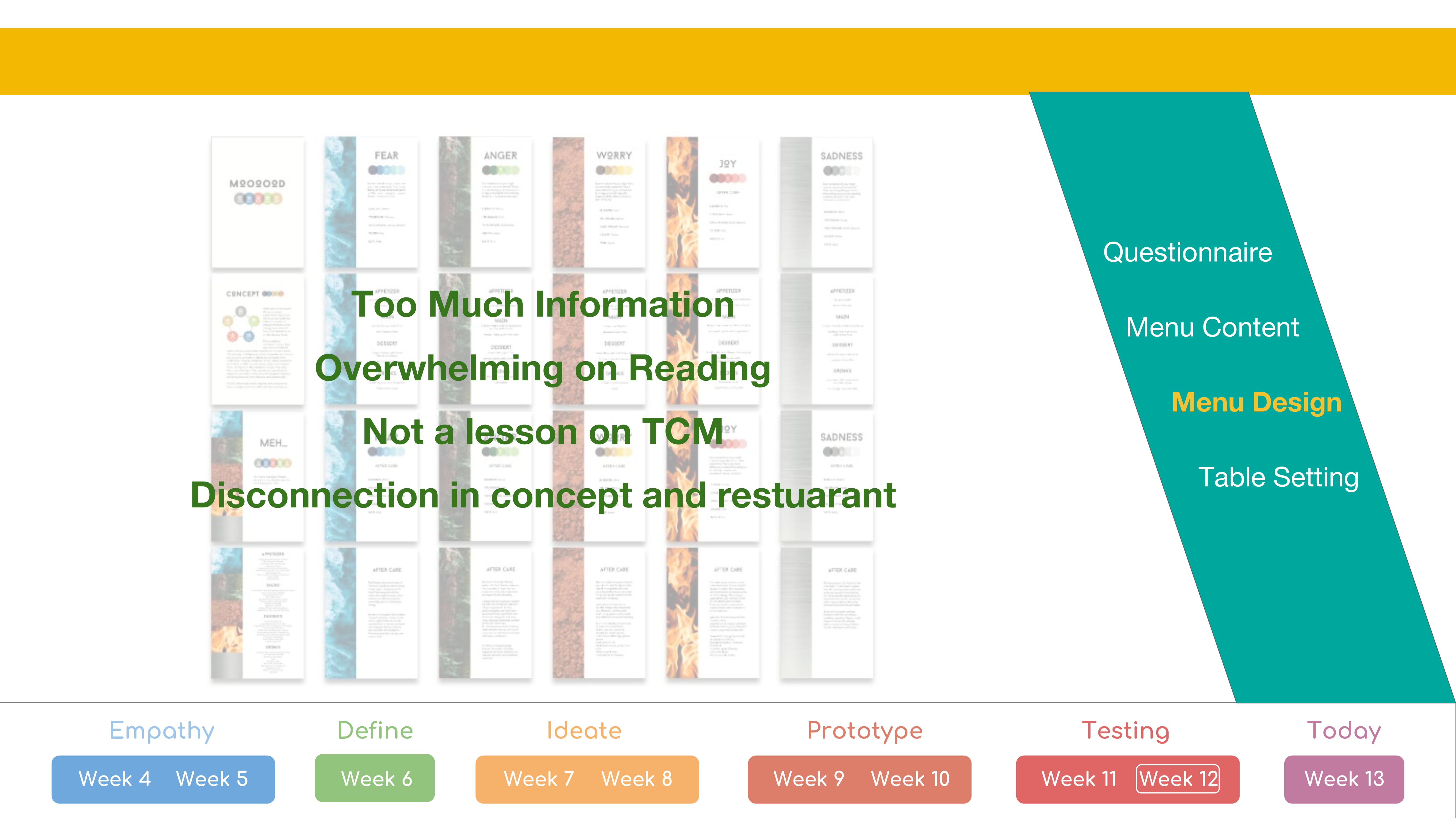
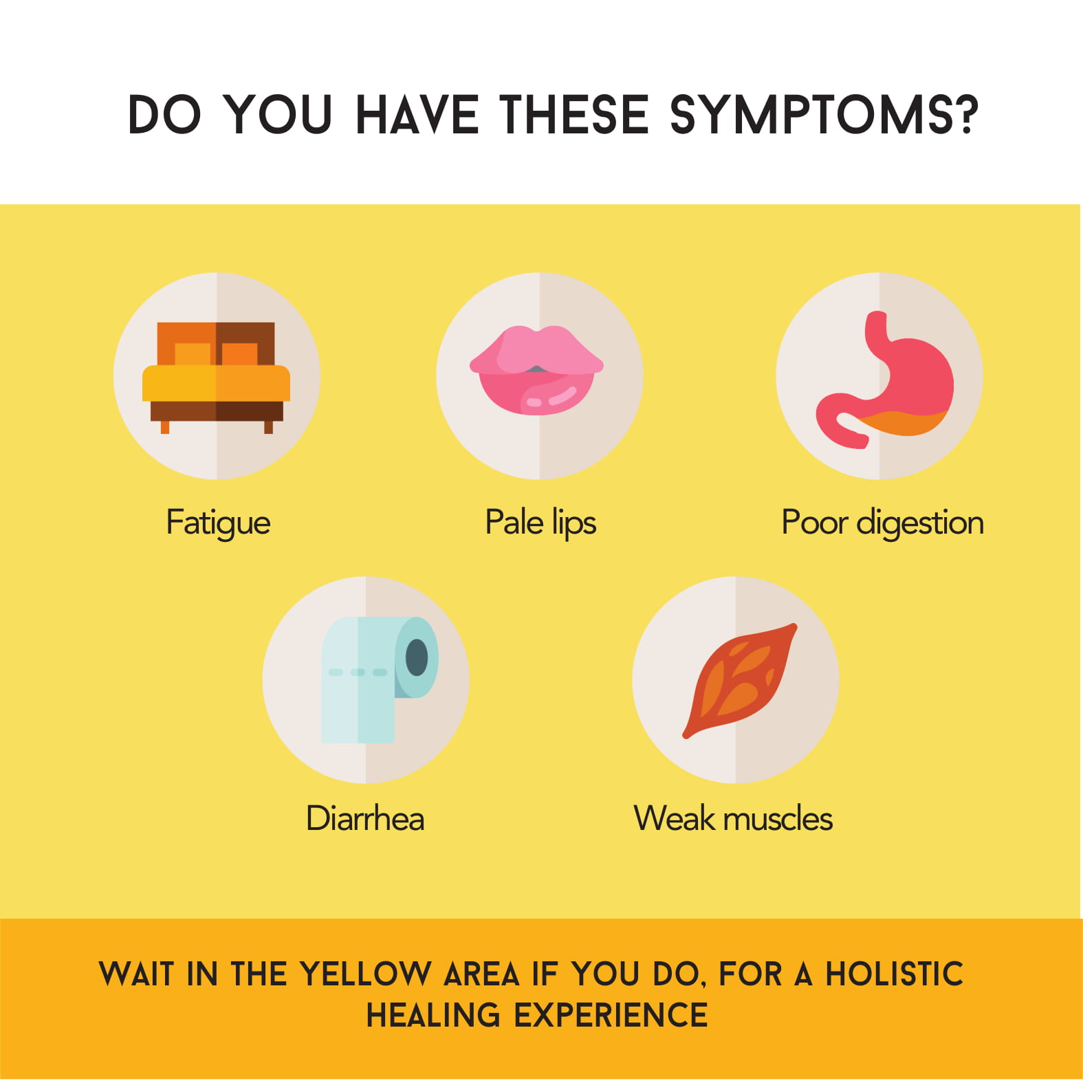
The design is a lot better now, however, there is still too many words and information. we were advised to make it into an infographic to retain the information given while cutting down the words.
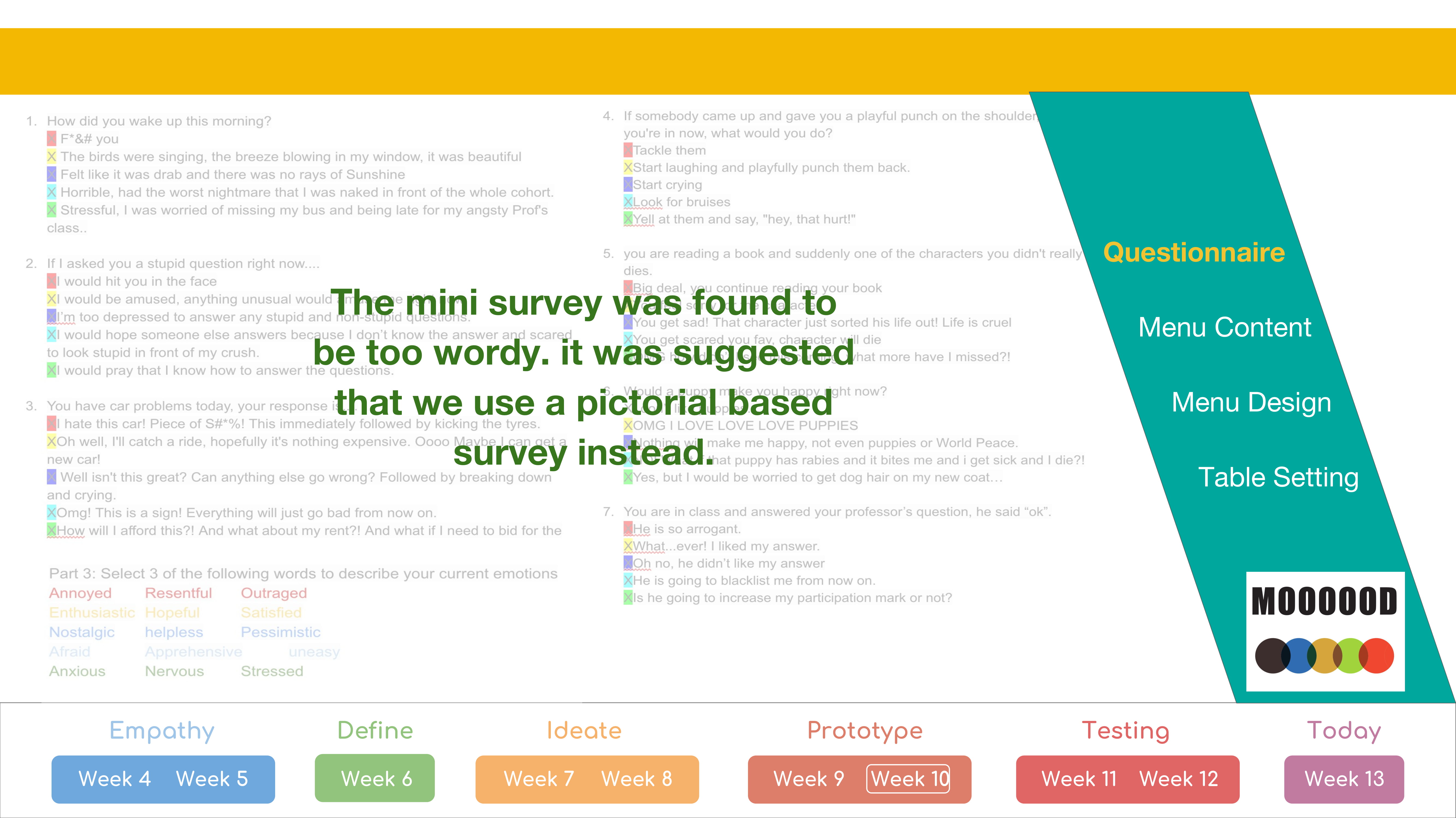
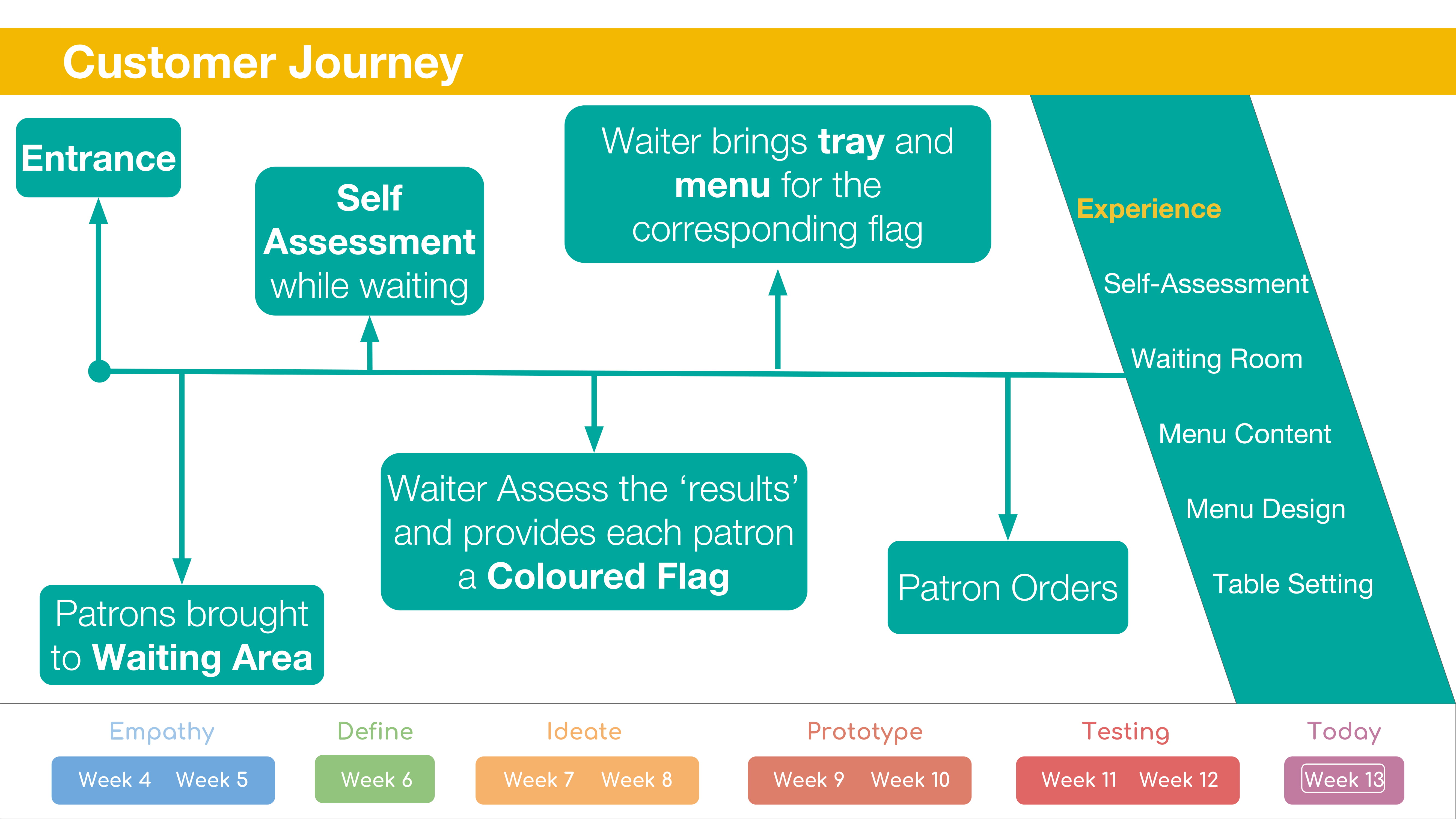
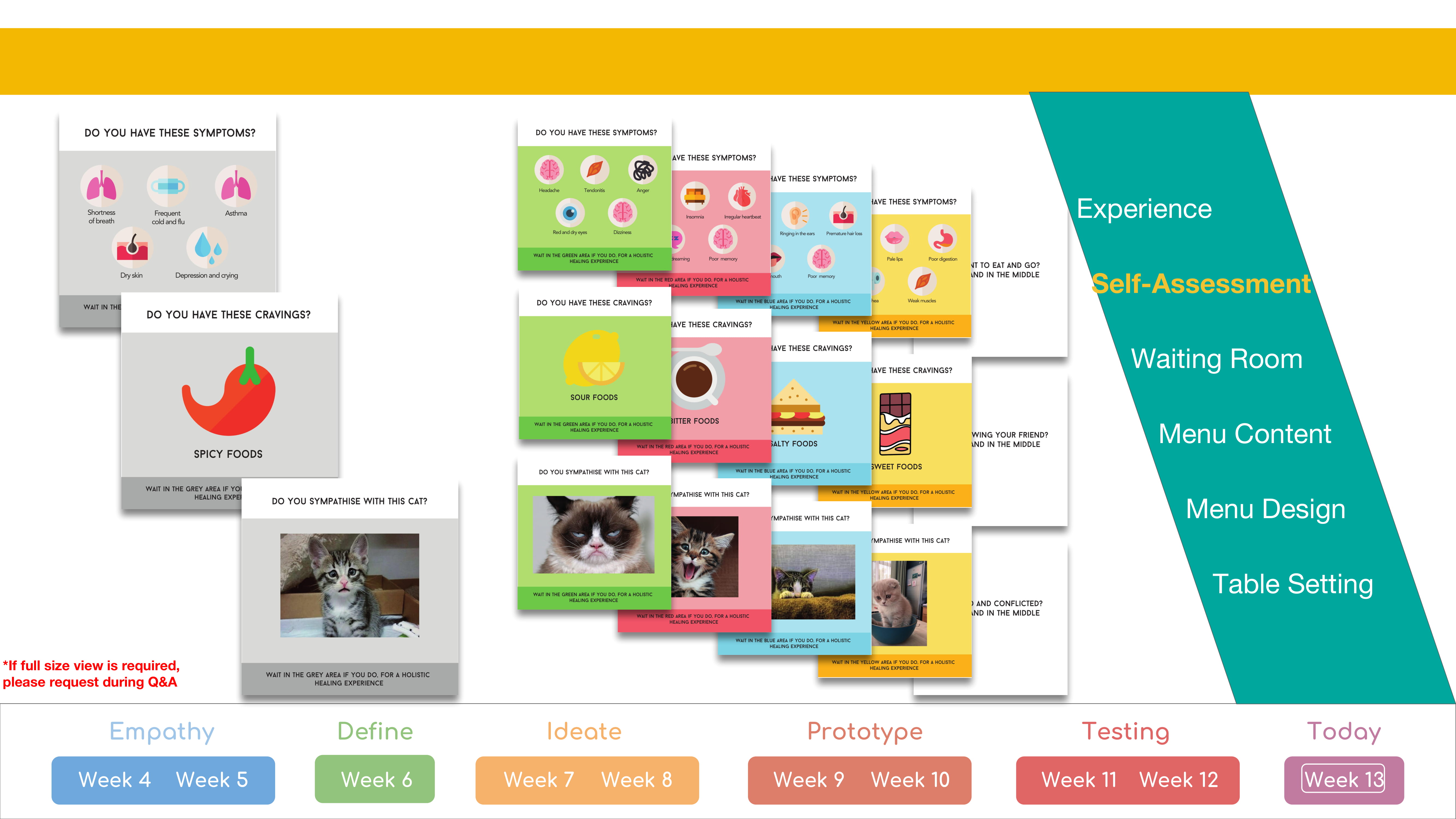
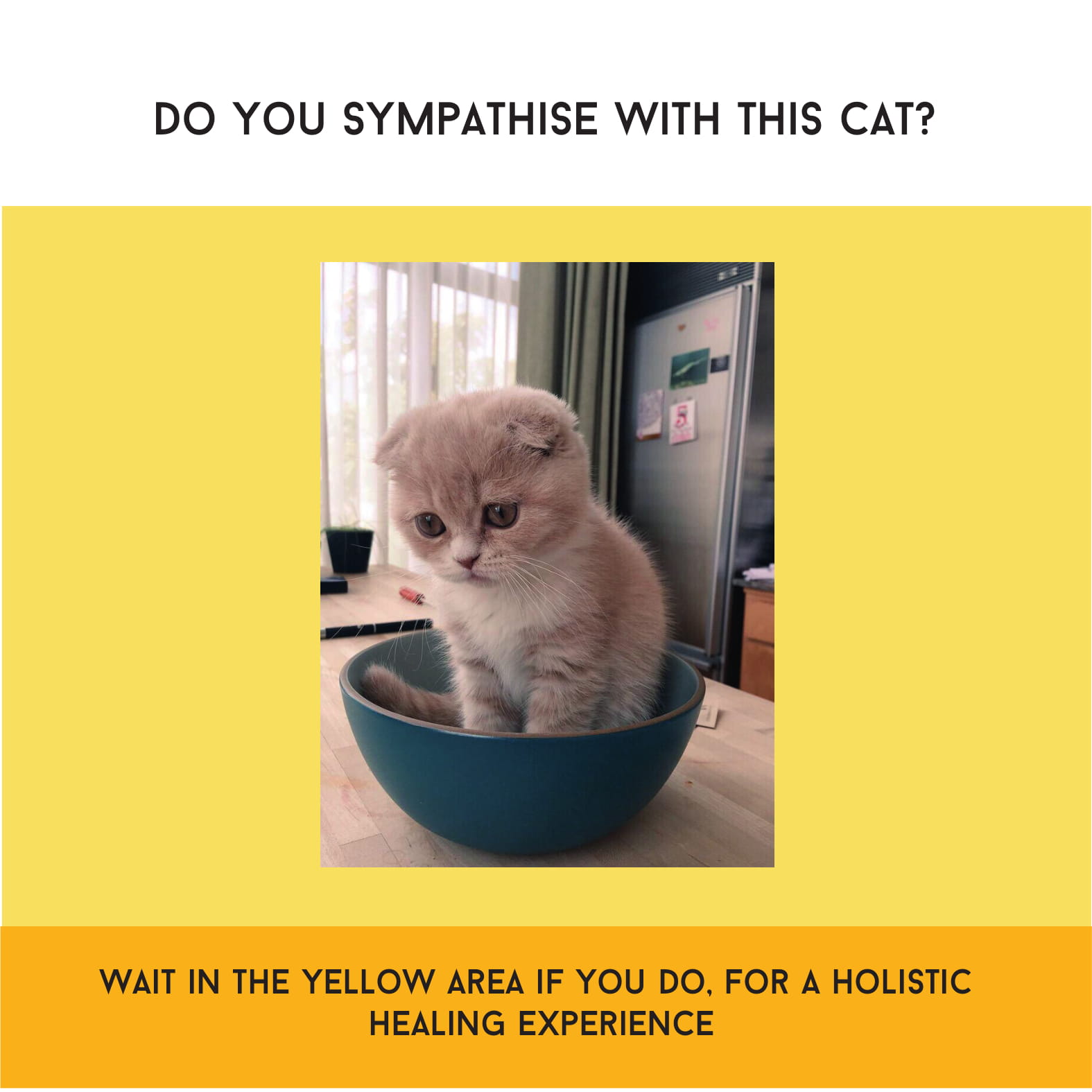
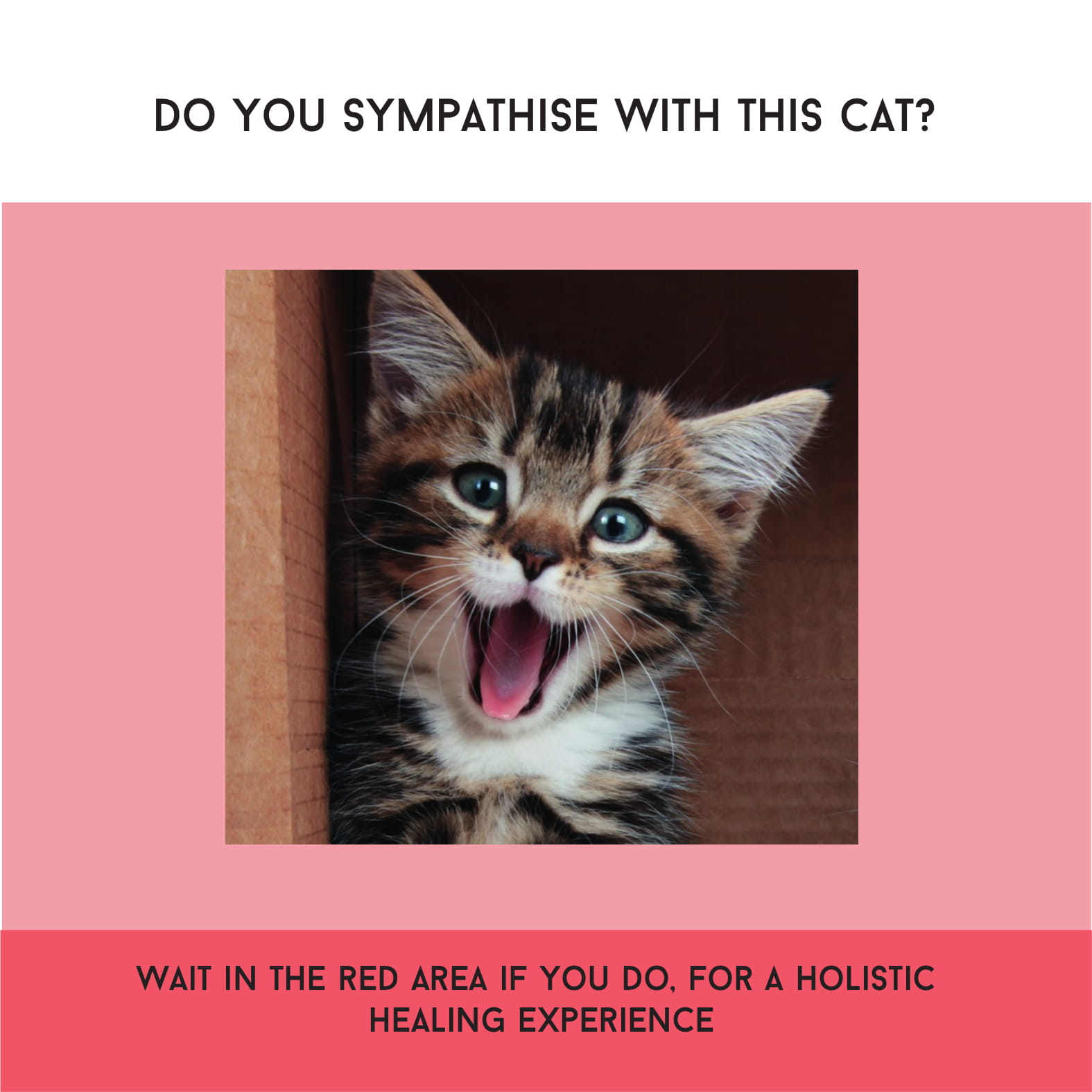
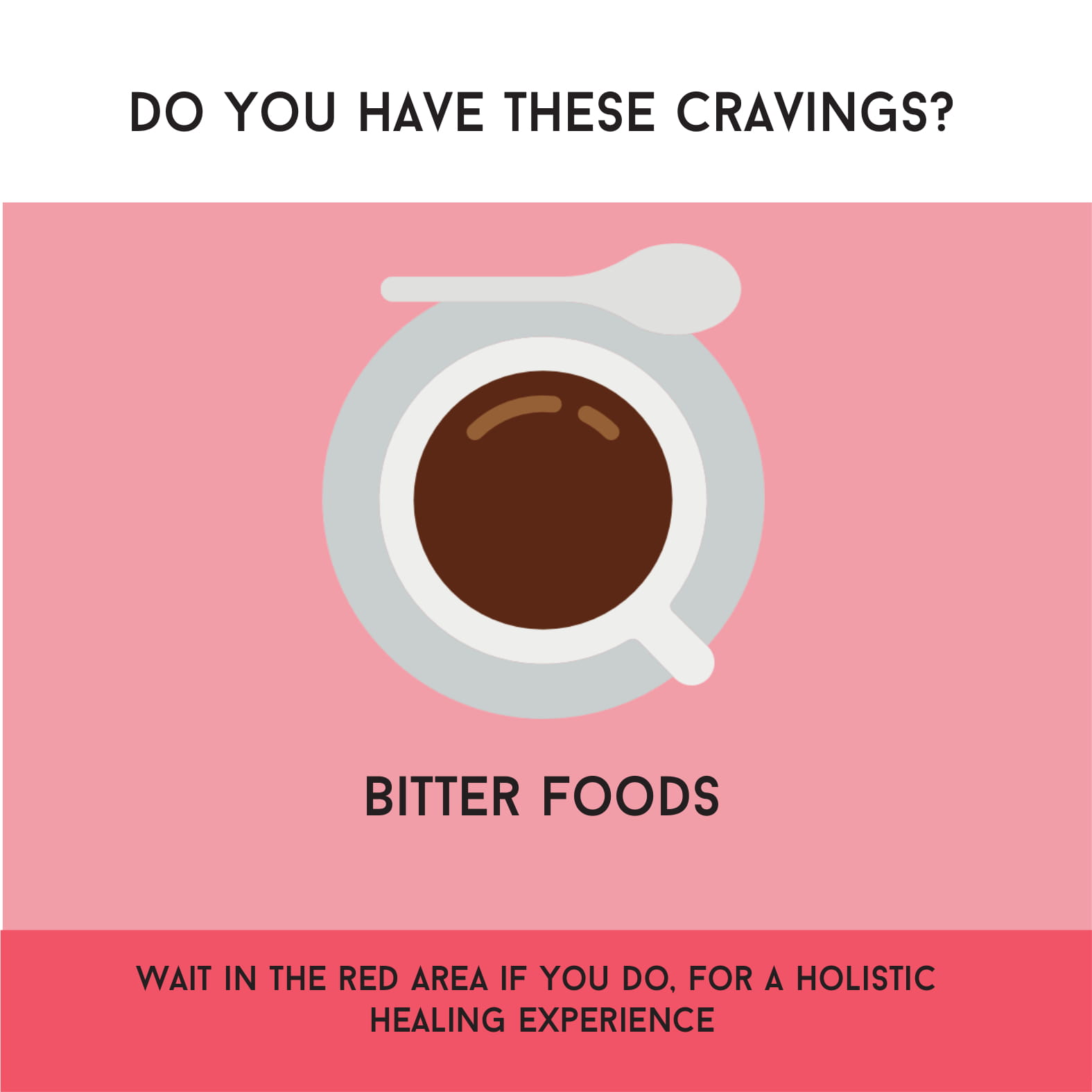
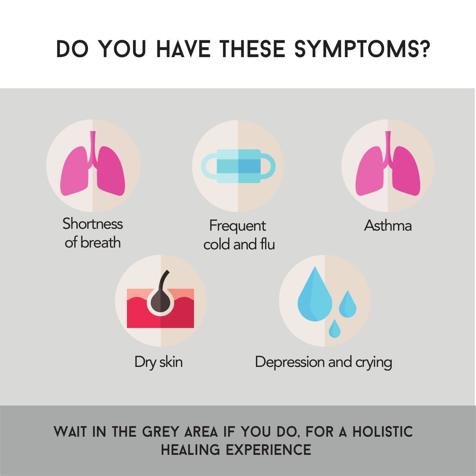
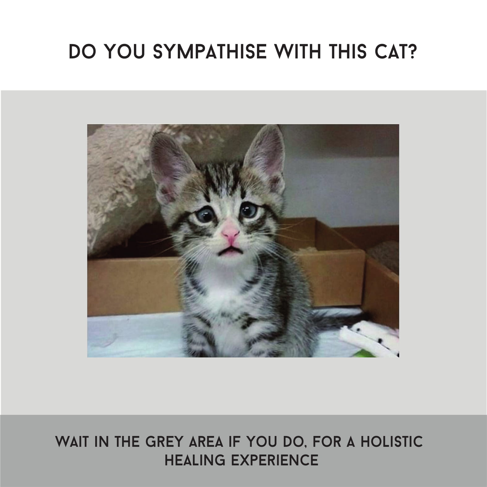
The Survey was found to be annoying and we were asked to make it more seamless. we decided to approach it more passively, by having posters in the waiting room. we realised that since we are dealing with millennials, we had to approach TCM in a more subtle way. If we were to push the idea onto them, they would instantly reject it. Hence we need to approach it more subtly.
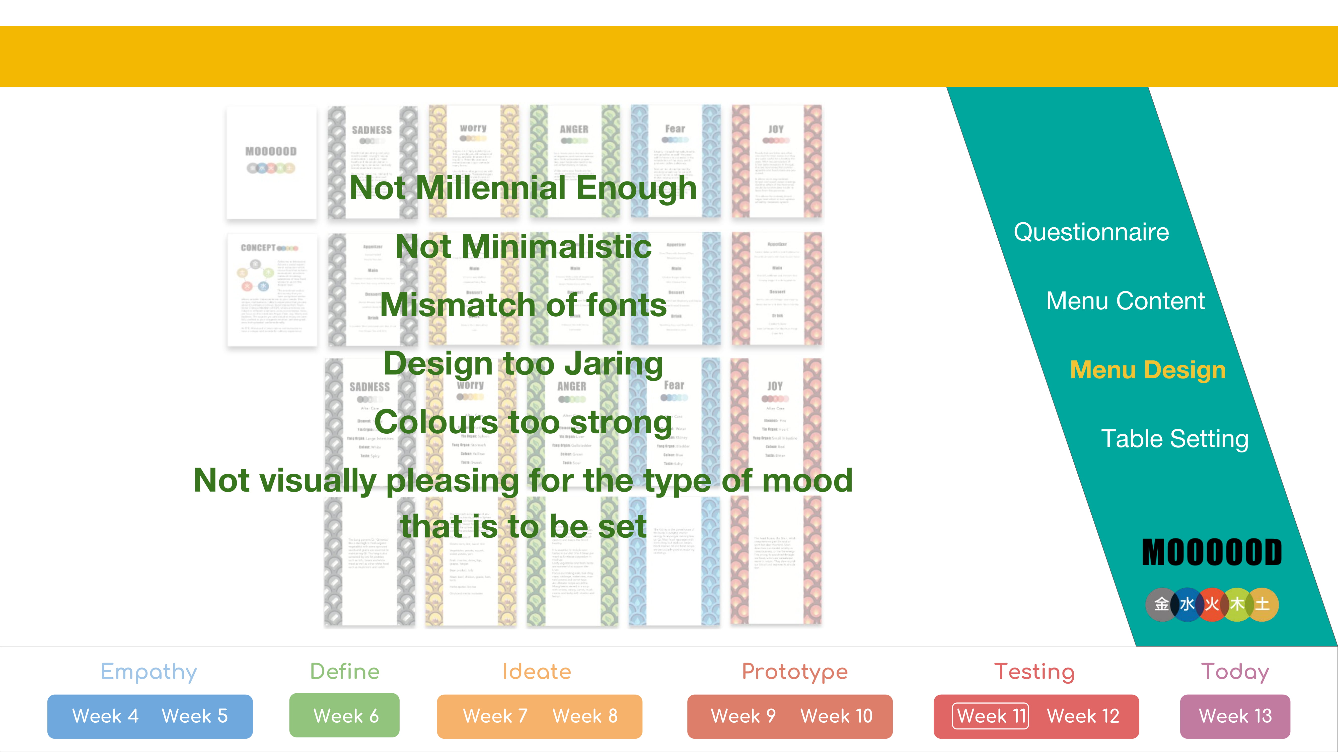
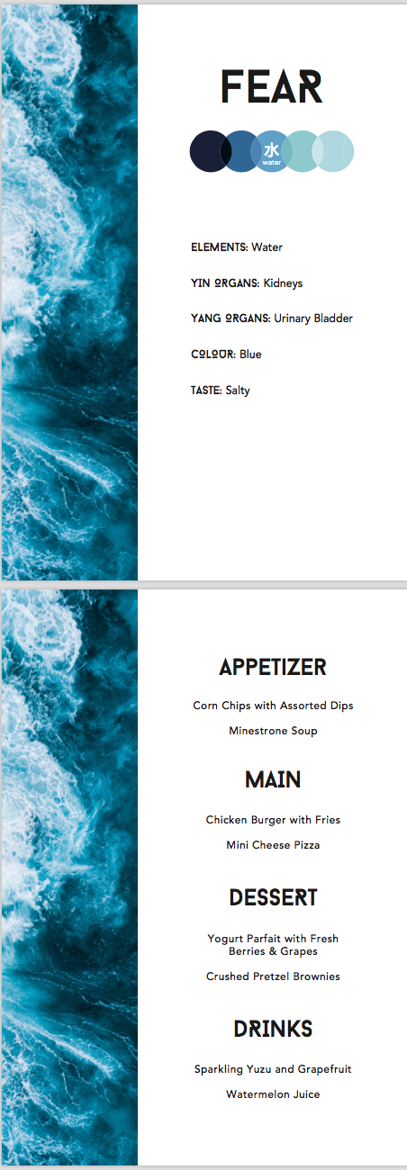
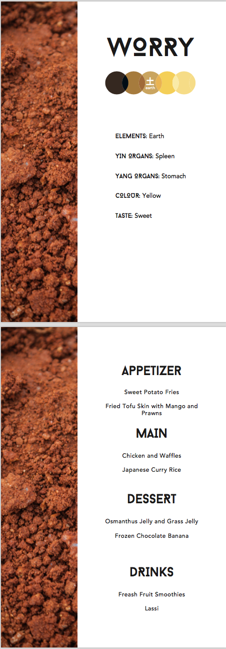
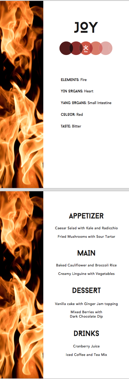
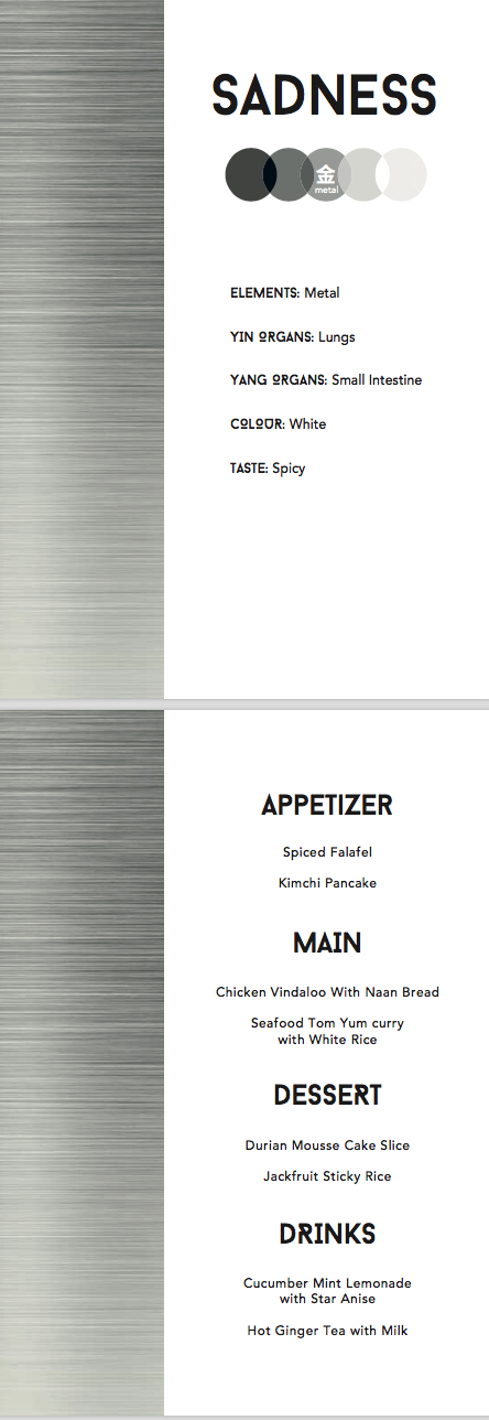
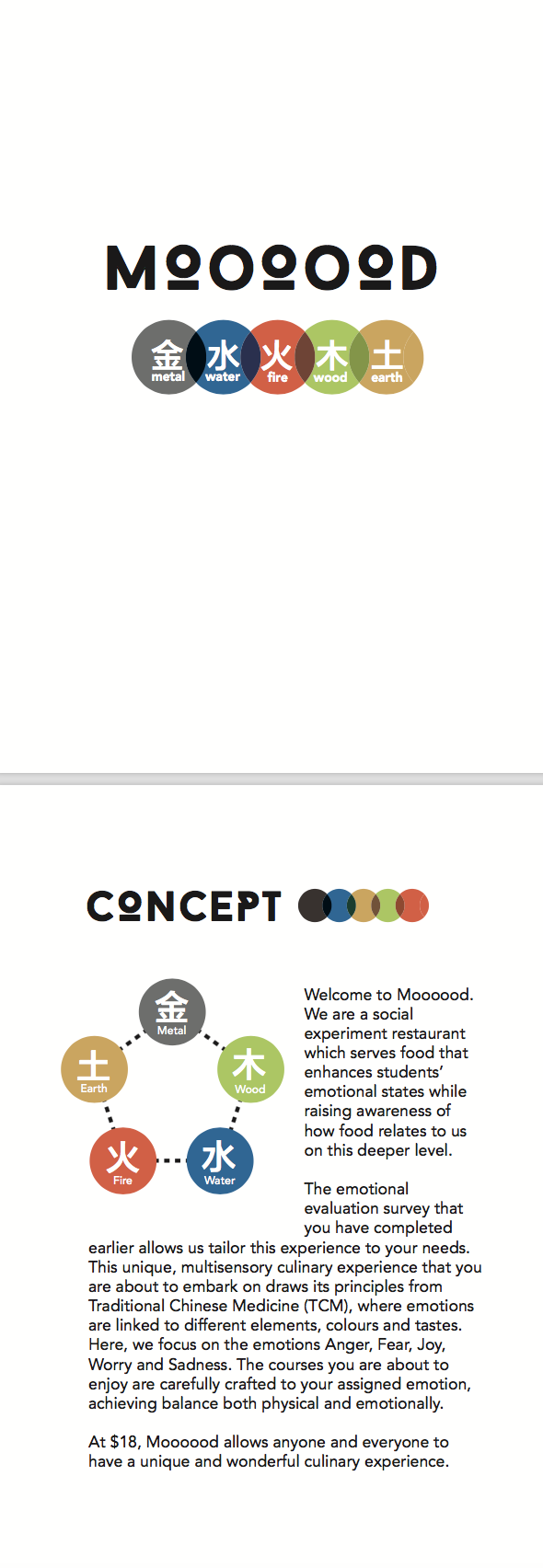
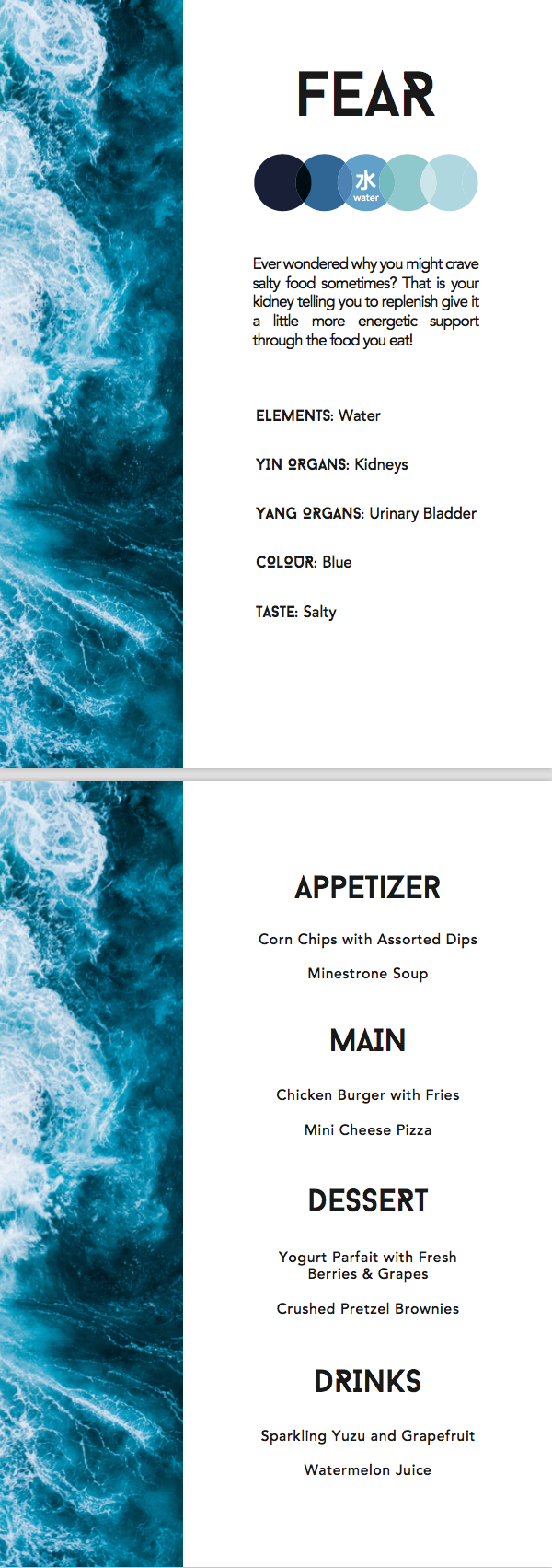
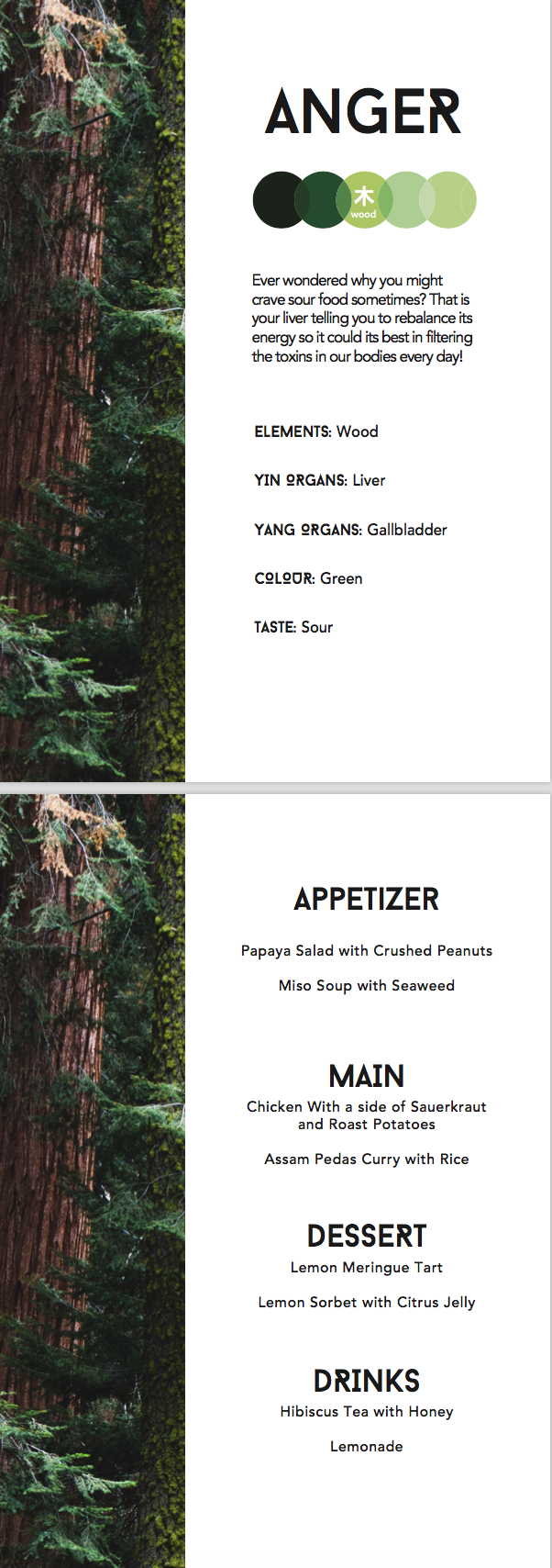
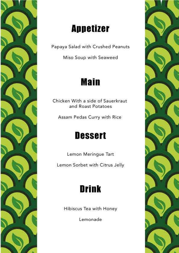
Menu Design (done by Rei advise by Ranveer)


Comments:
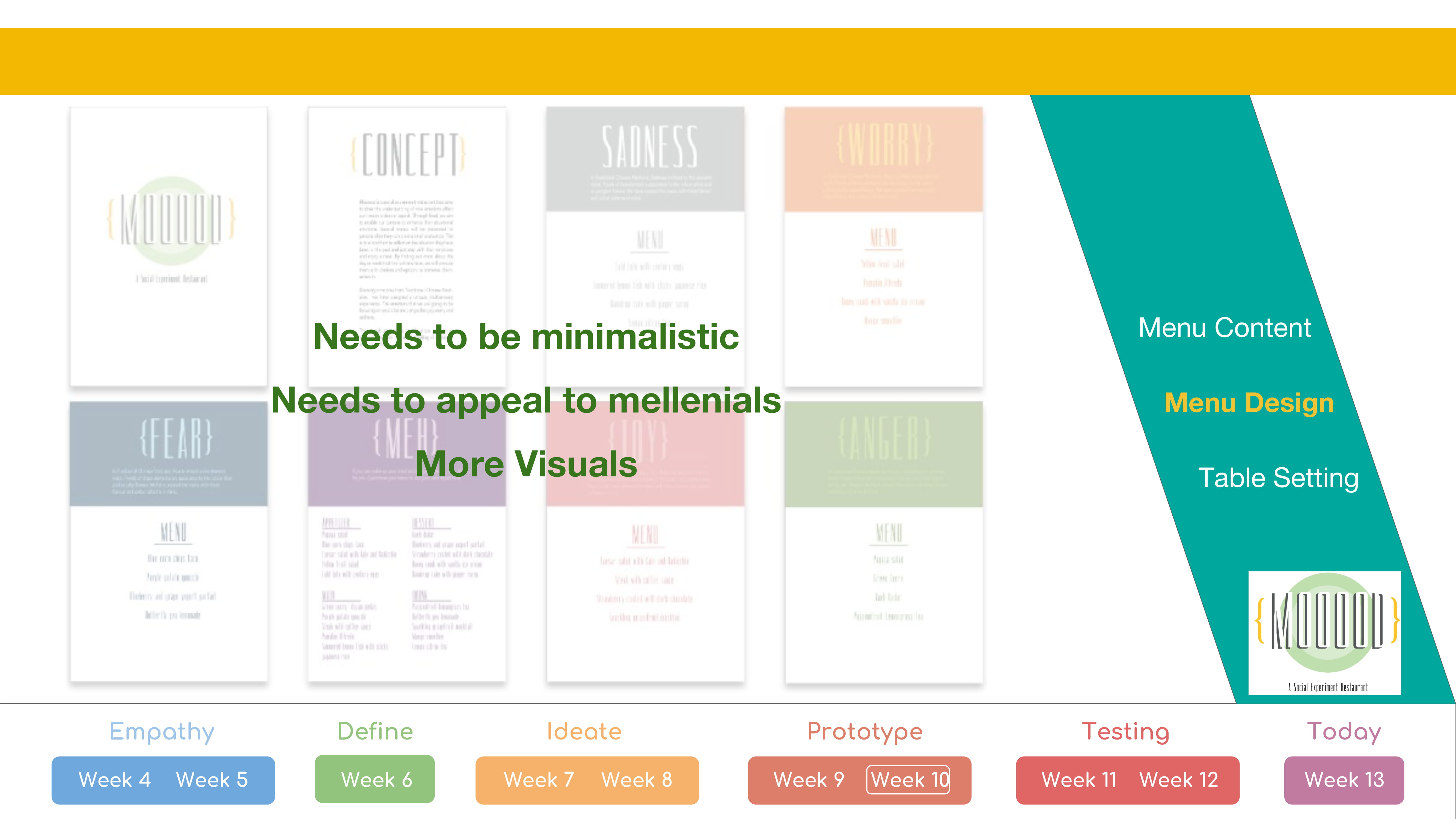
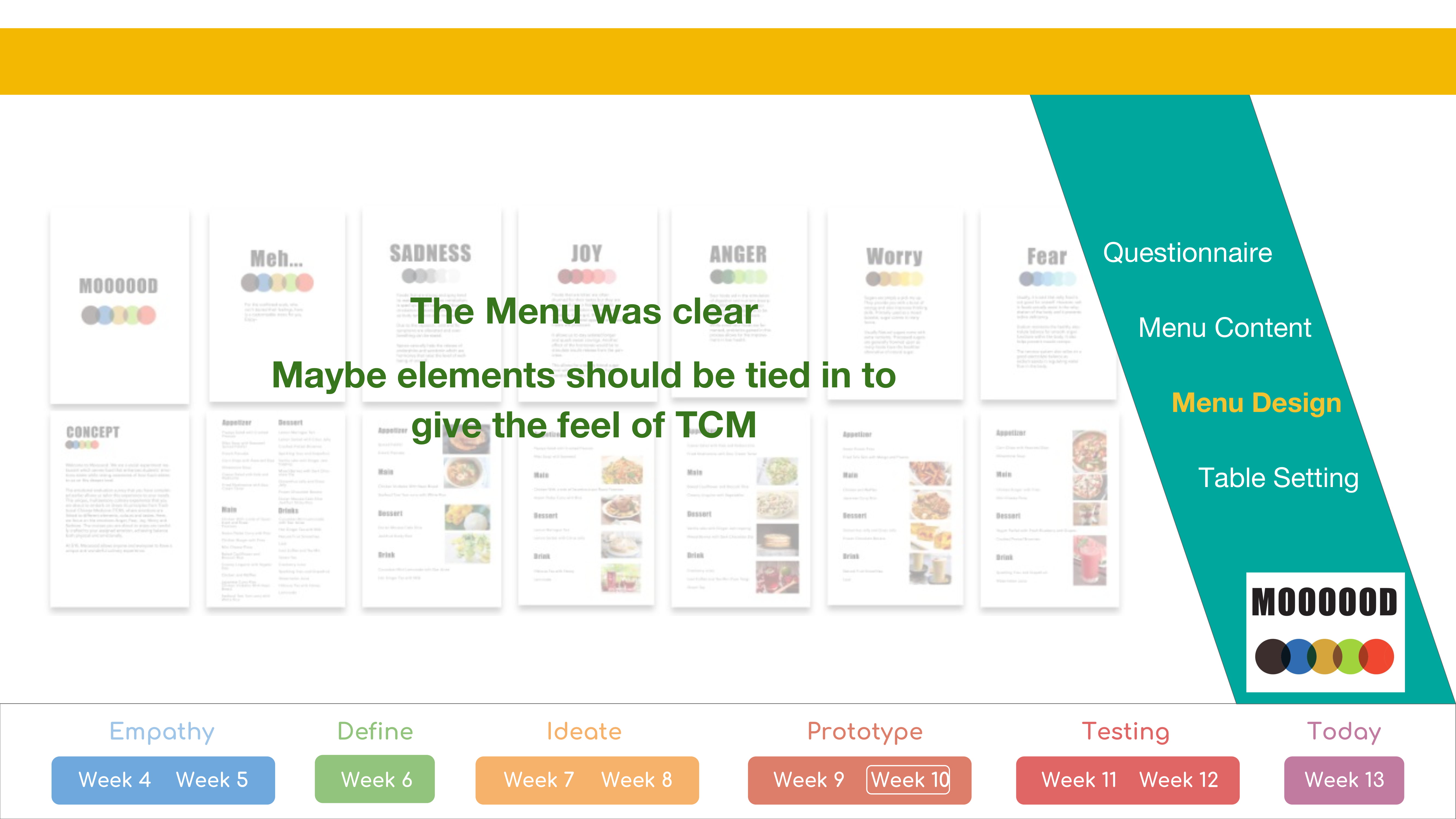
The Design was too Jaring, with strong colours. It was found to be visually unpleasing for the type of mood that is to be set.The design was found to be no Millennial enough. images of the elements were advised to be incorporated while making everything more clean and minimal.
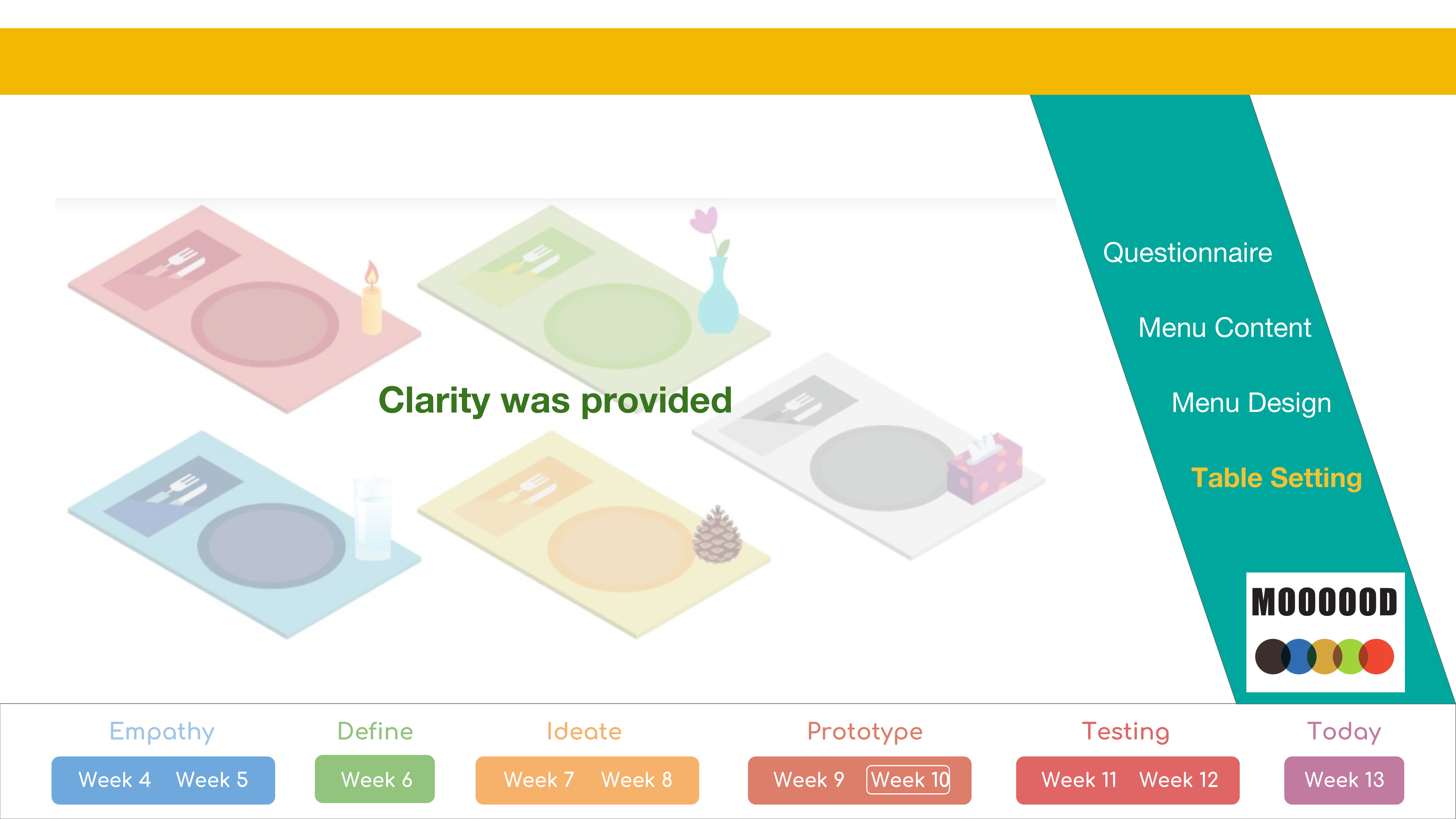
The survey was well received.
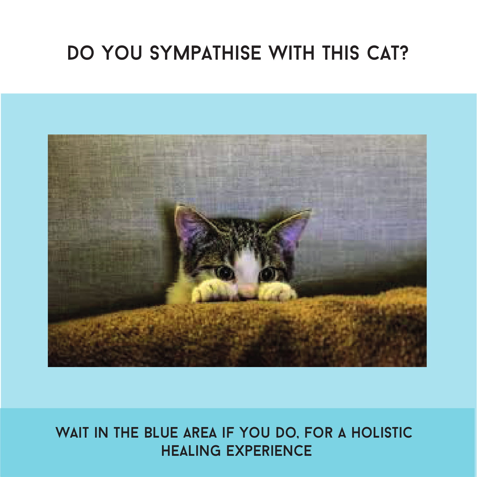
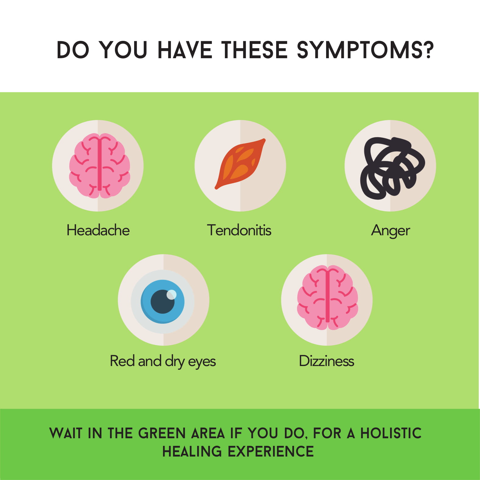
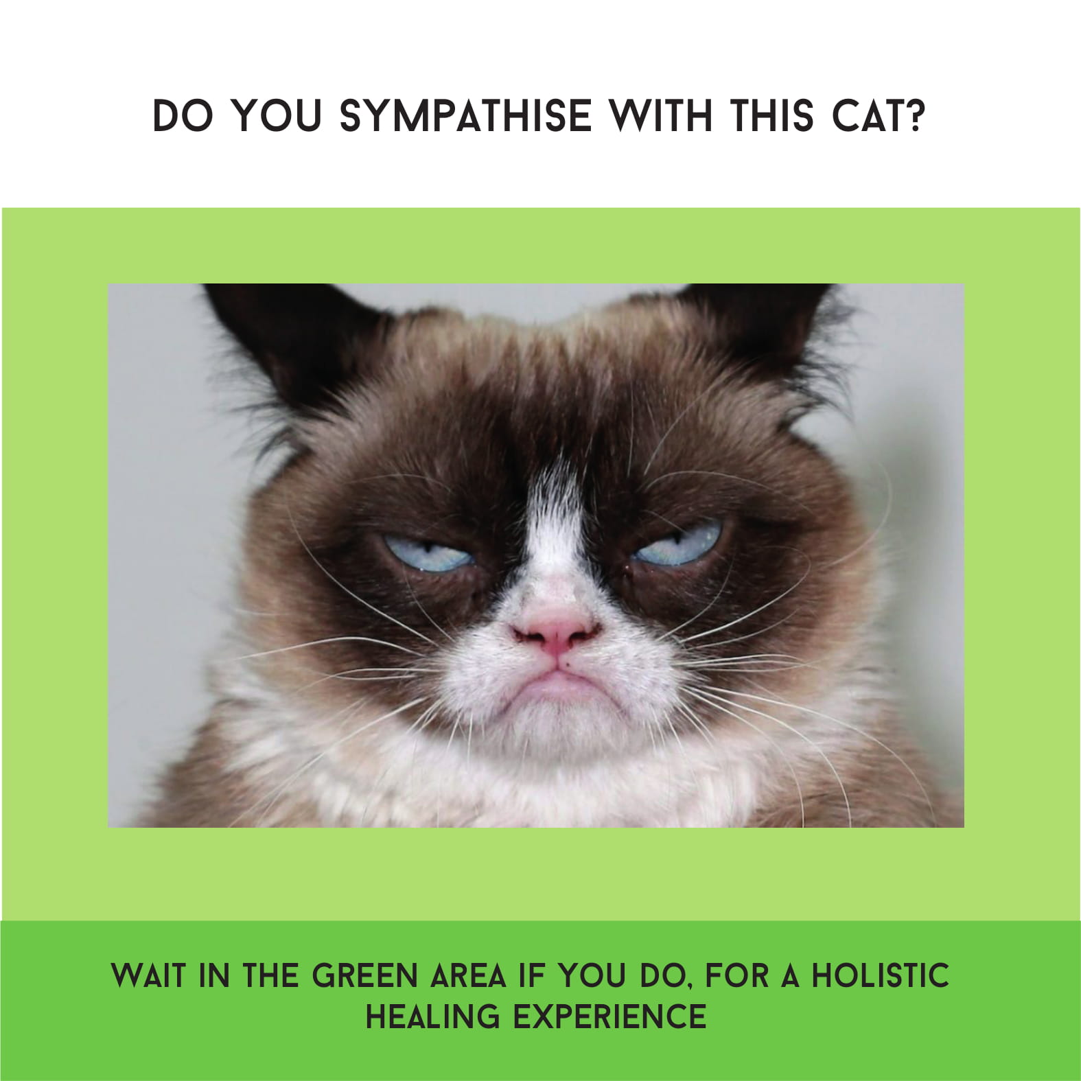
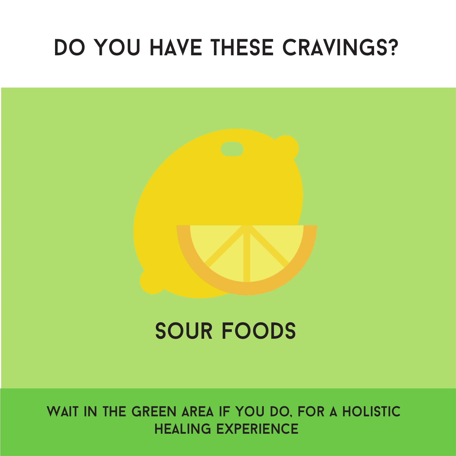
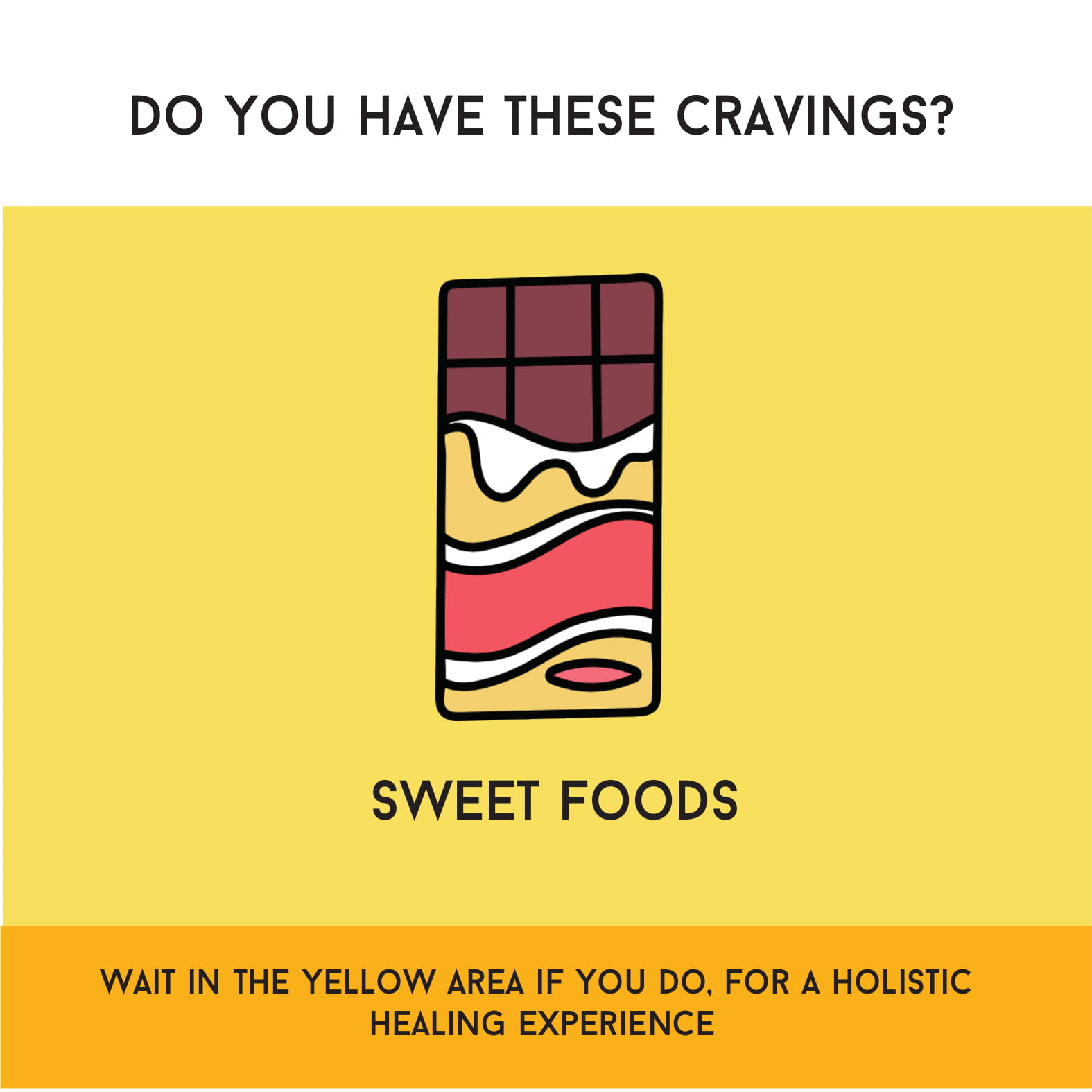
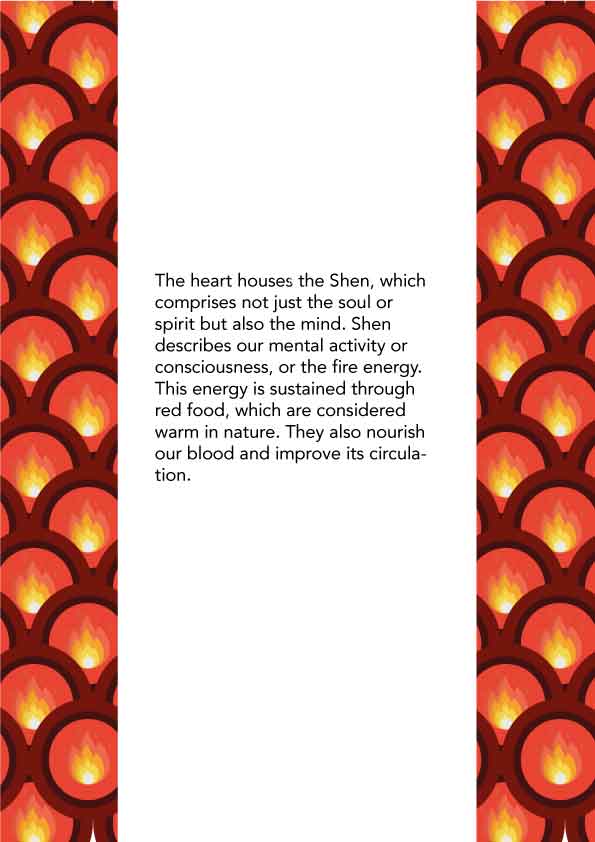
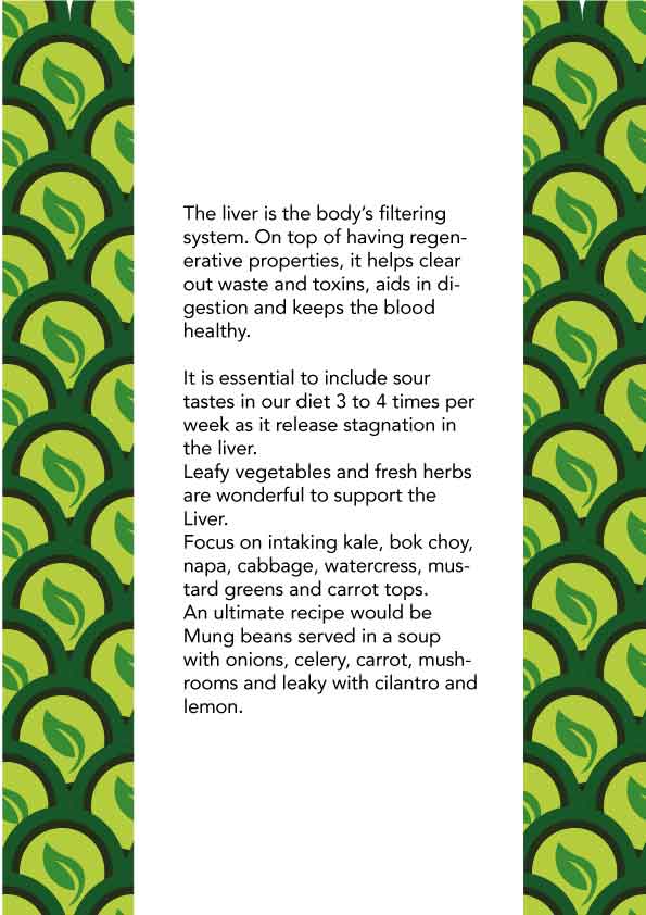
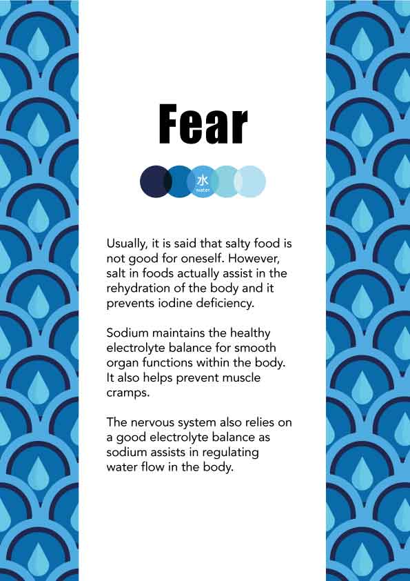
More information such as craving and symptoms are to be added to the aftercare card.


