Designing the koi fishes
By this time, I was really lost and decided to go back to the basics with black and white: 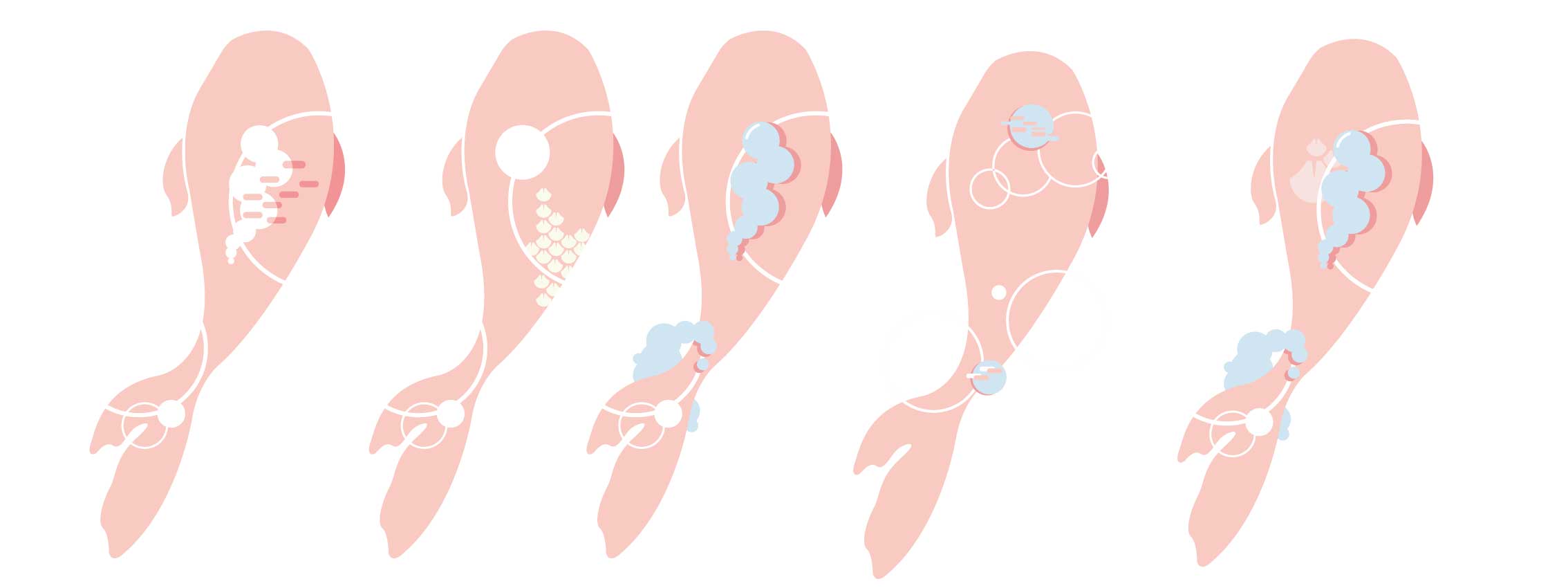
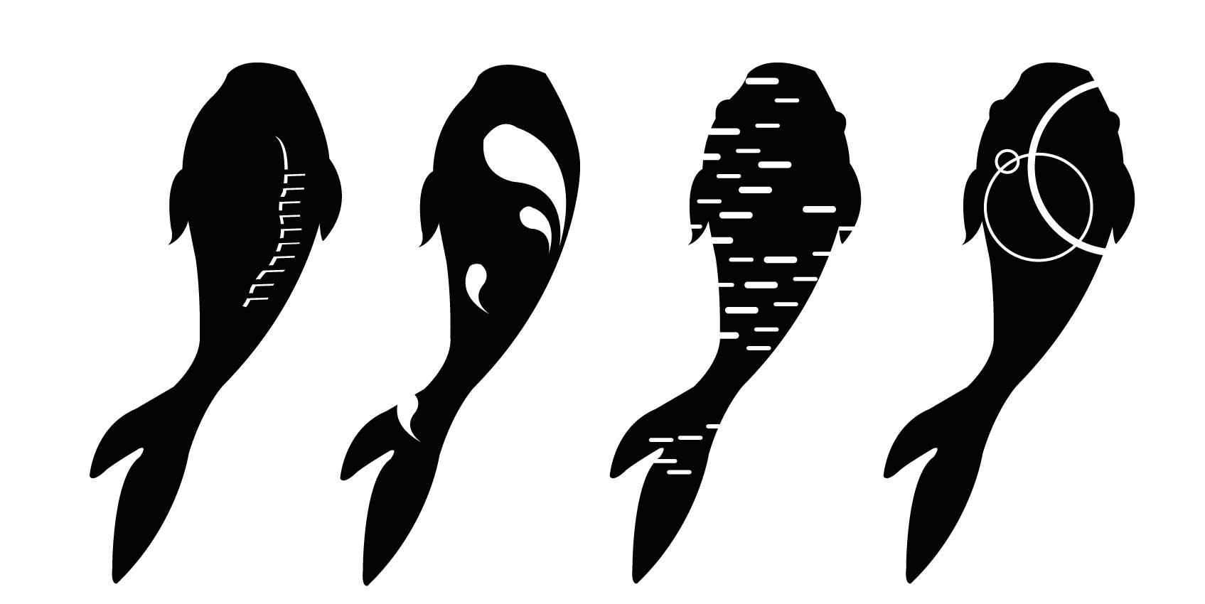
So I came up with these 4 designs, where I tried to incorporate the waves and ripples into the fish. I also tried to suggest the dynamic movements and form of the fish through the motif. Then I begin adding colour:
Design 1:
Design 2:

Among these two designs, I felt that they were rather plain, and wanted to play with patterns.
Design 3
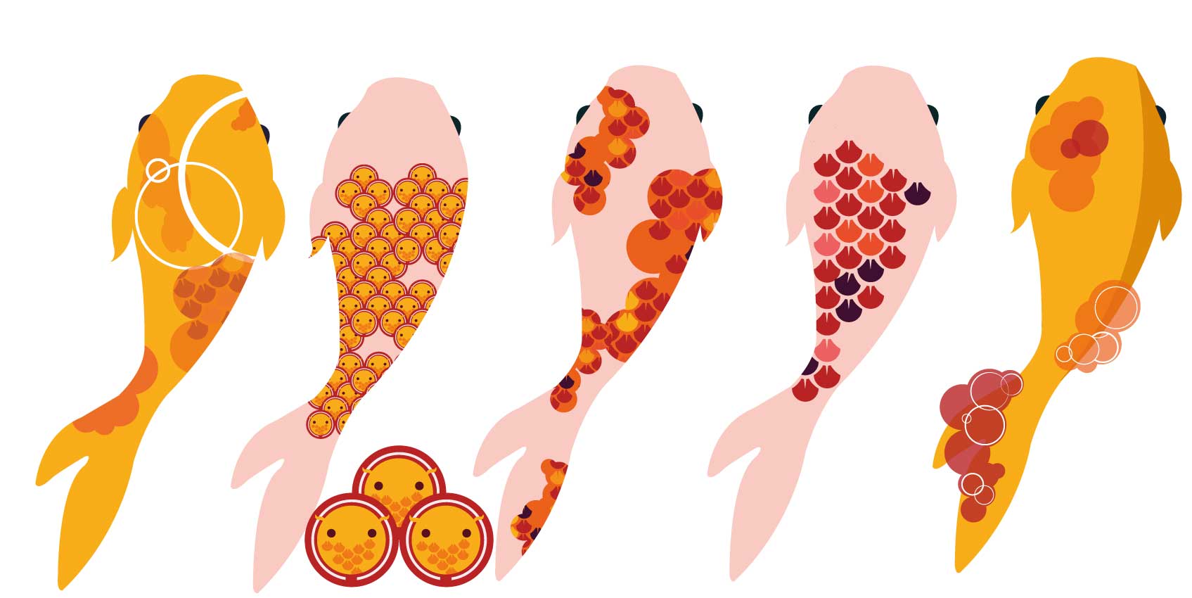
I tried to mimic the spots found on koi fishes and incorporating ripples for the last one. my favourite from this series is the first one where I tried to incorporate everything in a subtle way. I had a lot of fun creating the second fish. The patterns are made of mini koi fishes. It’s like a koi fish inception.
Design 4
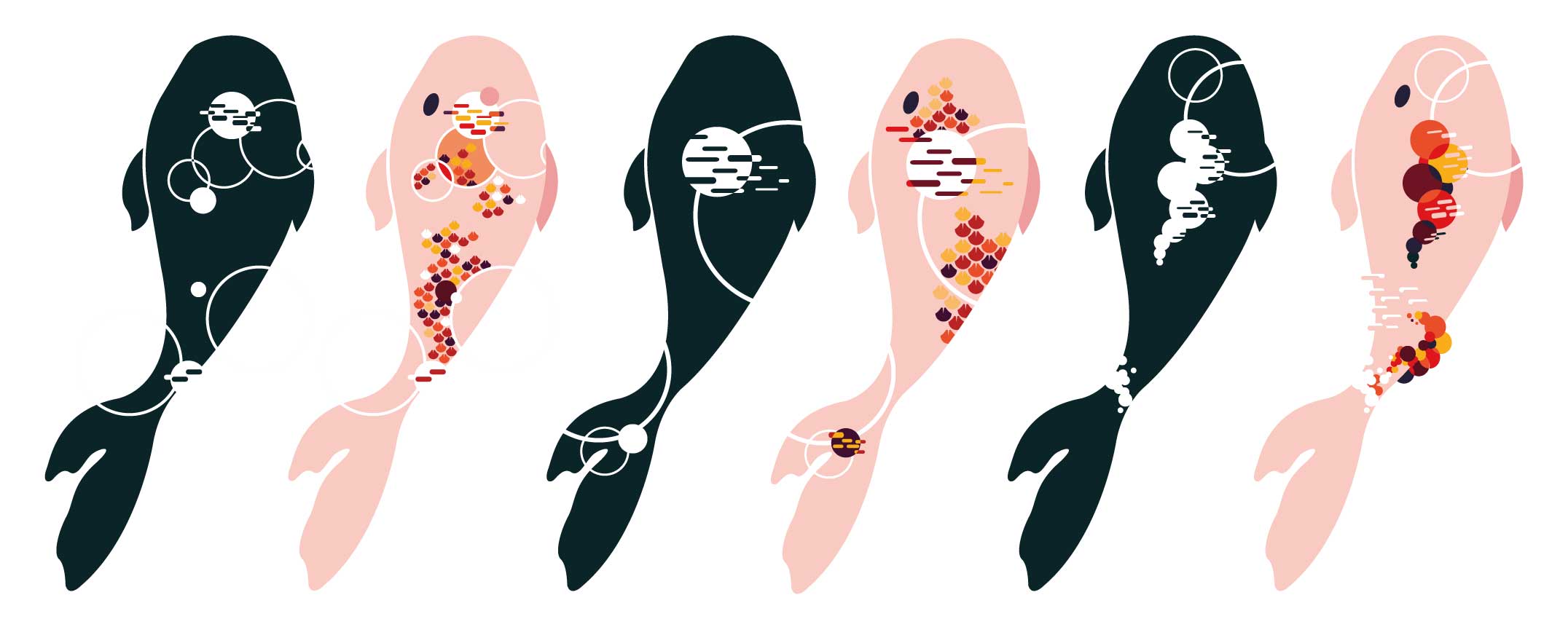
I decided to push the design further, by trying to incorporate more ripples and the patterns. I really love the designs especially number 2. I love how the patterns aren’t constrained and looked a lot more fluid as compared to the previous designs.
Design 5
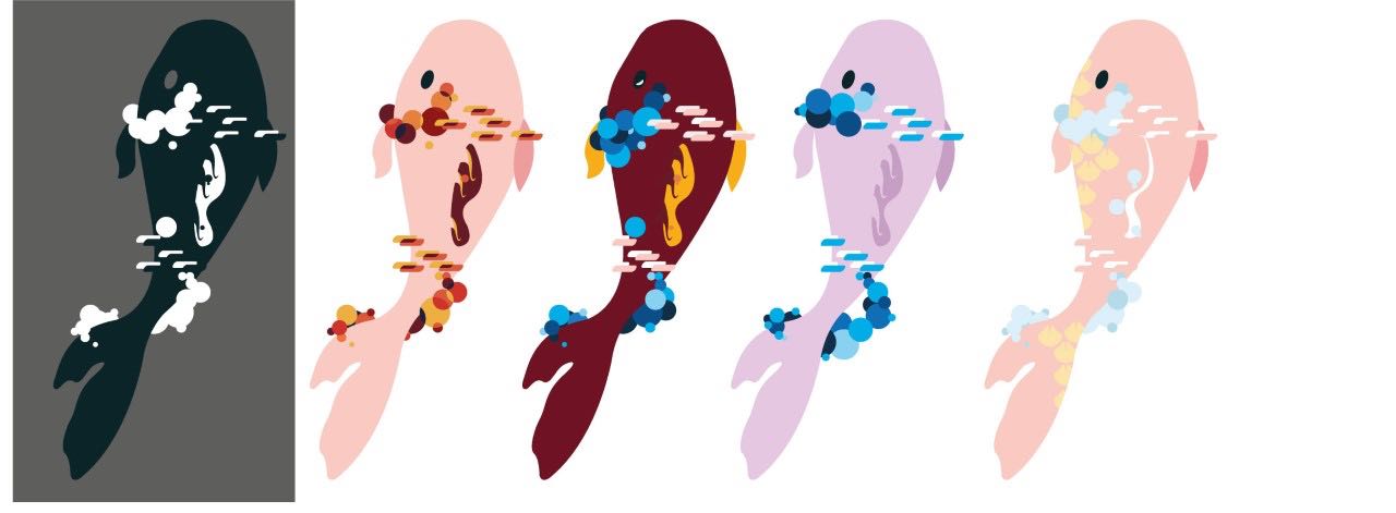
I really love how the layering and ordering of the circles create the form of waves while establishing foreground and background. However, by this point, I was seriously off brief. It was still to illustrative. I had to simplify. Less is more. I was advised to limit my colour palette and choose between patterns or ripples.
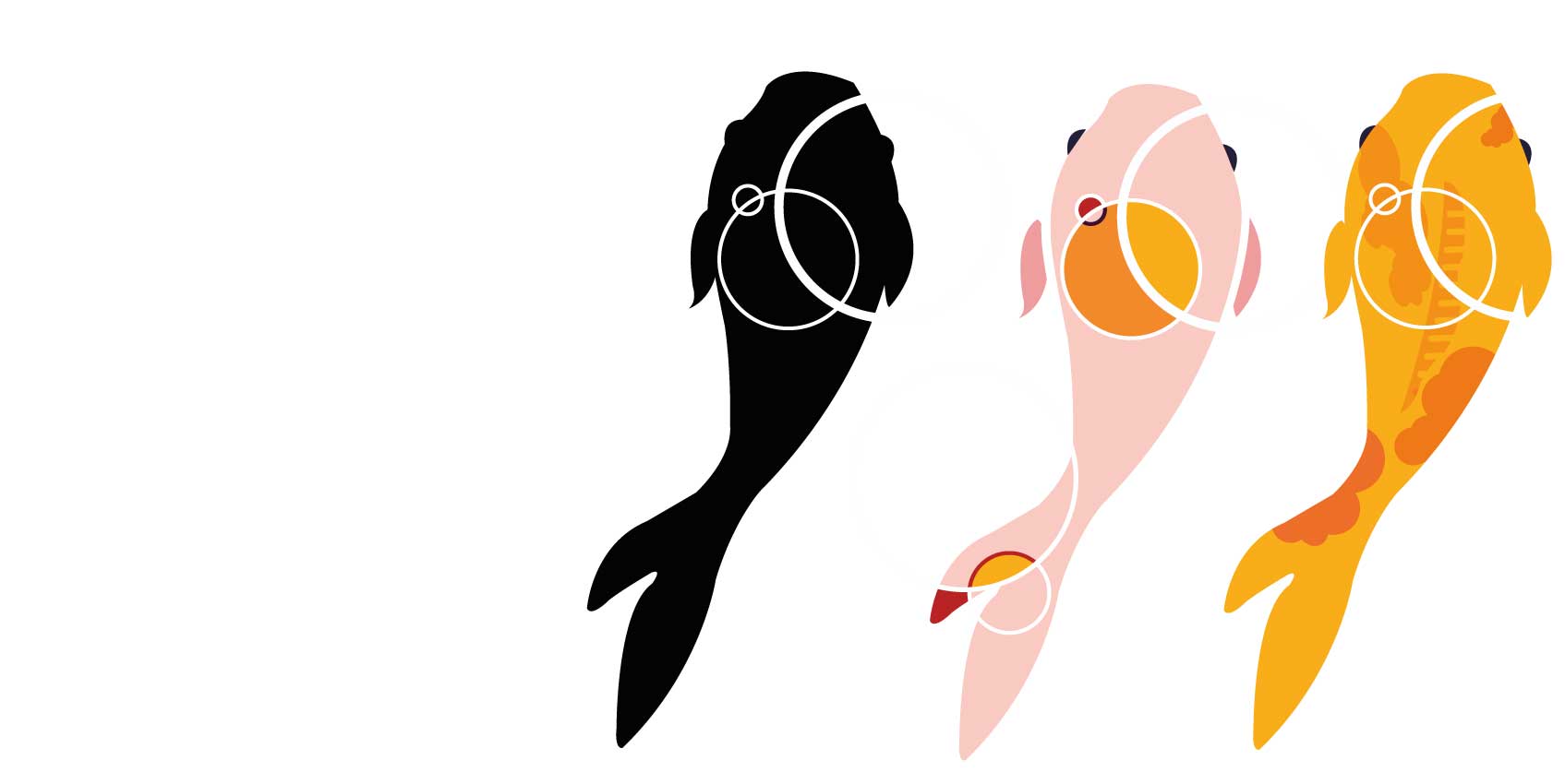
Design 6
This time I tried to limit my colour palette to 2 colours. I also forced myself to choose between the ripple and the patterns as the main element. After much exploration, I decided to go with the fifth koi. the circular bubbles not only represent the air bubbles that the fish boobles out, but it also suggests the dorsal fin of the koi too. The pattern that can be found isn’t too overbearing. That was what made me choose this design, I was finally able to marry both my concepts! (both patterns and ripples)
Colour scheme
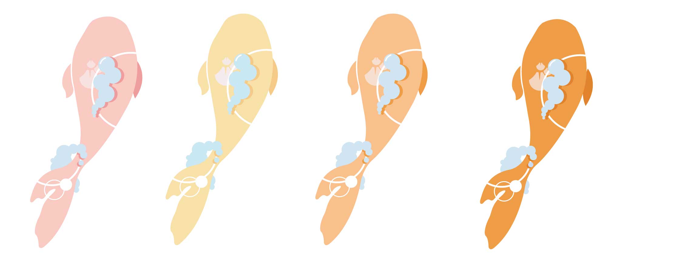
I decided to go with a warm analogous colour scheme. I felt that warm colours would be suitable for the image of hope. warm colour rises and cool colour sinks. I wanted the colours to have an uplifting effect on the patients. In addition, I used a lighter colour scheme to add to this lifting effect. In addition, I thought the colours should be soothing, to aid the patients’ recovery instead of a bright bombastic yellow.
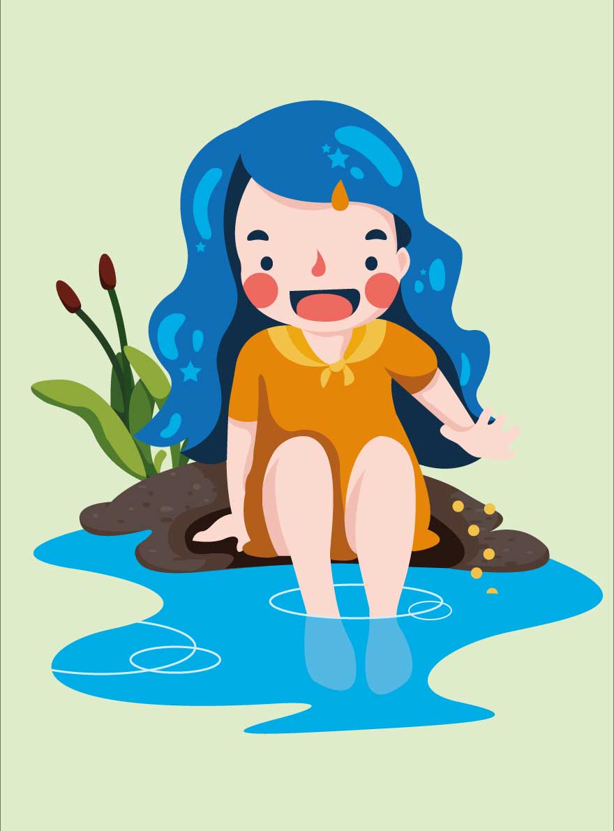
Designing the girl:
Design 1
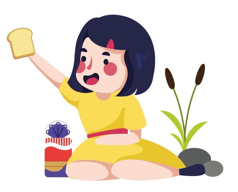
I wanted the girl to be sitting and feeding the fishes bread. However, her movements are too static and the whole illustration lacks energy. Then I went back to drawing and referring to images online to get the pose right.
Sketching

among both drawings, I decided to go with the second one. The pose was more relaxed, more natural and more energetic. I also decided to use stronger and more saturated colours for the girl.