
Ignoring the bad quality video and the cheesy music, the one thing the really struck me was how “people took type for granted”. This is undeniably true. To the untrained eye, all fonts may or may not look the same. Sure they might be able to discern the difference between a san serif and a serif font. However, they are still ignorant to the nuances a type hold. This results in terrible font choices especially the rampant use of comic sans. Shudders. I feel like this attitude towards type was propelled by the creation of the computer. Turn on a MacBook and you have a whole directory of type (tadaa font book). Using type became easier and more brainless. I feel like this change resulted in type turning from an art form to one of utility purpose.
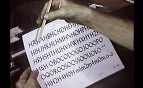
From this video, my respect for typewriters in the past has greatly increased. The amount of labour and repetitive work that is placed into creating each type. I wished that a greater amount of people is able to see this video and appreciate type more. Type is more than Microsoft words, it’s the life and the sweat of a typewriter. This video also made me more appreciative of illustrator. Today I swear by the pen tool and the direct selection tool in all my design works. With a few clicks of the mouse, I am able to distort and tweak the type. However, all of these had to be done manually in the past.