1.Bird + Hall = I hang my wings on the wall and sit in front of my laptop.
Because I’m a in-door person, so in this one I want to show that even I have the ability to go out (or fly away) I would still choose to stay in my room.
2. Pear + Someone shouting at me = i cut a piece of pear and eat it.
Well, this is not so positive. I got the idea of “self-digest”. Usually when I feel angry or pressure I’m tend to keep the emotion inside and digest it, and it also hit about automutilation because in face this habit is harmful to ourselves.
3. Ping glasses + Daiso = The symbol “$2” shows on the glasses.
———————————– WEEK 2 —————————————
This week after consultation I continue on brainstorm. And start to do research on the art style that I want to apply in this project. In this project I want to explore with different types of art styles, including hand-made and digital.
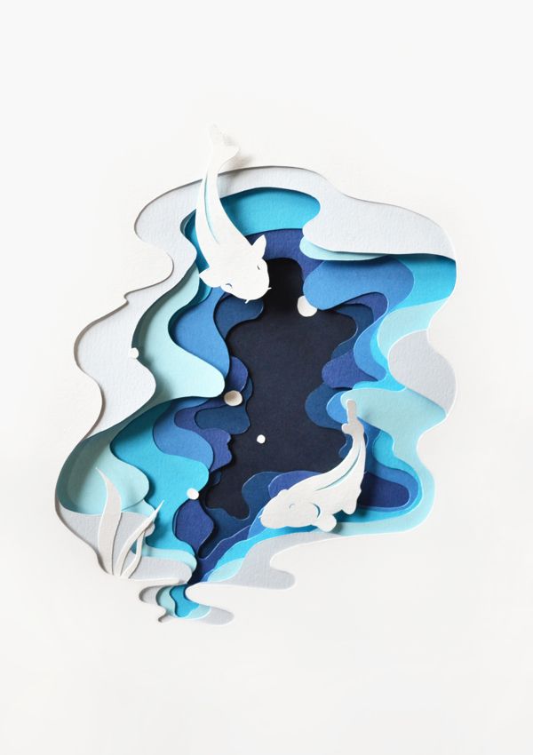
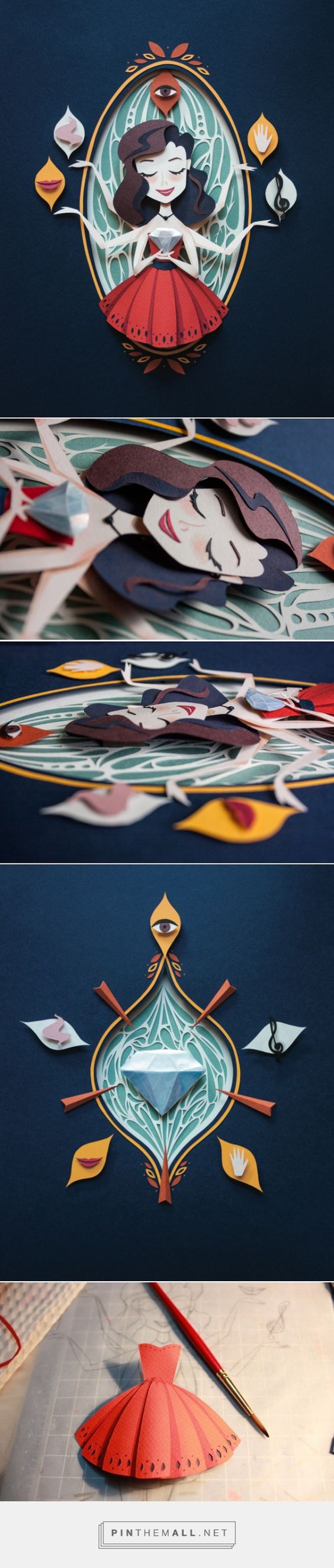
The first one is paper cut illustration.
When talk about using colors, this art style is the first one that comes into my mind. I like how artists use the different tones of pure colors to make the illustrations. Even though the style is a bit like children’s books but people won’t think this is childish because the shadows of different layers make it look more delicate. Here are some art references that I found online.
And I found out that the key point for this art style is color theme and the depth of layers, which create a 3D feel on the 2D illustration (We can find out this in the 2nd example picture). Since there is no or little texture involve, which color to choose is a really important question to think of at the start. For the depth of layer, I found a thick double sided tape which has a foam to create the distance between each layer. Without the distance the result will look very flat which is not what I want to see.
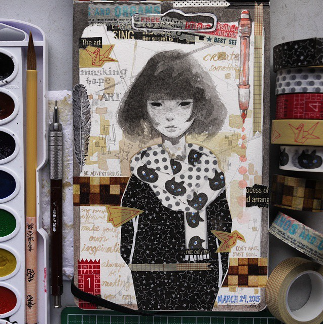
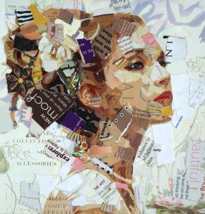
The second one is texture collage.
I want to try this style looooong times ago. I used to have a habit of writing techou and I have bought many washi tape as decoration, but usually I use the tapes as lines to divide the page space, so I aways want to find other usage of washi tape, until one day I saw this.
And I realize washi tapes can also be used of collage. But here is the question: although I have many tapes, the colors are still very limited. Then I found out that I also have many texture paper, so now I have much wider choices, and the textures of different kind of papers will make the illustration more interesting.( I’m pretty sure that the texture of washi tape, normal paper and magazine paper are very different.)
The difficulty of this technique is that how to divide the area. It can be as simple as only one texture, or very complex that people can see the details from the montage. Below are the examples.
This is something I will take note in my design sketches.
The third one will be digital painting. I have some texture brushes in my Photoshop and I got digital painting experience before so that one shouldn’t be a big proble
Here are some reference I find for my color themes.
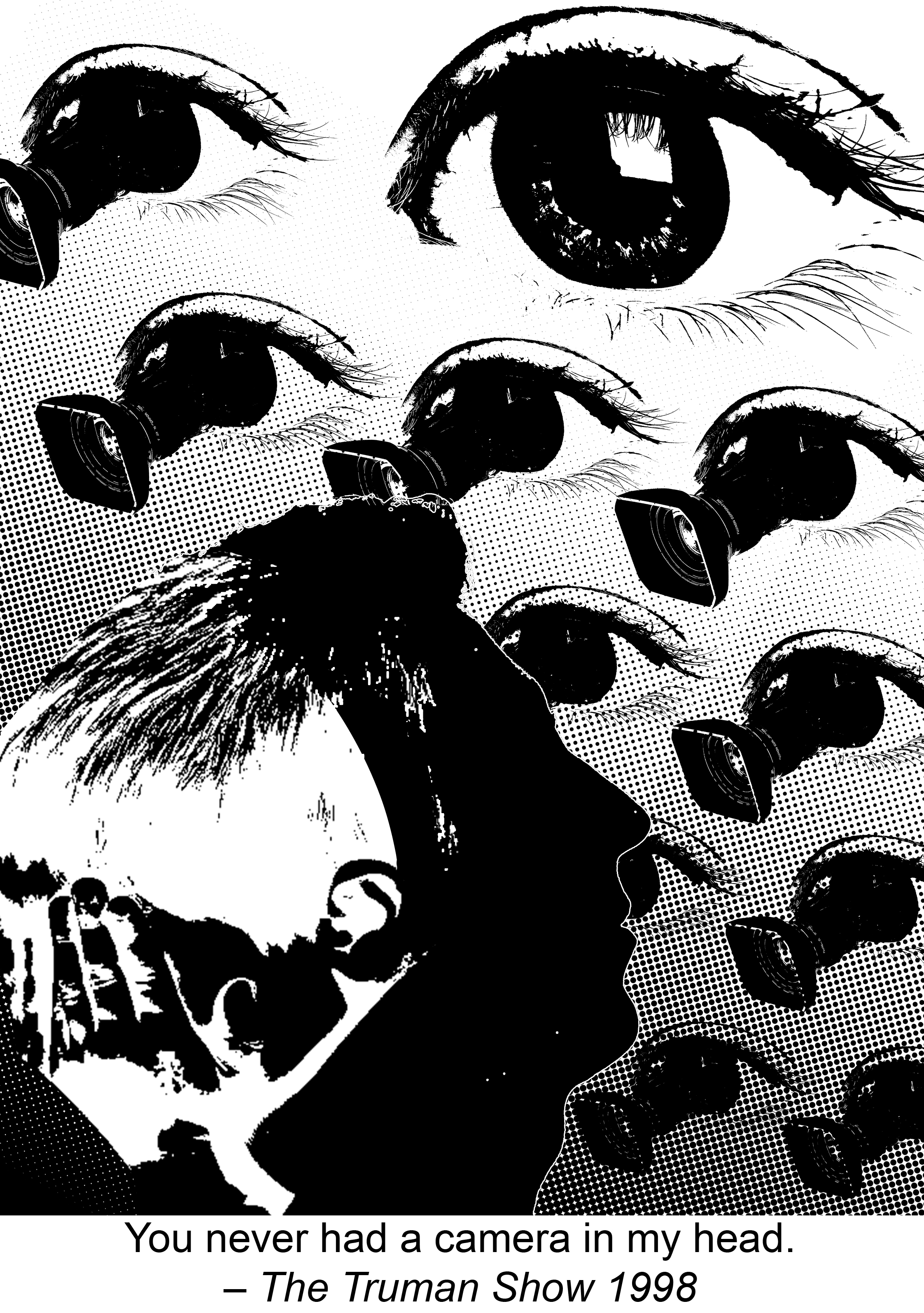
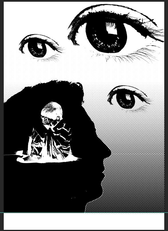
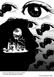
You never had a camera in my head – The Truman Show 1998
This quote is saying that even the main character is lived in a world that being watching by others all the time, he still has his own thoughts in his mind where camera cannot record.
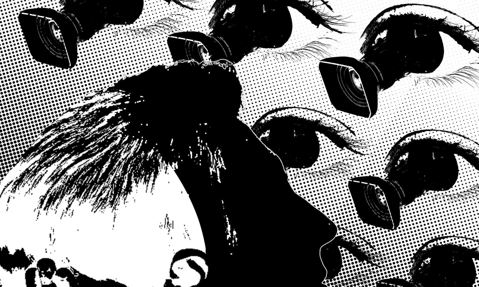
So in this design I’m using the principle of pattern and rhythm to form the background. The camera pops up from the eye represent the audience who are watching the Truman Show through the camera. The change of the scale forms the rhythm and shows the perspective that it looks like the eyes are looking down at the man. The direction of cameras helps to guide the audience’s view. In order to have a focus point in the background, I apply the principle of dominance to make one eye much more larger than the rest and without camera in it. It represents the director of the show, who are the “boss” of these camera and in this way the background won’t be boring.
As we follow the direction of the cameras we can see a sideview silhouette of a man’s head, the back part in white is a kid covering his face with hands. This uses gestalt to show the conflict that the man is struggling to hide somethings in his mind, he want to approve that even the people set so many cameras around him, they still can’t know 100% about him because they can’t read his mind. The contrast in colors and the directions of two faces emphasis the conflict. The foreground, which is the silhouette and background also follow the proper proportion.
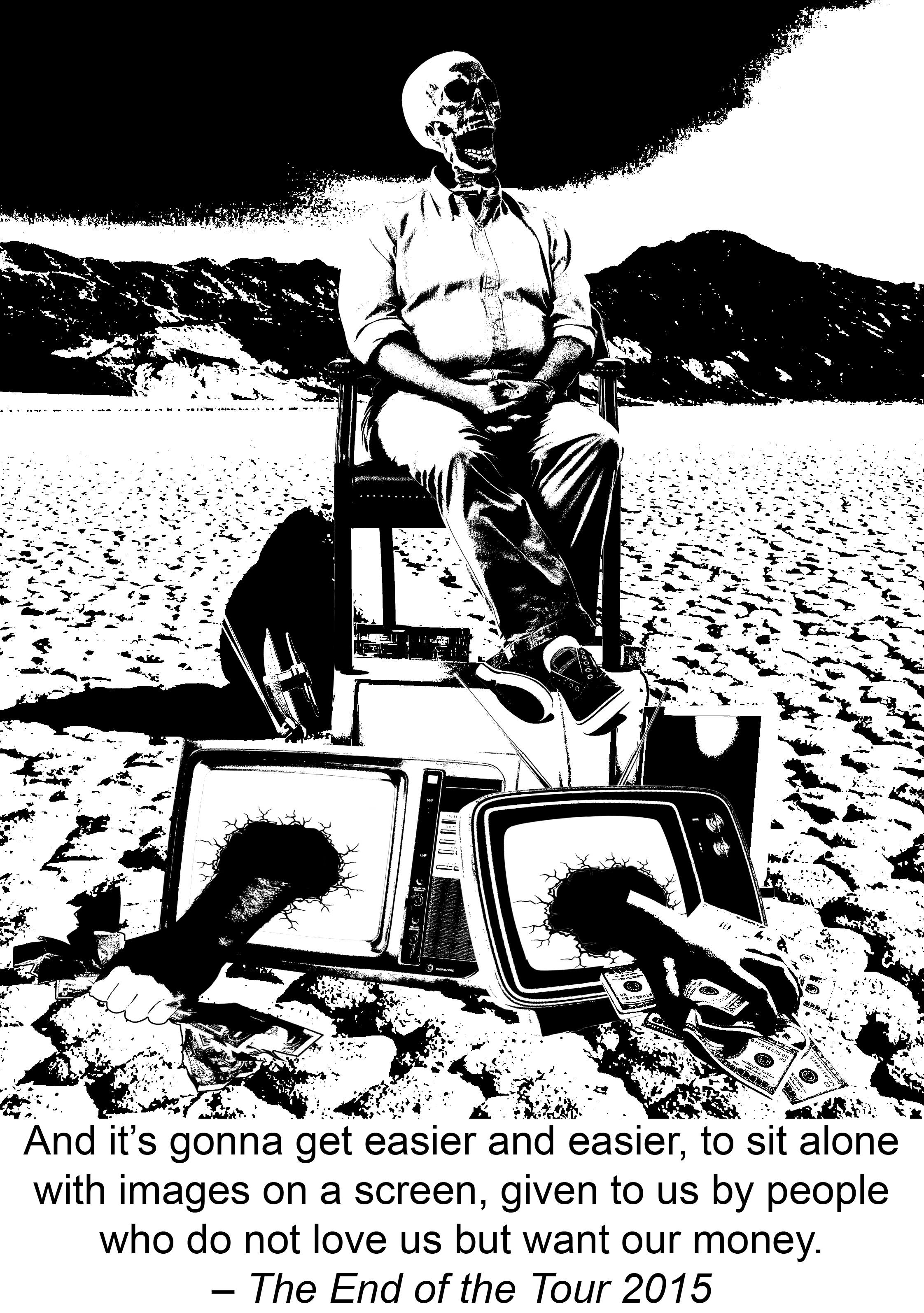
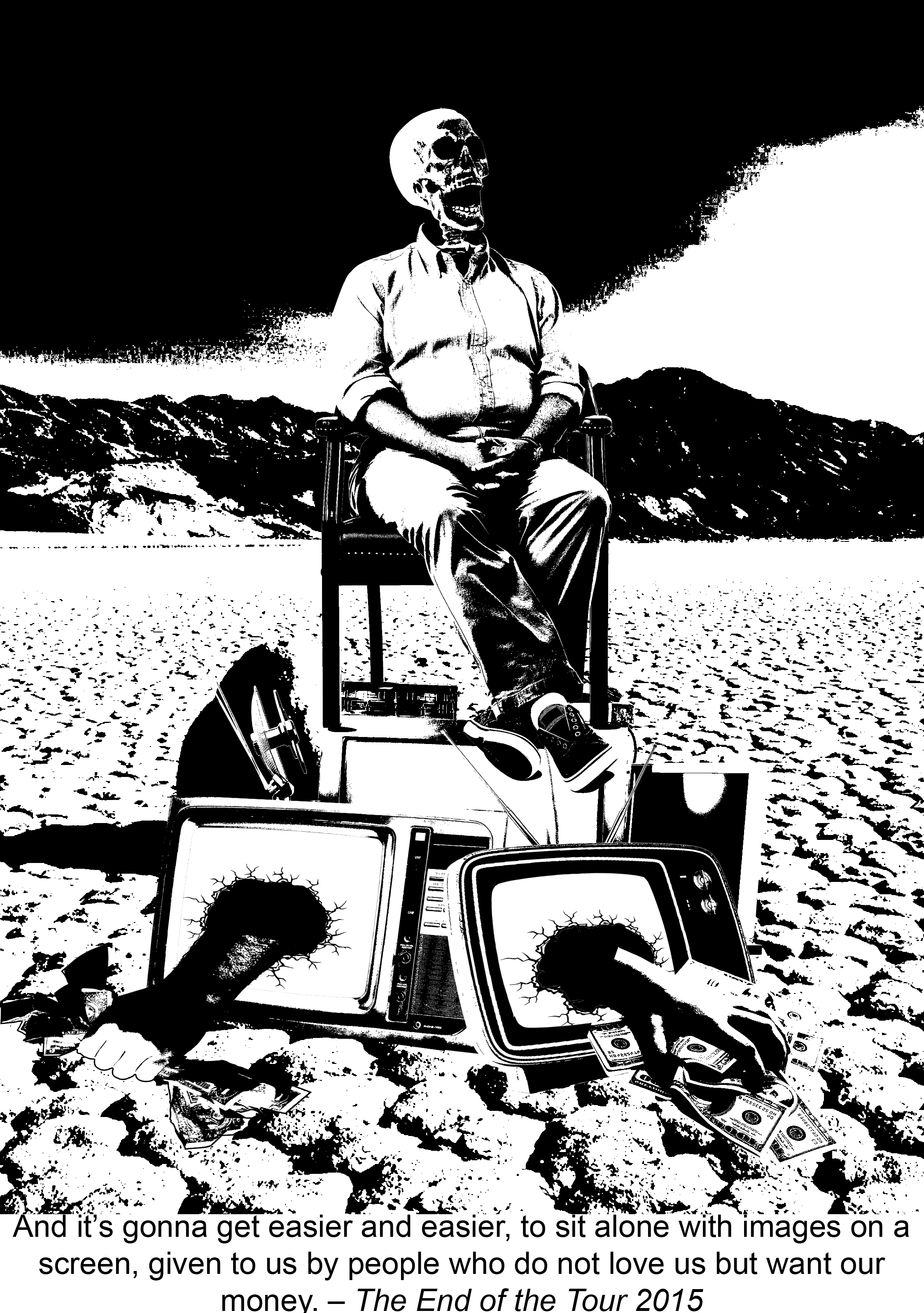
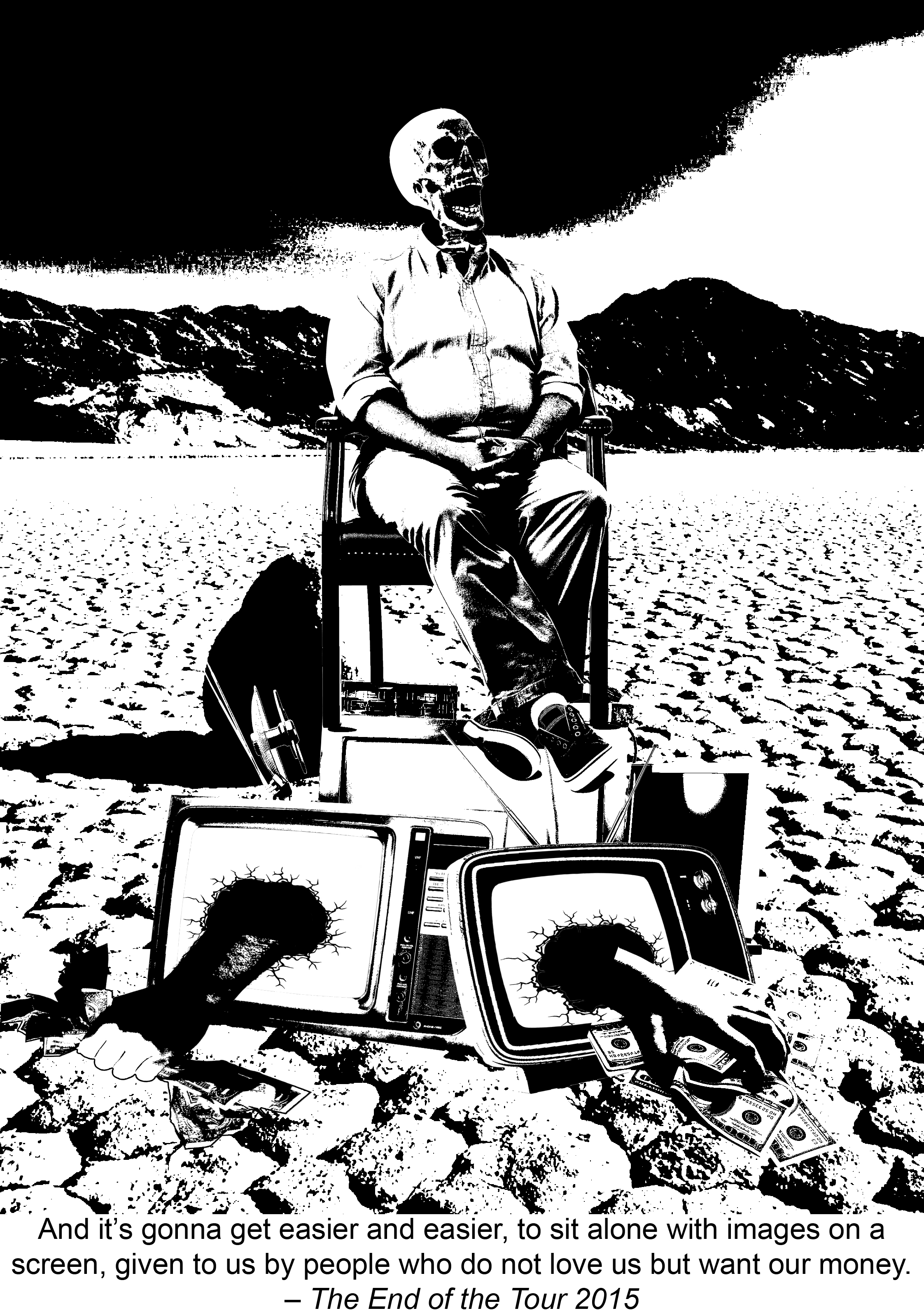
And it’s gonna get easier and easier, to sit alone with images on a screen, given by people who do not love us but want our money. – The End of the Tour 2015
The quote is about the phenomenon that the addiction of television becomes common for people nowadays and it “kill” us in mental. In another words it means the addicting to television is killing us. So I put a skeleton which looks like it’s watching TV and laughing on a pile of broken TVs. Many hands are coming out from those TV and grabbing money. The background is a desert which makes the image more lifeless.
In this design I use the rule of third for the background proportion, the horizontal line falls on one third of the height. And the composition of this picture is symmetry, for example the skeleton is in the middle, there is one hand at left and one hand at right. This symmetry structure make the picture look more dull and lifeless, which is the emotion expressed from the quote.
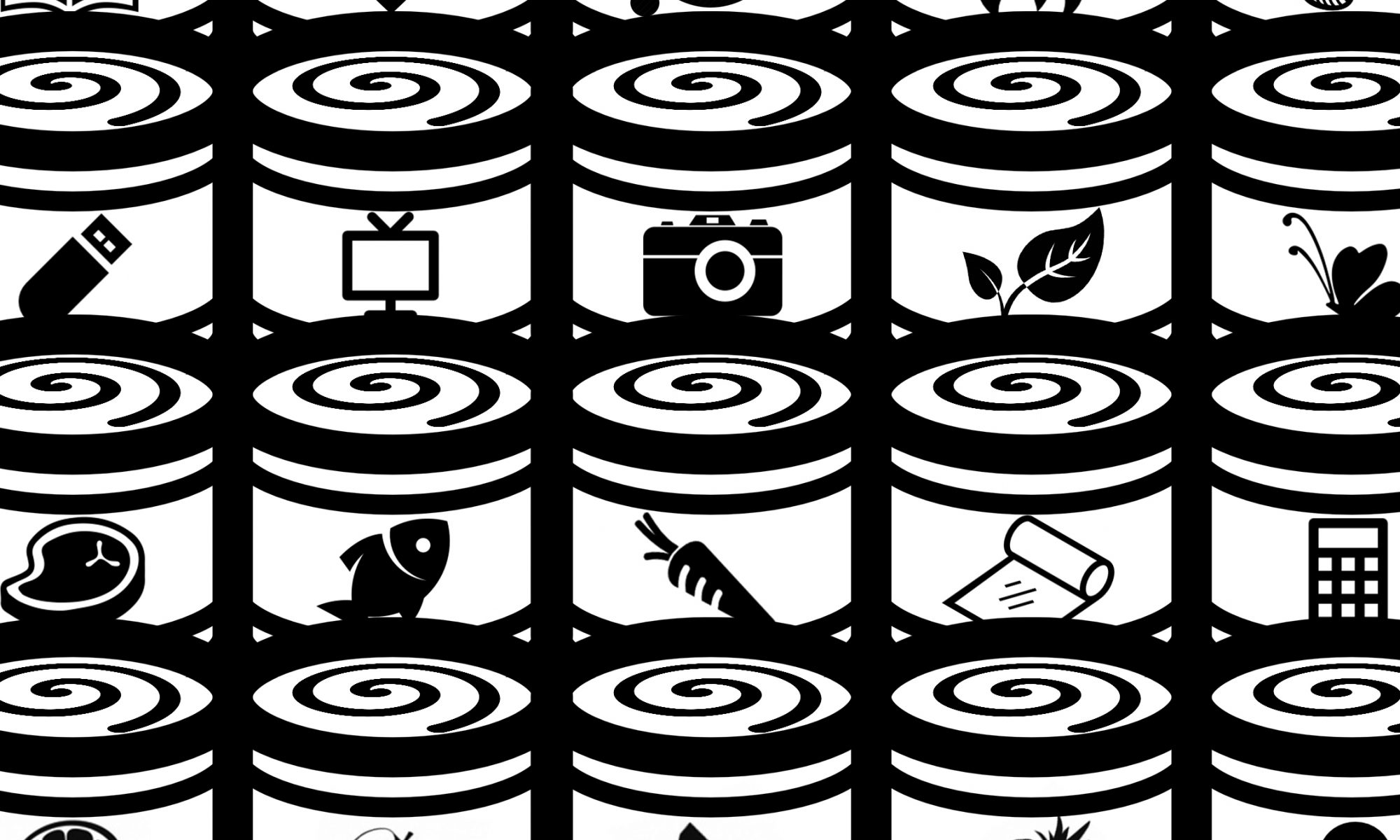
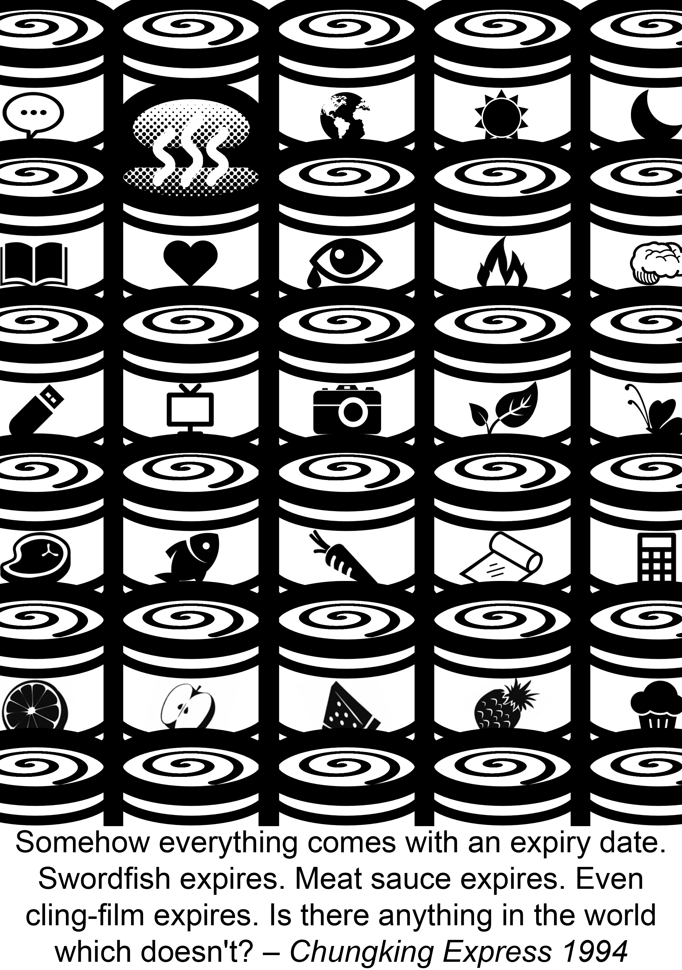
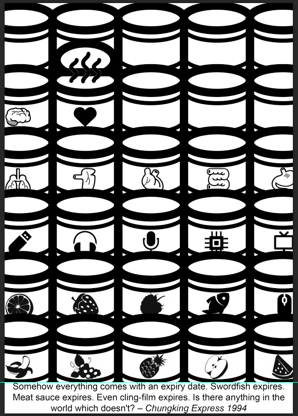
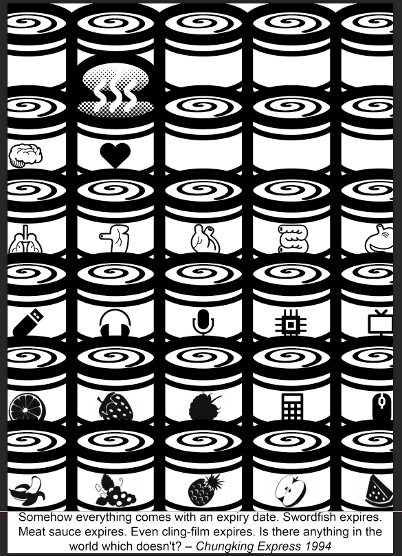
Somehow everything comes with an expiry date. Swordfish expires. Meat sauce expires. Even cling-film expires. Is there anything in the world which doesn’t? – Chungking Express 1994
When we talk about expiry date it always link to packaging. Inside the movie tinned pineapple is a important symbol and I get my inspiration from that. People always think that put something in tin can keep it longer, but what we forget is that it can’t keep forever. So I arrange many tins in order and put different icons on them, from visible things like food, electron devices, leaves and butterfly to those invisible stuff like emotion, language and universe. Then the tin of love is opened and become smelly because it’s expired.
We can see a strong pattern in this design, the can with a spiral on top, and also variety of icons on each tin. The position of the opened tin follows the rule of third, and the dominance form the contrast so people know which one to focus one. The color contrast make the smell icon more obvious.
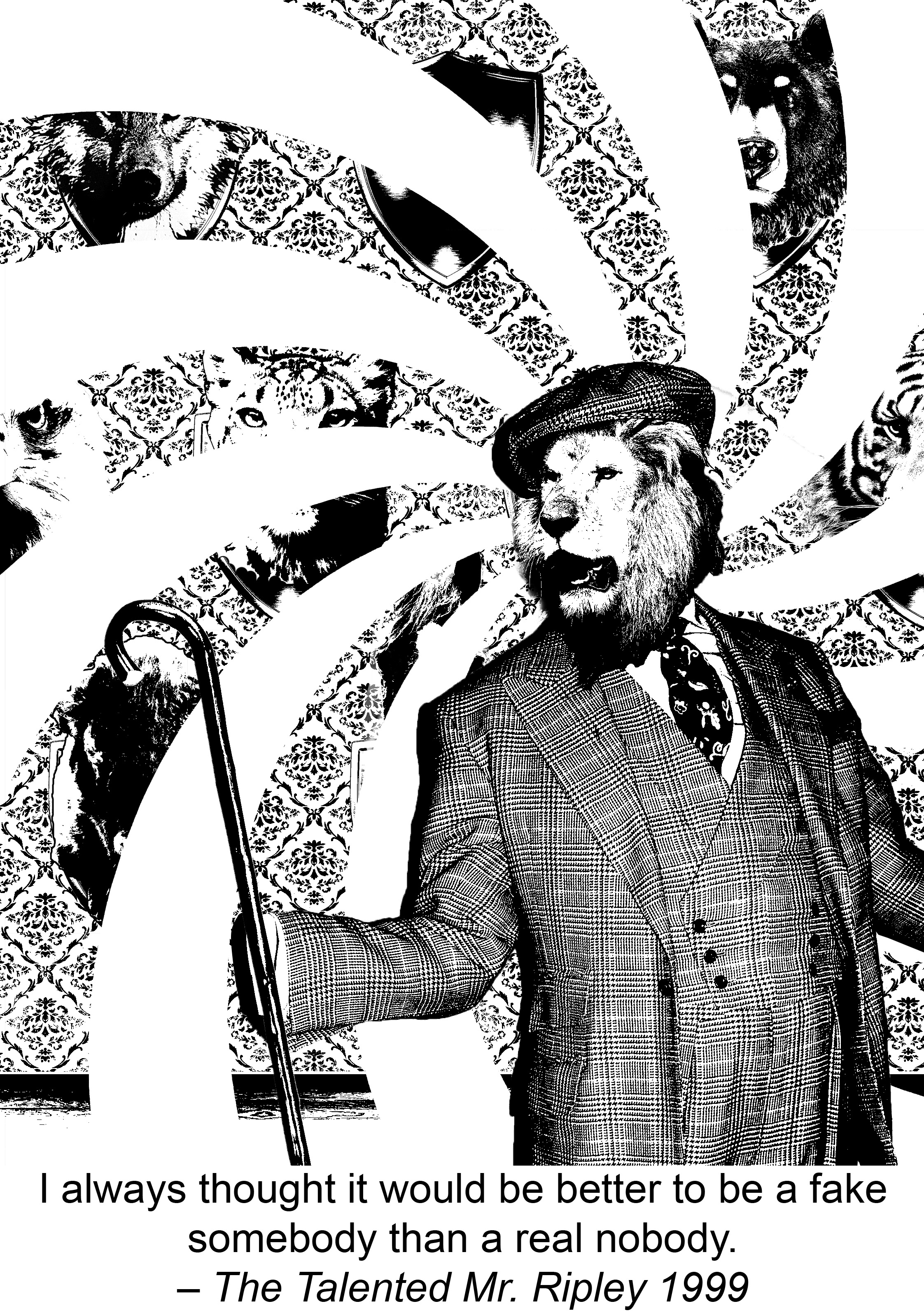
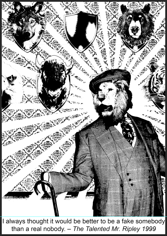
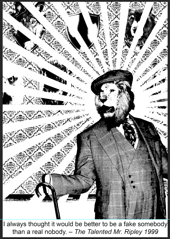
I aways thought it would be better to be a fake somebody than a real nobody. – The Talented Mr. Ripley 1999
In this design I create this guy in a lion head holds his stick and stands in a quite dramatic pose. This shows the vanity of being a famous. But if we look at how he holds the stick we can find out that there is no hand, which hints that inside this suit actually is “nobody” (or at least we can’t see the person because he is such a small person). The background is a wall with many animals heads mounted on it and one of them the head is missing. So the story behind this is the “nobody” wears the animal heads to pretend to be a famous everyday and he enjoys this kind of feigning.
Variety and unity is being used in the design of background. The animals heads forms a pattern and the wall also has its own retro pattern. The lion-head person is at one third of the picture. There are 3 functions of the white spiral behind the man: guiding audiences’ view, dividing foreground and background and emphasising the focus. The spiral also create a illusion feeling since the guy is a fake one. Because of gestalt, even it break the background people still can read what is happening at back.
In this assignment the biggest problem for me is the concern that audience can’t get the message behind. Because I prefer to hide many small details in design and sometimes I realized that sometimes I can get them but others might not. My solution for this is just go and ask around for opinions, then see can use anyway to make it easier to understand.
From this assignment what I learn is how to use design principles purposely to solve my problem. For example if I find my focus point doesn’t really stand out I can use leading lines, or if the object is merge with a complex background I can use color contrast. For repeated pattern can change one element to achieve the dominance. And also I find out again how important it is to arrange the working files layers properly. Making the layers in correct arrangement helps me work effectively.
You never had a camera in my head! — The Truman show 1998
My idea for this one is many eyes and cameras looking at the character, while inside the character’s head there is a small kid trying to hide himself in a corner. In this image I want to show that the person is struggling to hide his real thought even the world he lived is full of camera and people’s eyes.
So here is the first draft.
When the time I trying to put CCTV cameras inside I kept thinking of how to make it more interesting, then I came up with the idea that combine the camera and eye, means the camera pop up from the eyes which represent the audience who are watching the Truman Show. This can make the image more illusion. After that I also make the silhouette of the person larger to emphasis on the man. In the endthe picture become like this.
—————————– WEEK 2 ———————————–
After consult with the lecture, we realised that the small boy covering his face by hands and sit in corner is not so obvious, so I just focusing on the face part. During I adjust the picture I found out that the silhouette of the man can merge with the little boy’s head so can apply gestalt in it.
Then for the composition, I make the silhouette smaller to fit the rule of third, then change the direction of the gradient shadow as well so it follow the direction of cameras. Here is the final version of this.
Ok, next!
And it’s gonna get easier and easier to sit alone with images on a screen, given to us by people who do not love us but want our money. — The End of the Tour 2015
This quote is talking about how people addict to television, those entertainment provided to us make us lazy to thinking and “dying” mentally. So in this one I want to show many broken televisions are piled in a desert, on the top of them there is a skeleton sitting on a chair and laughing. In order to show that the entertainment is given by “people who do not love us but want our money”, I choose to add hands that are coming out from the TVs and crabbing money. So the first version looks like this.
Since the first one I use rule of third for the composition, this one I want to try something looked symmetry.
Beside the technical part of making those illusions, one big challenge for this image is how to place all the elements so that they won’t mix up with the complex desert background.
—————————– WEEK 3 ———————————–
This week we are working on silk screen print.
Here are the procedures of how to make the silk screen in dark room. First we put one layer of photo emulsion on a clean screen, after it was dried we place the transparency with our design on top of it and put inside the machine to expose, then we use water jet to wash off the exposed part and after take it out from dryer we get a nice screen with our design and it’s ready for printing now!
The screen ready for printing
We use tape to cover the edge part to avoid ink coming out, and four coins are places at the corner so the frame won’t get too close to the paper or bag and smudge the printing.
Doing the silk screen print first time 0u0Ummmmmm… Not so bad?
Some tips for printing process, control how much ink u put since we can see the left corner is merge together. Then when the brush goes down it need to be fast so the force will be even and ink won’t overflowed as well.
For the images designs side, I adjust the height of sky in background, so the horizontal line lies on the one third part. So below is the final version for my second quote.
And move on to the third one.
Somehow everything comes with an expiry date. Swordfish expires. Meat sauce expires. Even cling-film expires. Is there anything in the world which doesn’t?— Chungking Express 1994
In this one I want to use the principle of dominance, I will place many cans orderly with different icons on each one, then one of them will be opened up and become smelly because it’s expired. So the first draft is looked like this.
And I realise the contrast is not big enough, so I put a spiral shape on the top of the can to show that they are still sealed and unopened. Then for the opened one I will add some shadow inside to attract people’s eyes. Then the smell icon I will turn it to white to make it obvious as well.
I’m still finding interesting icon to put on the cans so it can shows that “Everything comes with an expiry date.”
—————————– WEEK 4 ———————————–
This week is recess week, and we still have one session to practice on screen printing. I found out for my design the bottom part needs more ink, so I turned the frame and start with the bottom part, the outcome looked better than the first one, here is the best one I have during this session.
The right side is smudged because when I left the screen up it smeared on the right part accidentally. For this one all the details are showed inside. Now I got a bit confidence on next week lesson when we will print this on our tote bags. = w =
And I also worked on last design for this project.
I always thought it would be better to be a fake somebody than a real nobody. — The Talented Mr. Ripley 1999
For this one I want to show someone put on a mask of famous or powerful person to hide himself. My first thought is a person in suit is putting on a mask and behind the mask is nothing. But it’s a bit simply and weak. Then I think maybe can put the person in front of a mirror, over his shoulder we can see in the mirror he is putting on the mask, but actually behind the mask is empty. (We are able to see this because the picture is take from his back)
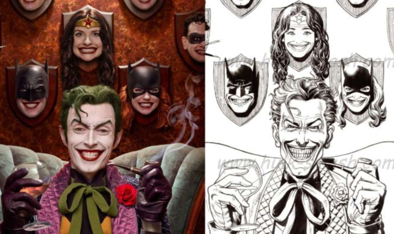
Then I got inspiration from one illustration of Joker, the character in DC comic.
I want to make the person stand in front, at back is the wall that hangs different famous masks. At first I want to make the person looking at the masks which shows that he is choosing which one to take today, but then it turned out not so good because the person is too small; those heads have more weight in comparison. To highlight more on the person itself, I bring it front and make it bigger, then I put it on the right bottom corner and here is the first draft.
At the sleeve part we can see there is a stick but without a hand, I create in this way to hint that the person is actually “nobody”.
For me this is still not strong enough, the lion head is around the same size as other animals heads behind. I try to make the person larger but then the sleeve part will goes out of the image which is not allowed because it has important message inside. In this case I want to add in leading lines to points to the person to emphasis it.
Now the problem is whether I should put the animals behind as middle ground so the image has more layers, or combine them into the background which make the highlight stronger.
—————————– WEEK 5 ———————————–
This week is the last session for silk screen print ;_; I will miss it
Finally try to print it on tote bag.
Great it looks fine!This is the best one I have for test out on newsprint paper.
For the design part, here is my final one for the third quote from Chungking Express.
I have found enough icons to put on the tins and I adjust the position because the quote is too long and need more space at bottom.
I also did some changes on the last design. I add some more animals’ heads around the man and the leading line behind I change to a spiral shape because I want to create a illusion atmosphere since the man is trying to prevent to be someone else. I also raise up the position of the stick so the lion’s eyes are look at it, which guide the audience’s view and make the flow smoothly. Below is how the final version looks like.
That’s the end of this project, looking forwards to the final submission day. I will miss this project >w<