———————————– WEEK 1 —————————————
This week I focus on brainstorm of idea. With the help of my classmates I have list down some d
Me:
Pear / Bird / Pink glass / Hamster / Squirrel / Robert
Situation:
Hall / Daiso Store / When I’m angry / On flight /
Here are my ideas:
1.Bird + Hall = I hang my wings on the wall and sit in front of my laptop.
Because I’m a in-door person, so in this one I want to show that even I have the ability to go out (or fly away) I would still choose to stay in my room.
2. Pear + Someone shouting at me = i cut a piece of pear and eat it.
Well, this is not so positive. I got the idea of “self-digest”. Usually when I feel angry or pressure I’m tend to keep the emotion inside and digest it, and it also hit about automutilation because in face this habit is harmful to ourselves.
3. Ping glasses + Daiso = The symbol “$2” shows on the glasses.
———————————– WEEK 2 —————————————
This week after consultation I continue on brainstorm. And start to do research on the art style that I want to apply in this project. In this project I want to explore with different types of art styles, including hand-made and digital.
The first one is paper cut illustration.
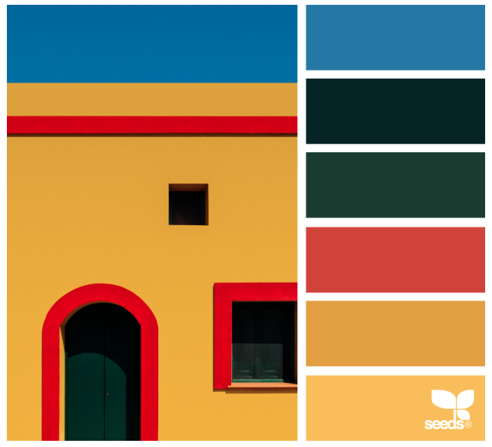
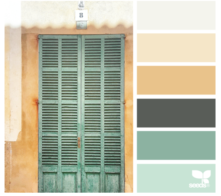
When talk about using colors, this art style is the first one that comes into my mind. I like how artists use the different tones of pure colors to make the illustrations. Even though the style is a bit like children’s books but people won’t think this is childish because the shadows of different layers make it look more delicate. Here are some art references that I found online.
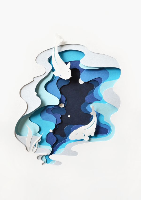
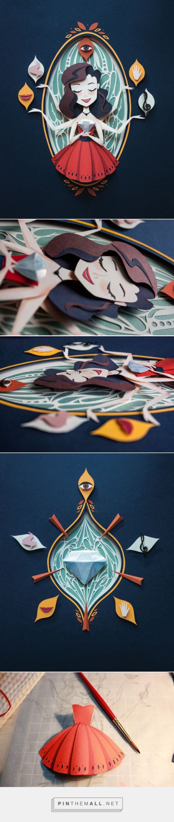
And I found out that the key point for this art style is color theme and the depth of layers, which create a 3D feel on the 2D illustration (We can find out this in the 2nd example picture). Since there is no or little texture involve, which color to choose is a really important question to think of at the start. For the depth of layer, I found a thick double sided tape which has a foam to create the distance between each layer. Without the distance the result will look very flat which is not what I want to see.
The second one is texture collage.
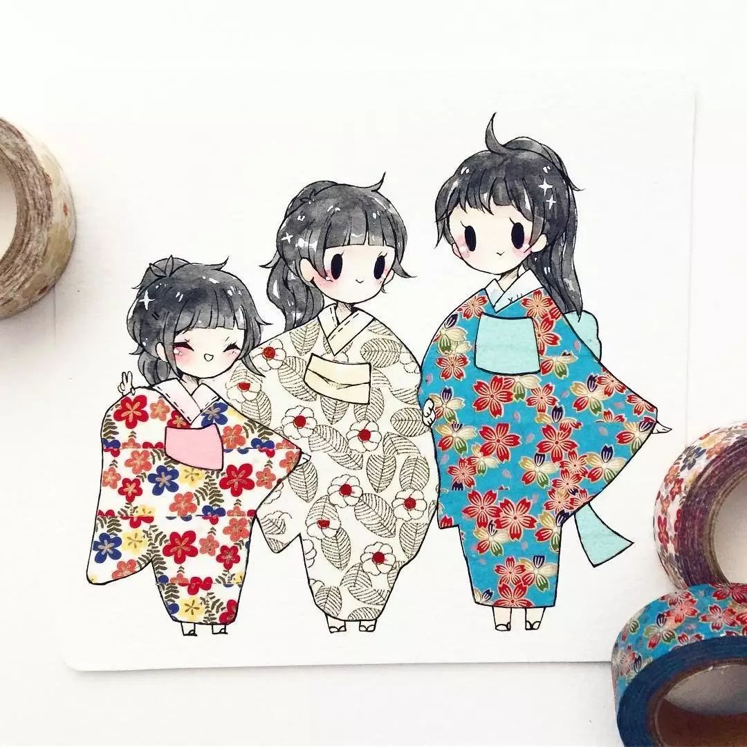
I want to try this style looooong times ago. I used to have a habit of writing techou and I have bought many washi tape as decoration, but usually I use the tapes as lines to divide the page space, so I aways want to find other usage of washi tape, until one day I saw this.
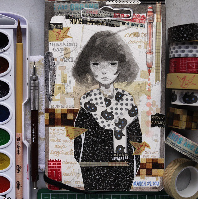
And I realize washi tapes can also be used of collage. But here is the question: although I have many tapes, the colors are still very limited. Then I found out that I also have many texture paper, so now I have much wider choices, and the textures of different kind of papers will make the illustration more interesting.( I’m pretty sure that the texture of washi tape, normal paper and magazine paper are very different.)
The difficulty of this technique is that how to divide the area. It can be as simple as only one texture, or very complex that people can see the details from the montage. Below are the examples.
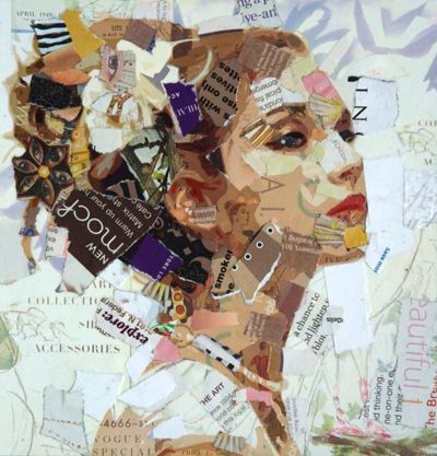
This is something I will take note in my design sketches.
The third one will be digital painting. I have some texture brushes in my Photoshop and I got digital painting experience before so that one shouldn’t be a big proble
Here are some reference I find for my color themes.