Project 4 – Dreamer

Video

https://vimeo.com/265131393

PW: digasg4

Gif

Artist Statement

I always have dreams during sleeping, some I forgot the next morning, but some I could remember the details for a long time. For me I feel it’s amazing that even when people are fall asleep, they can still experience something that might never happened in their real life. Even though the “world” is fake, those emotion it evoke, the sweet and hurt, the nervousness and desperation, the happiness and sadness, all of them are true. That’s the reason why I like having dreams even it might be a nightmare.

Based on this idea, I want to use an abstract moving image to show the interesting experience of dreaming. It starts from darkness when we close our eyes and fall into asleep, then things happened. Dreaming is kaleidoscopic, dream changes time to time and you don’t know what is going on next, but it’s definitely colourful. Then when it comes to the end things start to fade and we wake up because of the light.

Technical Decisions

For this moving image the main effect I used is CC Kalaida to imitate the experience of dreaming which is fantasy and moody. To achieve this in After Effect, just simply go to Effect menu and inside “Style” you can find it. To make the patterns moving I animated the center point to move. Then use fade out effect to combine several images with different color themes. That’s how I make the kaleidoscope background.

The other important effects I used are channel blur and add noise. Because this time my artist reference is Ninagawa Mika, so I make the image

Working Process

Photoshop

Before

After

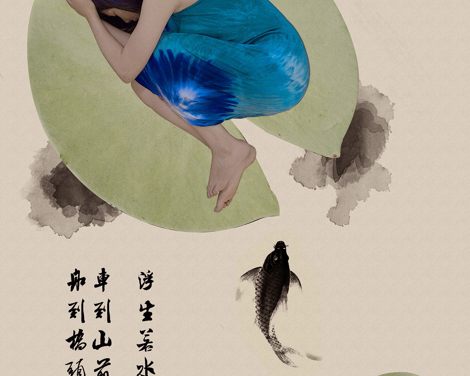
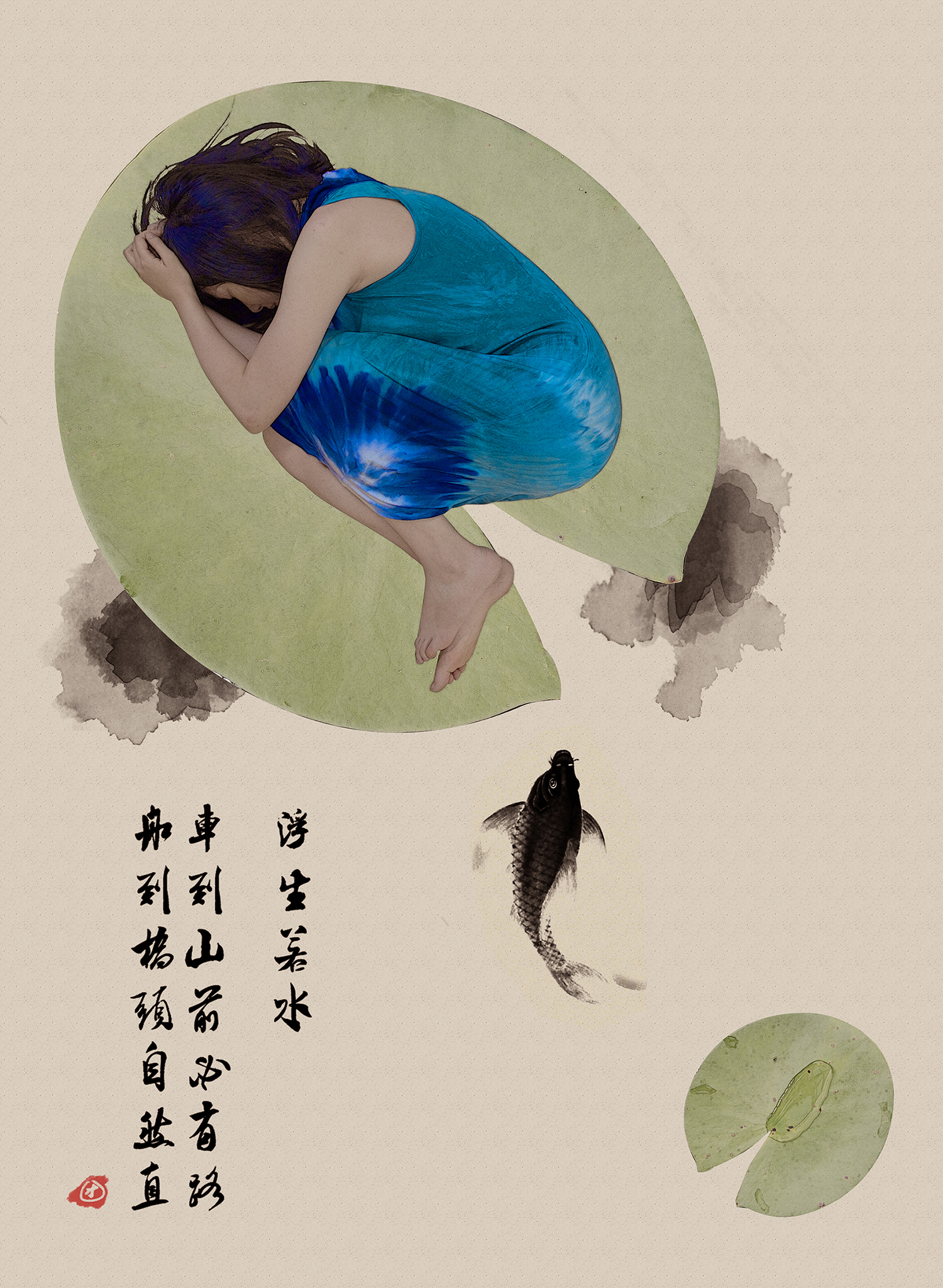
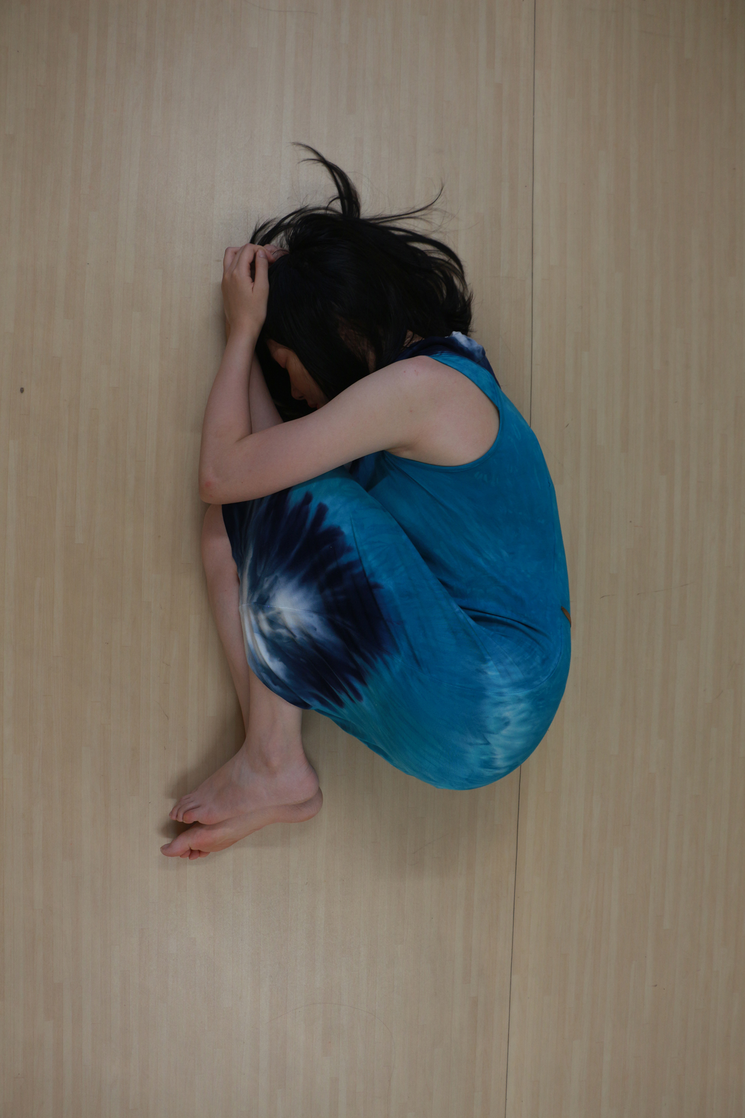
For human figure, I’m still using the same picture from project 2, but this time I edit the picture differently. This time I increase the saturation since I took Ninagawa Mika’s photos as reference. Her work has a very bright and rich color, the image is also a bit blur to create the illusion feeling.

The I go find the pictures I needed for this assignment. My concept is I sleeping on bed, so I need a top view of bed. For this one I use photoshop to move out the original baby on the bed and leave the blank bed sheet.

After Effect

After edit the figure in Photoshop, I start to work on After Effect. First I make the kaleidoscope background by using the effect I mentioned just now. Then saved the background as one composition.

Next open a new composition, put bed picture as background, then the kaleidoscope and human. For the kaleidoscope composition add a circle shape mask. It will look like the picture above.

Then add in the camera layer. Because the whole picture is rotating, to make thing easy and avoid any bug, I decide to rotate the camera instead of 3 images layers. Then the camera also move in and out to the picture to represent the process of falling asleep and waking up. This movement also feels like breathing.

The last step is to adjust the image. I add one adjustment layer to increase the saturation. This is to make the color brighter and richer.(Later I duplicate one more color adjustment layer just for the background because the human picture has already increase saturation in Photoshop.)

Then I put one more adjustment layer to create the blur effect and noise in the picture. And it becomes like this below.

Before

After


Artists References

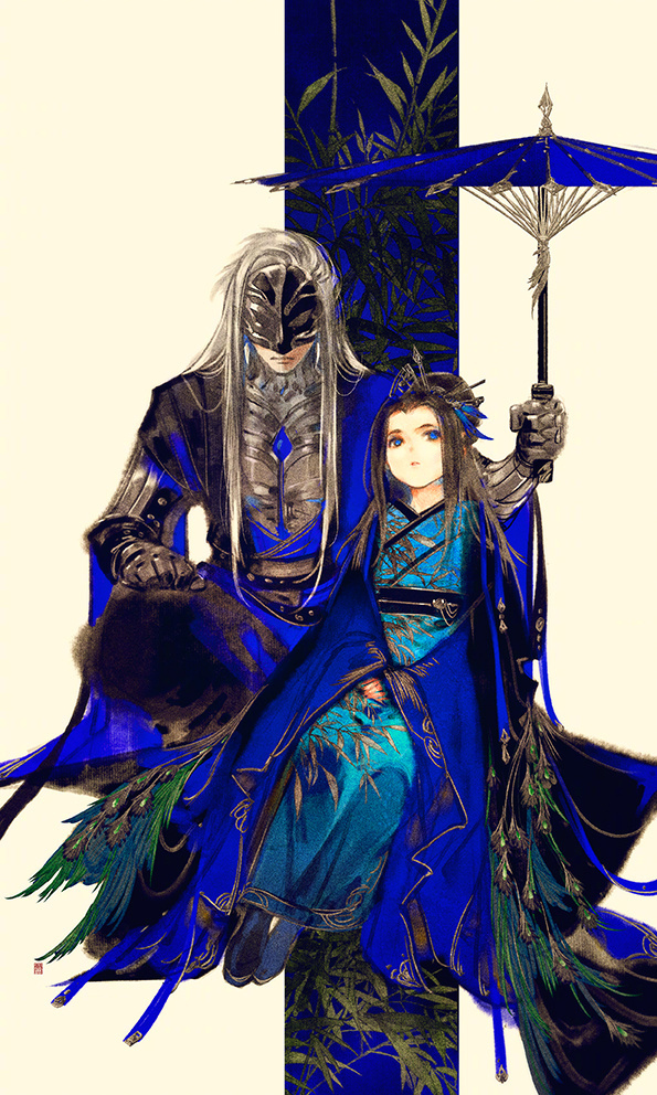
1. Gold Fish – Ninagawa Mika

Ninagawa Mika is a famous Japanese photographer. The color of her works is bright and vibrant. And they create a fancy and dreamy feeling to the audience. And that’s what I’m looking for for this project.

2. Memories of Matsuko

This is the part when Matsuko dead and we audience look back at her life. In this part the movie becomes very colourful which shows the childlike simplicity and also hint that these are all unrealistic, they are just Matsuko’s beautiful imagination.

3. Hey Morning Elegance – Oren Laive

This is a stop-motion short film which shows a girl is dreaming about her daily life and boyfriend. All the scenes are done on the bed and this is where my inspiration comes from.


Project 2 – Go With the Flow

Artist Statement

As Chinese New Year is approaching, I realised that this is the 5th CNY that I spend in Singapore. Sometimes I do feel that I’m like a duckweed which doesn’t have a strong root and only can drift with wave. I made important decisions in my life, but I didn’t really know where the path leads to, and those unknown makes me anxious. As time goes by, I learnt to be calm and composed to new environment or situation that I never expect. When things happened, there must a way to get through it, and I know I will get through it, somehow.

Before Image


Technical Decisions

Camera

Camera: Cannon 650D

Lens: 18 – 135 mm (Has a wide range)

IOS: 200 (It’s a indoor shooting)

Focus Length: 18 (Use wide angle to include the whole figure)

Shutter Speed: 1/40 (Based on my experience, if the speed is slower than 1/30, the picture will mostly become blur because of hand shaking)

F: 4.5 (To get enough exposure)

Digital Process

First of all I use masking to crop out the figure and the lotus leaf. Then I arranged all the elements to test the composition.

After the composition is done, I start to convert the real photos to Chinese painting style. I have done some research for tutorial, the basic steps are as below:

1. Duplicate your image and desaturate.

2. Duplicate the desaturate layer and inverse, change the mode to Color Dodge

3. In Filter, choose “minimum” in “other”, change the number according to get the line work of the image.

4. Merge the 2 desaturate layers, then there is the line of the image. Change the layer mode to “soft light”.

5. Now the photos convert to Chinese painting style, you can change the original layer mode to “multiply” then put a paper texture as background.

After those steps I desaturate the leaves a bit because it’s too bright. For the Chinese painting style that I took as my reference, I find out that the color is quite dull and more toward to yellow and brown.

To emphasis on the figure I decide to make the blue color brighter and pop out. In Chinese painting there is a blue color called lazuli blue, which is a very shining blue. So I try to adjust the blue to achieved the shining effect.

In the end I added in the fish and Chinese text to make it more looked like a Chinese painting. And I add in a bit red as well.

Artist References

1. Sun Jun

Sun Jun is a Chinese photographer and famous for his unique Chinese painting style. I was really surprised at his work when I first saw them and always want to try this style.

2. Ibuki Satsuki

Ibuki Satsuki is a illustrator, for this assignments I take her painting as reference for colouring, especially the lazuli blue that used in Chinese painting.


Project 1 – Sweet Burden

The theme of our first assignment is “self-portrait”, which also can be “a reflection of an exploration of oneself”. So in my understanding, the self-portrait is not just to show people how you look like, but also reflect your inner world – how is the world/something looks like in your eyes. So below is my artwork for this project.

Sweet Burden – By Yao Jiaqi

The title of this work is “Sweet Burden”, it shows how I feel about “drawing” as an animation student.

Artist Statement

There is a theory called “10,000-hour rule”, it says if someone want to be an expert of a skill, he/she need to spend at least 10,000 hours on it. This is still a controversial theory, but nobody will deny that continual practice is an important thing in skill training. Same goes to drawing. As an animation student, I feel that most of time my hand is tied to table and pencil, keep on drawing and drawing. This sounds horrible. In my point of view, it’s a tiring but enjoyable process, that’s why I call it a “sweet burden”.

Before Image

Because I want to show that “drawing is a tiring, but I enjoy it”, I use white yarn to tied around the wrist, and the hands are in very natural pose – no force, no hurt, no struggle. And all the props I choose to use wooden or brown color (like the drawing pencil), those natural color can give audience a friendly and comfortable feeling. And I put my pencil case and mug around to imitate my real working environment.

In order to show that the string is come from the table, I use paper and wooden-texture sticker to make a fake table cover. Then I zoom out my camera a little bit to make sure all the information I need is inside the frame.

For the camera angle I choose to use POV, point of view, to show the image, so the audience know what does drawing feel like in my eyes.

Camera Decisions

Camera: Cannon 650D

Lens: 18 – 135 mm (Has a wide range)

IOS: 200 (It’s a indoor shooting and the weather is cloudy)

Focus Length: 27 (35mm is the closest to the focal composition of the human eye. I reduce it a bit to include all the information inside the frame)

Shutter Speed: 1/50 (Based on my experience, if the speed is slower than 1/30, the picture will mostly become blur because of my hand shaking)

F: 5 (To get enough exposure and has a depth of view in the picture)

Digital Process

First thing I did is to refine the picture, it has too much unnecessary space in the original picture (like the white space that didn’t fully covered by the fake top.) So I rotate and crop the image, then extend the wooden texture and clean the scratches on the wooden part.

Then I start to think about “What kind of effect/feeling I want achieve in this work”.

Since my theme is “Sweet Burden”, my work should have a warm and comfortable feeling to the audience even the hands are tied by yarn. To achieve this, I did following steps.

1. Using Curve to brighten the image.

2. Raise the saturation to make the colors pop-up.

3. Adding red in color balance layer so the picture looks warmer.

Then I use brush to paint a yellow sunlight come across the picture diagonally and change the blend mode to “Screen”. This helps to bringing the atmosphere and leading the audience eyes. And I add one selective color adjustment layer to adjust the color based on my reference.

Then based on the lecturer’s advice, I cleaned the paper in the middle because the original drawing looked a bit nervous. I redrew some basic forms like cube and sphere, and some doodles of sweets – I always doodle when I’m doing my drawing homework, it’s time for me to rest and draw whatever I want.

Because of the cropping, the mug and pencil case around are not so obvious, so I use mask to crop the mug and take another photo of my pencil then add them inside the image, so audience can know this is my normal working space.

Artist References

Ume Kayo is a Japanese photographer, her work is most focus on those little humour moment in daily life. The first time I saw her work I thought this photographer must be a very interesting and careful person, that why she can capture those little moments which always being ignore by many people. That’s also how I get the concept of “reflect the world through my eyes” and decide to use POV angle. And her pictures are mostly about daily life, give audience a very life-close feeling, so I have referred the lighting and color tone as well.

For colouring and atmosphere, I have gone through many digital advertisements for reference. And this Russian manicurist advertisement inspiring me a lot for the color adjustment, especially for the finger part. The whole image looks dreamy and comfortable, which match what I want to achieve in my work.