Assignment 3 – To myself 10 years ago

Artist Statement

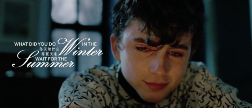
Chinese new year just past few weeks before, every time when we enter a new year we always want to ask ourselves, what did we do in the past year, and what are we looking for in the new year. So that’s where my inspiration comes from. I’m doing this video to see what message I will leave to myself in the past.

60s Version

PW: digasg3

30s Version

PW: digasg3


Technical Decision

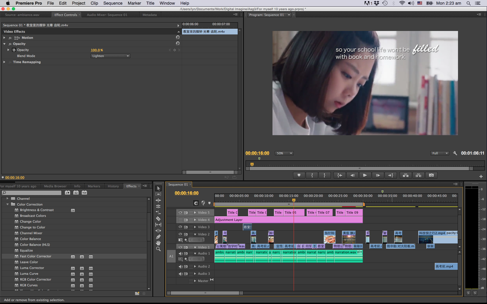
First of all I divided my narrative to 4 parts: introduction, preparing tests, spare activities, separation. Then based on this logic line I went to find all the clips I need and lined them up. Between each part I will use some establishing shots or object close-up shot for transition, like showing the playground, leaves, clock, etc. Those shots also indicate the time pass, for example the close-up of clock, the sunset in forest, and the light pass in classroom. And they work in creating the atmosphere and emotion in the video.

Through the whole video most of time I’m using straight cut, at the first 3 parts the tempo is quite fast so I used a lot short cut to create the rhythm, but in last part I switch to longer shots to change the mood towards to sadness because of separation.

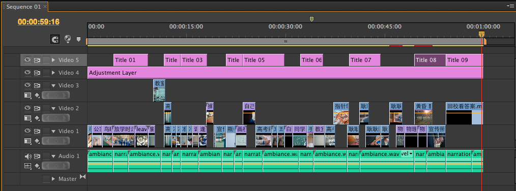
I have used blending scene or put gradient wipe effect because I realised that if I use straight cut all the way throughout, it would be too dull and inflexible. What’s more, the audience won’t realise that I have move to next part. I tried using fade in and fade out, but some parts the content is too different between each other,  it’s a bit strange when it faded to next scene directly. So I choose some establishing shots and applied effects to transit the video smoothly. These effects also help to emphasis the flow feeling, either the flow of video or the time flying.

For the countdown of days scene I have used mask to cover the original subtitle at bottom.

Before & After

All the sources are taken from 3 dramas and when I select the clips I try to stick with same color theme and lighting, so the draft looked quite consistent and I didn’t spend too much time on color correction. Since this is a video about high school life, I wanted to make it look fresh, so I brightened it and added in a bit green, and I found that the magenta in people’s face is reduced.

Artisits’ Reference

Rocky

I choose the training montage part in film Rocky as reference. When I searching for reference I’m more looking for montage editing because my narrative is not a story, it’s an emotional monolog. There are not so much story information inside but it’s a classic clip for a lot people because of the encouraging feeling that it brings to audience. Definitely the theme music Gonna Fly Now plays a important role inside, but the way they editing this part also contribute to the emotion.

This part include few activities like running, swimming, flicking the ball, how to move step, etc, then cut between those activities back and forth. The quick cut of different activities shows how hardworking Rocky is and also give an inspiring tempo. This point I have applied into my video where shows the students study hard to prepare for the final exams.

And as the training goes on, Rocky became more and more professional at boxing, the music rise up and the beat of shots become faster, more close-up shots add inside to make audience’s mind focusing on Rocky, all of these rise up the atmosphere. In the end, director changes to a slow-motion running scene, to show the peak when Rocky finally catch up and overtake his coach. The huge contrast with previous fast and exciting shots create a dramatic effect on the power and joy of Rocky.

Confession

There are many montage sequences and weird straight cutting in this movie that set a thrill and depress feeling in the movie. Most of time the movie is in dark desaturate color, almost black and white. This doesn’t match the style of my video, but what I learn from this movie is the symbolism in montage editing. Let’s take the scene when Student A’s mother left him as example. At the end of this scene is a bubble burst beside the ear of Student A. This also represent his hope is shattered and the love inside his heart disappear. In the end of movie the audience can know that the bubble burst also hints the explosion in his mother’s lab. The director using many symbolism shot to show the things that cannot be present by image, like emotion, or refer something indirectly, for example, the baseball at the beginning refers to teenager violence.

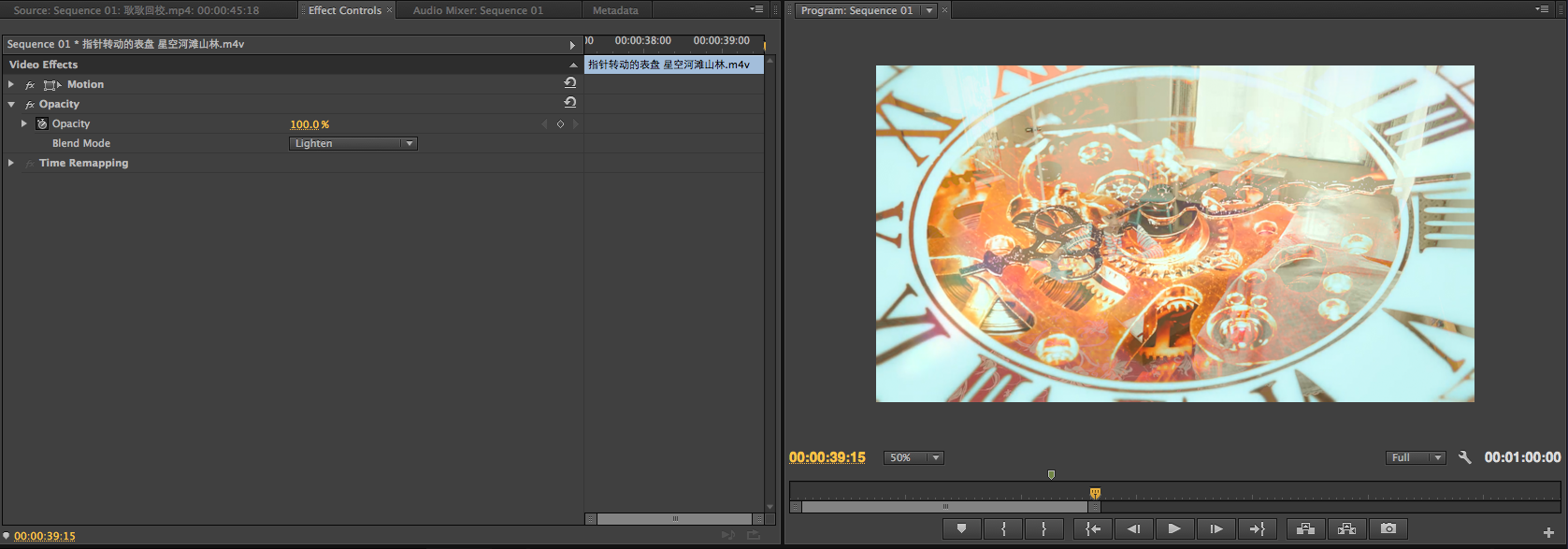
In my clip I need to show the pass of time, so I choose the scene of working gears, moving cars, clock and sunset. Then for separation I also put some indirect scene in my video, like the gradient wipe of the class group photo, student wipes out the notes on blackboard.

luomierkefu

https://www.bilibili.com/video/av17778412/

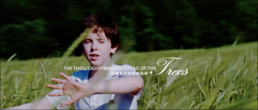
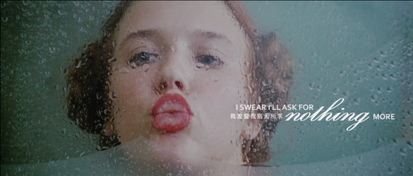
I get inspiration of the way how this editor layout the subtitle. The subtitle is no longer a extra part of the image, it’s part of the image and involves in the composition. But this method takes longer time to read because the word keep moving, so for the 30s version I still use the normal subtitle due to the time limitation.

Transcript of Voice Over

Hi! I’m you, from 10 years later.
I know what you wanna ask, don’t worry, you will get into your dream school.
Keep your hobbies, school life is not only about books and homework.
Don’t feel sad for graduation, you are still keep in touch with your friends.
There are more separations in the future, and you will get used to it.

Text Premise

Gears are driving, birds are flying through the sky, cars are crossing the road and students are walking out of school. Sunlight leaks in the green leaves. A fresh plant out side of window sways as the wind blows. Inside the classroom a bright light flash through.

The days on the blackboard is counting down, students are studying hard to prepare their final exams. Some are worshipping to get a good result.

On the school playground there are students playing badminton. One hand rises up a glass bottle that contained a ship model inside. Someone is sketching on the paper, someone is flipping the handmade comic book. However, a girl is staying at home and doing her homework until 5:30 AM.

In the school, one student is cleaning up the blackboard. A hand touches the class desks softly as the person walking by. Many desks are already organised nicely in the corridor. The whole class takes the last picture in classroom.

Clock is walking. A girl in mature suit opens one case and flips her album of high school memories. The group photo, the teacher’s notes on blackboard, the light of sunset, all of them are fading and disappearing. The holding hands separate and someone is sitting alone in a field full of withered grass.

Credit Lists

Drama With You (2016)

Drama My Huckleberry Friends (2017)

Drama Love, Timeless (2017)

Project 2 – Go With the Flow

Artist Statement

As Chinese New Year is approaching, I realised that this is the 5th CNY that I spend in Singapore. Sometimes I do feel that I’m like a duckweed which doesn’t have a strong root and only can drift with wave. I made important decisions in my life, but I didn’t really know where the path leads to, and those unknown makes me anxious. As time goes by, I learnt to be calm and composed to new environment or situation that I never expect. When things happened, there must a way to get through it, and I know I will get through it, somehow.

Before Image


Technical Decisions

Camera

Camera: Cannon 650D

Lens: 18 – 135 mm (Has a wide range)

IOS: 200 (It’s a indoor shooting)

Focus Length: 18 (Use wide angle to include the whole figure)

Shutter Speed: 1/40 (Based on my experience, if the speed is slower than 1/30, the picture will mostly become blur because of hand shaking)

F: 4.5 (To get enough exposure)

Digital Process

First of all I use masking to crop out the figure and the lotus leaf. Then I arranged all the elements to test the composition.

After the composition is done, I start to convert the real photos to Chinese painting style. I have done some research for tutorial, the basic steps are as below:

1. Duplicate your image and desaturate.

2. Duplicate the desaturate layer and inverse, change the mode to Color Dodge

3. In Filter, choose “minimum” in “other”, change the number according to get the line work of the image.

4. Merge the 2 desaturate layers, then there is the line of the image. Change the layer mode to “soft light”.

5. Now the photos convert to Chinese painting style, you can change the original layer mode to “multiply” then put a paper texture as background.

After those steps I desaturate the leaves a bit because it’s too bright. For the Chinese painting style that I took as my reference, I find out that the color is quite dull and more toward to yellow and brown.

To emphasis on the figure I decide to make the blue color brighter and pop out. In Chinese painting there is a blue color called lazuli blue, which is a very shining blue. So I try to adjust the blue to achieved the shining effect.

In the end I added in the fish and Chinese text to make it more looked like a Chinese painting. And I add in a bit red as well.

Artist References

1. Sun Jun

Sun Jun is a Chinese photographer and famous for his unique Chinese painting style. I was really surprised at his work when I first saw them and always want to try this style.

2. Ibuki Satsuki

Ibuki Satsuki is a illustrator, for this assignments I take her painting as reference for colouring, especially the lazuli blue that used in Chinese painting.


Project 1 – Sweet Burden

The theme of our first assignment is “self-portrait”, which also can be “a reflection of an exploration of oneself”. So in my understanding, the self-portrait is not just to show people how you look like, but also reflect your inner world – how is the world/something looks like in your eyes. So below is my artwork for this project.

Sweet Burden – By Yao Jiaqi

The title of this work is “Sweet Burden”, it shows how I feel about “drawing” as an animation student.

Artist Statement

There is a theory called “10,000-hour rule”, it says if someone want to be an expert of a skill, he/she need to spend at least 10,000 hours on it. This is still a controversial theory, but nobody will deny that continual practice is an important thing in skill training. Same goes to drawing. As an animation student, I feel that most of time my hand is tied to table and pencil, keep on drawing and drawing. This sounds horrible. In my point of view, it’s a tiring but enjoyable process, that’s why I call it a “sweet burden”.

Before Image

Because I want to show that “drawing is a tiring, but I enjoy it”, I use white yarn to tied around the wrist, and the hands are in very natural pose – no force, no hurt, no struggle. And all the props I choose to use wooden or brown color (like the drawing pencil), those natural color can give audience a friendly and comfortable feeling. And I put my pencil case and mug around to imitate my real working environment.

In order to show that the string is come from the table, I use paper and wooden-texture sticker to make a fake table cover. Then I zoom out my camera a little bit to make sure all the information I need is inside the frame.

For the camera angle I choose to use POV, point of view, to show the image, so the audience know what does drawing feel like in my eyes.

Camera Decisions

Camera: Cannon 650D

Lens: 18 – 135 mm (Has a wide range)

IOS: 200 (It’s a indoor shooting and the weather is cloudy)

Focus Length: 27 (35mm is the closest to the focal composition of the human eye. I reduce it a bit to include all the information inside the frame)

Shutter Speed: 1/50 (Based on my experience, if the speed is slower than 1/30, the picture will mostly become blur because of my hand shaking)

F: 5 (To get enough exposure and has a depth of view in the picture)

Digital Process

First thing I did is to refine the picture, it has too much unnecessary space in the original picture (like the white space that didn’t fully covered by the fake top.) So I rotate and crop the image, then extend the wooden texture and clean the scratches on the wooden part.

Then I start to think about “What kind of effect/feeling I want achieve in this work”.

Since my theme is “Sweet Burden”, my work should have a warm and comfortable feeling to the audience even the hands are tied by yarn. To achieve this, I did following steps.

1. Using Curve to brighten the image.

2. Raise the saturation to make the colors pop-up.

3. Adding red in color balance layer so the picture looks warmer.

Then I use brush to paint a yellow sunlight come across the picture diagonally and change the blend mode to “Screen”. This helps to bringing the atmosphere and leading the audience eyes. And I add one selective color adjustment layer to adjust the color based on my reference.

Then based on the lecturer’s advice, I cleaned the paper in the middle because the original drawing looked a bit nervous. I redrew some basic forms like cube and sphere, and some doodles of sweets – I always doodle when I’m doing my drawing homework, it’s time for me to rest and draw whatever I want.

Because of the cropping, the mug and pencil case around are not so obvious, so I use mask to crop the mug and take another photo of my pencil then add them inside the image, so audience can know this is my normal working space.

Artist References

Ume Kayo is a Japanese photographer, her work is most focus on those little humour moment in daily life. The first time I saw her work I thought this photographer must be a very interesting and careful person, that why she can capture those little moments which always being ignore by many people. That’s also how I get the concept of “reflect the world through my eyes” and decide to use POV angle. And her pictures are mostly about daily life, give audience a very life-close feeling, so I have referred the lighting and color tone as well.

For colouring and atmosphere, I have gone through many digital advertisements for reference. And this Russian manicurist advertisement inspiring me a lot for the color adjustment, especially for the finger part. The whole image looks dreamy and comfortable, which match what I want to achieve in my work.