Here are my final designs for this final assignment.
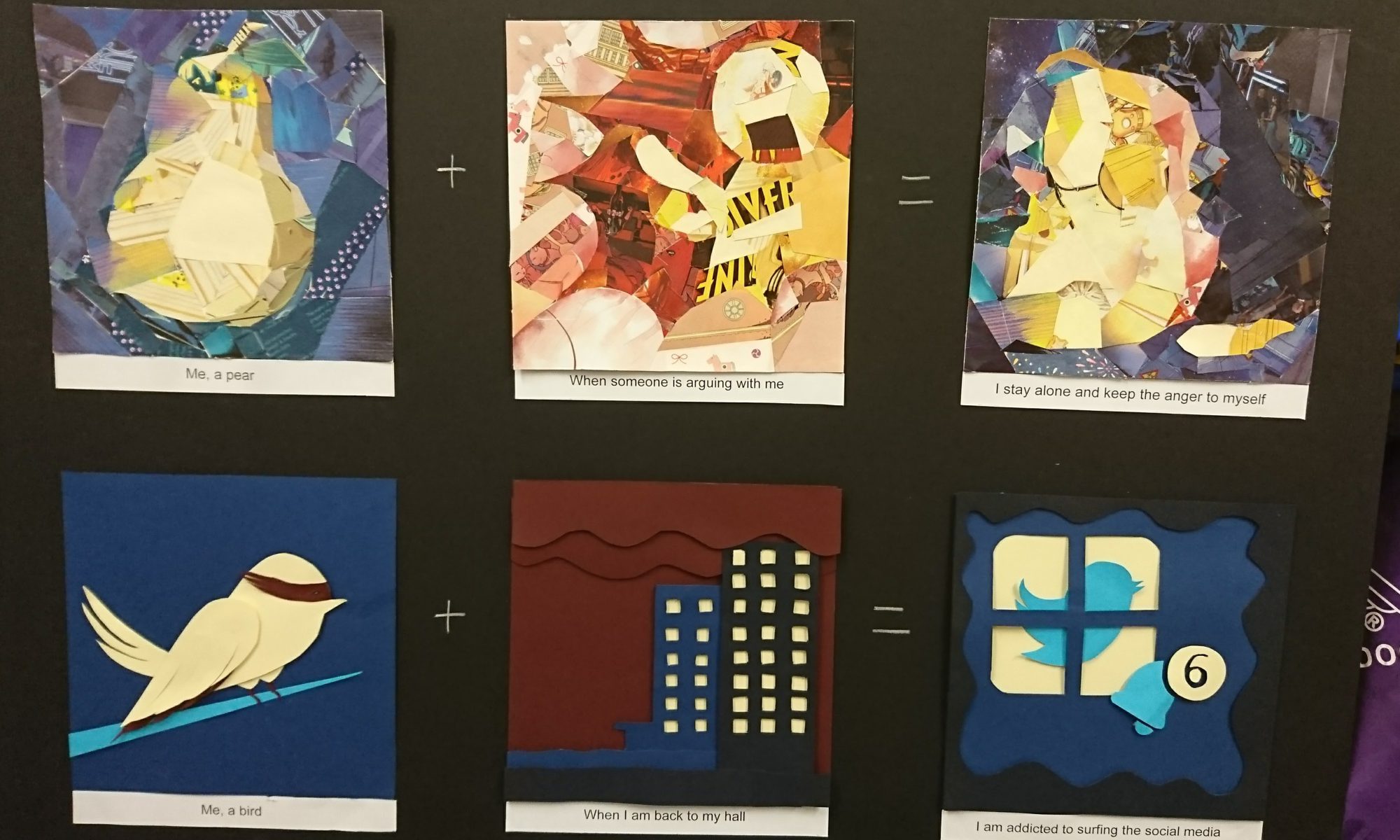
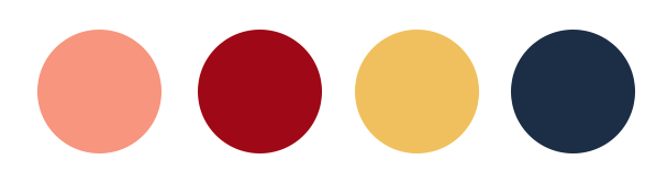
Me, a pear + when someone is shouting at me = I stay alone and keep the anger to myself
The style I used for this row is magazine collage because the designs are quite simple and don’t have many details inside, which suit to the collage style.
For the color theme I choose the primary colors because the contract between each other is high. The main problem for this style is that I need to choose the color carefully so the elements can stand out instead of merge together. Base on that, the brightness of the color between each other is very different as well. For detail like the mouth of the pear I use pen to draw it.
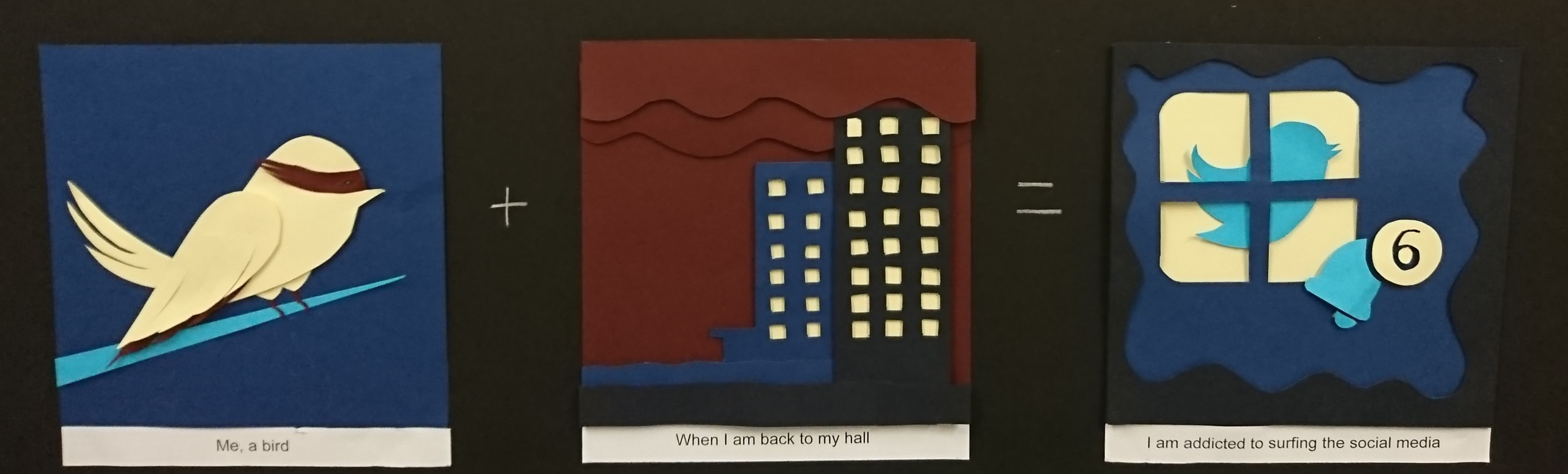
Me, a bird + when I’m back to hall = I’m addicted to social media
The style I’m using for this one is paper craft. This is very close to digital vector illustration because the color is plain and the outline is sharp and clear, but also it has the problem that the image will be too flat. In order to solve this, I use multiple layers and between each layer I add one piece of foam to create the distance and shadow.
For the colors I choose triacial colors so I have different shadow of blue, which can create a gradient effect and a bright yellow as contrast. And the blue fit to the twitter logo color as well, to help deliver the message of this design.
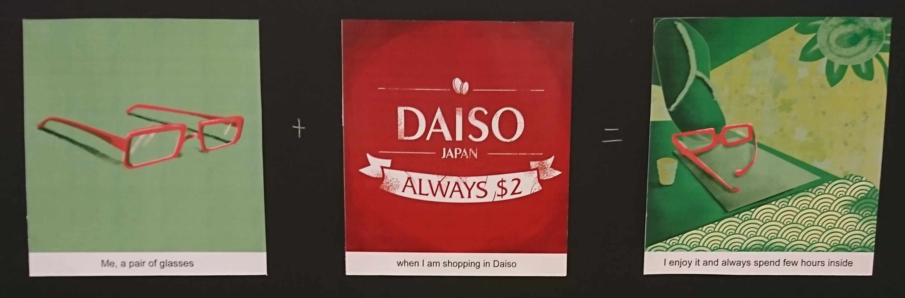
Me, a pair of glasses + when I’m shopping in Daiso = I enjoy it and spend a lot of time inside
The style I’m using for this one is digital painting. Adding texture inside make it more interesting and friendly feeling. It becomes more lively also.
The color I use is complemetary colors, which can create a high contrast to help my main object stands out from the background. Complementary colors are very dramatic and can catch people’s eyes very fast.
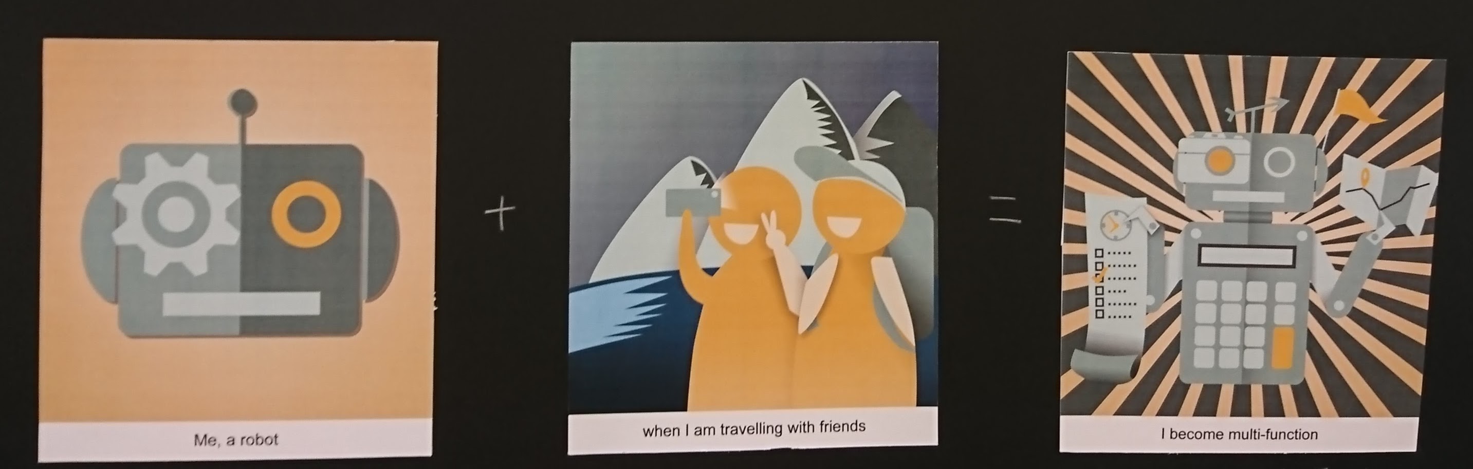
Me, a robot + when I’m traveling with my friends = I become multi-function
The style I’m using for this row is vector illustration. This style is very common in industry, it’s clean and simple, and vector illustrations are easy to fit different printing size without getting blur.
The colors I choose to use are monochromatic colors plus the yellow as highlight. All the colors are quite dull so the highlight can stands out, and dull colors fit the impression of robot also.
The difficulty I have during this project is choosing the colors since there are too much choices. And time management also since every module is rushing for the final assignments. But I’m very happy that I can try different type of traditional style to make the designs.
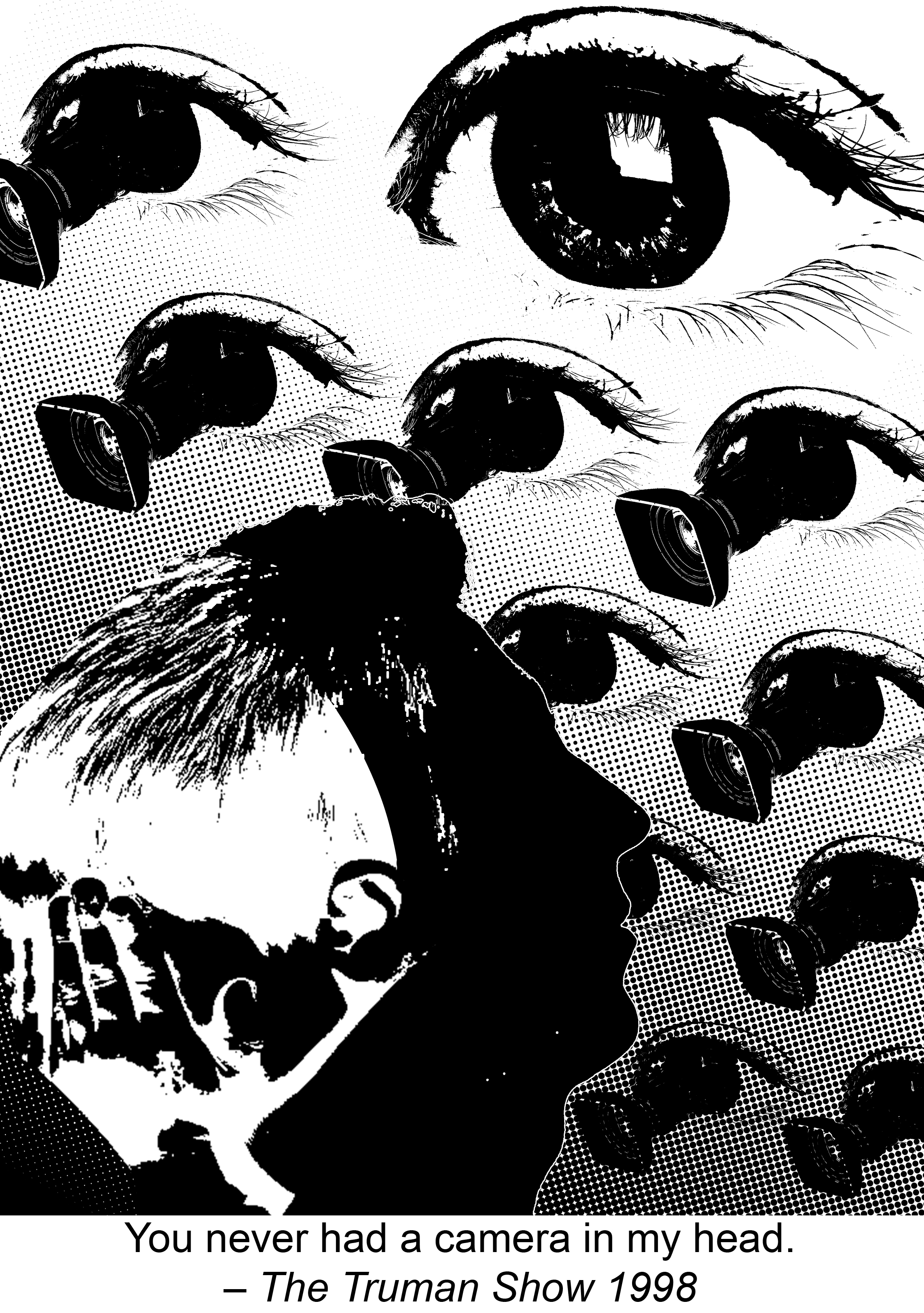
You never had a camera in my head – The Truman Show 1998
This quote is saying that even the main character is lived in a world that being watching by others all the time, he still has his own thoughts in his mind where camera cannot record.
So in this design I’m using the principle of pattern and rhythm to form the background. The camera pops up from the eye represent the audience who are watching the Truman Show through the camera. The change of the scale forms the rhythm and shows the perspective that it looks like the eyes are looking down at the man. The direction of cameras helps to guide the audience’s view. In order to have a focus point in the background, I apply the principle of dominance to make one eye much more larger than the rest and without camera in it. It represents the director of the show, who are the “boss” of these camera and in this way the background won’t be boring.
As we follow the direction of the cameras we can see a sideview silhouette of a man’s head, the back part in white is a kid covering his face with hands. This uses gestalt to show the conflict that the man is struggling to hide somethings in his mind, he want to approve that even the people set so many cameras around him, they still can’t know 100% about him because they can’t read his mind. The contrast in colors and the directions of two faces emphasis the conflict. The foreground, which is the silhouette and background also follow the proper proportion.
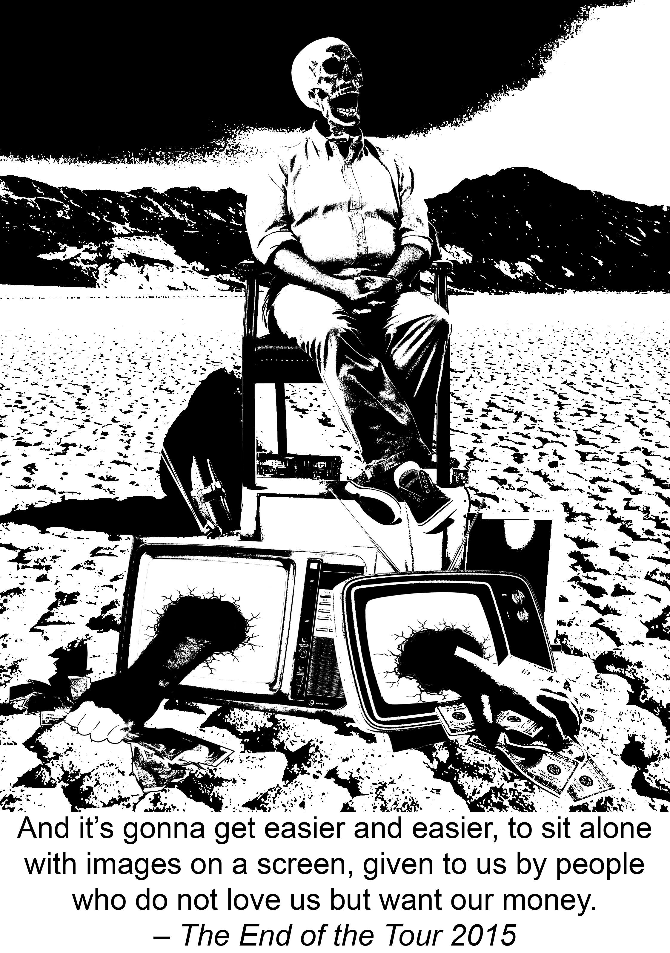
And it’s gonna get easier and easier, to sit alone with images on a screen, given by people who do not love us but want our money. – The End of the Tour 2015
The quote is about the phenomenon that the addiction of television becomes common for people nowadays and it “kill” us in mental. In another words it means the addicting to television is killing us. So I put a skeleton which looks like it’s watching TV and laughing on a pile of broken TVs. Many hands are coming out from those TV and grabbing money. The background is a desert which makes the image more lifeless.
In this design I use the rule of third for the background proportion, the horizontal line falls on one third of the height. And the composition of this picture is symmetry, for example the skeleton is in the middle, there is one hand at left and one hand at right. This symmetry structure make the picture look more dull and lifeless, which is the emotion expressed from the quote.
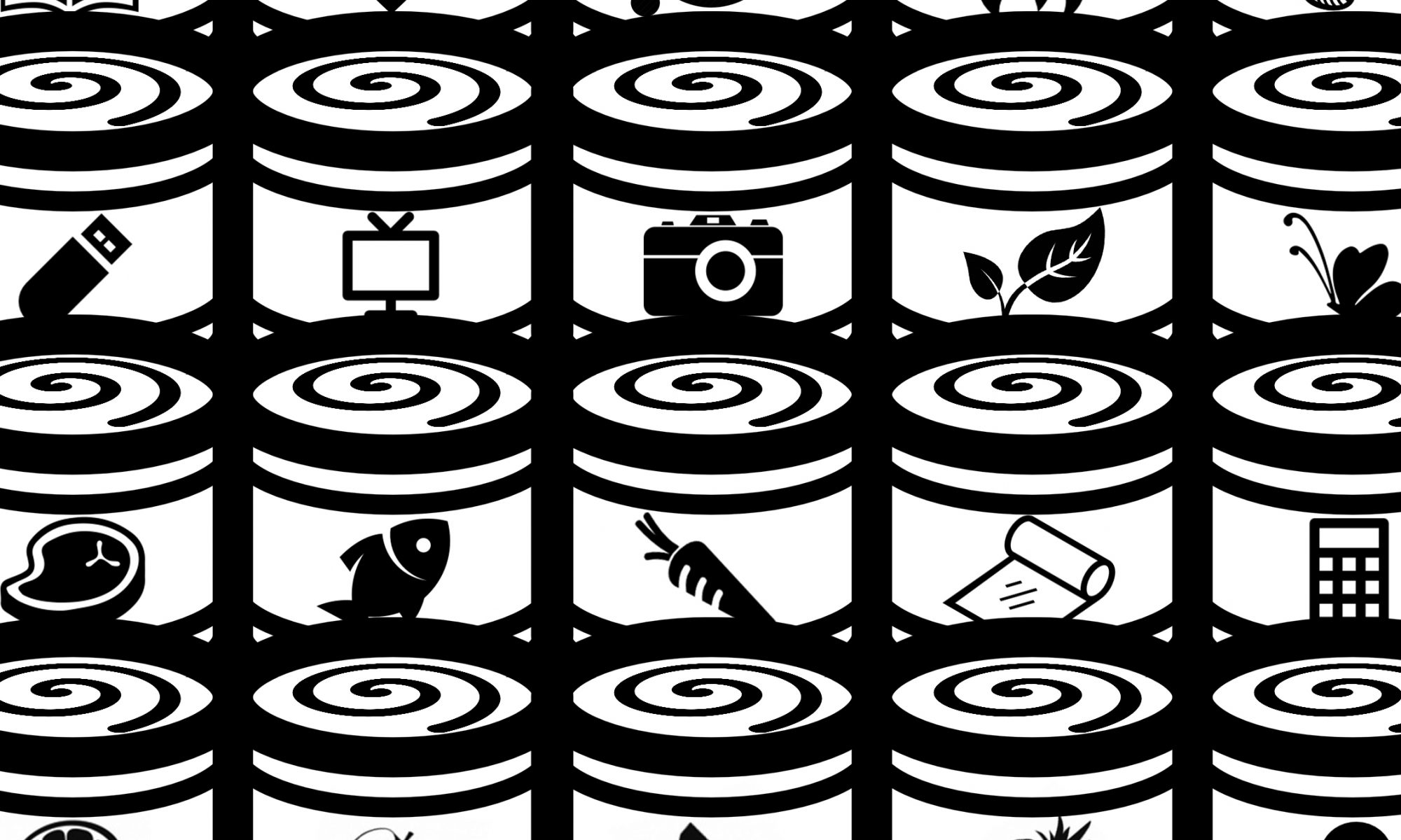
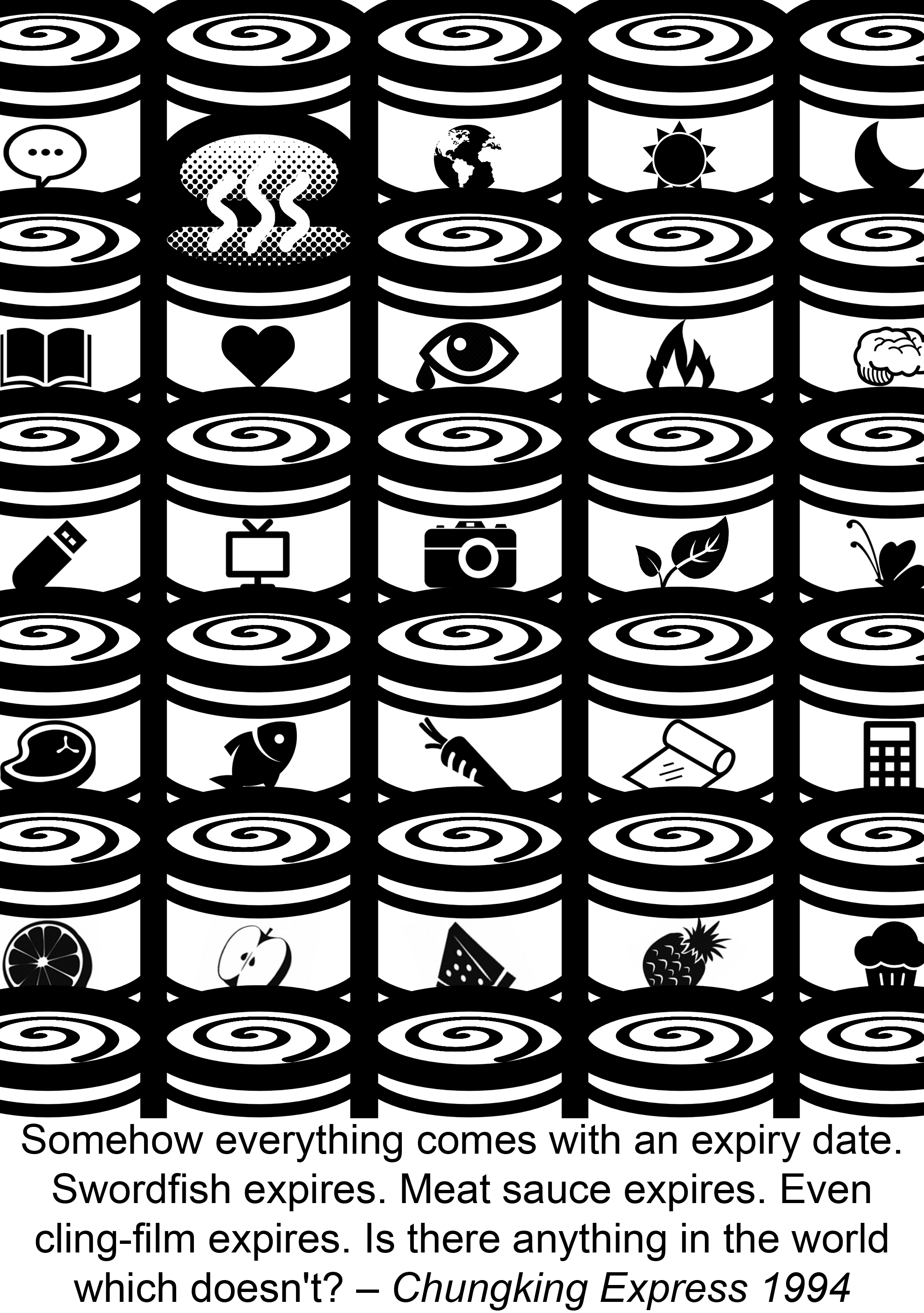
Somehow everything comes with an expiry date. Swordfish expires. Meat sauce expires. Even cling-film expires. Is there anything in the world which doesn’t? – Chungking Express 1994
When we talk about expiry date it always link to packaging. Inside the movie tinned pineapple is a important symbol and I get my inspiration from that. People always think that put something in tin can keep it longer, but what we forget is that it can’t keep forever. So I arrange many tins in order and put different icons on them, from visible things like food, electron devices, leaves and butterfly to those invisible stuff like emotion, language and universe. Then the tin of love is opened and become smelly because it’s expired.
We can see a strong pattern in this design, the can with a spiral on top, and also variety of icons on each tin. The position of the opened tin follows the rule of third, and the dominance form the contrast so people know which one to focus one. The color contrast make the smell icon more obvious.
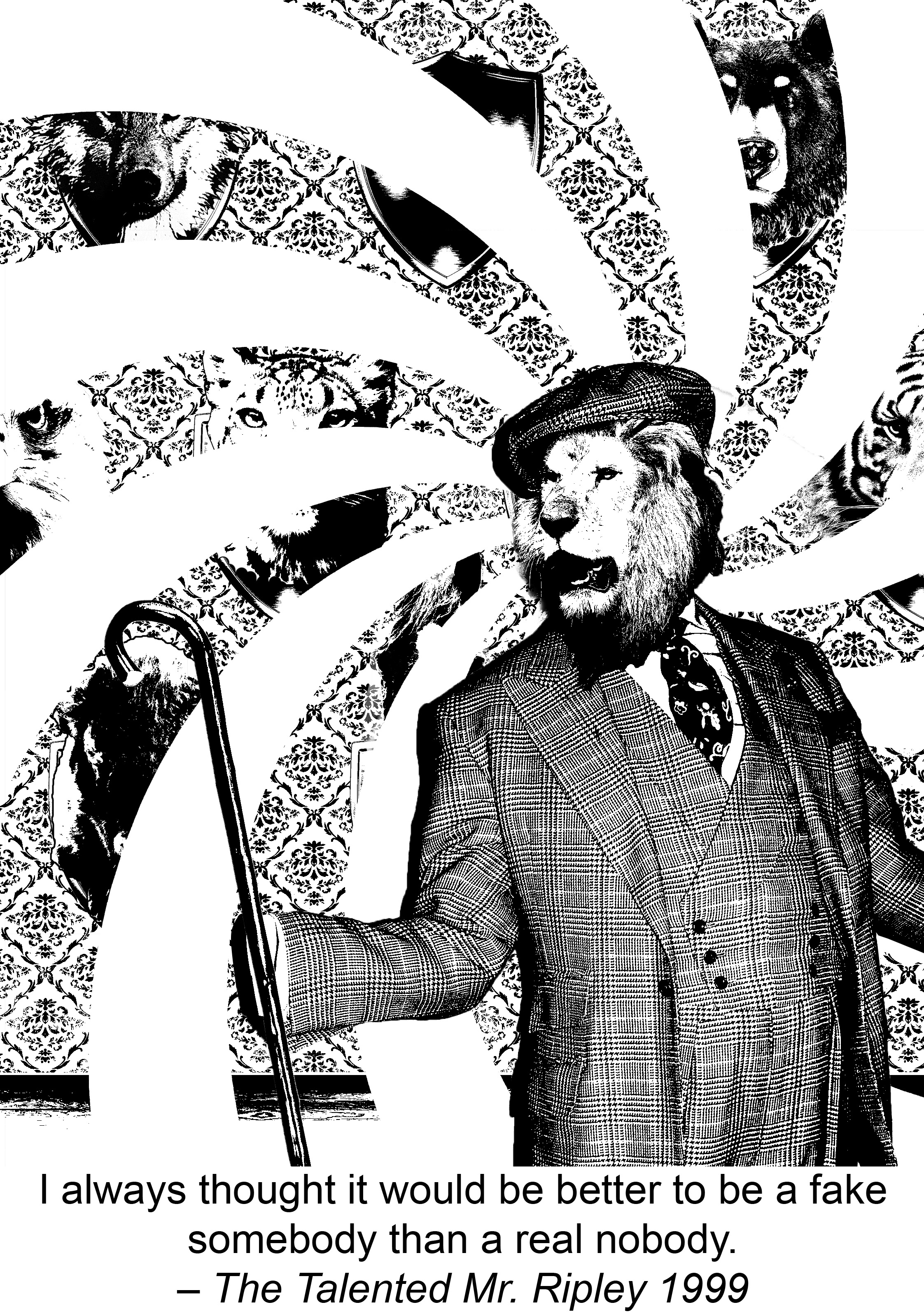
I aways thought it would be better to be a fake somebody than a real nobody. – The Talented Mr. Ripley 1999
In this design I create this guy in a lion head holds his stick and stands in a quite dramatic pose. This shows the vanity of being a famous. But if we look at how he holds the stick we can find out that there is no hand, which hints that inside this suit actually is “nobody” (or at least we can’t see the person because he is such a small person). The background is a wall with many animals heads mounted on it and one of them the head is missing. So the story behind this is the “nobody” wears the animal heads to pretend to be a famous everyday and he enjoys this kind of feigning.
Variety and unity is being used in the design of background. The animals heads forms a pattern and the wall also has its own retro pattern. The lion-head person is at one third of the picture. There are 3 functions of the white spiral behind the man: guiding audiences’ view, dividing foreground and background and emphasising the focus. The spiral also create a illusion feeling since the guy is a fake one. Because of gestalt, even it break the background people still can read what is happening at back.
In this assignment the biggest problem for me is the concern that audience can’t get the message behind. Because I prefer to hide many small details in design and sometimes I realized that sometimes I can get them but others might not. My solution for this is just go and ask around for opinions, then see can use anyway to make it easier to understand.
From this assignment what I learn is how to use design principles purposely to solve my problem. For example if I find my focus point doesn’t really stand out I can use leading lines, or if the object is merge with a complex background I can use color contrast. For repeated pattern can change one element to achieve the dominance. And also I find out again how important it is to arrange the working files layers properly. Making the layers in correct arrangement helps me work effectively.
After few weeks of research and exploration, finally we finish the first assignment and here are the final work!
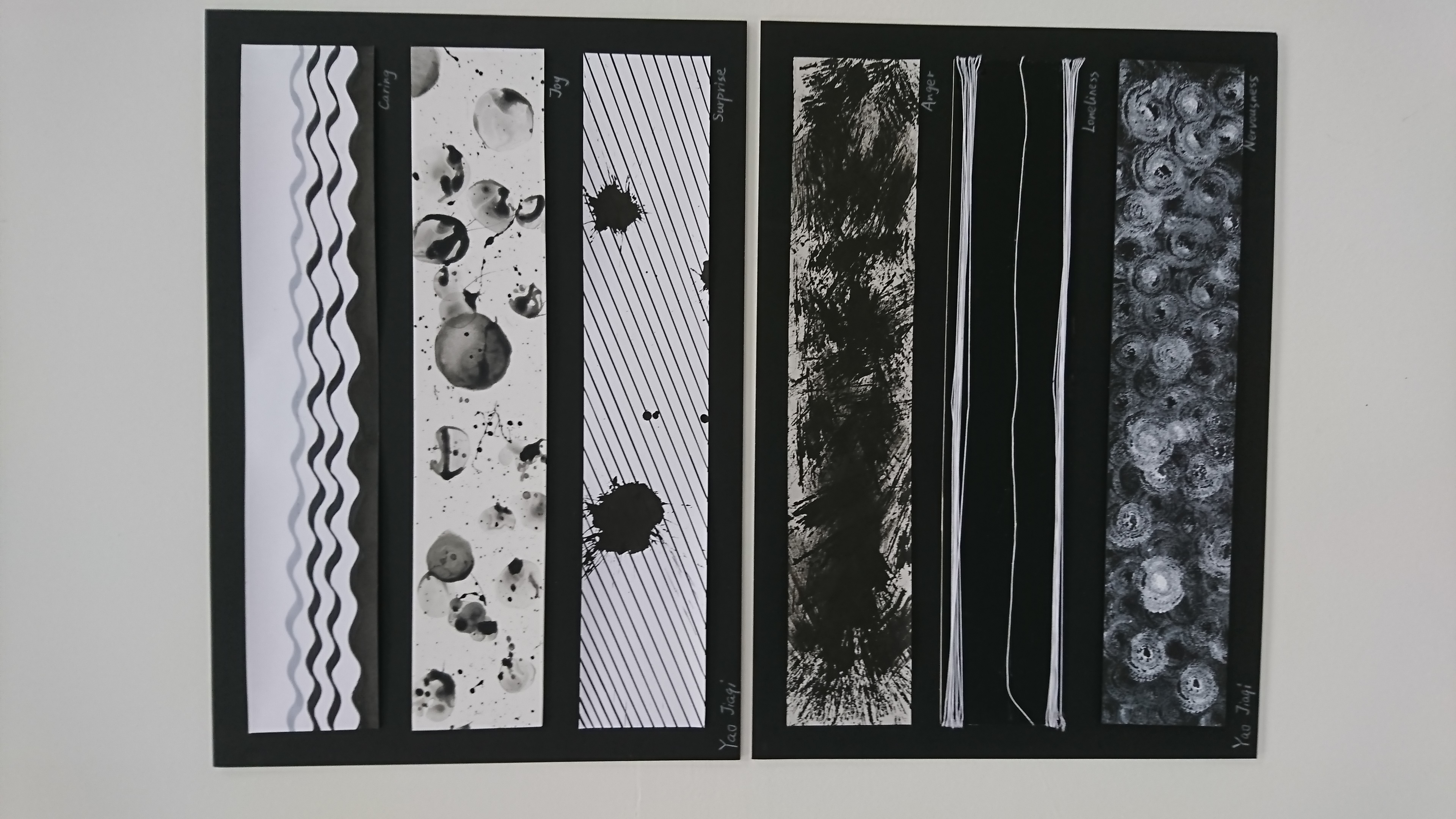
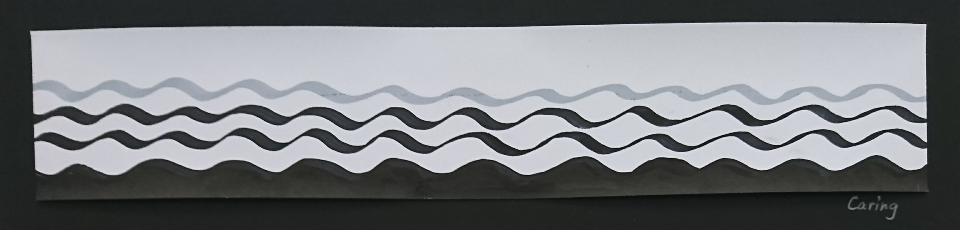
Mark-making of emotion “Caring”
Caring
The definition of caring is shows someone kindness and concern. When people talk about caring and concern, mother is the first word most of us think of because this is the first love and care we feel, even before we were born. When foetus are grown in womb they feel safe and the emotion from mother, that why people feel calm and safe in water. So for my understanding, caring is a emotion that can make people feel safety and heal their heart.
Based on this understanding, I choose to use curve line, since it represent pleasant and feminine. The curve line also look like sea wave which help people feel calm. The mark should be smooth so I choose marker and normal paper. The top part I leave it empty for breathe so the whole picture won’t be too crowded and anxious. I add one more grey curve line on top to create a fade-out effect so the curves don’t suddenly stop like a brake.
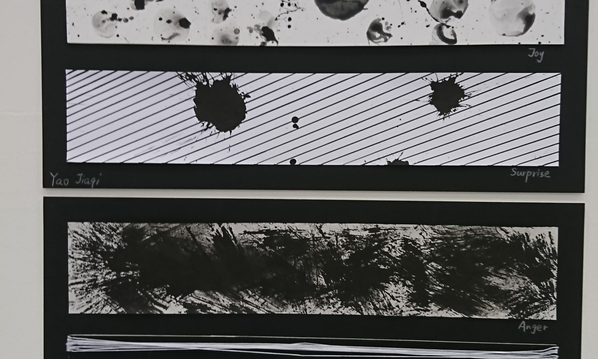
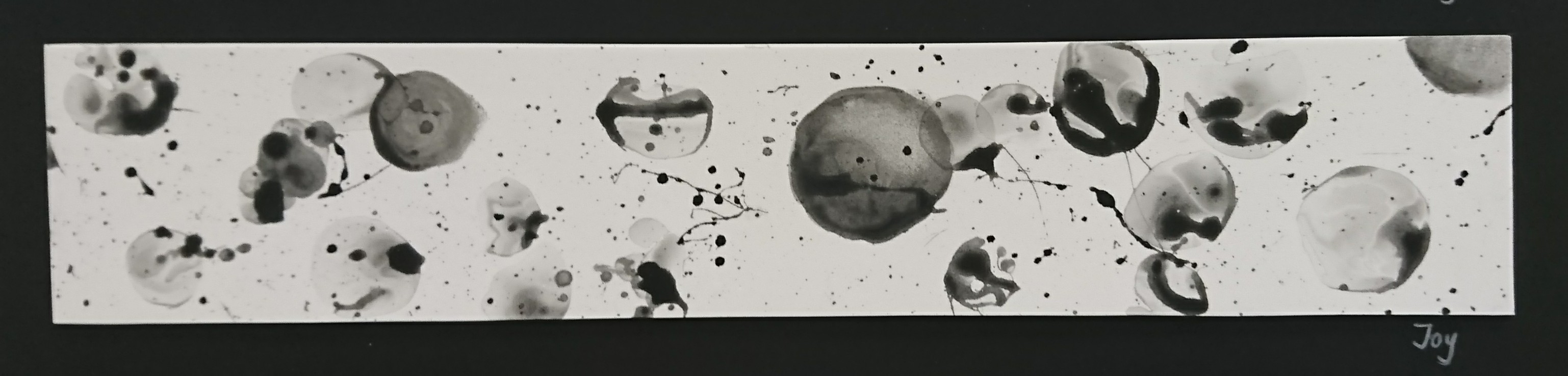
Mark-making of emotion “Joy”
Joy
Joy means a feeling of great pleasure and happiness. From the definition we know that joy is a level-up happiness, for example if happiness is a smiling face, then joy is a smiling face PLUS some flowers and sparkles surround it. So my definition of joy is a small burst of happiness.
Now, how to show the sparkles and burst? When I did research, the mark-making done by bubble has left a deep impression on me, and I realise I can use it for Joy because kids feel joyful when they blow and play with bubbles. So I mixed shampoo, water and ink, then use wire to make a circle as the hook and blowed bubbles on the foam sheet. Yes, for this one I didn’t use paper because the bubbles are too wet, and the foam sheet has many shallow holes on the surface, which help to soften the marks and has a bling-bling effect when everything is dried. When the bubbles touch the sheet it burst immediately and leave many nice splash on the foam. The bubble in the middle is drawn by brush because it’s really hard to make the bubble stay on sheet and make a nice circle. I use sponge to wipe the central part to imitate the transparent looking of bubble.
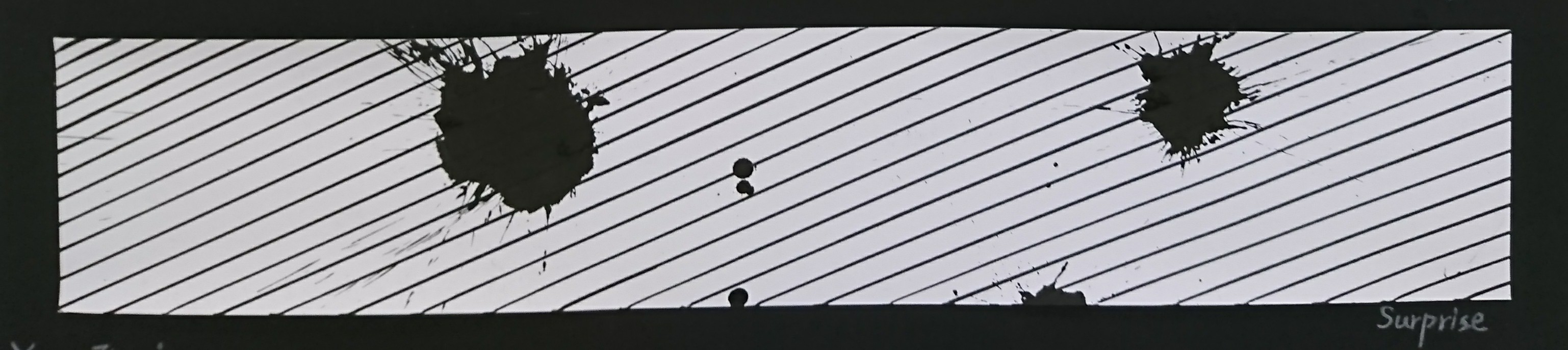
Mark-making of emotion “Surprise”
Surprise
Surprise is an unexpected or astonishing event, fact, etc. The definition doesn’t identify this is a positive or negative emotion, means surprise may not be a good thing in some case. Maybe because I did two positive emotion just now, this one I want to try something negative. I do have many happy memories about surprise, but the first thing it reminds me is one time I need to redo my painting for a poster one day before assignment deadline because I realised I use the wrong color at final stage. I also heard my friends complained somethings similar to me, her cat jumped on to her table while she was painting and it flipped the color palette. So I want to show this kind of surprise that destroy the hardwork or break the pattern, which makes people really annoyed.
The technique for this one is quite simple, I use marker to full fill diagonal lines on paper, then soak tissue with Chinese painting ink and smash it on paper. After that I find only one mark is a bit empty, so i drip some ink on the other side as well. The reason why I choose diagonal line is try to make a energetic atmosphere for the paint, vertical lines are too calm while horizontal lines are too dramatic. Also I only make a few marks because too much marks will distract people’s attention and they won’t know where is the focus point.
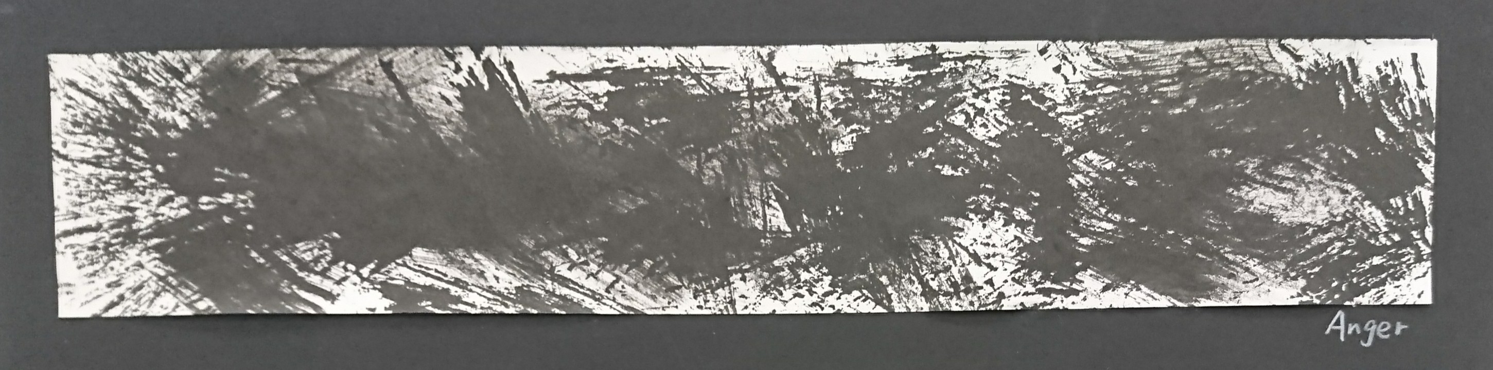
Mark-making of emotion “Anger”
Anger
The definition of anger is a strong feeling of annoyance, displeasure, or hostility. This is quite abstract, in my mind, anger is an image that someone is shouting at you. The person just burst out and vent all the emotion on you.
The tools I used is sugar cane, after press out all the juice, the dry faber can use as hard brush and create this kind of mark. And because anger is burst out the emotion, so I brush the stroke hardly in different direction. The paper is newsprint paper because it dry out very fast.
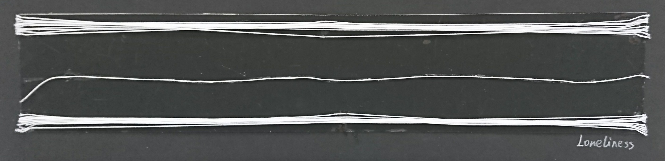
Loneliness
Loneliness is the sadness because one has no friend or company. It’s different from alone, one person stands in a room that is alone, but loneliness is a group of people inside the room but one stands in the middle because only that person has nobody to talk with. People will feel lonely only when compare with others who are in groups.
At first I tried to draw the white line but I find it always break in between and the thickness is not even, so I shifted to stick strings on black cardboard. There are some benefits about using string. Firstly, the line is thin and even. Second is that if I draw many lines they will merge together and looks like a thick stroke, if use string people can easily find out that they are two bunch of lines overlap each others. Loneliness is a negative emotion so I choose black as background, and it’s a low-key emotion so the lines direction is horizontal.
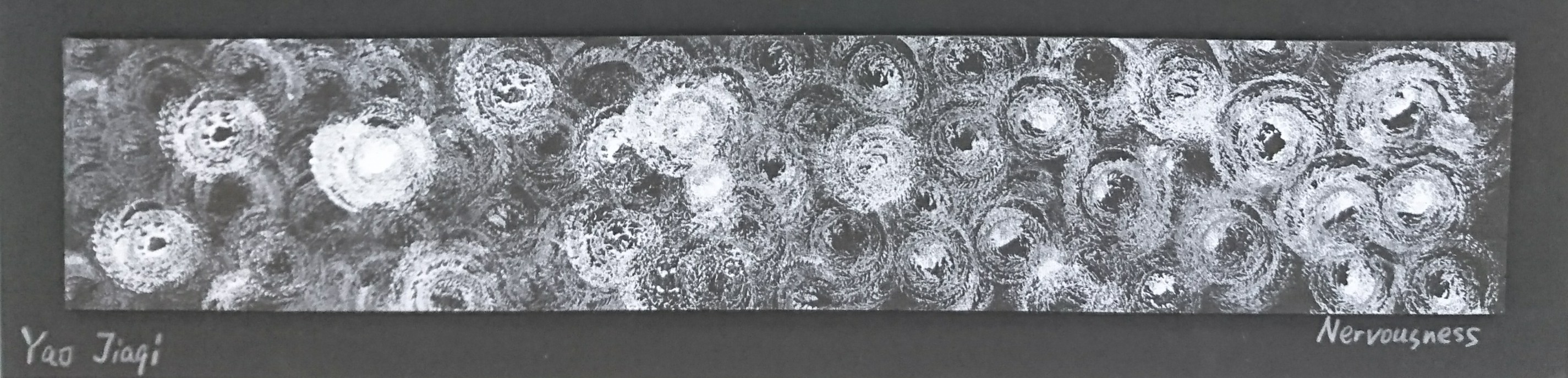
Mark-making of emotion “Nervousness”
Nervousness
The meaning of nervous is easily agitated. From my own experience I find out that people are tend to feel nervous when facing crowded, like giving a speech in front of public, looking at a picture that is filled with small dots, even when entered a crowded MRT station we also feel nervous and annoying. My understanding of nervousness is crowded.
The tools I used for this piece are white acrylic, chenille stem and black foam sheet. Chenille stem is a wire with many faber around it, and as I have mentioned previously, the foam has many small holes on surface, then plus the faber they can make a thicky-dotted texture. I roll the wire to coil, put white acrylic on one side then keep stamping it on the foam sheet. Why I roll up the wire is because I want to make this crowded texture warp and twisted, like what those artist do in horror manga, when the character are heading to a creepy place, they will draw a lot dots and warp them to swirl, to make reader feel the anxiety and nervousness.
From this assignment, I have learnt a lot of line language, different kind of line has different characteristics, and I have tried to apply the knowledge in the final work consciously. Also I have explored a variety of tools and materials for mark-making. Personally I realised that things can come out very different from sketches and real piece, so just try it out. Don’t fix your mind into your ideas, it adds limitations to yourself, try something you didn’t think of before and sometimes a good surprise will come to you.
One more thing is that when you finish your work, choose the final one objectively. For this assignment I have done several pieces for each emotions, some I spend half an hour, some just finish in few minutes, which turns out better than the half-an- hour work. Keep your focus point in mind and choose the work that best representative to your idea. Don’t let the money, time and effort you have spend affect your choice. The audience can’t know how much you have spend behind the work, the only thing they can see is the final outcome.