My Line is Emo – Final

My Line is Emo – Final

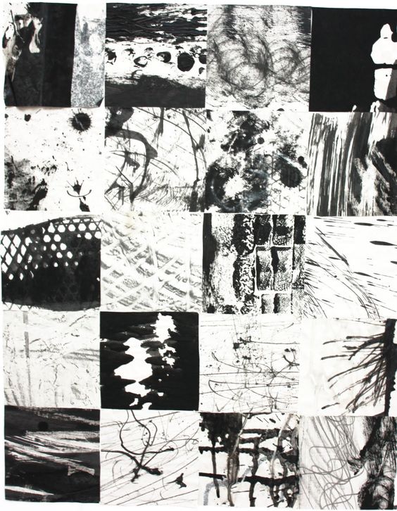
After few weeks of research and exploration, finally we finish the first assignment and here are the final work!
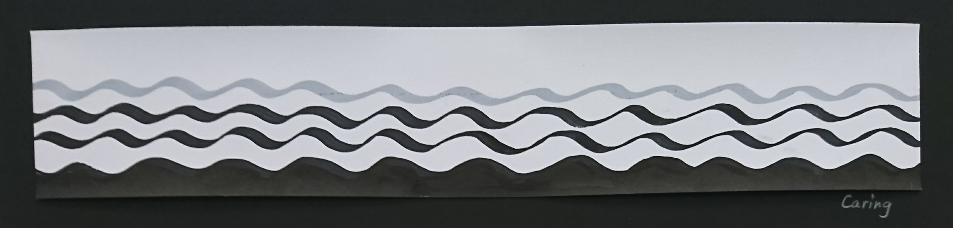
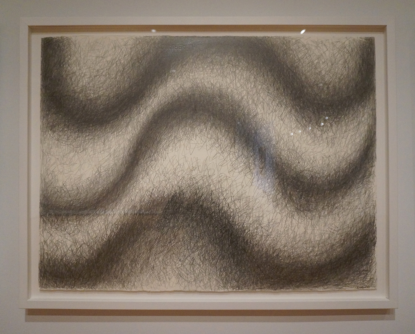
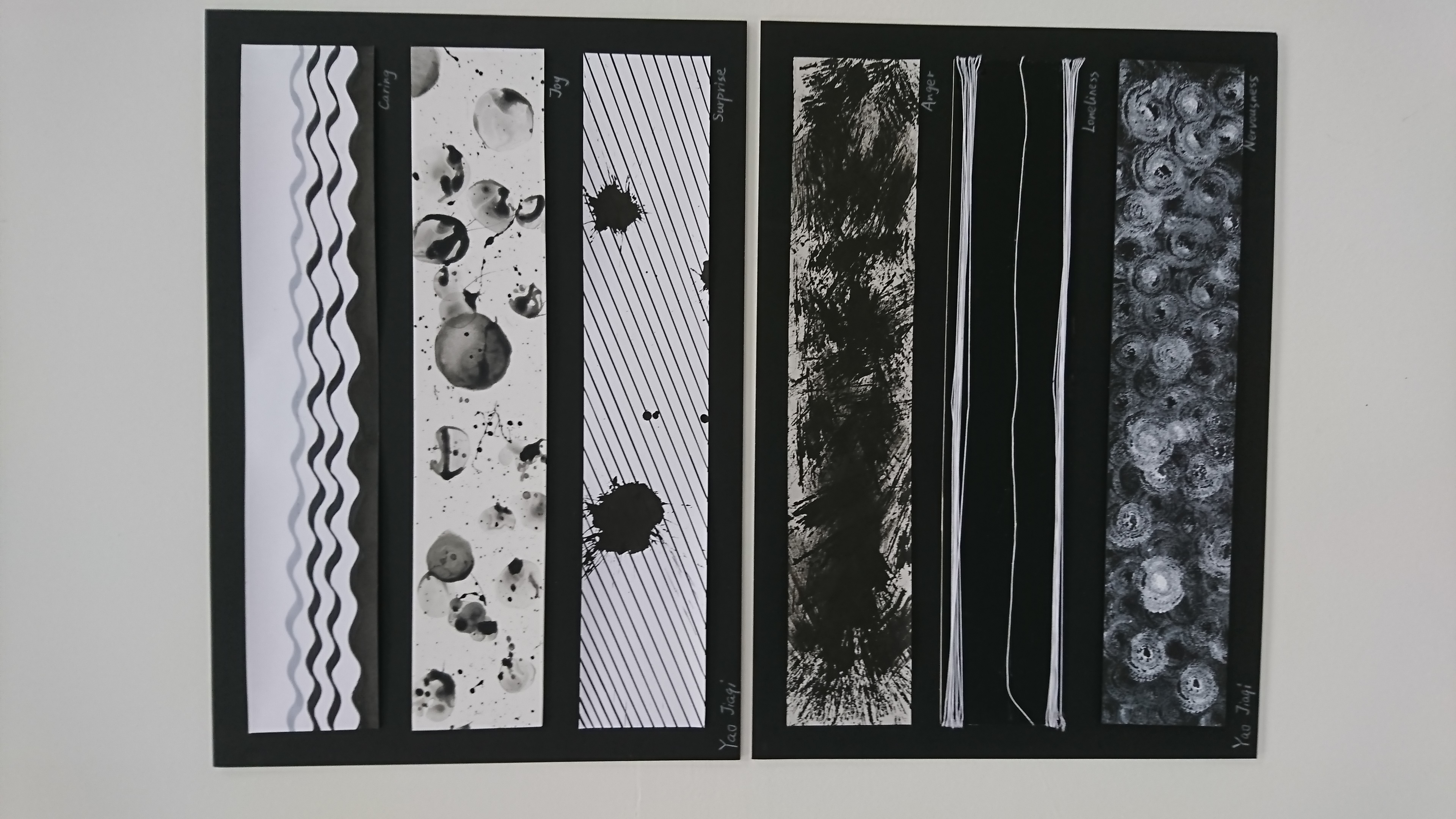
Mark-making of emotion “Caring”

Caring

The definition of caring is shows someone kindness and concern. When people talk about caring and concern, mother is the first word most of us think of because this is the first love and care we feel, even before we were born. When foetus are grown in womb they feel safe and the emotion from mother, that why people feel calm and safe in water. So for my understanding, caring is a emotion that can make people feel safety and heal their heart.

Based on this understanding, I choose to use curve line, since it represent pleasant and feminine. The curve line also look like sea wave which help people feel calm. The mark should be smooth so I choose marker and normal paper. The top part I leave it empty for breathe so the whole picture won’t be too crowded and anxious. I add one more grey curve line on top to create a fade-out effect so the curves don’t suddenly stop like a brake.
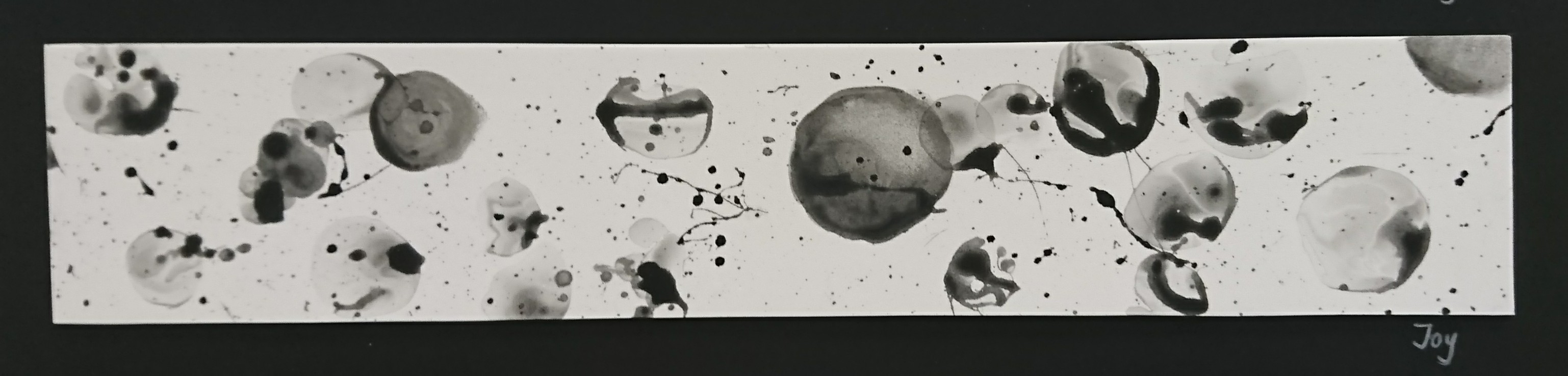
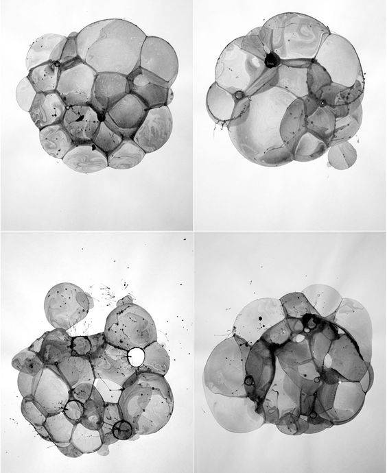
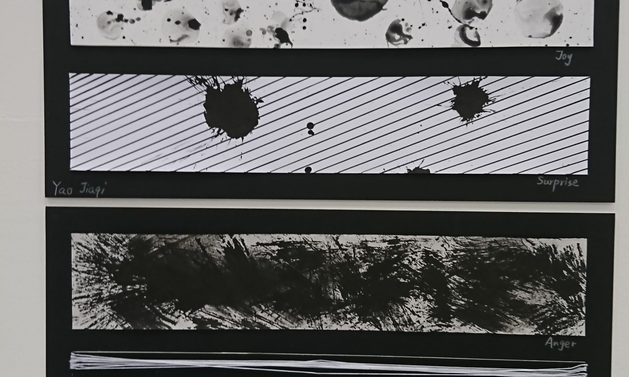
Mark-making of emotion “Joy”

Joy

Joy means a feeling of great pleasure and happiness. From the definition we know that joy is a level-up happiness, for example if happiness is a smiling face, then joy is a smiling face PLUS some flowers and sparkles surround it. So my definition of joy is a small burst of happiness.

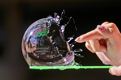
Now, how to show the sparkles and burst? When I did research, the mark-making done by bubble has left a deep impression on me, and I realise I can use it for Joy because kids feel joyful when they blow and play with bubbles. So I mixed shampoo, water and ink, then use wire to make a circle as the hook and blowed bubbles on the foam sheet. Yes, for this one I didn’t use paper because the bubbles are too wet, and the foam sheet has many shallow holes on the surface, which help to soften the marks and has a bling-bling effect when everything is dried. When the bubbles touch the sheet it burst immediately and leave many nice splash on the foam. The bubble in the middle is drawn by brush because it’s really hard to make the bubble stay on sheet and make a nice circle. I use sponge to wipe the central part to imitate the transparent looking of bubble.
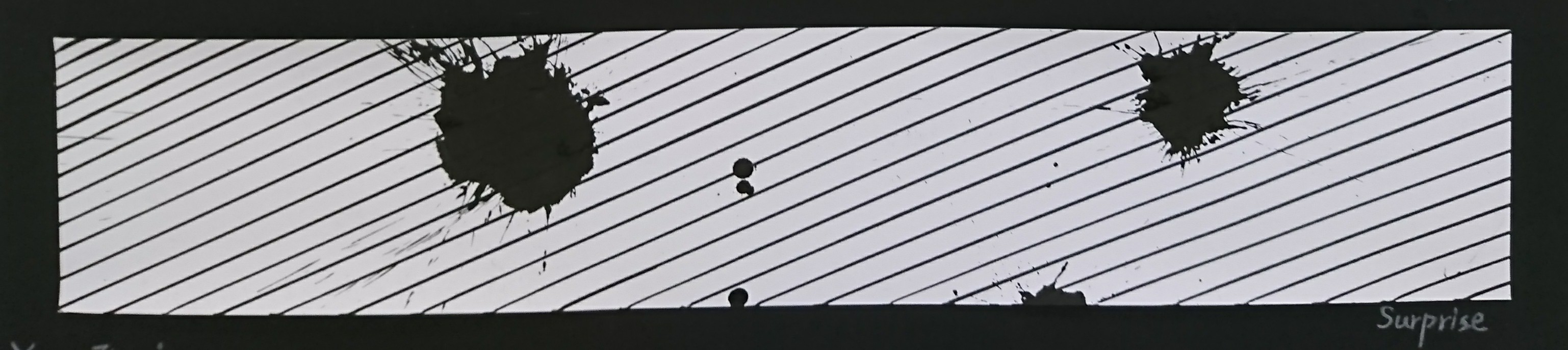
Mark-making of emotion “Surprise”

Surprise

Surprise is an unexpected or astonishing event, fact, etc. The definition doesn’t identify this is a positive or negative emotion, means surprise may not be a good thing in some case. Maybe because I did two positive emotion just now, this one I want to try something negative. I do have many happy memories about surprise, but the first thing it reminds me is one time I need to redo my painting for a poster one day before assignment deadline because I realised I use the wrong color at final stage. I also heard my friends complained somethings similar to me, her cat jumped on to her table while she was painting and it flipped the color palette. So I want to show this kind of surprise that destroy the hardwork or break the pattern, which makes people really annoyed.

The technique for this one is quite simple, I use marker to full fill diagonal lines on paper, then soak tissue with Chinese painting ink and smash it on paper. After that I find only one mark is a bit empty, so i drip some ink on the other side as well. The reason why I choose diagonal line is try to make a energetic atmosphere for the paint, vertical lines are too calm while horizontal lines are too dramatic. Also I only make a few marks because too much marks will distract people’s attention and they won’t know where is the focus point.
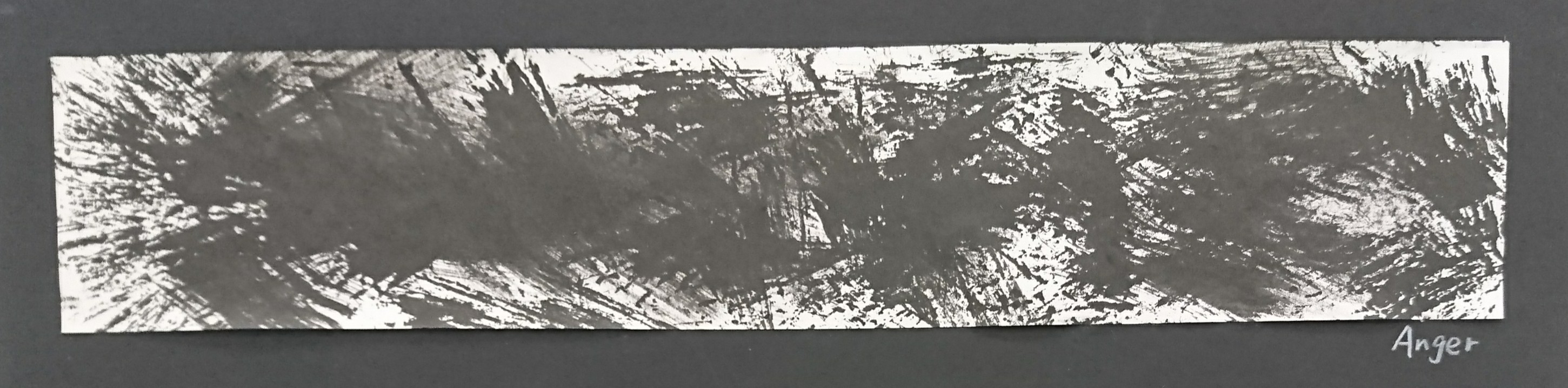
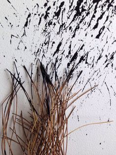
Mark-making of emotion “Anger”

Anger

The definition of anger is a strong feeling of annoyance, displeasure, or hostility. This is quite abstract, in my mind, anger is an image that someone is shouting at you. The person just burst out and vent all the emotion on you.

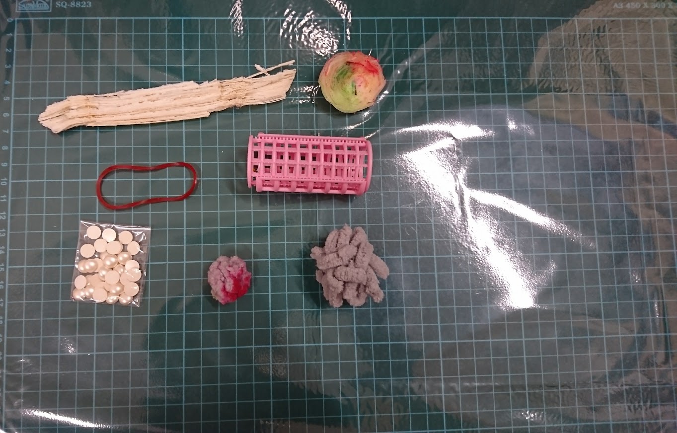
The tools I used is sugar cane, after press out all the juice, the dry faber can use as hard brush and create this kind of mark. And because anger is burst out the emotion, so I brush the stroke hardly in different direction. The paper is newsprint paper because it dry out very fast.
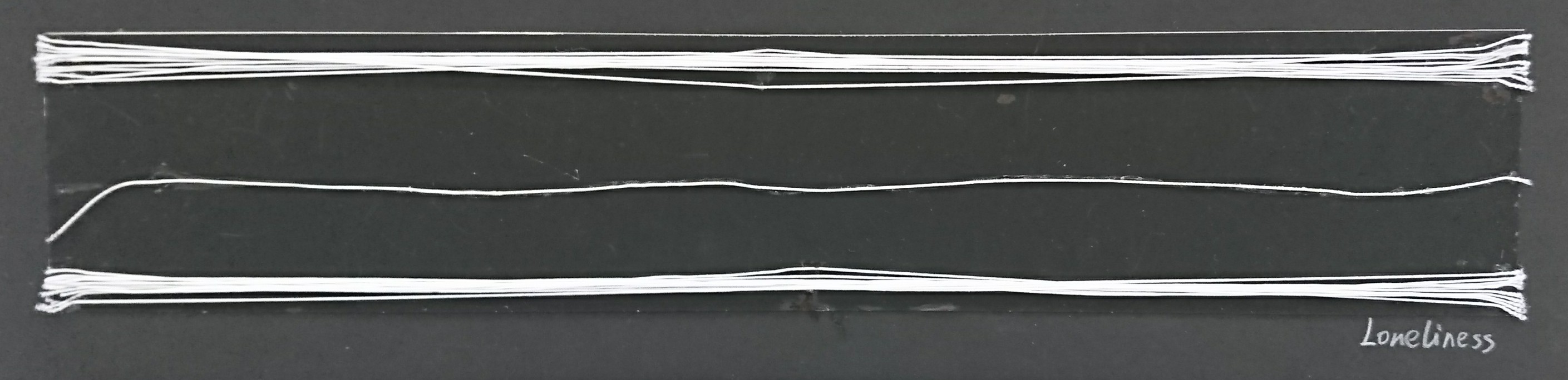
Loneliness

Loneliness is the sadness because one has no friend or company. It’s different from alone, one person stands in a room that is alone, but loneliness is a group of people inside the room but one stands in the middle because only that person has nobody to talk with. People will feel lonely only when compare with others who are in groups.

At first I tried to draw the white line but I find it always break in between and the thickness is not even, so I shifted to stick strings on black cardboard. There are some benefits about using string. Firstly, the line is thin and even. Second is that if I draw many lines they will merge together and looks like a thick stroke, if use string people can easily find out that they are two bunch of lines overlap each others. Loneliness is a negative emotion so I choose black as background, and it’s a low-key emotion so the lines direction is horizontal.
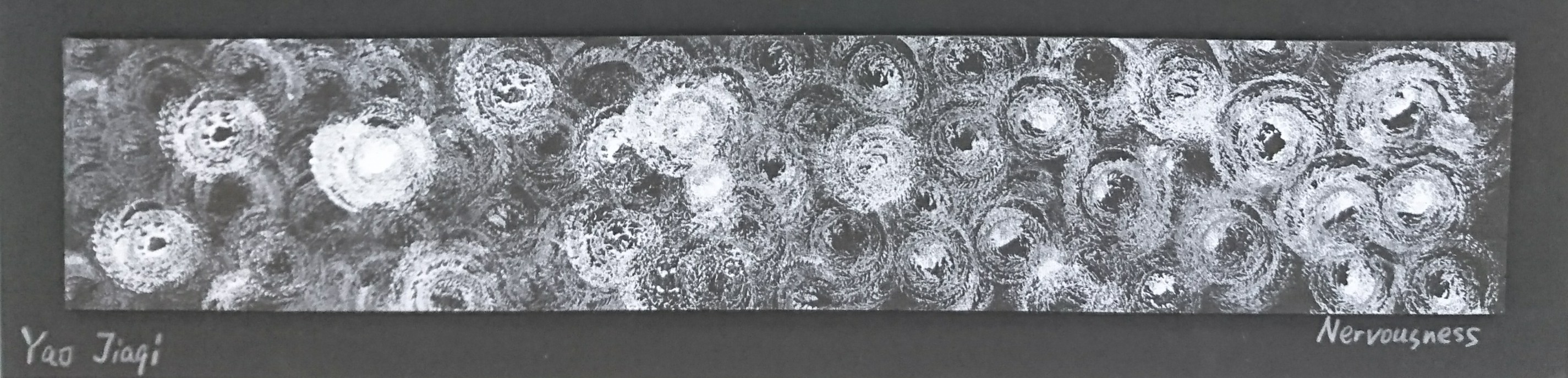
Mark-making of emotion “Nervousness”

Nervousness

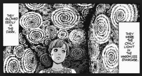
The meaning of nervous is easily agitated. From my own experience I find out that people are tend to feel nervous when facing crowded, like giving a speech in front of public, looking at a picture that is filled with small dots, even when entered a crowded MRT station we also feel nervous and annoying. My understanding of nervousness is crowded.

The tools I used for this piece are white acrylic, chenille stem and black foam sheet. Chenille stem is a wire with many faber around it, and as I have mentioned previously, the foam has many small holes on surface, then plus the faber they can make a thicky-dotted texture. I roll the wire to coil, put white acrylic on one side then keep stamping it on the foam sheet. Why I roll up the wire is because I want to make this crowded texture warp and twisted, like what those artist do in horror manga, when the character are heading to a creepy place, they will draw a lot dots and warp them to swirl, to make reader feel the anxiety and nervousness.


From this assignment, I have learnt a lot of line language, different kind of line has different characteristics, and I have tried to apply the knowledge in the final work consciously. Also I have explored a variety of tools and materials for mark-making. Personally I realised that things can come out very different from sketches and real piece, so just try it out. Don’t fix your mind into your ideas, it adds limitations to yourself, try something you didn’t think of before and sometimes a good surprise will come to you.

One more thing is that when you finish your work, choose the final one objectively. For this assignment I have done several pieces for each emotions, some I spend half an hour, some just finish in few minutes, which turns out better than the half-an- hour work. Keep your focus point in mind and choose the work that best representative to your idea. Don’t let the money, time and effort you have spend affect your choice. The audience can’t know how much you have spend behind the work, the only thing they can see is the final outcome.

Mark-making Research

————————————– WEEK 1 ————————————-

What is mark-making? In a simple way it’s using tools and ink to make marks on paper, no matter what kind of marks they are. It’s like playing with stamps when I was a kid. But for this assignment we are not just making pattern for fun, what we need to know is trying to understand the impression and feeling those patterns shown. In another word, we need to try to “talk” with the marks, learn their language and use it to express different kinds of emotions.

This is too abstract so I decide to start with mark-making reference first. I have seen the work of the reference artists that the PDF has provided. The different kinds of tools and techniques they used, like pencil, smoke, water marbling, really open up my mind.

There are two artwork that inspired me most.

http://hyperallergic.com/wp-content/uploads/2016/07/DSC09137.jpg

This art piece is named “Scribbles”, done by Sol LeWitt in 2005. The inspiration I get from this work is that mark-making is not only about mark and texture, I can use a simple mark as an element and duplicate it to form the pattern I want, even it’s a simple scratch or line, when a lot of them comes together they can form a wave or something else.

Cai Guo-Qiang – Drawing with Gunpowder – The Artist’s Studio – MOCAtv https://www.youtube.com/watch?v=c-QIj7E6CR8

After watching the gunpowder drawing by Cai Guo-Qiang, I realised that for the mark making is not just use the tools to draw out the thing, I can also use cardboard to cut the shape first, covered the place that I want to leave it blank and use tools to fill in the shape. It’s like you using filling function in Photoshop, u create the graphic you want then choose a texture to fill in the design.

And I have also look through Pinterest to look for nice mark-making pictures.

https://i.pinimg.com/564x/97/3d/1b/973d1bec16290863f2b1028da209ce97.jpg
https://i.pinimg.com/236x/6e/5a/f0/6e5af03796acecf5696093c9017ead17.jpg
https://i.pinimg.com/564x/4e/3a/51/4e3a51254361edde78b2f029962e5545.jpg


—————————————WEEK 2——————————————-

During this week I focus on line and line emotion study. I found a very useful article, the link is below.

Mood Lines: Setting the Tone of Your Design

By Rikard, Jan 11, 2015

http://zevendesign.wpengine.com/wp-content/uploads/2015/01/moods1.png

The most useful one is this chart which shows the emotions and meaning of a varies of different kinds of line.

For example, the curve line is more soften, and link to feminine; horizontal straight line means calm and satisfied, but if you slant it to a degree it has energy inside, and when it stands up, which means become a vertical line, it means dramatic and aspiring.

In the article it also use many movie poster as example, so we can have a visual understanding of the line languages.


And this week I have finalise the six emotion I’m going to work on, they are Caring, Joy, Surprise, Anger, Loneliness and nervousness. To have a better understanding of these emotion, I look up for the definition of each word.

Caring – displaying kindness and concern for others.

Joy – a feeling of great pleasure and happiness.

Surprise – an unexpected or astonishing event, fact, etc.

Anger – a strong feeling of annoyance, displeasure, or hostility.

Loneliness – sadness because one has no friends or company.

Nervous – easily agitated or alarmed.

The definitions are abstract, what I’m going to do is to link the emotions with my own experience, what’s the first thing I think of when people talk about this word? In this way I can have a better idea of how to express the emotion through my work. And I have googled some graphic for the things that related to each emotion, to help me generate the ideas.

http://naturalgasnow.org/wp-content/uploads/2015/04/bubble-burst_large.jpg
Manga from Junji Itou
http://hyperallergic.com/wp-content/uploads/2016/07/DSC09137.jpg

————————————– WEEK 3 ———————————————

This week I spend most time on finishing the final work, for research part I focus more on the techniques I need for my mark-making work. And keep on looking for new inspirations as well.

http://www.auntannie.com/SurfaceDesign/BubblePrint/

How to Make Bubble Printed Paper – Surface Design Technique – Aunt Annie’s Craft


Mark-making Project Progress

————————————-WEEK 1———————————————–

I used to do some handicraft and I like to stock many staff so I believed that I should have some left-over material, if I never threw them way when I moved into hall.

Let’s me list down the material that I will use first.

  1. Yarn Ball
  2. Tree Leaf
  3. Cabbage
  4. Ruber Band
  5. Wool Felt
  6. Salt
  7. Brush
  8. …..

So this is the first item I find.

I bought this yarn last time with my friends because we want to make a holder for our gudetama, but in the end I never do and it’s totally new.

I think one string is too tiny,  so I made a mini yarn ball, follow the instruction on youtube.

How to Make Mini Yarn Pom Poms Easy DIY           By giddyupworkshop

I have tried to do some mark making, and I find out that I like this texture, a bit rusty but not so boring.

OKAY NEXT!

I brought back a leaf on the way back to hall, but it’s too dry and I scare it will broken into pieces once I pressed it. So I washed and softened it first.

Then I try it with my stamp pad.

Still can see the texture but very shallow, and too much extract stuff. So what I decided to do is to brush away them, only leave the nervation. (Remind me of those handicraft class in primary school.)

Usually what we will do is boil the leaf in soap water, however, I can’t damage my only mini cooker, so I choose to soak it in hot soap water for few hours. But this will take longer time.

After half an hour, it turns out a bit transparent now, I hope it works well.

AND HERE WE HAVE ONE MORE!

https://bonnieplants.com/wp-content/uploads/chinese-napa-cabbage.jpg

Yep, is cabbage.

Trust me I’m not kidding, because I saw something like this before.

http://ww2.sinaimg.cn/large/b1779964gw1ehjht5zs60j208w0g1abz.jpg

And I want to try it long time ago! Let’s start!

I cut off the bottom part and stamped it immediately, and because I was too excited that I forgot to take a picture for half-way done.

So what we have is this.

Ummmmm… a nice… half flower shape…

I think is because my knife is too small and I didn’t cut it evenly, what’s more I should cut a bit more so still can adjust to make the surface smooth.

Never mind, I still got one more.

Now I think I need to eat cabbage for the rest of this week 🙂

(Can someone give me a suggestion about what I can do with these cabbage beside eating T_T)

——————————————-WEEK 2—————————————-

This week mostly I spend time on doing mark-making and forming ideas.

First let’s see what tools I’m going to use in mark-making.

Mark-making tools

And below are the lines and marks.

Mark-making using yarn ball by Yao Jiaqi

It’s like normal brush, but the texture is interesting when I keep stamping the ball to paper.

Mark-making using cabbage by Yao Jiaqi
Mark-making using nail pearl by Yao Jiaqi

This one didn’t come out what I want to see because the pearl is too thick and hard to leave texture on paper. But the dots can also form rhythm and pattern.

Mark-making using sugar cane by Yao Jiaqi
Mark-making using rubber band by Yao Jiaqi

The line draw by rubber band is very thin and clear, I think I can use that for “Loneliness”.

Mark-making using leaf by Yao Jiaqi

So based on the mark-making I have tried, I did some sketches for the emotions I choose.

The six emotions I choose are Caring, Joy, Surprise, Anger, Loneliness and Nervousness.

For caring I want something soft and make people feel safe, so the first thing I think of is sea wave, and also flower. But the flower idea turns out not so good because the curve line are broken, it’s more anxious to me.

For surprise my focus point is that you don’t expect something happens, it breaks the original routine or pattern.

For loneliness my idea is showing a thin line on the plain background. So I tear the black paper and split them a bit to show a tiny white line in between, what’s more the edge of this “line” is not smooth because of the paper fiber. The second one I want to show two thick lines go from right to left while the thin line in the middle goes from left to right.

For the nervousness I get inspiration from those horror manga, there are always many dots that are warp and distort on the background, that’s the kind of effect I want to achieve.

———————————– WEEK 3 ————————————————

This week I spend more time on making the real stuff instead of just sketching. The lecture also said things will turns out very different from sketch to real stuff, and to be honest, I also feel that from sketch book I can’t real estimate what the end product will look like.

Since I already have many idea in mind, I’d like to straight away start on working on the concepts I have already sketched.

First I start with “Caring”. My concept is to draw some curve line that looks like see wave. We know that people feel safe in water because fetus are grown up in amnionic fluid, and curve line always represent smooth, tender soft and feminine. The tool I use is normal paper and maker, because I can’t really find a tool which can create a smooth curve line. Having some try on paper first.

One thing I like marker is that the flat head can change the thickness of the curve, which make the line look more interesting.

I have some different plans and I drawn all of them. In order to avoid the paint looks crowded, I leave some white space on the top for breathe. Then I find if suddenly stop in the half way looks like a brake, so I decide to add one more grey curve to make a gradient fade-out effect, but two grey lines looks a bit too much, end up I decide one put one.

Then we move on to “Surprise”, for this one my concept is drawing diagonal full fill the paper nicely, then drop ink marks on it to “destory” the whole thing. For the ink mark I soak tissue into ink and throw it on the paper to create the dropping effect.

Look nice! I like the splash effect!

Next one is “Joy”. For joy I want to use bubble because it’s round shape and playing with bubble alway make people remind of kids and childhood, which is link to joy.

Instead of normal paper, I choose foam sheet for this one because form has it’s own texture on the surface.

Can you see those small holes and the dot texture on the foam? It varies the value of black and soften the the paint as well.

Making soap water with ink, ah I like the surface of this liquid.

At first I tried to use the small scissor hook to make bubble, but it didn’t really work, I think is because the hook too small and the shape not easy to put in the soap water. So I find this wire to make a hook for blowing bubbles.

Well a bit different from what I think, but at least this time we have bubbles on the sheet. And we can see when the bubbles are bursted, they leave a lot splashing ink mark on it, looks like spider silk.

I have tried some different material, which proved that the form works out the best. I have added some water in ink so this liquid is too wet for newsprint paper, and the edge is very clear on paper, but foam can soften it so make it not so hard.

But this one is too messy, when there are too much splashing the energy it shows is more than just joy, so for my final one should be cleaner than the one above. And it doesn’t really have a nice rounded bubble shape on it, which make people hard to understand what it is trying to tell. In the end I decide to draw some bubble on it.

This one looks cleaner and easier for people to recognize that “okay this one is showing us bubbles”.

Next is “Anger”, and I want to use hard brush to make those crazy marks on the paper, from all the tools I have I choose to use sugar cane.

I have some crepe paper and I think the texture on it might help to exaggerate the emotion, so I try on both vertical direction and horizontal direction.

The pictures look fine, but actually for the real stuff, the texture cut off those brush line and make it look less angry, I think is because when the line is cut off, the energy it shown also been cut and broken, so plain paper works better, to directly burst out the anger.

Then for “Loneliness”, firstly I change the background to black and line to white because I feel when there is more black the emotion more toward to negative. I try to draw lines by using white acrylic paint.

As we can see the line is not so smooth and when many lines come together they are just merge with each other and looks like one thick stroke, so I decide to change to use white string, which make sure I can have a thin line and won’t merge together as well. I use my glue to stick the line. But when it dry I find other problem.

Yeah the glue is transparent but it leaves a very ugly layer on the cardboard, that will definitely destroy the whole thing, so I need to change another type of glue.

This glue with a head allows me to draw a thin line on the card board so the glue mark won’t be so obviously.

And finally! Nervousness! For this one I choose chenille stem, with the texture of the small faber around plus the foam surface texture, I believe it can create a thickly dotted and compressed effect. I roll the string to a coil, to make it looks like the screen tone that some horror manga always use, when character enter or heading to some creepy place.

Manga from Junji Ito

The I put white acyclic on one side of the coil, and now LET’S STAMP IT!

Looks quite creepy, and it do make people sense of nervousness, especially those who have Trypophobia. At the beginning the texture is not so clear because of too much paint, but later it works out better, and makes a grey shade on the foam sheet.

I have tried on black card board also, but the result doesn’t look so good without the foam surface texture.

To have more choices, I did several more rounds of each emotion, and choose the best one to stick on mounting board.

And now good luck for the presentation!