
![]()
Continue reading “Exhibition Poster Design [Y2: VCI Project2]”

PORTFOLIO WORLD


In the very last lecture for graphic design, we learnt how graphic design grows and changes into the ‘graphic design’ we known today. In the lesson, typography, logos, posters, books and magazines covers, etc… were introduced. I am mostly interested in the 1960s Esquire covers which catches my eyes.
It is an American men’s magazine founded in 1933. Its target audience is “successful men and men who want to be successful”.
George Lois as the art director of the Esquire magazine, produced iconic and remarkable covers in the 1960s, that depicts social controversy and challenges social norms in the 60s US.
Continue reading “Graphic Design So Far. Reflection [Y2: History of Design L4]”

We learnt about quite a lot of movements and concept this week, including Bauhaus, cubism, expressionism, suprematism, etc… I am particular interested in De Stijl ! It is constructed with simple form and colours. It’s simple but powerful.
Continue reading “To Bauhaus & Beyond. Reflection [Y2: History of Design L3]”
This week we learnt about how new fonts are created and the relationship between text and illustration to better convey a message, especially advertisement during Industrial Revolution. Among varies movements, I want to drive into the “pictures of the floating world’.
What is the floating world (ukiyo)? Ukiyo is a term originated from buddhism, refers to earthly life, “the Sorrowful World” (“an endless cycle of rebirth, life, suffering, death, and rebirth from which Buddhists seek to escape”, thoughtco.com) During Tokugawa Period (1600-1868) in Japan, its meaning changed, refers to urban lifestyle of meaningless pleasure-seeking, especially in the entertainment industry. Merchant class were benefited from the rapid economic growth. People seek pleasure from “theater and musical performances, calligraphy and painting, poetry writing and speaking competitions, tea ceremonies, and of course, sexual adventures”. Ukiyo then becomes descriptive term for pictures (artworks) that depicted people seeking pleasure in the entertainment industry.
Continue reading “Industrial Revolution & Graphic Reactions. Reflection [Y2: History of Design L2]”
In the first lesson, we have learnt about different writing systems, styles, printing techniques and how they evolved from the earliest form to modern. Personally, I am interested in the derivation styles of fonts, including the old style, transitional and the modern style. They are gradually changing and deriving from the earlier forms.
This can be seen in the following images:

But why are there such changes…?
Continue reading “Writing To Typography. Reflection [Y2: History of Design L1]”

The Freebie is a provocative object that aims to bring the awareness of free stuff. Everyone loves free stuff however without people realising, free stuff is not technically free because people somehow have to pay for a price to receive them. As the word “free” is the best way to capture people’s attention, we decide to use it in our product.
“Nothing in life is free”
“kiss is”
This product gives away free unlimited kisses but the people who are receiving these kisses have to pay by embarrassing themselves in public, sharing their kiss experience with others.
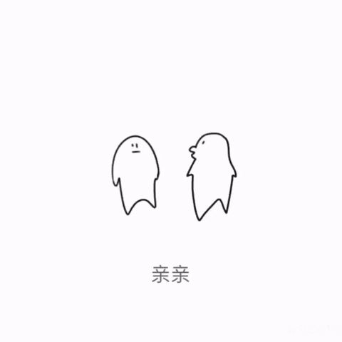
Concept: A kissing sticker from WeChat, Copyright: suano
Continue reading “The Freebie. a free kiss machine [Y1: Experimental Interaction Final Project]”


Continue reading “Kinetic Beast. Final [Y1: Form & Visualisation Project3]”

Based on Zine Part 1 survey result, Marina Bay is a… expensive tourist attraction. When asked this question: How much will you spend in the Marina bay area? Over 50% of the survey participants answered they would spend less than $ 50.

This comes up with a question: Is it real that people cannot really enjoy marina bay because of the pricey product?
Continue reading “Me and my $50 in Marina Bay. Final [Yr1: Graphic Form. Zine Part II]”


