Trial of Montage filming technique:
My idea: Suicide…
Comments: The hand is not expressive enough. Like the dissolve effect between different scenes.
Week 11 Class Exercise
Speak and Sound

PORTFOLIO WORLD
Trial of Montage filming technique:
My idea: Suicide…
Comments: The hand is not expressive enough. Like the dissolve effect between different scenes.
Week 11 Class Exercise
Speak and Sound

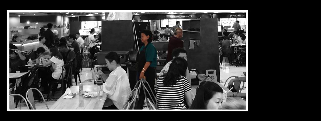
In this project, we need to decide on one theme/ rule/ restriction, and take a series of photos which can convey a message/ meaning.
Final Results:
Ageing, Working
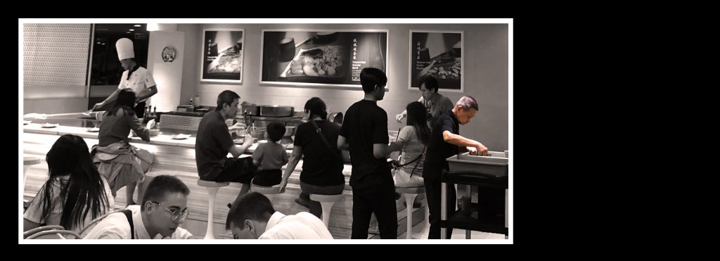
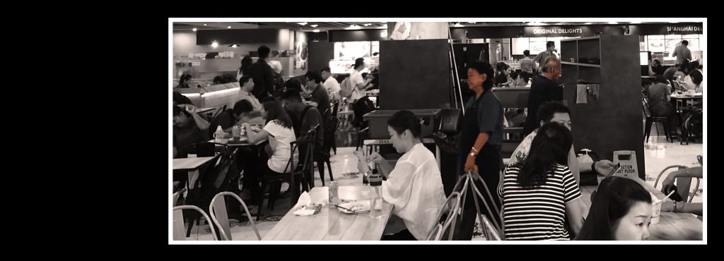

Ageing, Working, Photo series, 2018, Emma Cheuk Yan Wa
“Ageing, but still working” is a social phenomenon in Singapore. Some elderlies are living in poverty and have to work to earn a living. Questions appeared in my mind: Are their bodies healthy enough to afford every day workload? Are we responsible to help them? Elderly workers are in our society cannot be unseen them. (55words)
Ideation, Exploration & Execution (Google slides link):
https://docs.google.com/presentation/d/16W1i2ipp2GOf-pp1dTvreRl8Awb5MYH5t1fy6uTck98/edit?usp=sharing
Feedback and Questions from Harry after presentation:
Regarding Improvements and Answers:

2. To show elderly as a group
3. Too messy layout
Thank you for reading ☺
Theme: Light and Shadow Series (12/9/2018)


Attacked by a bee while studying (12/9/2018)

Feedback: more messy table, turned chair
Sensation, rigid and mysterious (5/9/2018)
![]()


Useless (21/8/2018)

Unplugged cable: sometimes you spend so much time climbing up the stairs, working hard to reach a goal. But the result is like the unplugged cable, not achieving anything. All effort you paid is useless.
Thank you for reading ?

Processes
I was inspired by the mosquito coil that is in a spiral shape. In order to fit my first model, I changed the base to a triangle instead of a circle.

Experimenting using a sketching paper
I kept drawing triangles inside another till I couldn’t draw anymore. It looks like a maze. Then, I figured out the route to the very end by extending lines and erasing unwanted lines. I was satisfied with it and tried with another material: cardboard (that is stronger, perhaps can spread out nicely when I hold the tip)

1st attempt using cardboard:

Creating the supportive part
My 2nd Model


Development of my 2nd Model

Development of my 3rd Model
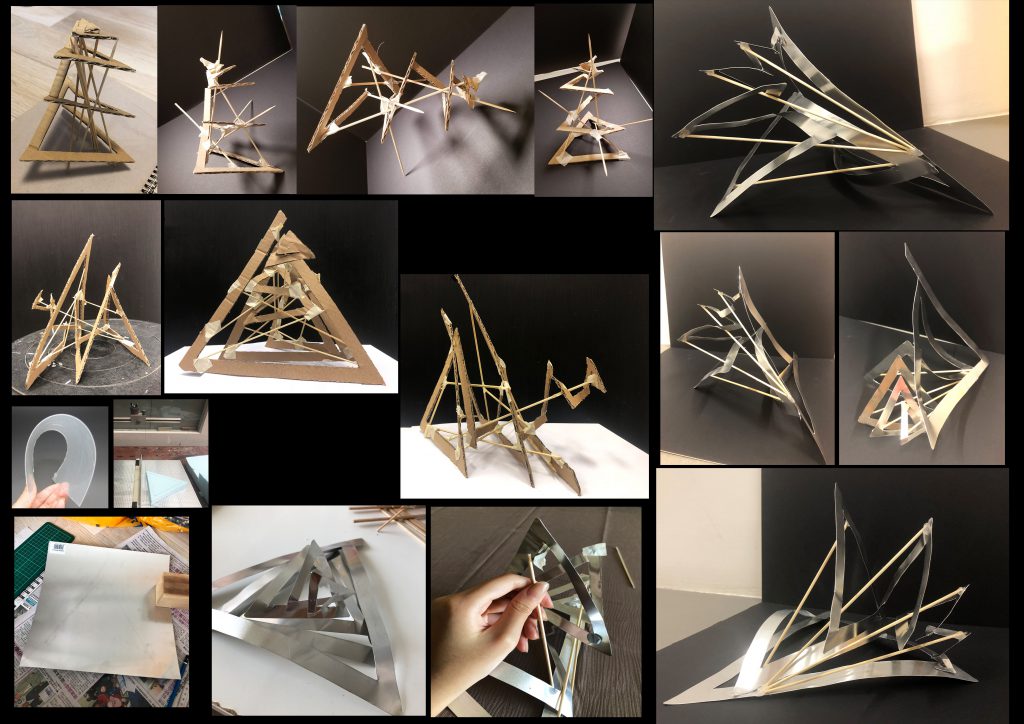
My 3rd model- ideas
My 3rd Model (Final Project)


So here’s my final model. I want it to look neat and unique at the same time. I like how the metal sheet reflects. General speaking, I think I achieve what I want: it looks interesting from all angles and doesn’t look symmetrical and rigid at all. But if I had more budget and more time, I would try to construct my model with another material.
Overall
Interesting to see myself developing and changing ideas through the 3 models. Learning through the processes and from others’ comments.
Feedback after presentation:
Thank you for reading ?

Research
I selected tetrahedron to make my reference model out of sticks.

My first model (reference model)
I was thinking to make something unique, maybe something layering, other than using simple shapes like triangles, circles and rectangles which I originally experimenting on.
I researched on layering sculptures in Pinterest:


Interactive Installation (left image)
https://www.pinterest.com/pin/69454019224698833/
Foam board staircase sculpture (right image)
https://ar.pinterest.com/pin/148829962671472140/?lp=true
On that night when I was researching, there was a huge mosquito in my parents’ room, kept ‘buzzing’. We battled with it with a mosquito swatter and tried finding something that could drive away it.
The mosquito coil came to my mind:

https://cameronwebb.wordpress.com/2015/05/01/are-mosquito-coils-making-us-sick/
A Mosquito Coil
I researched on how the mosquito coil can extend and form a cone:


Spiral
http://isilaltay.com/spiral.html https://graphicheck.com/Affinity-Designer-Spiral-Assets
That’s the end of my research. I then started exploring ideas by experimenting.
Final Idea: Contradiction

Long Bean is good for health, with high nutrient value. Many children do not like eating long beans. Parents often force their children to eat them as it benefits growth. When I was small, my parents forced me to eat long beans too. This idea contradicts with adults who smoke. Adults know cigarette is unhealthy but they are still addict to it. This shows how adults are contradicting themselves in their lives.
In this project, we are manipulating a found object in a way it conveys a meaning message.
Reference Artist: Marin Roller
First Idea: Addiction

Cigarette box + Fries, Ashtray + Tomato Sauce
When I was small, I always pretended I was smoking with the french fries. Fries and cigarette are both addictive ‘unhealthy’ things.
Feedback: Both are ‘unhealthy’ objects so the contract between the two is not big. Try to construct idea with a object which people think is healthy but actually not really. For example, certificate and cigarette box. Certificate is desired by everyone in the society, especially employers. But is certificate so important that an already skilled and qualified person have to spend years to study in a university just to satisfy the requirement set by the society?
Idea Development :

Cigarette box + Long Beans (photoshopped)

Crafting Process to create the final artwork
This is a McDonalds advertisement in Singapore. 
Image from: https://www.mcdonalds.com.sg/yousaiditwemadeit/
Google Slides available below: https://docs.google.com/presentation/d/1MJYalaZ6Ke3kDVnCChUWxoAYdKxrto04V4IAsSpiJFk/edit?usp=sharing
Analysis
First Impression:
Use of colours/tone:
The wooden tray, table and the burgers are all brown, therefore leading viewers to focus onto the brightest brown of the burgers.
Background/ connoted message:
Green of the grassland is the complementary colour of brown, contrasting the main objects in this image.
Choice of Containers:
More appealing to viewers when compared to plastic containers that we usually see in McDonalds.
Words/ denoted messages:
The caption is in brown-red that is in same tone with burgers, table and tray.
Placement of food/ connoted message:
Thank you for reading ?

Hellooooo to Harry.
https://metro.co.uk/2016/06/10/a-new-harry-potter-exhibition-has-opened-and-it-looks-magic-5936542/

Welcome to Open Source Studio. This is your first post. Edit or delete it, then start blogging!