Project 4: Poetics of Time

Project Proposal

  1. Flow of Time
  2. I was always fascinated with the idea that we were literally born to die, that every second of our lives is every second closer to death. I decided to explore a different concept, much darker than what I am used to. I would like the audience to get a “wake up call”,  relating what I am trying to convey in my video which is to spend time on things in life that matter and let go of things that are trivial.
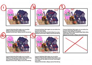
  3. I intend to create a 1 to 3 minute animated video, going through the ageing of a character since birth. The audience would see the gradual ageing of the character and how they would eventually meet Death, a character that waits at the end of the character’s life.
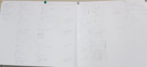
  4. I would mainly be using Photoshop to animate frame by frame, and using after effects to edit.
  5. The video will be projected through the class’ projector. I would use a timer that counts down the duration of the video and have it ring at the end of the video.

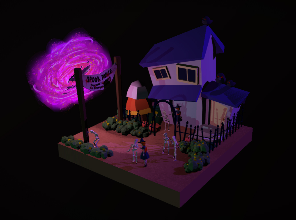
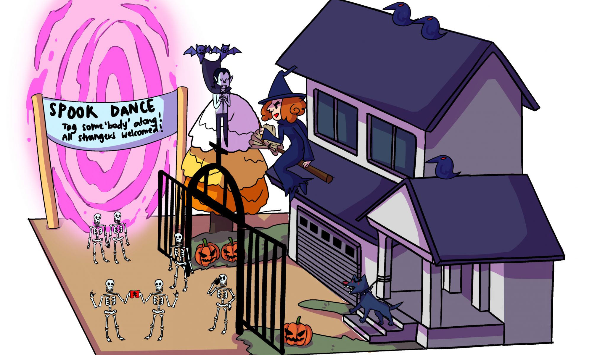
It starts off with a clock with the time ’01:00′ and you see an image of a baby, to signify the start of a new life through the 24 hour clock. As time passes, the baby ages and time moves on as well. Every time the character ages, the alarm would ring. At the end of the character’s life, at ’23:59′, it shows that the alarm clock was Death all along, waiting for the moment the character dies which is at ’00:00′. At the end, there a voice over of a poem by Ursula K Le Guin,  Hymn To Time, which tells us about how we as humans chase this notion of time, using units, be it through inanimate or animate objects, daily natural occurrences such as day and night, etc to measure time when time is ever flowing and stops for no one.  At the moment the poem ends, an alarm would ring in real time.

Honestly, while doing this project I felt really pressured as I dug myself a grave by raising the standards for myself through the previous project. I kept doubting my own concepts and was worried that people would not be impressed if I could not hit my own standards. Ironically, while overthinking things, I wasted lots of precious time that I could have used to work on my final project. Hence, I felt disappointed that my video fell short of my expectations and usual standards.


Audience Reactions

I am thankful that the audience were sensitive and encouraging, even though I felt pretty down. I’m also thankful to my friends for helping me through this project and for providing support, I would not have been able to move on without them. If I could work on a similar project again, I hope to be able to talk about my concepts confidently without doubting myself again.


In Class: Re-visit Project 3

RHYTHM 

The dub step music in the background, constant chipmunk noises, the man groaning in the foreground, and the repetitive crow cawing creates a sense of rhythm in my work.

MOVEMENT

The entrance and exit of Dracula in the middle of the video indicates the presence of attack, sustain and decay as he enters through the portal, rings the bell and waits, before proceeding to enter the house. As the video is 360 degrees, you are able to see every little detail such as the characters moving and interacting with each other.

CAUSALITY

I think my video is rather predictable. There is little to no movement in my video and the only unexpected aspect is Dracula entering through the portal.  If I had more time, I would have added more elements that could surprise the audience. For instance, I discussed my initial idea to Serena and she suggested for me to add explosions and aliens to further intensify my scene. 

DURATION

I feel that my video was long only because it was lacking the elements that I wanted to include but could not due to time constraint.  1 min is definitely more than enough time to tell a simple, but straightforward narrative.

In Class: 10 Seconds

10 wants:

  1. Gentle rain (hear)
  2. Water rippling (hear)
  3. More dogs (see)
  4. More cats (see)
  5. Rainbow (see)
  6. Money clinking out of a casino machine (see/hear)
  7. Freshly baked cookies (smell)
  8. Antiseptic (smell)
  9. Scented candles (smell)
  10.  Lush shower gel (smell)


10 Don’t Wants

  1. Drilling/Construction (hear)
  2. Dog barking (hear)
  3. People screaming (hear)
  4. Parents beating their kid and their kid is crying  (hear)
  5. Moist munching (hear)
  6. People who eat messily with food all over them (see)
  7. Soft, mushy soil (feel)
  8. Vomit (smell)
  9. Random hair in your food that does not belong to you (see)
  10.  People talking loudly on the phone in public spaces

Project 4 – Research

#1 – A Grandma’s Goldfish 「婆ちゃの金魚」

While researching for project 4, I stumbled upon this gold nugget from 2012.

This is an independently produced animated short film by Kaori Iwase who completed it at the Tokyo University of the Arts as her graduation production while she was a student there.

The subject of the film is about dementia, being heavily influenced by the theme that people’s memories become just like water; unstable and easily displaced, as they grow old.

The main character of the story is an elderly lady who has dementia and can’t remember the past.  Her world revolves around her beloved pet goldfish, Tama-Chan, that takes her on a journey down the River of Memory.

This short film is a combination of experienced time, Grandma’s perception of time passing as is, and non-linear edited time, when she realises that it is a flashback of her past as a child.

When the short film was released on DVD as part of the collection of the 2013 Tokyo Award Collection, it was the only film that came without the subtitles. Interestingly, going through some of the Youtube comments, I saw how this film had managed to transcend the language barrier to come to a common understanding that the film was about dementia. The film had skilfully directed the audience through the child-like behavioural attitude of the Grandma, the state of decay of the house; reflective of the grandma’s mental state, the use of water as a portal to her old memories, and the Tama-Chan being the trigger to her flashback for her love of fishes.

#2 The Village by Mark Baker 

This was an animated short film produced by Mark Baker in 1993.

In this short film, the subject is the man wearing the glasses. The story is about a town ruled by a church filled with sinners who spy on each other, pretending to be upright and lawful citizens. The whole film is heavily themed on the idea of sin, that every human character in the film has committed a sin even though the town is ruled by a church which preaches to the villagers and that the only “normal” and humane characters are the ants.

This makes the viewers question organised religion (touchy subject here wow) , being just an excuse to hide people’s negative side, and their own morality, whether they have been the victim of such behaviour or if they were just like the villagers in the film, full of doubt and mistrust in those around them.

The short film is a combination of linear time and edited linear time.


Similarities 

  • Both film uses edited time to show the passing of day/s.

Differences 

  • A Grandma’s Goldfish (2012) evokes emotional reactions hence, it is an emotional content whereas The Village (1993) raises questions and thoughts in the audience hence, it is an intellectual content.


I am v tired pls excuse my horrible writing will fix it once I’m functional (real question is, when will I ever be lmao) 

Project 3: The Impossibilities of Being

Component 1: 20 places I have never been to 

1. Underwater world
2. In a Candy land world
3. In space, alone on a spaceship
4. In a post apocalyptic world overrun by zombies
5. In a post apocalyptic world overrun by monsters
6. In a fantasy world where humans are the minority
7. In an ancient temple of Time with portals leading up to different timelines
8. In a world with sentient plant beings/monsters
9. In the Victorian era
10. On a lonely island where there are ancient tribes protecting the island
11. Antarctica
12. Atlantis party with mermaids
13. In a Vintage old shop
14. In a retro Japanese arcade shop
15. Tending a Japanese shop/bar
16. In Greece with all the Gods walking around/chilling
17. Halloween world (where all the spooky stuff are sentient)
18. Santa’s factory with elves
19. In a mushroom land with fun-gis (haha)
20. In a snow globe world

I decided to go with number 17 for this project as I have always loved the idea of spooky creatures hanging out and chilling.

Storyboards


Component 2

This was the initial list of sounds I wanted to use for my soundscape:

  • like a carnival sound (loads of chattering)
  • walking, either on hard concrete or rough road
  • sad woman crying
  • sad man crying
  • dog barking
  • church bells ringing
  • door bell ring
  • cricket noises
  • Ufo (flying across or landing/taking off)
  • maniac laughter
  • indistinct small talk
  • witch laughter
  • bat sounds
  • crows
  • ringing phone
  • loud disco/dubstep music
  • glass shattering
  • lady screaming

I wanted the party to be bustling with spooky folks so I wanted to layer different sounds that you would normally hear at parties.

However, due to time constraints, I used these sounds instead:

  • Foreground: Two-tone doorbell, Door closing, Lady screaming, Dracula laughter, Dog barking, Cave bats, Chipmunks chattering (Layered)
  • Middleground: Chipmunk chattering (Inaudible talking), Crows cawing
  • Background: Man groaning, Dubstep music

I wanted my video to be an unconventional low poly 3D model where the viewer could interact and view it in any angle. I felt that the additional level of interactivity would add more immersion to the soundscape.

Here are some models that inspired me while I was doing my research:


Component 3: Final Video

Here’s my final video (sounds used have been credited in the actual post):

Overall, I was proud that I managed to complete this within the short time frame that I had. It was a pity that I could not add the scenes where the alien in the spaceship would land and interact with the spooky folks and the explosion where Serena told me would add to the dramatisation of the whole scene.

The feedback that I got was that it felt more like a GIF image rather than a soundscape video and I do agree. If I had more time, I would have definitely added the necessary scenes and polished my work. However, the reactions I got at crit were sure assurance for the effort I put into making this model.

Project 2: The Subverted Object

Layout

I placed component 1 at the top, component 2 at the bottom and component 3 in the middle.


Component 1:

#1

I wanted to capture the lamp in it’s natural state, interacting with the environment around it.

#2

I wanted to show the function of the lamp, which is to illuminate it’s surroundings. Hence, it is taken at a lower angle to show the upwards direction of the light and where the light does not meet, it is left in the shadows.

#3

I wanted to invite the viewer to take a closer look at the texture of the lamp, how the use of a simple paper can change the mood of the light, emitting a soft orange glow. On top of that, the colour scheme and the holes on the paper reminds me of a carved Jack-O-Lantern.


Component 2: 

#1


I decided to subvert the lamp into a power-fruit, which is the Kiwi. I wanted to portray the idea of a lighthouse in the dark ocean, emitting the light to guide you to a healthy lifestyle.

#2

I subverted the lamp into a strawberry which, just like the kiwi, has a high concentration of vitamin C which many people do not know.

#3


I decided to use different types of lamps to turn it into a spooky, ancient aliens sort of composition. The UFO lamps are harvesting the delicious mushroom lamps that could be found only on earth!

I was actually really inspired by a Japanese artist that I have been following online for close to a year, known as Tanaka Tatsuya. I love how he is able to use everyday objects and change it’s function to capture that perfect moment. It is very inspiring his works transcends the global language barrier.

References: (click on link)

@tanaka_tatsuya


Component 3:


Initially I wanted to use my component 2 image #1 as an advert for healthy living.

I used the slogan, “Eat healthier, think Brighter”  as the linguistic message to try and convey the idea that eating healthy will lead to a better way of life as your brain gets the power food it needs to function well.

I added a link at the bottom, “visit www.foodforthought.org to sign up for a free consultation today” as the anchorage. The website itself is a made-up one as I did manage to find a local website ( http://foodforthought.com.sg/)  but it is far from my ideal which is a medical campaign. The website “foodforthought” is also a play on the idea that healthy food can help stimulate the brain.

While I was researching for my component 3, I came across an advert by Dallas Market where they substituted unhealthy food with healthier local produce.

References: (click on link)

Dallas Farmer’s Market Fries 

Dallas Farmer’s Market Burger

Dallas Farmer’s Market Ice Cream

I thought it was really interesting how even though all the images are depictions of food, they are able to substitute the unhealthy food with their own local produce to portray the idea that local food produce are a healthier option that tastes just as good as your everyday fast food chain.


Conclusion

To be honest, I had a really hard time racking my brain, trying to fully understand what it means to subvert an object. Perhaps it was my slow-functioning brain that was unable to grasp the concept that many of my classmates were able to get right away. I had to reshoot several times and even after consulting Serena, many of my shots had to be rejected.

Even though I was dejected for quite a while, I am happy that I was able to pull this off and seeing all my classmate’s works made me understand subversion better.

For future kids seeing this, hello. Please don’t give up, y’all can do it c:

Brainstorming Ideas – Lamp

Hi Hi, so this is my brainstorming process for my object, a lamp.

When I was thinking about adding characteristics to my lamp, I wanted it to have a more animated feel for the thumbnails. Hence a lot of these concepts would be harder to translate into photography.


Thank you for looking 🙂

Project 1: Curating Self

The idea of Acceptance

I wanted to play around with the concept of acceptance in all 3 of my components. Usually, acceptance is associated with a positive meaning but in my case, I wanted to add a little sadness to it. 


Component 1: Me

absence of self-Acceptance

#1

I wanted to show vulnerability even in the place where I felt the most comfortable, which is my bed. I hid my face in my arms to show how afraid I am in my own skin.

The curling of the body creates a rectangular shape that holds the focus of the viewer.


#2

A mask of chemicals to hide my imperfections and only letting you see what I want you to see through my eyes in the mirror, the only way where I felt I looked presentable.

The polaroid-like borders brings emphasis to the subject.

#3

Portrait shots are meant to be taken as clearly as possible, to show you every detail of your face and body but in my portrait, I am looking at the camera but I am blurred out, showing how I am unable to bring down my walls.


The absence of my face in every photo of component 1 shows my insecurities, worries and lack of confidence as an individual, unable to face another person directly without worries.


Component 2

Accepting that he can’t always be with me

#1

This bear was a gift to me by someone I love.  The bear represents him when he’s not around me. I tried to give the bear a more human-like look, as though I’m actually leaning on a person to rest my tired, weary head.

#2

To me, physical affection is direct connection to another person. I wanted to give the bear a more humanly touch, just like how I would hold tightly onto the hands of the ones I love.

#3

The image is intentionally cropped to create a sense of closeness and the hands on the bear’s thighs adds a sense of affection and love I have for the bear.


Component 3

Accepting that most of my childhood can’t be taken back

#1

This is a familiar sight growing up, when I visited my grandma’s house.

The low angle shows how I view this flight of stairs being powerful and impactful in the earlier parts of my life.

#2

Whenever I revisit this flight of stairs,  I feel like my body has turned back in time back to when I was a kid, with my head playfully peeking through the triangular hole in the wall. The white walls signifies a sense of purity and innocence.

The image is shifted to the left to give a sense of flow and direction, as well as to adhere to the rule of thirds.

#3

This was a common view when I was a kid. The low angle gives emphasis to the big influence this place had in my life. The walls used to be painted red, which I associated with the love I had for my Grandma and her house though the repainted walls shows how I had to paint over the memories I made here as a kid. I never quite understood the reasons for the holes in the walls but the light peeking through it shows the newfound hope I have for an old but unfamiliar place.


END