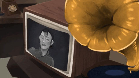
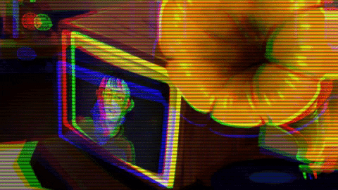
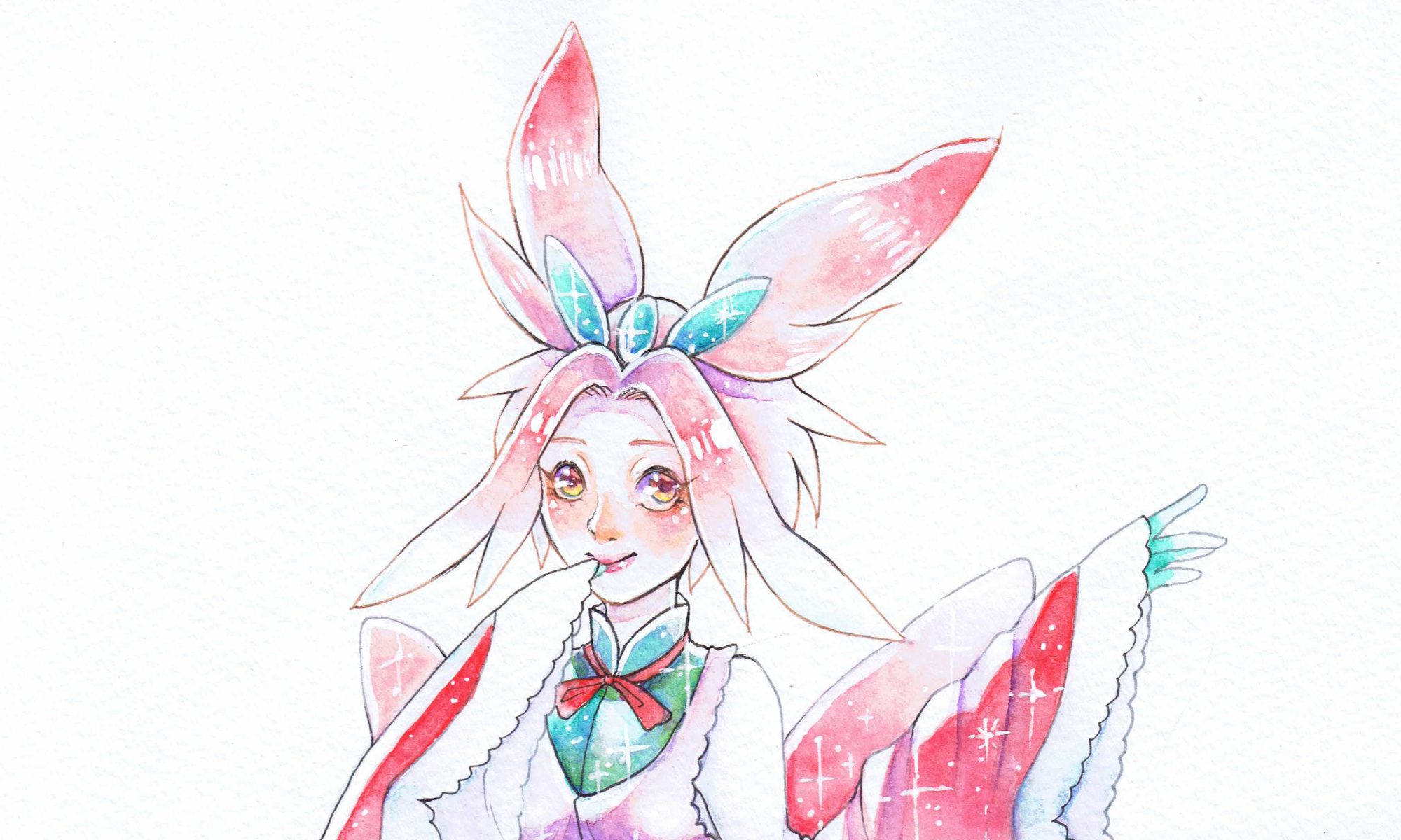
For my final project, I decided to go with Project 2’s theme of a girl in a TV. I wanted it to have a slight horror feel to it and do something a little different.
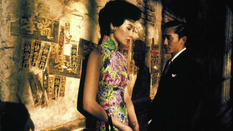
I wanted to keep with the theme of the 1940s and hence I chose to use the movie “In the mood for love” by Wong Kar Wai. It is a renowned film known for its interesting shots and cuts.
When I imported the film into my software, for some reason the audio was completely cut off. Hence I took the chance to retell a similar story of cheating, but in a gruesome way that was simply implied through sounds and cuts. As the original film itself had such wonderful scenes, I mainly shifted them around to tell a different story.
The main challenge that I found, was choosing which scenes to use and how to properly time each shot.
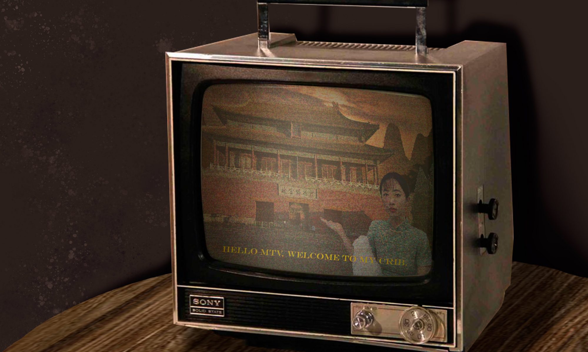
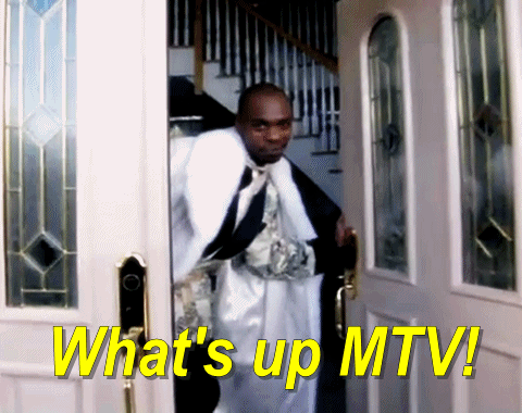
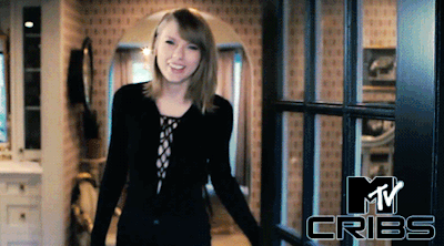
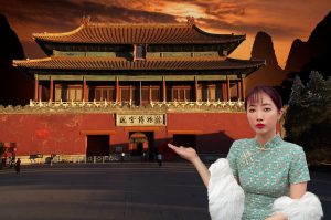
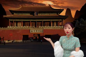
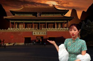
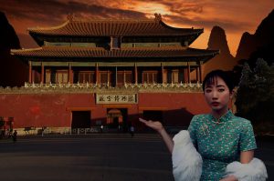
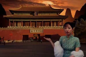
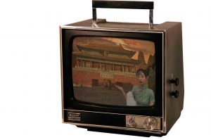
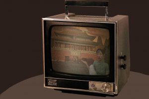
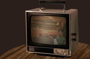
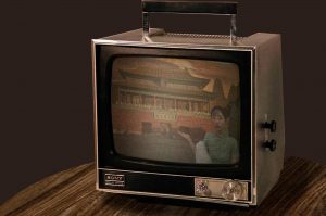
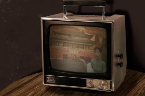
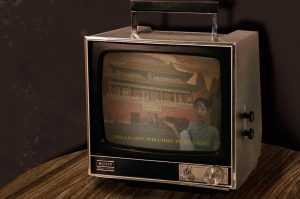
My concept is based on the television programme MTV Cribs.
In the show, it showcases many rich celebrities’ extravagant homes and they give you a tour of their everyday lives as well as introduce cool rooms that we, common folk, will never get to experience.
I don’t really take myself too seriously, hence I wanted to make a parody of this ridiculous show while adding a vintage Chinese twist as many of the patrons in the show are westerners. I decided to go with the Forbidden City as it is one of largest ancient chinese establishments that still stands today.
Here is a video to summarise my editing process:
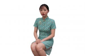
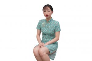
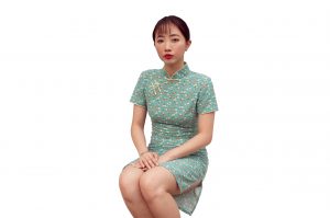
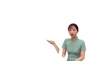
This is the original image.
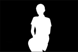
First I masked out the figure so it will be a clean removal process.
Next, I proceeded to clean the image, mainly the face where tiredness and weariness show through, using the clone stamp tool.
I brightened the image using curves as it was a little dark.
As I was going for a vintage theme, I decided to tint the image a little yellow using a colour balance adjustment layer.
As well as to add more reddish tint to the lips with a hue saturation adjustment layer.
I also added a high pass layer for the eyes so that the eye whites would look much brighter.
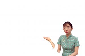
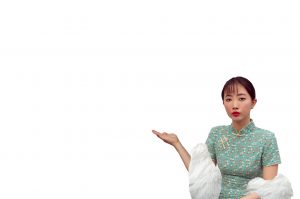
I then shifted the image and masked out the unnecessary portions. I composited an arm to give the impression of introducing something.
I darkened the hand with curves so that it would look more believable.
I composited in a fur coat to mesh the images together.
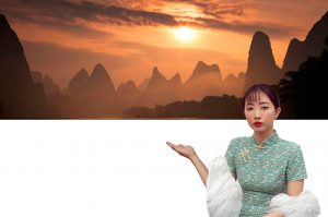
I proceeded to add a dreamy chinese backdrop.
Darkened it.
Composited the Forbidden City in after masking it out.
I converted the Forbidden City layer into a Smart Object layer and played with lens correction to give it a far away feel.
I decided to darken the forbidden city with curves so that it will match the mountainous layer.
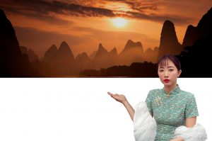
I darkened the figure with curves once again as it was too bright.
I tried to emphasize the blue shadow tint with colour balance.
I took out the warmth in the figure as it was far too yellow.
I darkened the figure once more to blend with the lighting in the Forbidden City.
Adding a yellow overlay over the whole image.
And adding noise so that the images would look cohesive.
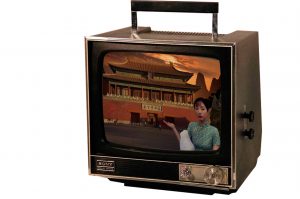
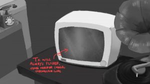
I masked out an image of an old television screen.
I masked out the screen portion.
Resized the composited image into the television.
I reduced the opacity of the composited layer as I wanted to imitate the resolution of the television screen back in the day and added a noise layer with thicker particles.
To give the impression of a curved screen, I added some shading in a multiply layer.
As well as add some highlights with a screen layer to further emphasize the curvature of the screen.
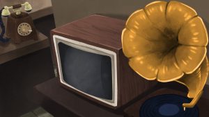
I added a dark brown backdrop.
Coloured in a lighter brown shade as the table.
Added a wooden texture.
Added shadows in a multiply layer.
Added shadows for the wall as well.
I used a brush to add lighter splatters on the wall, giving it a dirty look.
Finally, I added some fake subtitles to the famous line, “Hi MTV, welcome to my crib”.
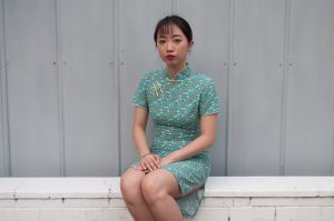
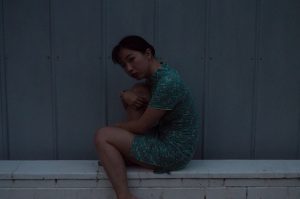
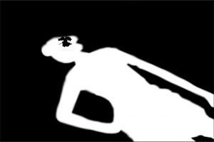
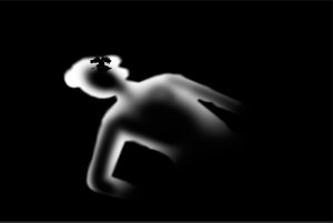
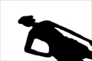
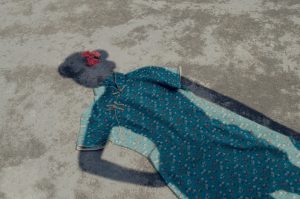
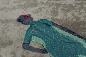
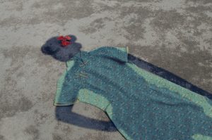
For my self portrait, I wanted to make use of shadows to create a silhouette of myself as the main focus point of my image.
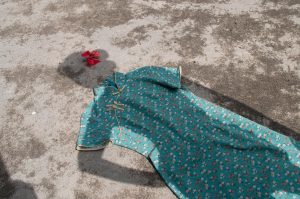
Here are some of the images I had taken.
I gained inspiration from John Arsenault’s Italian Stallion. I really like how the shadow of his silhouette is so carefully casted over the model’s body and I wanted to emulate a similar idea.
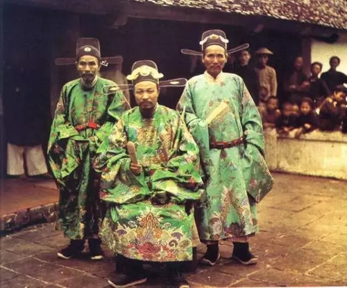
While researching, I was very attracted to old coloured chinese photographs taken by Albert Kahn. These images were taken in olden day China. I really liked how even though these photos were grainy, it still managed to capture the vibrancy of the reds, greens and blues while the rest of the photos were rather desaturated. Hence, I had a vision in mind to accentuate these tones while editing.
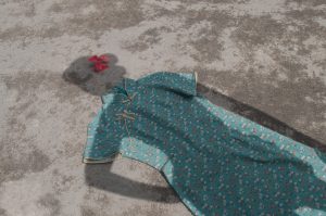
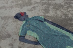
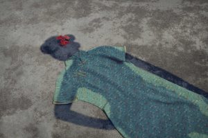
In the end, I didn’t like the other 2 shots so I retook it and decided to use this one instead.
Growing up, I always felt the pressure of being yellow-skinned chinese. I could never really understand why we were taught to follow certain “rules” and “traditions” that are outdated in our time. However, looking back, I realised that many children in our generation are so detached from our own roots that it is a sad reality to many, including myself.
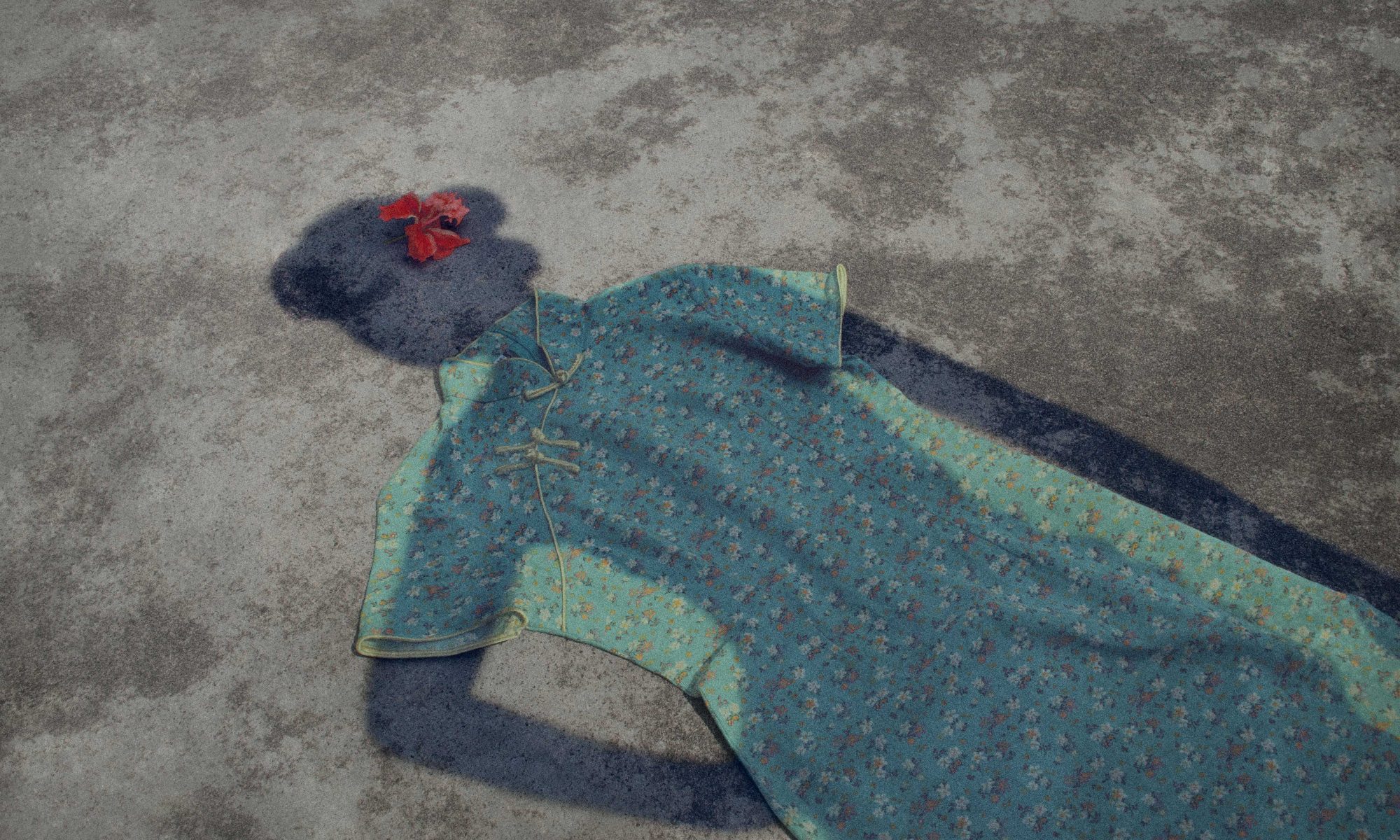
The Cheongsam was a dress that was often worn by chinese ladies in the past. With the westernisation of our current generation, the culture of wearing cheongsam in daily life is slowly being diminished and it is is no longer the norm. The cheongsam represents the chinese tradition and culture that is slowly left behind, thrown onto the floor like any regular trash.
I chose not to reveal myself in the shot as I wanted my silhouette to fit into the cheongsam, showing how I do not feel comfortable in my own tradition and culture, even though I am authentically “chinese”.
I used only 2 props in my shot, a hibiscus flower and a cheongsam dress. I had to angle my camera such that it would capture strong shadows under the 3 pm sunlight. My camera was set to auto as it was bright enough to take the shots that I wanted.
(1) I cleaned up the image. I used a combination of the Clone stamp tool and the Healing Brush tool.
(2) I desaturated the whole image using curves to decrease the contrast.
(3) I masked out the shadow and darkened it using curves.
(4) Using the same shadow mask, I added more blue by using a colour balance adjustment layer
(5) I cleaned up the shadow mask such that only the edges were masked and made it darker with curves.
(6) Next, I masked out the ground and desaturated it using curves.
(7) I added more yellow tones to the ground with a colour balance adjustment layer as it was too reddish. I darkened the bottom right corner of the ground with a curves adjustment.
(8) I masked out the hibiscus and proceeded to lighten it and saturate it.
(9) I masked the whole dress and lightened it with curves. I added more green into the dress with a colour balance adjustment layer and further refined it with a selective colour adjustment layer to tone down the green.
(10) I colour corrected the image as it was too yellow.
(11) I added some grain to imitate the graininess of Albert Kahn’s olden images.
(12) I proceeded to finish off the image with a slight vignette.
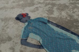
Here is a comparison of the Original (Top) and the Edited (Bottom).

 (wow, what a mess)