Typo 1 Interesting Typeface

Before the end of this summary, I would like to share an interesting typeface that I encounter for a long time, the typeface for the band “My Chemical Romance” and interestingly enough, the font type face is called “My Chemical Parade” typeface.

The Black Parade cover

I was intrigued by the font typeface, the strokes of the font gives them a strong weight and it appears to look very harsh in expression.

The expressive font gives me two feelings, energetic and anger. The energy to create such harsh stroke to reflect the power and personality of the person which translated to the anger within him, the deep boiling hatred that he processed within him.

Typography I Final Digital Submission

This is the google link for the files as attached for Typo 1 submission.

https://drive.google.com/drive/folders/1SP-IQXLikR5Looxzs5sqn7pRyKMkhIu5?usp=sharing

Overall for the conclusion for this module, it was an epic semester to begin with for year 3 considering the weightage that I am putting myself into. But nevertheless, this semester for this class has been a fun one considering how I get to explore around technicality of type faces, learning how to make use of creativity to enhance the readability of fonts and generally being more appreciative.

I will not say this is the best among the rest, but I have tried my best.

Thus to sum up, thank you very much Desmond for the effort in guiding me, I will look forward to future work with you.

Typography 1 Assignment 2

Assignment 2 – crystal goblet. Type arrangement. With 30 layouts that I have to do in terms of the type hierarchy, it definitely is not an easy assignment as there are alot of time spent and it is easy to deviate as almost every page will feels the same.

what i have tried out are basically simple type hierarchy tapping into the direction of dominant, sub dominant and subordinate to better help me determine my personal style and direction.

as seen from the pictures, most of the pictures have a dominant letter, word or sentences that stand out far rest than the sub dominant and subordinate

typography 1 – assignment 3a

assignment 3a where i get to explore around with grids is a fun exercise, trying to push the element of the fonts and words through different style and format for a poster design.

to be very honest, i first tried out with a very careful and safe approach, not daring to go beyond the normal square grid as i did not know what is my own style or am i doing correctly, but after the critique session with desmond, i realised that the boundary is limitless within this piece of paper, that’s where i decided to try to push out of my mind and go beyond what i usually do.

as such, below are the five new posters that i have edited.


Typo 1 – Assignment 1c

assignment 1c is an unique assignment as i get to stretch my creativity to visualise words literally. the ten words that i have chosen are

  1. engulf
  2. echo
  3. connect
  4. hide
  5. elevator
  6. invisible
  7. missing
  8. submerge
  9. collide
  10. flip

the letters that i explored are garamond, gill san and baskerville. let’s take an overview of each individual words as i break down my intention and purpose of visualising them respectively.


for engulf, i scale e to make it resemble a “pac man” engulfing the rest of the alphabets. each alphabets were tweak at different angle to show the process of the e engulfing them, as the flow of motion into the mouth

echo, i decided to play with the black negative space in capital letter e which resembles the ear, with the rest of the alphabets acting like sound waves going into the ear, as the wave travels to the ear, it started to get more faint and soft, thus them being smaller and fading away

connect, a more straightforward method as i combine both the “n” together, which seems to show that they are connected in this case

hide, personally my favourite, as the capital h resembles two block of tower, with the rest of the alphabets being playful as they seems to be hiding behind the two towers and peeking out

elevator, what i have done here is basically using capital letter e as the elevator shaft, which the capital letter l is the building

invisible, another one of my favuorite to play with, as i make the effect of fading to show that the word is invisible, part of it in visible while the remaining half is not

missing, a more straightforward visualisation, as i show the the missing alphabet here are the two “i”s which were filled as negative space inside the m and n respectively

submerge, playing with negative space to show how the word is submerging, with the rest falling into the bottom bed

collide, i am making this to show how the capital letter c actually bang into the rest of the alphabets and causing them to go out in different direction, the collision effect

flip, i guess that this is the mot straightforward one that requires no explanation a i flip the capital letter l  to make it look like a square with the perspective of the capital f

overall asignment 1c summarises what i have learnt for the whole of introduction to typeface. as 1c really taps into the element of 1b in terms of how i want to play around with alphabet, although i did not really incorporate the whole of the style into here. in the future, i would look forward to more opportunities in what i can apply in terms of logo branding for my product design assignments as i would have to design a product for my own. or even better, for fyp too where i also need to craft presentation slides.

Typo 1 – Assignment 1b

Assignment 1b is an interesting assignment that I did. Mainly the fact that I realised that how we can play around with cropping an alphabet to make it look illegible but yet at the same time, being able to be recognisable. The fonts that I used here are mainly “Gill Sans MT, Baskerville Old Face, Bauhaus 93, Comic Sans MS and Berlin Sans FB”.

Sticking to the design brief where I have to stick to black and white, i also plays around with negative space to show how I make use of the little inner details to showcase the whole alphabet out.

Just as what our tutor, Desmond, wanted us to do it “quickly without overthinking”, I did the whole 40 square cropping with the flow of my own perspectives. Which I would that there are more rooms for improvement and feedback to improve myself from my first attempt.

Typo 1 – Assignment 1a

For this assignment, I have decided to post the drawing which shows the original and final version. The intention that I want to show is the lesson learnt.

Obviously as seen here, the original versions are the one that look more out of place and intelligible.  The final version are the one that look to be more “effort” and in placed.

Though I have to admit that I initially wanted to get this over and done with as this assignment is like “tracing” our name out with the reference paper. But I decided to redo it as a challenge for myself to point out the different details and points in the alphabets.

As see in the final version, I emphasized more on the Cap, Y and Baseline. Just like the good old kindergarten days where we practice with alphabet writing. It sort of trigger the old memories that I had. From this assignment, it gives me a sense of understanding towards the different strokes and weight emphasis on each alphabet. Like how serif and sans-serifs are unique from each other here that makes typography beautiful in expressing the feelings and emotions of the authors towards the viewers.

Graphic Design So Far Reflection

Last lesson on the whole of History of Design, last lesson on visual communication history. Graphic design so far reflection. Personally I felt that this chapters paves the current designs that we are all witnessing right now in today’s perspective.

In no particular order,  I will be pointing out some of the interesting designs that I want to talk about.

Firstly, George Lois Esquire cover on Richard Nixon. During class, we were told by Desmond that Richard Nixon, did not win his first president election as he was deemed to look “evil” by the american citizens. During his second election, George Lois actually made use of graphic design to create a sleek message to infer a message that stated “this time he’d better look right!” with Nixon face being applied with make up as an inference that if he has the bravery to fight in the election the second time, he must have done something with his face to look less evil in order to garner votes. This humorous piece of artwork shows the genuine and creativity of Photoshop in the early days

Pang, D. 2019. Esquire covers, George Lois. Graphic Design So Far. Retrieved from https://drive.google.com/file/d/1df5gvzuoT_upgN67lyTWITMTQvSkMxAM/view

Next, MTV logo. Graphic design has came a long way from what we had known for since the first lesson as symbols into logos. Here, for the MTV logo, I personally like how the designers, Pat Gorman and Frank Olinsky actually create the negative space design, using patterns within space and also using line works, which were all what we had learnt from earlier lessons.

Pang, D. 2019.  MTV logo, Pat Gorman & Frank Olinsk of Manhattan Design. Graphic Design So Far. Retrieved from https://drive.google.com/file/d/1df5gvzuoT_upgN67lyTWITMTQvSkMxAM/view

What I have garnered so far from this four weeks of lecture is that the idea of today’s graphic design is are largely derived from past components and theories, as the title suggest, Graphic Design So Far… we wont be sure of what is the next movement that will arise and change the graphic scene, since we are all so comfortable with what our fore fathers had created for us. But nevertheless, I will be looking forward to see the next wave of design and what is the new style of movement.

History of Design Essay

iv What ideals, principles, motto and design qualities might you use to describe and define the next emergent design trend valid over the next 5 years, current to your practices? What name would you give to the design movement?

The principles that I will use to describe the next emergent trend over the next 5 years would be “Portable, Modular and Scalable” (PMS). Under the motto of “Everyone is a maker” and the design quality is to allow all households, no matter on their scale, to have the ability to develop product prototyping. My belief in these principles is based on technological “downsizing”. Examples on how workstations have evolved from bulky desktops placed in office cubicle to slim laptops stuffed in 14 inches sleeve pouch to interactive smartphones held within one palm. The ideology of “downsizing” has made the impossible to be achievable.  The art of “downsizing” would let me boldly define and predict it to be the next design movement over the first half of the next decade. Under the term of 5th Industrial revolution: Prototyping development on your table.

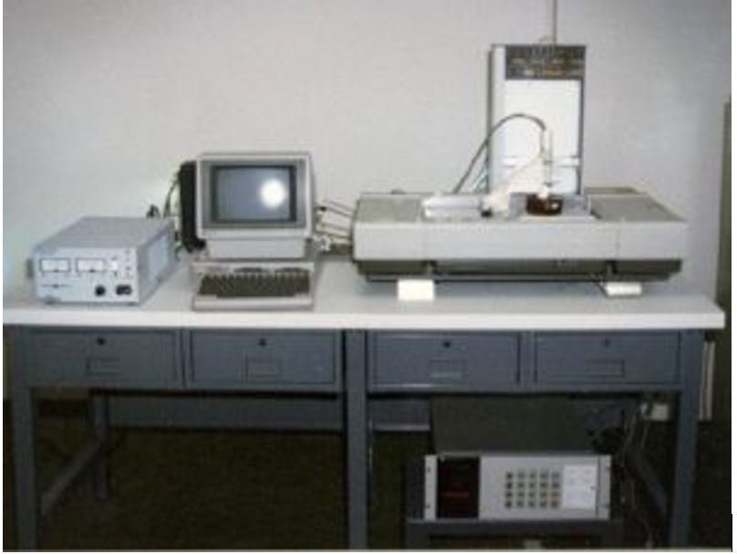
The key factors that revolves around downsizing largely fall on PMS. A prime example of current prototyping development products in the market with added on features to improve its efficiency and effectiveness is the widely known 3D printer. Invented in 1983 for rapid prototyping by Chuck Hull. Since then, it has become the phenomenal of developing prototypes without the presence of workshop tools and heavy machineries. (Flynt). Below are photos to show an example of how 3D elevates the efficiency and effectiveness of prototyping anywhere for our own personal convenience.

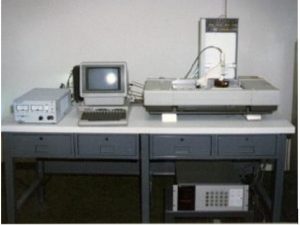
Fig 1. First 3D printer on top of a desk

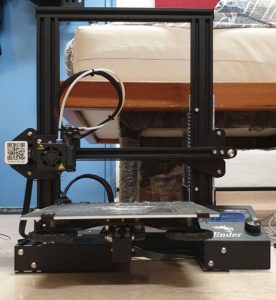
Fig 2. My 3D printer – Ender 3

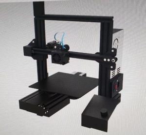
Fig 3. Perspective view of Ender 3

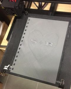
Fig 4. Printing book cover

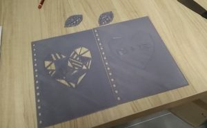
Fig 5. Final product

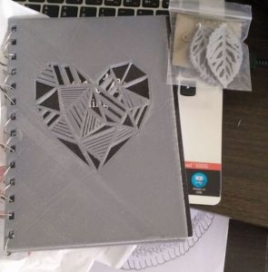
Fig 6. Final assembling

Secondly, with the increasing trend of maker spaces with prototype developing machines as classroom for students globally, they are exposed to the usability and importance of the machines to understand the foundation of prototyping. Thus, these greatly pinpointed the opportunity and reliability of a portable workstation, that has the feature of modularity compartments to scale the product up and down accordingly to the complexity and size of production. Thus, the term of 5th industrial revolution that emphasizes on homebased workstations where conventional central manufacturing plant and workshops will see the less relevance as more and more individuals can have the luxury to create their own products.

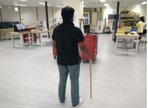
Fig 7. School makerspace

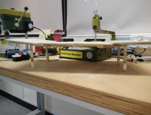
Fig 8. School makerspace with screw saw to represent a mini bandsaw and mini drill press

Fig 9. Me with my prototype developed in the maker space using.

Comparing the references to traditional industrial product prototyping lab with large and huge machineries that are huge and bulky, we can see how innovation has downscaled the machineries to cater to individual needs without being detrimenting the original function of the machineries.

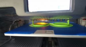
Fig 10. 3D printing spectacle prototype

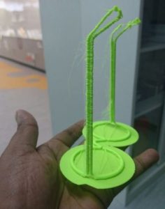
Fig 11. Finished prototype

The design movement that I would want to term is the “PMS movement”. Going along with the guidelines – “Portable, Modular and Scalable”. In the future, the “Portable” aspect focuses on the ease of keeping and setting up of the workstation on the study table at any time. Secondly, the “Modularity” allows users to focus on space efficiency as they can keep the part of the work station that they do not require and lastly, “Scalable” which is to allow users to increase the output of the prototype at low cost. Soon, people will be building products in their home, ranging from making clay, acrylic jewelleries and leather pieces to be turn into a product producing business by taking it to a newer level.


Bibliography


Flynt, Joseph. “History of 3D Printing Timeline: Who Invented 3D Printing.” 3D Insider, 2 Feb. 2018, https://3dinsider.com/3d-printing-history/.

Bowyer, Adrian. “The first 3D printer ever created was made in 983 by Chuck Hull.” “History of 3D Printing Timeline: Who Invented 3D Printing.” 3D Insider, 2 Feb. 2018, https://3dinsider.com/3d-printing-history/.

“Design Trend: Makerspace.” Demco, https://www.demco.com/shop-by-space/design-trends/design-trend-makerspace.

To Bauhaus and Beyond reflective journal

This week lecture is an interesting one as it points out the aspect of Bauhaus. splitting it down into three periods as mentioned by Desmond into Weimar, Dessau and lastly in Berlin.  Curiosity got the better of me as I went to further research onto why there were the three periods of Bauhaus. During the first phase, it was deemed that the art direction taught were too liberal by the community in Weimar, which causes the shift to Dessau, following in the period of the time in Dessau, the rise of the Nazis political party forced them to relocate to Berlin as the school does not share the same idealism of Nazism. However it did not get to reestablish in Berlin mainly due to the Nazis faction taking over the whole of Germany and Germany were involved in World War 2.

Moving towards the concept of Bauhaus, it has the curriculum of a basic foundation year where everyone get to study and learn every process of arts and crafts before transitioning and specialising in the years. This is very similar to the concept of ADM where we get to learn every different aspect back in foundation year from sketches, graphic to product making. Personally I felt that it was a good experience as we get to understand and touch on different aspect of the art so that we are able to view art from the view of a maker and not an end user.

The Bauhaus period was also largely linked towards war propaganda based on the posters that were shown in class. For example,

Air Corps U.S. Army poster, Joseph Binder, 1941 – Retrieved from Desmond Pang’s To Bauhaus and Beyond lecture slides

This posters touches on the aspect of image cropping method derived from Laszlo Moholy-nagy to show the plane wing and the use of colour wheel to show the complimentary colours s derived from Jan Tschichold.

In today’s perspective, we can see how Bauhaus influence has left a big impact on our art scene with the usage of colour wheel theory and image cropping to show the main message of the poster.

References

Unknown. 2011.  The Three Locations of Bauhaus. Retrieved from http://www.designhistory.org/Bauhaus_pages/BauhausLocations.html