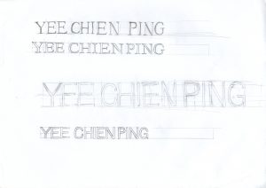
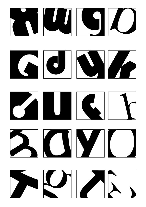
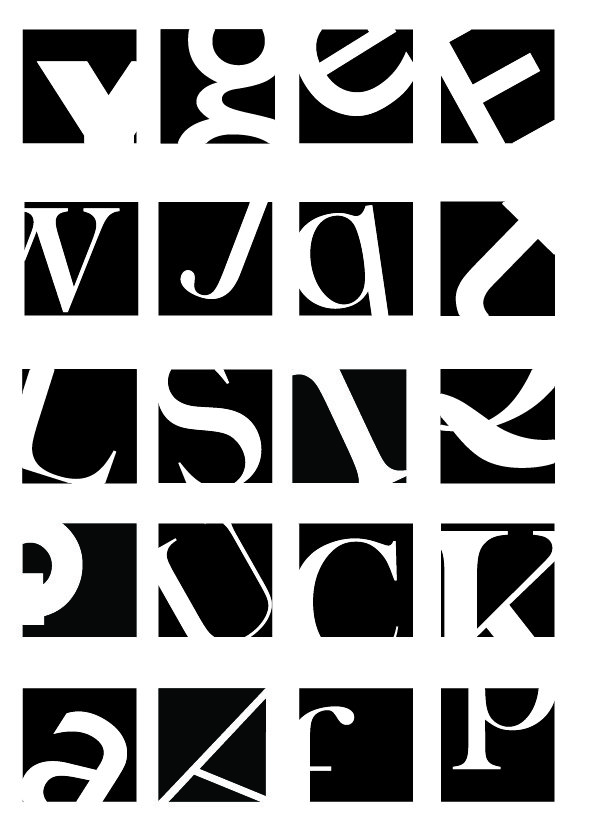
Assignment 1b is an interesting assignment that I did. Mainly the fact that I realised that how we can play around with cropping an alphabet to make it look illegible but yet at the same time, being able to be recognisable. The fonts that I used here are mainly “Gill Sans MT, Baskerville Old Face, Bauhaus 93, Comic Sans MS and Berlin Sans FB”.
Sticking to the design brief where I have to stick to black and white, i also plays around with negative space to show how I make use of the little inner details to showcase the whole alphabet out.
Just as what our tutor, Desmond, wanted us to do it “quickly without overthinking”, I did the whole 40 square cropping with the flow of my own perspectives. Which I would that there are more rooms for improvement and feedback to improve myself from my first attempt.