
assignment 1c is an unique assignment as i get to stretch my creativity to visualise words literally. the ten words that i have chosen are
- engulf
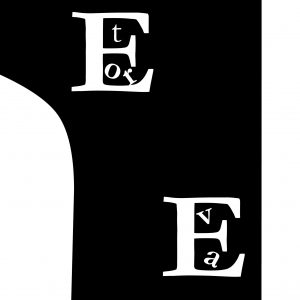
- echo
- connect
- hide
- elevator
- invisible
- missing
- submerge
- collide
- flip
the letters that i explored are garamond, gill san and baskerville. let’s take an overview of each individual words as i break down my intention and purpose of visualising them respectively.
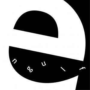
for engulf, i scale e to make it resemble a “pac man” engulfing the rest of the alphabets. each alphabets were tweak at different angle to show the process of the e engulfing them, as the flow of motion into the mouth
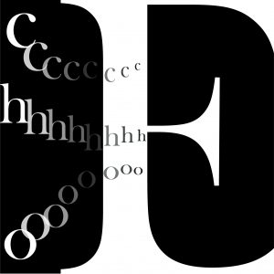
echo, i decided to play with the black negative space in capital letter e which resembles the ear, with the rest of the alphabets acting like sound waves going into the ear, as the wave travels to the ear, it started to get more faint and soft, thus them being smaller and fading away
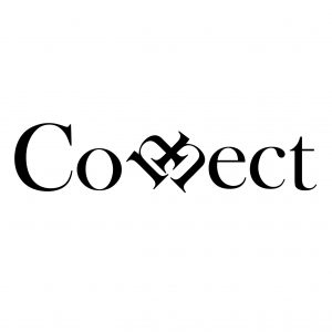
connect, a more straightforward method as i combine both the “n” together, which seems to show that they are connected in this case
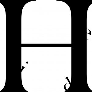
hide, personally my favourite, as the capital h resembles two block of tower, with the rest of the alphabets being playful as they seems to be hiding behind the two towers and peeking out
elevator, what i have done here is basically using capital letter e as the elevator shaft, which the capital letter l is the building
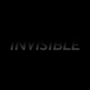
invisible, another one of my favuorite to play with, as i make the effect of fading to show that the word is invisible, part of it in visible while the remaining half is not
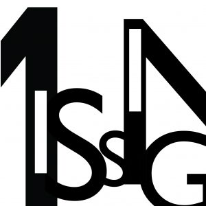
missing, a more straightforward visualisation, as i show the the missing alphabet here are the two “i”s which were filled as negative space inside the m and n respectively

submerge, playing with negative space to show how the word is submerging, with the rest falling into the bottom bed
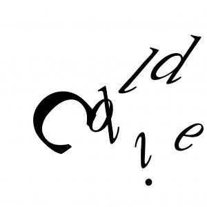
collide, i am making this to show how the capital letter c actually bang into the rest of the alphabets and causing them to go out in different direction, the collision effect
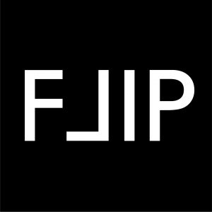
flip, i guess that this is the mot straightforward one that requires no explanation a i flip the capital letter l to make it look like a square with the perspective of the capital f
overall asignment 1c summarises what i have learnt for the whole of introduction to typeface. as 1c really taps into the element of 1b in terms of how i want to play around with alphabet, although i did not really incorporate the whole of the style into here. in the future, i would look forward to more opportunities in what i can apply in terms of logo branding for my product design assignments as i would have to design a product for my own. or even better, for fyp too where i also need to craft presentation slides.