Hi! I’ll start off with introducing both my ideal user and negative user that further lead to my final design. Based on my previous thumbnail sketches and pencil composition, I knew I wanted my design to look quirky and funny with a rather “dark” sense of humour. Therefore, I created Babara who is a quirky artist and she is interested in wacky fashion trends. She will be my ideal user persona in mind in creating my final magazine cover design.

Next, meet Sam who is my negative user persona. I created Sam to be an engineer who is very serious about getting his job done. He is a no nonsense guy who aspires to open his own engineering firm some day. Additionally, he is a family oriented man who spends most of his free time with his family. He is someone who draws a clear line between work and family so he does not use his phone very much during family time. Thus, Sam will never be interested in my upcoming quirky design because he is too serious for it.


 Initially, I thought I wanted to take a photograph of a nice croissant and lay them out for the magazine design. However, later on due to personal liking of the look of watercolour croissant, I decided to paint my own croissant.

Later on, I drew an image of an accident scene with a man lying on the floor as a template for me to fit the croissants around it.
 This was my initial composition using a photograph of a croissant to see the effect. I was worried that the title and the text at the bottom will be lost in my sea of croissants.
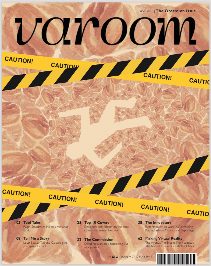
 After that, I tried to see the effect of the colours of my watercolour croissant. Initially, I made my croissant slightly darker than the scanned image. However, when I put into the magazine template, I find that it’s quite dark at the bottom text area. Therefore, I stuck with the original colour of the scanned image and did the final layout as shown below. I did not do watercolour painting on the caution tape because I thought that they will look too pastel. I wanted the caution tape to stand out, that’s why I decided to include the caution tape digitally.

 So this is my final magazine cover! From far, one may not be able to tell that they are croissants. I even got feedback that they look like intestines. However, upon closer look you can see that nearer to the dead man outline, the smaller croissants can be seen more clearly then you will realised that it is a sea of croissants.
