Week 7 – Interactive Environments & Experience Design Response

Part 1: Write a response to one of the projects shown in class on “Interactive Environments & Experience Design.”

A Hole in Space

Head-to-toe, life-sized, television images of the people on the opposite coast appeared. They could now see, hear, and speak with each other as if encountering each other on the same sidewalk.

To think that this was the height of technology at a point in time. I thought the title of the project was relevant, given that this was the first time humans could “skip” so much distance to see one another, we created a loophole in space.

 No signs, sponsor logos, or credits were posted—no explanation at all was offered.

I thought it was interesting how the people who created this project left nothing to explain the situation, it was testing the reactions of the people who passed by it. There was nothing to limit them in terms of how they can use this opportunity to see someone from miles away. Of course there was the chance of meeting someone they haven’t seen before, to strike a conversation and to establish a connection – reduced by hours, or there was the chance to meet someone who they haven’t seen in a long time. By 1980, the telephone has been around for sometime that people would have relatively easy access to it, but that was limiting the connection to purely a verbal one. This face to face virtual reality might be known as something “less intimate” than real life now, but back then it was definitely more intimate than a phone call.
UX Week 6 – You Are What You Carry

Chipchase Chapter 4: 

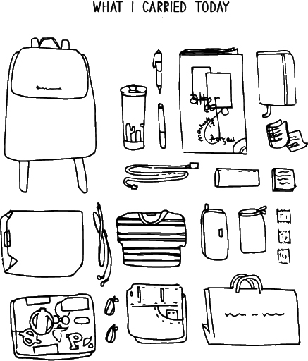
Whilst reading the beginning of the chapter, it got me thinking about how everyone has their own unique system of handing their belongings, as well as my own. Then I decided to do a little analysing with my own, depicted through some doodles from yours truly.


cc

bb

Range of distribution – The distance that people are willing to let physical objects stray when they are out and about. Criteria: perceived risk of danger, actual risk of danger, perceived and actual need and convenience.

Of course, the criteria for consideration is subjective to the individual – whether one is habitually paranoid or relaxed, they will perceive risk of danger or need and convenience differently.

dd

I find the concepts of centers of gravity and point of reflection intriguing as I have never thought of it beyond just being extra mindful of one’s possessions. Also, to note that I did not intuitive pick up the habit of practicing point of reflection, and instead was taught by my mother to “look by at your seat when you leave”.

aa

With regards to the story of police officers in Afghanistan, the highlighting of the people’s mind-set of “if you can’t see it, you don’t own it” telling of the suspicious attitudes, behaviours and the kind of life they live. This contrast with the average citywalker, for at the touch and a swipe, we can recover our account balance through a phone app, and will readily accept the numbers we see as indicative of how much we still own (so long its not far off from what we expect).

I’ll end with a quote from the chapter that concludes everything.

“…we could try to either reduce the risk of losing things, reduce the cost of recovering or replacing those things, and/or make it easier to live without carrying those things around. One of the simplest ways to accomplish all three is to allow people to use more while owning less.”

UX Week 6 – Response to “Future World”

19th Feb 2017 – Art Science Museum

“ArtScience Museum collaborated with teamLab, an award-winning Tokyo-based art collective of “ultra-technologists” that includes artists, programmers, engineers, CG animators, mathematicians, architects and designers. The result is Future World – Singapore’s largest interactive digital playground.”

Looking back at the works, the first thing that came to mind was the extensive use of sensors throughout the different exhibitions, and then the coordination of information that was scattered, then collected, analyzed and then answered – all in the matter of a second.

As a Visual Communications major, the most I could do was tag along and listen to the third year Interactive Media seniors talk about the different software used, along with a handful of jargon thrown into the conversation, more or less lost through the technicality of it all. But one thing was clear, there was most definitely a complicated system behind the magical inflatable sound ball pit.

The one exhibition that stuck out was exactly that, but not for the exhibition and the great time I had running around with the kids in the ball pit. It was when we sat down to listen to team Lab-san that I truly understood how much I did not know. It was not just normal motion sensors that were in the balls, instead you had machines that detected gravity, movement, as well as to calculate speed, acceleration and position in the pit, all of which contributed to the sounds created. To think that all that technology was packed into one flat package, stuck to the surface of the inflated ball.

UX Week 1 – Yoosh Trying to Catch Up

Response – Donald Norman’s The Design of Everyday Things, Chapter 1

Norman broke down the aspects of design into simple categories: Affordance, Signifiers, Mapping and Feedback. In each category, there is a simple consideration to design and it allows designers to think of them independently and yet see how they flow and work dependently with one another. While it was doable to think about these aspects separately, it was also about how one affected the other. To design something that could check off all the boxes was the difficult part. 

“As I watched people struggle with technology, it became clear that the difficulties were caused by the technology, not the people.”

I was thinking about the ever shifting sort of common technology knowledge that everyone has (or at least those up to date). For example, knowing/realising a laptop is out of battery, and knowing how to charge it, something that any adult, teen or even primary school child could do, might not be as apparent to the grandfathers and grandmothers of today. It got me thinking about how we should take into account the different generations and their different levels of this common knowledge. However, as I read and I thought about it more, I realised that this had to do with interaction and experience with other technologies, and it was the good designs of the past that have develop this almost instinct reaction to know what to do. I saw that as technology improves, the design for it to be used practically and to be easily understood has to be improving as well. We should not be making excuses for ourselves and technologies.

Questions:

How large of a part does habit have/is able to play in the world of design?

Is relying on the idea of habit and contextual knowledge only sort of an “escapist” or “easy way out” mentality? Or is it also frequently, using design to affect habit? Will that be under “bad design forces the user to behave as the product wishes”? Do I also sound like a mad scientist trying to figure out how to control human behaviour? Maybe..

Map Assignment: Pasir Ris Park

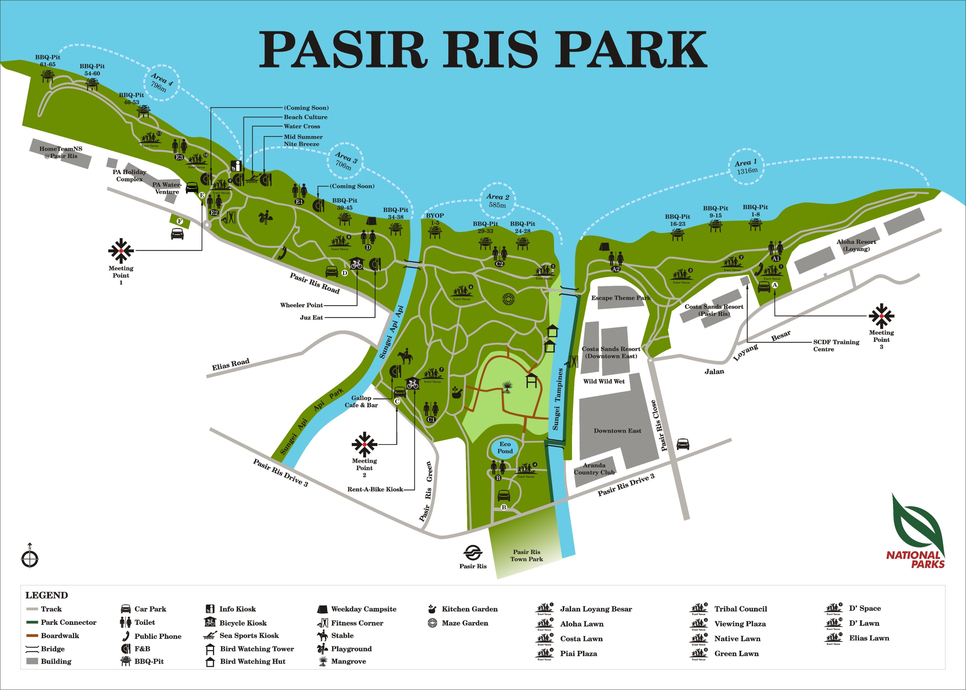
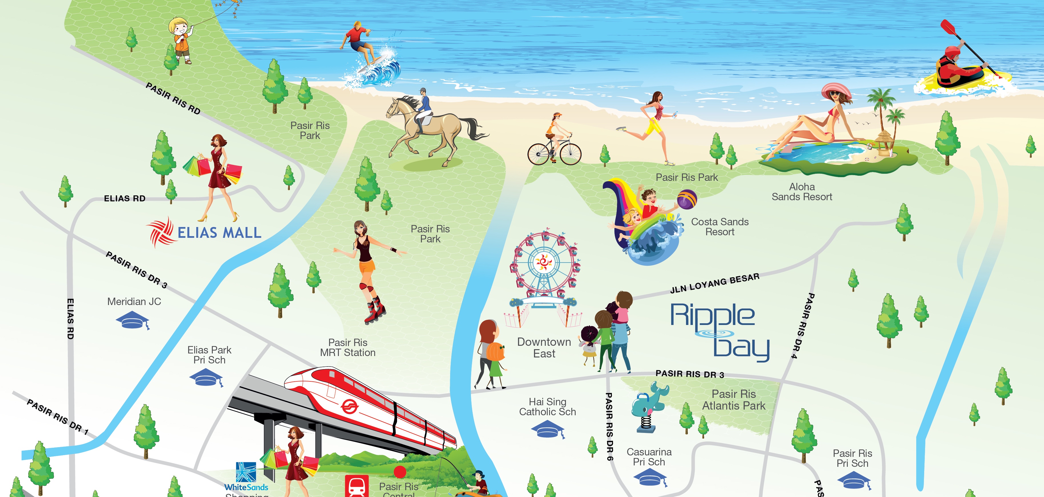
Both maps presented have their own pros and cons, but clearly in terms of doing a better job, the first one is definitely a real map’s map. (lol jk) Its not amazing but it does a good job and accurately depicting the land mass, yet without being overly anal about the little details, which might have complicated it more. While the second map simplified itself as well, it was overdone and presents itself as too inaccurate. Furthermore, the first man has more information about Pasir Ris Park, while the second only highlights its main attractions, leaving out toilets, pavements and individual BBQ pits. Although the second map has a more interesting and eye catching aesthetic, it does sacrifice accuracy and details about the park. 

pasir-ris-park-map ripple-bay-brochure-locationmap

Redesign Everyday Objects

I’ll get on that soon, promise.