More Motifs + Layout Experimentations

From last last week: Finished the rest of my motifs, through my tracing method (should post pictures of them soon, took me freaking hours for just one imagine.. ANYWAYS)

From last week: From the consult to current progress, the first four are what I had for the stand up and the comments were mainly about layering and deciding on the colour palettes.

I’m lazy to save all the different tries, but here are some at the moment. The first 2 are just my initial layout with the leaf patterned overlay at the back. Colour wise, I was going with more fun pop of vibrant colours, with the crows and the moths in the lightest to attract the most attention, after all they are the “badluck” that we see, and the “goodluck” plants are a supplement to the whole piece. Then tried with different background colours. In 3 and 4, I changed the layout, adding more branches, and playing with opacity in the motifs itself (not sure if it’s obvious here), and I have 2 sets of colours, for branches – more black at the bottom and more blue at the top, and etc with other motifs, wanted to try for a gradient. It looks messy, I’m not sure if that’s nice or in line with the “chaotic pattern” like of thing. Hmm.

Right now I’m working on more colour stuff. I’m more concerned with that, I think the layout can work itself out once I got my colours. 

Motifs and Experimentation

Talked to my mom abit about my project and she told me more about why we have potted plants around the house near door or at the window. “Different plants are for warding off spirits or to balance the energy of the house,” she said. I got onto the idea of creating a balance in my motifs.

Thus, I spent a bit of time researching into which flora or fauna had superstitions attached to them, and the shortlisted animals/plants are as follow:

Unlucky/Other world animals: Raven, Moth, Black cat, Snake
Lucky plants: Money plant, Snake plant, Jade Plant

First, I found photos online to copy its form. To achieve the images, I printed them out on A4 paper and traced the outline and basic shapes, then adding on my own textures and fine lines as inspired by Mazzoni’s drawings. Next, I scan them into my computer at 400 dpi and images trace the files to edit and clean up the lines. This whole process was to retain a hand drawn effect, but also making it easy to clean up the images.


I also wanted to experiment with more textures than just lines and managed to come up with a few gray swatches using a water tub, gauche, some paper, and alot of testing. Here are the results:


They don’t look much, but with a bit of cleaning up and photo editing etc, these are a few works I’ve come up.


(Post to be finished)

Pattern – Moodboarding

www.pinterest.com/yooshlee/pattern-concepts-for-ina/

The supernatural is a sensitive subject for me as I grew up with conservative family, specifically my mother, who will tell me to avoid doing certain things for fear of angering or attracting spirits. Its something that I will have an irrational paranoia over, and do my best to not break these rules.

However, I would like to consider this fear aside from the topic and instead add my own touch of imagination, using interesting visuals to beautify and mystify. After all, the supernatural might not be scary to everyone, but it sure does mystify and leave us wondering.

My concept ideas are selected from some of my favourite graphic artists, as their works and motifs create the same atmosphere I would want to portray the supernatural in. The subject matters are likely to be animals and most likely paired with intricate line work.

Artist 1: Henrik Uldalen – Human portraits, usually with the subject matter eyes closed, unaware and floating. Always has an interesting texture going on, either misty and smokiness, or wrinkles and blotches of paint.

Theme: Existentialism, Human and Spiritual Realms, Fading/Wasting away

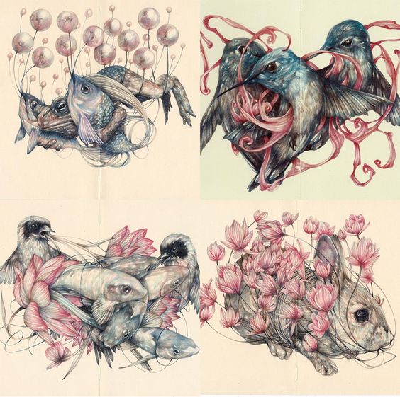
Artist 2: Marco Mazzoni – Animals or humans hybridized with flora of sorts. Colours are intense but muted and have a fantasy element in their design. Subject matter are rendered softly and have a flowy quality in their shape and lines.

Theme: Fantastical creatures, Spiritual Realm

Artist 3: Archan Nair – Bright colours and rough outlines pattern the subject matter. Heavy filled character against a plain background makes it look rigid and strong while the strokes of colour provide a magical quality about the animals.

Theme: Fantastical creatures, Spiritual Realm