Digital Photography Part 2 (Final Assignment)

逊卿自治药房
The Art of Self Care, 2019

This year marks the 48th work anniversary of my mother at the Singapore Thong Chai Medical Institution. At age 19 in the 1980s, she’s served as a clerk long enough to witnessed the relocation of Former Thong Chai Medical Building from Eu Tong Sen Street to where it is today, at Chin Swee Road.

Growing up at my mother’s office, I cruised through the pharmacies, libraries and even gotten my first acupuncture at the age of 8 (after a broken ankle). Getting fed bitter, Chinese traditional medical pills instead of flavoured antibiotics as a child got me a little peeved, only to find myself leaning towards the bottle of anti-heaty pills instead of paracetamol when I feel a fever growing at age 24.

Inspired by familiarity and my mother’s penchant for self medication, I composed my series of 10 body of images reflecting upon these traditional Chinese medicinal products lying around at home.

In the first assignment, I managed to experiment with a layout, featuring local flowers and fun pack stickers for the first variant.


https://docs.google.com/spreadsheets/d/1kl5NC0WKQuDruUKFASK-D2afYhvpgMAw1txzPJDesTI/edit?usp=sharing

In order to do this, I’ve prepared a workflow to shoot, and determine which flowers to match, below are some revised layouts and borders, the square boxes are to  align the cropping of the product shots.

Some snippets of the actual product shoot.

Camera Settings – f/5.6, ISO 200, focal length 41.0
Camera – Sony A6000, 16-50mm lens

In all honesty, I enjoyed this layout, but I was mostly concerned about the fact that almost 40% of the image is being covered in this composition. As this is a photographic based assignment, I decided to explore other sets of borders. But hey, this gets a feature on my OSS page.

Each product is then matched to its individual exotic flowers (drawn By Olga Korneeva, I previously purchased her set of illustrations for another project).

_________________
Post Production:

__________________
Before & After Images:


Link to hi-res jpg here:
https://drive.google.com/drive/folders/1s0duSwTC7q98Iw6Ap8pgFCIPjH1V3e7J?usp=sharing
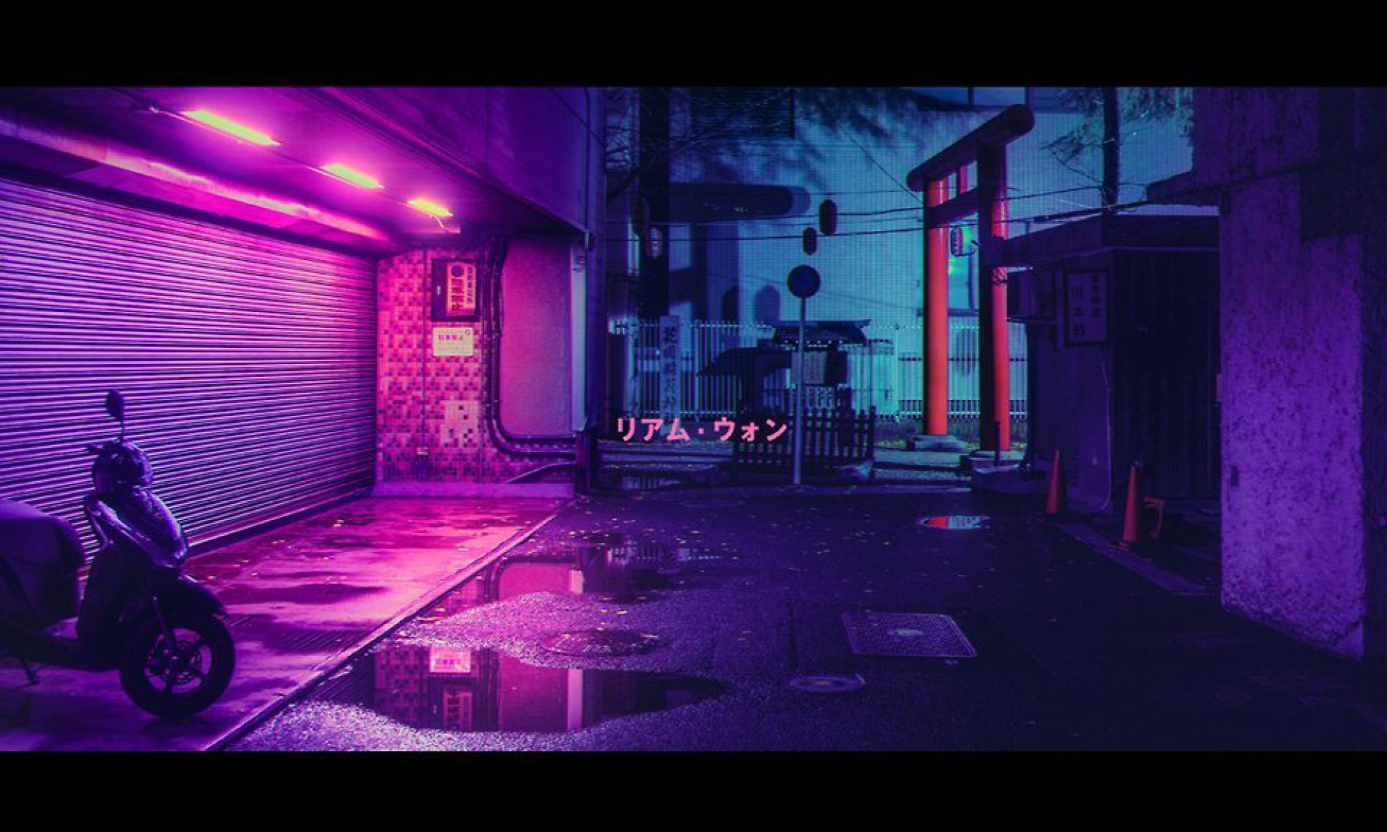

ASSIGNMENT 3 | Exploration of three routes


By using the channel mask, I was able to isolate the flowers with ease! I can’t image the past where I literally use the magic wand or direct selection tool with a lot of difficulty ;(


There are also a couple of scenes that didn’t make it into the edit 🙁 Here’s the two main entrance to the Hawpar Villa that I felt was a little too much to be part of the composition.

Closer to the final composition, I used the Gaussian Blur effect to make it more anime/dreamy like?

Download the files here! Or scroll down to find all three
TIGER BALM – https://drive.google.com/file/d/1SmTvIoZjOyygC2Ky7QkfAJTG5RIZjZC1/view?usp=sharing

_________________________


TIGER BALM – https://drive.google.com/file/d/1SmTvIoZjOyygC2Ky7QkfAJTG5RIZjZC1/view?usp=sharing

PURPLE PORTAL –
https://drive.google.com/file/d/1SmTvIoZjOyygC2Ky7QkfAJTG5RIZjZC1/view?usp=sharing

ASTRO BROS-
https://drive.google.com/file/d/1AnAuX0Y-AkfxlR6SxuNb1NEW4YqV0D7p/view?usp=sharing

CLARA PROJECT 2

“Singapore’s founding father thought air conditioning was the secret to his country’s success”  – Vox 

As an ongoing theme of my practice, I’ve always been curious about alternative spaces, and human agency towards these spaces. Somehow, I’ve find myself trying to reconcile with various national policies and history that has happened while being present in these spaces.

Most recently, I’m trying to capture a series of images involving Air Con as a representation of our city’s obsession with efficiency.  As quoted from our Ah Gong, the late Mr Lee Kuan Yew,  “This (aircon) was key to public efficiency.”.Yvan Cohen/LightRocket via Getty Images
Original Image for Assignment 2
Taken by: Clara Lim
Shot on: Sony A6000

First Attempts/Experiments.
I wasn’t so happy with  how I’ve edit (or the lack of my ability) to properly mask the images.


After getting a refresher on the notes, I managed to neaten up my mask layers a little bit (the haphazard ones on the left are honestly before I got comfortable with the mask options)


A couple more experimenting on different masked areas and using the curves.

At the end of much attempts, I decided to bump up the flat-ness of the Aircon masking area and juxtapose with a very eccentric colour spectrum for the surroundings. The “Fines” on the walls are also featured in unison with the Aircons. While at the left, it was important to leave the door flat as well as a message to convey our gateways to these subconscious, fleeting spaces that pretty much make up our society today.

Vibrant city, at what costs? Ideally, i would really wish for this to be printed in riso like the examples from Anna Lomax.

We’ll see how it goes!

Links to the psd files:
https://drive.google.com/file/d/1cypBb63v-kOClS8sQf4D32ovqcf7_98g/view?usp=sharing

DP2001 | REVISED PROJECT 1

FROM WHERE I LEFT OFF, I REALISED THAT MY FILE IS IN A MESS.
My Separation Frequency was all over the place and I have since fixed it!

Overall, I’ve also taken in the feedback to make the model thicc-er and increase the size of them muscles with the use of liquify tool.

I’ve also used the Gaussian Blur to make the skin more smooth without looking like a Ken Doll.

Quick gif to demostrate!


THE FINAL BEFORE AND AFTER
Here’s the link to download:
https://drive.google.com/file/d/1m1NpfYroaxts5lXhVfy7AP_NTZBNBc5S/view?usp=sharing

Digital Photography | First Assignment

https://gph.is/2Apcuvb

新年快乐 FAMILY. It’s been so long since my last post with OSS, but here’s the rundown of my first assignment for the Digital Photography class.

In the mood of CNY, one of my viscomm senior Leon had a photoshoot as a joke of sorts towards the festivities. It’s a tongue in cheek, hilarious homage to bondage?

In terms of the technicality decisions for this assignment, I’ve utilised these tools as featured in Bryan’s past two lessons.
1. Basic cleaning using
2. Dodge and Burn
3. Separation Frequency


Basic cleaning of the background


Recolouring the face/chin area because one thing Rupaul Drag Race Queens have taught me is that your face colour gotta match your neck. I re-edit this because I felt that the shade is slightly lighter (on the right). I’m not exactly sure how to do this, but I realised Dodge and Burn is quite useful in colouring the skin (I adjusted tot opacity and flow, slightly beyond 25%, 3%).


I’ve also noticed a little bit of glare of the lighting here and there, I’ve used the clone tool to fix them!

Link to download the .psd file:
https://drive.google.com/file/d/1XjY7FEPjILMYhxwAATvaXg4KDSiZmBzq/view?usp=sharing

HAVE A GOOD DAY AND THX FOR READING.

Birth Control Pills | Infographic Design Final

Process:

Assignment 1 documentation will be structured into 2 main processes.
1. Survey and Research
2. Process of Infographic

  1. Survey & Research
    After an extensive search of web sources about Birth Control Pills, the slight lack of access to these information has strengthed and further supported the importance of my campaign to generate awareness of the BCP.
    I’ve gathered two main sources to support my infographic:
    https://goo.gl/7tnj3Xhttps://goo.gl/fYQhxY
    The overall survey I gathered is also exported here:
    https://goo.gl/LFY8zV
    The conclusion includes the need to discern between all the pills in the market, the functions and difference between BCP, Morning After Pill & Abortion Pills. In order to raise the importance of choice and prevention, a segment on Abortion laws relevant to Singapore is also added.


  2. Initial Exploration

    The initial concept board is inspired by George Goes to Japan (Couple) and Brand Guide Singapore (Foreign Policy), to give a more textured, overlay approach to break away from conventional infographic form found in the internet. However after consultation, it was understood that as a art direction and approach, this angle is workable. It was important to streamline an infograph to 

Additional Inspiration that is more relevant to the assignment.

Draft 1
After the first mass consult with the class and (Prof) Michael, I was able to gain feedback to restructure and arrange certain information. To also allow the information to have a better flow with headers. Supporting images also requires more context and directly facilitate the text. Last but not least, a more consistent typeface should be considered.

Draft 2
As part of the final presentation, I was able to see more clearly how the red spot might be fighting to gain attention from the overall graphic. Title and headers in this draft is not exactly ideal for a smooth flow in reading.

Michael gave us the option to re-submit the final layout via OSS. For final layout, please refer to the first two image of this post.

Flowerdose | Design Artefact 2 Final

Output – Site
The site can be viewed live here:
https://flowerdose.cargocollective.com/


Through the weeks of consultation, I was able to figure out how to streamline the information I want to convey to the public.

Flower Dose has an underlying intention to break away from the familar, hipster-ish aesthetic of a typical floral shop to break away from the narrative of a single level flower exchange. By supporting Flower Dose, you are taking a step towards having a healthy conversation about Birth Control Pills.

The longevity of the site includes supporting a future research organization dedicated to safe Birth Control Pills distribution as well as on-going medical research on the side effects of these pills.


Initial Drafts

Draft 1
(This was the very first consultation of the site. Feedback from Michael was monumental to the final restructuring and clarity of messages)

Flowerdose | Final Project

Flowerdose | Design Artefact 1 Final

Output – Overall Art Direction of Flowerdose Pop Up
Includes:
– Flower Tag (with BCP Pills Name  & Write Up)
– Set of Myth Cards

The intention of these flowers is to spread the awareness and literacy of Birth Control Pills in Singapore. Each flower you send comes with a tag matching a flower of your choice with a similar BCP brand name.

The myth cards serve as an additional add-on for you to send together with the flowers if you wish. The final artwork of the myth cards will also be available on the web.

Task 1A: Exploratory Research Part 2 (Visuals)

YASSSS THE FAVOURITE PART, VISUAL RESEARCH. Just to follow up to part one – link here I have chosen to research and discuss the topic of Birth Control, with a focus on accessibility, side effects, and women’s health (not limited to sex health).
Link to the work: https://www.fastcodesign.com/3067438/pentagram-visualizes-planned-parenthoods-100-year-fight-for-reproductive-rights
Analysis:


Link to the work: http://www.designindaba.com/articles/creative-work/pill-talk-%E2%80%93-creative-campaign-working-transform-way-we-perceive-birth-control
Analysis:


Link to the work: https://www.behance.net/gallery/18742241/The-Downside-of-the-Birth-Control-Pill
Analysis:

Other notable video approaches towards my research topic:

https://nyti.ms/2FjrjPE