

Abstract:
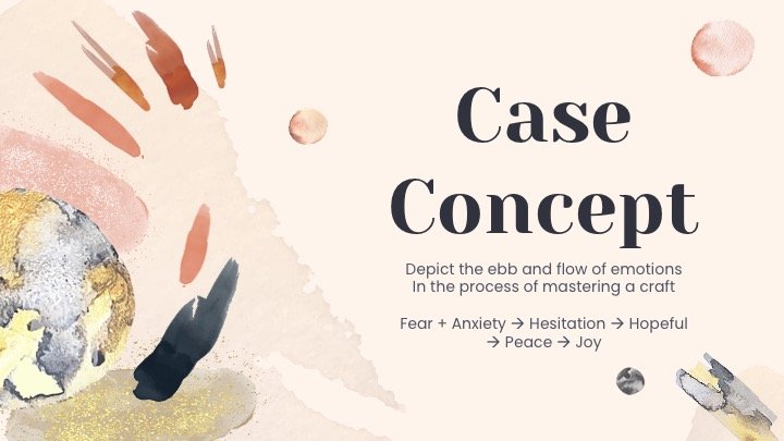
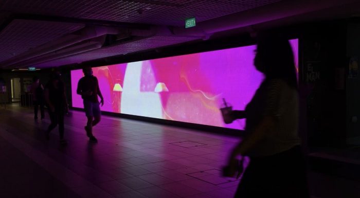
Refining upon the idea of ‘Urban Magic’, I wanted this piece of work to capture the magic of everyday passing moments which we often miss in our busy lives. Our subconscious never forgets. Moment in Transience is a piece which draws focus on the magic of colors, smells, sounds that we take in everyday, bringing immersion to the walking audience with the movements of flow and stillness. Starting with the slow rise/fall of sunrise and sunset, to the ripples of rain, this piece of work is all about entering a state of ‘flow’ to lose sense of passing time, inspired from the Japanese concept of Ikigai.

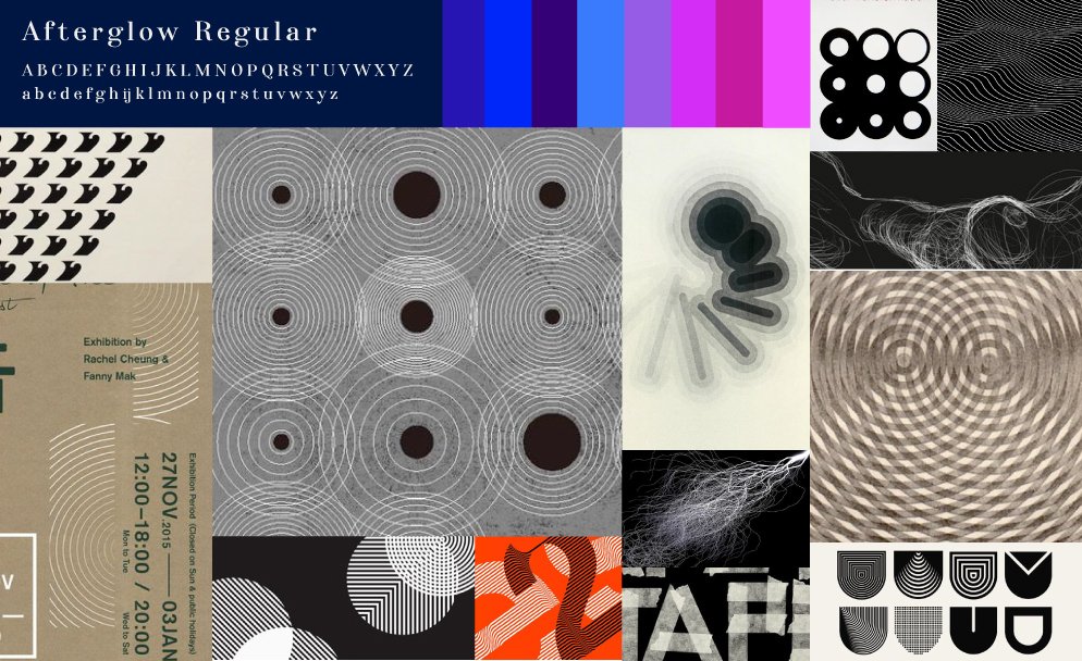
Moodboard

Methodology:
It is my first time using Aftereffects and I am glad that I got to learn a new software! There were 2 methods that I used to create this piece, using Aftereffects:
1. Video editing
For this method, I used open-source videos found through the online site: pexels.com Through manipulating videos with color adjustments, overlays and effects, it helped me to obtain the effects I wanted which would have been otherwise a little more challenging to create through Aftereffects at a beginner level.
Links to videos:
https://www.pexels.com/video/the-sun-rising-on-the-horizon-2288346/
https://www.pexels.com/video/dropping-a-blue-liquid-on-a-clear-water-to-create-an-abstract-images-3024112/
2. Shapes and plugin effects
Through drawing directly onto the canvas in Aftereffects, I experimented with multiple effects to manipulate the shapes into the various forms:
Some effects I played with include:
Tutorials:
Final:
https://vimeo.com/user128208049/review/485542246/5e7356ee40
Submissions google drive link: https://drive.google.com/drive/folders/1wa8JQ9iNgNzSvLA3DmhU3uGJb5uE9AXv?usp=sharing
Drafts:
Final:
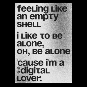
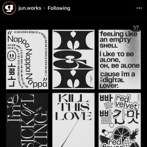
Some of my favourite font collection:
Display Type faces – I really love the experimental details of each lettering and thought these interesting!
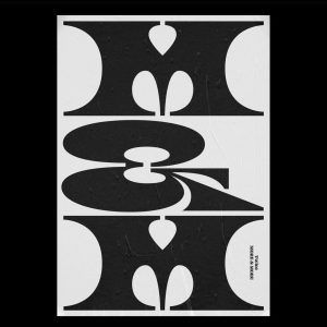
I really enjoy the design of these fonts and their usage as main visuals. 🙂
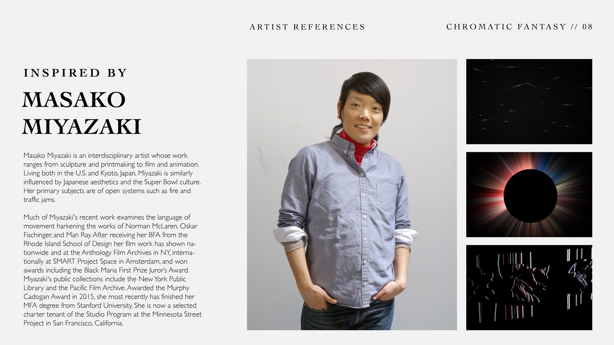
Thanks Desmond for the great semester! Had fun in your class and thank you for all the crits and feedbacks!

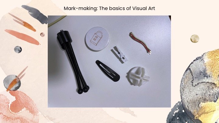
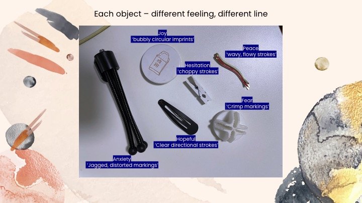
Techniques: Animated digital projection using mediums like paper, mylar, mirror.
AfterEffect Tutorials for Lucid Sea
AfterEffect Tutorial for Urban Magic
AfterEffect Tutorials for Quiet Noise
Oki thank you byebye!
WIP of first piece, with 1 serif and 1 sans-serif font.

Unfortunately, I decided it was very smart to drink ice milo while drawing, resulting in the following tragedy 😄
New piece, redrawn and tidied up (without iced milo on the table)

For this hand-drawn exercise, I decided to go with my chinese name simply because of the choice of letters. It was fun drawing the letter ‘g’ and while in the process of it, appreciate the different curves and structure of the type anatomy. I chose to use Didot Regular for the serif font, as I really like the contrast in line weight and curves within ‘L’ and ‘g’.
For the sans-serif font, I used Gill Sans as my reference.
While drawing, I started to realise the proportions, curves and weight difference of each line and stroke. To ensure the drawing was proportionate and well-aligned, I used measurements to mark out certain points before drawing them. With that, I also made sure that each letter sat nicely on the baseline so that there will be no ‘floating letters’. I also measured the spaces between individual letters to ensure the kerning was consistent. It was a little challenging with the serif typeface, but having a direct visual reference helped.
Overall, this exercise made me realise that the beauty of typography really lies in its details, and I can only imagine how intricate and careful the printers in the past have to be when they crafted the metal plates for each letter. I enjoy the aesthetic of the sans-serif font here due to its cleaner design compared to the serif font. However, I feel drawn to the design of the serif typeface for some reason, as it seems like there is a lot more space and potential to explore in designing one.

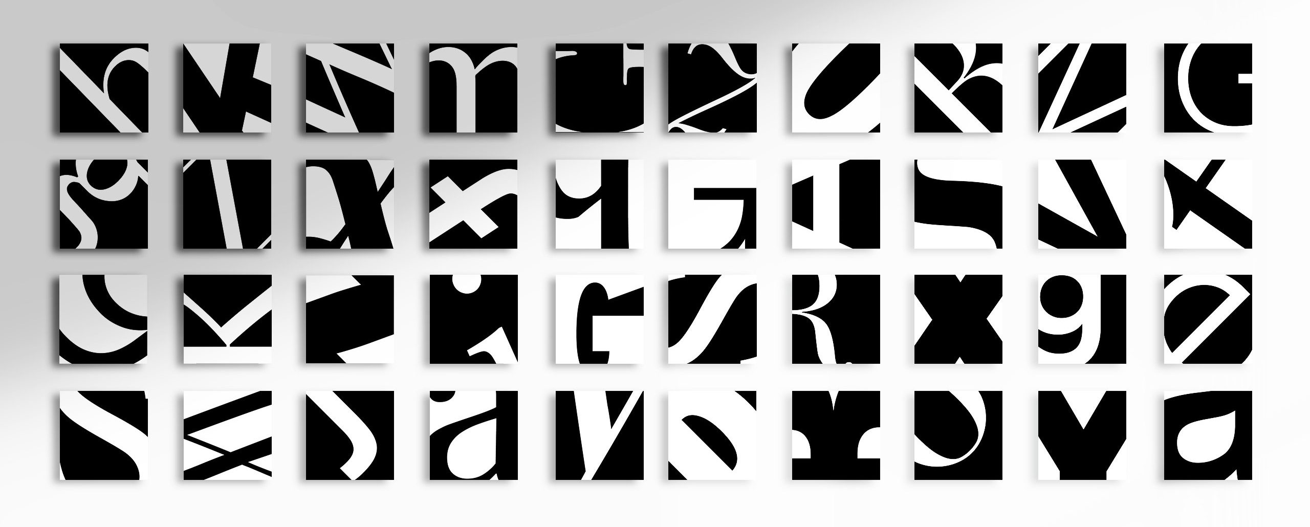
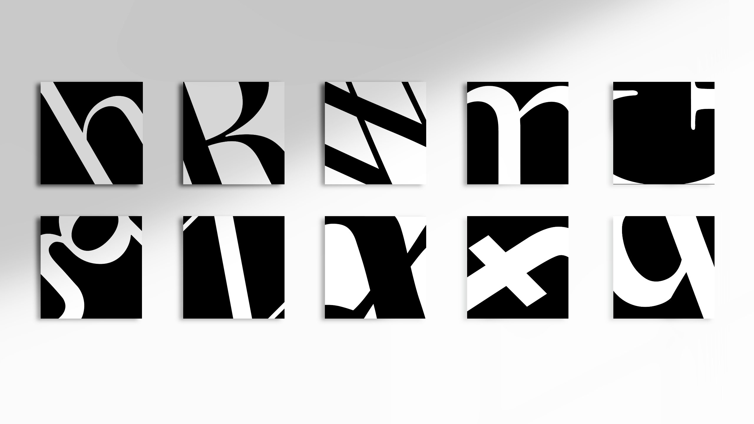
For this project, we were tasked to familiarise ourselves with each letter’s individualities and recognise each of their unique form and structure, before cropping them into 40 x 40mm squares.
The result:
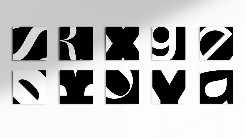

Typefaces used: Baskerville, Georgia, Palatino, Times New Roman, Bodoni, Didot, Futura, Gill Sans, Helvetica, Avenir
The Process
For this exercise, I really enjoyed the process of experimenting with the different typefaces and crop angles. It has helped me to better observe and appreciate the typeface for its graphical form, and it is quite cool to see these letters in a new way; as shapes and compositions, instead of just appreciating it for its functional aspect.
While experimenting with various fonts for each square, I got to be better acquainted with the intimate detailing of each letterform, and it was fascinating to see how the design principles were in play, even within each of their type anatomy.
This short exercise was fun, as we could experiment with how far we get to push the legibility of each letter before it becomes unrecognisable. 😈 (yay!!!)
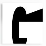
My approach towards this exercise was to firstly visually deconstruct the letterform into shapes, and then identify the parts that gives each letterform its essence, bringing to attention the crop along those areas. I thought along the lines of:
“What makes ‘m’ an m?”
and… what makes “g” not a “q”?
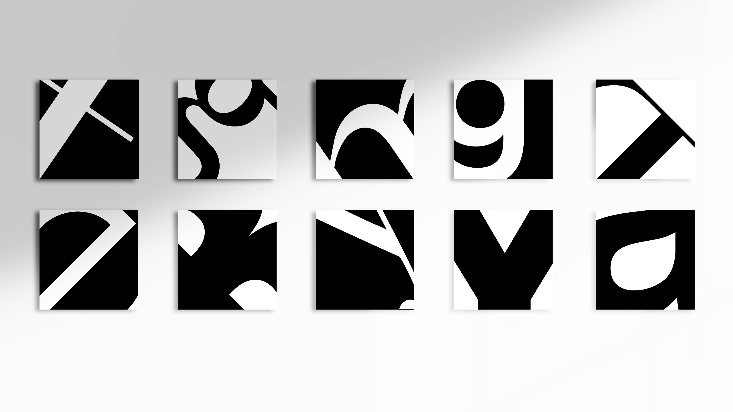
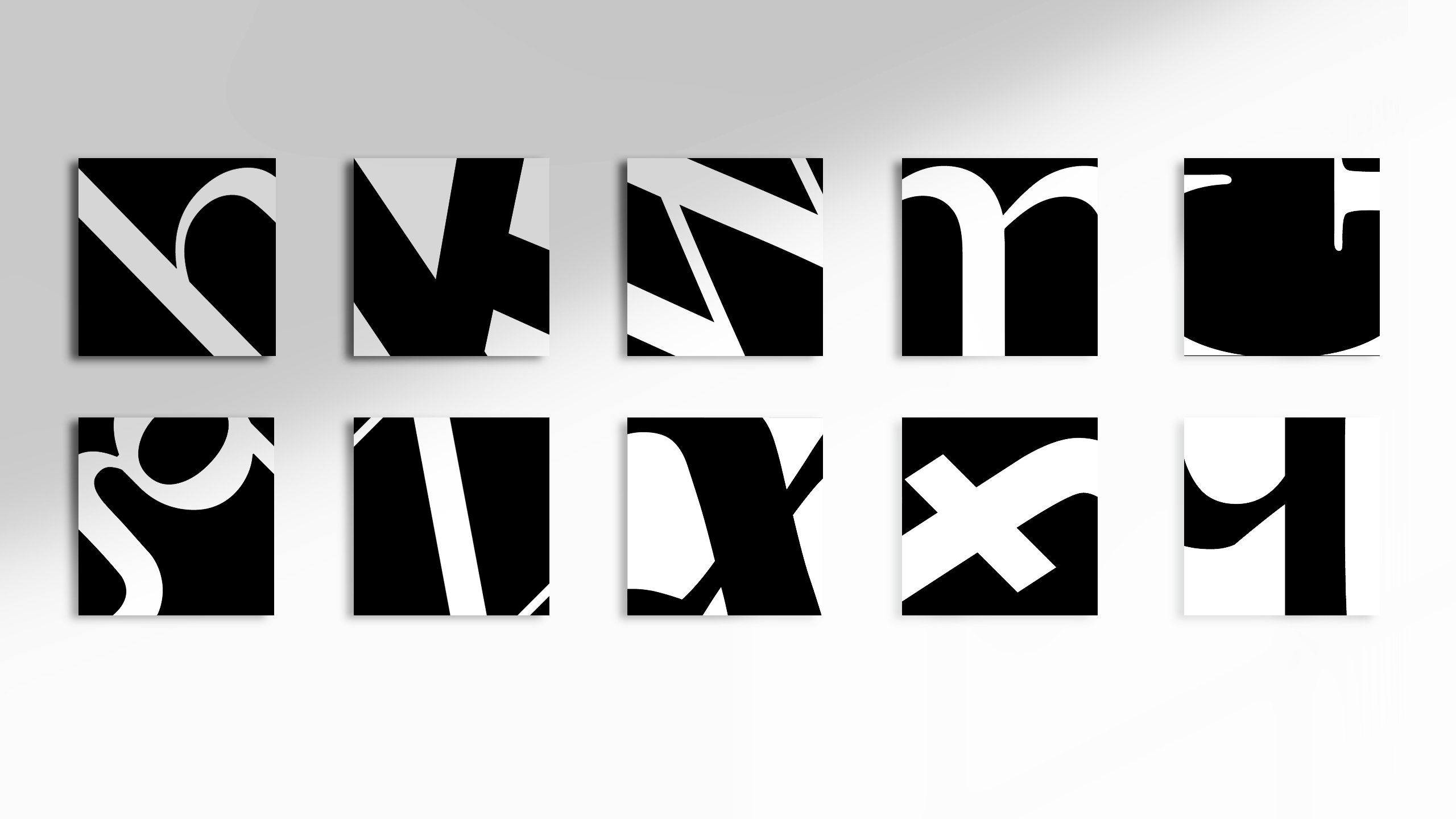
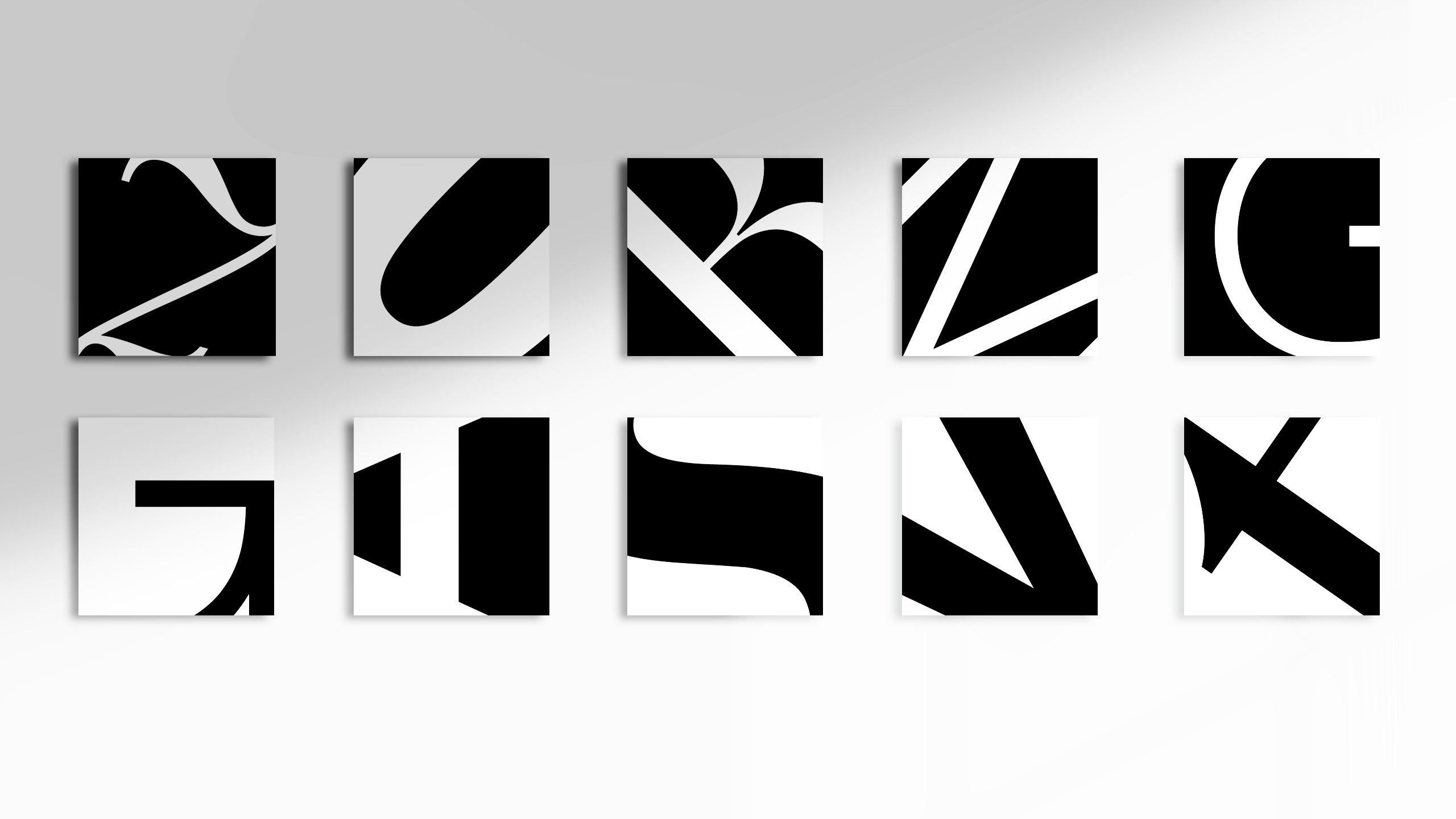
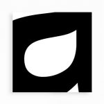
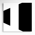
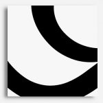
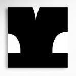
During the process, I found the letters ‘g, G, K, a, s and R’ to be rather interesting to work with and these are some of my personal favourites as they seem to resemble abstract shapes rather than letterforms.
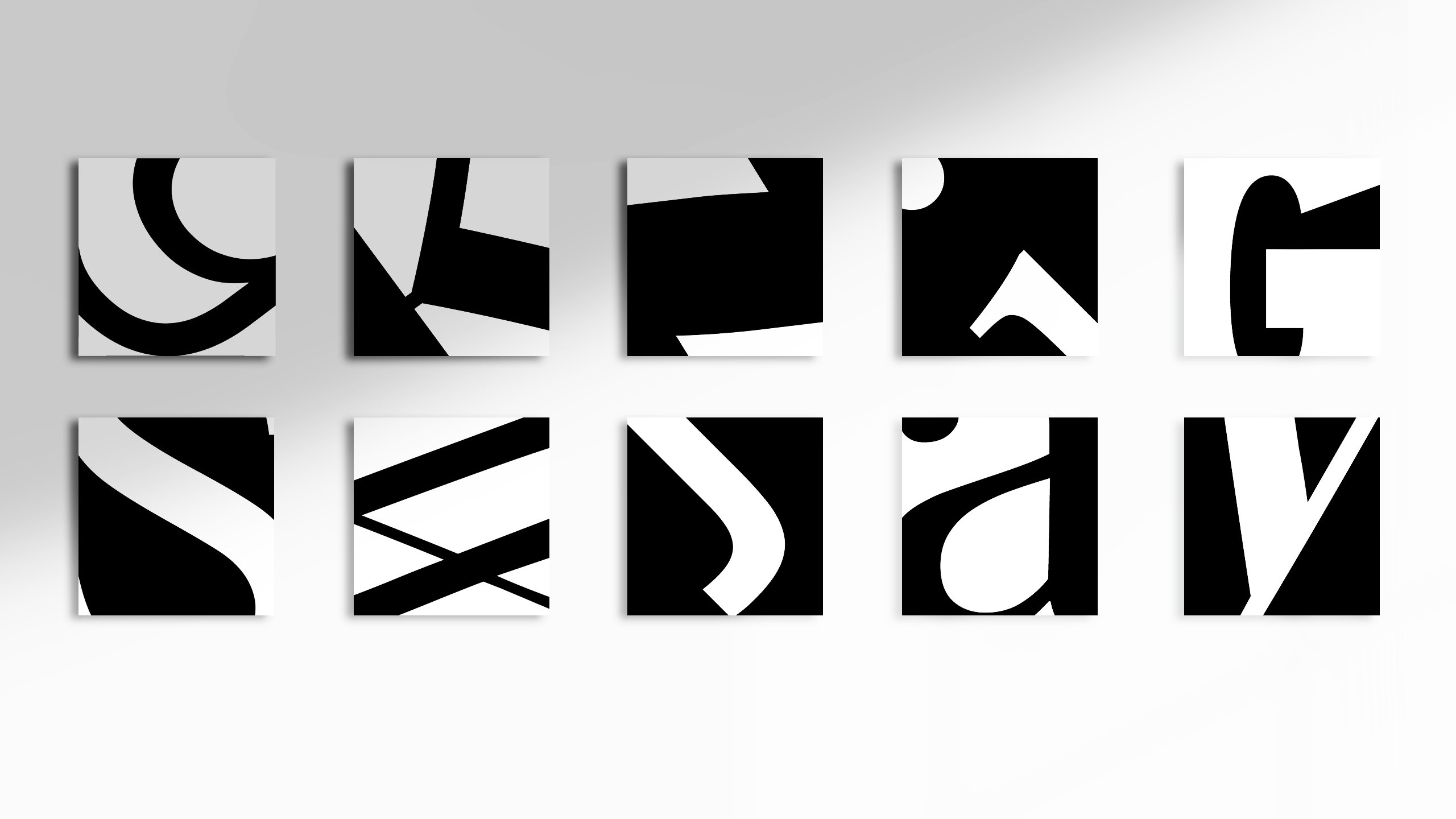
Some of my personal favourites:

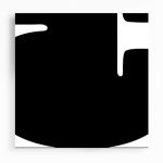

While cropping, I also realised that visual weight do matter, in determining the legibility of a letterform. Some cropped compositions worked better with the letterform being in the dominant color, whereas for others it was the contrary.
For example:
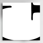
Interestingly, the few that really appealed to me personally, have their counterforms in a seemingly sub-dominant color (in terms of color proportion) and yet managed to retain their legibility through their distinct counterform shapes.
For the crops, I also tried to do it with the various design principles in mind, such as the rule of thirds (… well at least i tried my best!!), symmetry and visual direction.
Ok that’s all for now, goodnight!!
Final Poster design: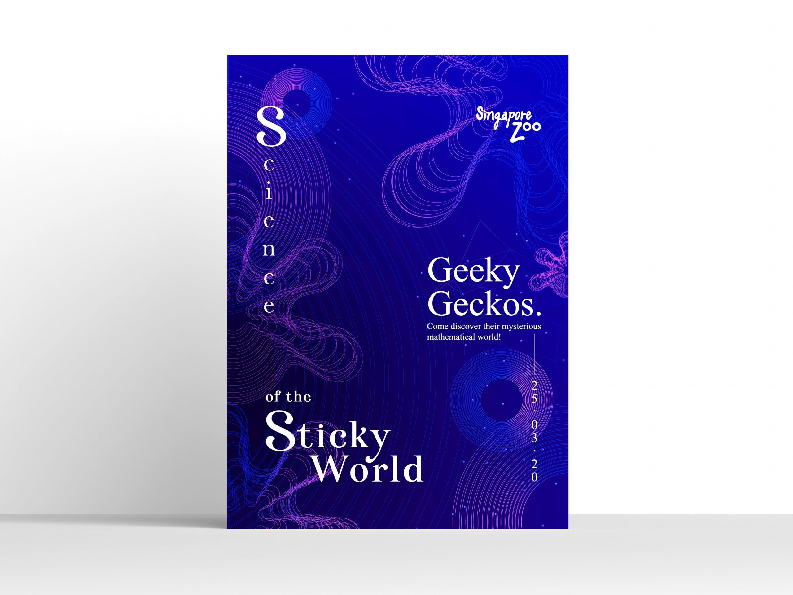
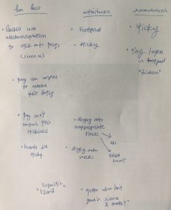
For this project, I think it was a really interesting experience learning about the grid system and layouts. To begin, I started with researching on the fun facts about geckos, and coming up with some random names that resonate with the creature’s attributes:
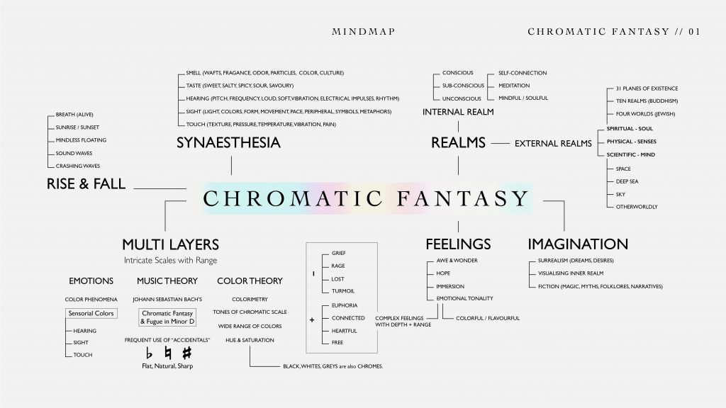
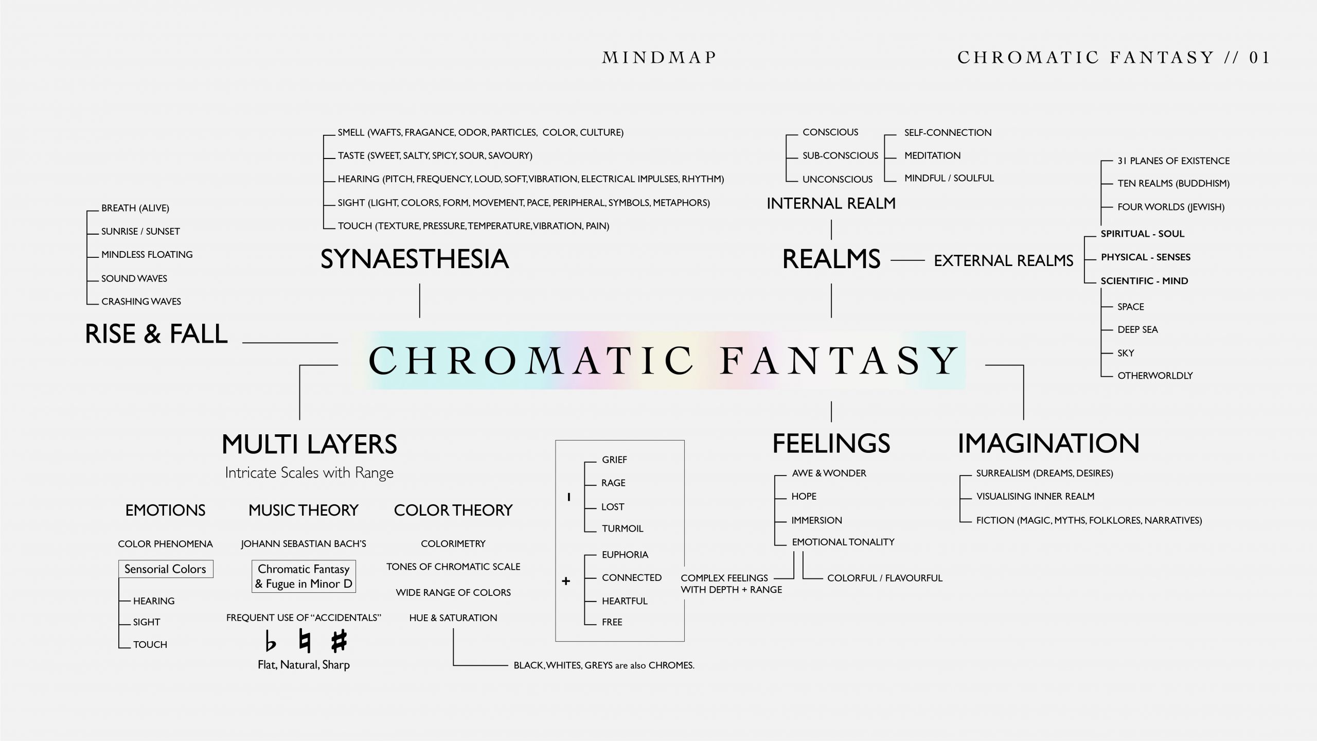
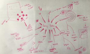
Assigned Exercise #4 Mindmap
Eventually, after much ideation and brainstorming, I settled on the idea of “Geeky Geckos”, with the following 2 headlines as options:
1. Masters of Math & Science
2. Scientists of the Sticky World
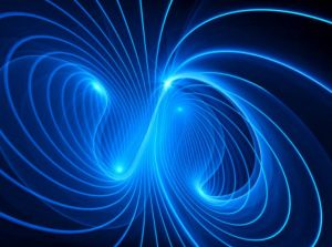
ElectroMagnetic Wave
Both of these headlines are crafted to reflect the sticky and quirky attributes of the gecko’s footpad, based off interesting facts like:
Assigned Exercise #5 Moodboards
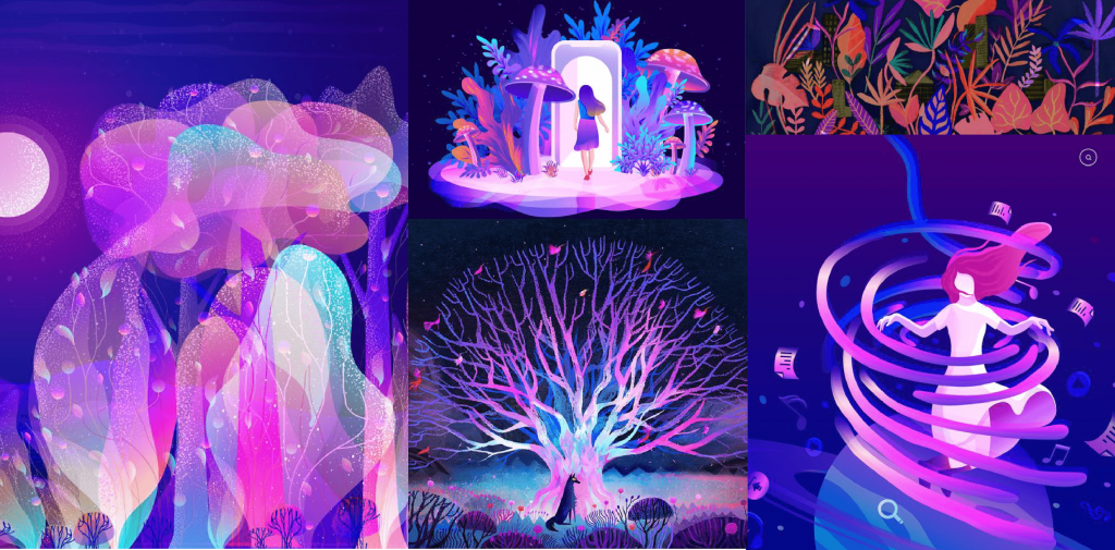
With the above research, I started putting together some moodboards based on what we learnt in class, in order to obtain the color feel, elements, and ideal composition for later conceptualisation:
Concept: Geckos – Mysterious little creatures that not many people really appreciate. Secretly science-y, intellectual little beings… welcome to their tiny worlds!
I wanted something mysterious, dark yet intriguing, something abstract that represents the interesting physicalities of the gecko, that would also give a sense of curiosity to the viewers and invite them forth to take a closer look at the poster for the event.
In my head, I had the keywords: Abstract, Mysterious, Science-y, Graphical.
The main colours that I decided to use are:
#EF4CFF, #965CE5, #0027F9, #000099, 0F003D and #FFFFFF.
Color Moodboard:
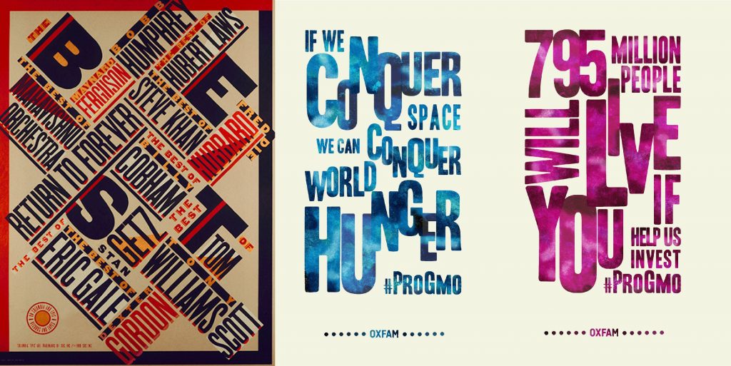
While researching, the following typographic posters caught my eye:
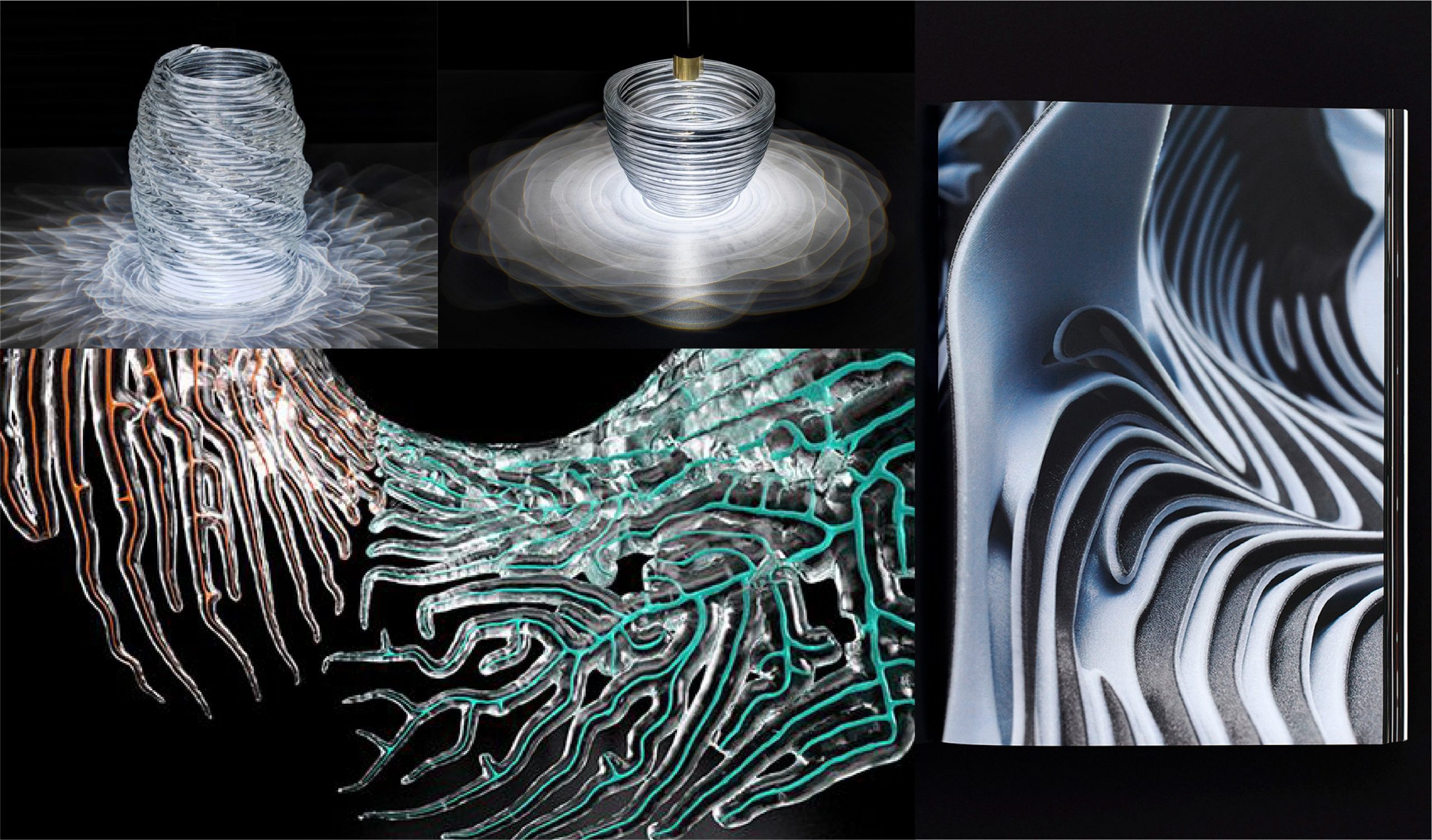
While researching, I was also inspired by an artist called Neri Oxman.
I enjoy the bio-art concepts she produces, but most importantly, the organic shapes and geometrical aesthetics of her works seems quite suitable for the visual direction of the selected second concept pertaining to electromagnetism.
Overall inspiration and visual direction moodboard put together:
Assigned Exercise #6 Grid Layout