Essay Response to Question IV.
November 2019
History of Design – Graphic Design So Far:
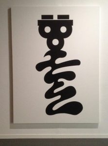
Ang Sang Soo:
The “godfather of Korean typography”. He uses Hangul, the Korean alphabet, to create very interesting designs. Much more than a typographer and graphic designer, he is a multi-faceted cultural producer who translates his philosophy through various mediums from visual design to poetry, photography, and installation. With 40 years of innovative contributions under his pen, Ang Sang Soo has reinvented and championed the field of linguistic illustration.
The Hangul is written with many geometric shapes, giving him a lot of room to be playful with his typography designs. It is founded on five basic elements: vertical, horizontal, and diagonal strokes, the dot, and the circle.
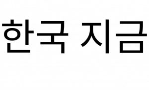
He was the first to “step out of the box,” so to speak, exploiting the graphic flexibility of Hangul and removing it from its incommodious square-framed structure.
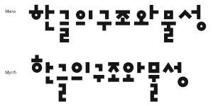
Generally understood as the simplest writing system in the world, Hangul, so linguists say, can be learned within just a few hours. Comprising 14 consonants and 10 vowels, this practical linguistic system is founded on five basic elements: vertical, horizontal, and diagonal strokes, the dot, and the circle. Established by order of King Sejong in the mid-15th Century in a progressive effort to create an alphabet unique to the spoken idiom and, in doing so, break away from its foundation in Chinese ideograph, Hangul symbolically realizes Korea’s cultural independence.
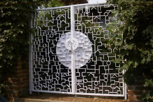
Some of his other works:
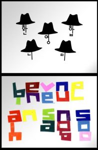
Hangul is a very interesting writing system, and it is one of the easiest writing systems to learn. I really like the way he deconstructs the Korean alphabet into shapes, to create expressive forms for his works!
History of Design – To Bauhaus and Beyond
For this week, I really like the works of Piet Mondrian. One of the founders of the Dutch modern movement De Stilj, Mondrian is recognized for the purity of his abstractions and methodical practice. He radically simplified the elements of his paintings to reflect what he saw as the spiritual order underlying the visible world, creating a clear, universal aesthetic language within his canvases.

In his best known paintings from the 1920s, Mondrian reduced his shapes to lines and rectangles and his palette to fundamental basics pushing past references to the outside world toward pure abstraction. His use of asymmetrical balance and a simplified pictorial vocabulary were crucial in the development of modern art, and his iconic abstract works remain influential in design and familiar in popular culture to this day.
 Personally I like the geometry and contrast of the lines, together with the primary color and makes it enticingly vibrant to look at.
Today, there are many contemporary products and art pieces inspired by Mondrian’s works. Across fields of interior, product and even fashion design, the Mondrian aesthetics can be incorporated to create an endless possibilities of designs.


History of Design – Industrial Revolution & Graphic Reactions Reflection
In this lecture, we looked at more font styles and graphic styles. In the 18th century with the start of Industrial Revolution, more interesting and creative fonts such as ‘fat’ typeface, and display typeface began to surface, and I personally feel that this was a fascinating period when visual communication became a lot more captivating.
I was actually quite intrigued by the wood type posters of that time, as they used several decorative fonts to increase the appeal of the poster. This is contradictory to what we learn about modern typography today, as we are often advised to use only 2 fonts where a clean and minimalistic look is often recommended.

What I love about this particular type of design is that despite using several different fonts, the overall looks aesthetically pleasing and cohesive. I have always been intrigued by the choice of typography fonts in this kind of design which I feel contributes greatly to the harmonious and engaging poster aesthetics.

I also like the words from Alphonse Mucha, where the distinctive styles and influence of the Art Nouveau period was very prominent.

His works were so profound that the Art Nouveau was also alternatively known after his name: the Mucha Style. His works often portray woman with long flow hair, which has influenced most of the feminine portraits seen in some abstract works today. I love the ornamental floral details that often accompanies the character in his works, as well as the choice of earthy enticing colours.


It is interesting to see that even in more contemporary art works, the roots of it style can be traced back to centuries ago. Past styles inspire the current and the current inspires the future. What’s amazing is that throughout the process, none of them ever goes ‘out of style’, and each individual design movement only serve to become an irreplaceable timeless reference and muse for the next generation of artists.
History of Design – Writing to Typography Reflection
In this first lecture, we started off with a Lascaux cave painting that dates back to an unimaginable 15000-10000 BC. When we first started the module, I was expecting the topic of ‘typography’ to be associated more with contemporary designs and fonts, as those are the modern typography styles that we are currently using today.
It is very interesting to learn how people used to express themselves in the past, mainly through symbols and drawings like pictographs and petroglyphs. Designed mainly for communication purposes, they were very straightforward in meaning and are much easier to interpret as compared to the language that we all know today. It is really interested how the modern day language and alphabet can carry such distinct and abstract meaning and is widely spread among people today regardless of region and language.

We’ve also looked at some Chinese calligraphy that area also similar to the ancient Egyptian pictographs, in the way they were derived and evolved from rudimentary drawings and symbols. I actually quite like the circular forms of the olden Chinese writing as they were more expressive, and ‘human’, making them more interesting to play with when put into the context of typography.

The ancient Egyptian hieroglyphs are also very interesting, as information such as the direction of the hawk’s beak dictates the reading direction. Unlike our modern language form, the language medium used back in the day was very visually engaging and expressive. The way they are created is interested as a picture could also be interpreted in different ways. However, simple pictures are are quite hard to interpret for messages that are may contain several layers of meanings and are less literal. Being simple, it is not hard to wonder if the language carried different layers of meaning that we may not have deciphered yet, thus remaining mysterious and intriguing to most today.