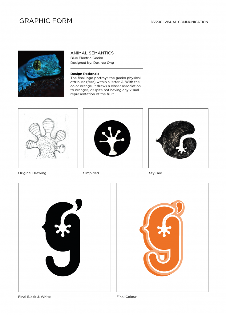
This project was a really fun and interesting, and I really enjoyed the process of researching, ideating and refining the concepts for a logo form based off my chosen animal, the electric blue gecko! I chose this animal because of its striking color and adorable face. I felt the physical attributes and form of it was also interesting to work with, especially since not many people know about this unique little creature 🙂
Animal’s Visual Reference
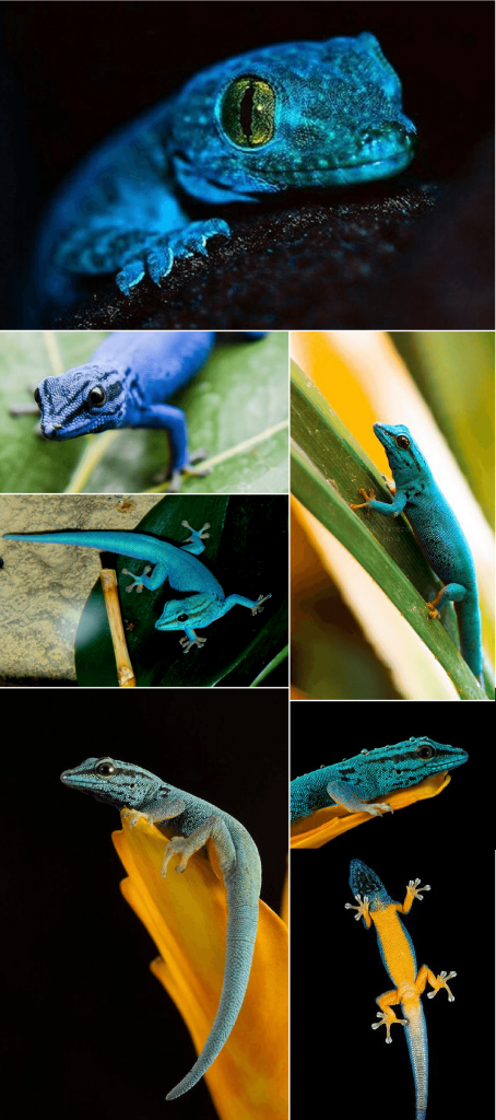
To start off, I did some research into the chosen animal and found the following interesting facts:
-
- It is also known as Lygodactylus Williamsi (Blue Electric Gecko).
- This creature is diurnal.
- The males striking are blue in color and the females are olive green.
- During courtship, the male flattens its back and bobs its head in a little courtship dance to attract its mate.
- Female geckos will stick its eggs with a glue-like substance onto any substrate surface to keep it well hidden in sight.
- Each gecko footpad is made up of little skin creases that creates fantastic traction against surfaces. This gives them the illusion of being sticky, but it is in fact simply friction at work.
- Slender and nimble, this gecko can climb trees and thread water well.
- Consumes live insects and lives mainly on pandan plants, and is often associated with swamps and forest limestones.
- This species of gecko is currently endangered as reptile enthusiasts and poachers have illegally removed 15% of the wildlife population.
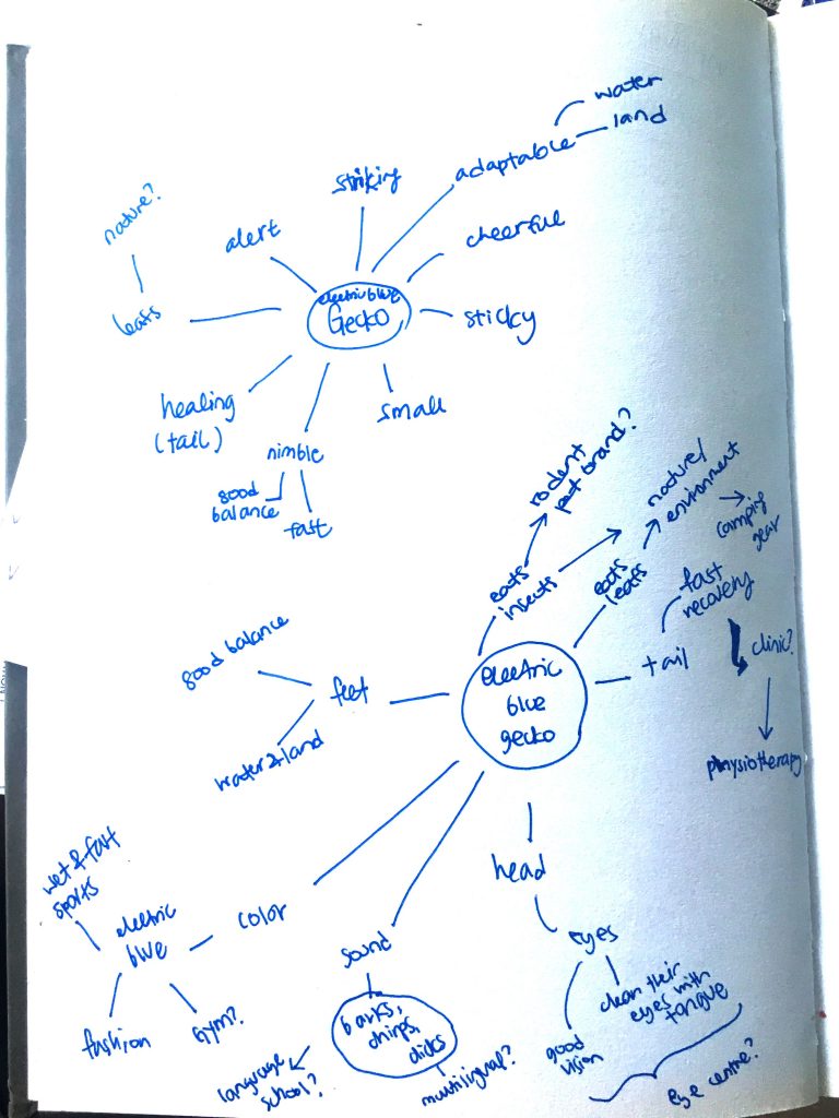
With this information, I began brainstorming and churning out ideas for the potential graphic associations that came to mind:
(brainstorming paper)
After ideating, I realised that the graphic form could be used to associate with the following brands/industries due to its physical attributes and characteristics:

I also did some research on existing gecko logos, as well as other animal logos to see the type of designs that already exists on the market.
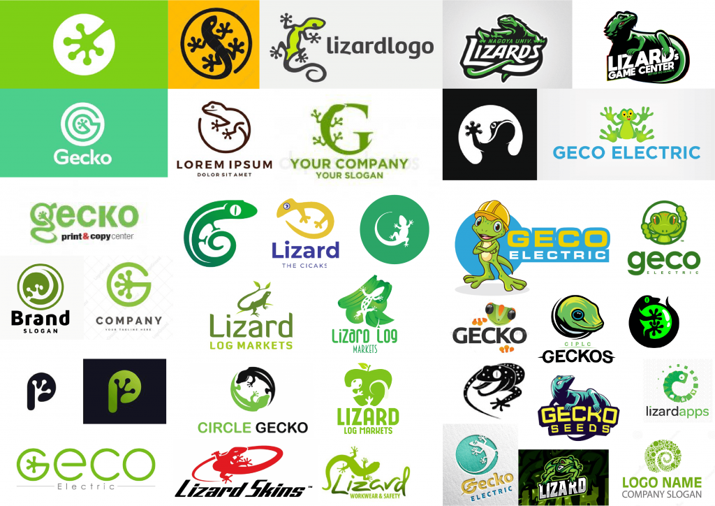
(animal logos)
I realised that among all, the color green was commonly used to depict the gecko icon, with majority of the forms being more feminine and organic in style. I was definitely drawn to this, but at the same time was inspired to create something more minimalistic in perhaps a different color, that could contrast the existing designs.
With that I started to work on the 20 sketches, building on the earlier physical sketches made of the animal earlier.
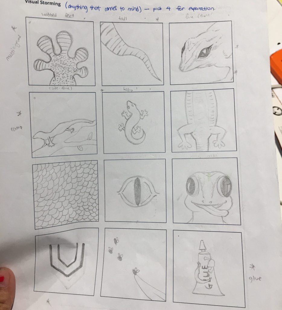
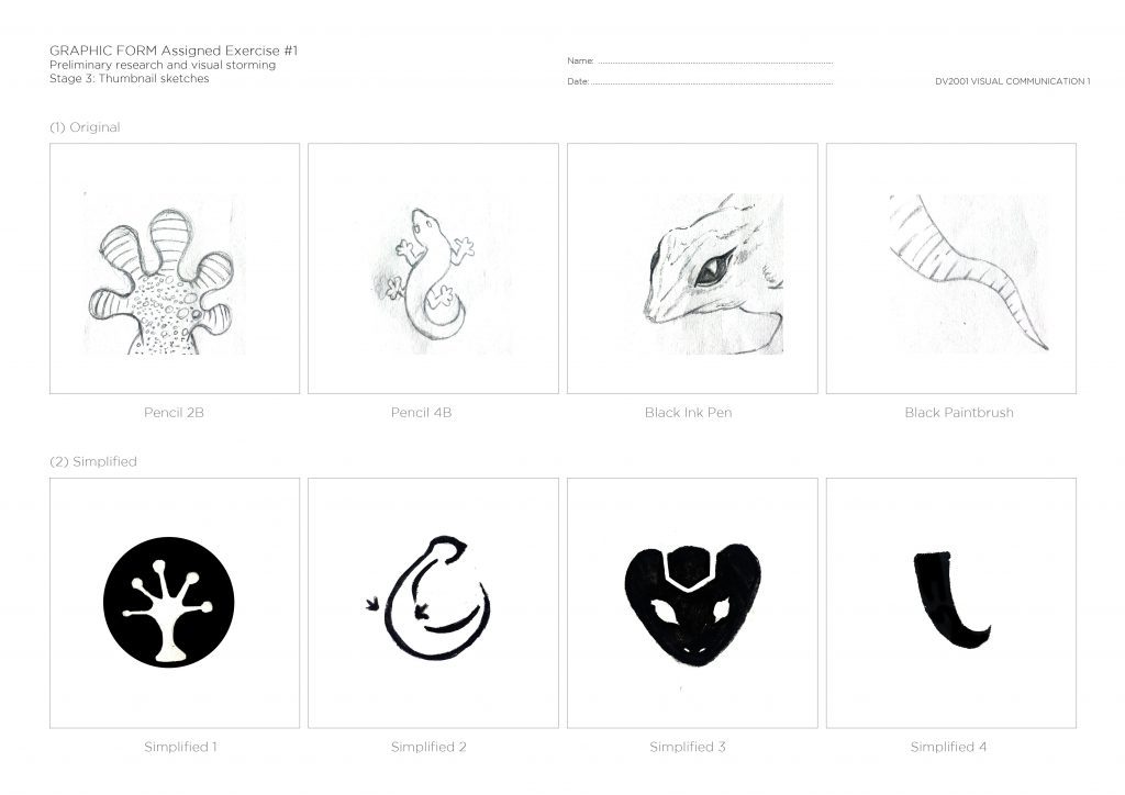

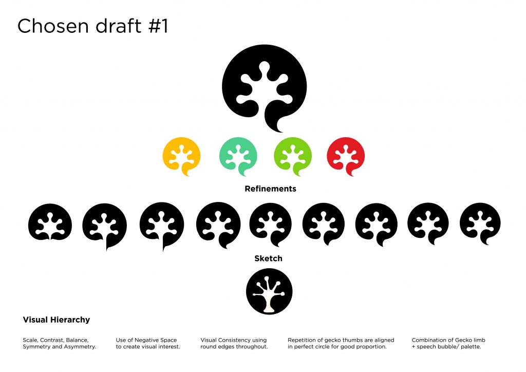
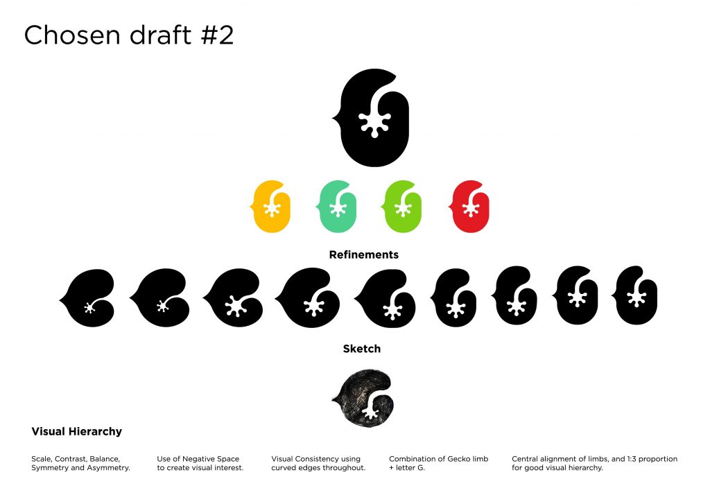
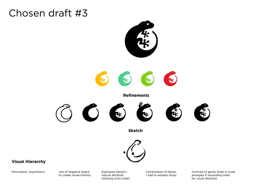
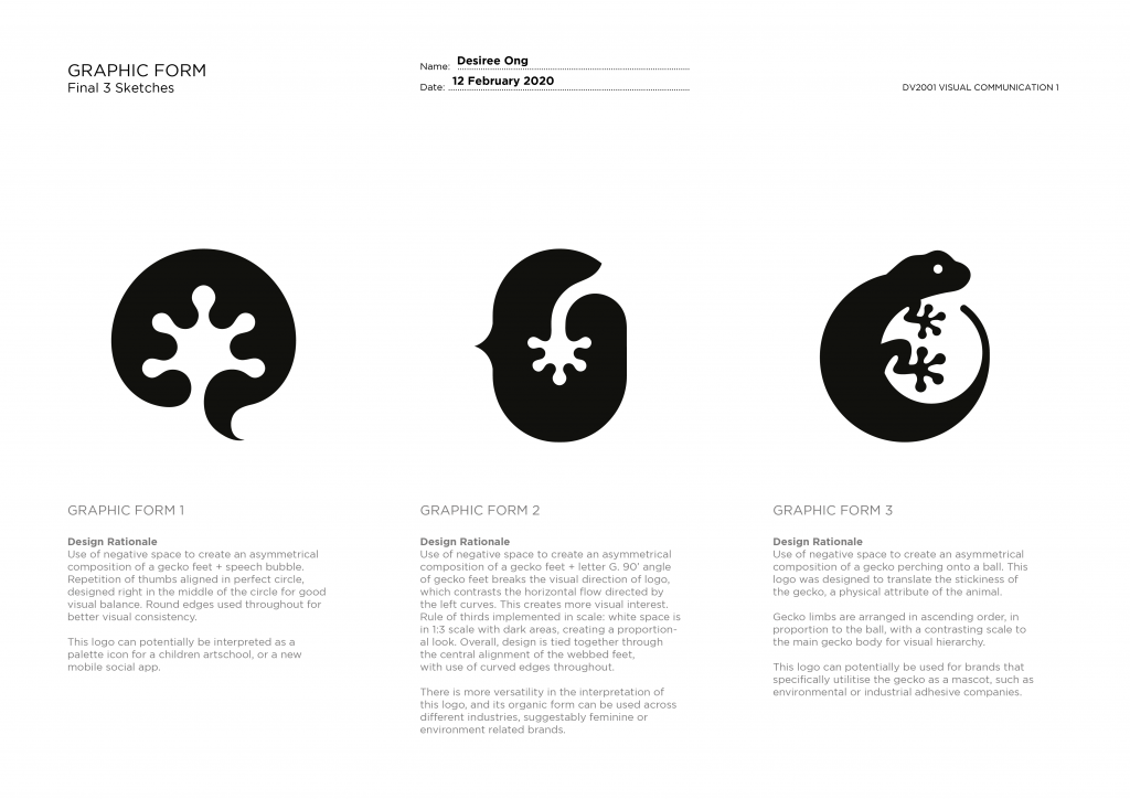
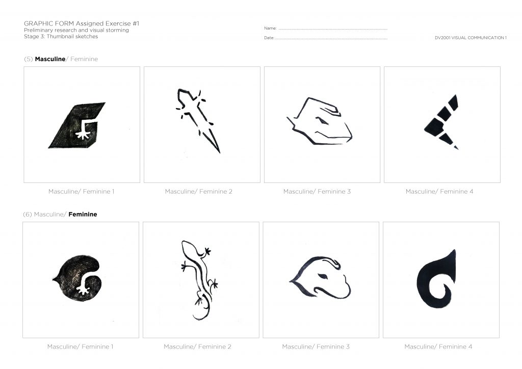 After consultation and feedback from Lisa and friends, I decided to select these 3 options to work upon for my refinement process:

The refinement process:
Assignment 2:
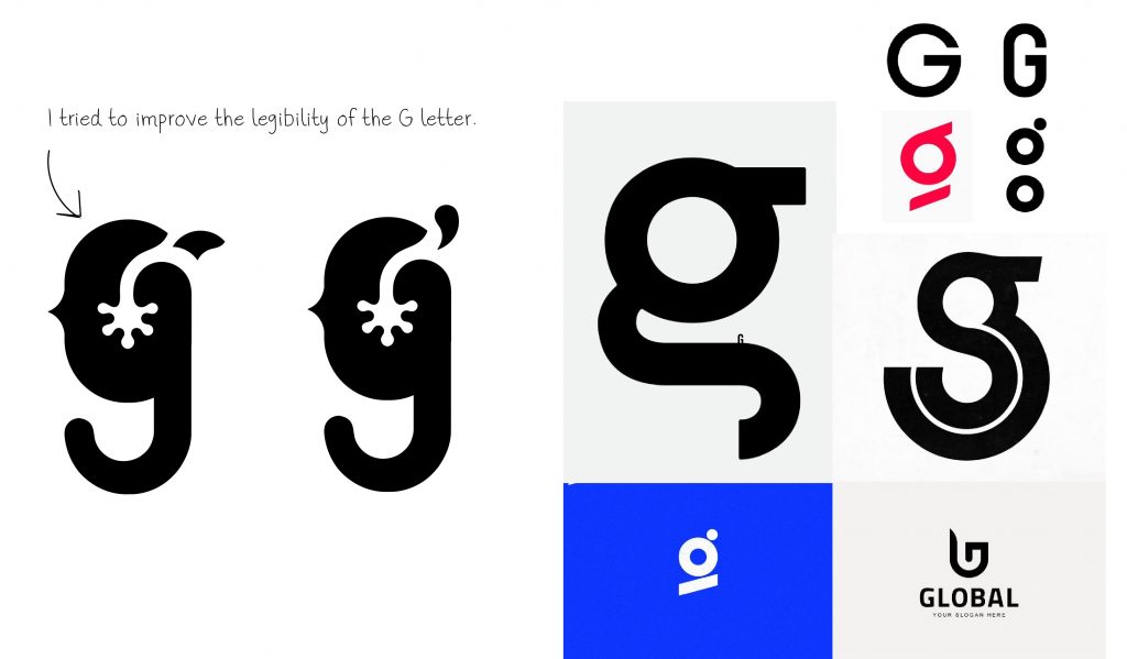
After another round of consultation and feedback once again by Lisa and peers, I continued to work on refining the visual depicting and proportion of the selected logo based on some of the ideas given. 🙂

Inspired by logotypes that utilise visual elements, I decided to combine the letter G with the second option (as seen above – bottom row).
More refinements…
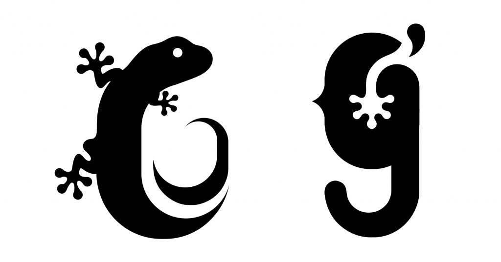
Final refined forms, ready for color!
Between these 2, I really like the organic feel of the lizard body, but felt that it is too literal and does not portray the abstract idea of a “G”. The second concept seem to work better, as it not only presents the physicality of the animal, but also leaves room for interpretation especially with the influence of colors (see: color experimentation)
Color Research / General collection of brands that use the various color combinations.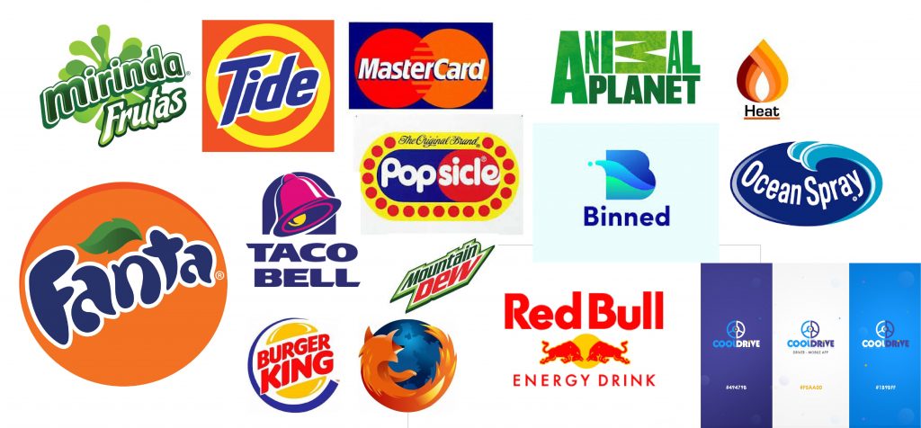
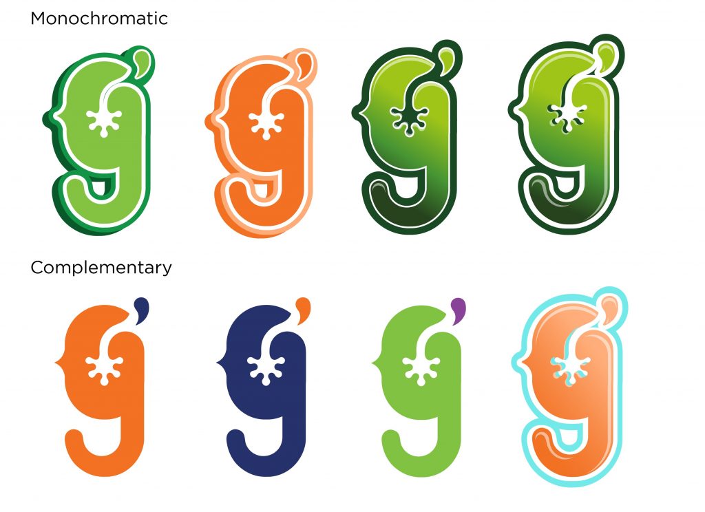
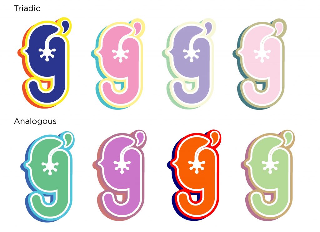
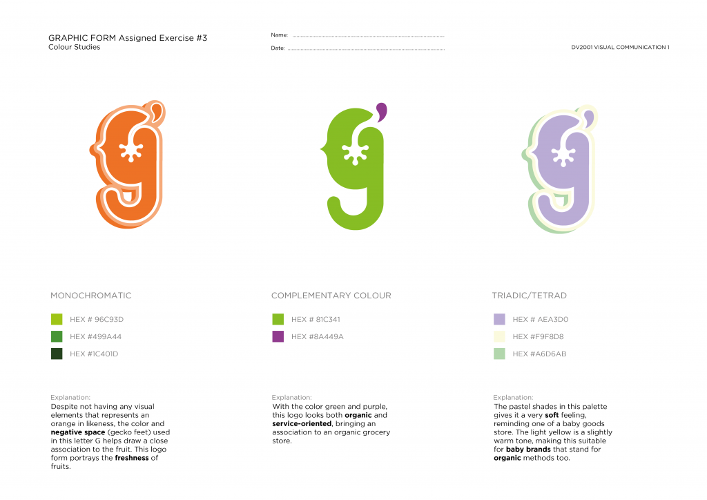
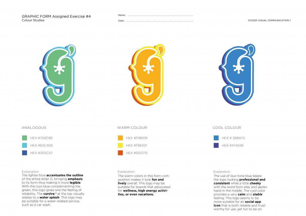
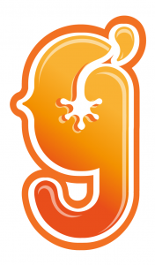
Color Experimentation
