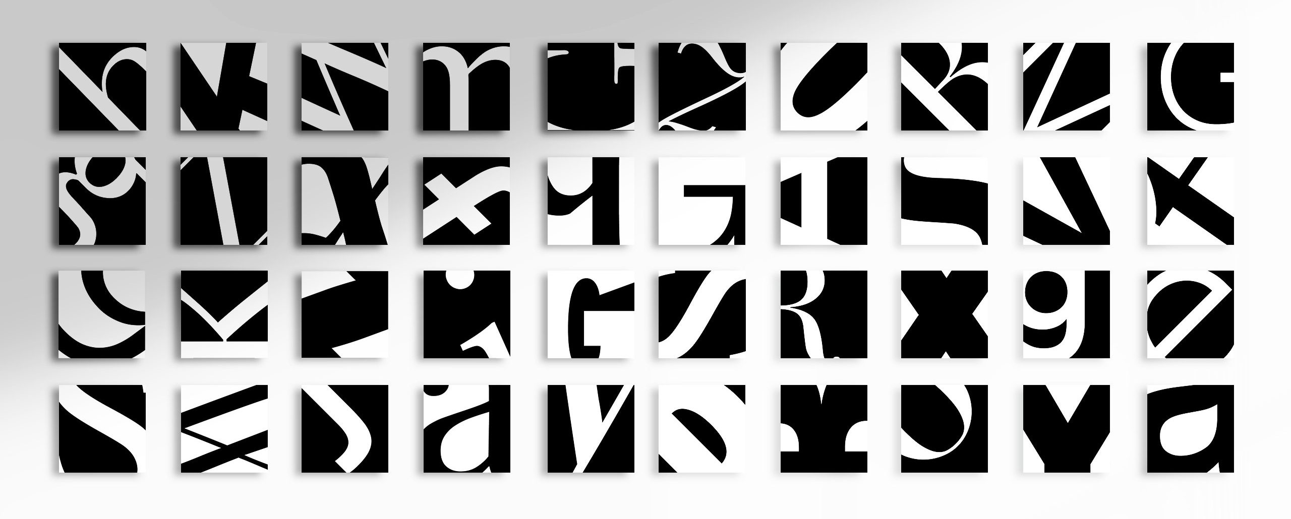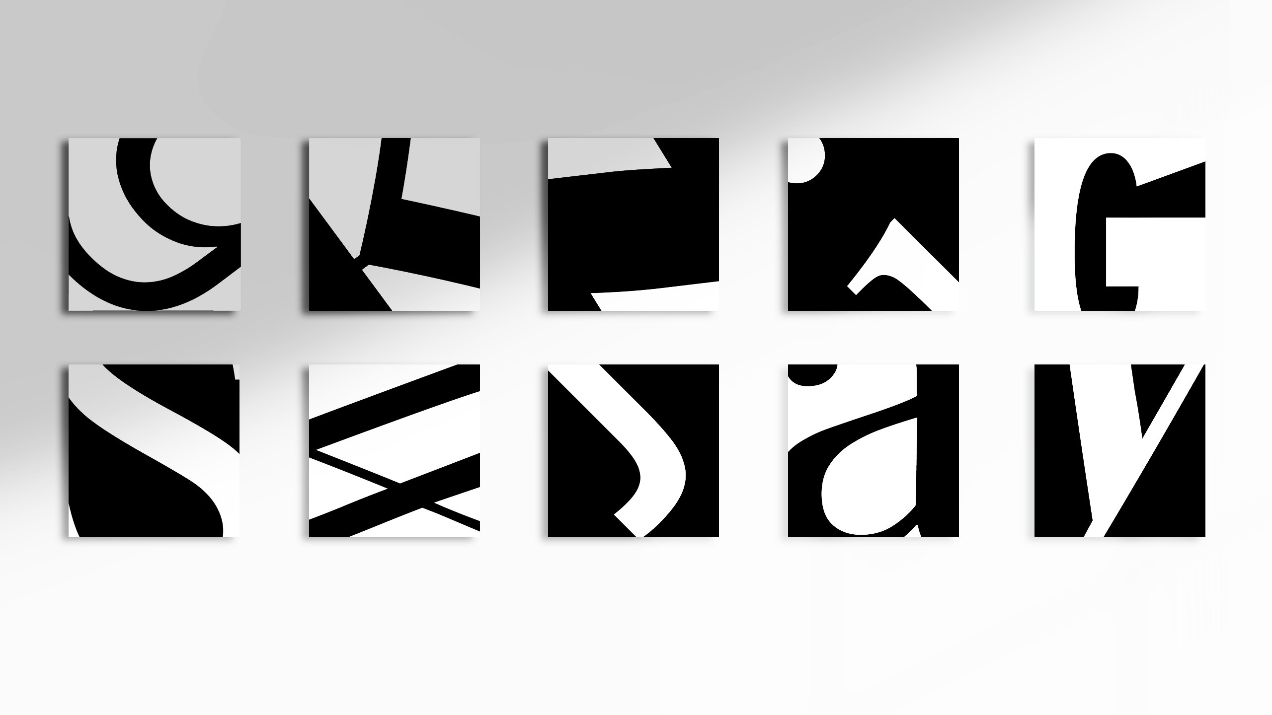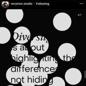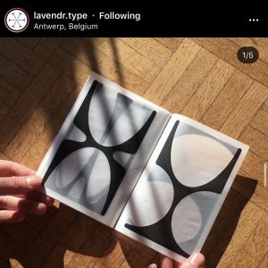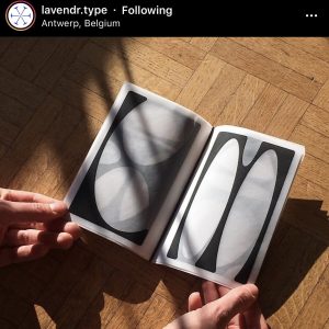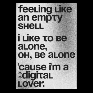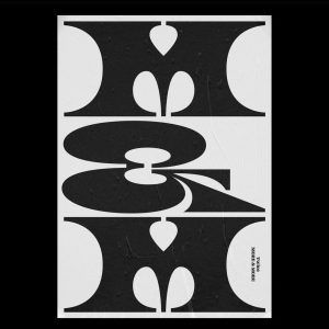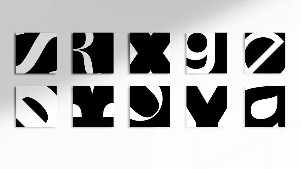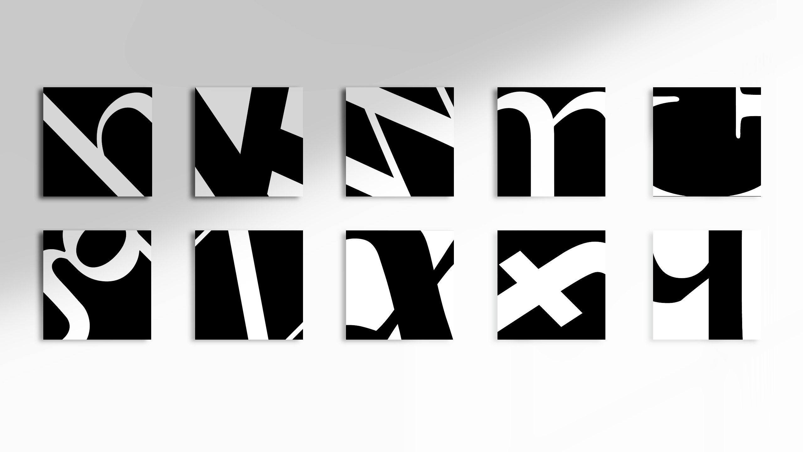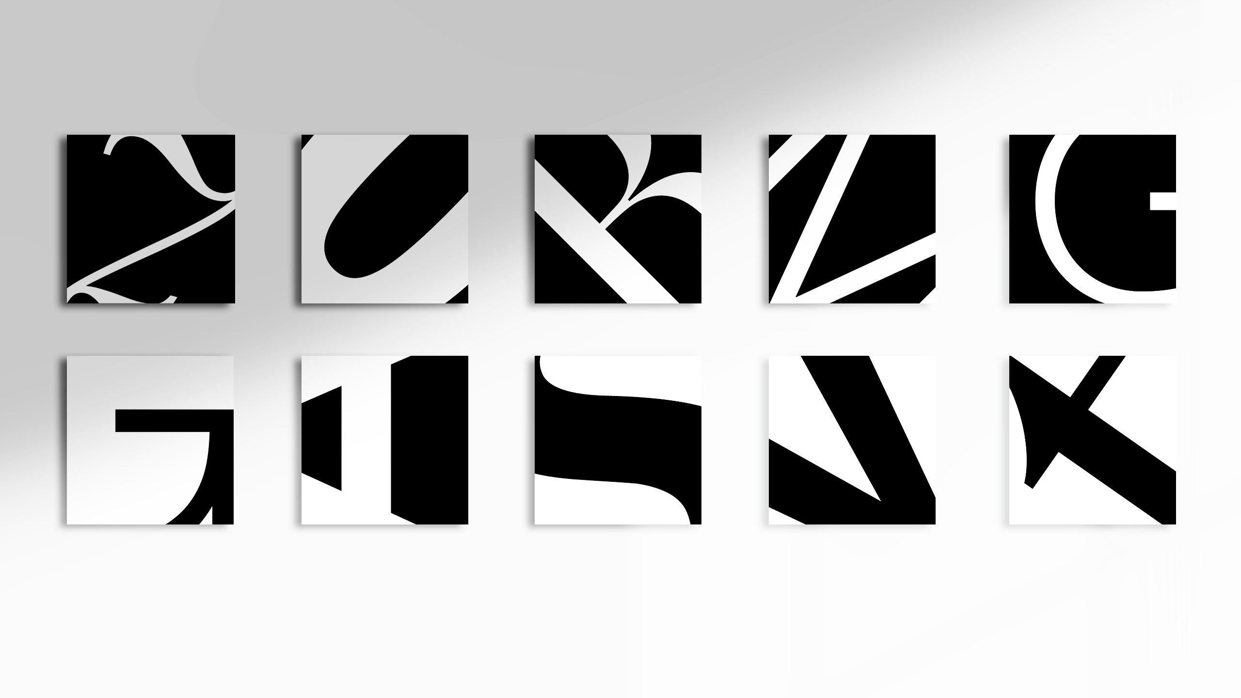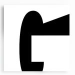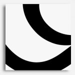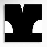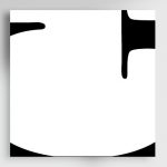
For this project, we were tasked to familiarise ourselves with each letter’s individualities and recognise each of their unique form and structure, before cropping them into 40 x 40mm squares.
The result:


Typefaces used: Baskerville, Georgia, Palatino, Times New Roman, Bodoni, Didot, Futura, Gill Sans, Helvetica, Avenir
The Process
For this exercise, I really enjoyed the process of experimenting with the different typefaces and crop angles. It has helped me to better observe and appreciate the typeface for its graphical form, and it is quite cool to see these letters in a new way; as shapes and compositions, instead of just appreciating it for its functional aspect.
While experimenting with various fonts for each square, I got to be better acquainted with the intimate detailing of each letterform, and it was fascinating to see how the design principles were in play, even within each of their type anatomy.
This short exercise was fun, as we could experiment with how far we get to push the legibility of each letter before it becomes unrecognisable. 😈 (yay!!!)
My approach towards this exercise was to firstly visually deconstruct the letterform into shapes, and then identify the parts that gives each letterform its essence, bringing to attention the crop along those areas. I thought along the lines of:
“What makes ‘m’ an m?”
and… what makes “g” not a “q”?
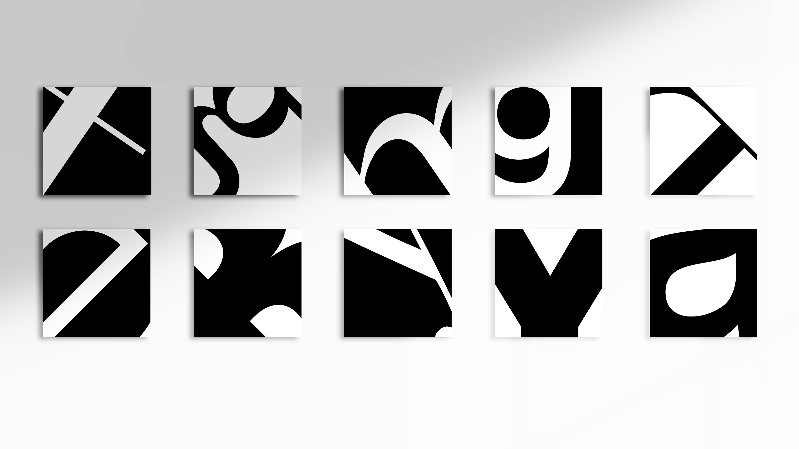
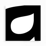
During the process, I found the letters ‘g, G, K, a, s and R’ to be rather interesting to work with and these are some of my personal favourites as they seem to resemble abstract shapes rather than letterforms.
Some of my personal favourites:


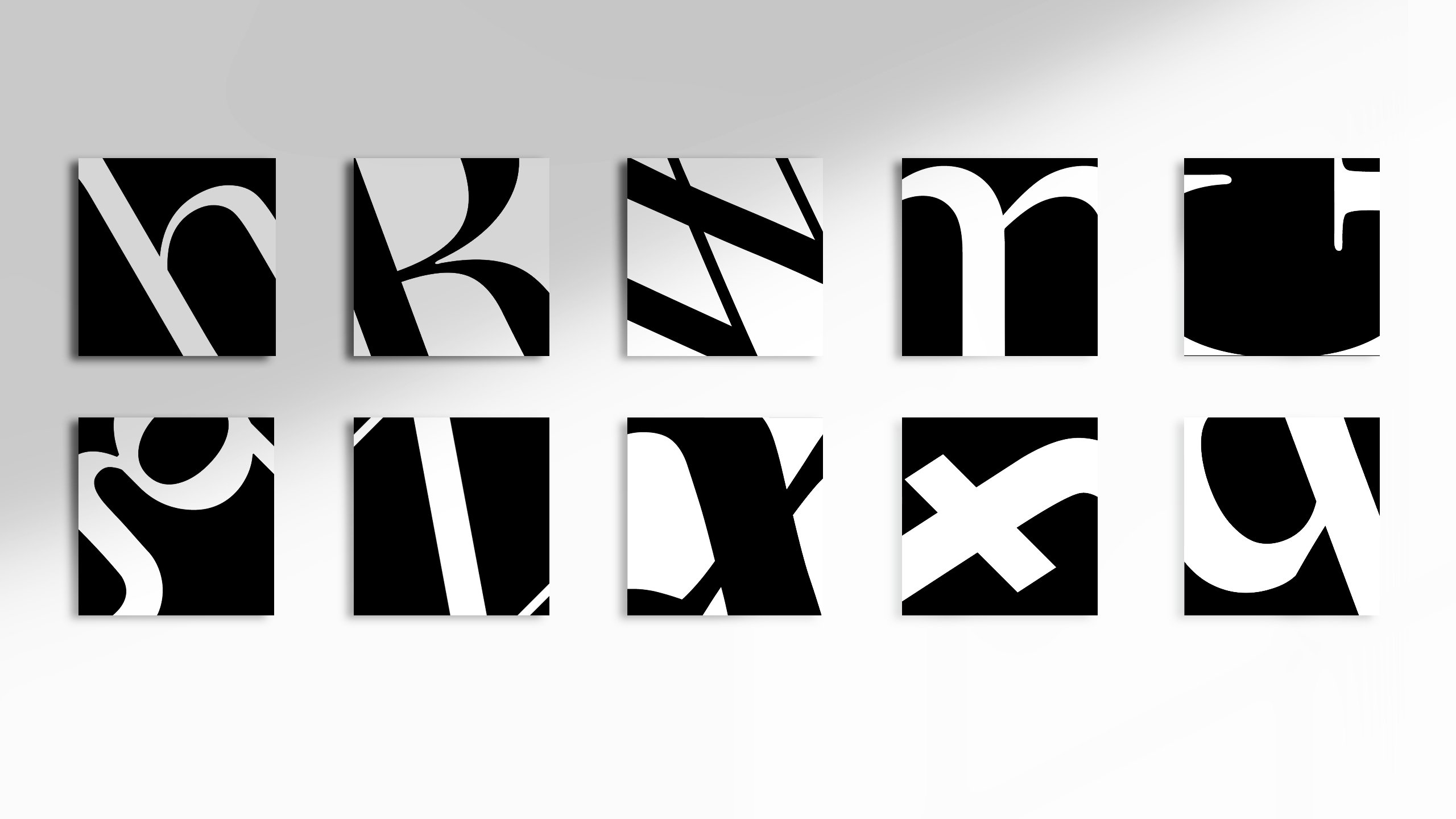
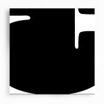
While cropping, I also realised that visual weight do matter, in determining the legibility of a letterform. Some cropped compositions worked better with the letterform being in the dominant color, whereas for others it was the contrary.
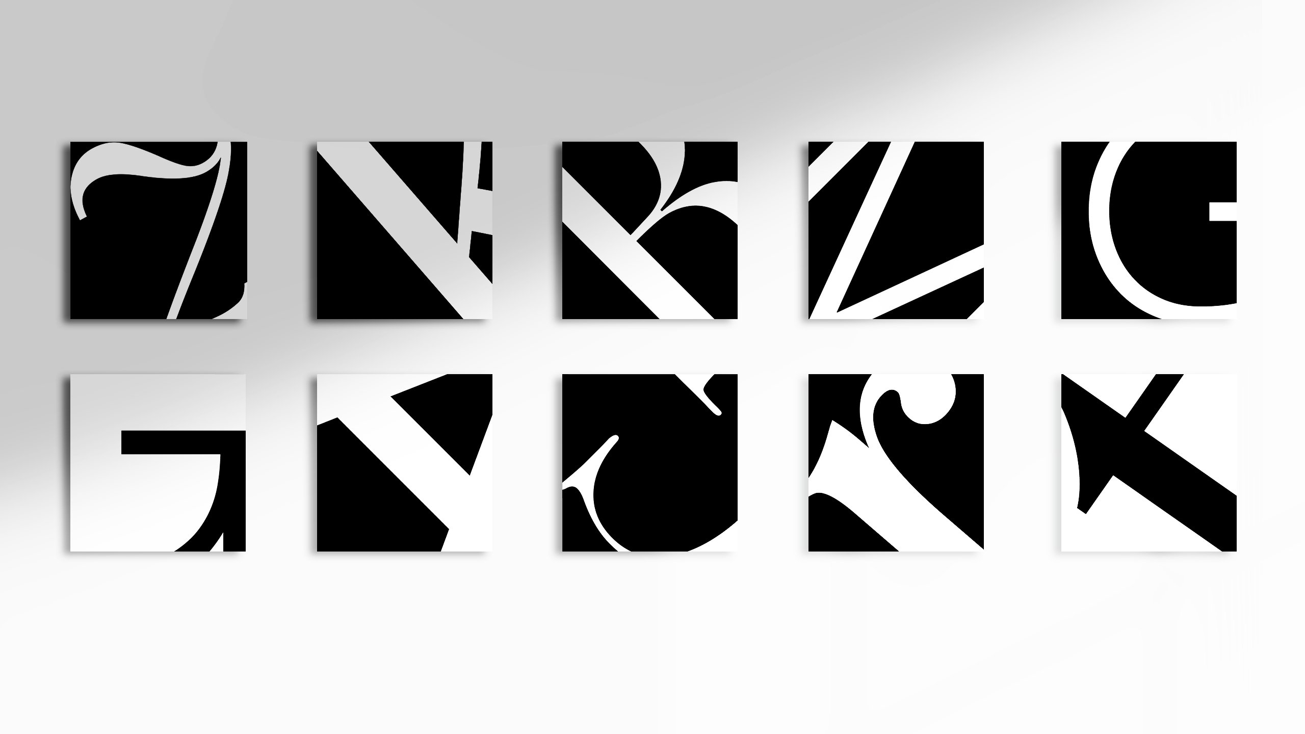
For example:


Interestingly, the few that really appealed to me personally, have their counterforms in a seemingly sub-dominant color (in terms of color proportion) and yet managed to retain their legibility through their distinct counterform shapes.
For the crops, I also tried to do it with the various design principles in mind, such as the rule of thirds (… well at least i tried my best!!), symmetry and visual direction.
Ok that’s all for now, goodnight!!
