Assignment 2A Object & Craft Technique Studies – Task 2 (Object Studies)

For this assignment, I decided to draw a hairdryer.

I started with some rough sketches:

And then worked on the orthographic drawings in a 1:2 scale.

After coming up with the first version, I realised that it was wrong as the proportion was off and the side angle of it was in the wrong direction.

Hence, I re-drew it, this time with cleaner lines and better accuracy.

With that, I utilised the orthographic views to project into an axonometric drawing.

(Really sorry for the late submission!)

Project 1 – Blue Electric Gecko

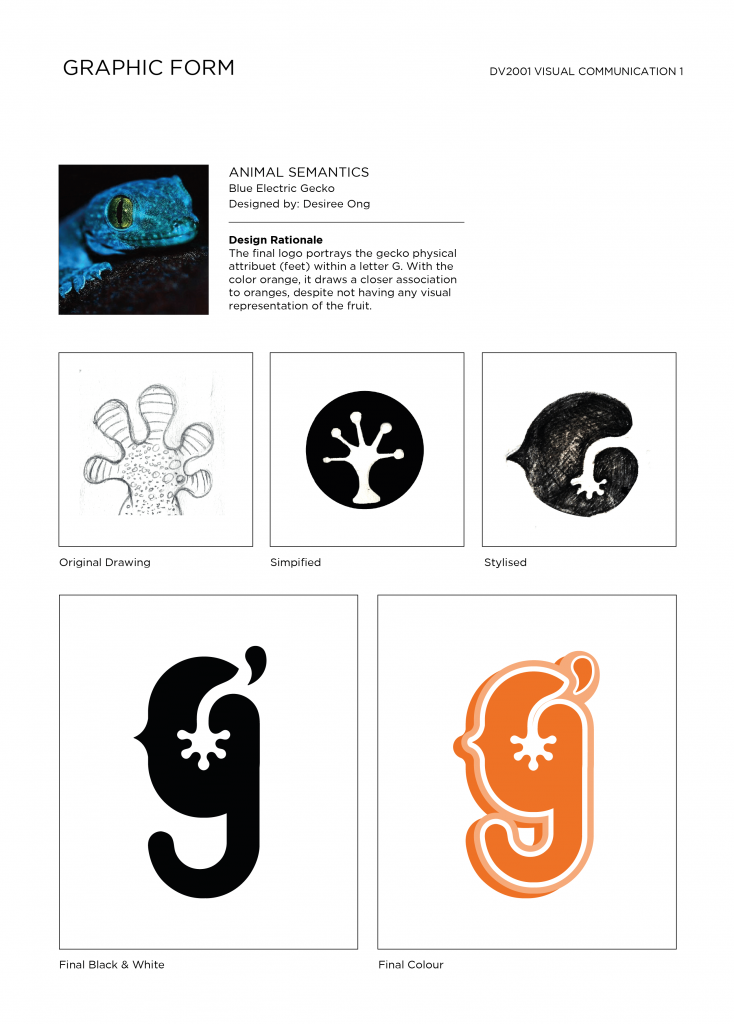
This project was a really fun and interesting, and I really enjoyed the process of researching, ideating and refining the concepts for a logo form based off my chosen animal, the electric blue gecko! I chose this animal because of its striking color and adorable face. I felt the physical attributes and form of it was also interesting to work with, especially since not many people know about this unique little creature 🙂

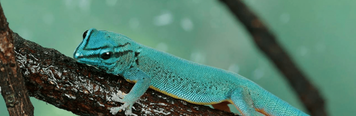
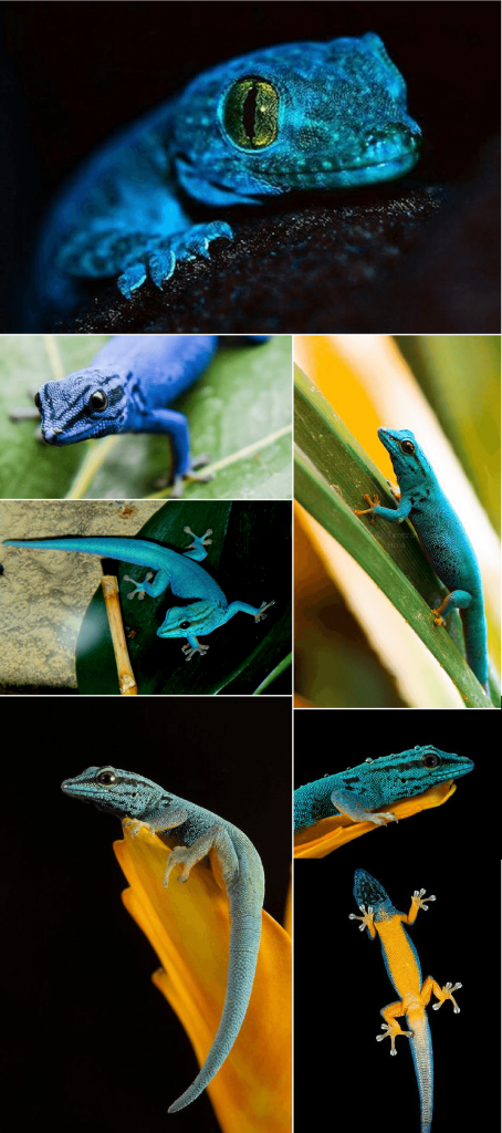
Animal’s Visual Reference

To start off, I did some research into the chosen animal and found the following interesting facts:

    • It is also known as Lygodactylus Williamsi (Blue Electric Gecko).
    • This creature is diurnal.
    • The males striking are blue in color and the females are olive green.
    • During courtship, the male flattens its back and bobs its head in a little courtship dance to attract its mate.
    • Female geckos will stick its eggs with a glue-like substance onto any substrate surface to keep it well hidden in sight.
    • Each gecko footpad is made up of little skin creases that creates fantastic traction against surfaces. This gives them the illusion of being sticky, but it is in fact simply friction at work.
    • Slender and nimble, this gecko can climb trees and thread water well.
    • Consumes live insects and lives mainly on pandan plants, and is often associated with swamps and forest limestones.
    • This species of gecko is currently endangered as reptile enthusiasts and poachers have illegally removed 15% of the wildlife population.

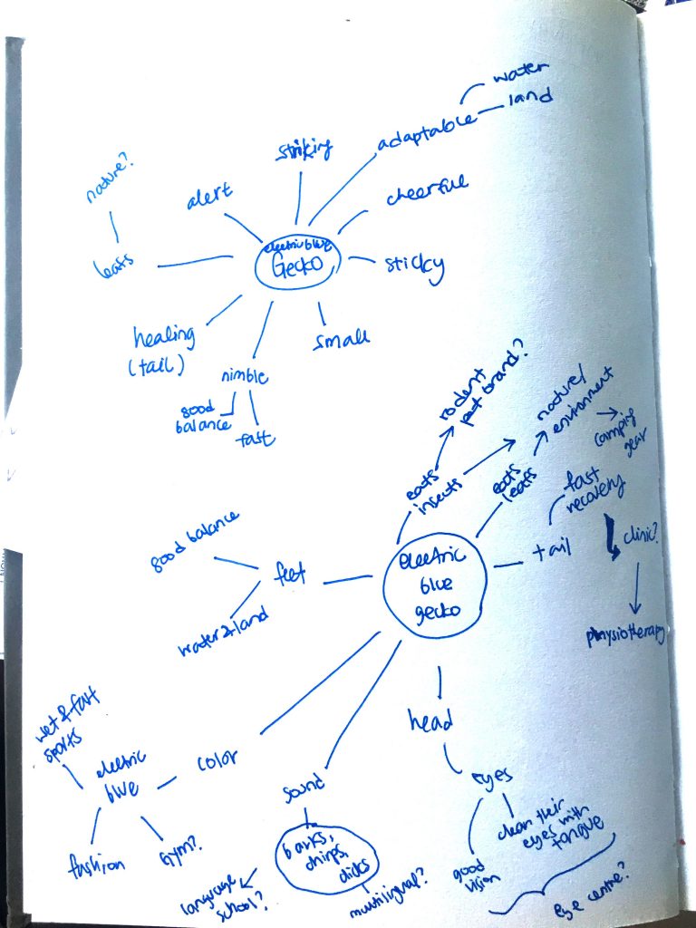
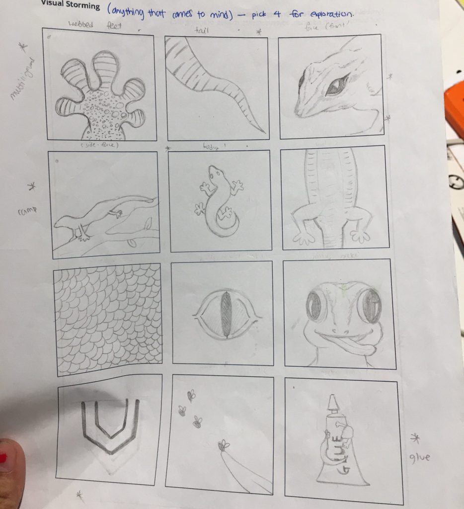
With this information, I began brainstorming and churning out ideas for the potential graphic associations that came to mind:

(brainstorming paper)

After ideating, I realised that the graphic form could be used to associate with the following brands/industries due to its physical attributes and characteristics:

I also did some research on existing gecko logos, as well as other animal logos to see the type of designs that already exists on the market.
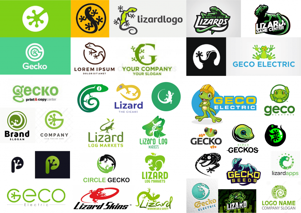
(animal logos)

I realised that among all, the color green was commonly used to depict the gecko icon, with majority of the forms being more feminine and organic in style. I was definitely drawn to this, but at the same time was inspired to create something more minimalistic in perhaps a different color, that could contrast the existing designs.

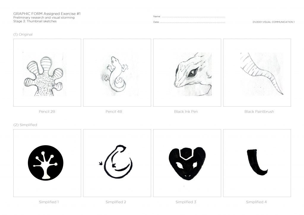
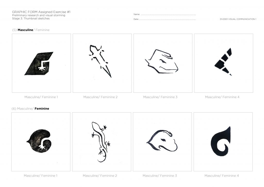
With that I started to work on the 20 sketches, building on the earlier physical sketches made of the animal earlier.

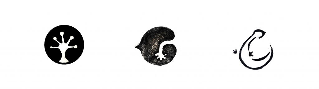
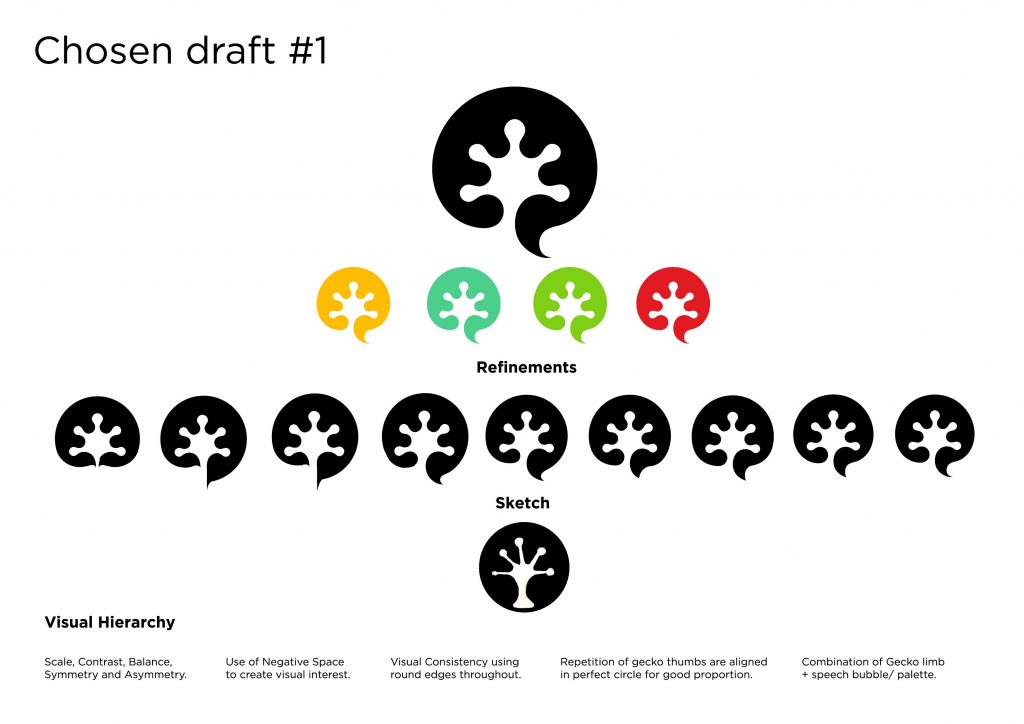
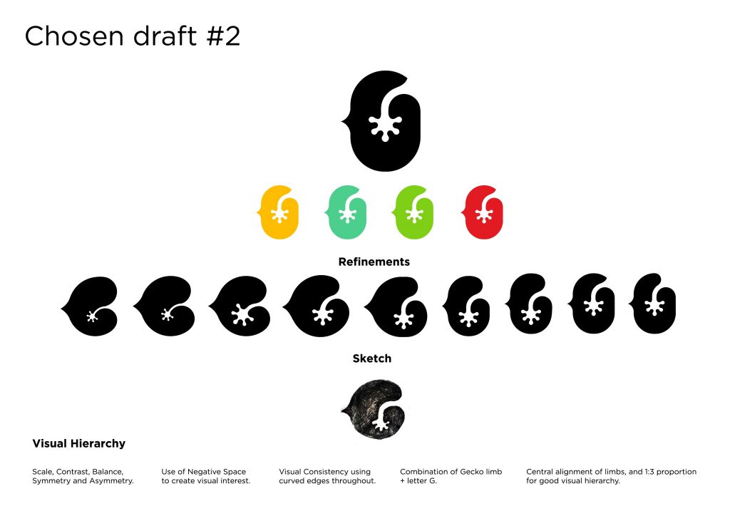
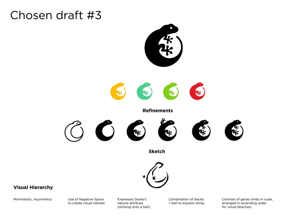
After consultation and feedback from Lisa and friends, I decided to select these 3 options to work upon for my refinement process:

The refinement process:

Assignment 2:

After another round of consultation and feedback once again by Lisa and peers, I continued to work on refining the visual depicting and proportion of the selected logo based on some of the ideas given. 🙂

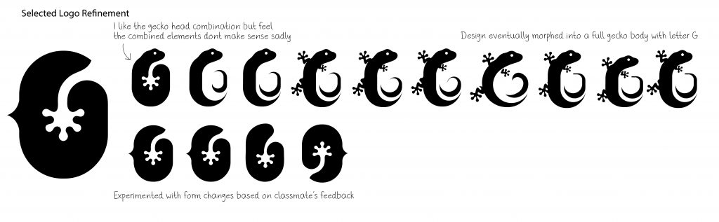
Inspired by logotypes that utilise visual elements, I decided to combine the letter G with the second option (as seen above – bottom row).

More refinements…

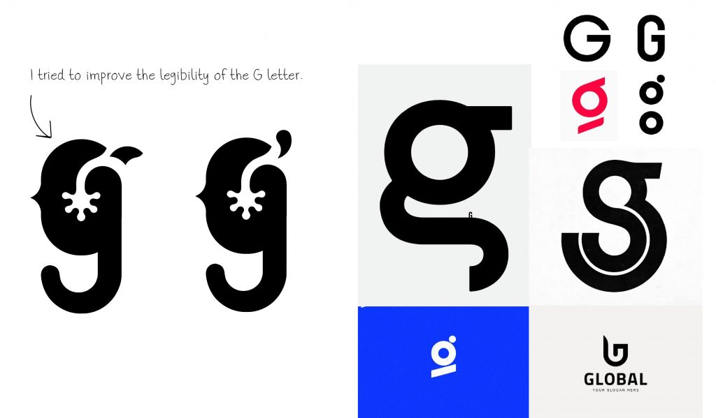
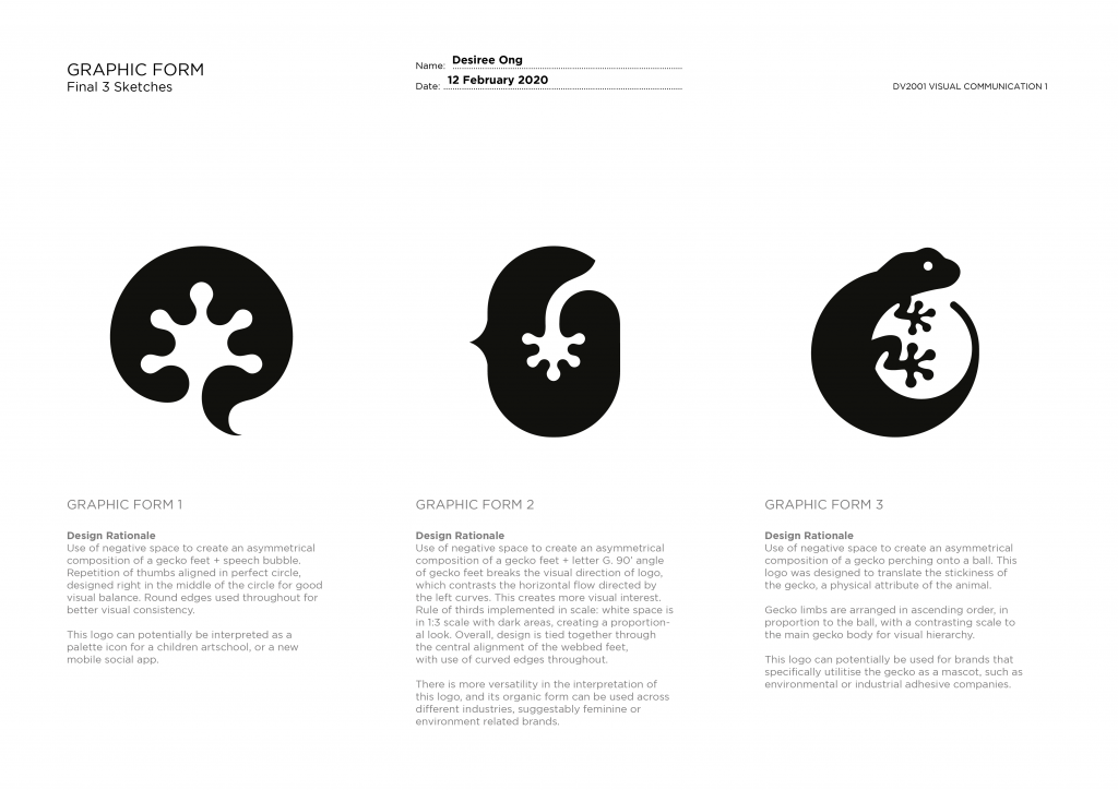
Final refined forms, ready for color!

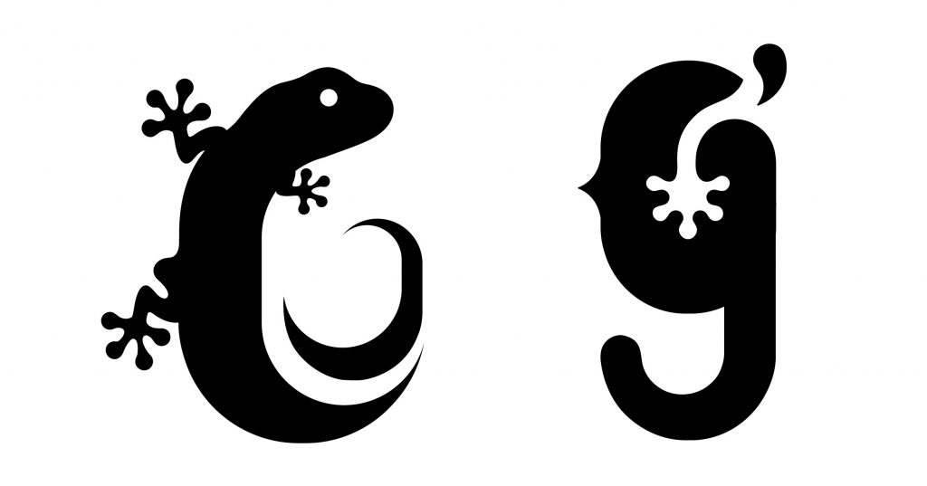
Between these 2, I really like the organic feel of the lizard body, but felt that it is too literal and does not portray the abstract idea of a “G”. The second concept seem to work better, as it not only presents the physicality of the animal, but also leaves room for interpretation especially with the influence of colors (see: color experimentation)

Color Research / General collection of brands that use the various color combinations.

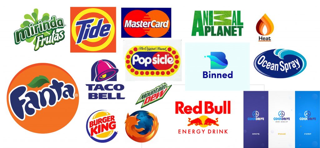
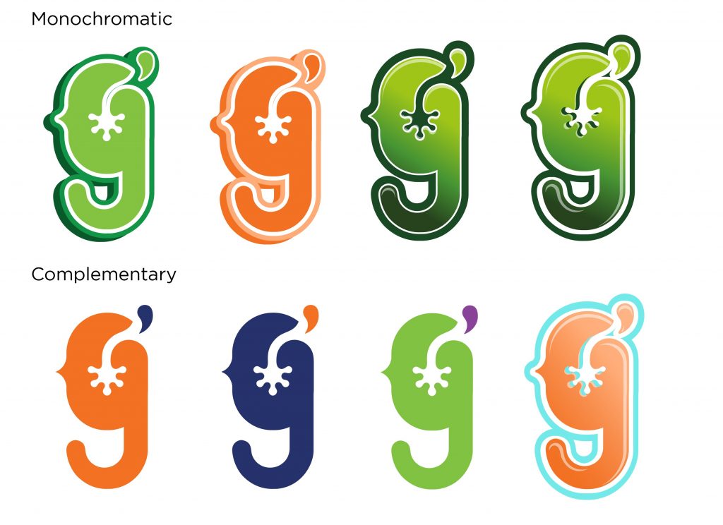
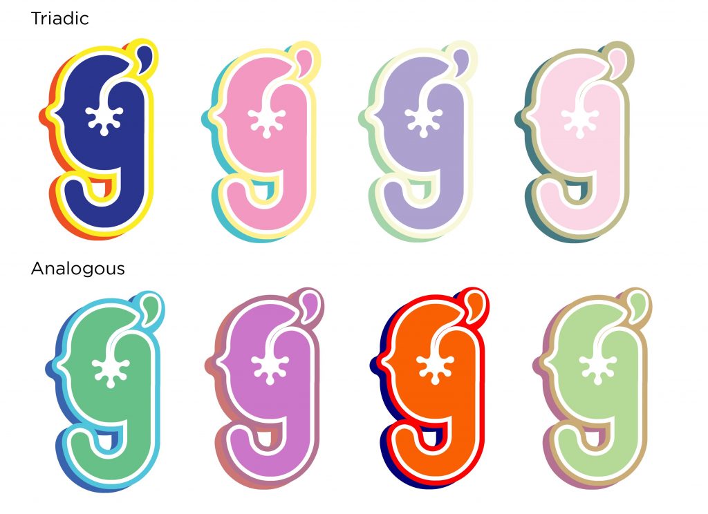
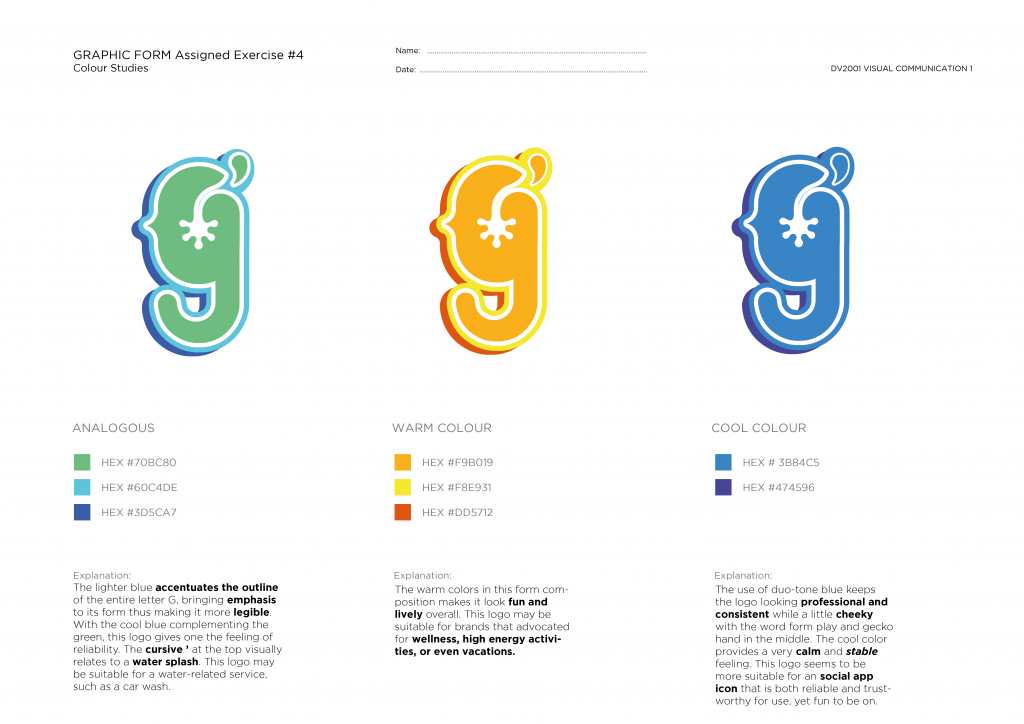
Color Experimentation

Axonometric Drawings


Have your snack in peace.


Process:

This project was created purely out of a coincidence. When I first started working on it by building the blocks, I had zero idea in mind and didn’t know what to come up with. Eventually, I explored a few different variations and finally settled for the eventual design. Because of its aggressive shape and tank-like structure, the random idea of a “fruit fly killer” came to mind, and I decided to work on it!

Raw Drawing:

The above is a cleaned-up version of what I originally had. Some of the errors that I made during the process was:

  1. Not factoring into consideration the thickness of the marker pen into dimensions when doing outlines. This led to wonky and inaccurate shapes that looked weird visually.
  2. Mis-outlining of the wrong lines to indicate depth and mis-dotting the wrong hidden lines.
  3. Marker smudges and deep eraser lines (oops)

Research:

Some of the images that I was inspired by while doing research.

I like the simple layout of the middle design, as it is easy to understand and the white background helps to keep it clean and minimal. I also like the style of the older lego manual color. Since these blocks are from the brand, I decided to mimic the colours of it in a cleaner knock-off version.

Final:

History of Design – Graphic Design So Far:

Ang Sang Soo:

The “godfather of Korean typography”. He uses Hangul, the Korean alphabet, to create very interesting designs. Much more than a typographer and graphic designer, he is a multi-faceted cultural producer who translates his philosophy through various mediums from visual design to poetry, photography, and installation. With 40 years of innovative contributions under his pen, Ang Sang Soo has reinvented and championed the field of linguistic illustration.

The Hangul is written with many geometric shapes, giving him a lot of room to be playful with his typography designs. It is founded on five basic elements: vertical, horizontal, and diagonal strokes, the dot, and the circle.

He was the first to “step out of the box,” so to speak, exploiting the graphic flexibility of Hangul and removing it from its incommodious square-framed structure.

Generally understood as the simplest writing system in the world, Hangul, so linguists say, can be learned within just a few hours. Comprising 14 consonants and 10 vowels, this practical linguistic system is founded on five basic elements: vertical, horizontal, and diagonal strokes, the dot, and the circle. Established by order of King Sejong in the mid-15th Century in a progressive effort to create an alphabet unique to the spoken idiom and, in doing so, break away from its foundation in Chinese ideograph, Hangul symbolically realizes Korea’s cultural independence.

Some of his other works:

Hangul is a very interesting writing system, and it is one of the easiest writing systems to learn. I really like the way he deconstructs the Korean alphabet into shapes, to create expressive forms for his works!

History of Design – To Bauhaus and Beyond

For this week, I really like the works of Piet Mondrian. One of the founders of the Dutch modern movement De Stilj, Mondrian is recognized for the purity of his abstractions and methodical practice. He radically simplified the elements of his paintings to reflect what he saw as the spiritual order underlying the visible world, creating a clear, universal aesthetic language within his canvases.

In his best known paintings from the 1920s, Mondrian reduced his shapes to lines and rectangles and his palette to fundamental basics pushing past references to the outside world toward pure abstraction. His use of asymmetrical balance and a simplified pictorial vocabulary were crucial in the development of modern art, and his iconic abstract works remain influential in design and familiar in popular culture to this day.

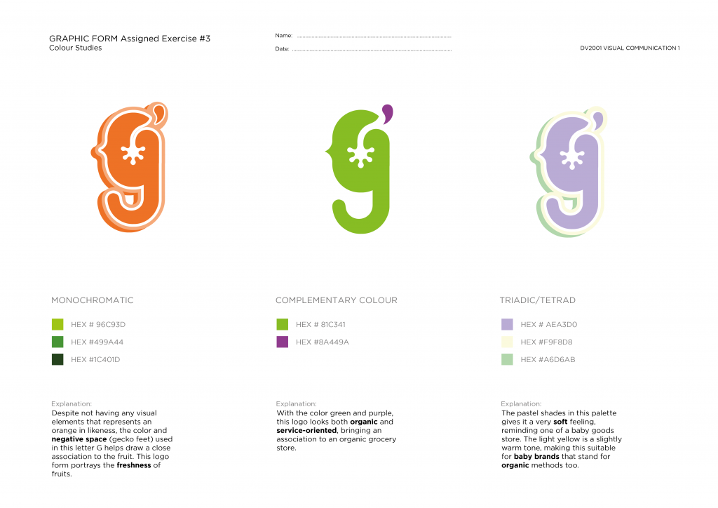
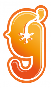
Personally I like the geometry and contrast of the lines, together with the primary color and makes it enticingly vibrant to look at.

Today, there are many contemporary products and art pieces inspired by Mondrian’s works. Across fields of interior, product and even fashion design, the Mondrian aesthetics can be incorporated to create an endless possibilities of designs.


History of Design – Industrial Revolution & Graphic Reactions Reflection

In this lecture, we looked at more font styles and graphic styles. In the 18th century with the start of Industrial Revolution, more interesting and creative fonts such as ‘fat’ typeface, and display typeface began to surface, and I personally feel that this was a fascinating period when visual communication became a lot more captivating.

I was actually quite intrigued by the wood type posters of that time, as they used several decorative fonts to increase the appeal of the poster. This is contradictory to what we learn about modern typography today, as we are often advised to use only 2 fonts where a clean and minimalistic look is often recommended.

What I love about this particular type of design is that despite using several different fonts, the overall looks aesthetically pleasing and cohesive. I have always been intrigued by the choice of typography fonts in this kind of design which I feel contributes greatly to the harmonious and engaging poster aesthetics.

I also like the words from Alphonse Mucha, where the distinctive styles and influence of the Art Nouveau period was very prominent.

His works were so profound that the Art Nouveau was also alternatively known after his name: the Mucha Style. His works often portray woman with long flow hair, which has influenced most of the feminine portraits seen in some abstract works today. I love the ornamental floral details that often accompanies the character in his works, as well as the choice of earthy enticing colours.

It is interesting to see that even in more contemporary art works, the roots of it style can be traced back to centuries ago. Past styles inspire the current and the current inspires the future. What’s amazing is that throughout the process, none of them ever goes ‘out of style’, and each individual design movement only serve to become an irreplaceable timeless reference and muse for the next generation of artists.

History of Design – Writing to Typography Reflection

In this first lecture, we started off with a Lascaux cave painting that dates back to an unimaginable 15000-10000 BC. When we first started the module, I was expecting the topic of ‘typography’ to be associated more with contemporary designs and fonts, as those are the modern typography styles that we are currently using today.

It is very interesting to learn how people used to express themselves in the past, mainly through symbols and drawings like pictographs and petroglyphs. Designed mainly for communication purposes, they were very straightforward in meaning and are much easier to interpret as compared to the language that we all know today. It is really interested how the modern day language and alphabet can carry such distinct and abstract meaning and is widely spread among people today regardless of region and language.

We’ve also looked at some Chinese calligraphy that area also similar to the ancient Egyptian pictographs, in the way they were derived and evolved from rudimentary drawings and symbols. I actually quite like the circular forms of the olden Chinese writing as they were more expressive, and ‘human’, making them more interesting to play with when put into the context of typography.

The ancient Egyptian hieroglyphs are also very interesting, as information such as the direction of the hawk’s beak dictates the reading direction. Unlike our modern language form, the language medium used back in the day was very visually engaging and expressive. The way they are created is interested as a picture could also be interpreted in different ways. However, simple pictures are are quite hard to interpret for messages that are may contain several layers of meanings and are less literal. Being simple, it is not hard to wonder if the language carried different layers of meaning that we may not have deciphered yet, thus remaining mysterious and intriguing to most today.

Reading Assignment Reflection – Steve Dixon’s Digital Performance: A History of New Media In Theatre, Dance, Performance Art, and Installation

For this book, I find it very interesting to learn how the past decade has been intensely dedicated to experimentation with computer technology within the performing arts. The entire book talks about how digital media has been vastly used and explored within live theatre and dance, resulting in new forms of interactive performances that have emerged in these participatory installations, executed on CD-ROMS and the Web at that time. As part of a newer generation, we witness how past performance artists have constantly involved the performance arts, and digital media into their works through studying their pieces. Today, new forms of interactive media have been heavily incorporated into the world of art, and new media has undoubtedly diversified the types of performing arts, leaving traditional live performance art with an astoundingly new perspective.

In chapter 14 of this book, Steve Dixon focused on how incorporating media screens can affect and enhance the spatial possibilities of traditional three dimensional theatre spaces. In spite of its two-dimensional offerings, digital projects can re-create a space to be more ‘pliable and poetic’. For example, being able to simultaneously view multiple perspectives through the use of different camera angles can help make a medium more flexible, attesting to the “pliability” of digital medium. In film, space and time can be transformed by the artist to create scenes that are almost impossible to re-enact physically, together with designed visuals that range from 360′ panorama, close ups and slow motion shots. One of the more intriguing things that he mentioned within the book was that projected media is often used to appeal to the senses rather than the rational intellect. Referencing to the contrast between the visceral instincts of an audience versus the intent of an artist, this statement made me reflect about the times when a ‘non-artistic’ friend was not able to comprehend an art piece, dismissing a work for its lack of visual intricacy. Did the meaning of the art piece get lost in translation while we are desperately trying to make meanings out of it?

In one of Steve Dixon’s examples, he talked about the Builders Associations, where the “Brechtian use of media displays remind audiences of the dialectical interplay between actors and screen.” In his argument, he wrote about how the boundary of reality should not be blurred by theatre, and audiences should be allowed to view the performance as more of a past event. This is similar to the use of the “suspension of disbelief” technique used commonly in theatre and live performances today, to enable participants to be engaged in a more immersive experience through their senses. In view of this reading relating back to our work, I think this is also where our project “In Light of You” could be classified under, because Steve Dixon wrote about the Brechtian critiques, focusing more on the cultural and societal aspects rather than the political. Using Brechtian techniques like “breaking the fourth wall” narration and Spass within the project, users can feel more engaged and involved as it touches on a serious topic through a fun and game-like interface, while maintaining focus on the players themselves as the main protagonist of the narration.

REFERENCES

Dixon, Steve. 2015. Digital Performance: A History Of New Media In Theater. Cambridge, Mass.: MIT Press.

https://www.britannica.com/biography/Bertolt-Brecht.

https://www.4thwalldramaturgy.byu.edu/brechtian-a-clarification

https://www.bbc.co.uk/bitesize/guides/zwmvd2p/revision/7