
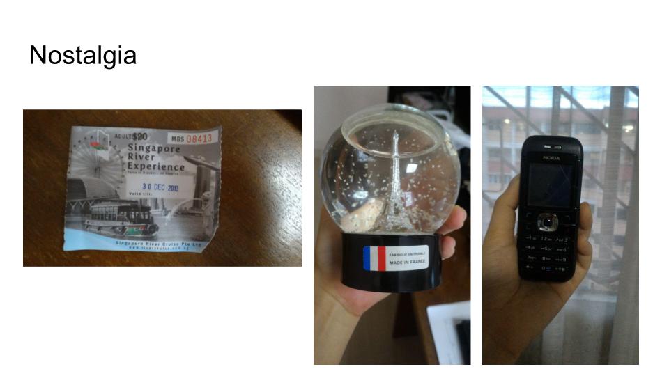
New assignment! Lets go!
BRIEF 3
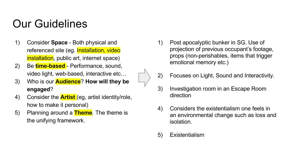
| Brief 3 | BLACK & WHITE TYPE: Playing with type language |
| Summary | Typography is a versatile element in the world of visual communication. Not only is it meant for language communication but also as graphic communication. The following experiments will get you to think differently about typography. It aims to equip you with the principles of type and also pushes for discovery of new typeform. Use only black and white, no other colours are allowed. |
| Assignment objectives: | Exercise 3a and 3b will allow students to appreciate type beyond its textual nature but as a graphic element of image creation. Exercise 3c develops the students’ sensitivity to the scale and white spaces of typography and the impact it produces to communicate emotions. |
| Task 1 | 3a. Type as image
Select one traditional typeface and create a series of composition explorations from it. You may use the various font within the typeface as your series but you need to stick to your chosen typeface. Explore the various anatomy of the selected letter and see how you can create an image out of it. You may also crop or combine certain anatomy together to create your image ! For example: Typeface: Baskerville Font: Bold / Light / Italics Deliver: 2 best compositions at 14cm by 14cm. Printed on quality white paper card (more than 150gsm) |
| Task 2 | 3b. Type as pattern
Create a series of patterns using a single letterform from any traditional typeface (for eg, an “S”). Copy and repeat the letter in columns or rows to make an overall pattern. Change the spacing of the letters to create variations, create repetitive rows and columns and try overlap them. Change the orientation of elements to find your own grid. Repeat that grid to see what kind of pattern reveal itself Deliver: 2 best pattern creations at 14cm by 14cm. Printed on quality white paper card (more than 150gsm) |
| Task 3 | 3c. Type as emotion
What does emotion looks like in black and white? Express the word “HELLO” in the following mood. Choose only 4. Friendly, Angry, Seductive, Confused, Arrogant, Depressed, Annoyed, Excited, Bored. Use only one typeface throughout but feel free to vary the different weights, caps, spacing, sizing etc. Explore negative and positive spaces too! No manipulation of type. Deliver: 4 different emotional type creation at 14cm by 14cm. |
| What you must deliver for this assignment |
A total of 8 square cards
A process documentation link on OSS |
| Grading criteria |
|
| Due date: | Week 10 |
So before that, Miss Angeline allowed us to do some experiments in class to have a gauge of what the assignment for task 1 and 2 is about!
Task 1 trial: We were told to try different methods to distort the alphabet on the paper physically and rearranging it to create an image out of it. I cut the letter up with a pair of scissors and arranged it like so. Can you tell what letter and typeface it previously was? 🙂
 Task 2 Trial: Afterwards we were to experiment with the repetition of a letter to create a pattern! Can you tell what letter and typeface it previously was? 🙂 It was the letter ‘P’ of the Typeface: Bauhaus 93.

3a. Type as image
Using different letters of the same typeface, I will slice and dice the anatomy of the letter; and then creating the letter using the anatomy of the other letters, to become another typeface.
I chose a few typefaces to narrow down which one I would like to use eventually in the end. In my search, I was looking for type that had more personality. Type where the mere fraction of its anatomy can distinguish itself from the other alphabets. Hence, I chose these 3 to analyse.

And I chose Adobe Caslon in the end as I felt that the Caslon type anatomy has more personality and can aid in distinguishing the letters.
Methodology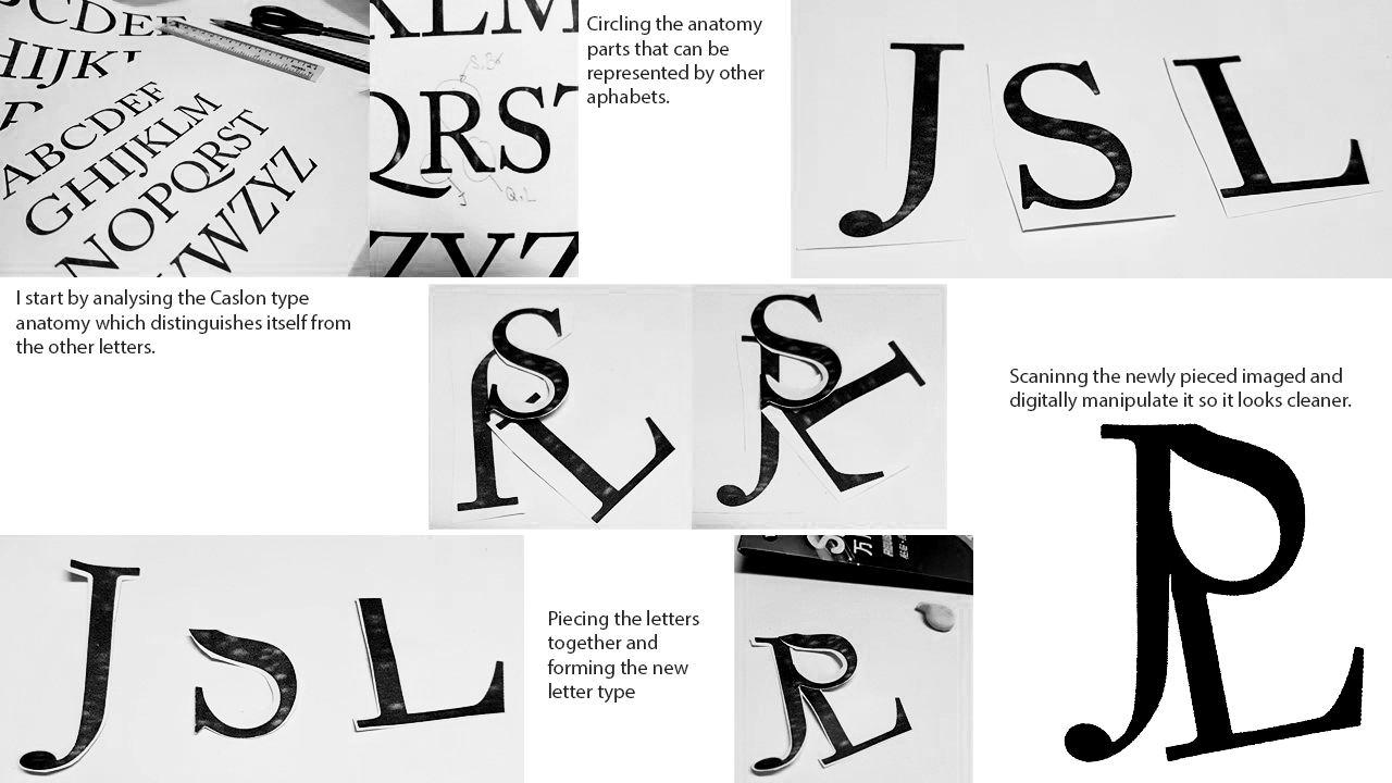 I also tried to recreate some other alphabets.


3b. Type as Pattern
I had a lot of fun doing this segment of the assignment as it not only is very interesting to see how each letter of each type can create beautiful patterns, the variety is endless because every angle the letter is inverted or tilted, bolder etc. It gives off a completely different feeling!
I used the typeface: Garamond for this part of the project as I really liked the old style serif. It looks classy and posh, especially the letters with the round descender, such as the lower case ‘y’.
I decided to play with many ways of creating patterns with the lower case Garamond ‘y’.

Garamond Lowercase ‘y’: I was inspired by Bohemian carpets for this pattern, wanted something that resembles the sun.

Garamond Lowercase ‘y’: Inverted the colors for this: White on Black background. I also increased the scale so that the radial composition can be seen more clearly, while also turning the composition in 45 degrees to make it less straight.

Garamond Lowercase ‘y’: Mirroring and reflecting.
I decided to play with optical illusion for upper case ‘Q’, the tail of ‘Q’ is very long and sleek, hence direction can be created subtly with the tail of ‘Q’.

Garamond Uppercase ‘Q’:
Repeating the upper case Q in a radial direction, and reflecting it so it will create a sense of movement with the different directions as indicated by the tail of the Q.

Garamond Uppercase ‘Q’:
Inverted the colors, White on Black.

Garamond Uppercase ‘Q’:
Created outlines and varying the core color to create more movement, as though you are being sucked into the hole on the top left hand corner
I have realized that not only layout and composition is very important as it is not merely just repetition, I wanted to create movement in my compositions. Hence, I chose to do my patterns in radial form, to create some form of optical illusion. In addition, I inverted the colors and played with tonality and outlines to push my designs.
3c. Type as Emotion
For this segment, I chose to use the typeface: Helvetica. My objective was to convey emotions through layout, scale and tonality.
I chose Helvetica because the typeface is very neutral. There is no biasness or any form of personality which was what I wanted as it can help me achieve my goal: Strip off any preconceived notion of typeface to express the emotion. For instance, if I were to use ‘Black Letter’ for this segment, Black Letter is medieval and vintage. Hence, using Black Letter to express the emotion, ‘anger’ it will feel like an angry old man being angry. Well… that is my interpretation. 🙂

Inspired by a weak heartbeat on the heart monitor

Changed the tonality of ‘LO’ and arranged in high and low to emulate boredom

All pushed to the side in a black background Wanting to be alone. All letters are tilted as though leaning on each other for support

Excitement is bursting of out the frame! E is tilted to show slight cheekiness as compared to the straight ‘HLLO’

Pushed all to the corner. Tonal contrast shows that it is slowly being consumed by darkness.

A more Obessive Compulsive Disorder (OCD) perspective where everything is aligned properly and there is a titled letter to ruin the formation. Used Greyscale for visibility.

Swirly line formation to create a whimsical mood. Scale changes as though it is approaching you. Letters go out of the frame to express enthusiasm in the greeting.
I have come to the end for this process documentation of my explorations! Stay tuned to my final Assignment 3 post to see my final productions! 🙂
Thank you!
Seng Yi Ling.


 Hence I placed all my bloomed lotuses at the top, and the petals falling from there. This creates visual direction as well from top to bottom, where all the fallen petals gather at the bottom.
 After consulting with Miss Ina, she asked me to try another composition where the babies are buried in lotus petals!
 And it was indeed a very different feeling as compared to the floating babies composition, and I added other existing motifs to see what else works best!
 To be honest, the comments given were really helpful because I was really stuck for a long time and the comments really helped to give me a new direction to approach my banner. THANK YOU. 🙂
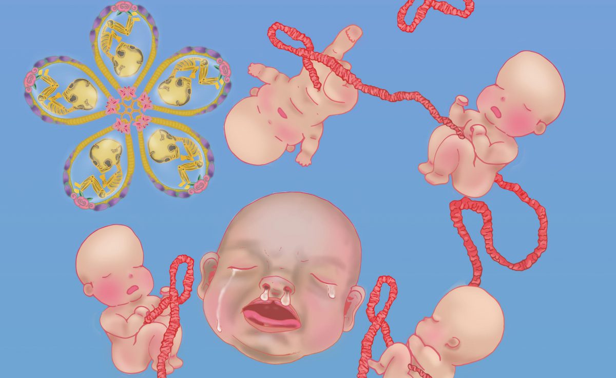
 Banner Draft 1
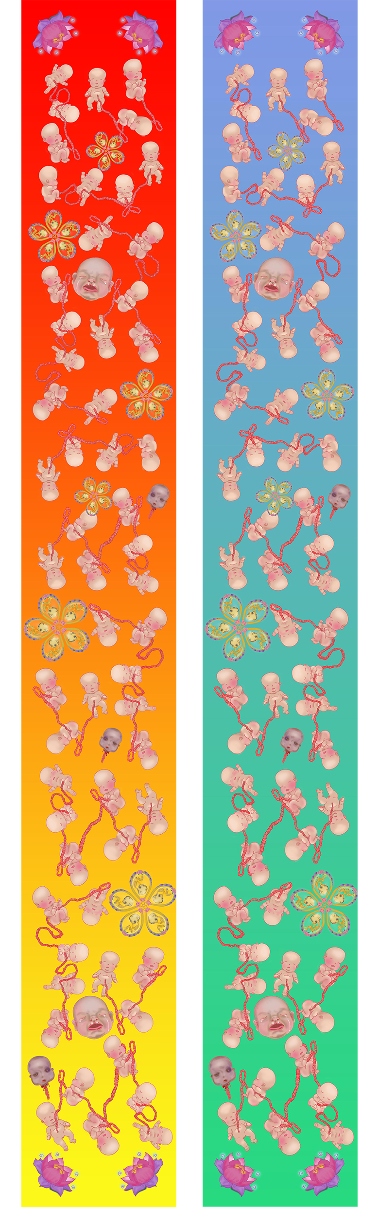


 18 x 18 cm Black and White Letter that has an interesting type.
 I further scattered the letters and changed up the scale of the letters and play around with the arrangement, while taking into consideration of visual hierarchy.
 18 x 18 cm organic letter. I like the different broken glass shards within the letter. It is raw and edgy. The reflective surface creates depth.
 I changed up the curve levels and got this lovely colour! It has a combusted metallic look and it is a fresh new perspective to the glass shards~


 I chose textured paper for the A3 pieces (250 gsm) for the Vernacular Type because I like the grid-like texture, which resembles the top view of the map. Comparing the texture of the paper and its location, its rough grid lines and yet smooth texture as a whole is like the area of choice: Jalan Wong Ah Fook. The town is pretty urban and a mixture of old and new.
 I chose silk white textured paper (different from the Vernacular paper) for the A3 pieces (250 gsm) for the Organic Type because I really liked how the type looked raw and edgy, and the irregularly gridded textured paper reflected what I felt of the broken glass type: Irregular, angular and broken.
 I chose glossy white A4 (260 gsm) for the Organic Type 18 x18cm letter is because the type itself has a smooth glossy texture, and I thought using the a glossy smooth texture for the printed version will enhance the shine and smoothness of the glass pieces.
 I used tiny stamps and neon highlighters as an inkpad to create this, and then Angeline taught us to use Photoshop to manipulate the designs, which brings about more variety of how far the designs can be pushed!


 It is very jarring against the white background I have realized… I was about to go blind. Hence a black background might be better! Debbie (my classmate) suggested that I should add a tinge of blue to make the glass less yellowish and it worked out really good! Thanks Debbie 🙂 ! I also added some glass shards to make it look more shattered. 🙂


 Because I couldn’t decide which location works best for me and which location would provide me more interesting typefaces and background, I decided to try two locations:
 Things I have noticed when choosing to take photographs of Hawker Centre signboards:
 I arranged the letters in a way that the word ‘two’ was not in the composition. I spelt the word ‘Worlds’ twice so there is 2 of ‘Worlds’.
 After consultations, I jot down some of the feedback given by my peers and Miss Angeline.
 Afterwards I made more amendments and experimented with more ways of arrangements.
 Yin Yang inspiration is just a try out when I asked a friend what she thought of ‘two different world’.
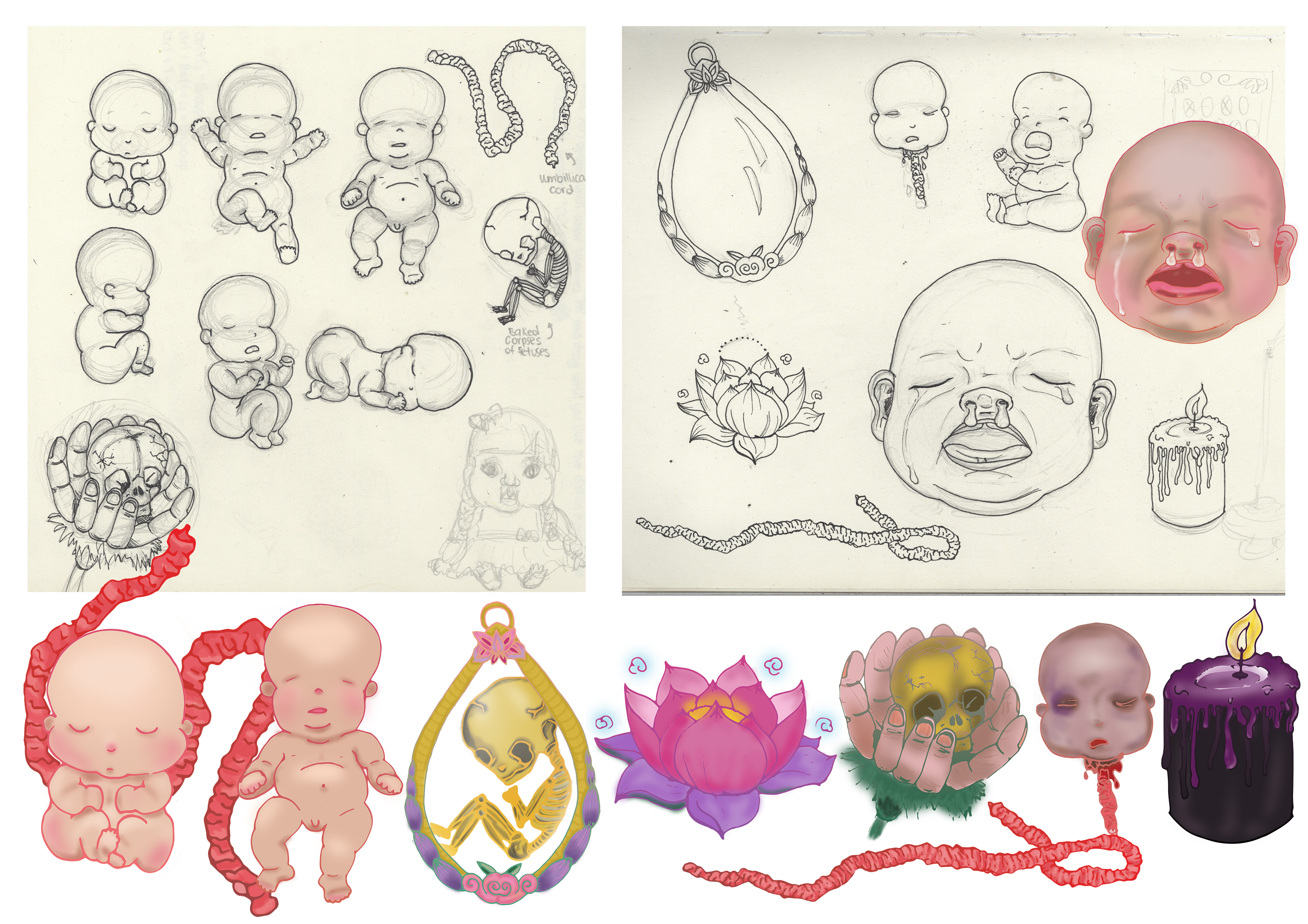
 Afterwards I tried out different forms of illustrating it in digital form, just to see which method works the best. I was looking for feasibility and which method looks best.
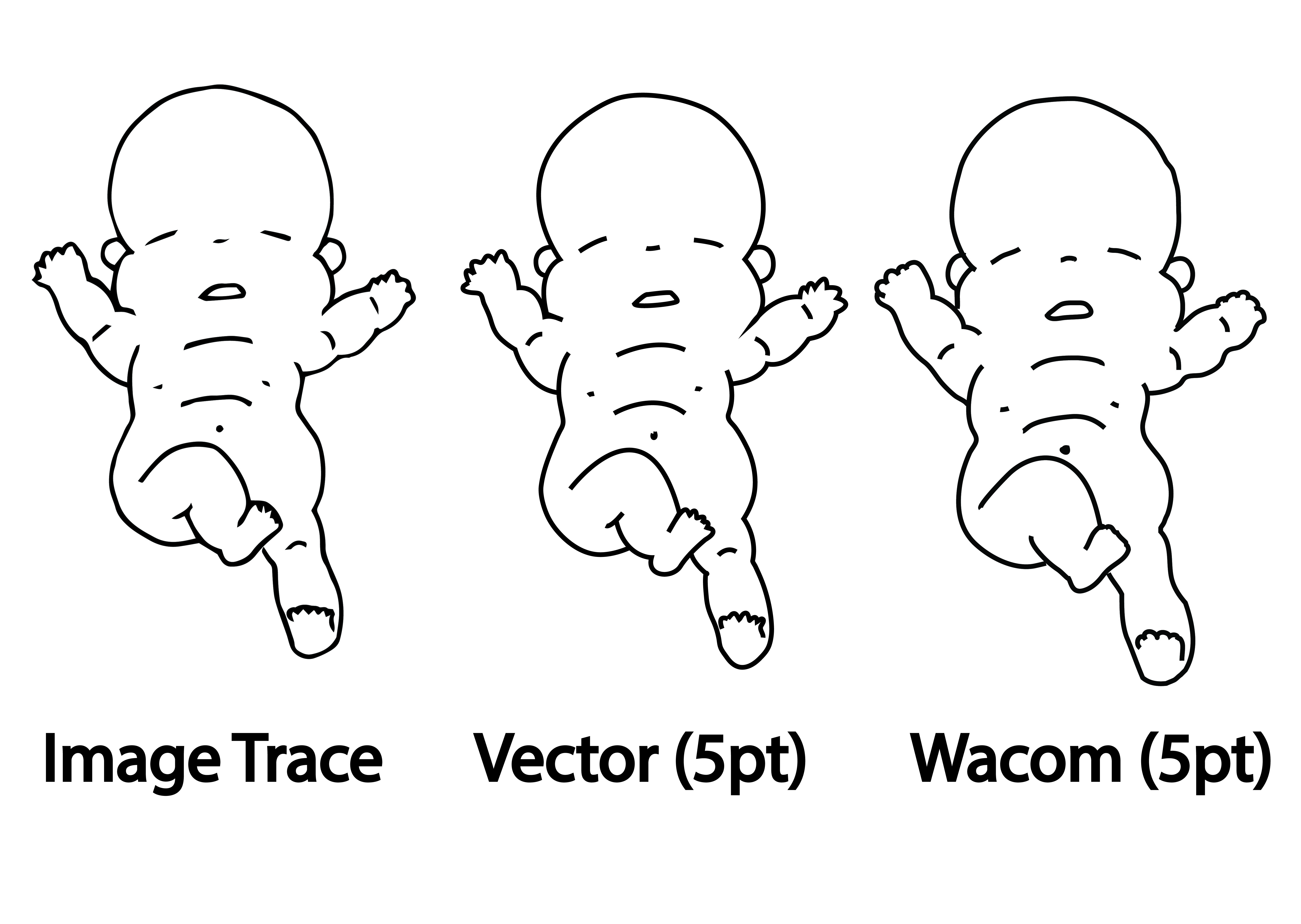 Every method has its pros and cons.
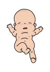 So I colored the baby using Wacom tablet over the Vectored outline method and got this as a result.
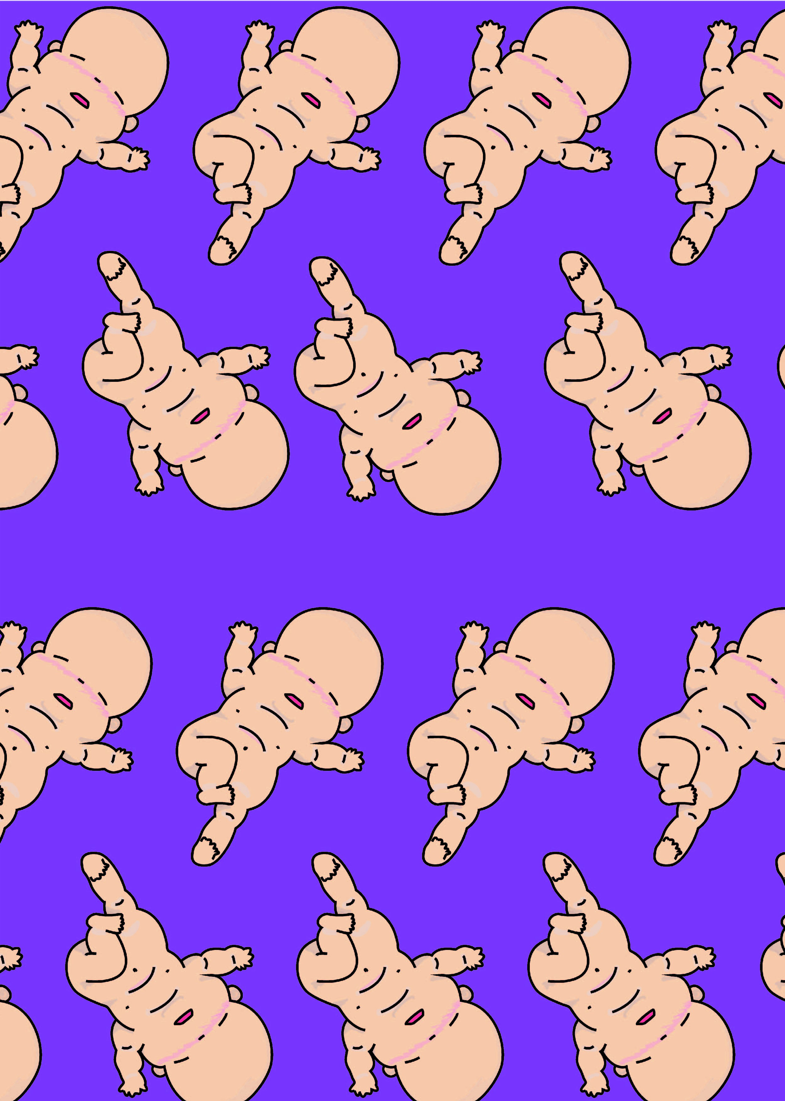 Woo~ it looks like they are doing a mass baby yoga event!


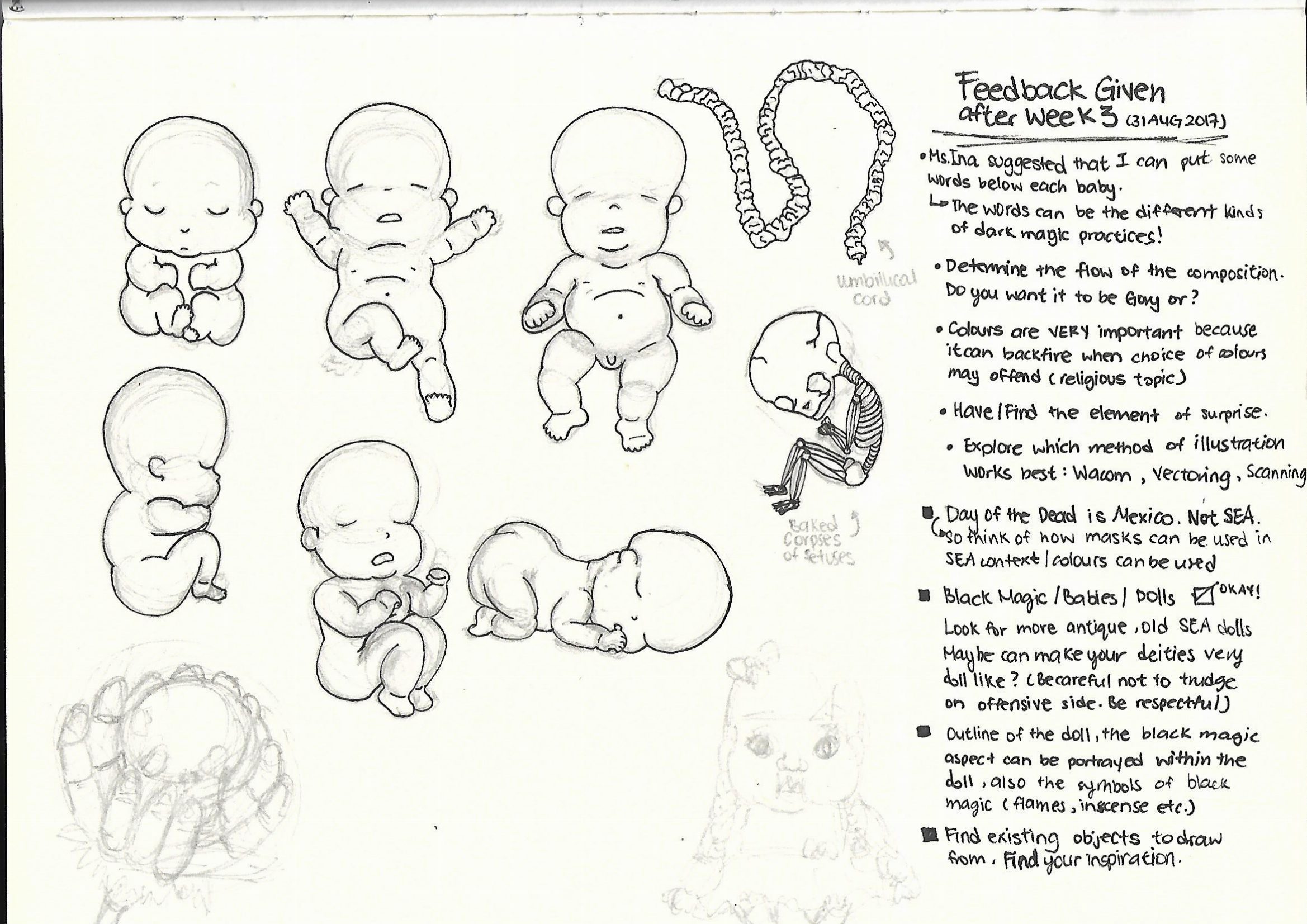
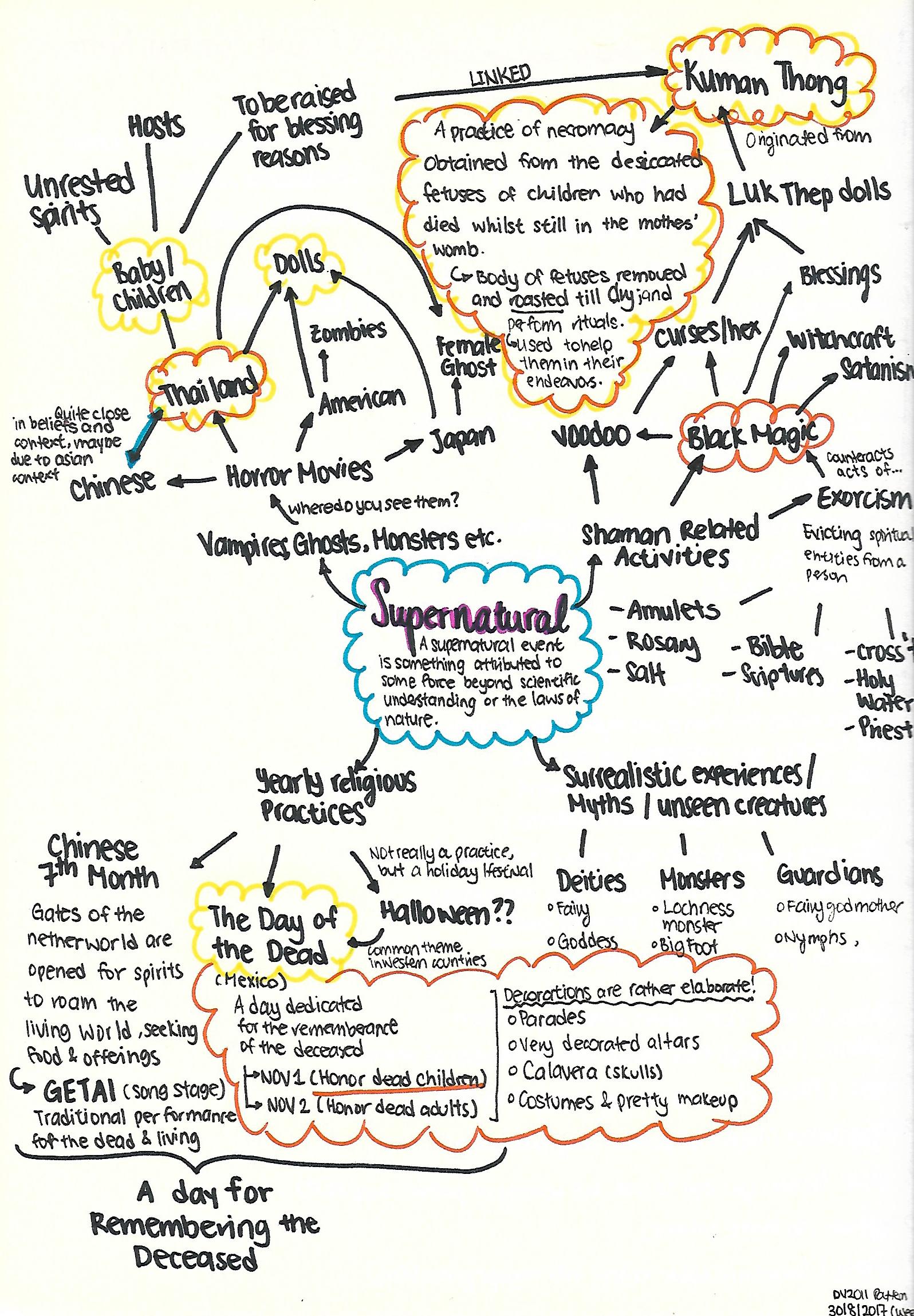 It is a wide network of sparse thoughts here and there, but I finally narrowed down to 2 topics I would like to explore on (The
  There is this grey area because it is a mixture of good and bad. In a way which meddling with ghost/spirits to obtain a positive outcome, is something that is quite risky.
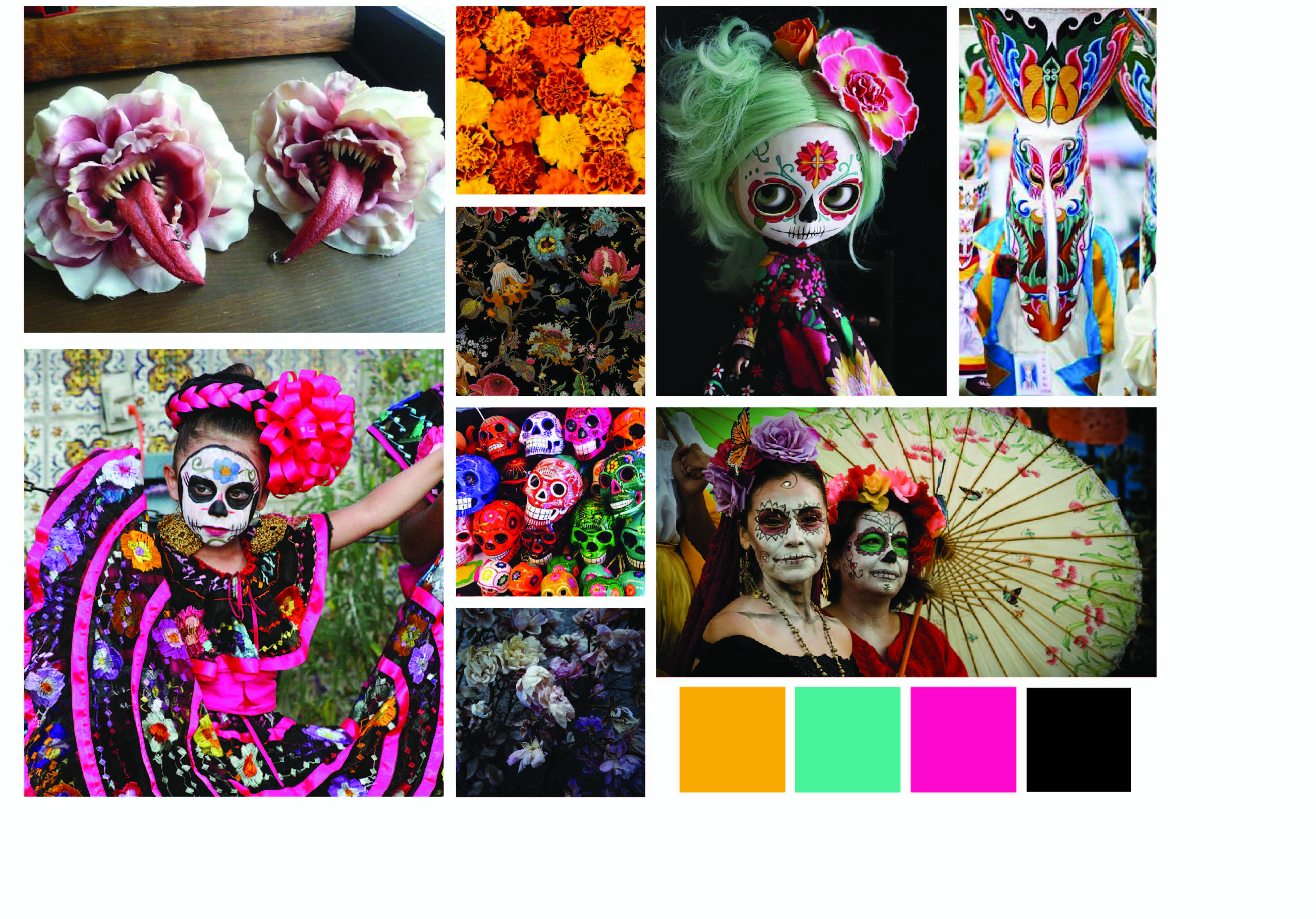 I am rather torn by the two themes, but at the same time I wonder how can I combine the two themes without being too jarring and contradicting, for which the Kuman Thong has a negative connotation to it due to its association with Black Magic, whereas The Day of The Dead is a jovial holiday marked to remember their loved ones.

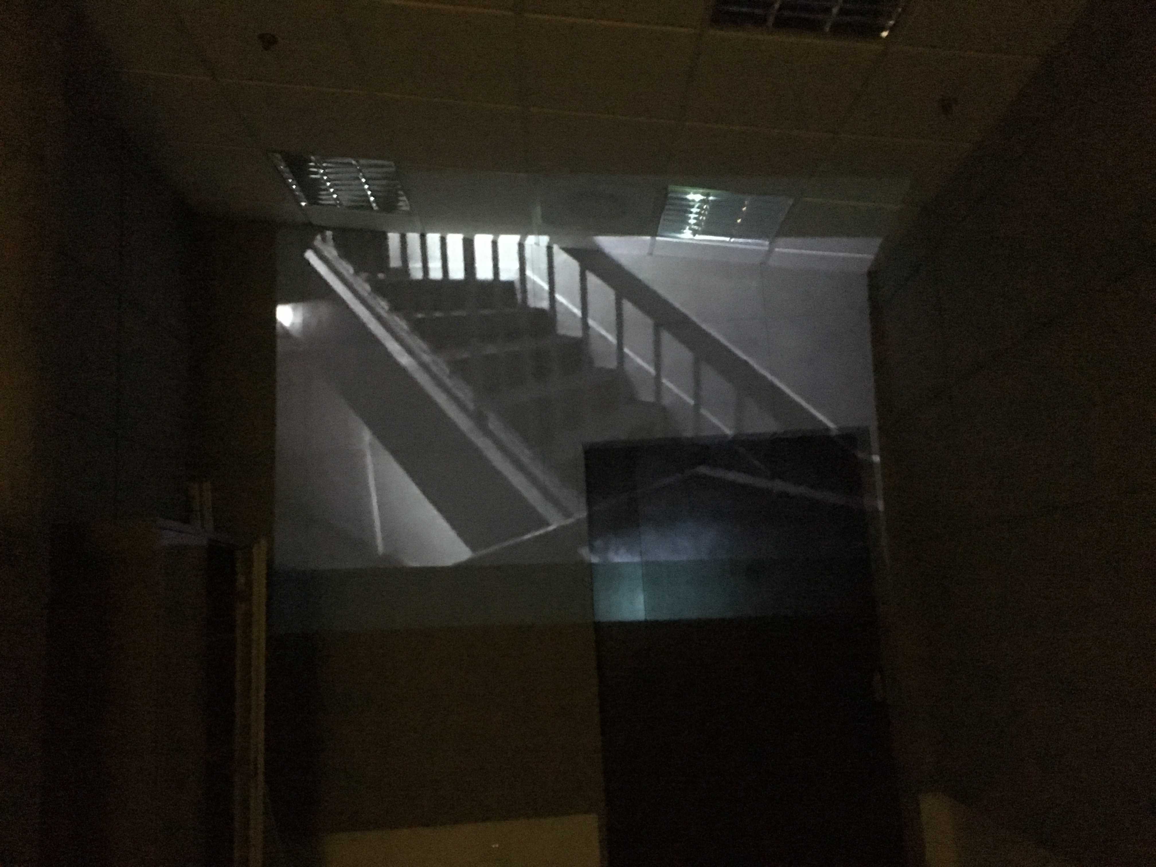
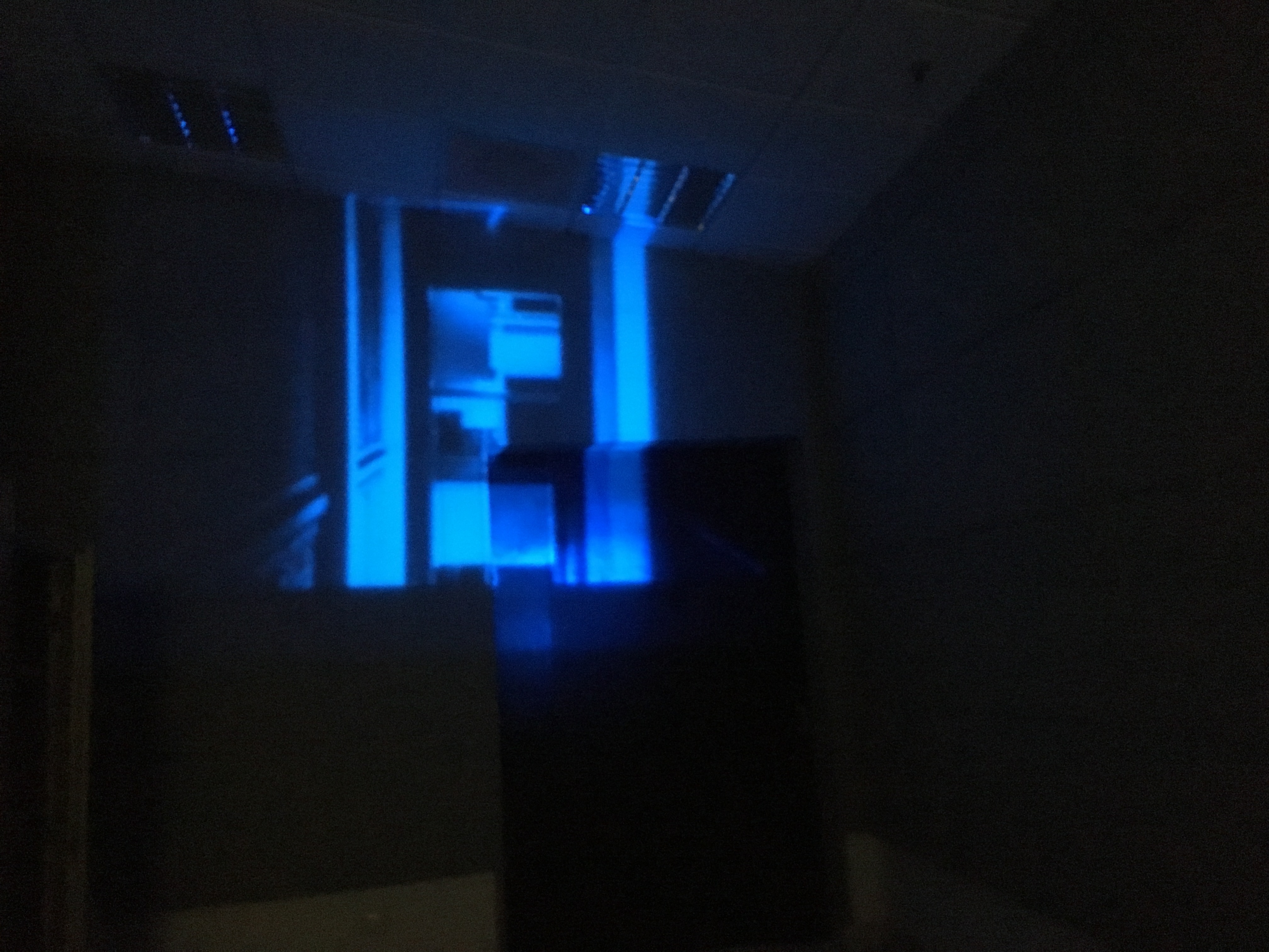 In addition, the projection on the wall creates space in a confined indoor area as it shows the vast outside world.
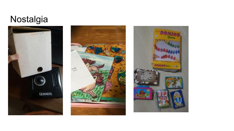
 CHEERIO~ See you guys around in Year 2 Sem 1 ;D