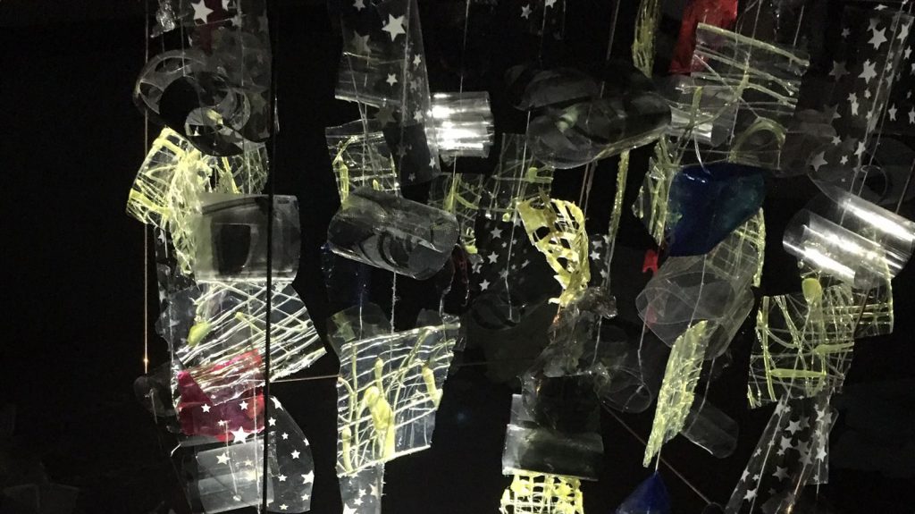
For this modular construction project, our group which consists of Queenie and I, created this lampshade cover (sort of).

20161116_123929fhdh


Amalgamation

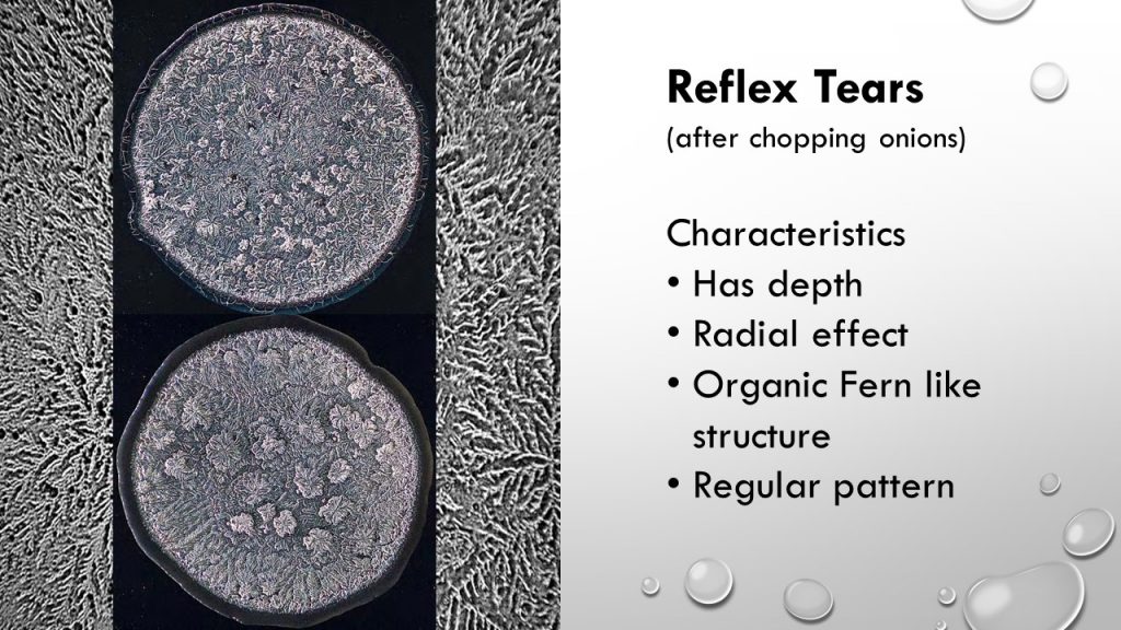
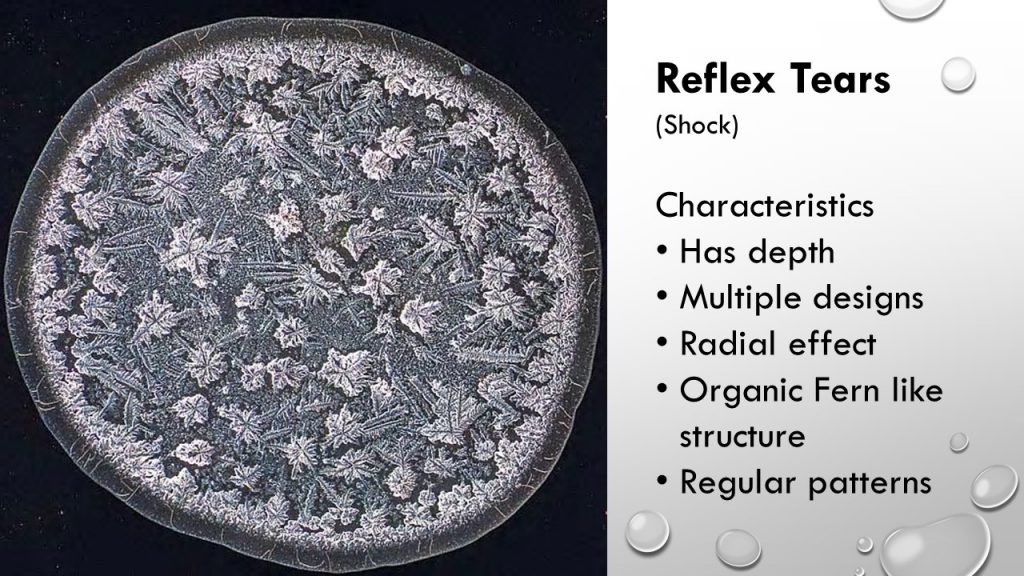
This modular construction is the amalgamation of our previous project on Morphogenic Construction. Queenie used the SEM of Leek and I used SEM of Dried Tears.

Queenie Ke’s

img_0651

We obtained her construction’s highlights which were …

  1. The Folds in the layer -> We incorporated that into our brainchild, by folding transparency paper.
  2. Use of dried layers of glue -> We incorporated that into ours by coloring the glue sheets with red and blue paint as well as calligraphy ink.

Mine (Seng Yi Ling)

20161019_094011

My previous construction’s highlights were…

  1. The Wire frame
  2. Plastic to make the units -> Used transparency and plastic sheets with pattern to create shadows.
  3. Thread to hang units.

Aesthetic Cohesiveness

img-20161116-wa0026

Units in each row are arranged in a uniform pattern.

Materials used for each unit are…

  • Glue from glue gun onto cling wrap
  • Star patterned plastic wrapping sheet
  • Red and Blue Watercolor paint on glue
  • Donated transparency paper from our classmates

Delight

Colors, light and shadows are rather friendly. Rather interactive due to the mobility of each row. Each unit moves rather independently on it’s own in the air.


Light and Shadow

For this assignment, Queenie and I heavily focused on the light and shadow casted from our model, hence the physical exterior aesthetic aspect of our model is rather… ahem….

ANYWAYS.

This is a video of how the light and shadow look upon changing the position of the light source: front and back, left and right.

  • The panels closer to the light source appears larger, and overlaps with the shadow casted by the panel which is further away from the light source.
  • Transmission of light through the red, blue and black glue layers created colored translucent shadows.
  • Transparency folded up has a reflective surface. Hence, mobility of the transparency units when turning creates a refraction of lights.

img-20161116-wa0024

During presentation, our classmates were rather fazed –Queenie and I were rather surprised by the responses haha.– by the shadows casted on the ceiling and all around the room when we placed the light source (iPhone light) directly faced up on the table, in the center of the model. Yit Ling told me that she felt serene looking at our ‘constellation’ like shadows cool.


Some of the pictures in class of our work were taken by Dawin and they were really pretty so we used them! Thanks Dawin!

Constructive feedbacks we’ve received from Mr. Peter and our lovely classmates were that we could actually hang our lampshade cover instead of having it on legs; and that letting it have uneven legs to give mobility or allow it to rotate like a musical box would make the shadow even more interesting on the walls and ceilings. smile

20161116_155625

‘Family Portrait’ of Queenie and my lovechi..I mean. BRAINCHILD. 😀 THANK YOU QUEENIE FOR WORKING WITH ME ON THIS PROJECT <3

Our group or as known as Ling Teh Kam-pany (Derived from our names), consists of Kam Yit Ling, Clara Teh Ke Wei and myself, Seng Yi Ling. And here, we present to you our very own movie trailer for our final 4D assignment of Year 1 Semester 1…

Movie Title: Yi(t) Ling
Genre: Fantasy + Psychological Horror

3 Act Structure

Beginning (Act 1)

Yi Ling is a shy and quiet person. Once focused on a task, she is far from being distracted. Sadly, she is ostracized by her classmates as she seemed rude and had a stuck up attitude. Her classmates disliked and gave her a hard time. Until one day, her new classmate Queenie decided to befriend her.

Rising action

To her dismay, Queenie sold Yi Ling out to fit in as she got ostracized by their classmates when she was seen hanging out with Yi Ling. She ganged up with her classmates and forced Yi ling into room rumored to be haunted for fun’s sake. When Yi Ling managed to open the door after much struggling, she was transported to another dimension where there were doors which led her to places as a ghost tailed her.

Middle (Act 2)

Encounters with the ghost tells Yi Ling that the ghost wants her to stay in this dimension and never go back. The spirit was motivated by loneliness which both characters shared and was enraged when Yi Ling refused to stay.

Ending (Act 3)

The ghost is in actual fact a manifestation as her alter ego. The other dimension filled with doors was a symbolism of change Yi Ling faced in her life. And the only way Yi Ling can get back to her world is by killing a part of her: Her Alter Ego.


References

We watched many horror movie trailers as a form of research and shared our experiences and views on past movies we’ve watched that could be of assistance to our movie trailer! 🙂

Crimson Peak (The Ghost was constantly present, but not shown blatantly.)

Black Swan (Killing of her Alter Ego)

The Babadook (Ghost was a manifestation of main character’s fears.)

The Boy ( Placement of background music.)

Placement of background music was very on point here – it had us 3 covering our ears and half shutting our eyes in fear to watch the trailer. The initial beginning of the trailer has a soft mellow piano tune when the female lead approaches the mansion, and the drastic change of music when they revealed The Boy to her sent shivers down our spine. The sudden change of music instantly let the viewers know what atmosphere the trailer aims to set: Simple life of the girl -> Horror of her lifetime.

Blair Witch Project (Handheld camera shots to show desperation and fear.)

https://www.youtube.com/watch?v=D51QgOHrCj0

Coraline (Travelling into another dimension, and use of different colour for different world)

In Coraline, the saturation of her world is low and colours are dull like the reality she lives in. In the other dimension, she enters a door where saturation is high and colours are vibrant and lively like the life she yearns to live in.


Editorial

Blackout shots – Blackout transition shots are a recurring motif. It is used as a representation of time lapse. When used in our trailer, the following scene will be of another place and another time. In addition, length of transition creates suspense and indicate a tonal shift in the scene.

Color  – Adjusting of color to establish different dimensions were used. In the real world, colors are more saturated and was brighter; whereas in the other dimension, saturation was kept to a minimum and brightness was decreased to emphasize on the stark differences in both worlds, so as to make it more spooky.

Background music and audio – Music were used to build up the anticipation and gives the audience the emotion they ought to be feeling a specific sections of the trailer. For instance, mellow piano music at the start to give a soothing feeling, and high pitched fast paced music at the climax when main character was being chased down.

Parallel Universe – At the scene (0:45) where the main character exit onto the parking lot, the composition has a mirror image reflection on the extreme left of the shot, to enhance the parallel universe feeling.
Staircase scene shows main character running up the stairs away from the Ghost, but she remains on the same level as the stairway in the other dimension is an infinite loop (0:58 – 1:09) .

Shots Established

Still Shot was used at the start of the trailer, where a serene feeling is given of the school environment. (0:09)

Fast Pan + POV at the scene where main character looks around perplexed at the new dimension she entered (0:49) .

Dolly In and Out scenes are present at the scene to show the ominous door (0:30) and the scene where zooming in on her expression to show that  she is perplexed after opening the door to another location (0:48).

Mid-shot was used at the scene where main character is pleading the classmates to let her out. (0:40)

Handheld shot when the main character is running up the stairs. (1:01)

Low Angle Shot at the scene where 3 Classmates (Dawin, Jon, JiaQi – Thanks guys!) were gossiping about the main character. (0:22)

Trucking Shot was used when classmates (Thanks Queenie and Debbie!)were pushing the main character inside the haunted room. (0:35)

Close-up Shot was used when main character was wrenching at the door handle when she is locked in (0:41). And the part where the main character’s phone is ringing (1:25).

Canted angle shot are present when phone is dropped amidst the struggle when pushing the main character inside the haunted room (0:37), and the scene where the ghost is wrenching the door to be opened (1:14). This is to create drama and suspense.

Slow Pan is used at the transition scene where the main character looks into the mirror and the reflection looks back at her (1:39-1:42).

Challenges Faced

  • We tend to forget that the trailer is 2 mins and thus, eventually worry that our trailer does not convey our plot properly; but at the same time we don’t want our trailer to be a 2 min summary of the movie (given that it is a MOVIE trailer).
  • Finding an appropriate location which conveyed the intended feeling was not easy. Our main character’s setting is in a school environment and hence the school was used. But for the horror aspect we had to find narrow and dark areas within campus and that was difficult. Given that we even trespassed ongoing construction sites in school.
  • Suitable. background. music. was. really. hard. to. find.
  • Miss Ruyi mentioned that our logo and lobby music was not very appropriate for our Horror trailer, but our group felt that the logo was a good representation of our efforts as a group and the elevator music gave it a merry feeling. This will create the drop of emotions when the horror aspects of our trailer is revealed. 🙂

Feedbacks and Critiques
  • Bar chart results obtained from Ms Ruyi’s Google survey for our group were more towards the positive end of the spectrum.  (thank you!)
  • Sound effect can be toned down to hear narration of the alter ego better in the end.
  • The starting music doesn’t match with the rest of the trailer , perhaps a non jazzy music that foreshadows the story?
  • Show that the alter ego and the main character are two compelling personalities/ people by including more interactive scenes between the 2. Perhaps by voice over of dialogue between 2 person or a struggle between the 2.
  • Yi Ling can act! (Yi Ling says thank you >~< )
  • There were different shots to show the mood of the character.
If u guys have any constructive criticism or comments that we’ve missed out, do leave a feedback down below! WE APPRECIATE IT ?

Initially I was pretty apprehensive to do group work for assignments as I am a rather ‘lone ranger’ kind of person, and having to do group work would mean that there is potential conflicts etc. But I was proven extremely wrong as I felt that our group worked really well together and even bonded closer as friends! 😀 I am very blessed to have worked with Clara and Yit Ling for this project, and I couldn’t have asked for better group mates~
Our first and hopefully not the last group photo as Ling Teh Kam-pany :D

Our first and hopefully not the last group photo as Ling Teh Kam-pany 😀

Thanks lovelies 😉

YAY So we have finally completed our FINAL assignment for 2D Foundation WOOHOO~
So lets get on with this extremely long and detailed post~

ME
Representation of Me: Tofu + Baby Elephant
slide1
Instead of using photographs of myself to represent myself, I decided to use my spirit animal as a representation of myself: A baby elephant.
Why a BABY elephant?
Because I often wish that I didn’t have to grow up so fast, and like a kid I am rather gullible & childish.
Why a baby ELEPHANT?
Because an elephant is a gentle giant ( I am rather big), they never forget(I bear grudges), they are playful and friendly but not to be trifled with ( my emotions are easily riled).
I was also intrigued to explore Anthropomorphism as well. Hence, I wanted to use Tofu as my subject as well. The texture of my elephant I have decided to go with is different types of Tofu as my friend once told me that I am like Tofu, soft and fragile and I ought to toughen up to be like Tau Pok.
slide2
Hence, in each row, the toughness of each elephant in each square will show the progression of how I , from a fragile watery Tau Huay transform into a tougher Tau Pok. Vice Versa. cool

Methodology
For the methodology for the representation of myself, I was very inspired by the cartoons I have watched in the past and recently.
Hence, I decided to carrying out my emotions and state into the form of hand-drawn elephant cartoon drawings, which then I scan my drawings into the computer, and then overlaying the texture of tofu over my drawings for the elephant’s skin on Photoshop.
This further emphasized on the meaning of my spirit animal is also soft and fragile like Tofu. Thus, giving a new definition to my spirit animal.
I decided to split the 4 rows into 2 where the first two will be on my concept of Dystopia and the other two will be my ideal concept of Utopia.
 scanwf
A constant method of carrying this project out is on Surrealism, as I was having lots of fun for project 2 and I would like to incorporate photo manipulation and montages again. 🙂

Compositions

1) Utopia 1:
 slide1
Me: Me when I am stressed.
Setting: Lured by Temptation
Black used in the background and doodled TV to show the dull and mundane life I am in. Juxtaposed by the burst of white light behind the TV, it acts as a metaphorical representation of the TV being a portal to send me to another dimension ( color wheel ) where there is colour, vibrance and excitement. Outstretched hand (Korean drama actor Song Joong Ki’s hand) from the center of the colour wheel invites and lures me into his world. *fangirl snigger*
Outcome: Living vicariously through fiction.
My concept for this composition is a themepark because I love thrilling rides and I lose track of time there. Similarly, in the land of fiction, I lose track of time and reality when I watch TV dramas.
I used Square complementary Harmony color wheel in this composition where I used : Violet, Orange, Blue and Green. Violet/ purple gives off a dream like atmosphere, Blue is calming, orange gives a youthful and warm feeling and Green is refreshing.

 For this row, I was rather inspired by an image I saw online once which I felt it was highly relatable.
 main-qimg-b98d152beefb60cbd0cc74ab21e30e0e-c
Everyone is a genius. But if you judge a fish by its ability to climb a tree, it will live its whole life believing that it is stupid.
– Albert Einstein
2) Dystopia 1
slide3
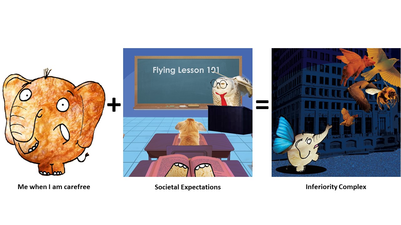
Me: Me when I am carefree
Setting:  Societal Expectations.
I used cool colors for this composition that has similar tones. Scene takes place in a classroom setting in my perspective. Blackboard serves as the center of focus to create line of perspective, further emphasized by grids on the floor, which says, “Flying Lesson 101”.
This is to show that sometimes in society and education, we are often taught things that we don’t need or does not apply to us individually, or it simply is not cut out for us. And no matter how hard we push ourselves to learn, we remember the theory but we cannot apply it.
Outcome: Inferiority complex.
Outcome is a representation of Exam day.
I used monochrome harmony ( Blue) and split complementary ( Blue with Orange ) in this composition. I used blue as the background as I wanted to express the coldness and cruel side of society (building in the background), as well as inferiority I experienced when my peers do extremely well but I don’t. It is as though, when I am not doing well in certain subjects as compared to others, I am deemed as incompetent, inadequate and less intelligent by society…
The bright orange juxtaposed against the dark blue background is to show how much my peers shine through their abilities, where I am blended into the background, questioning my abilities. I attempted to create a diagonal implied line from the bottom left corner to the top right hand corner, to convey the instability I felt.

3) Utopia 2

slide2

Me: Me when I have Anxiety
Setting: My Safe Haven
My Safe Haven is depicted in an outdoor scenario where ELEPHANTS SHOULD BE ROAMING AND NOT LOCKED IN CAGES NOR ENCLOSURES *ahem* where there is plenty of room to roam. I used rain, as Elephants love the rain; I represented the sun with a fried egg (Because I like too eat eggs) and the vegetation at the bottom to be a Soya Bean field as Tofu is made from Soya Beans, and metaphorically, I am where I am born. Hence, my safe haven is places where I find most joy and comfort as a child.
I used a Analogous Warm Colors for this composition where Green, Red, Orange and Yellow are present.
Outcome: Recuperation.
In this composition, the Elephant is seen in the ground with a Soya Bean and a rice grain on it’s side. This is a representation of me talking my problems out with my loved ones, and in this scenario, the Soya Bean is a representation of my family and friends (What made me ‘Me’.) and Rice is also the basic element which makes my comfort food: Carbohydrates. My elephant’s texture is Tau Huay again as I wanted to show that in front of my loved ones, I am allowed to breakdown and show my weak and fragile side 🙂 The Farmer Boots, Watering Can and Sunlight are what will help me grow up as a Soya Bean to be a stronger and happier person…I mean tofu.
I used Analogous Warm Colors and Earth tones for this composition.

4)Dystopia 2
slide4
Me: Me when I am Happy
Setting: Whirlpool of negativity
I depicted this composition by a hand grabbing the Elephant and attempting to throw her in the black hole made by the black and white whirlpool.
My highs and lows are rather unpredictable. I get triggered by comments and actions really easily as I am hypersensitive- *sighs* I am a Scorpio…excuses – and in an instant I get so caught up in chains of thoughts or reasons, I enter my abyss of fear and swirling thoughts, which eventually lead me to a state of melancholy.
Used Monochrome Harmony for this composition.
Outcome: Abyss of fear and melancholy
In my state of fear and melancholy, I am consumed by my own thoughts, things people say and self-loathe. I’ll think about past events and I get really scared of my consuming thoughts which swirls around me like vultures waiting to feed on my corpse.
Flying eyeballs with mouth-Conscious of things people say and the way they look at me.
Lizards with Math equations on them – Constant reminder of greatest fear in Math. I hate lizards.
Frankenstein Snowman – Things people compare parts of my body to.
Used Monochrome Harmony and Split Complementary ( Yellow rays from Window)
The texture of my elephant from a tough Tao Pok to Tau Gua to a watery fragile Tao Huay is evident here.

Artist References
A lot of my inspirations come from the cartoons I binged watched as a kid and the cartoons I watch now with my younger cousin on cable TV as a form of bonding session!
Best thing about being an Art student is that I can get away with watching cartoons for research purpose MUAHAHA.
I pay quite a lot of attention to the details in the animations which I drew my inspirations from:
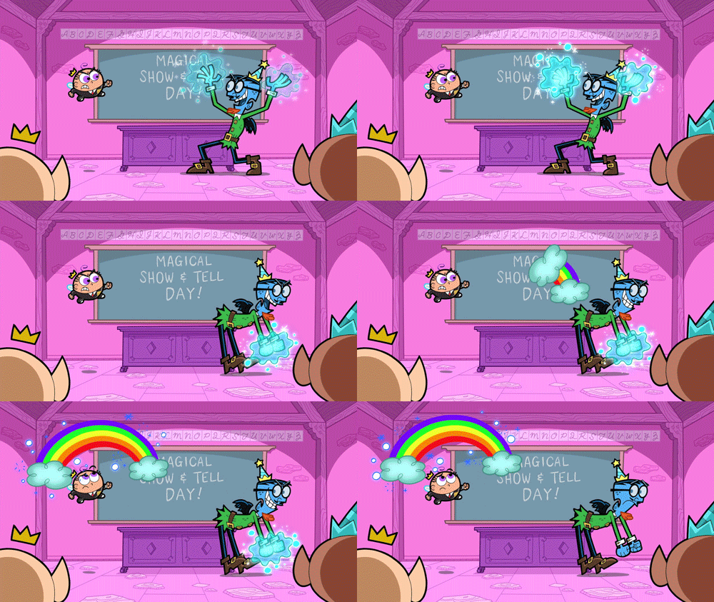
Fairly Odd Parents
I really liked how they used color of the background has similar tones and roughly from the same hue. And the main characters are usually much more saturated and has brighter hues to draw our attention to them. The juxtaposition of the one-hue background to the more vibrant and colorful main characters really gives the main characters that POP of color.
The AMAZING WORLD OF GUMBALL
&
PICKLE AND PEANUT
cartoon-network-the-amazing-world-of-gumball
sectionname_xd_pickle_peanut_rich_nonretina_01c8eb16
My inspiration for Anthropomorphism comes from these 2 cartoons.
I liked how in The Amazing World of Gumball, the character’s personality are related for the medium they are made from. For instance, Teri (the paper bear beside Tina the T-rex) is made out of paper, she is very fragile, and physically weak. It is revealed that if Teri stands in the light, you can see “inside of her.”
And in Pickle and Peanut , I like how the main characters are the only ones made from ‘Real Objects’ whereas the rests are drawings.

Problems Faced
Use of colors
The colors aspect was bugging me quite a bit. The placement of colors on certain areas of my compositions and the saturation, tone and the Hex color code made it hard for me to decide as there were so many colors to choose from. But then again I was intrigued by the types of color harmony I can use to further illustrate and emphasize on my intention and emotion in each composition.
Ideas
I was rather concerned regarding using Color Harmony as the main key point as my head was really congested with ideas on how to pull off the photo montages, methodology, ideology and which elephant to use for which setting etc.
Images
Finding the right high resolution images for my photo montages and photo manipulation was rather difficult. For instance, it was not easy to find a high resolution image for tofu. 🙁

Comments and Feedback

Lovely Classmates’:
commensTHANK YOU GUYS FOR THE LOVELY COMMENTS <3
Miss Joy’s ( I can’t remember word for word but I got the gist):
– Can tell that I tried to apply my Principles of design such as implied lines and use of perspective.
– Joy suggested that for my ‘Societal Expectation’ composition, doing a sketch of a bunny hopping off a cliff to show the act of learning to fly would be better as compared to writing the text ‘Flying Lesson 101’ as the texts are rather jarring when seen as a whole during presentation of my 12 compositions, as it was the only composition with text on it. 🙂

Have pretty mixed feelings when lesson ended today 🙁 I had lots of fun working on the assignments, and odd to say but critique day is my favorite part of the assignment XD, but I cant help but feel a tinge of sadness when in sem 2 our class may split up and we may not get Joy as our instructor again even if we try to grab our timetable slots on STARwarS… sigh. But regardless I am very glad to get to know my classmates more as individuals through 2D projects ;’) It is my utmost pleasure guys~ Thank you for the memories <3

Our group (Clara, Yit Ling and myself) created this movie trailer for our Final Assignement 🙂


Genre: Fantasy + Psychological Horror

Beginning (Act 1)

Yi Ling is a shy and quiet person, but she was ostracized by her classmates as she seemed as though she had a stuck up attitude. Her classmates disliked and gave her a hard time. Until one day, her new classmate Queenie decided to befriend her.

Rising action

To her dismay, Queenie sold Yi Ling out to fit in as she got ostracized by her classmates when she was seen hanging out with her. She ganged up with her classmates and forced Yi ling into room rumored to be haunted for fun’s sake. When Yi ling managed to open the door after much struggling, she was transported to another dimension where there were doors which led her to places where a ghost tailed her.

Middle (Act 2)

Encounters with the ghost tells Yi ling that the ghost wants her to stay in this dimension and never go back. The spirit was motivated by loneliness which both characters shared and was enraged when Yi ling refused to stay.

Ending (Act 3)

The ghost is in actual fact a manifestation as her alter ego. The other dimension filled with doors was a symbolism of change Yi ling faced in her life. And the only way Yi ling can get back to her world is by killing a part of her: Her alter ego.

THIS IS NOT THE FINAL VIDEO 🙂 STAY TUNED FOR A NEWER, BETTER AND UPDATED MOVIE TRAILER.

COMING SOON BEFORE 15 NOVEMBER! 😉

Our very first G05 class outing happened yesterday at NUS Museum featuring the exhibition: Double Vision! Double Vision is a selection of video works and experimental films that are inspired by the affinities between the Philippines and Vietnam in the history of the American wars in the Pacific.

cmfvp6rukaabtog

Videos & artist films by: David Griggs, Gym Lumbera, Miko Revereza, Roxlee, Shireen Seno, Angel Velasco Shaw, Stephanie Syjuco and Kidlat Tahimik.

Pdf format of the Brochure: http://www.nus.edu.sg/museum/pdf/2016/NUSM_DoubleVision.pdf


When we first entered the exhibition, the first film we watched was Shotgun Tuding by Shireen Seno

Trailer:

In summary, the film is about Tuding (the protagonist) who journeys to a distant town to hunt down the man who got her youngest sister Teresit pregnant. Along the way she

This film is constructed after Pancit Western, which is the Pinoy form of Spaghetti Westerns.

What I liked about this film:

Shots used are rather interesting. I found the dramatic close up of the subject matter’s face and dramatic pan out shots to be rather comedic and kind of poking fun at the mainstream western American Wild Wild West kind of films, where two cow boys would be having their showdown.

Color pallete used in this film was muted and had a rather soft and dusty feeling to me.


Nailed by Angel Velasco Shaw 

Is a Filipina’s exploration of a Catholic Church and 400 years of Spanish and American colonialism woven in a montage of images, sounds, stories and performances.

Although I watched this film from the start, I didn’t have much patience to sit through this particular film. The narrations were muffled, and I think with subtitles I would actually have stayed till the end of the film…

But regardless, I took away some learning points from the video in which I really find it interesting. The way the artists juxtaposes 2 shots: The dying pig being tortured to it’s death on the ground & the baby cradled in the mother’s arms; was rather fascinating to me because, in the case of the ritual where the child is baptized in one scene ( I think?), a pig is slaughtered. The phrase, ‘A life for a life.’ came to my mind immediately after this scene, and then Yit Ling (my classmate who was sitting beside me) said :’ The pig is like a baby also… because it can only scream and cry and you have no idea what it is saying, but it is suffering.’ My heart sank when I heard that.


ABCD by Rox Lee is an experimental animation video shot on Super 8 film. It uses techniques such as hand-drawn animation, painting on film, found footage, and collage to advocate a radically new and personal understanding of the alphabet.

I really liked the use of a mixture of techniques to this film as it adds variety. The film is a socio-political commentary. By incorporating the use of the order of alphabets, it made things a little disturbing in a sense by which the use of hand-drawn animation and Alphabetical sequence usually seen on American TV shows for children to teach them about alphabets, things take a darker turn when something so innocent turns into something morbid and cruel.

Instead of the usual, ‘A is for Apple, B is for Boy etc.’ the film goes ‘ D is for Dynamite’ and then the following scene is a morbid display of explosion etc.


My thoughts at the end of the exhibition:

Sad to say, I was not as enthralled as I expected to be after watching the film exhibition as I did not understand majority of the films. Perhaps it is because I have little interest in politics. The film that kept my attention from start to end is Shotgun Tuding by Shireen Seno as I felt there was a narrative story plot goal for me to follow from start to end. But regardless, I took away some lessons from this exhibition and that is the choice of color pallete, type of shots to be excuted and use of different techniques to evoke certain emotions in the viewers.


Methodology
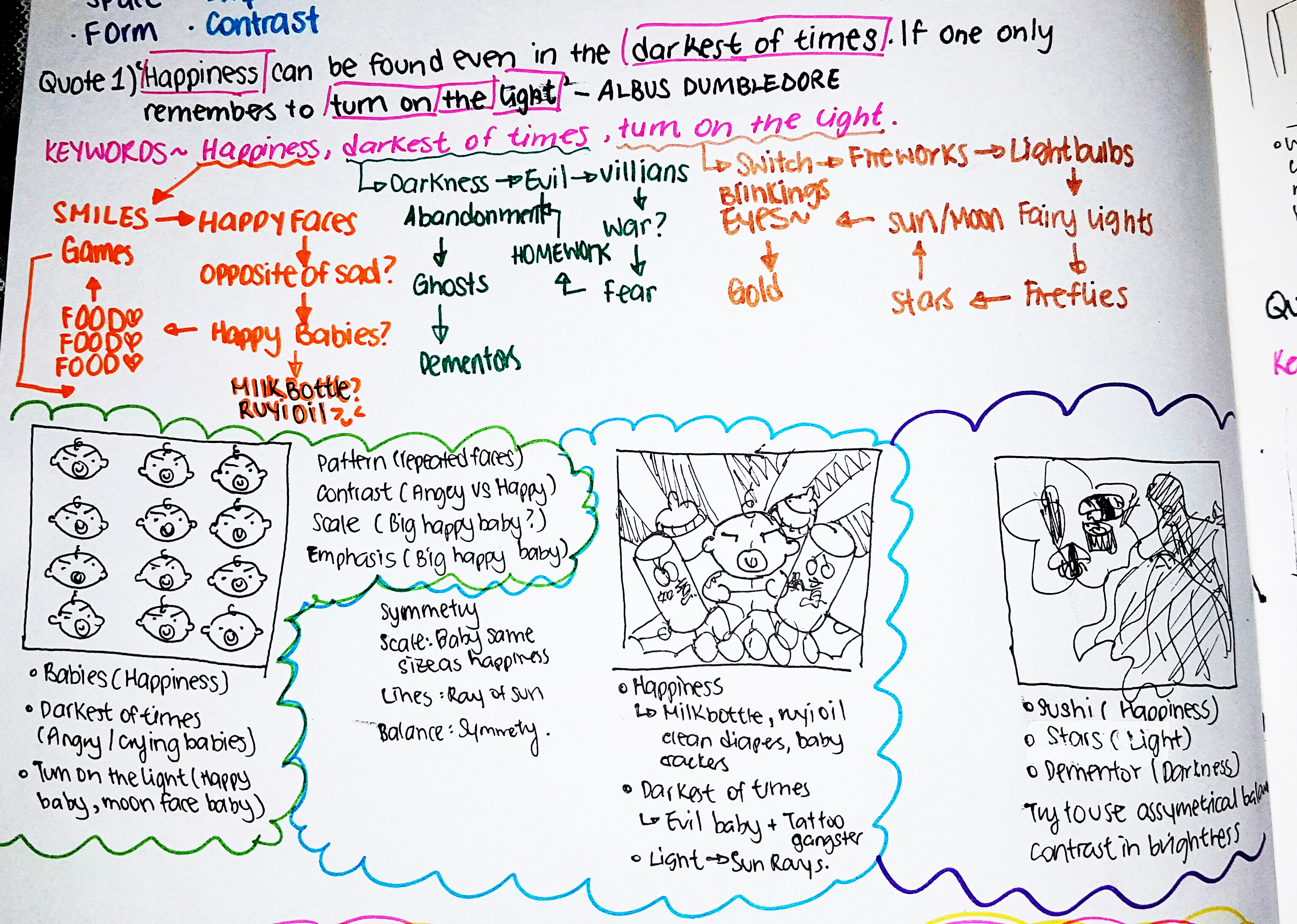
My approach to Project 2 was to breakdown the quotes into keywords, and then branch out from the keywords to get inspirations as to what my possible choice of subjects can be used to represent my quotes without being too literal! 🙂
The final words I have decided to use to represent the key words are usually what I belive in or what I prefer to. For instance, I love “babies”. HENCE, “babies” would mean “Happiness” to me.
You can see the thought process in the following attached image of my 2D Sketchbook! ^-^
aslas
My objective in this assignment
In the following works, my unanimous goal is to make the quotes as non literal as I can by inserting dark humor, playing around with scale and involve the use of Dadaism to make the final pieces as surreal as I can. At the same time reinterpreting the quotes in my own perspective and exploring my choice of subjects.

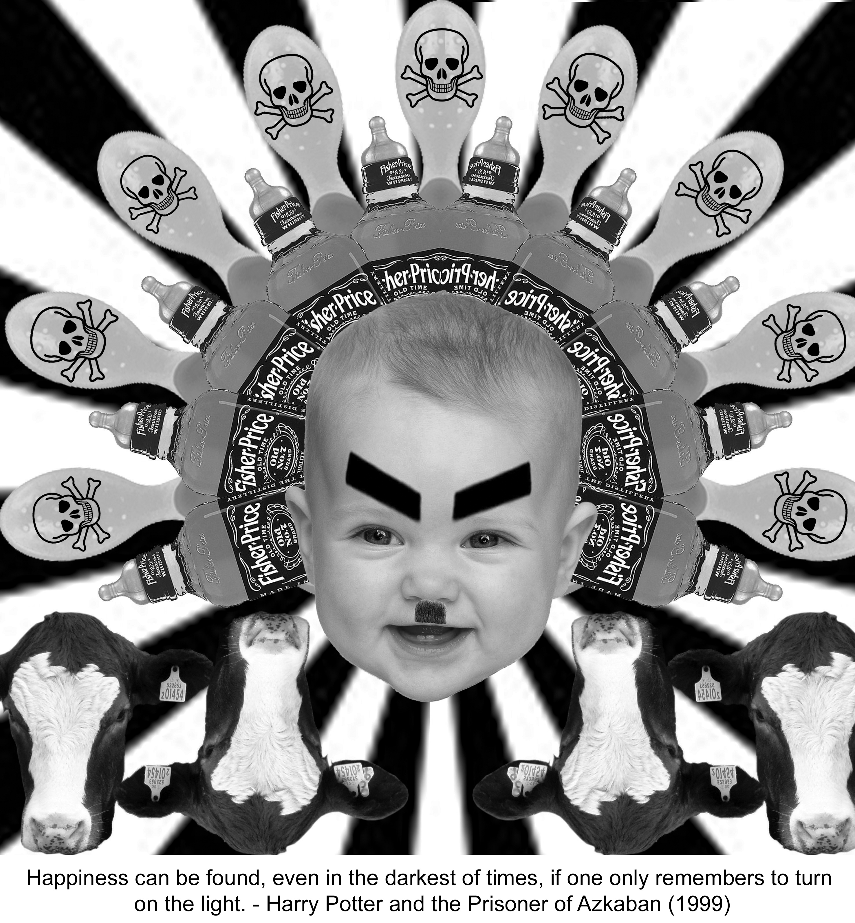
Quote 1) “Happiness can be found, even in the darkest of times, if one only remembers to turn on the light.”

Keywords: 
Happiness -> babies , things that make babies happy
Darkest of times -> evil Hitler baby , poison
Turn on the light -> Sun
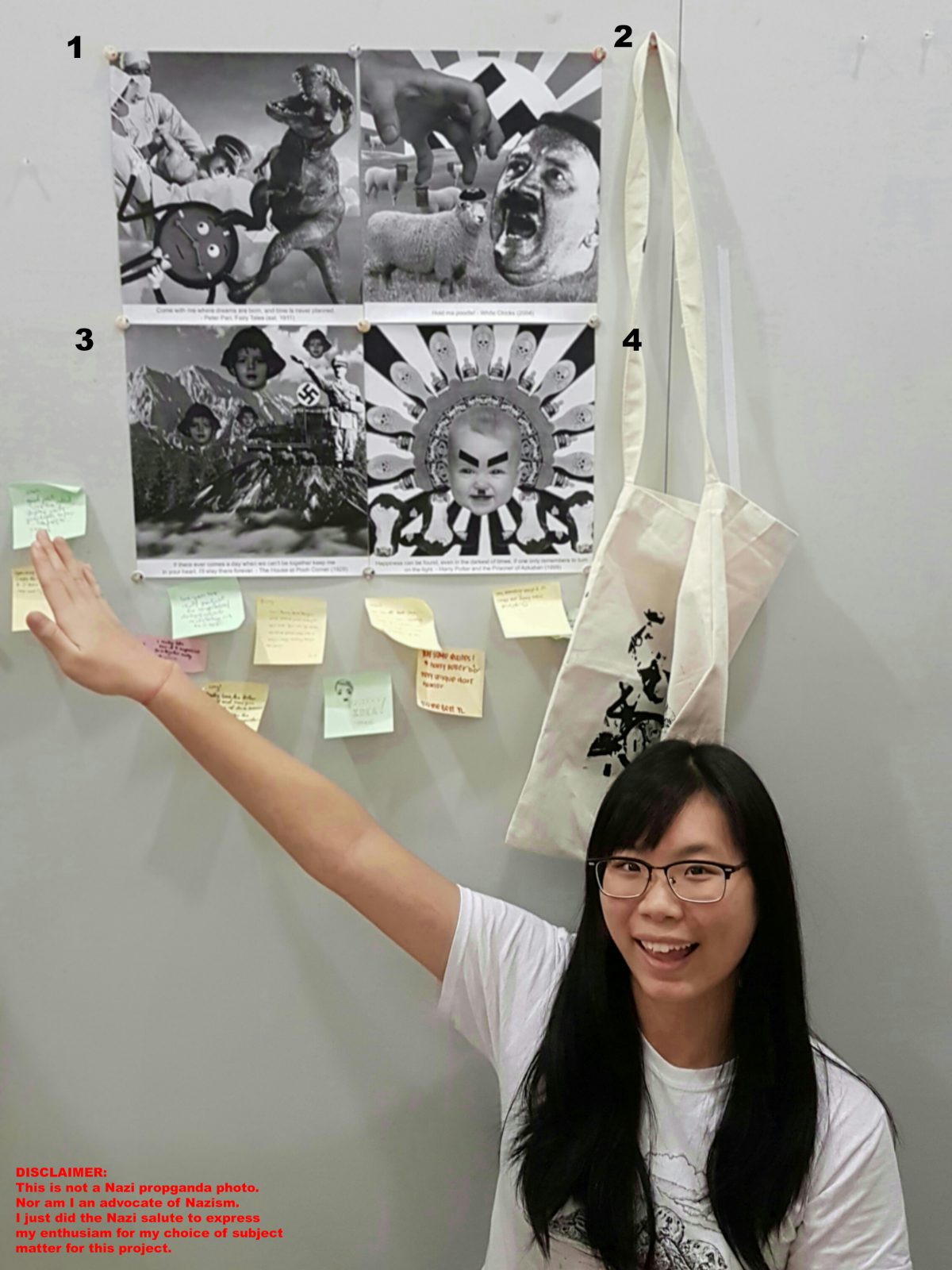
ay201617_fdn2d_g05_sengyiling_project2_4
Principles of elements and design: Lines, Repetition and Symmetrical Balance.
LINES from the sun rays in the background creates a radiating effect from the center of the image, to create a form of radial symmetry.
REPETITION of the items (bottles, spoons, cows etc.) in a spread out manner, using the rays of sun as guideline creates a sense of SYMMETRICAL BALANCE as the Baby Hitler acts as the central axis of this symmetry.
My Interpretation: Baby Hitler’s death could have been easily staged earlier to prevent a chaos, by poisoning (hence the poison sign on the spoons) the things baby Hitler would have loved. Such as adding alcohol to his milk, feeding poison to him in his baby food. Hence, Hitler’s death is a form of happiness to his victims.

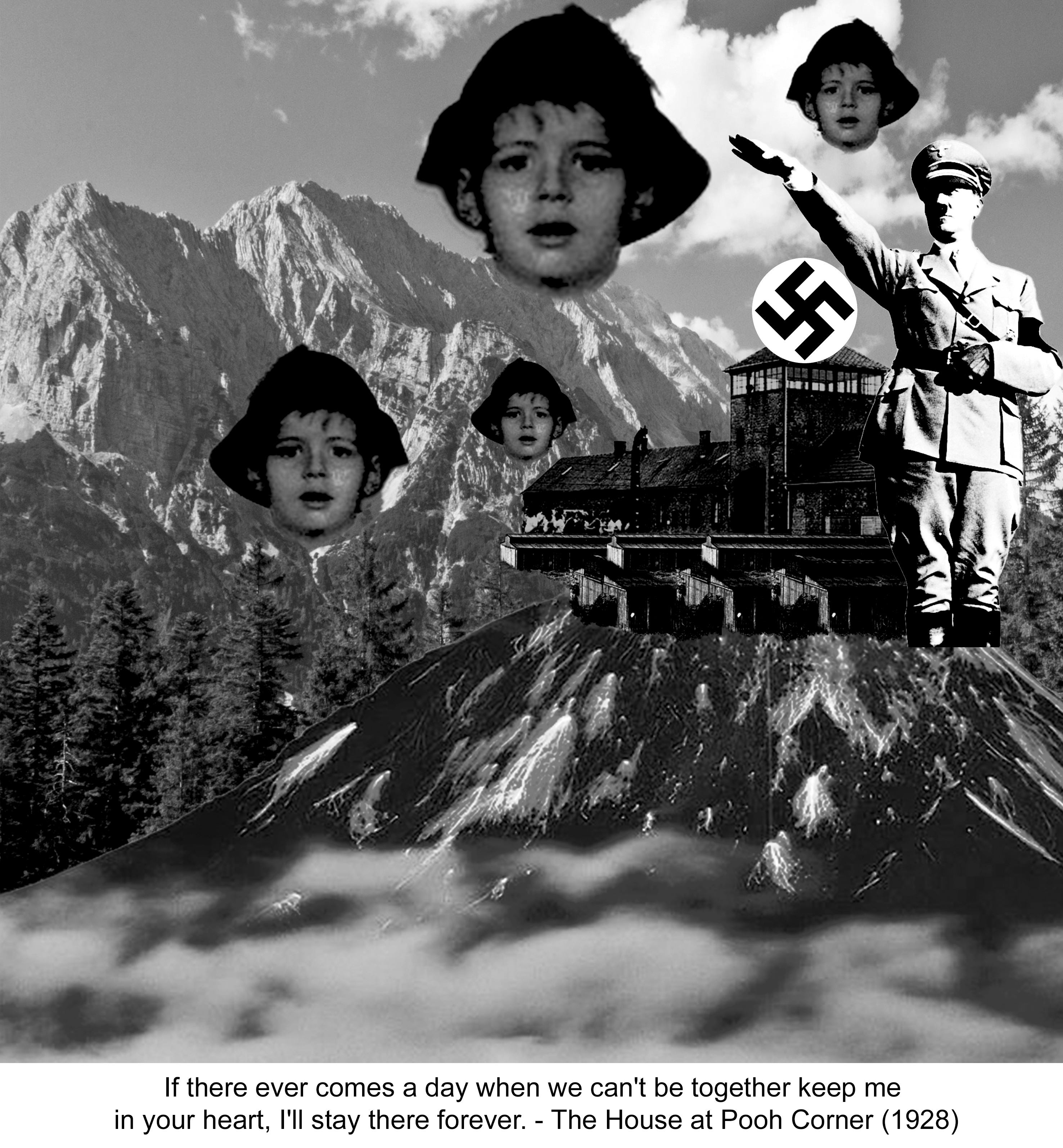
Quote 2) “If there ever comes a day when we can’t be together keep me in your heart, I’ll stay there forever.”

Keywords 

Can’t be together-> distance and separation

Heart -> warmth in cold , maternal love, child

Stay there forever-> longing
 ay201617_fdn2d_g05_sengyiling_project2_3
Principles of elements and design: Scale, Repetition and Lines.
REPETITION of Jewish boy’s head in varying SCALE. There is slight use of implied lines created by the direction at which Hitler’s salute is directing our eyes to : Boy’s head.
My interpretation: This quote can be used in the situation where the Jewish mother is going to be executed while her son is being sent off to the concentration camps during the Holocaust. The use of the Jewish boy’s head in the background is to represent that, although he is held captive in the camp, his mind and spirit is elsewhere and not brainwashed by Hitler’s idealogy .

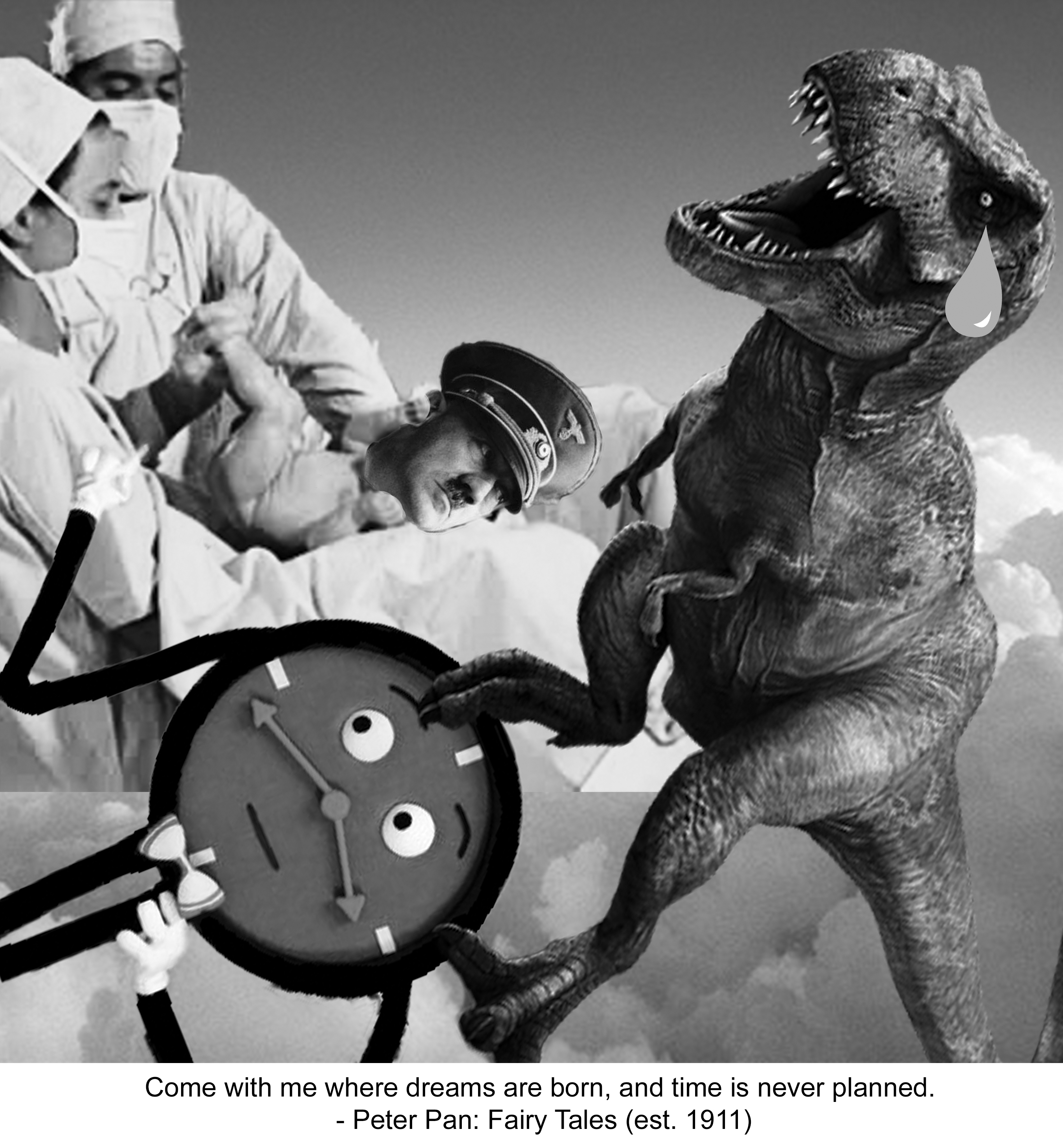
Quote 3) “Hold Ma Poodle!”
Keywords: 
Hold->grabbing
Poodle-> fluffy ->Sheeps
 zxcvbnmasdfghj
Since this quote had lesser keywords, I got feelings emulated in this quote instead, which is Agression.
Principles of elements and design: Scale, Repetition and Balance.
REPETITION of sheep with Mein Kampf books on their faces. SCALE of hand and Hitler’s face is much larger than the sheep. ASSYMETRICAL BALANCE is attempted as I tried to balance the visual weight of Hitler’s head on the right with the hand and Jewish Sheep on the left.
My interpretation: Mein Kampf is an autobiography by the National Socialist leader Adolf Hitler, in which he outlines his political ideology and future plans for Germany. And I pasted the book all over the sheeps’ face as I wanted to imply that the innocent sheep in the meadow were being brainwashed by Hitler’s ideologies. The sheep in the foreground is the only one without the Mein Kampf book as a face, instead it has a Kippah (Jewish cap), a representation that the innocent sheep is a Jew.
The hand is about to grab the Jewish sheep to be fed into Hitler’s mouth, a metaphor for the sheep that is about to be killed by Hitler, or brainwashed to be like the rest of the sheep. The aggression of the quote is carried out into action in this image.

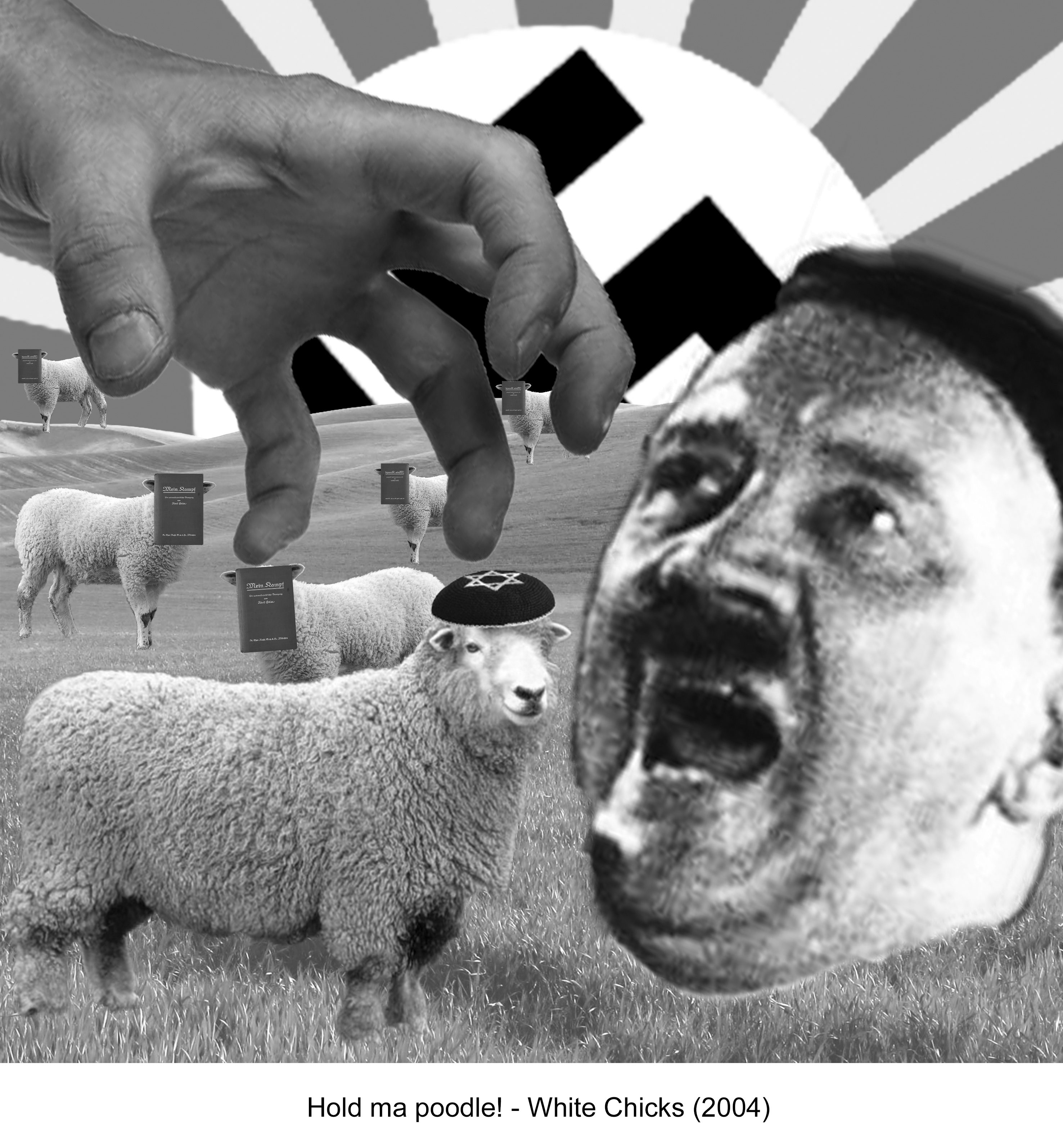
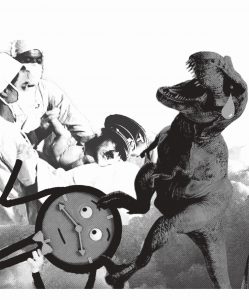
Quote 4) “Come with me where dreams are born, and time is never planned.”

Keywords: 
Dreams->Clouds, Hitler
Born -> Giving Birth -> Beginning of time -> Dinosaur
Time-> Clock
Never planned ->Unexpectedness -> Impromptu birth?
 ay201617_fdn2d_g05_sengyiling_project2_1
Principles of elements and design: Scale, Repetition and Balance.
SCALE of Doctors against the Dinosaur. ASSYMETRICAL BALANCE is attempted as I tried to balance the visual weight of Dinosaur on the right with the doctors and clock on the left.
My interpretation: The dinosaur ( beginning of time = to imply birth of Hitler was a long time ago)  gave birth to baby Hitler, not knowing that it also gave birth to “Time” unexpectedly. “Time” is the antagonist from the mini web series: Don’t hug me I’m scared, on YouTube. Hence, implying that the birth of Hitler long time ago was the unexpected birth of an antagonist.

After looking at my concepts and final images, I decide to rearrange the sequence of my quotes. After looking through my final pieces, I felt that the images kind of convey a sequential story of the Hitler I portrayed.
Sequence is as followed.

Sequence is as followed.

Birth of Hitler > Rise of Nazism and mass murder/ conversion of Jews> Jews kept in concentration camps > How Hitler’s act of terror could have been prevented by an early death.

My Inspirations
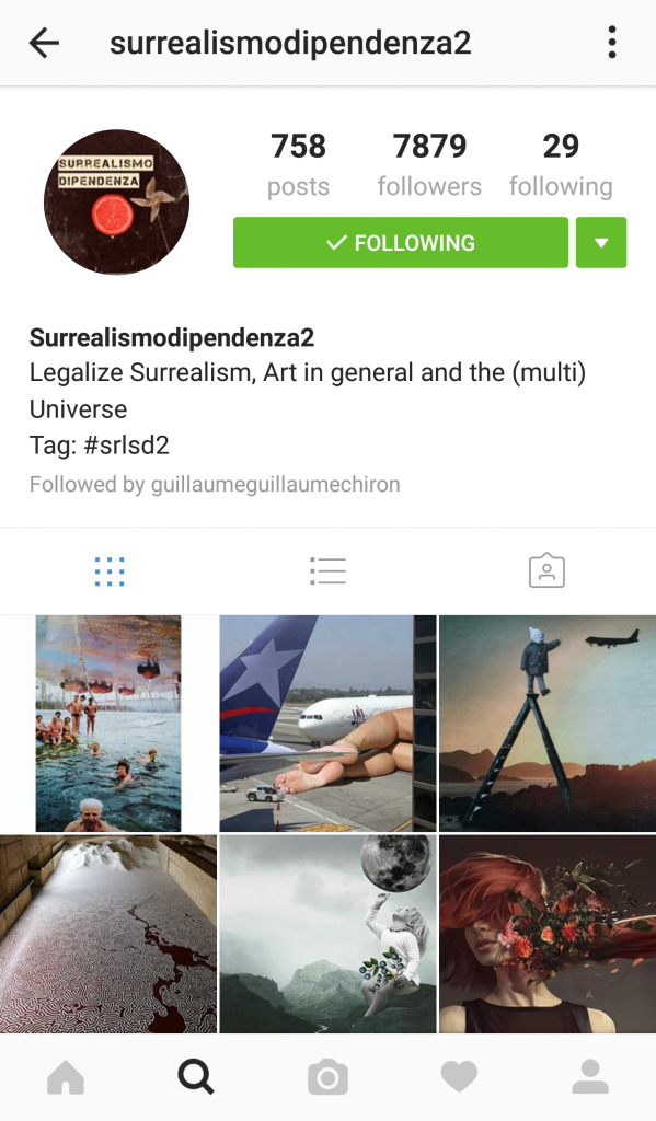
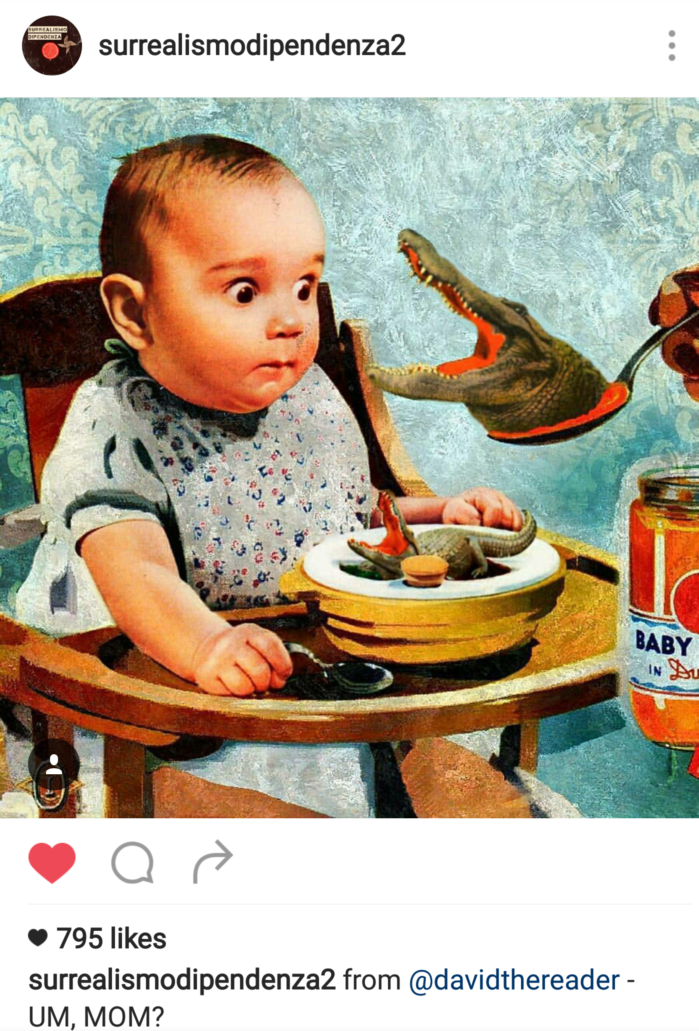
  • I followed an Instagram account which posted a variety of creations by surrealistic artists, which gave me ideas on the choice of subjects and how I might want to compile the images together.
Instagram account where I drew my surrealism inspiration and ideas from.

Instagram account where I drew my surrealism inspiration and ideas from.

20161015_210538
  • I also used photo collage most of the time, inspired by Hannah Hoch’s photo collaging and John Hartfield’s form of photo montage. (link to my research on both artists :  https://oss.adm.ntu.edu.sg/yseng001/2d-project-2-for…rch-17-sept-2016/ )
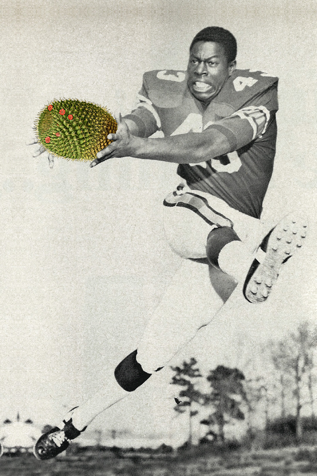
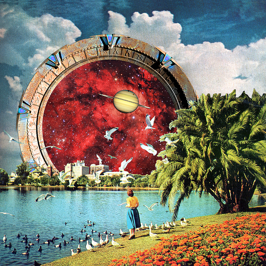
  • I was truly enamored by Eugenia Loli ‘s compositions as she is very creative and imaginative in how she placed her subject matters and objects. Her compositions spurred me to be more imaginative and look at everyday objects differently.

Raw Deal Stargate Installation


Inner struggles through Project 2:

  • I had a hard time finding images I sought for which are in high quality 300dpi. The use of Adobe Photoshop and Adobe Illustrator was a huge headache for me when I first started as I had to learn from trial and error on how to configure the programs. The frequency of bitmap and tonal contrast was difficult to grasp as well as I was not sure how my design will look like upon silk screening. Sadly, in the end the design on my tote bag was not very well produced as I expected it to.:(
  • I really disliked how much water was wasted in the process of silk screen washing 🙁

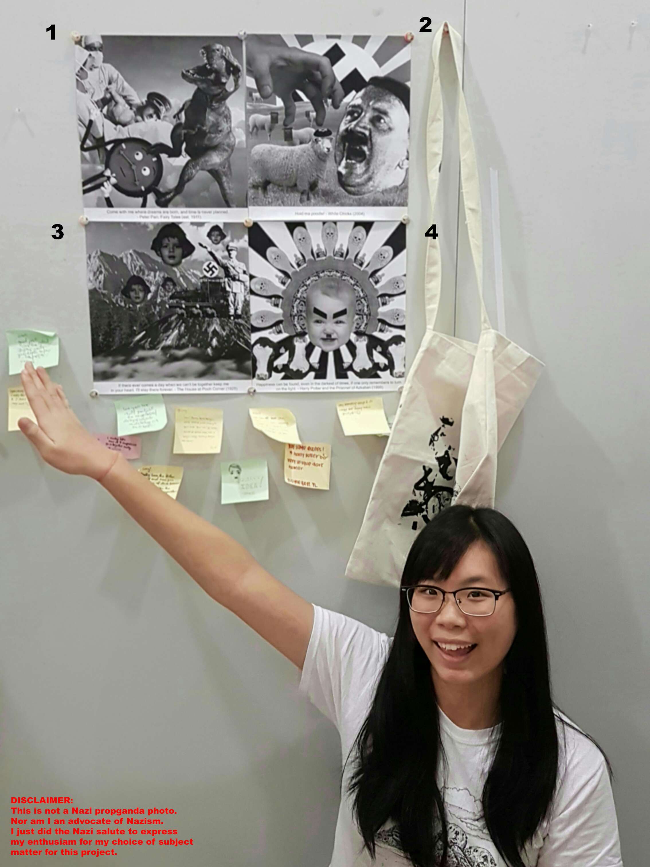
Presentation Day Comments!

asdfghgfdsgfdf


Ms. Joy’s comment/feedback:

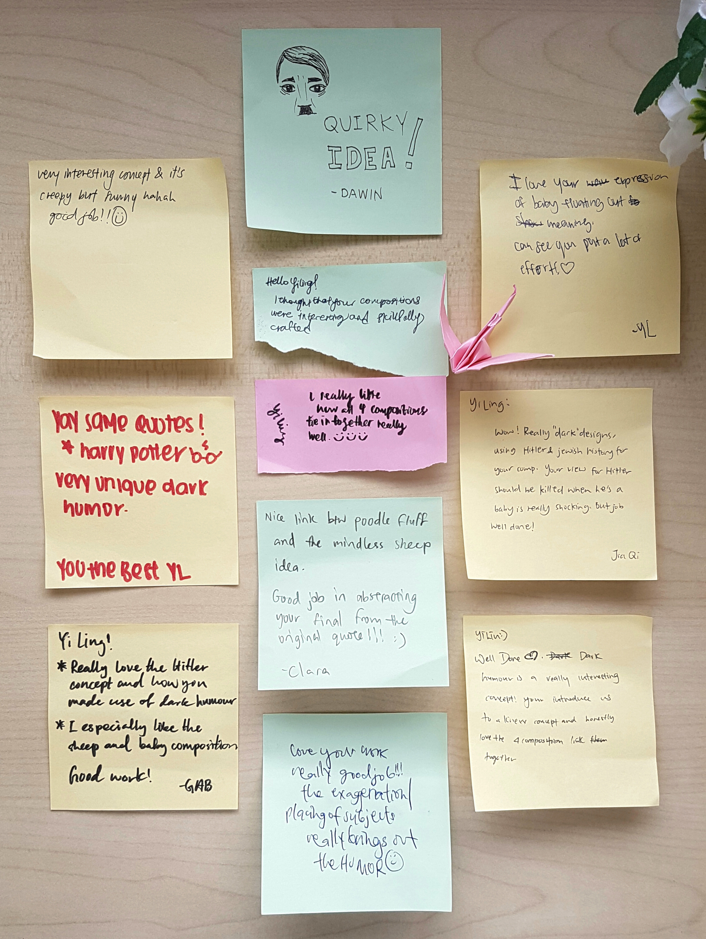
I cant remember 100% of what Ms. Joy said, but the gist of the good things she said about my Project 2 was that she liked how I used the elements and principles of design in my work to direct the viewer’s attention to areas I wanted to focus on, and the use of dark humor with the reoccurring motif of Hitler in my various warm and fuzzy quotes were well played.

Whereas things to improve on is that the 2nd composition was a rather confusing as the visual weight of the hand and Hitler’s head are very similar, hence it was rather confusing if the hand was grabbing Hitler or the Jewish sheep as, Hitler’s facial expression looked scared. Joy also suggested that maybe averting the gaze of Hitler could assist in my composition to make Hitler look less afraid of the hand. 🙂

Regarding my silkscreened tote bag, we both agreed that the silkscreen pay off was not that good and that perhaps in the future I can have more opportunity to silkscreen again, and perhaps exposing my screen for a longer time will result in a better print! 😀

Thank you Ms. Joy and my lovely classmates for your feedback and comments!!embarassed To be honest, my favorite part for presentation day is getting the post-it notes from my classmates, and obtaining feedback. For some unknown reason it makes me feel very excited! ^0^

Nonetheless, I had a really great experience with this project as I managed to use the principals of elements and design to create the design I wanted and then having to print them onto a tote bag! Having my design to be printed onto a product gave me a sense of achievement and a more tangible feeling of being a real designer. embarassed

Cheers!

Seng Yi Ling

SILK SCREENING

It was my very first time at silk-screening on the previous week and I had trouble conceptualizing the process because I simply couldn’t fathom how our printed designs on TRANSPARENT PLASTIC (Correct term: Transparency Paper) could be translated onto printed designs on tote bag while using this sieve looking tool (Correct term: Silk Screening frame).

I had to see and have hands-on experience to believe this amazing invention created by mankind!

Firstly we were told to wash our silk screen frames and use a hair dryer to blow dry them, to ensure they were clean!

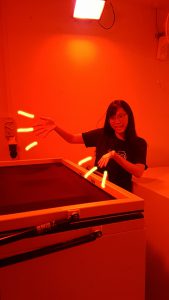
Then we went into this enclosed red room ( Red light was present) where NO LIGHT was allowed to be present as there might be some chemical reaction with the medium we were going to use. We then coated the netting of our frames on the back and front using the blue paint-like medium and then placing our coated frames in this GIAGANTIC oven (It had really smooth rolling trays…) to dry the medium !

After which we were taught by Xiuming (Work-study senior) to place our transparency and frame into this GIGANTIC MACHINE which looked like a photocopy machine on the outside, but had like reflective metal on the inside which made it look like a tanning machine. After which we locked our designs in the machine, it made a whirring sound and the cloth above our designs was like sucked in!!! I was super amused at this point because I had never seen anything like this before!

The Photocopy looking machine which printed our designs onto the silk screen frame surface :)

The Photocopy looking machine which printed our designs onto the silk screen frame surface 🙂

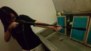
After which the machine did it’s job, we took our designs to the back of the room to wash the residue off using this jet spray (It was fun… pretending that the jet spray was a rifle cool)! But in all honesty, I was rather upset at the amount of water wasted in this process of washing… considering that all of the students in ADM Year 1 had to do this, it is bad for the environment by wasting so much water. :'(

This jet spray allows the residue to be forced out of the net!

This jet spray allows the residue to be forced out of the net!

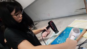
After cleaning up our designs on the frames, we used the hairdryer to dry the frame and apply a layer of thick ink over the top of our frame and pushed the ink across the designs using a wiper tool to ‘print’ our designs onto our tote bag!

Drying the design

Drying the design

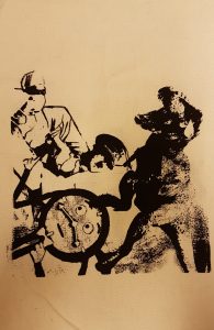
I wasn’t very please with the eventual outcome on the tote bag as some areas were too dark and splotchy instead of greyish, and details were missed out… As you can see it is pretty in-identical to my digital design.

After test runs on paper, the final design has been printed on my totebag!

After test runs on paper, the final design has been printed on my tote bag!

Original digital design after bitmap<<<Original digital design after bitmap

What I regretted the most after the final printing onto my tote bag was not being able to have a good gauge of what my final print will look like based on the tonal contrast, quality of the digital image and frequency of the dots in bitmap, BEFORE printing on the transparency paper … I hope that in the future I can have more opportunity to try out silk screening again. It was really fun! But at the same time, the process of silk screening was not easy at all; and I really do commend those who could do it so well! laughing

If my personal experience with silk screening is not detailed enough, do check out this video on how silk screening is conducted!!

Cheers!

Seng Yi Ling cool

NEW PROJECT IS HERE!!

Our second project for 2D foundation class is called ‘Forrest Gump’! So let me start my research before we dive right into the course work!

Project Brief:

Create a visual narrative that expresses each movie quote of your choice using only symbols, pictograms, dingbats(ornaments), icons and engravings as your visual vocabulary.

The old engraving imagery puts the composition into historical context. You are to manipulate, alter and deconstruct the found graphic imagery to transcend its original meaning through the creation of the indicated narratives. Pay particular attention to the application of design principles to create visually engaging compositions.


~~~~~~~~~~~~~~~~~~~~~~~~~~~~~~~~~~~~~~~~~~~~~~~~~~~~~~

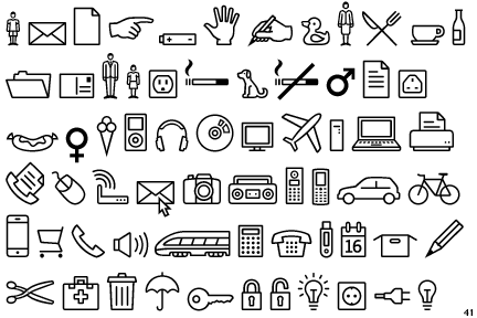
Symbols:

symbol-signs-the-ministry-of-type

A mark that is universally recognized to represent an object, action or situation.

Pictograms:

piccc

Pictograms are pictorial symbols for a word or phrase. Pictographs were used as the earliest known form of writing, examples having been discovered in Egypt and Mesopotamia from before 3000 BC.

image

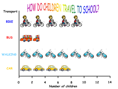
Pictograms are also used as pictorial representation of statistics on a chart, graph, or computer screen.

Dingbats:

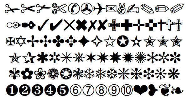
A dingbat is an ornament (used for decoration/embellishment), character, or spacer used in typesetting (composition of texts), often employed for the creation of box frames.

BlueGobletOrnaments

The term continues to be used in the computer industry to describe typeface that have symbols and shapes in the positions designated for alphabetical or numeric characters.

Dingbats2StrongForms dingbats-hero_image

In summary, I understand Dingbats as a form of ornamental embellishment OR symbols or shape that acts as a semiotic. (Correct me if I am wrong surprised)

Icons:

b_1279429335264

Icon has a physical resemblance to the signified, the symbol being represented and is usually a pictorial representation.

Engravings:

800px-2008-engraving

$_32

Engraving is putting a design onto a hard, flat surface (stone, wood, metal etc.), by carving into it resulting in a decorative piece.

958405b42008a8f67267a4eb1f60579b

Or may provide a printing plate of copper or another metal, for printing images on paper which are also called engravings.

~~~~~~~~~~~~~~~~~~~~~~~~~~~~~~~~~~~~~~~~~~~~~~~~~~~~~

More research will be done on my visual journal starting from this project onwards (I hope), and I will be uploading images of my journal in the furure!

Cheers,

Seng Yi Ling~smile

Before I dive into the project, some research and reference artists required to get my creative factory to start its engine~ But as of now, I am pretty uncertain about this project because it is rather abstract and lots of limitless imagination is required which I am rather worried about. ( Sounds familiar to my Project 1 woes…) And because I am a technology caveman, I predict that I going to have a hard time using the Adobe Photoshop and Illustrator. :'( Wish me luck~!

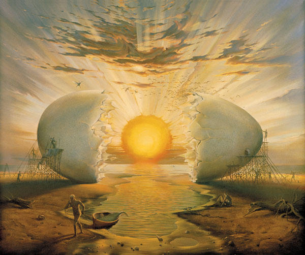
Surrealism

Surrealism is a 20th-century avant-garde movement in art and literature which sought to release the creative potential of the unconscious mind by using irrational juxtaposition of images.

surreal-painting-vladimir-kush%2017 6354760-r3l8t8d-800-18

To my understanding, surrealism is to create meaningful images that are illogically possible in reality.

DADAISM

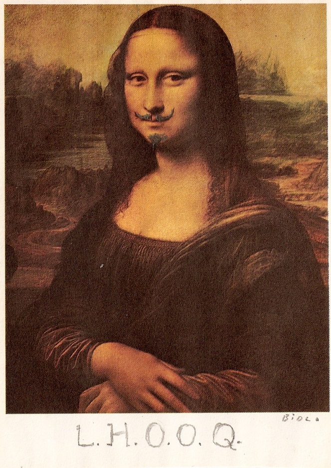
Dada was an art movement of the European avant-garde in the early 20th century. The beginnings of Dada correspond to the outbreak of WWI. And the movement was a protest against the bourgeois nationalist and colonist interests, which many Dadaists believed were the root cause of the war.

f319679309841_560cc247eafab

Many Dadaists believed that the ‘reason’ and ‘logic’ of bourgeois capitalist society had led people into war. Hence they expressed their rejection of that ideology in artistic expression by embracing chaos and irrationality. Dada was not art: it was “anti-art”. Dada represented the opposite of everything which traditional art stood for.

duchamp

Based on my own understanding, Dadaism is ‘Anti-art’. It’s purpose is to reject any logical and reasonable thinking, going against whatever traditional art stood for. It seemed like a mass rebellion against traditional art. Fighting Art with Anti-art.

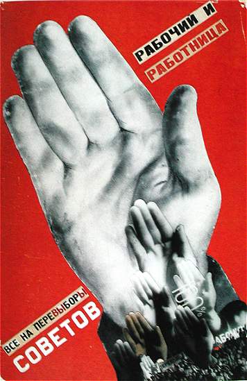
Russian Constructivism

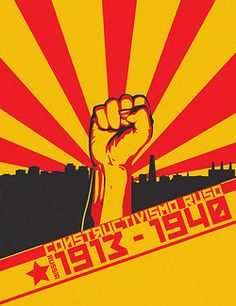
Russian Constructivists had the intention to reinvent art and reconstruct art from level 0. Constructivism was primarily an art and architectural movement. It rejected the idea of art for arts’ sake and the traditional bourgeois class of society to which previous art had been catered. Practicality with beauty was the main thrust behind the constructivists.

manwithmoviecam

Instead it favored art as a practice directed towards social change or that would serve a social purpose and be practical in its nature. Developing after World War I, the movement sought to push people to rebuild society in a Utopian model rather than the one that had led to the war. Art, music, architecture etc. were influenced by constructivism. 

gustavklutsis-workers-everyone-must-vote-in-the-election-of-soviets-1930

Based on my observation, I realize that Russian Constructivism has minimal colors in its artworks. Variety is added by using basic element of design such as contrast of color and lines.

3337399f88d431c79e56c0820f82db31

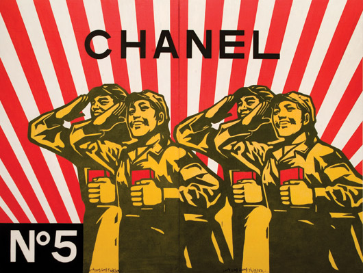
Chinese Political Pop art by Wang Guang Yi’s Great Criticism Series instantly came to my mind when I searched for ‘Russian Constructivism’.

tumblr_nefs07nzif1r29uz6o1_540

Artwork by Wang Guang Yi

As you can see, there are some forms of similarity such as red is the dominant color, and use of lines draws the viewer’s attention to an area of focus.

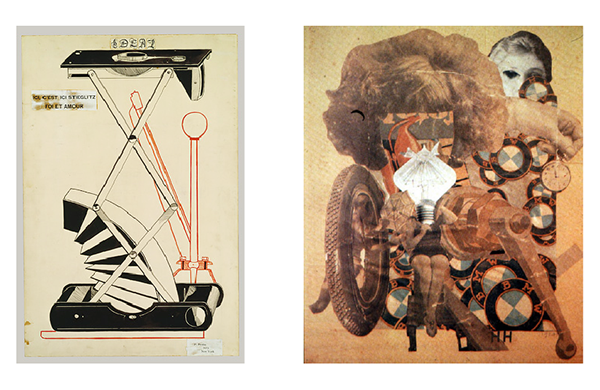
Hannah Hoch

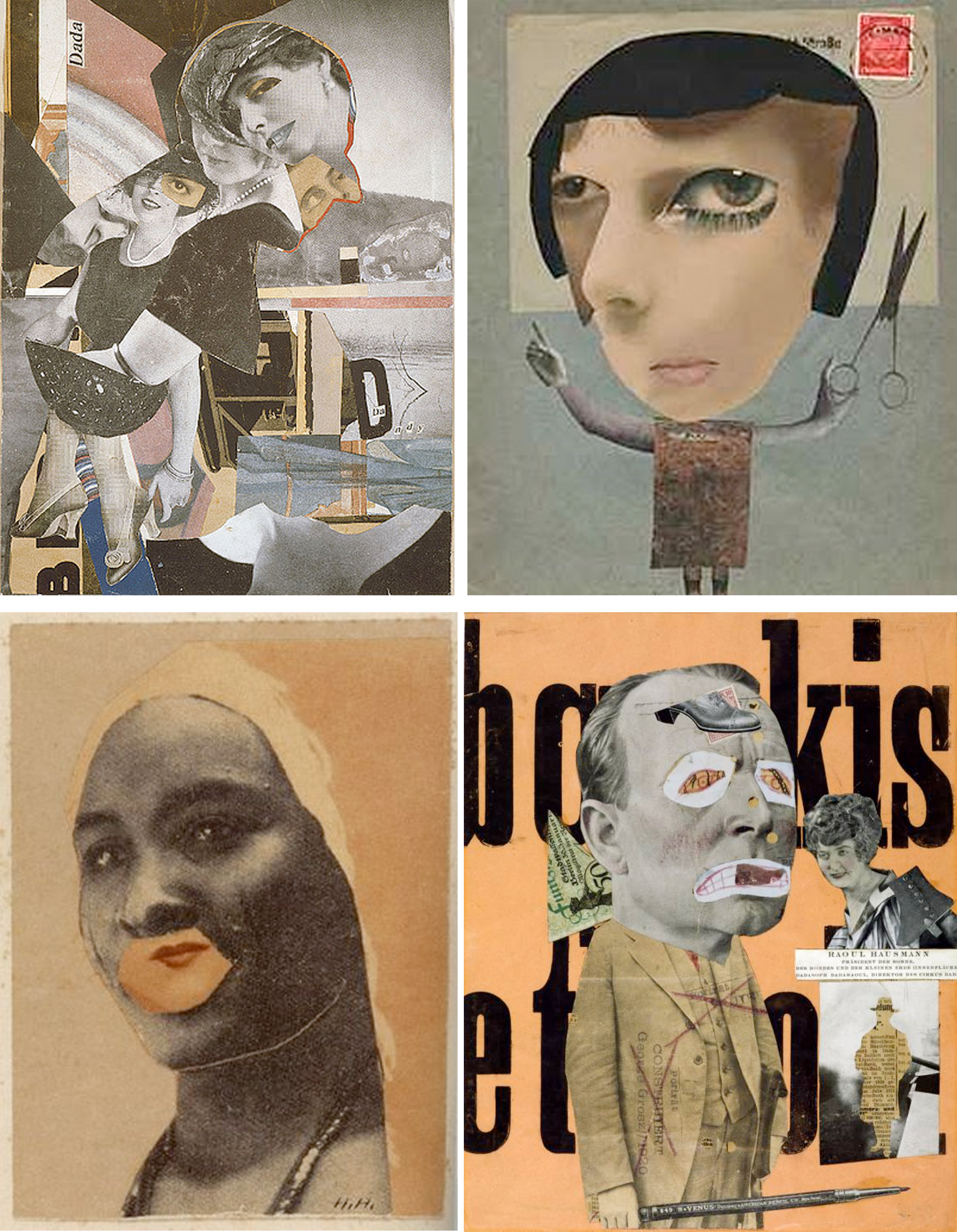
At first glance into her works, . I assumed she was a modern artist initially as Hoch’s work seemed timeless and is applicable to the present times.

hannah-hoch

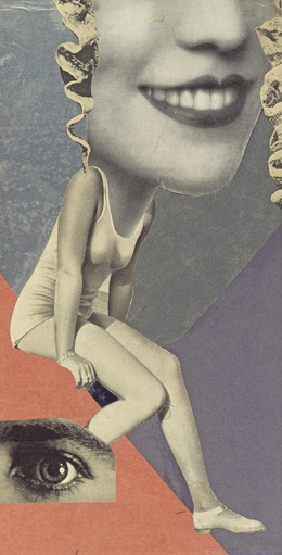
Hannah Hoch was an important member of the Berlin Dada movement and a pioneer in collage and was one of the originators of Photomontage. She also consciously promoted the idea of women working creatively more generally in society. She explicitly addressed in her pioneering artwork in the form of photomontage the issue of gender and the figure of woman in modern society

tall

Surrealism and Dadaism seems to be heavily involved in her works. The effect of her work is initially one of visual confusion, and yet a kind of nonsense-narrative begins to develop. To me, she is like Picasso who used magazine cutouts to create collages instead of paint!

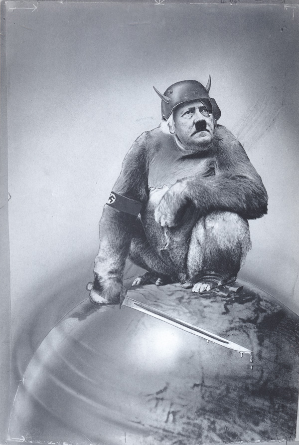
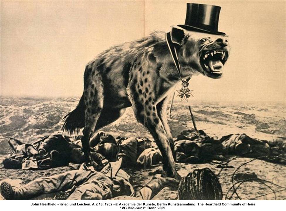
John Heartfield

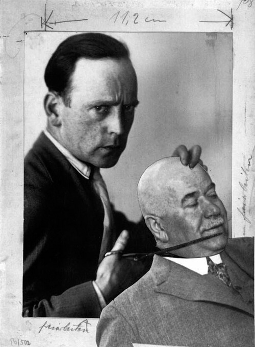
John Heartfield was a pioneer of modern photomontage. Working in Germany and Czechoslovakia between the two world wars, he developed a unique method of appropriating and reusing photographs to powerful political effect. The process of cutting and pasting together elements to form a brilliant cohesive image became the foundation of Heartfield art.

yet-it-moves

To compose his works, he chose recognizable press photographs of politicians or events from the mainstream illustrated press. He then disassembled and rearranged these images to radically alter their meaning.

15johnheartfieldkriegundleichenHeartfield’s strongest work used variations of scale and stark juxtapositions to activate his already gruesome photo-fragments. The result could have a frightening visual impact.
john_heartfield

I felt that Heartfield’s work are rather heartfelt as his ‘Anti-Nazi’ and ‘Anti-politics’ works held significant meaning behind the photomontage of satirical humor.

~~~~~~~~~~~~~~~~~~~~~~~~~~~~~~~~~~~~~~~~~~~~~~~~~~~~~~

From this round of research, I am inspired by a few concepts and methodology of artists, which I may use for this project:

  1. Basic Principles and Elements of Design can help direct the viewer’s attention to an area I want to focus on, AND to emphasize on a certain intention.
  2. Stray away from conventional traditional art mindsets, focus on the idea you want to bring out instead of the aesthetics. UNLEASH YOUR IRRATIONAL UNCONSCIOUS MIND~ RELEASE THE KRAKEN!!
  3. Create nonsense-narrative
  4. Use recognizable images
  5.  Vary scale of object and create stark juxtapositions

Cheers~

Seng Yi Ling.

Assignment 3: Morphogenetic Construction

For assignment 3, we will explore the relationship of the unit and how unitary elements operate as cellular building blocks towards the growth of complex organic structures.

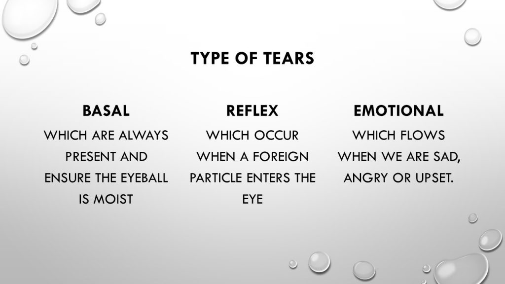
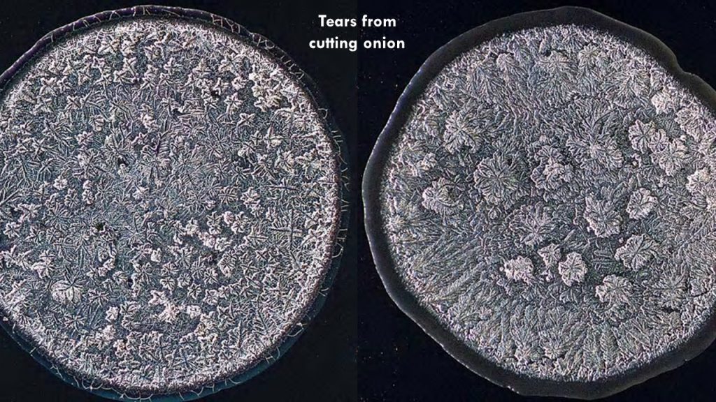
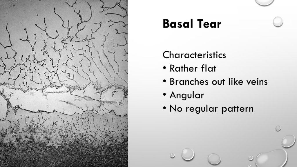
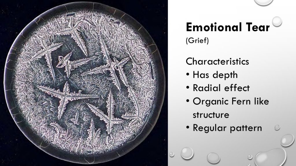
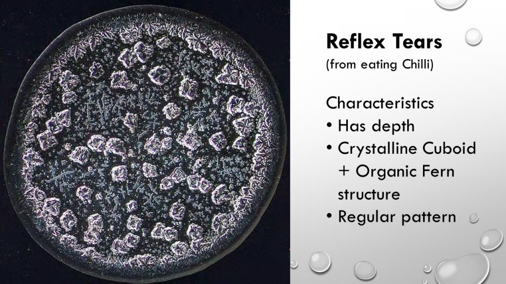
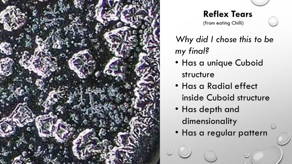
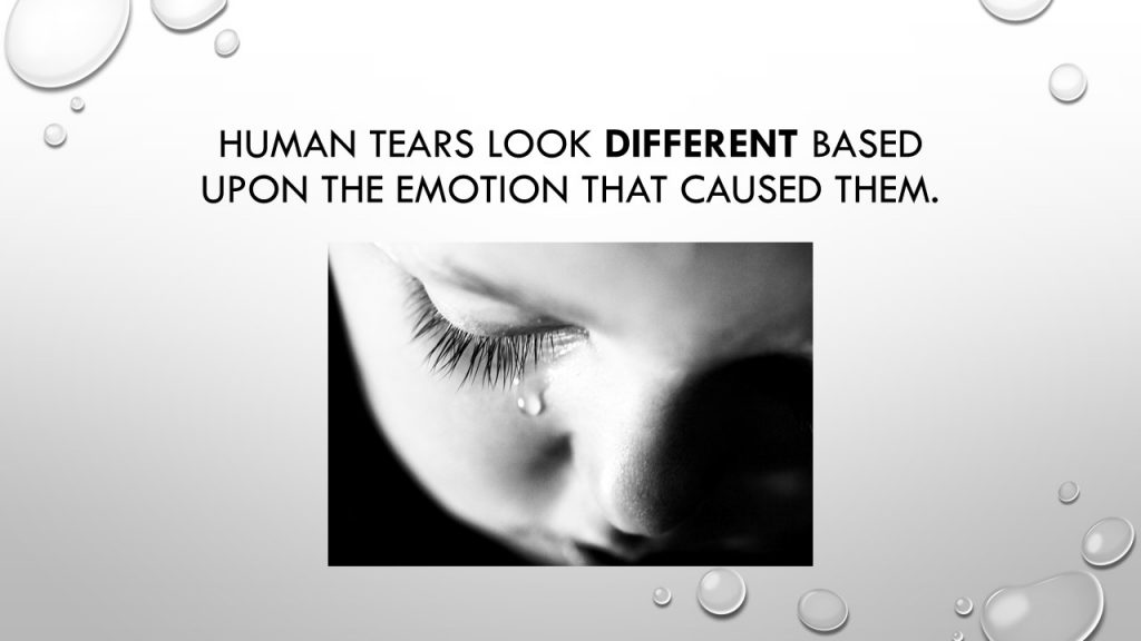
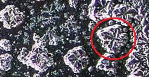
For our individual research and analysis, I have decided to go with the SEM of Tears where we did a PowerPoint presentation slide!

slide1 slide2 slide3 slide5 slide6 slide7 slide8 slide9 slide10 slide11 slide12And the video which failed to play during presentation entails the tear extraction process by the creator of these SEM and how the crystallization is formed:
https://www.youtube.com/watch?v=uvDNVE3_A5Y


Construction of Model

So my initial idea was to create the units using egg cartons, but Mr. Peter suggested a better readymade/material can be used to recreate the units as the egg cartons did not really look like the units.

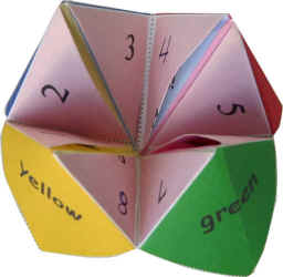
So after much brainstorming, I have decided to use the plastic used to create the previous assignment to create my childhood ‘Fortune telling paper’ toy, as the top view resembled the top view of the unit.

mfortuner-teller

The X in the middle resembled the unit of the image I wanted to recreate

teardwes

20161019_093953

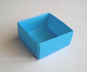
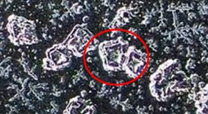
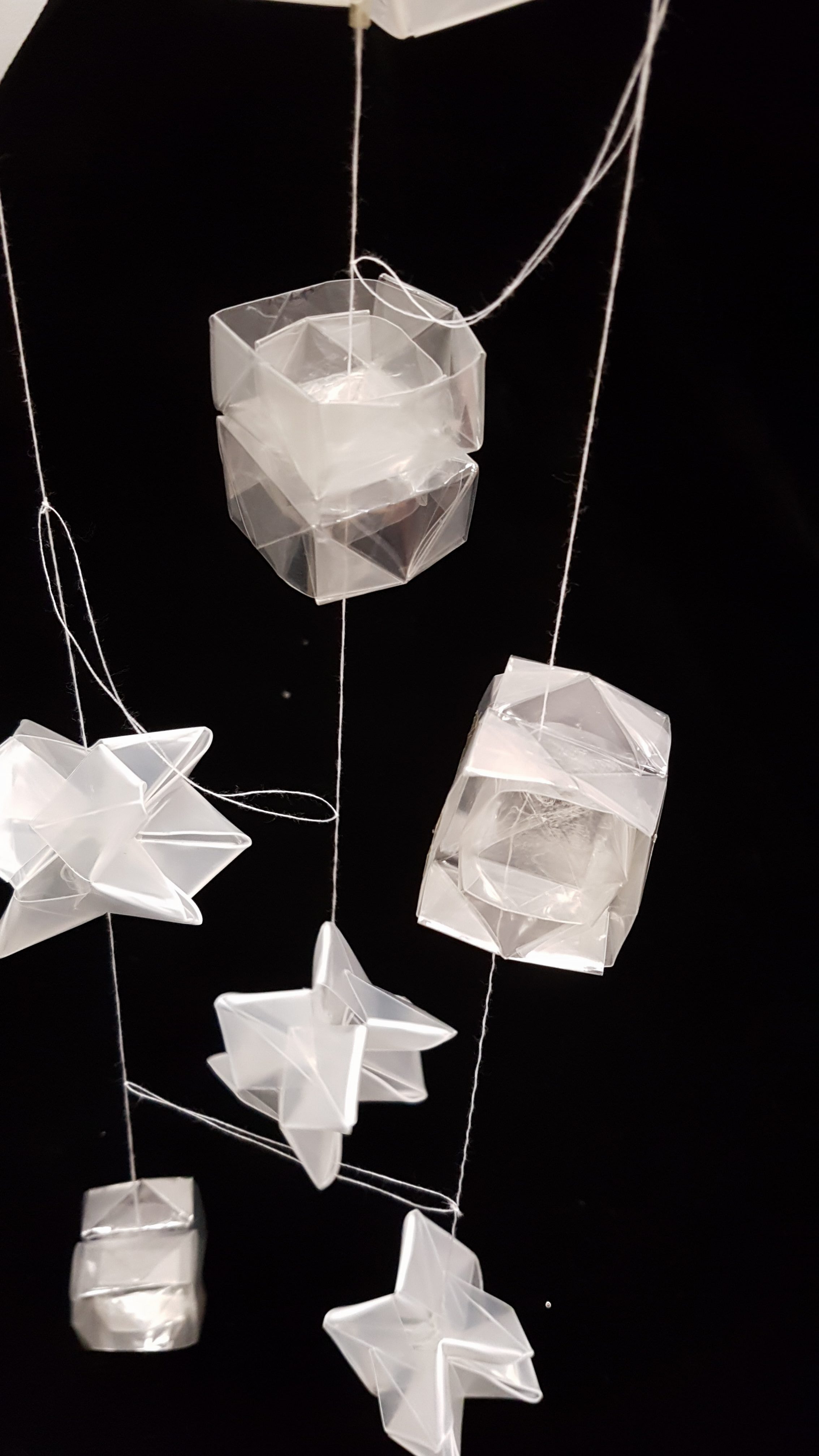
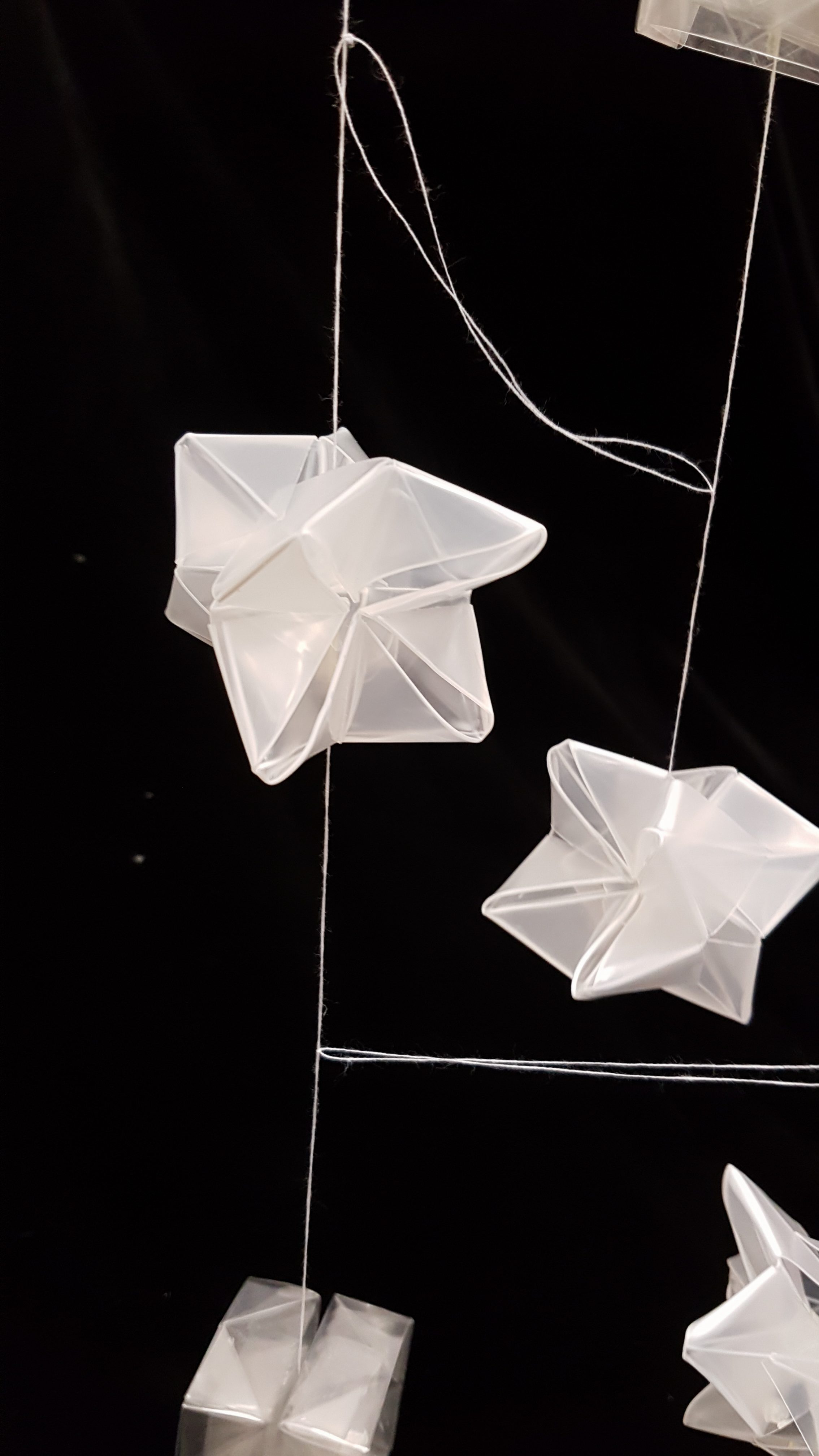
As the SEM of the reflex tears has different repetitive units, the second unit I have decided to go with using Transparency paper to create origami paper box to recreate this unit:

Origami box

Origami box

tears-asdfghjkjpg

By stacking a smaller box into a bigger box, I was able to create this structure.

20161019_094001

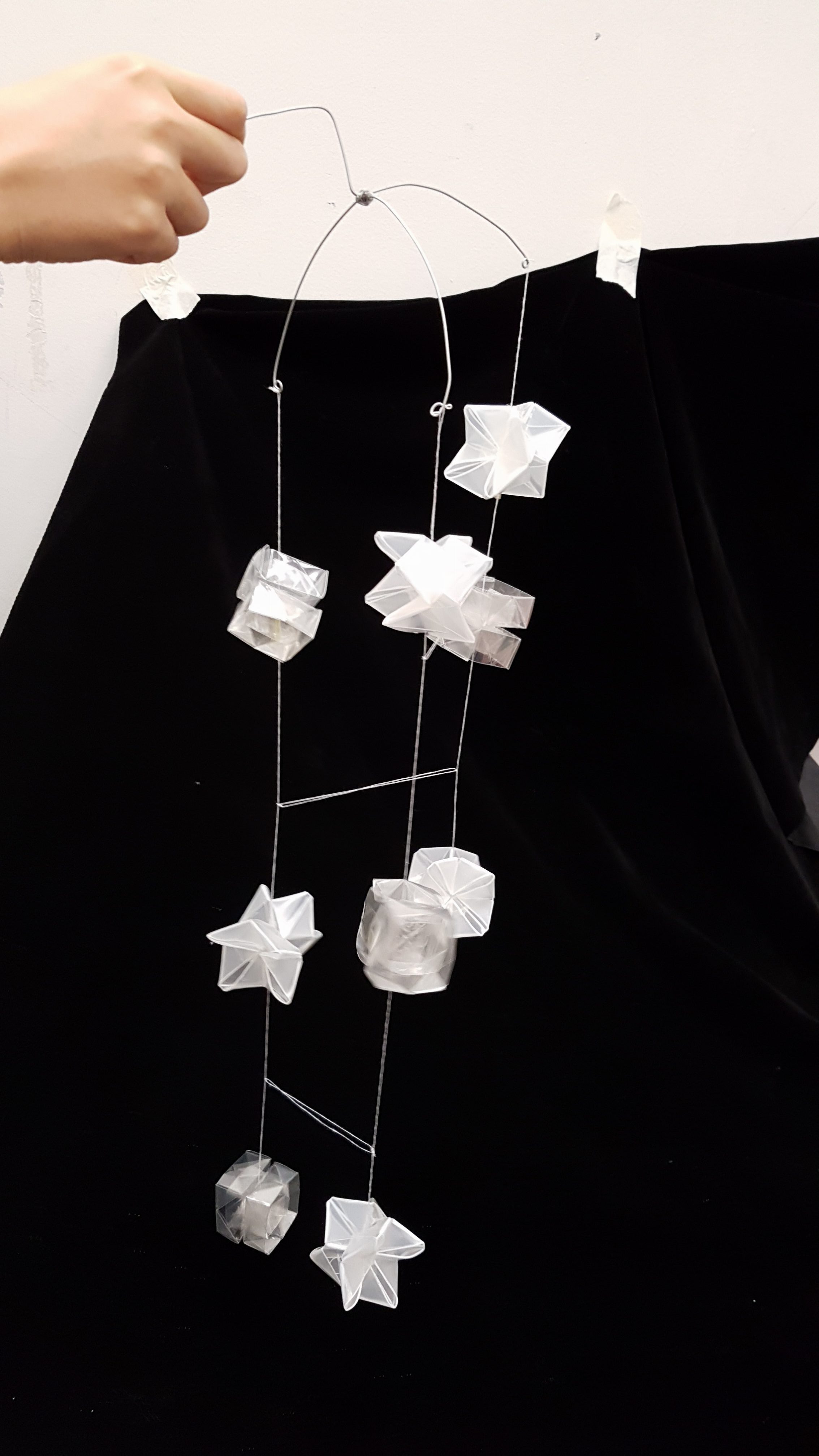
Using wires to create this frame, so that when I hang the units, the 3 Dimensionality is enhanced and they are more interactive and flowy. By adding strings across the strings, the units are more connected and flows rhythmically (like liquid), instead of giving an airy feeling.

20161019_094011

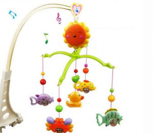
I was inspired by the baby toy to create the framework.baby-toys-for-0-12-months-hand-bed-crib-musical-hanging-rotate-bell-ring-rattle_jpg_350x350