More exploration of mark making! (23 Aug 2016)

20160825_092046

Mediums

20160825_092122

Tools for Monoprinting

New mediums and tools I tried out are white mono printing paint, Chinese calligraphy ink ; cardboard, kitchen towel, fake flower. My gut feeling for that day was the same as the previous self-exploration post! Just have fun and explore the possibilities of what each tool can do! 🙂

Chop chop

Used the cardboard with chopping motion to create curved lines.

Tried out Jackson Pollock's drip painting technique.

Tried out Jackson Pollock’s drip painting technique.

Tried out Jackson Pollock’s drip painting technique while I was literally jumping around the work area, hoping to generate some extravagant and expressive motions on the lino-cut.

P.S: The tool was very clean when I dipped it in the mono-printing ink.

BUBBLE BUBBLE BUBBLE POP

Gabrielle brought up the idea in the mono-printing room to use bubbles as a medium for our mark making, and many of us decide to give it a shot! Clara made a bubble blowing device by tying a rigid string into loops and lent it to me to experiment! (Thanks guys! ^~^)

The results were beautiful, but yet messy because the direction and size of bubbles are hard to control. In addition many of us who experimented with the bubble blowing techniques in the room ended up with black spots all over our faces when the bubble popped ! cool

~~~~~~~~~~~~~~~~~~~~~~~~~~~~~~~~~~~~~~~~~~~~~~~~~~~~~~

Brain-Storming Session (30 August 2016)

20160908_003943

I labeled each age range in a different colour and I’d realise that majority of my yellow stars lie in the Negative emotions category whereas my pink stars lie in the Positive Emotions category. This goes to show that more of my emotions has taken a downwards direction as I grew older.

After attempting with using my childhood item ( beads for braiding my hair) as a mark making tool in the previous post,

Childhoods beads

Childhoods beads

Short preview of the beads post

Rolling the beads down my newsprint paper.

I realised that something that had brought me joyful memories produces a mark that resembled something very distressful… I brought this problem I faced to group discussion where Miss Joy and my classmates gave me very insightful suggestions and I think I might really try them out to produce more emotive marks !
My classmates suggested to…
– Use the tools differently instead of sticking to the one way conventional method.
(For instance, rolling the entire paintbrush over my paper rather than simply using the brush tip.)
– Use the same method and same tools on different paper types.
– Inverse the colours. For instance, white marks on black paper instead of black marks on white paper.

Hence I decided to do more mark making explorations while trying out some of the suggestions given ! ^^

~~~~~~~~~~~~~~~~~~~~~~~~~~~~~~~~~~~~~~~~~~~~~~~~~~~~~~

Self Exploration into Mark Making (4 Sept 2016)

Was inspired by a few sceneries I spotted earlier that day which made me feel good, so I decided to recreate them to generate more ‘Positive Emotion’ marks.

Creating water blobs with water colour pen

Creating water blobs with water color pen inspired by rain on the window shield.

Decided to go ahead with my classmates’ suggestions of inversing the color and changing the choice of paper, and a few turned out pretty alright!

Dragging white water color paint over black vanguard sheet.

Dragging white water color paint over black vanguard sheet, to recreate the reflection of the sea at night.

Correction tape

Using correction tape as a medium

Thank you for reading through this extremely long post! The final post for ‘Project 1 : My line is Emo’ is coming to an end soon, so stay tuned for my last and final post on this project!! smile

Cheers,

Yi Ling.


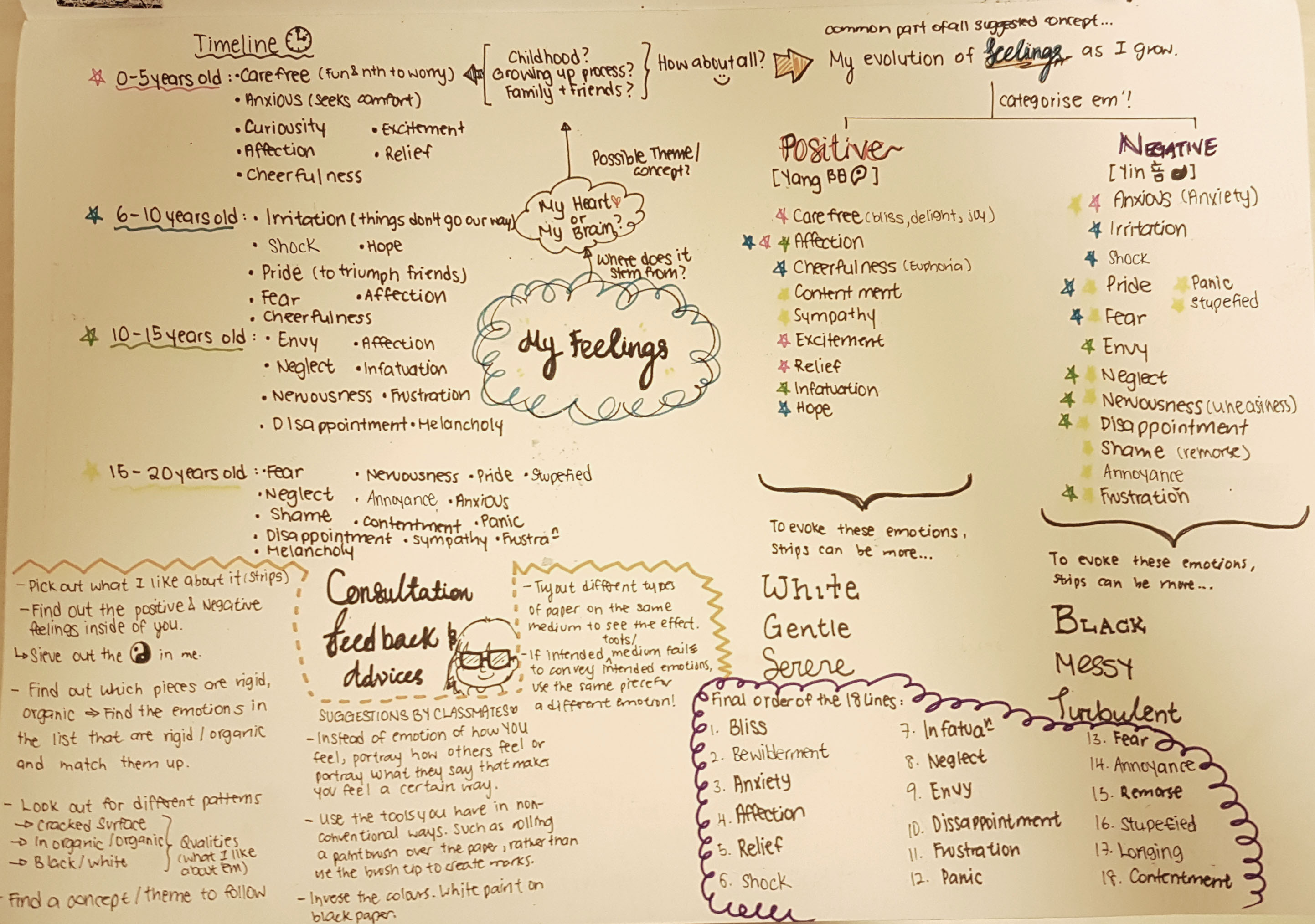
Place of significance: My Grandparent’s House

Q: Why does it make you feel the way you feel? Are there any particular features or qualities about the place that evoke those feelings? Is it people, the environment or a combination?

I like to feel safe and stick to the things I am used to and familiar with, because I already know nothing bad is going to get to me.

My grandmother is very similar to me when it comes to preference. We both like things of the past. So she tries to retain the way things were when she first moved in the HDB flat, and never buys something new or modern unless the new replica of the broken product cannot be found anymore. Hence, the place is very much like the way I was as a child as far as I could remember.

The non-slip mustard tiled grid floors, traditional Chinese tear-off calendar, wooden rice container etc. looked the way they were for my whole life. Being in my grandmother’s house makes me feel like a little girl again every time I visit.

It is a combination of both the people and the environment really, that evoke those feelings of nostalgia, safety and lots of love. My grandparent’s house will not be the same as it is without my grandmother nor the feeling will be the same if my grandmother is living in a totally different house. I felt that difference the most upon the passing of my grandfather. Hence, the emptiness portrayed in the photographs is evident in my photos.

Q: What would you like to share with us?

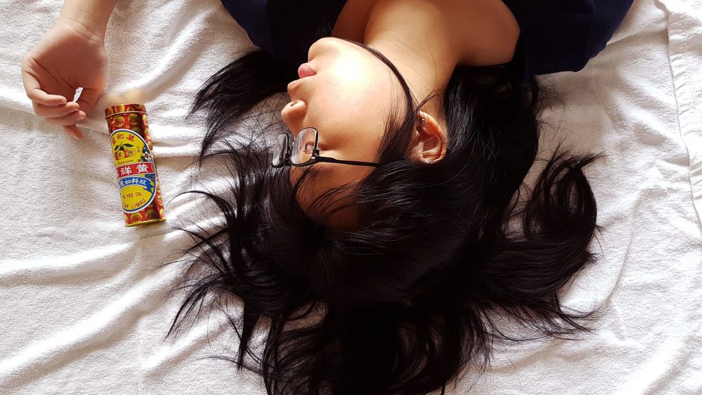
Richard Billingham, Untitled (Ray’s A Laugh 6), 1995

I was quite inspired by one of the reference artist, Richard Billingham. He was able to evoke the personalities of his subject matter and scenario, while being frank and authentic. He say he feels better when he doesn’t use a digital camera as he does not want to keep looking at the photographs behind the screen be bothered by how he can repetitively take a better photograph and he no longer knows what is he doing, so he thinks it is better if he cannot see what he has done at that moment, and then look later when the film is developed. I could relate to how Billingham feel regarding using a digital camera or smartphone to take photographs, as I would be so concerned about how pretty a photograph looks, I forget my initial intention: to take a meaningful photograph instead. A lot of his inspiration comes from childhood, which is what captured my attention initially.

The reason I shot the photographs from a downward angle is because I wanted to recreate the perspective I had as a child: Small and curious. I enhance the colours to replicate how the actual scenario looked like off camera, it is because this is how I see things: In colour, the way it is.

Upon taking the photographs, I was trying to look at the parts in the house that caught my attention the most at that age. I recall climbing up the table counter from the kitchen stove area so that I can reach the ‘Mamee Noodle Snack’ in the cabinet my grandmother hid from me before dinner. Hence, this photo of the kitchen counter. (Photograph 2)

The area where I played ‘Masak Masak’ with my grandmother’s bowls in the wooden cabinet, mixing my milk powder formula with the raw rice in the wooden bucket. (Photograph 4)

The cooking area where I watched my grandmother cook as I snuck a few pieces of piping hot luncheon meat into my mouth the instant she plated them. But of course, I think she knew. (Photograph 1)

All of these scenarios ended the same: My grandmother carrying and scolding me in Teo Chew dialect while I writhed and kicked in annoyance all the way to the living room where it is ‘safer’ for me to play as my grandfather would be watching me while he dozes off.

Problems faced when I was doing this project is that I was unable to capture the entire scenario. Like for instance, this photo feels incomplete without having that table. But if I were to manually move the table into the photo I am taking, the photo loses its significance because it feels staged.

However, if I were to stand in a position where both the table and the scenario I want to capture can be simultaneously captured, it still feels wrong because there is an extra materials in the photo that I don’t wish to capture.

Doing a panoramic shot of my world feels very spherical and some objects have too much depth when it is actually rather flat. Hence, the photos I have taken feels… missing of some emotions, or too many elements to focus on.

~~~~~~~~~~~~~~~~~~~~~~~~~~~~~~~~~~~~~~~~~~~~~~~~~~~~~~

These are the 4 images I have selected that best convey the world that is significant to me:

reedit

Photograph 1: A panoramic view of my world

My World Photo 2

Photograph 2

My World Photo 3

Photograph 3

My World Photo 1

Photograph 4

To conclude, as I grow older I have learnt that society does not work the way it does at home. I have to learn to try new things, be adventurous and take a leap of faith. But very much, most of the times I feel that doing these are very daunting and foreign to me, and that is where I rely on things that remind me of my safe haven. Since childhood is something I can never ever go back to, holding dear memories of it and being in places that reminds me of them is the least I can do to comfort myself when things gets too scary, it allows me to know how much of a person I have grown into, and how much more I have to know and grow.


Object of Significance: Yu Yee Oil.

Significance:

Yu Yee Oil has been with us for as long as many of us can remember. I believe that every Singaporean is able to recognise this brand just base on the packaging design and colour. It is a go-to medicated oil for children who has stomach-ache and an essential item for parents to apply this on the belly and bottom of the feet for their kids every time after their bath.

Yu Yee Oil is a significant object that greatly reminds me of my childhood. It has been with me since I was a baby.

Even today, I still use it. Not only because for its function to cure stomach-aches, but because the smell itself is very comforting. I even bring it with me to places I am unfamiliar with. A familiar scent that has been with me since childhood. A scent that is highly distinguishable. A whiff of it instantly calms me down. It makes me feel grounded. The moment the minty scent hits the back of my throat; a surge of warmth spreads within me and I feel all soft, mushy and warm; like a baby wrapped in a bundle. And I like feeling like that. A baby wrapped in a bundle, safe and sound with not a thing to worry about. And I think this is a way I can take myself away from reality, even if it is only just for a while.

References and Objectives:

I used maternity, family and baby photoshoots as visual references.

I wanted to capture the essence of family love, tranquility and purity. So I studied how the position of subject matters in the photos can help achieve the mood I wanted to convey.

photo ref

Baby photo shoot ideas pictures with baby girl with her cute headband looking up to the camera


Hence, with that, I wanted to capture these bolded words above in my photographs.

~~~~~~~~~~~~~~~~~~~~~~~~~~~~~~~~~~~~~~~~~~~~~~~~~~~~~

My Story:

Close up of the object in a neutral background from various vantage points

Front view of object against white back drop.

Front view of object against white back drop.

Top View of object on soft towel

Top View of object on soft towel


Side view of object lying down on soft towel.

Side view of object lying down on soft towel.


Full Figure shot of myself with the object.

Normal Standing pose with the object.

Normal Standing pose with the object.


Full Figure shot of myself interacting with the object. Aim to capture my feeling about the object.

Cradling my object like a baby bump.

Cradling my object like a baby bump.


Mid-range shot of me interacting with the object. Aim to capture my feeling about the object.

Playing with my object as though it is like a newborn.

Playing with my object as though it is like a newborn.

My Story Photo 3 My Story Photo 2


Close- up shots of me interacting with the object

My Story Photo 1Close up shot 1


My final top 3 photographs that I felt conveyed the mood of my story:

I deliberately wore white to create a juxtaposition between the bright and vibrant colours of my object. So that more attention can be drawn to my object and my expressions which I wanted to use as the main elements to set the mood of my story.

My Story Photo 2

My object keeps me safe when I am scared.

I chose a specific timing in the afternoon to capture this image as the lighting from my window casts a shadow behind me. Shadow is casted towards the interior of the room which represented the internal darkness I have inside of me, and the bright light casted towards the exterior is a representation of my bright personality on the outside.

My Story Photo 3

My Object is soft and delicate to the skin like a baby.

My Story Photo 1

My object is small and close to me. Literally and metaphorically.


I attempted to create depth in this photograph as I brought my object much closer to the camera and pulled myself far behind. I wanted to show that a small and bright object like this, can also have a great impact in my plain white life.

~~~~~~~~~~~~~~~~~~~~~~~~~~~~~~~~~~~~~~~~~~~~~~~~~~~

THE HALL OF REJECTED WORKS

These are just some of the photographs that failed the cut to get selected as my top 3 images because I couldn’t capture the emotions I want to convey in the photographs.

photo ref


editted


I brought my hand around the object to draw the viewer’s attention by framing it, and tilting my head at that direction. I thought looking at it would provide an implied line in the direction of the object. I tousled and spread out my hair to give a more relaxed feeling. However, I felt that after the shot was taken the mood was more…sensuous than pure and tranquil. Hence this photograph did not make the cut.

~~~~~~~~~~~~~~~~~~~~~~~~~~~~~~~~~~~~~~~~~~~~~~~~~~~~~

Physical contact is a way to draw people closer because of intimacy and entering of one’s personal space. Hence, I plastered the object close to my face and cropped a mid-shot photograph to a close-up photograph obtain this. My objective for cropping is to allow the viewer to feel closer to us (me and my object). And placing the object against my face is a form of physical intimacy.

Close up shot 1

This photograph failed the cut because my object’s function is not to be used anywhere near the face (application on face may burn). In addition, this photograph looks like a cosmetic advertisement instead, which totally goes against the function of my object.


This was a fun project! 😀